| // Copyright 2014 The Flutter Authors. All rights reserved. |
| // Use of this source code is governed by a BSD-style license that can be |
| // found in the LICENSE file. |
| |
| import 'dart:async'; |
| import 'dart:collection'; |
| import 'dart:math' as math; |
| |
| import 'package:flutter/foundation.dart'; |
| import 'package:flutter/rendering.dart'; |
| import 'package:flutter/widgets.dart'; |
| import 'package:flutter/gestures.dart' show DragStartBehavior; |
| |
| import 'app_bar.dart'; |
| import 'bottom_sheet.dart'; |
| import 'button_bar.dart'; |
| import 'colors.dart'; |
| import 'divider.dart'; |
| import 'drawer.dart'; |
| import 'flexible_space_bar.dart'; |
| import 'floating_action_button.dart'; |
| import 'floating_action_button_location.dart'; |
| import 'material.dart'; |
| import 'snack_bar.dart'; |
| import 'snack_bar_theme.dart'; |
| import 'theme.dart'; |
| import 'theme_data.dart'; |
| |
| // Examples can assume: |
| // TabController tabController; |
| // void setState(VoidCallback fn) { } |
| // String appBarTitle; |
| // int tabCount; |
| // TickerProvider tickerProvider; |
| |
| const FloatingActionButtonLocation _kDefaultFloatingActionButtonLocation = FloatingActionButtonLocation.endFloat; |
| const FloatingActionButtonAnimator _kDefaultFloatingActionButtonAnimator = FloatingActionButtonAnimator.scaling; |
| |
| // When the top of the BottomSheet crosses this threshold, it will start to |
| // shrink the FAB and show a scrim. |
| const double _kBottomSheetDominatesPercentage = 0.3; |
| const double _kMinBottomSheetScrimOpacity = 0.1; |
| const double _kMaxBottomSheetScrimOpacity = 0.6; |
| |
| enum _ScaffoldSlot { |
| body, |
| appBar, |
| bodyScrim, |
| bottomSheet, |
| snackBar, |
| persistentFooter, |
| bottomNavigationBar, |
| floatingActionButton, |
| drawer, |
| endDrawer, |
| statusBar, |
| } |
| |
| /// The geometry of the [Scaffold] after all its contents have been laid out |
| /// except the [FloatingActionButton]. |
| /// |
| /// The [Scaffold] passes this pre-layout geometry to its |
| /// [FloatingActionButtonLocation], which produces an [Offset] that the |
| /// [Scaffold] uses to position the [FloatingActionButton]. |
| /// |
| /// For a description of the [Scaffold]'s geometry after it has |
| /// finished laying out, see the [ScaffoldGeometry]. |
| @immutable |
| class ScaffoldPrelayoutGeometry { |
| /// Abstract const constructor. This constructor enables subclasses to provide |
| /// const constructors so that they can be used in const expressions. |
| const ScaffoldPrelayoutGeometry({ |
| @required this.bottomSheetSize, |
| @required this.contentBottom, |
| @required this.contentTop, |
| @required this.floatingActionButtonSize, |
| @required this.minInsets, |
| @required this.scaffoldSize, |
| @required this.snackBarSize, |
| @required this.textDirection, |
| }); |
| |
| /// The [Size] of [Scaffold.floatingActionButton]. |
| /// |
| /// If [Scaffold.floatingActionButton] is null, this will be [Size.zero]. |
| final Size floatingActionButtonSize; |
| |
| /// The [Size] of the [Scaffold]'s [BottomSheet]. |
| /// |
| /// If the [Scaffold] is not currently showing a [BottomSheet], |
| /// this will be [Size.zero]. |
| final Size bottomSheetSize; |
| |
| /// The vertical distance from the Scaffold's origin to the bottom of |
| /// [Scaffold.body]. |
| /// |
| /// This is useful in a [FloatingActionButtonLocation] designed to |
| /// place the [FloatingActionButton] at the bottom of the screen, while |
| /// keeping it above the [BottomSheet], the [Scaffold.bottomNavigationBar], |
| /// or the keyboard. |
| /// |
| /// The [Scaffold.body] is laid out with respect to [minInsets] already. This |
| /// means that a [FloatingActionButtonLocation] does not need to factor in |
| /// [minInsets.bottom] when aligning a [FloatingActionButton] to |
| /// [contentBottom]. |
| final double contentBottom; |
| |
| /// The vertical distance from the [Scaffold]'s origin to the top of |
| /// [Scaffold.body]. |
| /// |
| /// This is useful in a [FloatingActionButtonLocation] designed to |
| /// place the [FloatingActionButton] at the top of the screen, while |
| /// keeping it below the [Scaffold.appBar]. |
| /// |
| /// The [Scaffold.body] is laid out with respect to [minInsets] already. This |
| /// means that a [FloatingActionButtonLocation] does not need to factor in |
| /// [minInsets.top] when aligning a [FloatingActionButton] to [contentTop]. |
| final double contentTop; |
| |
| /// The minimum padding to inset the [FloatingActionButton] by for it |
| /// to remain visible. |
| /// |
| /// This value is the result of calling [MediaQuery.padding] in the |
| /// [Scaffold]'s [BuildContext], |
| /// and is useful for insetting the [FloatingActionButton] to avoid features like |
| /// the system status bar or the keyboard. |
| /// |
| /// If [Scaffold.resizeToAvoidBottomInset] is set to false, [minInsets.bottom] |
| /// will be 0.0. |
| final EdgeInsets minInsets; |
| |
| /// The [Size] of the whole [Scaffold]. |
| /// |
| /// If the [Size] of the [Scaffold]'s contents is modified by values such as |
| /// [Scaffold.resizeToAvoidBottomInset] or the keyboard opening, then the |
| /// [scaffoldSize] will not reflect those changes. |
| /// |
| /// This means that [FloatingActionButtonLocation]s designed to reposition |
| /// the [FloatingActionButton] based on events such as the keyboard popping |
| /// up should use [minInsets] to make sure that the [FloatingActionButton] is |
| /// inset by enough to remain visible. |
| /// |
| /// See [minInsets] and [MediaQuery.padding] for more information on the appropriate |
| /// insets to apply. |
| final Size scaffoldSize; |
| |
| /// The [Size] of the [Scaffold]'s [SnackBar]. |
| /// |
| /// If the [Scaffold] is not showing a [SnackBar], this will be [Size.zero]. |
| final Size snackBarSize; |
| |
| /// The [TextDirection] of the [Scaffold]'s [BuildContext]. |
| final TextDirection textDirection; |
| } |
| |
| /// A snapshot of a transition between two [FloatingActionButtonLocation]s. |
| /// |
| /// [ScaffoldState] uses this to seamlessly change transition animations |
| /// when a running [FloatingActionButtonLocation] transition is interrupted by a new transition. |
| @immutable |
| class _TransitionSnapshotFabLocation extends FloatingActionButtonLocation { |
| |
| const _TransitionSnapshotFabLocation(this.begin, this.end, this.animator, this.progress); |
| |
| final FloatingActionButtonLocation begin; |
| final FloatingActionButtonLocation end; |
| final FloatingActionButtonAnimator animator; |
| final double progress; |
| |
| @override |
| Offset getOffset(ScaffoldPrelayoutGeometry scaffoldGeometry) { |
| return animator.getOffset( |
| begin: begin.getOffset(scaffoldGeometry), |
| end: end.getOffset(scaffoldGeometry), |
| progress: progress, |
| ); |
| } |
| |
| @override |
| String toString() { |
| return '${objectRuntimeType(this, '_TransitionSnapshotFabLocation')}(begin: $begin, end: $end, progress: $progress)'; |
| } |
| } |
| |
| /// Geometry information for [Scaffold] components after layout is finished. |
| /// |
| /// To get a [ValueNotifier] for the scaffold geometry of a given |
| /// [BuildContext], use [Scaffold.geometryOf]. |
| /// |
| /// The ScaffoldGeometry is only available during the paint phase, because |
| /// its value is computed during the animation and layout phases prior to painting. |
| /// |
| /// For an example of using the [ScaffoldGeometry], see the [BottomAppBar], |
| /// which uses the [ScaffoldGeometry] to paint a notch around the |
| /// [FloatingActionButton]. |
| /// |
| /// For information about the [Scaffold]'s geometry that is used while laying |
| /// out the [FloatingActionButton], see [ScaffoldPrelayoutGeometry]. |
| @immutable |
| class ScaffoldGeometry { |
| /// Create an object that describes the geometry of a [Scaffold]. |
| const ScaffoldGeometry({ |
| this.bottomNavigationBarTop, |
| this.floatingActionButtonArea, |
| }); |
| |
| /// The distance from the [Scaffold]'s top edge to the top edge of the |
| /// rectangle in which the [Scaffold.bottomNavigationBar] bar is laid out. |
| /// |
| /// Null if [Scaffold.bottomNavigationBar] is null. |
| final double bottomNavigationBarTop; |
| |
| /// The [Scaffold.floatingActionButton]'s bounding rectangle. |
| /// |
| /// This is null when there is no floating action button showing. |
| final Rect floatingActionButtonArea; |
| |
| ScaffoldGeometry _scaleFloatingActionButton(double scaleFactor) { |
| if (scaleFactor == 1.0) |
| return this; |
| |
| if (scaleFactor == 0.0) { |
| return ScaffoldGeometry( |
| bottomNavigationBarTop: bottomNavigationBarTop, |
| ); |
| } |
| |
| final Rect scaledButton = Rect.lerp( |
| floatingActionButtonArea.center & Size.zero, |
| floatingActionButtonArea, |
| scaleFactor, |
| ); |
| return copyWith(floatingActionButtonArea: scaledButton); |
| } |
| |
| /// Creates a copy of this [ScaffoldGeometry] but with the given fields replaced with |
| /// the new values. |
| ScaffoldGeometry copyWith({ |
| double bottomNavigationBarTop, |
| Rect floatingActionButtonArea, |
| }) { |
| return ScaffoldGeometry( |
| bottomNavigationBarTop: bottomNavigationBarTop ?? this.bottomNavigationBarTop, |
| floatingActionButtonArea: floatingActionButtonArea ?? this.floatingActionButtonArea, |
| ); |
| } |
| } |
| |
| class _ScaffoldGeometryNotifier extends ChangeNotifier implements ValueListenable<ScaffoldGeometry> { |
| _ScaffoldGeometryNotifier(this.geometry, this.context) |
| : assert (context != null); |
| |
| final BuildContext context; |
| double floatingActionButtonScale; |
| ScaffoldGeometry geometry; |
| |
| @override |
| ScaffoldGeometry get value { |
| assert(() { |
| final RenderObject renderObject = context.findRenderObject(); |
| if (renderObject == null || !renderObject.owner.debugDoingPaint) |
| throw FlutterError( |
| 'Scaffold.geometryOf() must only be accessed during the paint phase.\n' |
| 'The ScaffoldGeometry is only available during the paint phase, because ' |
| 'its value is computed during the animation and layout phases prior to painting.' |
| ); |
| return true; |
| }()); |
| return geometry._scaleFloatingActionButton(floatingActionButtonScale); |
| } |
| |
| void _updateWith({ |
| double bottomNavigationBarTop, |
| Rect floatingActionButtonArea, |
| double floatingActionButtonScale, |
| }) { |
| this.floatingActionButtonScale = floatingActionButtonScale ?? this.floatingActionButtonScale; |
| geometry = geometry.copyWith( |
| bottomNavigationBarTop: bottomNavigationBarTop, |
| floatingActionButtonArea: floatingActionButtonArea, |
| ); |
| notifyListeners(); |
| } |
| } |
| |
| // Used to communicate the height of the Scaffold's bottomNavigationBar and |
| // persistentFooterButtons to the LayoutBuilder which builds the Scaffold's body. |
| // |
| // Scaffold expects a _BodyBoxConstraints to be passed to the _BodyBuilder |
| // widget's LayoutBuilder, see _ScaffoldLayout.performLayout(). The BoxConstraints |
| // methods that construct new BoxConstraints objects, like copyWith() have not |
| // been overridden here because we expect the _BodyBoxConstraintsObject to be |
| // passed along unmodified to the LayoutBuilder. If that changes in the future |
| // then _BodyBuilder will assert. |
| class _BodyBoxConstraints extends BoxConstraints { |
| const _BodyBoxConstraints({ |
| double minWidth = 0.0, |
| double maxWidth = double.infinity, |
| double minHeight = 0.0, |
| double maxHeight = double.infinity, |
| @required this.bottomWidgetsHeight, |
| @required this.appBarHeight, |
| }) : assert(bottomWidgetsHeight != null), |
| assert(bottomWidgetsHeight >= 0), |
| assert(appBarHeight != null), |
| assert(appBarHeight >= 0), |
| super(minWidth: minWidth, maxWidth: maxWidth, minHeight: minHeight, maxHeight: maxHeight); |
| |
| final double bottomWidgetsHeight; |
| final double appBarHeight; |
| |
| // RenderObject.layout() will only short-circuit its call to its performLayout |
| // method if the new layout constraints are not == to the current constraints. |
| // If the height of the bottom widgets has changed, even though the constraints' |
| // min and max values have not, we still want performLayout to happen. |
| @override |
| bool operator ==(Object other) { |
| if (super != other) |
| return false; |
| return other is _BodyBoxConstraints |
| && other.bottomWidgetsHeight == bottomWidgetsHeight |
| && other.appBarHeight == appBarHeight; |
| } |
| |
| @override |
| int get hashCode { |
| return hashValues(super.hashCode, bottomWidgetsHeight, appBarHeight); |
| } |
| } |
| |
| // Used when Scaffold.extendBody is true to wrap the scaffold's body in a MediaQuery |
| // whose padding accounts for the height of the bottomNavigationBar and/or the |
| // persistentFooterButtons. |
| // |
| // The bottom widgets' height is passed along via the _BodyBoxConstraints parameter. |
| // The constraints parameter is constructed in_ScaffoldLayout.performLayout(). |
| class _BodyBuilder extends StatelessWidget { |
| const _BodyBuilder({ |
| Key key, |
| @required this.extendBody, |
| @required this.extendBodyBehindAppBar, |
| @required this.body, |
| }) : assert(extendBody != null), |
| assert(extendBodyBehindAppBar != null), |
| assert(body != null), |
| super(key: key); |
| |
| final Widget body; |
| final bool extendBody; |
| final bool extendBodyBehindAppBar; |
| |
| @override |
| Widget build(BuildContext context) { |
| if (!extendBody && !extendBodyBehindAppBar) |
| return body; |
| |
| return LayoutBuilder( |
| builder: (BuildContext context, BoxConstraints constraints) { |
| final _BodyBoxConstraints bodyConstraints = constraints as _BodyBoxConstraints; |
| final MediaQueryData metrics = MediaQuery.of(context); |
| |
| final double bottom = extendBody |
| ? math.max(metrics.padding.bottom, bodyConstraints.bottomWidgetsHeight) |
| : metrics.padding.bottom; |
| |
| final double top = extendBodyBehindAppBar |
| ? math.max(metrics.padding.top, bodyConstraints.appBarHeight) |
| : metrics.padding.top; |
| |
| return MediaQuery( |
| data: metrics.copyWith( |
| padding: metrics.padding.copyWith( |
| top: top, |
| bottom: bottom, |
| ), |
| ), |
| child: body, |
| ); |
| }, |
| ); |
| } |
| } |
| |
| class _ScaffoldLayout extends MultiChildLayoutDelegate { |
| _ScaffoldLayout({ |
| @required this.minInsets, |
| @required this.textDirection, |
| @required this.geometryNotifier, |
| // for floating action button |
| @required this.previousFloatingActionButtonLocation, |
| @required this.currentFloatingActionButtonLocation, |
| @required this.floatingActionButtonMoveAnimationProgress, |
| @required this.floatingActionButtonMotionAnimator, |
| @required this.isSnackBarFloating, |
| @required this.extendBody, |
| @required this.extendBodyBehindAppBar, |
| }) : assert(minInsets != null), |
| assert(textDirection != null), |
| assert(geometryNotifier != null), |
| assert(previousFloatingActionButtonLocation != null), |
| assert(currentFloatingActionButtonLocation != null), |
| assert(extendBody != null), |
| assert(extendBodyBehindAppBar != null); |
| |
| final bool extendBody; |
| final bool extendBodyBehindAppBar; |
| final EdgeInsets minInsets; |
| final TextDirection textDirection; |
| final _ScaffoldGeometryNotifier geometryNotifier; |
| |
| final FloatingActionButtonLocation previousFloatingActionButtonLocation; |
| final FloatingActionButtonLocation currentFloatingActionButtonLocation; |
| final double floatingActionButtonMoveAnimationProgress; |
| final FloatingActionButtonAnimator floatingActionButtonMotionAnimator; |
| |
| final bool isSnackBarFloating; |
| |
| @override |
| void performLayout(Size size) { |
| final BoxConstraints looseConstraints = BoxConstraints.loose(size); |
| |
| // This part of the layout has the same effect as putting the app bar and |
| // body in a column and making the body flexible. What's different is that |
| // in this case the app bar appears _after_ the body in the stacking order, |
| // so the app bar's shadow is drawn on top of the body. |
| |
| final BoxConstraints fullWidthConstraints = looseConstraints.tighten(width: size.width); |
| final double bottom = size.height; |
| double contentTop = 0.0; |
| double bottomWidgetsHeight = 0.0; |
| double appBarHeight = 0.0; |
| |
| if (hasChild(_ScaffoldSlot.appBar)) { |
| appBarHeight = layoutChild(_ScaffoldSlot.appBar, fullWidthConstraints).height; |
| contentTop = extendBodyBehindAppBar ? 0.0 : appBarHeight; |
| positionChild(_ScaffoldSlot.appBar, Offset.zero); |
| } |
| |
| double bottomNavigationBarTop; |
| if (hasChild(_ScaffoldSlot.bottomNavigationBar)) { |
| final double bottomNavigationBarHeight = layoutChild(_ScaffoldSlot.bottomNavigationBar, fullWidthConstraints).height; |
| bottomWidgetsHeight += bottomNavigationBarHeight; |
| bottomNavigationBarTop = math.max(0.0, bottom - bottomWidgetsHeight); |
| positionChild(_ScaffoldSlot.bottomNavigationBar, Offset(0.0, bottomNavigationBarTop)); |
| } |
| |
| if (hasChild(_ScaffoldSlot.persistentFooter)) { |
| final BoxConstraints footerConstraints = BoxConstraints( |
| maxWidth: fullWidthConstraints.maxWidth, |
| maxHeight: math.max(0.0, bottom - bottomWidgetsHeight - contentTop), |
| ); |
| final double persistentFooterHeight = layoutChild(_ScaffoldSlot.persistentFooter, footerConstraints).height; |
| bottomWidgetsHeight += persistentFooterHeight; |
| positionChild(_ScaffoldSlot.persistentFooter, Offset(0.0, math.max(0.0, bottom - bottomWidgetsHeight))); |
| } |
| |
| // Set the content bottom to account for the greater of the height of any |
| // bottom-anchored material widgets or of the keyboard or other |
| // bottom-anchored system UI. |
| final double contentBottom = math.max(0.0, bottom - math.max(minInsets.bottom, bottomWidgetsHeight)); |
| |
| if (hasChild(_ScaffoldSlot.body)) { |
| double bodyMaxHeight = math.max(0.0, contentBottom - contentTop); |
| |
| if (extendBody) { |
| bodyMaxHeight += bottomWidgetsHeight; |
| bodyMaxHeight = bodyMaxHeight.clamp(0.0, looseConstraints.maxHeight - contentTop).toDouble(); |
| assert(bodyMaxHeight <= math.max(0.0, looseConstraints.maxHeight - contentTop)); |
| } |
| |
| final BoxConstraints bodyConstraints = _BodyBoxConstraints( |
| maxWidth: fullWidthConstraints.maxWidth, |
| maxHeight: bodyMaxHeight, |
| bottomWidgetsHeight: extendBody ? bottomWidgetsHeight : 0.0, |
| appBarHeight: appBarHeight, |
| ); |
| layoutChild(_ScaffoldSlot.body, bodyConstraints); |
| positionChild(_ScaffoldSlot.body, Offset(0.0, contentTop)); |
| } |
| |
| // The BottomSheet and the SnackBar are anchored to the bottom of the parent, |
| // they're as wide as the parent and are given their intrinsic height. The |
| // only difference is that SnackBar appears on the top side of the |
| // BottomNavigationBar while the BottomSheet is stacked on top of it. |
| // |
| // If all three elements are present then either the center of the FAB straddles |
| // the top edge of the BottomSheet or the bottom of the FAB is |
| // kFloatingActionButtonMargin above the SnackBar, whichever puts the FAB |
| // the farthest above the bottom of the parent. If only the FAB is has a |
| // non-zero height then it's inset from the parent's right and bottom edges |
| // by kFloatingActionButtonMargin. |
| |
| Size bottomSheetSize = Size.zero; |
| Size snackBarSize = Size.zero; |
| if (hasChild(_ScaffoldSlot.bodyScrim)) { |
| final BoxConstraints bottomSheetScrimConstraints = BoxConstraints( |
| maxWidth: fullWidthConstraints.maxWidth, |
| maxHeight: contentBottom, |
| ); |
| layoutChild(_ScaffoldSlot.bodyScrim, bottomSheetScrimConstraints); |
| positionChild(_ScaffoldSlot.bodyScrim, Offset.zero); |
| } |
| |
| // Set the size of the SnackBar early if the behavior is fixed so |
| // the FAB can be positioned correctly. |
| if (hasChild(_ScaffoldSlot.snackBar) && !isSnackBarFloating) { |
| snackBarSize = layoutChild(_ScaffoldSlot.snackBar, fullWidthConstraints); |
| } |
| |
| if (hasChild(_ScaffoldSlot.bottomSheet)) { |
| final BoxConstraints bottomSheetConstraints = BoxConstraints( |
| maxWidth: fullWidthConstraints.maxWidth, |
| maxHeight: math.max(0.0, contentBottom - contentTop), |
| ); |
| bottomSheetSize = layoutChild(_ScaffoldSlot.bottomSheet, bottomSheetConstraints); |
| positionChild(_ScaffoldSlot.bottomSheet, Offset((size.width - bottomSheetSize.width) / 2.0, contentBottom - bottomSheetSize.height)); |
| } |
| |
| Rect floatingActionButtonRect; |
| if (hasChild(_ScaffoldSlot.floatingActionButton)) { |
| final Size fabSize = layoutChild(_ScaffoldSlot.floatingActionButton, looseConstraints); |
| |
| // To account for the FAB position being changed, we'll animate between |
| // the old and new positions. |
| final ScaffoldPrelayoutGeometry currentGeometry = ScaffoldPrelayoutGeometry( |
| bottomSheetSize: bottomSheetSize, |
| contentBottom: contentBottom, |
| contentTop: contentTop, |
| floatingActionButtonSize: fabSize, |
| minInsets: minInsets, |
| scaffoldSize: size, |
| snackBarSize: snackBarSize, |
| textDirection: textDirection, |
| ); |
| final Offset currentFabOffset = currentFloatingActionButtonLocation.getOffset(currentGeometry); |
| final Offset previousFabOffset = previousFloatingActionButtonLocation.getOffset(currentGeometry); |
| final Offset fabOffset = floatingActionButtonMotionAnimator.getOffset( |
| begin: previousFabOffset, |
| end: currentFabOffset, |
| progress: floatingActionButtonMoveAnimationProgress, |
| ); |
| positionChild(_ScaffoldSlot.floatingActionButton, fabOffset); |
| floatingActionButtonRect = fabOffset & fabSize; |
| } |
| |
| if (hasChild(_ScaffoldSlot.snackBar)) { |
| if (snackBarSize == Size.zero) { |
| snackBarSize = layoutChild(_ScaffoldSlot.snackBar, fullWidthConstraints); |
| } |
| final double snackBarYOffsetBase = floatingActionButtonRect != null && isSnackBarFloating |
| ? floatingActionButtonRect.top |
| : contentBottom; |
| positionChild(_ScaffoldSlot.snackBar, Offset(0.0, snackBarYOffsetBase - snackBarSize.height)); |
| } |
| |
| if (hasChild(_ScaffoldSlot.statusBar)) { |
| layoutChild(_ScaffoldSlot.statusBar, fullWidthConstraints.tighten(height: minInsets.top)); |
| positionChild(_ScaffoldSlot.statusBar, Offset.zero); |
| } |
| |
| if (hasChild(_ScaffoldSlot.drawer)) { |
| layoutChild(_ScaffoldSlot.drawer, BoxConstraints.tight(size)); |
| positionChild(_ScaffoldSlot.drawer, Offset.zero); |
| } |
| |
| if (hasChild(_ScaffoldSlot.endDrawer)) { |
| layoutChild(_ScaffoldSlot.endDrawer, BoxConstraints.tight(size)); |
| positionChild(_ScaffoldSlot.endDrawer, Offset.zero); |
| } |
| |
| geometryNotifier._updateWith( |
| bottomNavigationBarTop: bottomNavigationBarTop, |
| floatingActionButtonArea: floatingActionButtonRect, |
| ); |
| } |
| |
| @override |
| bool shouldRelayout(_ScaffoldLayout oldDelegate) { |
| return oldDelegate.minInsets != minInsets |
| || oldDelegate.textDirection != textDirection |
| || oldDelegate.floatingActionButtonMoveAnimationProgress != floatingActionButtonMoveAnimationProgress |
| || oldDelegate.previousFloatingActionButtonLocation != previousFloatingActionButtonLocation |
| || oldDelegate.currentFloatingActionButtonLocation != currentFloatingActionButtonLocation |
| || oldDelegate.extendBody != extendBody |
| || oldDelegate.extendBodyBehindAppBar != extendBodyBehindAppBar; |
| } |
| } |
| |
| /// Handler for scale and rotation animations in the [FloatingActionButton]. |
| /// |
| /// Currently, there are two types of [FloatingActionButton] animations: |
| /// |
| /// * Entrance/Exit animations, which this widget triggers |
| /// when the [FloatingActionButton] is added, updated, or removed. |
| /// * Motion animations, which are triggered by the [Scaffold] |
| /// when its [FloatingActionButtonLocation] is updated. |
| class _FloatingActionButtonTransition extends StatefulWidget { |
| const _FloatingActionButtonTransition({ |
| Key key, |
| @required this.child, |
| @required this.fabMoveAnimation, |
| @required this.fabMotionAnimator, |
| @required this.geometryNotifier, |
| @required this.currentController, |
| }) : assert(fabMoveAnimation != null), |
| assert(fabMotionAnimator != null), |
| assert(currentController != null), |
| super(key: key); |
| |
| final Widget child; |
| final Animation<double> fabMoveAnimation; |
| final FloatingActionButtonAnimator fabMotionAnimator; |
| final _ScaffoldGeometryNotifier geometryNotifier; |
| |
| /// Controls the current child widget.child as it exits. |
| final AnimationController currentController; |
| |
| @override |
| _FloatingActionButtonTransitionState createState() => _FloatingActionButtonTransitionState(); |
| } |
| |
| class _FloatingActionButtonTransitionState extends State<_FloatingActionButtonTransition> with TickerProviderStateMixin { |
| // The animations applied to the Floating Action Button when it is entering or exiting. |
| // Controls the previous widget.child as it exits. |
| AnimationController _previousController; |
| Animation<double> _previousScaleAnimation; |
| Animation<double> _previousRotationAnimation; |
| // The animations to run, considering the widget's fabMoveAnimation and the current/previous entrance/exit animations. |
| Animation<double> _currentScaleAnimation; |
| Animation<double> _extendedCurrentScaleAnimation; |
| Animation<double> _currentRotationAnimation; |
| Widget _previousChild; |
| |
| @override |
| void initState() { |
| super.initState(); |
| |
| _previousController = AnimationController( |
| duration: kFloatingActionButtonSegue, |
| vsync: this, |
| )..addStatusListener(_handlePreviousAnimationStatusChanged); |
| _updateAnimations(); |
| |
| if (widget.child != null) { |
| // If we start out with a child, have the child appear fully visible instead |
| // of animating in. |
| widget.currentController.value = 1.0; |
| } else { |
| // If we start without a child we update the geometry object with a |
| // floating action button scale of 0, as it is not showing on the screen. |
| _updateGeometryScale(0.0); |
| } |
| } |
| |
| @override |
| void dispose() { |
| _previousController.dispose(); |
| super.dispose(); |
| } |
| |
| @override |
| void didUpdateWidget(_FloatingActionButtonTransition oldWidget) { |
| super.didUpdateWidget(oldWidget); |
| final bool oldChildIsNull = oldWidget.child == null; |
| final bool newChildIsNull = widget.child == null; |
| if (oldChildIsNull == newChildIsNull && oldWidget.child?.key == widget.child?.key) |
| return; |
| if (oldWidget.fabMotionAnimator != widget.fabMotionAnimator || oldWidget.fabMoveAnimation != widget.fabMoveAnimation) { |
| // Get the right scale and rotation animations to use for this widget. |
| _updateAnimations(); |
| } |
| if (_previousController.status == AnimationStatus.dismissed) { |
| final double currentValue = widget.currentController.value; |
| if (currentValue == 0.0 || oldWidget.child == null) { |
| // The current child hasn't started its entrance animation yet. We can |
| // just skip directly to the new child's entrance. |
| _previousChild = null; |
| if (widget.child != null) |
| widget.currentController.forward(); |
| } else { |
| // Otherwise, we need to copy the state from the current controller to |
| // the previous controller and run an exit animation for the previous |
| // widget before running the entrance animation for the new child. |
| _previousChild = oldWidget.child; |
| _previousController |
| ..value = currentValue |
| ..reverse(); |
| widget.currentController.value = 0.0; |
| } |
| } |
| } |
| |
| static final Animatable<double> _entranceTurnTween = Tween<double>( |
| begin: 1.0 - kFloatingActionButtonTurnInterval, |
| end: 1.0, |
| ).chain(CurveTween(curve: Curves.easeIn)); |
| |
| void _updateAnimations() { |
| // Get the animations for exit and entrance. |
| final CurvedAnimation previousExitScaleAnimation = CurvedAnimation( |
| parent: _previousController, |
| curve: Curves.easeIn, |
| ); |
| final Animation<double> previousExitRotationAnimation = Tween<double>(begin: 1.0, end: 1.0).animate( |
| CurvedAnimation( |
| parent: _previousController, |
| curve: Curves.easeIn, |
| ), |
| ); |
| |
| final CurvedAnimation currentEntranceScaleAnimation = CurvedAnimation( |
| parent: widget.currentController, |
| curve: Curves.easeIn, |
| ); |
| final Animation<double> currentEntranceRotationAnimation = widget.currentController.drive(_entranceTurnTween); |
| |
| // Get the animations for when the FAB is moving. |
| final Animation<double> moveScaleAnimation = widget.fabMotionAnimator.getScaleAnimation(parent: widget.fabMoveAnimation); |
| final Animation<double> moveRotationAnimation = widget.fabMotionAnimator.getRotationAnimation(parent: widget.fabMoveAnimation); |
| |
| // Aggregate the animations. |
| _previousScaleAnimation = AnimationMin<double>(moveScaleAnimation, previousExitScaleAnimation); |
| _currentScaleAnimation = AnimationMin<double>(moveScaleAnimation, currentEntranceScaleAnimation); |
| _extendedCurrentScaleAnimation = _currentScaleAnimation.drive(CurveTween(curve: const Interval(0.0, 0.1))); |
| |
| _previousRotationAnimation = TrainHoppingAnimation(previousExitRotationAnimation, moveRotationAnimation); |
| _currentRotationAnimation = TrainHoppingAnimation(currentEntranceRotationAnimation, moveRotationAnimation); |
| |
| _currentScaleAnimation.addListener(_onProgressChanged); |
| _previousScaleAnimation.addListener(_onProgressChanged); |
| } |
| |
| void _handlePreviousAnimationStatusChanged(AnimationStatus status) { |
| setState(() { |
| if (status == AnimationStatus.dismissed) { |
| assert(widget.currentController.status == AnimationStatus.dismissed); |
| if (widget.child != null) |
| widget.currentController.forward(); |
| } |
| }); |
| } |
| |
| bool _isExtendedFloatingActionButton(Widget widget) { |
| return widget is FloatingActionButton |
| && widget.isExtended; |
| } |
| |
| @override |
| Widget build(BuildContext context) { |
| return Stack( |
| alignment: Alignment.centerRight, |
| children: <Widget>[ |
| if (_previousController.status != AnimationStatus.dismissed) |
| if (_isExtendedFloatingActionButton(_previousChild)) |
| FadeTransition( |
| opacity: _previousScaleAnimation, |
| child: _previousChild, |
| ) |
| else |
| ScaleTransition( |
| scale: _previousScaleAnimation, |
| child: RotationTransition( |
| turns: _previousRotationAnimation, |
| child: _previousChild, |
| ), |
| ), |
| if (_isExtendedFloatingActionButton(widget.child)) |
| ScaleTransition( |
| scale: _extendedCurrentScaleAnimation, |
| child: FadeTransition( |
| opacity: _currentScaleAnimation, |
| child: widget.child, |
| ), |
| ) |
| else |
| ScaleTransition( |
| scale: _currentScaleAnimation, |
| child: RotationTransition( |
| turns: _currentRotationAnimation, |
| child: widget.child, |
| ), |
| ), |
| ], |
| ); |
| } |
| |
| void _onProgressChanged() { |
| _updateGeometryScale(math.max(_previousScaleAnimation.value, _currentScaleAnimation.value)); |
| } |
| |
| void _updateGeometryScale(double scale) { |
| widget.geometryNotifier._updateWith( |
| floatingActionButtonScale: scale, |
| ); |
| } |
| } |
| |
| /// Implements the basic material design visual layout structure. |
| /// |
| /// This class provides APIs for showing drawers, snack bars, and bottom sheets. |
| /// |
| /// To display a snackbar or a persistent bottom sheet, obtain the |
| /// [ScaffoldState] for the current [BuildContext] via [Scaffold.of] and use the |
| /// [ScaffoldState.showSnackBar] and [ScaffoldState.showBottomSheet] functions. |
| /// |
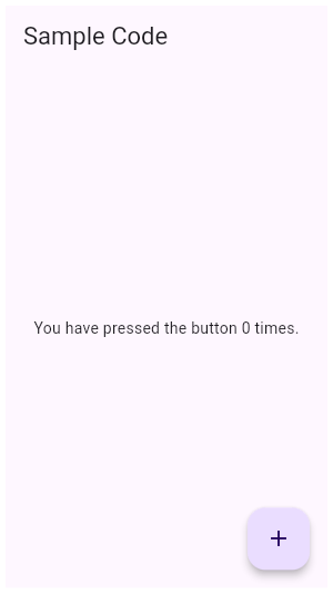
| /// {@tool dartpad --template=stateful_widget_material} |
| /// This example shows a [Scaffold] with a [body] and [FloatingActionButton]. |
| /// The [body] is a [Text] placed in a [Center] in order to center the text |
| /// within the [Scaffold]. The [FloatingActionButton] is connected to a |
| /// callback that increments a counter. |
| /// |
| ///  |
| /// |
| /// ```dart |
| /// int _count = 0; |
| /// |
| /// Widget build(BuildContext context) { |
| /// return Scaffold( |
| /// appBar: AppBar( |
| /// title: const Text('Sample Code'), |
| /// ), |
| /// body: Center( |
| /// child: Text('You have pressed the button $_count times.') |
| /// ), |
| /// floatingActionButton: FloatingActionButton( |
| /// onPressed: () => setState(() => _count++), |
| /// tooltip: 'Increment Counter', |
| /// child: const Icon(Icons.add), |
| /// ), |
| /// ); |
| /// } |
| /// ``` |
| /// {@end-tool} |
| /// |
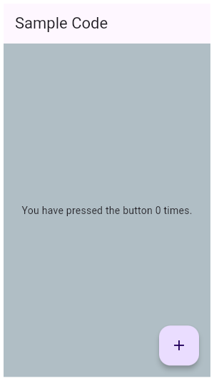
| /// {@tool dartpad --template=stateful_widget_material} |
| /// This example shows a [Scaffold] with a blueGrey [backgroundColor], [body] |
| /// and [FloatingActionButton]. The [body] is a [Text] placed in a [Center] in |
| /// order to center the text within the [Scaffold]. The [FloatingActionButton] |
| /// is connected to a callback that increments a counter. |
| /// |
| ///  |
| /// |
| /// ```dart |
| /// int _count = 0; |
| /// |
| /// Widget build(BuildContext context) { |
| /// return Scaffold( |
| /// appBar: AppBar( |
| /// title: const Text('Sample Code'), |
| /// ), |
| /// body: Center( |
| /// child: Text('You have pressed the button $_count times.') |
| /// ), |
| /// backgroundColor: Colors.blueGrey.shade200, |
| /// floatingActionButton: FloatingActionButton( |
| /// onPressed: () => setState(() => _count++), |
| /// tooltip: 'Increment Counter', |
| /// child: const Icon(Icons.add), |
| /// ), |
| /// ); |
| /// } |
| /// ``` |
| /// {@end-tool} |
| /// |
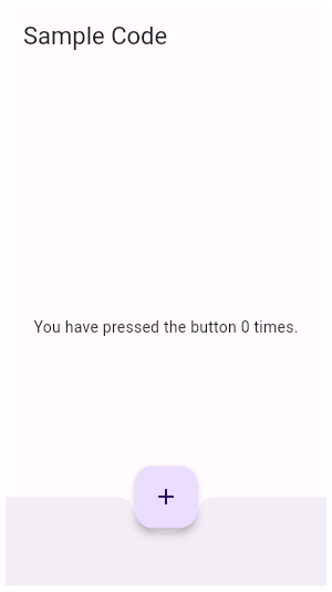
| /// {@tool dartpad --template=stateful_widget_material} |
| /// This example shows a [Scaffold] with an [AppBar], a [BottomAppBar] and a |
| /// [FloatingActionButton]. The [body] is a [Text] placed in a [Center] in order |
| /// to center the text within the [Scaffold]. The [FloatingActionButton] is |
| /// centered and docked within the [BottomAppBar] using |
| /// [FloatingActionButtonLocation.centerDocked]. The [FloatingActionButton] is |
| /// connected to a callback that increments a counter. |
| /// |
| ///  |
| /// |
| /// ```dart |
| /// int _count = 0; |
| /// |
| /// Widget build(BuildContext context) { |
| /// return Scaffold( |
| /// appBar: AppBar( |
| /// title: Text('Sample Code'), |
| /// ), |
| /// body: Center( |
| /// child: Text('You have pressed the button $_count times.'), |
| /// ), |
| /// bottomNavigationBar: BottomAppBar( |
| /// shape: const CircularNotchedRectangle(), |
| /// child: Container(height: 50.0,), |
| /// ), |
| /// floatingActionButton: FloatingActionButton( |
| /// onPressed: () => setState(() { |
| /// _count++; |
| /// }), |
| /// tooltip: 'Increment Counter', |
| /// child: Icon(Icons.add), |
| /// ), |
| /// floatingActionButtonLocation: FloatingActionButtonLocation.centerDocked, |
| /// ); |
| /// } |
| /// ``` |
| /// {@end-tool} |
| /// |
| /// ## Scaffold layout, the keyboard, and display "notches" |
| /// |
| /// The scaffold will expand to fill the available space. That usually |
| /// means that it will occupy its entire window or device screen. When |
| /// the device's keyboard appears the Scaffold's ancestor [MediaQuery] |
| /// widget's [MediaQueryData.viewInsets] changes and the Scaffold will |
| /// be rebuilt. By default the scaffold's [body] is resized to make |
| /// room for the keyboard. To prevent the resize set |
| /// [resizeToAvoidBottomInset] to false. In either case the focused |
| /// widget will be scrolled into view if it's within a scrollable |
| /// container. |
| /// |
| /// The [MediaQueryData.padding] value defines areas that might |
| /// not be completely visible, like the display "notch" on the iPhone |
| /// X. The scaffold's [body] is not inset by this padding value |
| /// although an [appBar] or [bottomNavigationBar] will typically |
| /// cause the body to avoid the padding. The [SafeArea] |
| /// widget can be used within the scaffold's body to avoid areas |
| /// like display notches. |
| /// |
| /// ## Troubleshooting |
| /// |
| /// ### Nested Scaffolds |
| /// |
| /// The Scaffold was designed to be the single top level container for |
| /// a [MaterialApp] and it's typically not necessary to nest |
| /// scaffolds. For example in a tabbed UI, where the |
| /// [bottomNavigationBar] is a [TabBar] and the body is a |
| /// [TabBarView], you might be tempted to make each tab bar view a |
| /// scaffold with a differently titled AppBar. It would be better to add a |
| /// listener to the [TabController] that updates the AppBar. |
| /// |
| /// {@tool snippet} |
| /// Add a listener to the app's tab controller so that the [AppBar] title of the |
| /// app's one and only scaffold is reset each time a new tab is selected. |
| /// |
| /// ```dart |
| /// TabController(vsync: tickerProvider, length: tabCount)..addListener(() { |
| /// if (!tabController.indexIsChanging) { |
| /// setState(() { |
| /// // Rebuild the enclosing scaffold with a new AppBar title |
| /// appBarTitle = 'Tab ${tabController.index}'; |
| /// }); |
| /// } |
| /// }) |
| /// ``` |
| /// {@end-tool} |
| /// |
| /// Although there are some use cases, like a presentation app that |
| /// shows embedded flutter content, where nested scaffolds are |
| /// appropriate, it's best to avoid nesting scaffolds. |
| /// |
| /// See also: |
| /// |
| /// * [AppBar], which is a horizontal bar typically shown at the top of an app |
| /// using the [appBar] property. |
| /// * [BottomAppBar], which is a horizontal bar typically shown at the bottom |
| /// of an app using the [bottomNavigationBar] property. |
| /// * [FloatingActionButton], which is a circular button typically shown in the |
| /// bottom right corner of the app using the [floatingActionButton] property. |
| /// * [Drawer], which is a vertical panel that is typically displayed to the |
| /// left of the body (and often hidden on phones) using the [drawer] |
| /// property. |
| /// * [BottomNavigationBar], which is a horizontal array of buttons typically |
| /// shown along the bottom of the app using the [bottomNavigationBar] |
| /// property. |
| /// * [SnackBar], which is a temporary notification typically shown near the |
| /// bottom of the app using the [ScaffoldState.showSnackBar] method. |
| /// * [BottomSheet], which is an overlay typically shown near the bottom of the |
| /// app. A bottom sheet can either be persistent, in which case it is shown |
| /// using the [ScaffoldState.showBottomSheet] method, or modal, in which case |
| /// it is shown using the [showModalBottomSheet] function. |
| /// * [ScaffoldState], which is the state associated with this widget. |
| /// * <https://material.io/design/layout/responsive-layout-grid.html> |
| class Scaffold extends StatefulWidget { |
| /// Creates a visual scaffold for material design widgets. |
| const Scaffold({ |
| Key key, |
| this.appBar, |
| this.body, |
| this.floatingActionButton, |
| this.floatingActionButtonLocation, |
| this.floatingActionButtonAnimator, |
| this.persistentFooterButtons, |
| this.drawer, |
| this.endDrawer, |
| this.bottomNavigationBar, |
| this.bottomSheet, |
| this.backgroundColor, |
| this.resizeToAvoidBottomPadding, |
| this.resizeToAvoidBottomInset, |
| this.primary = true, |
| this.drawerDragStartBehavior = DragStartBehavior.start, |
| this.extendBody = false, |
| this.extendBodyBehindAppBar = false, |
| this.drawerScrimColor, |
| this.drawerEdgeDragWidth, |
| }) : assert(primary != null), |
| assert(extendBody != null), |
| assert(extendBodyBehindAppBar != null), |
| assert(drawerDragStartBehavior != null), |
| super(key: key); |
| |
| /// If true, and [bottomNavigationBar] or [persistentFooterButtons] |
| /// is specified, then the [body] extends to the bottom of the Scaffold, |
| /// instead of only extending to the top of the [bottomNavigationBar] |
| /// or the [persistentFooterButtons]. |
| /// |
| /// If true, a [MediaQuery] widget whose bottom padding matches the |
| /// the height of the [bottomNavigationBar] will be added above the |
| /// scaffold's [body]. |
| /// |
| /// This property is often useful when the [bottomNavigationBar] has |
| /// a non-rectangular shape, like [CircularNotchedRectangle], which |
| /// adds a [FloatingActionButton] sized notch to the top edge of the bar. |
| /// In this case specifying `extendBody: true` ensures that that scaffold's |
| /// body will be visible through the bottom navigation bar's notch. |
| /// |
| /// See also: |
| /// |
| /// * [extendBodyBehindAppBar], which extends the height of the body |
| /// to the top of the scaffold. |
| final bool extendBody; |
| |
| /// If true, and an [appBar] is specified, then the height of the [body] is |
| /// extended to include the height of the app bar and the top of the body |
| /// is aligned with the top of the app bar. |
| /// |
| /// This is useful if the app bar's [AppBar.backgroundColor] is not |
| /// completely opaque. |
| /// |
| /// This property is false by default. It must not be null. |
| /// |
| /// See also: |
| /// |
| /// * [extendBody], which extends the height of the body to the bottom |
| /// of the scaffold. |
| final bool extendBodyBehindAppBar; |
| |
| /// An app bar to display at the top of the scaffold. |
| final PreferredSizeWidget appBar; |
| |
| /// The primary content of the scaffold. |
| /// |
| /// Displayed below the [appBar], above the bottom of the ambient |
| /// [MediaQuery]'s [MediaQueryData.viewInsets], and behind the |
| /// [floatingActionButton] and [drawer]. If [resizeToAvoidBottomInset] is |
| /// false then the body is not resized when the onscreen keyboard appears, |
| /// i.e. it is not inset by `viewInsets.bottom`. |
| /// |
| /// The widget in the body of the scaffold is positioned at the top-left of |
| /// the available space between the app bar and the bottom of the scaffold. To |
| /// center this widget instead, consider putting it in a [Center] widget and |
| /// having that be the body. To expand this widget instead, consider |
| /// putting it in a [SizedBox.expand]. |
| /// |
| /// If you have a column of widgets that should normally fit on the screen, |
| /// but may overflow and would in such cases need to scroll, consider using a |
| /// [ListView] as the body of the scaffold. This is also a good choice for |
| /// the case where your body is a scrollable list. |
| final Widget body; |
| |
| /// A button displayed floating above [body], in the bottom right corner. |
| /// |
| /// Typically a [FloatingActionButton]. |
| final Widget floatingActionButton; |
| |
| /// Responsible for determining where the [floatingActionButton] should go. |
| /// |
| /// If null, the [ScaffoldState] will use the default location, [FloatingActionButtonLocation.endFloat]. |
| final FloatingActionButtonLocation floatingActionButtonLocation; |
| |
| /// Animator to move the [floatingActionButton] to a new [floatingActionButtonLocation]. |
| /// |
| /// If null, the [ScaffoldState] will use the default animator, [FloatingActionButtonAnimator.scaling]. |
| final FloatingActionButtonAnimator floatingActionButtonAnimator; |
| |
| /// A set of buttons that are displayed at the bottom of the scaffold. |
| /// |
| /// Typically this is a list of [FlatButton] widgets. These buttons are |
| /// persistently visible, even if the [body] of the scaffold scrolls. |
| /// |
| /// These widgets will be wrapped in a [ButtonBar]. |
| /// |
| /// The [persistentFooterButtons] are rendered above the |
| /// [bottomNavigationBar] but below the [body]. |
| final List<Widget> persistentFooterButtons; |
| |
| /// A panel displayed to the side of the [body], often hidden on mobile |
| /// devices. Swipes in from either left-to-right ([TextDirection.ltr]) or |
| /// right-to-left ([TextDirection.rtl]) |
| /// |
| /// Typically a [Drawer]. |
| /// |
| /// To open the drawer, use the [ScaffoldState.openDrawer] function. |
| /// |
| /// To close the drawer, use [Navigator.pop]. |
| /// |
| /// {@tool dartpad --template=stateful_widget_material} |
| /// To disable the drawer edge swipe, set the [Scaffold.drawerEdgeWidth] to 0. |
| /// Then, use [ScaffoldState.openDrawer] to open the drawer and |
| /// [Navigator.pop] to close it. |
| /// |
| /// ```dart |
| /// final GlobalKey<ScaffoldState> _scaffoldKey = GlobalKey<ScaffoldState>(); |
| /// |
| /// void _openDrawer() { |
| /// _scaffoldKey.currentState.openDrawer(); |
| /// } |
| /// |
| /// void _closeDrawer() { |
| /// Navigator.of(context).pop(); |
| /// } |
| /// |
| /// @override |
| /// Widget build(BuildContext context) { |
| /// return Scaffold( |
| /// key: _scaffoldKey, |
| /// appBar: AppBar(title: const Text('Drawer Demo')), |
| /// body: Center( |
| /// child: RaisedButton( |
| /// onPressed: _openDrawer, |
| /// child: const Text('Open Drawer'), |
| /// ), |
| /// ), |
| /// drawer: Drawer( |
| /// child: Center( |
| /// child: Column( |
| /// mainAxisAlignment: MainAxisAlignment.center, |
| /// children: <Widget>[ |
| /// const Text('This is the Drawer'), |
| /// RaisedButton( |
| /// onPressed: _closeDrawer, |
| /// child: const Text('Close Drawer'), |
| /// ), |
| /// ], |
| /// ), |
| /// ), |
| /// ), |
| /// drawerEdgeDragWidth: 0.0, // Disable opening the drawer with a swipe gesture. |
| /// ); |
| /// } |
| /// ``` |
| /// {@end-tool} |
| final Widget drawer; |
| |
| /// A panel displayed to the side of the [body], often hidden on mobile |
| /// devices. Swipes in from right-to-left ([TextDirection.ltr]) or |
| /// left-to-right ([TextDirection.rtl]) |
| /// |
| /// Typically a [Drawer]. |
| /// |
| /// To open the drawer, use the [ScaffoldState.openEndDrawer] function. |
| /// |
| /// To close the drawer, use [Navigator.pop]. |
| /// |
| /// {@tool dartpad --template=stateful_widget_material} |
| /// To disable the drawer edge swipe, set the [Scaffold.drawerEdgeWidth] |
| /// to 0. Then, use [ScaffoldState.openEndDrawer] to open the drawer and |
| /// [Navigator.pop] to close it. |
| /// |
| /// ```dart |
| /// final GlobalKey<ScaffoldState> _scaffoldKey = GlobalKey<ScaffoldState>(); |
| /// |
| /// void _openEndDrawer() { |
| /// _scaffoldKey.currentState.openEndDrawer(); |
| /// } |
| /// |
| /// void _closeEndDrawer() { |
| /// Navigator.of(context).pop(); |
| /// } |
| /// |
| /// @override |
| /// Widget build(BuildContext context) { |
| /// return Scaffold( |
| /// key: _scaffoldKey, |
| /// appBar: AppBar(title: Text('Drawer Demo')), |
| /// body: Center( |
| /// child: RaisedButton( |
| /// onPressed: _openEndDrawer, |
| /// child: Text('Open End Drawer'), |
| /// ), |
| /// ), |
| /// endDrawer: Drawer( |
| /// child: Center( |
| /// child: Column( |
| /// mainAxisAlignment: MainAxisAlignment.center, |
| /// children: <Widget>[ |
| /// const Text('This is the Drawer'), |
| /// RaisedButton( |
| /// onPressed: _closeEndDrawer, |
| /// child: const Text('Close Drawer'), |
| /// ), |
| /// ], |
| /// ), |
| /// ), |
| /// ), |
| /// drawerEdgeDragWidth: 0.0, // Disable opening the drawer with a swipe gesture. |
| /// ); |
| /// } |
| /// ``` |
| /// {@end-tool} |
| final Widget endDrawer; |
| |
| /// The color to use for the scrim that obscures primary content while a drawer is open. |
| /// |
| /// By default, the color is [Colors.black54] |
| final Color drawerScrimColor; |
| |
| /// The color of the [Material] widget that underlies the entire Scaffold. |
| /// |
| /// The theme's [ThemeData.scaffoldBackgroundColor] by default. |
| final Color backgroundColor; |
| |
| /// A bottom navigation bar to display at the bottom of the scaffold. |
| /// |
| /// Snack bars slide from underneath the bottom navigation bar while bottom |
| /// sheets are stacked on top. |
| /// |
| /// The [bottomNavigationBar] is rendered below the [persistentFooterButtons] |
| /// and the [body]. |
| final Widget bottomNavigationBar; |
| |
| /// The persistent bottom sheet to display. |
| /// |
| /// A persistent bottom sheet shows information that supplements the primary |
| /// content of the app. A persistent bottom sheet remains visible even when |
| /// the user interacts with other parts of the app. |
| /// |
| /// A closely related widget is a modal bottom sheet, which is an alternative |
| /// to a menu or a dialog and prevents the user from interacting with the rest |
| /// of the app. Modal bottom sheets can be created and displayed with the |
| /// [showModalBottomSheet] function. |
| /// |
| /// Unlike the persistent bottom sheet displayed by [showBottomSheet] |
| /// this bottom sheet is not a [LocalHistoryEntry] and cannot be dismissed |
| /// with the scaffold appbar's back button. |
| /// |
| /// If a persistent bottom sheet created with [showBottomSheet] is already |
| /// visible, it must be closed before building the Scaffold with a new |
| /// [bottomSheet]. |
| /// |
| /// The value of [bottomSheet] can be any widget at all. It's unlikely to |
| /// actually be a [BottomSheet], which is used by the implementations of |
| /// [showBottomSheet] and [showModalBottomSheet]. Typically it's a widget |
| /// that includes [Material]. |
| /// |
| /// See also: |
| /// |
| /// * [showBottomSheet], which displays a bottom sheet as a route that can |
| /// be dismissed with the scaffold's back button. |
| /// * [showModalBottomSheet], which displays a modal bottom sheet. |
| final Widget bottomSheet; |
| |
| /// This flag is deprecated, please use [resizeToAvoidBottomInset] |
| /// instead. |
| /// |
| /// Originally the name referred [MediaQueryData.padding]. Now it refers |
| /// [MediaQueryData.viewInsets], so using [resizeToAvoidBottomInset] |
| /// should be clearer to readers. |
| @Deprecated( |
| 'Use resizeToAvoidBottomInset to specify if the body should resize when the keyboard appears. ' |
| 'This feature was deprecated after v1.1.9.' |
| ) |
| final bool resizeToAvoidBottomPadding; |
| |
| /// If true the [body] and the scaffold's floating widgets should size |
| /// themselves to avoid the onscreen keyboard whose height is defined by the |
| /// ambient [MediaQuery]'s [MediaQueryData.viewInsets] `bottom` property. |
| /// |
| /// For example, if there is an onscreen keyboard displayed above the |
| /// scaffold, the body can be resized to avoid overlapping the keyboard, which |
| /// prevents widgets inside the body from being obscured by the keyboard. |
| /// |
| /// Defaults to true. |
| final bool resizeToAvoidBottomInset; |
| |
| /// Whether this scaffold is being displayed at the top of the screen. |
| /// |
| /// If true then the height of the [appBar] will be extended by the height |
| /// of the screen's status bar, i.e. the top padding for [MediaQuery]. |
| /// |
| /// The default value of this property, like the default value of |
| /// [AppBar.primary], is true. |
| final bool primary; |
| |
| /// {@macro flutter.material.drawer.dragStartBehavior} |
| final DragStartBehavior drawerDragStartBehavior; |
| |
| /// The width of the area within which a horizontal swipe will open the |
| /// drawer. |
| /// |
| /// By default, the value used is 20.0 added to the padding edge of |
| /// `MediaQuery.of(context).padding` that corresponds to [alignment]. |
| /// This ensures that the drag area for notched devices is not obscured. For |
| /// example, if `TextDirection.of(context)` is set to [TextDirection.ltr], |
| /// 20.0 will be added to `MediaQuery.of(context).padding.left`. |
| final double drawerEdgeDragWidth; |
| |
| /// The state from the closest instance of this class that encloses the given context. |
| /// |
| /// {@tool dartpad --template=freeform} |
| /// Typical usage of the [Scaffold.of] function is to call it from within the |
| /// `build` method of a child of a [Scaffold]. |
| /// |
| /// ```dart imports |
| /// import 'package:flutter/material.dart'; |
| /// ``` |
| /// |
| /// ```dart main |
| /// void main() => runApp(MyApp()); |
| /// ``` |
| /// |
| /// ```dart preamble |
| /// class MyApp extends StatelessWidget { |
| /// // This widget is the root of your application. |
| /// @override |
| /// Widget build(BuildContext context) { |
| /// return MaterialApp( |
| /// title: 'Flutter Code Sample for Scaffold.of.', |
| /// theme: ThemeData( |
| /// primarySwatch: Colors.blue, |
| /// ), |
| /// home: Scaffold( |
| /// body: MyScaffoldBody(), |
| /// appBar: AppBar(title: Text('Scaffold.of Example')), |
| /// ), |
| /// color: Colors.white, |
| /// ); |
| /// } |
| /// } |
| /// ``` |
| /// |
| /// ```dart |
| /// class MyScaffoldBody extends StatelessWidget { |
| /// @override |
| /// Widget build(BuildContext context) { |
| /// return Center( |
| /// child: RaisedButton( |
| /// child: Text('SHOW A SNACKBAR'), |
| /// onPressed: () { |
| /// Scaffold.of(context).showSnackBar( |
| /// SnackBar( |
| /// content: Text('Have a snack!'), |
| /// ), |
| /// ); |
| /// }, |
| /// ), |
| /// ); |
| /// } |
| /// } |
| /// ``` |
| /// {@end-tool} |
| /// |
| /// {@tool dartpad --template=stateless_widget_material} |
| /// When the [Scaffold] is actually created in the same `build` function, the |
| /// `context` argument to the `build` function can't be used to find the |
| /// [Scaffold] (since it's "above" the widget being returned in the widget |
| /// tree). In such cases, the following technique with a [Builder] can be used |
| /// to provide a new scope with a [BuildContext] that is "under" the |
| /// [Scaffold]: |
| /// |
| /// ```dart |
| /// Widget build(BuildContext context) { |
| /// return Scaffold( |
| /// appBar: AppBar( |
| /// title: Text('Demo') |
| /// ), |
| /// body: Builder( |
| /// // Create an inner BuildContext so that the onPressed methods |
| /// // can refer to the Scaffold with Scaffold.of(). |
| /// builder: (BuildContext context) { |
| /// return Center( |
| /// child: RaisedButton( |
| /// child: Text('SHOW A SNACKBAR'), |
| /// onPressed: () { |
| /// Scaffold.of(context).showSnackBar(SnackBar( |
| /// content: Text('Have a snack!'), |
| /// )); |
| /// }, |
| /// ), |
| /// ); |
| /// }, |
| /// ), |
| /// ); |
| /// } |
| /// ``` |
| /// {@end-tool} |
| /// |
| /// A more efficient solution is to split your build function into several |
| /// widgets. This introduces a new context from which you can obtain the |
| /// [Scaffold]. In this solution, you would have an outer widget that creates |
| /// the [Scaffold] populated by instances of your new inner widgets, and then |
| /// in these inner widgets you would use [Scaffold.of]. |
| /// |
| /// A less elegant but more expedient solution is assign a [GlobalKey] to the |
| /// [Scaffold], then use the `key.currentState` property to obtain the |
| /// [ScaffoldState] rather than using the [Scaffold.of] function. |
| /// |
| /// If there is no [Scaffold] in scope, then this will throw an exception. |
| /// To return null if there is no [Scaffold], then pass `nullOk: true`. |
| static ScaffoldState of(BuildContext context, { bool nullOk = false }) { |
| assert(nullOk != null); |
| assert(context != null); |
| final ScaffoldState result = context.findAncestorStateOfType<ScaffoldState>(); |
| if (nullOk || result != null) |
| return result; |
| throw FlutterError.fromParts(<DiagnosticsNode>[ |
| ErrorSummary( |
| 'Scaffold.of() called with a context that does not contain a Scaffold.' |
| ), |
| ErrorDescription( |
| 'No Scaffold ancestor could be found starting from the context that was passed to Scaffold.of(). ' |
| 'This usually happens when the context provided is from the same StatefulWidget as that ' |
| 'whose build function actually creates the Scaffold widget being sought.' |
| ), |
| ErrorHint( |
| 'There are several ways to avoid this problem. The simplest is to use a Builder to get a ' |
| 'context that is "under" the Scaffold. For an example of this, please see the ' |
| 'documentation for Scaffold.of():\n' |
| ' https://api.flutter.dev/flutter/material/Scaffold/of.html' |
| ), |
| ErrorHint( |
| 'A more efficient solution is to split your build function into several widgets. This ' |
| 'introduces a new context from which you can obtain the Scaffold. In this solution, ' |
| 'you would have an outer widget that creates the Scaffold populated by instances of ' |
| 'your new inner widgets, and then in these inner widgets you would use Scaffold.of().\n' |
| 'A less elegant but more expedient solution is assign a GlobalKey to the Scaffold, ' |
| 'then use the key.currentState property to obtain the ScaffoldState rather than ' |
| 'using the Scaffold.of() function.' |
| ), |
| context.describeElement('The context used was') |
| ]); |
| } |
| |
| /// Returns a [ValueListenable] for the [ScaffoldGeometry] for the closest |
| /// [Scaffold] ancestor of the given context. |
| /// |
| /// The [ValueListenable.value] is only available at paint time. |
| /// |
| /// Notifications are guaranteed to be sent before the first paint pass |
| /// with the new geometry, but there is no guarantee whether a build or |
| /// layout passes are going to happen between the notification and the next |
| /// paint pass. |
| /// |
| /// The closest [Scaffold] ancestor for the context might change, e.g when |
| /// an element is moved from one scaffold to another. For [StatefulWidget]s |
| /// using this listenable, a change of the [Scaffold] ancestor will |
| /// trigger a [State.didChangeDependencies]. |
| /// |
| /// A typical pattern for listening to the scaffold geometry would be to |
| /// call [Scaffold.geometryOf] in [State.didChangeDependencies], compare the |
| /// return value with the previous listenable, if it has changed, unregister |
| /// the listener, and register a listener to the new [ScaffoldGeometry] |
| /// listenable. |
| static ValueListenable<ScaffoldGeometry> geometryOf(BuildContext context) { |
| final _ScaffoldScope scaffoldScope = context.dependOnInheritedWidgetOfExactType<_ScaffoldScope>(); |
| if (scaffoldScope == null) |
| throw FlutterError.fromParts(<DiagnosticsNode>[ |
| ErrorSummary( |
| 'Scaffold.geometryOf() called with a context that does not contain a Scaffold.' |
| ), |
| ErrorDescription( |
| 'This usually happens when the context provided is from the same StatefulWidget as that ' |
| 'whose build function actually creates the Scaffold widget being sought.' |
| ), |
| ErrorHint( |
| 'There are several ways to avoid this problem. The simplest is to use a Builder to get a ' |
| 'context that is "under" the Scaffold. For an example of this, please see the ' |
| 'documentation for Scaffold.of():\n' |
| ' https://api.flutter.dev/flutter/material/Scaffold/of.html' |
| ), |
| ErrorHint( |
| 'A more efficient solution is to split your build function into several widgets. This ' |
| 'introduces a new context from which you can obtain the Scaffold. In this solution, ' |
| 'you would have an outer widget that creates the Scaffold populated by instances of ' |
| 'your new inner widgets, and then in these inner widgets you would use Scaffold.geometryOf().', |
| ), |
| context.describeElement('The context used was') |
| ]); |
| return scaffoldScope.geometryNotifier; |
| } |
| |
| /// Whether the Scaffold that most tightly encloses the given context has a |
| /// drawer. |
| /// |
| /// If this is being used during a build (for example to decide whether to |
| /// show an "open drawer" button), set the `registerForUpdates` argument to |
| /// true. This will then set up an [InheritedWidget] relationship with the |
| /// [Scaffold] so that the client widget gets rebuilt whenever the [hasDrawer] |
| /// value changes. |
| /// |
| /// See also: |
| /// |
| /// * [Scaffold.of], which provides access to the [ScaffoldState] object as a |
| /// whole, from which you can show snackbars, bottom sheets, and so forth. |
| static bool hasDrawer(BuildContext context, { bool registerForUpdates = true }) { |
| assert(registerForUpdates != null); |
| assert(context != null); |
| if (registerForUpdates) { |
| final _ScaffoldScope scaffold = context.dependOnInheritedWidgetOfExactType<_ScaffoldScope>(); |
| return scaffold?.hasDrawer ?? false; |
| } else { |
| final ScaffoldState scaffold = context.findAncestorStateOfType<ScaffoldState>(); |
| return scaffold?.hasDrawer ?? false; |
| } |
| } |
| |
| @override |
| ScaffoldState createState() => ScaffoldState(); |
| } |
| |
| /// State for a [Scaffold]. |
| /// |
| /// Can display [SnackBar]s and [BottomSheet]s. Retrieve a [ScaffoldState] from |
| /// the current [BuildContext] using [Scaffold.of]. |
| class ScaffoldState extends State<Scaffold> with TickerProviderStateMixin { |
| |
| // DRAWER API |
| |
| final GlobalKey<DrawerControllerState> _drawerKey = GlobalKey<DrawerControllerState>(); |
| final GlobalKey<DrawerControllerState> _endDrawerKey = GlobalKey<DrawerControllerState>(); |
| |
| /// Whether this scaffold has a non-null [Scaffold.appBar]. |
| bool get hasAppBar => widget.appBar != null; |
| /// Whether this scaffold has a non-null [Scaffold.drawer]. |
| bool get hasDrawer => widget.drawer != null; |
| /// Whether this scaffold has a non-null [Scaffold.endDrawer]. |
| bool get hasEndDrawer => widget.endDrawer != null; |
| /// Whether this scaffold has a non-null [Scaffold.floatingActionButton]. |
| bool get hasFloatingActionButton => widget.floatingActionButton != null; |
| |
| double _appBarMaxHeight; |
| /// The max height the [Scaffold.appBar] uses. |
| /// |
| /// This is based on the appBar preferred height plus the top padding. |
| double get appBarMaxHeight => _appBarMaxHeight; |
| bool _drawerOpened = false; |
| bool _endDrawerOpened = false; |
| |
| /// Whether the [Scaffold.drawer] is opened. |
| /// |
| /// See also: |
| /// |
| /// * [ScaffoldState.openDrawer], which opens the [Scaffold.drawer] of a |
| /// [Scaffold]. |
| bool get isDrawerOpen => _drawerOpened; |
| |
| /// Whether the [Scaffold.endDrawer] is opened. |
| /// |
| /// See also: |
| /// |
| /// * [ScaffoldState.openEndDrawer], which opens the [Scaffold.endDrawer] of |
| /// a [Scaffold]. |
| bool get isEndDrawerOpen => _endDrawerOpened; |
| |
| void _drawerOpenedCallback(bool isOpened) { |
| setState(() { |
| _drawerOpened = isOpened; |
| }); |
| } |
| |
| void _endDrawerOpenedCallback(bool isOpened) { |
| setState(() { |
| _endDrawerOpened = isOpened; |
| }); |
| } |
| |
| /// Opens the [Drawer] (if any). |
| /// |
| /// If the scaffold has a non-null [Scaffold.drawer], this function will cause |
| /// the drawer to begin its entrance animation. |
| /// |
| /// Normally this is not needed since the [Scaffold] automatically shows an |
| /// appropriate [IconButton], and handles the edge-swipe gesture, to show the |
| /// drawer. |
| /// |
| /// To close the drawer once it is open, use [Navigator.pop]. |
| /// |
| /// See [Scaffold.of] for information about how to obtain the [ScaffoldState]. |
| void openDrawer() { |
| if (_endDrawerKey.currentState != null && _endDrawerOpened) |
| _endDrawerKey.currentState.close(); |
| _drawerKey.currentState?.open(); |
| } |
| |
| /// Opens the end side [Drawer] (if any). |
| /// |
| /// If the scaffold has a non-null [Scaffold.endDrawer], this function will cause |
| /// the end side drawer to begin its entrance animation. |
| /// |
| /// Normally this is not needed since the [Scaffold] automatically shows an |
| /// appropriate [IconButton], and handles the edge-swipe gesture, to show the |
| /// drawer. |
| /// |
| /// To close the end side drawer once it is open, use [Navigator.pop]. |
| /// |
| /// See [Scaffold.of] for information about how to obtain the [ScaffoldState]. |
| void openEndDrawer() { |
| if (_drawerKey.currentState != null && _drawerOpened) |
| _drawerKey.currentState.close(); |
| _endDrawerKey.currentState?.open(); |
| } |
| |
| // SNACKBAR API |
| |
| final Queue<ScaffoldFeatureController<SnackBar, SnackBarClosedReason>> _snackBars = Queue<ScaffoldFeatureController<SnackBar, SnackBarClosedReason>>(); |
| AnimationController _snackBarController; |
| Timer _snackBarTimer; |
| bool _accessibleNavigation; |
| |
| /// Shows a [SnackBar] at the bottom of the scaffold. |
| /// |
| /// A scaffold can show at most one snack bar at a time. If this function is |
| /// called while another snack bar is already visible, the given snack bar |
| /// will be added to a queue and displayed after the earlier snack bars have |
| /// closed. |
| /// |
| /// To control how long a [SnackBar] remains visible, use [SnackBar.duration]. |
| /// |
| /// To remove the [SnackBar] with an exit animation, use [hideCurrentSnackBar] |
| /// or call [ScaffoldFeatureController.close] on the returned |
| /// [ScaffoldFeatureController]. To remove a [SnackBar] suddenly (without an |
| /// animation), use [removeCurrentSnackBar]. |
| /// |
| /// See [Scaffold.of] for information about how to obtain the [ScaffoldState]. |
| ScaffoldFeatureController<SnackBar, SnackBarClosedReason> showSnackBar(SnackBar snackbar) { |
| _snackBarController ??= SnackBar.createAnimationController(vsync: this) |
| ..addStatusListener(_handleSnackBarStatusChange); |
| if (_snackBars.isEmpty) { |
| assert(_snackBarController.isDismissed); |
| _snackBarController.forward(); |
| } |
| ScaffoldFeatureController<SnackBar, SnackBarClosedReason> controller; |
| controller = ScaffoldFeatureController<SnackBar, SnackBarClosedReason>._( |
| // We provide a fallback key so that if back-to-back snackbars happen to |
| // match in structure, material ink splashes and highlights don't survive |
| // from one to the next. |
| snackbar.withAnimation(_snackBarController, fallbackKey: UniqueKey()), |
| Completer<SnackBarClosedReason>(), |
| () { |
| assert(_snackBars.first == controller); |
| hideCurrentSnackBar(reason: SnackBarClosedReason.hide); |
| }, |
| null, // SnackBar doesn't use a builder function so setState() wouldn't rebuild it |
| ); |
| setState(() { |
| _snackBars.addLast(controller); |
| }); |
| return controller; |
| } |
| |
| void _handleSnackBarStatusChange(AnimationStatus status) { |
| switch (status) { |
| case AnimationStatus.dismissed: |
| assert(_snackBars.isNotEmpty); |
| setState(() { |
| _snackBars.removeFirst(); |
| }); |
| if (_snackBars.isNotEmpty) |
| _snackBarController.forward(); |
| break; |
| case AnimationStatus.completed: |
| setState(() { |
| assert(_snackBarTimer == null); |
| // build will create a new timer if necessary to dismiss the snack bar |
| }); |
| break; |
| case AnimationStatus.forward: |
| case AnimationStatus.reverse: |
| break; |
| } |
| } |
| |
| /// Removes the current [SnackBar] (if any) immediately. |
| /// |
| /// The removed snack bar does not run its normal exit animation. If there are |
| /// any queued snack bars, they begin their entrance animation immediately. |
| void removeCurrentSnackBar({ SnackBarClosedReason reason = SnackBarClosedReason.remove }) { |
| assert(reason != null); |
| if (_snackBars.isEmpty) |
| return; |
| final Completer<SnackBarClosedReason> completer = _snackBars.first._completer; |
| if (!completer.isCompleted) |
| completer.complete(reason); |
| _snackBarTimer?.cancel(); |
| _snackBarTimer = null; |
| _snackBarController.value = 0.0; |
| } |
| |
| /// Removes the current [SnackBar] by running its normal exit animation. |
| /// |
| /// The closed completer is called after the animation is complete. |
| void hideCurrentSnackBar({ SnackBarClosedReason reason = SnackBarClosedReason.hide }) { |
| assert(reason != null); |
| if (_snackBars.isEmpty || _snackBarController.status == AnimationStatus.dismissed) |
| return; |
| final MediaQueryData mediaQuery = MediaQuery.of(context); |
| final Completer<SnackBarClosedReason> completer = _snackBars.first._completer; |
| if (mediaQuery.accessibleNavigation) { |
| _snackBarController.value = 0.0; |
| completer.complete(reason); |
| } else { |
| _snackBarController.reverse().then<void>((void value) { |
| assert(mounted); |
| if (!completer.isCompleted) |
| completer.complete(reason); |
| }); |
| } |
| _snackBarTimer?.cancel(); |
| _snackBarTimer = null; |
| } |
| |
| |
| // PERSISTENT BOTTOM SHEET API |
| |
| // Contains bottom sheets that may still be animating out of view. |
| // Important if the app/user takes an action that could repeatedly show a |
| // bottom sheet. |
| final List<_StandardBottomSheet> _dismissedBottomSheets = <_StandardBottomSheet>[]; |
| PersistentBottomSheetController<dynamic> _currentBottomSheet; |
| |
| void _maybeBuildPersistentBottomSheet() { |
| if (widget.bottomSheet != null && _currentBottomSheet == null) { |
| // The new _currentBottomSheet is not a local history entry so a "back" button |
| // will not be added to the Scaffold's appbar and the bottom sheet will not |
| // support drag or swipe to dismiss. |
| final AnimationController animationController = BottomSheet.createAnimationController(this)..value = 1.0; |
| LocalHistoryEntry _persistentSheetHistoryEntry; |
| bool _persistentBottomSheetExtentChanged(DraggableScrollableNotification notification) { |
| if (notification.extent > notification.initialExtent) { |
| if (_persistentSheetHistoryEntry == null) { |
| _persistentSheetHistoryEntry = LocalHistoryEntry(onRemove: () { |
| if (notification.extent > notification.initialExtent) { |
| DraggableScrollableActuator.reset(notification.context); |
| } |
| showBodyScrim(false, 0.0); |
| _floatingActionButtonVisibilityValue = 1.0; |
| _persistentSheetHistoryEntry = null; |
| }); |
| ModalRoute.of(context).addLocalHistoryEntry(_persistentSheetHistoryEntry); |
| } |
| } else if (_persistentSheetHistoryEntry != null) { |
| ModalRoute.of(context).removeLocalHistoryEntry(_persistentSheetHistoryEntry); |
| } |
| return false; |
| } |
| |
| _currentBottomSheet = _buildBottomSheet<void>( |
| (BuildContext context) { |
| return NotificationListener<DraggableScrollableNotification>( |
| onNotification: _persistentBottomSheetExtentChanged, |
| child: DraggableScrollableActuator( |
| child: widget.bottomSheet, |
| ), |
| ); |
| }, |
| true, |
| animationController: animationController, |
| ); |
| } |
| } |
| |
| void _closeCurrentBottomSheet() { |
| if (_currentBottomSheet != null) { |
| if (!_currentBottomSheet._isLocalHistoryEntry) { |
| _currentBottomSheet.close(); |
| } |
| assert(() { |
| _currentBottomSheet?._completer?.future?.whenComplete(() { |
| assert(_currentBottomSheet == null); |
| }); |
| return true; |
| }()); |
| } |
| } |
| |
| PersistentBottomSheetController<T> _buildBottomSheet<T>( |
| WidgetBuilder builder, |
| bool isPersistent, { |
| AnimationController animationController, |
| Color backgroundColor, |
| double elevation, |
| ShapeBorder shape, |
| Clip clipBehavior, |
| }) { |
| assert(() { |
| if (widget.bottomSheet != null && isPersistent && _currentBottomSheet != null) { |
| throw FlutterError( |
| 'Scaffold.bottomSheet cannot be specified while a bottom sheet ' |
| 'displayed with showBottomSheet() is still visible.\n' |
| 'Rebuild the Scaffold with a null bottomSheet before calling showBottomSheet().' |
| ); |
| } |
| return true; |
| }()); |
| |
| final Completer<T> completer = Completer<T>(); |
| final GlobalKey<_StandardBottomSheetState> bottomSheetKey = GlobalKey<_StandardBottomSheetState>(); |
| _StandardBottomSheet bottomSheet; |
| |
| bool removedEntry = false; |
| void _removeCurrentBottomSheet() { |
| removedEntry = true; |
| if (_currentBottomSheet == null) { |
| return; |
| } |
| assert(_currentBottomSheet._widget == bottomSheet); |
| assert(bottomSheetKey.currentState != null); |
| _showFloatingActionButton(); |
| |
| void _closed(void value) { |
| setState(() { |
| _currentBottomSheet = null; |
| }); |
| |
| if (animationController.status != AnimationStatus.dismissed) { |
| _dismissedBottomSheets.add(bottomSheet); |
| } |
| completer.complete(); |
| } |
| |
| final Future<void> closing = bottomSheetKey.currentState.close(); |
| if (closing != null) { |
| closing.then(_closed); |
| } else { |
| _closed(null); |
| } |
| } |
| |
| final LocalHistoryEntry entry = isPersistent |
| ? null |
| : LocalHistoryEntry(onRemove: () { |
| if (!removedEntry) { |
| _removeCurrentBottomSheet(); |
| } |
| }); |
| |
| bottomSheet = _StandardBottomSheet( |
| key: bottomSheetKey, |
| animationController: animationController, |
| enableDrag: !isPersistent, |
| onClosing: () { |
| if (_currentBottomSheet == null) { |
| return; |
| } |
| assert(_currentBottomSheet._widget == bottomSheet); |
| if (!isPersistent && !removedEntry) { |
| assert(entry != null); |
| entry.remove(); |
| removedEntry = true; |
| } |
| }, |
| onDismissed: () { |
| if (_dismissedBottomSheets.contains(bottomSheet)) { |
| setState(() { |
| _dismissedBottomSheets.remove(bottomSheet); |
| }); |
| } |
| }, |
| builder: builder, |
| isPersistent: isPersistent, |
| backgroundColor: backgroundColor, |
| elevation: elevation, |
| shape: shape, |
| clipBehavior: clipBehavior, |
| ); |
| |
| if (!isPersistent) |
| ModalRoute.of(context).addLocalHistoryEntry(entry); |
| |
| return PersistentBottomSheetController<T>._( |
| bottomSheet, |
| completer, |
| entry != null |
| ? entry.remove |
| : _removeCurrentBottomSheet, |
| (VoidCallback fn) { bottomSheetKey.currentState?.setState(fn); }, |
| !isPersistent, |
| ); |
| } |
| |
| /// Shows a material design bottom sheet in the nearest [Scaffold]. To show |
| /// a persistent bottom sheet, use the [Scaffold.bottomSheet]. |
| /// |
| /// Returns a controller that can be used to close and otherwise manipulate the |
| /// bottom sheet. |
| /// |
| /// To rebuild the bottom sheet (e.g. if it is stateful), call |
| /// [PersistentBottomSheetController.setState] on the controller returned by |
| /// this method. |
| /// |
| /// The new bottom sheet becomes a [LocalHistoryEntry] for the enclosing |
| /// [ModalRoute] and a back button is added to the app bar of the [Scaffold] |
| /// that closes the bottom sheet. |
| /// |
| /// To create a persistent bottom sheet that is not a [LocalHistoryEntry] and |
| /// does not add a back button to the enclosing Scaffold's app bar, use the |
| /// [Scaffold.bottomSheet] constructor parameter. |
| /// |
| /// A persistent bottom sheet shows information that supplements the primary |
| /// content of the app. A persistent bottom sheet remains visible even when |
| /// the user interacts with other parts of the app. |
| /// |
| /// A closely related widget is a modal bottom sheet, which is an alternative |
| /// to a menu or a dialog and prevents the user from interacting with the rest |
| /// of the app. Modal bottom sheets can be created and displayed with the |
| /// [showModalBottomSheet] function. |
| /// |
| /// {@tool dartpad --template=stateless_widget_scaffold} |
| /// |
| /// This example demonstrates how to use `showBottomSheet` to display a |
| /// bottom sheet when a user taps a button. It also demonstrates how to |
| /// close a bottom sheet using the Navigator. |
| /// |
| /// ```dart |
| /// Widget build(BuildContext context) { |
| /// return Center( |
| /// child: RaisedButton( |
| /// child: const Text('showBottomSheet'), |
| /// onPressed: () { |
| /// Scaffold.of(context).showBottomSheet<void>( |
| /// (BuildContext context) { |
| /// return Container( |
| /// height: 200, |
| /// color: Colors.amber, |
| /// child: Center( |
| /// child: Column( |
| /// mainAxisAlignment: MainAxisAlignment.center, |
| /// mainAxisSize: MainAxisSize.min, |
| /// children: <Widget>[ |
| /// const Text('BottomSheet'), |
| /// RaisedButton( |
| /// child: const Text('Close BottomSheet'), |
| /// onPressed: () => Navigator.pop(context), |
| /// ) |
| /// ], |
| /// ), |
| /// ), |
| /// ); |
| /// }, |
| /// ); |
| /// }, |
| /// ), |
| /// ); |
| /// } |
| /// ``` |
| /// {@end-tool} |
| /// See also: |
| /// |
| /// * [BottomSheet], which becomes the parent of the widget returned by the |
| /// `builder`. |
| /// * [showBottomSheet], which calls this method given a [BuildContext]. |
| /// * [showModalBottomSheet], which can be used to display a modal bottom |
| /// sheet. |
| /// * [Scaffold.of], for information about how to obtain the [ScaffoldState]. |
| /// * <https://material.io/design/components/sheets-bottom.html#standard-bottom-sheet> |
| PersistentBottomSheetController<T> showBottomSheet<T>( |
| WidgetBuilder builder, { |
| Color backgroundColor, |
| double elevation, |
| ShapeBorder shape, |
| Clip clipBehavior, |
| }) { |
| assert(() { |
| if (widget.bottomSheet != null) { |
| throw FlutterError( |
| 'Scaffold.bottomSheet cannot be specified while a bottom sheet ' |
| 'displayed with showBottomSheet() is still visible.\n' |
| 'Rebuild the Scaffold with a null bottomSheet before calling showBottomSheet().' |
| ); |
| } |
| return true; |
| }()); |
| assert(debugCheckHasMediaQuery(context)); |
| |
| _closeCurrentBottomSheet(); |
| final AnimationController controller = BottomSheet.createAnimationController(this)..forward(); |
| setState(() { |
| _currentBottomSheet = _buildBottomSheet<T>( |
| builder, |
| false, |
| animationController: controller, |
| backgroundColor: backgroundColor, |
| elevation: elevation, |
| shape: shape, |
| clipBehavior: clipBehavior, |
| ); |
| }); |
| return _currentBottomSheet as PersistentBottomSheetController<T>; |
| } |
| |
| // Floating Action Button API |
| AnimationController _floatingActionButtonMoveController; |
| FloatingActionButtonAnimator _floatingActionButtonAnimator; |
| FloatingActionButtonLocation _previousFloatingActionButtonLocation; |
| FloatingActionButtonLocation _floatingActionButtonLocation; |
| |
| AnimationController _floatingActionButtonVisibilityController; |
| |
| /// Gets the current value of the visibility animation for the |
| /// [Scaffold.floatingActionButton]. |
| double get _floatingActionButtonVisibilityValue => _floatingActionButtonVisibilityController.value; |
| |
| /// Sets the current value of the visibility animation for the |
| /// [Scaffold.floatingActionButton]. This value must not be null. |
| set _floatingActionButtonVisibilityValue(double newValue) { |
| assert(newValue != null); |
| _floatingActionButtonVisibilityController.value = newValue.clamp( |
| _floatingActionButtonVisibilityController.lowerBound, |
| _floatingActionButtonVisibilityController.upperBound, |
| ) as double; |
| } |
| |
| /// Shows the [Scaffold.floatingActionButton]. |
| TickerFuture _showFloatingActionButton() { |
| return _floatingActionButtonVisibilityController.forward(); |
| } |
| |
| // Moves the Floating Action Button to the new Floating Action Button Location. |
| void _moveFloatingActionButton(final FloatingActionButtonLocation newLocation) { |
| FloatingActionButtonLocation previousLocation = _floatingActionButtonLocation; |
| double restartAnimationFrom = 0.0; |
| // If the Floating Action Button is moving right now, we need to start from a snapshot of the current transition. |
| if (_floatingActionButtonMoveController.isAnimating) { |
| previousLocation = _TransitionSnapshotFabLocation(_previousFloatingActionButtonLocation, _floatingActionButtonLocation, _floatingActionButtonAnimator, _floatingActionButtonMoveController.value); |
| restartAnimationFrom = _floatingActionButtonAnimator.getAnimationRestart(_floatingActionButtonMoveController.value); |
| } |
| |
| setState(() { |
| _previousFloatingActionButtonLocation = previousLocation; |
| _floatingActionButtonLocation = newLocation; |
| }); |
| |
| // Animate the motion even when the fab is null so that if the exit animation is running, |
| // the old fab will start the motion transition while it exits instead of jumping to the |
| // new position. |
| _floatingActionButtonMoveController.forward(from: restartAnimationFrom); |
| } |
| |
| // iOS FEATURES - status bar tap, back gesture |
| |
| // On iOS, tapping the status bar scrolls the app's primary scrollable to the |
| // top. We implement this by providing a primary scroll controller and |
| // scrolling it to the top when tapped. |
| |
| final ScrollController _primaryScrollController = ScrollController(); |
| |
| void _handleStatusBarTap() { |
| if (_primaryScrollController.hasClients) { |
| _primaryScrollController.animateTo( |
| 0.0, |
| duration: const Duration(milliseconds: 300), |
| curve: Curves.linear, // TODO(ianh): Use a more appropriate curve. |
| ); |
| } |
| } |
| |
| // INTERNALS |
| |
| _ScaffoldGeometryNotifier _geometryNotifier; |
| |
| // Backwards compatibility for deprecated resizeToAvoidBottomPadding property |
| bool get _resizeToAvoidBottomInset { |
| // ignore: deprecated_member_use_from_same_package |
| return widget.resizeToAvoidBottomInset ?? widget.resizeToAvoidBottomPadding ?? true; |
| } |
| |
| @override |
| void initState() { |
| super.initState(); |
| _geometryNotifier = _ScaffoldGeometryNotifier(const ScaffoldGeometry(), context); |
| _floatingActionButtonLocation = widget.floatingActionButtonLocation ?? _kDefaultFloatingActionButtonLocation; |
| _floatingActionButtonAnimator = widget.floatingActionButtonAnimator ?? _kDefaultFloatingActionButtonAnimator; |
| _previousFloatingActionButtonLocation = _floatingActionButtonLocation; |
| _floatingActionButtonMoveController = AnimationController( |
| vsync: this, |
| lowerBound: 0.0, |
| upperBound: 1.0, |
| value: 1.0, |
| duration: kFloatingActionButtonSegue * 2, |
| ); |
| |
| _floatingActionButtonVisibilityController = AnimationController( |
| duration: kFloatingActionButtonSegue, |
| vsync: this, |
| ); |
| } |
| |
| @override |
| void didUpdateWidget(Scaffold oldWidget) { |
| // Update the Floating Action Button Animator, and then schedule the Floating Action Button for repositioning. |
| if (widget.floatingActionButtonAnimator != oldWidget.floatingActionButtonAnimator) { |
| _floatingActionButtonAnimator = widget.floatingActionButtonAnimator ?? _kDefaultFloatingActionButtonAnimator; |
| } |
| if (widget.floatingActionButtonLocation != oldWidget.floatingActionButtonLocation) { |
| _moveFloatingActionButton(widget.floatingActionButtonLocation ?? _kDefaultFloatingActionButtonLocation); |
| } |
| if (widget.bottomSheet != oldWidget.bottomSheet) { |
| assert(() { |
| if (widget.bottomSheet != null && _currentBottomSheet?._isLocalHistoryEntry == true) { |
| throw FlutterError.fromParts(<DiagnosticsNode>[ |
| ErrorSummary( |
| 'Scaffold.bottomSheet cannot be specified while a bottom sheet displayed ' |
| 'with showBottomSheet() is still visible.' |
| ), |
| ErrorHint( |
| 'Use the PersistentBottomSheetController ' |
| 'returned by showBottomSheet() to close the old bottom sheet before creating ' |
| 'a Scaffold with a (non null) bottomSheet.' |
| ), |
| ]); |
| } |
| return true; |
| }()); |
| _closeCurrentBottomSheet(); |
| _maybeBuildPersistentBottomSheet(); |
| } |
| super.didUpdateWidget(oldWidget); |
| } |
| |
| @override |
| void didChangeDependencies() { |
| final MediaQueryData mediaQuery = MediaQuery.of(context); |
| // If we transition from accessible navigation to non-accessible navigation |
| // and there is a SnackBar that would have timed out that has already |
| // completed its timer, dismiss that SnackBar. If the timer hasn't finished |
| // yet, let it timeout as normal. |
| if (_accessibleNavigation == true |
| && !mediaQuery.accessibleNavigation |
| && _snackBarTimer != null |
| && !_snackBarTimer.isActive) { |
| hideCurrentSnackBar(reason: SnackBarClosedReason.timeout); |
| } |
| _accessibleNavigation = mediaQuery.accessibleNavigation; |
| _maybeBuildPersistentBottomSheet(); |
| super.didChangeDependencies(); |
| } |
| |
| @override |
| void dispose() { |
| _snackBarController?.dispose(); |
| _snackBarTimer?.cancel(); |
| _snackBarTimer = null; |
| _geometryNotifier.dispose(); |
| for (final _StandardBottomSheet bottomSheet in _dismissedBottomSheets) { |
| bottomSheet.animationController?.dispose(); |
| } |
| if (_currentBottomSheet != null) { |
| _currentBottomSheet._widget.animationController?.dispose(); |
| } |
| _floatingActionButtonMoveController.dispose(); |
| _floatingActionButtonVisibilityController.dispose(); |
| super.dispose(); |
| } |
| |
| void _addIfNonNull( |
| List<LayoutId> children, |
| Widget child, |
| Object childId, { |
| @required bool removeLeftPadding, |
| @required bool removeTopPadding, |
| @required bool removeRightPadding, |
| @required bool removeBottomPadding, |
| bool removeBottomInset = false, |
| bool maintainBottomViewPadding = false, |
| }) { |
| MediaQueryData data = MediaQuery.of(context).removePadding( |
| removeLeft: removeLeftPadding, |
| removeTop: removeTopPadding, |
| removeRight: removeRightPadding, |
| removeBottom: removeBottomPadding, |
| ); |
| if (removeBottomInset) |
| data = data.removeViewInsets(removeBottom: true); |
| |
| if (maintainBottomViewPadding && data.viewInsets.bottom != 0.0) { |
| data = data.copyWith( |
| padding: data.padding.copyWith(bottom: data.viewPadding.bottom) |
| ); |
| } |
| |
| if (child != null) { |
| children.add( |
| LayoutId( |
| id: childId, |
| child: MediaQuery(data: data, child: child), |
| ), |
| ); |
| } |
| } |
| |
| void _buildEndDrawer(List<LayoutId> children, TextDirection textDirection) { |
| if (widget.endDrawer != null) { |
| assert(hasEndDrawer); |
| _addIfNonNull( |
| children, |
| DrawerController( |
| key: _endDrawerKey, |
| alignment: DrawerAlignment.end, |
| child: widget.endDrawer, |
| drawerCallback: _endDrawerOpenedCallback, |
| dragStartBehavior: widget.drawerDragStartBehavior, |
| scrimColor: widget.drawerScrimColor, |
| edgeDragWidth: widget.drawerEdgeDragWidth, |
| ), |
| _ScaffoldSlot.endDrawer, |
| // remove the side padding from the side we're not touching |
| removeLeftPadding: textDirection == TextDirection.ltr, |
| removeTopPadding: false, |
| removeRightPadding: textDirection == TextDirection.rtl, |
| removeBottomPadding: false, |
| ); |
| } |
| } |
| |
| void _buildDrawer(List<LayoutId> children, TextDirection textDirection) { |
| if (widget.drawer != null) { |
| assert(hasDrawer); |
| _addIfNonNull( |
| children, |
| DrawerController( |
| key: _drawerKey, |
| alignment: DrawerAlignment.start, |
| child: widget.drawer, |
| drawerCallback: _drawerOpenedCallback, |
| dragStartBehavior: widget.drawerDragStartBehavior, |
| scrimColor: widget.drawerScrimColor, |
| edgeDragWidth: widget.drawerEdgeDragWidth, |
| ), |
| _ScaffoldSlot.drawer, |
| // remove the side padding from the side we're not touching |
| removeLeftPadding: textDirection == TextDirection.rtl, |
| removeTopPadding: false, |
| removeRightPadding: textDirection == TextDirection.ltr, |
| removeBottomPadding: false, |
| ); |
| } |
| } |
| |
| bool _showBodyScrim = false; |
| Color _bodyScrimColor = Colors.black; |
| |
| /// Whether to show a [ModalBarrier] over the body of the scaffold. |
| /// |
| /// The `value` parameter must not be null. |
| void showBodyScrim(bool value, double opacity) { |
| assert(value != null); |
| if (_showBodyScrim == value && _bodyScrimColor.opacity == opacity) { |
| return; |
| } |
| setState(() { |
| _showBodyScrim = value; |
| _bodyScrimColor = Colors.black.withOpacity(opacity); |
| }); |
| } |
| |
| @override |
| Widget build(BuildContext context) { |
| assert(debugCheckHasMediaQuery(context)); |
| assert(debugCheckHasDirectionality(context)); |
| final MediaQueryData mediaQuery = MediaQuery.of(context); |
| final ThemeData themeData = Theme.of(context); |
| final TextDirection textDirection = Directionality.of(context); |
| _accessibleNavigation = mediaQuery.accessibleNavigation; |
| |
| if (_snackBars.isNotEmpty) { |
| final ModalRoute<dynamic> route = ModalRoute.of(context); |
| if (route == null || route.isCurrent) { |
| if (_snackBarController.isCompleted && _snackBarTimer == null) { |
| final SnackBar snackBar = _snackBars.first._widget; |
| _snackBarTimer = Timer(snackBar.duration, () { |
| assert(_snackBarController.status == AnimationStatus.forward || |
| _snackBarController.status == AnimationStatus.completed); |
| // Look up MediaQuery again in case the setting changed. |
| final MediaQueryData mediaQuery = MediaQuery.of(context); |
| if (mediaQuery.accessibleNavigation && snackBar.action != null) |
| return; |
| hideCurrentSnackBar(reason: SnackBarClosedReason.timeout); |
| }); |
| } |
| } else { |
| _snackBarTimer?.cancel(); |
| _snackBarTimer = null; |
| } |
| } |
| |
| final List<LayoutId> children = <LayoutId>[]; |
| _addIfNonNull( |
| children, |
| widget.body == null ? null : _BodyBuilder( |
| extendBody: widget.extendBody, |
| extendBodyBehindAppBar: widget.extendBodyBehindAppBar, |
| body: widget.body, |
| ), |
| _ScaffoldSlot.body, |
| removeLeftPadding: false, |
| removeTopPadding: widget.appBar != null, |
| removeRightPadding: false, |
| removeBottomPadding: widget.bottomNavigationBar != null || widget.persistentFooterButtons != null, |
| removeBottomInset: _resizeToAvoidBottomInset, |
| ); |
| if (_showBodyScrim) { |
| _addIfNonNull( |
| children, |
| ModalBarrier( |
| dismissible: false, |
| color: _bodyScrimColor, |
| ), |
| _ScaffoldSlot.bodyScrim, |
| removeLeftPadding: true, |
| removeTopPadding: true, |
| removeRightPadding: true, |
| removeBottomPadding: true, |
| ); |
| } |
| |
| if (widget.appBar != null) { |
| final double topPadding = widget.primary ? mediaQuery.padding.top : 0.0; |
| _appBarMaxHeight = widget.appBar.preferredSize.height + topPadding; |
| assert(_appBarMaxHeight >= 0.0 && _appBarMaxHeight.isFinite); |
| _addIfNonNull( |
| children, |
| ConstrainedBox( |
| constraints: BoxConstraints(maxHeight: _appBarMaxHeight), |
| child: FlexibleSpaceBar.createSettings( |
| currentExtent: _appBarMaxHeight, |
| child: widget.appBar, |
| ), |
| ), |
| _ScaffoldSlot.appBar, |
| removeLeftPadding: false, |
| removeTopPadding: false, |
| removeRightPadding: false, |
| removeBottomPadding: true, |
| ); |
| } |
| |
| bool isSnackBarFloating = false; |
| if (_snackBars.isNotEmpty) { |
| final SnackBarBehavior snackBarBehavior = _snackBars.first._widget.behavior |
| ?? themeData.snackBarTheme.behavior |
| ?? SnackBarBehavior.fixed; |
| isSnackBarFloating = snackBarBehavior == SnackBarBehavior.floating; |
| |
| _addIfNonNull( |
| children, |
| _snackBars.first._widget, |
| _ScaffoldSlot.snackBar, |
| removeLeftPadding: false, |
| removeTopPadding: true, |
| removeRightPadding: false, |
| removeBottomPadding: widget.bottomNavigationBar != null || widget.persistentFooterButtons != null, |
| maintainBottomViewPadding: !_resizeToAvoidBottomInset, |
| ); |
| } |
| |
| if (widget.persistentFooterButtons != null) { |
| _addIfNonNull( |
| children, |
| Container( |
| decoration: BoxDecoration( |
| border: Border( |
| top: Divider.createBorderSide(context, width: 1.0), |
| ), |
| ), |
| child: SafeArea( |
| top: false, |
| child: ButtonBar( |
| children: widget.persistentFooterButtons, |
| ), |
| ), |
| ), |
| _ScaffoldSlot.persistentFooter, |
| removeLeftPadding: false, |
| removeTopPadding: true, |
| removeRightPadding: false, |
| removeBottomPadding: false, |
| maintainBottomViewPadding: !_resizeToAvoidBottomInset, |
| ); |
| } |
| |
| if (widget.bottomNavigationBar != null) { |
| _addIfNonNull( |
| children, |
| widget.bottomNavigationBar, |
| _ScaffoldSlot.bottomNavigationBar, |
| removeLeftPadding: false, |
| removeTopPadding: true, |
| removeRightPadding: false, |
| removeBottomPadding: false, |
| maintainBottomViewPadding: !_resizeToAvoidBottomInset, |
| ); |
| } |
| |
| if (_currentBottomSheet != null || _dismissedBottomSheets.isNotEmpty) { |
| final Widget stack = Stack( |
| alignment: Alignment.bottomCenter, |
| children: <Widget>[ |
| ..._dismissedBottomSheets, |
| if (_currentBottomSheet != null) _currentBottomSheet._widget, |
| ], |
| ); |
| _addIfNonNull( |
| children, |
| stack, |
| _ScaffoldSlot.bottomSheet, |
| removeLeftPadding: false, |
| removeTopPadding: true, |
| removeRightPadding: false, |
| removeBottomPadding: _resizeToAvoidBottomInset, |
| ); |
| } |
| |
| _addIfNonNull( |
| children, |
| _FloatingActionButtonTransition( |
| child: widget.floatingActionButton, |
| fabMoveAnimation: _floatingActionButtonMoveController, |
| fabMotionAnimator: _floatingActionButtonAnimator, |
| geometryNotifier: _geometryNotifier, |
| currentController: _floatingActionButtonVisibilityController, |
| ), |
| _ScaffoldSlot.floatingActionButton, |
| removeLeftPadding: true, |
| removeTopPadding: true, |
| removeRightPadding: true, |
| removeBottomPadding: true, |
| ); |
| |
| switch (themeData.platform) { |
| case TargetPlatform.iOS: |
| case TargetPlatform.macOS: |
| _addIfNonNull( |
| children, |
| GestureDetector( |
| behavior: HitTestBehavior.opaque, |
| onTap: _handleStatusBarTap, |
| // iOS accessibility automatically adds scroll-to-top to the clock in the status bar |
| excludeFromSemantics: true, |
| ), |
| _ScaffoldSlot.statusBar, |
| removeLeftPadding: false, |
| removeTopPadding: true, |
| removeRightPadding: false, |
| removeBottomPadding: true, |
| ); |
| break; |
| case TargetPlatform.android: |
| case TargetPlatform.fuchsia: |
| break; |
| } |
| |
| if (_endDrawerOpened) { |
| _buildDrawer(children, textDirection); |
| _buildEndDrawer(children, textDirection); |
| } else { |
| _buildEndDrawer(children, textDirection); |
| _buildDrawer(children, textDirection); |
| } |
| |
| // The minimum insets for contents of the Scaffold to keep visible. |
| final EdgeInsets minInsets = mediaQuery.padding.copyWith( |
| bottom: _resizeToAvoidBottomInset ? mediaQuery.viewInsets.bottom : 0.0, |
| ); |
| |
| // extendBody locked when keyboard is open |
| final bool _extendBody = minInsets.bottom <= 0 && widget.extendBody; |
| |
| return _ScaffoldScope( |
| hasDrawer: hasDrawer, |
| geometryNotifier: _geometryNotifier, |
| child: PrimaryScrollController( |
| controller: _primaryScrollController, |
| child: Material( |
| color: widget.backgroundColor ?? themeData.scaffoldBackgroundColor, |
| child: AnimatedBuilder(animation: _floatingActionButtonMoveController, builder: (BuildContext context, Widget child) { |
| return CustomMultiChildLayout( |
| children: children, |
| delegate: _ScaffoldLayout( |
| extendBody: _extendBody, |
| extendBodyBehindAppBar: widget.extendBodyBehindAppBar, |
| minInsets: minInsets, |
| currentFloatingActionButtonLocation: _floatingActionButtonLocation, |
| floatingActionButtonMoveAnimationProgress: _floatingActionButtonMoveController.value, |
| floatingActionButtonMotionAnimator: _floatingActionButtonAnimator, |
| geometryNotifier: _geometryNotifier, |
| previousFloatingActionButtonLocation: _previousFloatingActionButtonLocation, |
| textDirection: textDirection, |
| isSnackBarFloating: isSnackBarFloating, |
| ), |
| ); |
| }), |
| ), |
| ), |
| ); |
| } |
| } |
| |
| /// An interface for controlling a feature of a [Scaffold]. |
| /// |
| /// Commonly obtained from [ScaffoldState.showSnackBar] or [ScaffoldState.showBottomSheet]. |
| class ScaffoldFeatureController<T extends Widget, U> { |
| const ScaffoldFeatureController._(this._widget, this._completer, this.close, this.setState); |
| final T _widget; |
| final Completer<U> _completer; |
| |
| /// Completes when the feature controlled by this object is no longer visible. |
| Future<U> get closed => _completer.future; |
| |
| /// Remove the feature (e.g., bottom sheet or snack bar) from the scaffold. |
| final VoidCallback close; |
| |
| /// Mark the feature (e.g., bottom sheet or snack bar) as needing to rebuild. |
| final StateSetter setState; |
| } |
| |
| class _StandardBottomSheet extends StatefulWidget { |
| const _StandardBottomSheet({ |
| Key key, |
| this.animationController, |
| this.enableDrag = true, |
| this.onClosing, |
| this.onDismissed, |
| this.builder, |
| this.isPersistent = false, |
| this.backgroundColor, |
| this.elevation, |
| this.shape, |
| this.clipBehavior, |
| }) : super(key: key); |
| |
| final AnimationController animationController; // we control it, but it must be disposed by whoever created it. |
| final bool enableDrag; |
| final VoidCallback onClosing; |
| final VoidCallback onDismissed; |
| final WidgetBuilder builder; |
| final bool isPersistent; |
| final Color backgroundColor; |
| final double elevation; |
| final ShapeBorder shape; |
| final Clip clipBehavior; |
| |
| @override |
| _StandardBottomSheetState createState() => _StandardBottomSheetState(); |
| } |
| |
| class _StandardBottomSheetState extends State<_StandardBottomSheet> { |
| @override |
| void initState() { |
| super.initState(); |
| assert(widget.animationController != null); |
| assert(widget.animationController.status == AnimationStatus.forward |
| || widget.animationController.status == AnimationStatus.completed); |
| widget.animationController.addStatusListener(_handleStatusChange); |
| } |
| |
| @override |
| void didUpdateWidget(_StandardBottomSheet oldWidget) { |
| super.didUpdateWidget(oldWidget); |
| assert(widget.animationController == oldWidget.animationController); |
| } |
| |
| Future<void> close() { |
| assert(widget.animationController != null); |
| widget.animationController.reverse(); |
| if (widget.onClosing != null) { |
| widget.onClosing(); |
| } |
| return null; |
| } |
| |
| void _handleStatusChange(AnimationStatus status) { |
| if (status == AnimationStatus.dismissed && widget.onDismissed != null) { |
| widget.onDismissed(); |
| } |
| } |
| |
| bool extentChanged(DraggableScrollableNotification notification) { |
| final double extentRemaining = 1.0 - notification.extent; |
| final ScaffoldState scaffold = Scaffold.of(context); |
| if (extentRemaining < _kBottomSheetDominatesPercentage) { |
| scaffold._floatingActionButtonVisibilityValue = extentRemaining * _kBottomSheetDominatesPercentage * 10; |
| scaffold.showBodyScrim(true, math.max( |
| _kMinBottomSheetScrimOpacity, |
| _kMaxBottomSheetScrimOpacity - scaffold._floatingActionButtonVisibilityValue, |
| )); |
| } else { |
| scaffold._floatingActionButtonVisibilityValue = 1.0; |
| scaffold.showBodyScrim(false, 0.0); |
| } |
| // If the Scaffold.bottomSheet != null, we're a persistent bottom sheet. |
| if (notification.extent == notification.minExtent && scaffold.widget.bottomSheet == null) { |
| close(); |
| } |
| return false; |
| } |
| |
| Widget _wrapBottomSheet(Widget bottomSheet) { |
| return Semantics( |
| container: true, |
| onDismiss: close, |
| child: NotificationListener<DraggableScrollableNotification>( |
| onNotification: extentChanged, |
| child: bottomSheet, |
| ), |
| ); |
| } |
| |
| @override |
| Widget build(BuildContext context) { |
| if (widget.animationController != null) { |
| return AnimatedBuilder( |
| animation: widget.animationController, |
| builder: (BuildContext context, Widget child) { |
| return Align( |
| alignment: AlignmentDirectional.topStart, |
| heightFactor: widget.animationController.value, |
| child: child, |
| ); |
| }, |
| child: _wrapBottomSheet( |
| BottomSheet( |
| animationController: widget.animationController, |
| enableDrag: widget.enableDrag, |
| onClosing: widget.onClosing, |
| builder: widget.builder, |
| backgroundColor: widget.backgroundColor, |
| elevation: widget.elevation, |
| shape: widget.shape, |
| clipBehavior: widget.clipBehavior, |
| ), |
| ), |
| ); |
| } |
| |
| return _wrapBottomSheet( |
| BottomSheet( |
| onClosing: widget.onClosing, |
| builder: widget.builder, |
| backgroundColor: widget.backgroundColor, |
| ), |
| ); |
| } |
| |
| } |
| |
| /// A [ScaffoldFeatureController] for standard bottom sheets. |
| /// |
| /// This is the type of objects returned by [ScaffoldState.showBottomSheet]. |
| /// |
| /// This controller is used to display both standard and persistent bottom |
| /// sheets. A bottom sheet is only persistent if it is set as the |
| /// [Scaffold.bottomSheet]. |
| class PersistentBottomSheetController<T> extends ScaffoldFeatureController<_StandardBottomSheet, T> { |
| const PersistentBottomSheetController._( |
| _StandardBottomSheet widget, |
| Completer<T> completer, |
| VoidCallback close, |
| StateSetter setState, |
| this._isLocalHistoryEntry, |
| ) : super._(widget, completer, close, setState); |
| |
| final bool _isLocalHistoryEntry; |
| } |
| |
| class _ScaffoldScope extends InheritedWidget { |
| const _ScaffoldScope({ |
| Key key, |
| @required this.hasDrawer, |
| @required this.geometryNotifier, |
| @required Widget child, |
| }) : assert(hasDrawer != null), |
| super(key: key, child: child); |
| |
| final bool hasDrawer; |
| final _ScaffoldGeometryNotifier geometryNotifier; |
| |
| @override |
| bool updateShouldNotify(_ScaffoldScope oldWidget) { |
| return hasDrawer != oldWidget.hasDrawer; |
| } |
| } |