| // Copyright 2015 The Chromium Authors. All rights reserved. |
| // Use of this source code is governed by a BSD-style license that can be |
| // found in the LICENSE file. |
| |
| import 'dart:collection'; |
| |
| import 'package:flutter/foundation.dart'; |
| import 'package:flutter/gestures.dart'; |
| import 'package:flutter/rendering.dart'; |
| import 'package:flutter/widgets.dart'; |
| |
| import 'debug.dart'; |
| import 'feedback.dart'; |
| import 'ink_highlight.dart'; |
| import 'material.dart'; |
| import 'theme.dart'; |
| |
| /// An ink feature that displays a [color] "splash" in response to a user |
| /// gesture that can be confirmed or canceled. |
| /// |
| /// Subclasses call [confirm] when an input gesture is recognized. For |
| /// example a press event might trigger an ink feature that's confirmed |
| /// when the corresponding up event is seen. |
| /// |
| /// Subclasses call [cancel] when an input gesture is aborted before it |
| /// is recognized. For example a press event might trigger an ink feature |
| /// that's canceled when the pointer is dragged out of the reference |
| /// box. |
| /// |
| /// The [InkWell] and [InkResponse] widgets generate instances of this |
| /// class. |
| abstract class InteractiveInkFeature extends InkFeature { |
| /// Creates an InteractiveInkFeature. |
| /// |
| /// The [controller] and [referenceBox] arguments must not be null. |
| InteractiveInkFeature({ |
| @required MaterialInkController controller, |
| @required RenderBox referenceBox, |
| Color color, |
| VoidCallback onRemoved, |
| }) : assert(controller != null), |
| assert(referenceBox != null), |
| _color = color, |
| super(controller: controller, referenceBox: referenceBox, onRemoved: onRemoved); |
| |
| /// Called when the user input that triggered this feature's appearance was confirmed. |
| /// |
| /// Typically causes the ink to propagate faster across the material. By default this |
| /// method does nothing. |
| void confirm() { } |
| |
| /// Called when the user input that triggered this feature's appearance was canceled. |
| /// |
| /// Typically causes the ink to gradually disappear. By default this method does |
| /// nothing. |
| void cancel() { } |
| |
| /// The ink's color. |
| Color get color => _color; |
| Color _color; |
| set color(Color value) { |
| if (value == _color) |
| return; |
| _color = value; |
| controller.markNeedsPaint(); |
| } |
| } |
| |
| /// An encapsulation of an [InteractiveInkFeature] constructor used by |
| /// [InkWell], [InkResponse], and [ThemeData]. |
| /// |
| /// Interactive ink feature implementations should provide a static const |
| /// `splashFactory` value that's an instance of this class. The `splashFactory` |
| /// can be used to configure an [InkWell], [InkResponse] or [ThemeData]. |
| /// |
| /// See also: |
| /// |
| /// * [InkSplash.splashFactory] |
| /// * [InkRipple.splashFactory] |
| abstract class InteractiveInkFeatureFactory { |
| /// Subclasses should provide a const constructor. |
| const InteractiveInkFeatureFactory(); |
| |
| /// The factory method. |
| /// |
| /// Subclasses should override this method to return a new instance of an |
| /// [InteractiveInkFeature]. |
| InteractiveInkFeature create({ |
| @required MaterialInkController controller, |
| @required RenderBox referenceBox, |
| @required Offset position, |
| @required Color color, |
| @required TextDirection textDirection, |
| bool containedInkWell = false, |
| RectCallback rectCallback, |
| BorderRadius borderRadius, |
| ShapeBorder customBorder, |
| double radius, |
| VoidCallback onRemoved, |
| }); |
| } |
| |
| /// An area of a [Material] that responds to touch. Has a configurable shape and |
| /// can be configured to clip splashes that extend outside its bounds or not. |
| /// |
| /// For a variant of this widget that is specialized for rectangular areas that |
| /// always clip splashes, see [InkWell]. |
| /// |
| /// An [InkResponse] widget does two things when responding to a tap: |
| /// |
| /// * It starts to animate a _highlight_. The shape of the highlight is |
| /// determined by [highlightShape]. If it is a [BoxShape.circle], the |
| /// default, then the highlight is a circle of fixed size centered in the |
| /// [InkResponse]. If it is [BoxShape.rectangle], then the highlight is a box |
| /// the size of the [InkResponse] itself, unless [getRectCallback] is |
| /// provided, in which case that callback defines the rectangle. The color of |
| /// the highlight is set by [highlightColor]. |
| /// |
| /// * Simultaneously, it starts to animate a _splash_. This is a growing circle |
| /// initially centered on the tap location. If this is a [containedInkWell], |
| /// the splash grows to the [radius] while remaining centered at the tap |
| /// location. Otherwise, the splash migrates to the center of the box as it |
| /// grows. |
| /// |
| /// The following two diagrams show how [InkResponse] looks when tapped if the |
| /// [highlightShape] is [BoxShape.circle] (the default) and [containedInkWell] |
| /// is false (also the default). |
| /// |
| /// The first diagram shows how it looks if the [InkResponse] is relatively |
| /// large: |
| /// |
| /// 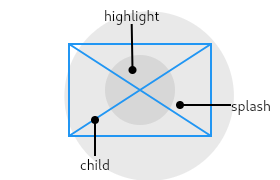 |
| /// |
| /// The second diagram shows how it looks if the [InkResponse] is small: |
| /// |
| /// 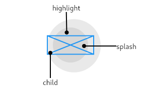 |
| /// |
| /// The main thing to notice from these diagrams is that the splashes happily |
| /// exceed the bounds of the widget (because [containedInkWell] is false). |
| /// |
| /// The following diagram shows the effect when the [InkResponse] has a |
| /// [highlightShape] of [BoxShape.rectangle] with [containedInkWell] set to |
| /// true. These are the values used by [InkWell]. |
| /// |
| /// 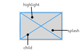 |
| /// |
| /// The [InkResponse] widget must have a [Material] widget as an ancestor. The |
| /// [Material] widget is where the ink reactions are actually painted. This |
| /// matches the material design premise wherein the [Material] is what is |
| /// actually reacting to touches by spreading ink. |
| /// |
| /// If a Widget uses this class directly, it should include the following line |
| /// at the top of its build function to call [debugCheckHasMaterial]: |
| /// |
| /// ```dart |
| /// assert(debugCheckHasMaterial(context)); |
| /// ``` |
| /// |
| /// ## Troubleshooting |
| /// |
| /// ### The ink splashes aren't visible! |
| /// |
| /// If there is an opaque graphic, e.g. painted using a [Container], [Image], or |
| /// [DecoratedBox], between the [Material] widget and the [InkResponse] widget, |
| /// then the splash won't be visible because it will be under the opaque graphic. |
| /// This is because ink splashes draw on the underlying [Material] itself, as |
| /// if the ink was spreading inside the material. |
| /// |
| /// The [Ink] widget can be used as a replacement for [Image], [Container], or |
| /// [DecoratedBox] to ensure that the image or decoration also paints in the |
| /// [Material] itself, below the ink. |
| /// |
| /// If this is not possible for some reason, e.g. because you are using an |
| /// opaque [CustomPaint] widget, alternatively consider using a second |
| /// [Material] above the opaque widget but below the [InkResponse] (as an |
| /// ancestor to the ink response). The [MaterialType.transparency] material |
| /// kind can be used for this purpose. |
| /// |
| /// See also: |
| /// |
| /// * [GestureDetector], for listening for gestures without ink splashes. |
| /// * [RaisedButton] and [FlatButton], two kinds of buttons in material design. |
| /// * [IconButton], which combines [InkResponse] with an [Icon]. |
| class InkResponse extends StatefulWidget { |
| /// Creates an area of a [Material] that responds to touch. |
| /// |
| /// Must have an ancestor [Material] widget in which to cause ink reactions. |
| /// |
| /// The [containedInkWell], [highlightShape], [enableFeedback], and |
| /// [excludeFromSemantics] arguments must not be null. |
| const InkResponse({ |
| Key key, |
| this.child, |
| this.onTap, |
| this.onTapDown, |
| this.onTapCancel, |
| this.onDoubleTap, |
| this.onLongPress, |
| this.onHighlightChanged, |
| this.onHover, |
| this.containedInkWell = false, |
| this.highlightShape = BoxShape.circle, |
| this.radius, |
| this.borderRadius, |
| this.customBorder, |
| this.focusColor, |
| this.hoverColor, |
| this.highlightColor, |
| this.splashColor, |
| this.splashFactory, |
| this.enableFeedback = true, |
| this.excludeFromSemantics = false, |
| }) : assert(containedInkWell != null), |
| assert(highlightShape != null), |
| assert(enableFeedback != null), |
| assert(excludeFromSemantics != null), |
| super(key: key); |
| |
| /// The widget below this widget in the tree. |
| /// |
| /// {@macro flutter.widgets.child} |
| final Widget child; |
| |
| /// Called when the user taps this part of the material. |
| final GestureTapCallback onTap; |
| |
| /// Called when the user taps down this part of the material. |
| final GestureTapDownCallback onTapDown; |
| |
| /// Called when the user cancels a tap that was started on this part of the |
| /// material. |
| final GestureTapCallback onTapCancel; |
| |
| /// Called when the user double taps this part of the material. |
| final GestureTapCallback onDoubleTap; |
| |
| /// Called when the user long-presses on this part of the material. |
| final GestureLongPressCallback onLongPress; |
| |
| /// Called when this part of the material either becomes highlighted or stops |
| /// being highlighted. |
| /// |
| /// The value passed to the callback is true if this part of the material has |
| /// become highlighted and false if this part of the material has stopped |
| /// being highlighted. |
| /// |
| /// If all of [onTap], [onDoubleTap], and [onLongPress] become null while a |
| /// gesture is ongoing, then [onTapCancel] will be fired and |
| /// [onHighlightChanged] will be fired with the value false _during the |
| /// build_. This means, for instance, that in that scenario [State.setState] |
| /// cannot be called. |
| final ValueChanged<bool> onHighlightChanged; |
| |
| /// Called when a pointer enters or exits the ink response area. |
| /// |
| /// The value passed to the callback is true if a pointer has entered this |
| /// part of the material and false if a pointer has exited this part of the |
| /// material. |
| final ValueChanged<bool> onHover; |
| |
| /// Whether this ink response should be clipped its bounds. |
| /// |
| /// This flag also controls whether the splash migrates to the center of the |
| /// [InkResponse] or not. If [containedInkWell] is true, the splash remains |
| /// centered around the tap location. If it is false, the splash migrates to |
| /// the center of the [InkResponse] as it grows. |
| /// |
| /// See also: |
| /// |
| /// * [highlightShape], the shape of the focus, hover, and pressed |
| /// highlights. |
| /// * [borderRadius], which controls the corners when the box is a rectangle. |
| /// * [getRectCallback], which controls the size and position of the box when |
| /// it is a rectangle. |
| final bool containedInkWell; |
| |
| /// The shape (e.g., circle, rectangle) to use for the highlight drawn around |
| /// this part of the material when pressed, hovered over, or focused. |
| /// |
| /// The same shape is used for the pressed highlight (see [highlightColor]), |
| /// the focus highlight (see [focusColor]), and the hover highlight (see |
| /// [hoverColor]). |
| /// |
| /// If the shape is [BoxShape.circle], then the highlight is centered on the |
| /// [InkResponse]. If the shape is [BoxShape.rectangle], then the highlight |
| /// fills the [InkResponse], or the rectangle provided by [getRectCallback] if |
| /// the callback is specified. |
| /// |
| /// See also: |
| /// |
| /// * [containedInkWell], which controls clipping behavior. |
| /// * [borderRadius], which controls the corners when the box is a rectangle. |
| /// * [highlightColor], the color of the highlight. |
| /// * [getRectCallback], which controls the size and position of the box when |
| /// it is a rectangle. |
| final BoxShape highlightShape; |
| |
| /// The radius of the ink splash. |
| /// |
| /// Splashes grow up to this size. By default, this size is determined from |
| /// the size of the rectangle provided by [getRectCallback], or the size of |
| /// the [InkResponse] itself. |
| /// |
| /// See also: |
| /// |
| /// * [splashColor], the color of the splash. |
| /// * [splashFactory], which defines the appearance of the splash. |
| final double radius; |
| |
| /// The clipping radius of the containing rect. This is effective only if |
| /// [customBorder] is null. |
| /// |
| /// If this is null, it is interpreted as [BorderRadius.zero]. |
| final BorderRadius borderRadius; |
| |
| /// The custom clip border which overrides [borderRadius]. |
| final ShapeBorder customBorder; |
| |
| /// The color of the ink response when the parent widget is focused. If this |
| /// property is null then the focus color of the theme, |
| /// [ThemeData.focusColor], will be used. |
| /// |
| /// See also: |
| /// |
| /// * [highlightShape], the shape of the focus, hover, and pressed |
| /// highlights. |
| /// * [hoverColor], the color of the hover highlight. |
| /// * [splashColor], the color of the splash. |
| /// * [splashFactory], which defines the appearance of the splash. |
| final Color focusColor; |
| |
| /// The color of the ink response when a pointer is hovering over it. If this |
| /// property is null then the hover color of the theme, |
| /// [ThemeData.hoverColor], will be used. |
| /// |
| /// See also: |
| /// |
| /// * [highlightShape], the shape of the focus, hover, and pressed |
| /// highlights. |
| /// * [highlightColor], the color of the pressed highlight. |
| /// * [focusColor], the color of the focus highlight. |
| /// * [splashColor], the color of the splash. |
| /// * [splashFactory], which defines the appearance of the splash. |
| final Color hoverColor; |
| |
| /// The highlight color of the ink response when pressed. If this property is |
| /// null then the highlight color of the theme, [ThemeData.highlightColor], |
| /// will be used. |
| /// |
| /// See also: |
| /// |
| /// * [hoverColor], the color of the hover highlight. |
| /// * [focusColor], the color of the focus highlight. |
| /// * [highlightShape], the shape of the focus, hover, and pressed |
| /// highlights. |
| /// * [splashColor], the color of the splash. |
| /// * [splashFactory], which defines the appearance of the splash. |
| final Color highlightColor; |
| |
| /// The splash color of the ink response. If this property is null then the |
| /// splash color of the theme, [ThemeData.splashColor], will be used. |
| /// |
| /// See also: |
| /// |
| /// * [splashFactory], which defines the appearance of the splash. |
| /// * [radius], the (maximum) size of the ink splash. |
| /// * [highlightColor], the color of the highlight. |
| final Color splashColor; |
| |
| /// Defines the appearance of the splash. |
| /// |
| /// Defaults to the value of the theme's splash factory: [ThemeData.splashFactory]. |
| /// |
| /// See also: |
| /// |
| /// * [radius], the (maximum) size of the ink splash. |
| /// * [splashColor], the color of the splash. |
| /// * [highlightColor], the color of the highlight. |
| /// * [InkSplash.splashFactory], which defines the default splash. |
| /// * [InkRipple.splashFactory], which defines a splash that spreads out |
| /// more aggressively than the default. |
| final InteractiveInkFeatureFactory splashFactory; |
| |
| /// Whether detected gestures should provide acoustic and/or haptic feedback. |
| /// |
| /// For example, on Android a tap will produce a clicking sound and a |
| /// long-press will produce a short vibration, when feedback is enabled. |
| /// |
| /// See also: |
| /// |
| /// * [Feedback] for providing platform-specific feedback to certain actions. |
| final bool enableFeedback; |
| |
| /// Whether to exclude the gestures introduced by this widget from the |
| /// semantics tree. |
| /// |
| /// For example, a long-press gesture for showing a tooltip is usually |
| /// excluded because the tooltip itself is included in the semantics |
| /// tree directly and so having a gesture to show it would result in |
| /// duplication of information. |
| final bool excludeFromSemantics; |
| |
| /// The rectangle to use for the highlight effect and for clipping |
| /// the splash effects if [containedInkWell] is true. |
| /// |
| /// This method is intended to be overridden by descendants that |
| /// specialize [InkResponse] for unusual cases. For example, |
| /// [TableRowInkWell] implements this method to return the rectangle |
| /// corresponding to the row that the widget is in. |
| /// |
| /// The default behavior returns null, which is equivalent to |
| /// returning the referenceBox argument's bounding box (though |
| /// slightly more efficient). |
| RectCallback getRectCallback(RenderBox referenceBox) => null; |
| |
| /// Asserts that the given context satisfies the prerequisites for |
| /// this class. |
| /// |
| /// This method is intended to be overridden by descendants that |
| /// specialize [InkResponse] for unusual cases. For example, |
| /// [TableRowInkWell] implements this method to verify that the widget is |
| /// in a table. |
| @mustCallSuper |
| bool debugCheckContext(BuildContext context) { |
| assert(debugCheckHasMaterial(context)); |
| assert(debugCheckHasDirectionality(context)); |
| return true; |
| } |
| |
| @override |
| _InkResponseState<InkResponse> createState() => _InkResponseState<InkResponse>(); |
| |
| @override |
| void debugFillProperties(DiagnosticPropertiesBuilder properties) { |
| super.debugFillProperties(properties); |
| final List<String> gestures = <String>[ |
| if (onTap != null) 'tap', |
| if (onDoubleTap != null) 'double tap', |
| if (onLongPress != null) 'long press', |
| if (onTapDown != null) 'tap down', |
| if (onTapCancel != null) 'tap cancel', |
| ]; |
| properties.add(IterableProperty<String>('gestures', gestures, ifEmpty: '<none>')); |
| properties.add(DiagnosticsProperty<bool>('containedInkWell', containedInkWell, level: DiagnosticLevel.fine)); |
| properties.add(DiagnosticsProperty<BoxShape>( |
| 'highlightShape', |
| highlightShape, |
| description: '${containedInkWell ? "clipped to " : ""}$highlightShape', |
| showName: false, |
| )); |
| } |
| } |
| |
| /// Used to index the allocated highlights for the different types of highlights |
| /// in [_InkResponseState]. |
| enum _HighlightType { |
| pressed, |
| hover, |
| focus, |
| } |
| |
| class _InkResponseState<T extends InkResponse> extends State<T> with AutomaticKeepAliveClientMixin<T> { |
| Set<InteractiveInkFeature> _splashes; |
| InteractiveInkFeature _currentSplash; |
| FocusNode _focusNode; |
| bool _hovering = false; |
| final Map<_HighlightType, InkHighlight> _highlights = <_HighlightType, InkHighlight>{}; |
| |
| bool get highlightsExist => _highlights.values.where((InkHighlight highlight) => highlight != null).isNotEmpty; |
| |
| @override |
| void initState() { |
| super.initState(); |
| WidgetsBinding.instance.focusManager.addHighlightModeListener(_handleFocusHighlightModeChange); |
| } |
| |
| @override |
| void didChangeDependencies() { |
| super.didChangeDependencies(); |
| _focusNode?.removeListener(_handleFocusUpdate); |
| _focusNode = Focus.of(context, nullOk: true); |
| _focusNode?.addListener(_handleFocusUpdate); |
| } |
| |
| @override |
| void didUpdateWidget(InkResponse oldWidget) { |
| super.didUpdateWidget(oldWidget); |
| if (_isWidgetEnabled(widget) != _isWidgetEnabled(oldWidget)) { |
| _handleHoverChange(_hovering); |
| _handleFocusUpdate(); |
| } |
| } |
| |
| @override |
| void dispose() { |
| WidgetsBinding.instance.focusManager.removeHighlightModeListener(_handleFocusHighlightModeChange); |
| _focusNode?.removeListener(_handleFocusUpdate); |
| super.dispose(); |
| } |
| |
| @override |
| bool get wantKeepAlive => highlightsExist || (_splashes != null && _splashes.isNotEmpty); |
| |
| Color getHighlightColorForType(_HighlightType type) { |
| switch (type) { |
| case _HighlightType.pressed: |
| return widget.highlightColor ?? Theme.of(context).highlightColor; |
| case _HighlightType.focus: |
| return widget.focusColor ?? Theme.of(context).focusColor; |
| case _HighlightType.hover: |
| return widget.hoverColor ?? Theme.of(context).hoverColor; |
| } |
| assert(false, 'Unhandled $_HighlightType $type'); |
| return null; |
| } |
| |
| Duration getFadeDurationForType(_HighlightType type) { |
| switch (type) { |
| case _HighlightType.pressed: |
| return const Duration(milliseconds: 200); |
| case _HighlightType.hover: |
| case _HighlightType.focus: |
| return const Duration(milliseconds: 50); |
| } |
| assert(false, 'Unhandled $_HighlightType $type'); |
| return null; |
| } |
| |
| void updateHighlight(_HighlightType type, {@required bool value}) { |
| final InkHighlight highlight = _highlights[type]; |
| void handleInkRemoval() { |
| assert(_highlights[type] != null); |
| _highlights[type] = null; |
| updateKeepAlive(); |
| } |
| |
| if (value == (highlight != null && highlight.active)) |
| return; |
| if (value) { |
| if (highlight == null) { |
| final RenderBox referenceBox = context.findRenderObject(); |
| _highlights[type] = InkHighlight( |
| controller: Material.of(context), |
| referenceBox: referenceBox, |
| color: getHighlightColorForType(type), |
| shape: widget.highlightShape, |
| borderRadius: widget.borderRadius, |
| customBorder: widget.customBorder, |
| rectCallback: widget.getRectCallback(referenceBox), |
| onRemoved: handleInkRemoval, |
| textDirection: Directionality.of(context), |
| fadeDuration: getFadeDurationForType(type), |
| ); |
| updateKeepAlive(); |
| } else { |
| highlight.activate(); |
| } |
| } else { |
| highlight.deactivate(); |
| } |
| assert(value == (_highlights[type] != null && _highlights[type].active)); |
| |
| switch(type) { |
| case _HighlightType.pressed: |
| if (widget.onHighlightChanged != null) |
| widget.onHighlightChanged(value); |
| break; |
| case _HighlightType.hover: |
| if (widget.onHover != null) |
| widget.onHover(value); |
| break; |
| case _HighlightType.focus: |
| break; |
| } |
| } |
| |
| InteractiveInkFeature _createInkFeature(TapDownDetails details) { |
| final MaterialInkController inkController = Material.of(context); |
| final RenderBox referenceBox = context.findRenderObject(); |
| final Offset position = referenceBox.globalToLocal(details.globalPosition); |
| final Color color = widget.splashColor ?? Theme.of(context).splashColor; |
| final RectCallback rectCallback = widget.containedInkWell ? widget.getRectCallback(referenceBox) : null; |
| final BorderRadius borderRadius = widget.borderRadius; |
| final ShapeBorder customBorder = widget.customBorder; |
| |
| InteractiveInkFeature splash; |
| void onRemoved() { |
| if (_splashes != null) { |
| assert(_splashes.contains(splash)); |
| _splashes.remove(splash); |
| if (_currentSplash == splash) |
| _currentSplash = null; |
| updateKeepAlive(); |
| } // else we're probably in deactivate() |
| } |
| |
| splash = (widget.splashFactory ?? Theme.of(context).splashFactory).create( |
| controller: inkController, |
| referenceBox: referenceBox, |
| position: position, |
| color: color, |
| containedInkWell: widget.containedInkWell, |
| rectCallback: rectCallback, |
| radius: widget.radius, |
| borderRadius: borderRadius, |
| customBorder: customBorder, |
| onRemoved: onRemoved, |
| textDirection: Directionality.of(context), |
| ); |
| |
| return splash; |
| } |
| |
| void _handleFocusHighlightModeChange(FocusHighlightMode mode) { |
| if (!mounted) { |
| return; |
| } |
| setState(() { |
| _handleFocusUpdate(); |
| }); |
| } |
| |
| void _handleFocusUpdate() { |
| bool showFocus; |
| switch (WidgetsBinding.instance.focusManager.highlightMode) { |
| case FocusHighlightMode.touch: |
| showFocus = false; |
| break; |
| case FocusHighlightMode.traditional: |
| showFocus = enabled && (Focus.of(context, nullOk: true)?.hasPrimaryFocus ?? false); |
| break; |
| } |
| updateHighlight(_HighlightType.focus, value: showFocus); |
| } |
| |
| void _handleTapDown(TapDownDetails details) { |
| final InteractiveInkFeature splash = _createInkFeature(details); |
| _splashes ??= HashSet<InteractiveInkFeature>(); |
| _splashes.add(splash); |
| _currentSplash = splash; |
| if (widget.onTapDown != null) { |
| widget.onTapDown(details); |
| } |
| updateKeepAlive(); |
| updateHighlight(_HighlightType.pressed, value: true); |
| } |
| |
| void _handleTap(BuildContext context) { |
| _currentSplash?.confirm(); |
| _currentSplash = null; |
| updateHighlight(_HighlightType.pressed, value: false); |
| if (widget.onTap != null) { |
| if (widget.enableFeedback) |
| Feedback.forTap(context); |
| widget.onTap(); |
| } |
| } |
| |
| void _handleTapCancel() { |
| _currentSplash?.cancel(); |
| _currentSplash = null; |
| if (widget.onTapCancel != null) { |
| widget.onTapCancel(); |
| } |
| updateHighlight(_HighlightType.pressed, value: false); |
| } |
| |
| void _handleDoubleTap() { |
| _currentSplash?.confirm(); |
| _currentSplash = null; |
| if (widget.onDoubleTap != null) |
| widget.onDoubleTap(); |
| } |
| |
| void _handleLongPress(BuildContext context) { |
| _currentSplash?.confirm(); |
| _currentSplash = null; |
| if (widget.onLongPress != null) { |
| if (widget.enableFeedback) |
| Feedback.forLongPress(context); |
| widget.onLongPress(); |
| } |
| } |
| |
| @override |
| void deactivate() { |
| if (_splashes != null) { |
| final Set<InteractiveInkFeature> splashes = _splashes; |
| _splashes = null; |
| for (InteractiveInkFeature splash in splashes) |
| splash.dispose(); |
| _currentSplash = null; |
| } |
| assert(_currentSplash == null); |
| for (_HighlightType highlight in _highlights.keys) { |
| _highlights[highlight]?.dispose(); |
| _highlights[highlight] = null; |
| } |
| super.deactivate(); |
| } |
| |
| bool _isWidgetEnabled(InkResponse widget) { |
| return widget.onTap != null || widget.onDoubleTap != null || widget.onLongPress != null; |
| } |
| |
| bool get enabled => _isWidgetEnabled(widget); |
| |
| void _handleMouseEnter(PointerEnterEvent event) => _handleHoverChange(true); |
| void _handleMouseExit(PointerExitEvent event) => _handleHoverChange(false); |
| void _handleHoverChange(bool hovering) { |
| if (_hovering != hovering) { |
| _hovering = hovering; |
| updateHighlight(_HighlightType.hover, value: enabled && _hovering); |
| } |
| } |
| |
| @override |
| Widget build(BuildContext context) { |
| assert(widget.debugCheckContext(context)); |
| super.build(context); // See AutomaticKeepAliveClientMixin. |
| for (_HighlightType type in _highlights.keys) { |
| _highlights[type]?.color = getHighlightColorForType(type); |
| } |
| _currentSplash?.color = widget.splashColor ?? Theme.of(context).splashColor; |
| return MouseRegion( |
| onEnter: enabled ? _handleMouseEnter : null, |
| onExit: enabled ? _handleMouseExit : null, |
| child: GestureDetector( |
| onTapDown: enabled ? _handleTapDown : null, |
| onTap: enabled ? () => _handleTap(context) : null, |
| onTapCancel: enabled ? _handleTapCancel : null, |
| onDoubleTap: widget.onDoubleTap != null ? _handleDoubleTap : null, |
| onLongPress: widget.onLongPress != null ? () => _handleLongPress(context) : null, |
| behavior: HitTestBehavior.opaque, |
| child: widget.child, |
| excludeFromSemantics: widget.excludeFromSemantics, |
| ), |
| ); |
| } |
| } |
| |
| /// A rectangular area of a [Material] that responds to touch. |
| /// |
| /// For a variant of this widget that does not clip splashes, see [InkResponse]. |
| /// |
| /// The following diagram shows how an [InkWell] looks when tapped, when using |
| /// default values. |
| /// |
| ///  |
| /// |
| /// The [InkWell] widget must have a [Material] widget as an ancestor. The |
| /// [Material] widget is where the ink reactions are actually painted. This |
| /// matches the material design premise wherein the [Material] is what is |
| /// actually reacting to touches by spreading ink. |
| /// |
| /// If a Widget uses this class directly, it should include the following line |
| /// at the top of its build function to call [debugCheckHasMaterial]: |
| /// |
| /// ```dart |
| /// assert(debugCheckHasMaterial(context)); |
| /// ``` |
| /// |
| /// ## Troubleshooting |
| /// |
| /// ### The ink splashes aren't visible! |
| /// |
| /// If there is an opaque graphic, e.g. painted using a [Container], [Image], or |
| /// [DecoratedBox], between the [Material] widget and the [InkWell] widget, then |
| /// the splash won't be visible because it will be under the opaque graphic. |
| /// This is because ink splashes draw on the underlying [Material] itself, as |
| /// if the ink was spreading inside the material. |
| /// |
| /// The [Ink] widget can be used as a replacement for [Image], [Container], or |
| /// [DecoratedBox] to ensure that the image or decoration also paints in the |
| /// [Material] itself, below the ink. |
| /// |
| /// If this is not possible for some reason, e.g. because you are using an |
| /// opaque [CustomPaint] widget, alternatively consider using a second |
| /// [Material] above the opaque widget but below the [InkWell] (as an |
| /// ancestor to the ink well). The [MaterialType.transparency] material |
| /// kind can be used for this purpose. |
| /// |
| /// ### The ink splashes don't track the size of an animated container |
| /// If the size of an InkWell's [Material] ancestor changes while the InkWell's |
| /// splashes are expanding, you may notice that the splashes aren't clipped |
| /// correctly. This can't be avoided. |
| /// |
| /// An example of this situation is as follows: |
| /// |
| /// {@tool snippet --template=stateful_widget_scaffold_center} |
| /// |
| /// Tap the container to cause it to grow. Then, tap it again and hold before |
| /// the widget reaches its maximum size to observe the clipped ink splash. |
| /// |
| /// ```dart |
| /// double sideLength = 50; |
| /// |
| /// Widget build(BuildContext context) { |
| /// return AnimatedContainer( |
| /// height: sideLength, |
| /// width: sideLength, |
| /// duration: Duration(seconds: 2), |
| /// curve: Curves.easeIn, |
| /// child: Material( |
| /// color: Colors.yellow, |
| /// child: InkWell( |
| /// onTap: () { |
| /// setState(() { |
| /// sideLength == 50 ? sideLength = 100 : sideLength = 50; |
| /// }); |
| /// }, |
| /// ), |
| /// ), |
| /// ); |
| /// } |
| /// ``` |
| /// {@end-tool} |
| /// |
| /// An InkWell's splashes will not properly update to conform to changes if the |
| /// size of its underlying [Material], where the splashes are rendered, changes |
| /// during animation. You should avoid using InkWells within [Material] widgets |
| /// that are changing size. |
| /// |
| /// See also: |
| /// |
| /// * [GestureDetector], for listening for gestures without ink splashes. |
| /// * [RaisedButton] and [FlatButton], two kinds of buttons in material design. |
| /// * [InkResponse], a variant of [InkWell] that doesn't force a rectangular |
| /// shape on the ink reaction. |
| class InkWell extends InkResponse { |
| /// Creates an ink well. |
| /// |
| /// Must have an ancestor [Material] widget in which to cause ink reactions. |
| /// |
| /// The [enableFeedback] and [excludeFromSemantics] arguments must not be |
| /// null. |
| const InkWell({ |
| Key key, |
| Widget child, |
| GestureTapCallback onTap, |
| GestureTapCallback onDoubleTap, |
| GestureLongPressCallback onLongPress, |
| GestureTapDownCallback onTapDown, |
| GestureTapCancelCallback onTapCancel, |
| ValueChanged<bool> onHighlightChanged, |
| ValueChanged<bool> onHover, |
| Color focusColor, |
| Color hoverColor, |
| Color highlightColor, |
| Color splashColor, |
| InteractiveInkFeatureFactory splashFactory, |
| double radius, |
| BorderRadius borderRadius, |
| ShapeBorder customBorder, |
| bool enableFeedback = true, |
| bool excludeFromSemantics = false, |
| }) : super( |
| key: key, |
| child: child, |
| onTap: onTap, |
| onDoubleTap: onDoubleTap, |
| onLongPress: onLongPress, |
| onTapDown: onTapDown, |
| onTapCancel: onTapCancel, |
| onHighlightChanged: onHighlightChanged, |
| onHover: onHover, |
| containedInkWell: true, |
| highlightShape: BoxShape.rectangle, |
| focusColor: focusColor, |
| hoverColor: hoverColor, |
| highlightColor: highlightColor, |
| splashColor: splashColor, |
| splashFactory: splashFactory, |
| radius: radius, |
| borderRadius: borderRadius, |
| customBorder: customBorder, |
| enableFeedback: enableFeedback ?? true, |
| excludeFromSemantics: excludeFromSemantics ?? false, |
| ); |
| } |