| // Copyright 2014 The Flutter Authors. All rights reserved. |
| // Use of this source code is governed by a BSD-style license that can be |
| // found in the LICENSE file. |
| |
| import 'package:flutter/widgets.dart'; |
| |
| import 'list_tile.dart'; |
| import 'radio.dart'; |
| import 'theme.dart'; |
| import 'theme_data.dart'; |
| |
| // Examples can assume: |
| // void setState(VoidCallback fn) { } |
| |
| /// A [ListTile] with a [Radio]. In other words, a radio button with a label. |
| /// |
| /// The entire list tile is interactive: tapping anywhere in the tile selects |
| /// the radio button. |
| /// |
| /// The [value], [groupValue], [onChanged], and [activeColor] properties of this |
| /// widget are identical to the similarly-named properties on the [Radio] |
| /// widget. The type parameter `T` serves the same purpose as that of the |
| /// [Radio] class' type parameter. |
| /// |
| /// The [title], [subtitle], [isThreeLine], and [dense] properties are like |
| /// those of the same name on [ListTile]. |
| /// |
| /// The [selected] property on this widget is similar to the [ListTile.selected] |
| /// property, but the color used is that described by [activeColor], if any, |
| /// defaulting to the accent color of the current [Theme]. No effort is made to |
| /// coordinate the [selected] state and the [checked] state; to have the list |
| /// tile appear selected when the radio button is the selected radio button, set |
| /// [selected] to true when [value] matches [groupValue]. |
| /// |
| /// The radio button is shown on the left by default in left-to-right languages |
| /// (i.e. the leading edge). This can be changed using [controlAffinity]. The |
| /// [secondary] widget is placed on the opposite side. This maps to the |
| /// [ListTile.leading] and [ListTile.trailing] properties of [ListTile]. |
| /// |
| /// To show the [RadioListTile] as disabled, pass null as the [onChanged] |
| /// callback. |
| /// |
| /// {@tool dartpad --template=stateful_widget_scaffold} |
| /// |
| /// 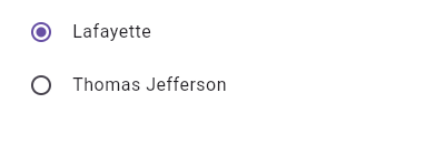 |
| /// |
| /// This widget shows a pair of radio buttons that control the `_character` |
| /// field. The field is of the type `SingingCharacter`, an enum. |
| /// |
| /// ```dart preamble |
| /// enum SingingCharacter { lafayette, jefferson } |
| /// ``` |
| /// ```dart |
| /// SingingCharacter? _character = SingingCharacter.lafayette; |
| /// |
| /// @override |
| /// Widget build(BuildContext context) { |
| /// return Column( |
| /// children: <Widget>[ |
| /// RadioListTile<SingingCharacter>( |
| /// title: const Text('Lafayette'), |
| /// value: SingingCharacter.lafayette, |
| /// groupValue: _character, |
| /// onChanged: (SingingCharacter? value) { setState(() { _character = value; }); }, |
| /// ), |
| /// RadioListTile<SingingCharacter>( |
| /// title: const Text('Thomas Jefferson'), |
| /// value: SingingCharacter.jefferson, |
| /// groupValue: _character, |
| /// onChanged: (SingingCharacter? value) { setState(() { _character = value; }); }, |
| /// ), |
| /// ], |
| /// ); |
| /// } |
| /// ``` |
| /// {@end-tool} |
| /// |
| /// ## Semantics in RadioListTile |
| /// |
| /// Since the entirety of the RadioListTile is interactive, it should represent |
| /// itself as a single interactive entity. |
| /// |
| /// To do so, a RadioListTile widget wraps its children with a [MergeSemantics] |
| /// widget. [MergeSemantics] will attempt to merge its descendant [Semantics] |
| /// nodes into one node in the semantics tree. Therefore, RadioListTile will |
| /// throw an error if any of its children requires its own [Semantics] node. |
| /// |
| /// For example, you cannot nest a [RichText] widget as a descendant of |
| /// RadioListTile. [RichText] has an embedded gesture recognizer that |
| /// requires its own [Semantics] node, which directly conflicts with |
| /// RadioListTile's desire to merge all its descendants' semantic nodes |
| /// into one. Therefore, it may be necessary to create a custom radio tile |
| /// widget to accommodate similar use cases. |
| /// |
| /// {@tool dartpad --template=stateful_widget_scaffold} |
| /// |
| /// 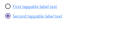 |
| /// |
| /// Here is an example of a custom labeled radio widget, called |
| /// LinkedLabelRadio, that includes an interactive [RichText] widget that |
| /// handles tap gestures. |
| /// |
| /// ```dart imports |
| /// import 'package:flutter/gestures.dart'; |
| /// ``` |
| /// ```dart preamble |
| /// class LinkedLabelRadio extends StatelessWidget { |
| /// const LinkedLabelRadio({ |
| /// required this.label, |
| /// required this.padding, |
| /// required this.groupValue, |
| /// required this.value, |
| /// required this.onChanged, |
| /// }); |
| /// |
| /// final String label; |
| /// final EdgeInsets padding; |
| /// final bool groupValue; |
| /// final bool value; |
| /// final Function onChanged; |
| /// |
| /// @override |
| /// Widget build(BuildContext context) { |
| /// return Padding( |
| /// padding: padding, |
| /// child: Row( |
| /// children: <Widget>[ |
| /// Radio<bool>( |
| /// groupValue: groupValue, |
| /// value: value, |
| /// onChanged: (bool? newValue) { |
| /// onChanged(newValue); |
| /// } |
| /// ), |
| /// RichText( |
| /// text: TextSpan( |
| /// text: label, |
| /// style: TextStyle( |
| /// color: Colors.blueAccent, |
| /// decoration: TextDecoration.underline, |
| /// ), |
| /// recognizer: TapGestureRecognizer() |
| /// ..onTap = () { |
| /// print('Label has been tapped.'); |
| /// }, |
| /// ), |
| /// ), |
| /// ], |
| /// ), |
| /// ); |
| /// } |
| /// } |
| /// ``` |
| /// ```dart |
| /// bool _isRadioSelected = false; |
| /// |
| /// @override |
| /// Widget build(BuildContext context) { |
| /// return Scaffold( |
| /// body: Column( |
| /// mainAxisAlignment: MainAxisAlignment.center, |
| /// children: <Widget>[ |
| /// LinkedLabelRadio( |
| /// label: 'First tappable label text', |
| /// padding: EdgeInsets.symmetric(horizontal: 5.0), |
| /// value: true, |
| /// groupValue: _isRadioSelected, |
| /// onChanged: (bool newValue) { |
| /// setState(() { |
| /// _isRadioSelected = newValue; |
| /// }); |
| /// }, |
| /// ), |
| /// LinkedLabelRadio( |
| /// label: 'Second tappable label text', |
| /// padding: EdgeInsets.symmetric(horizontal: 5.0), |
| /// value: false, |
| /// groupValue: _isRadioSelected, |
| /// onChanged: (bool newValue) { |
| /// setState(() { |
| /// _isRadioSelected = newValue; |
| /// }); |
| /// }, |
| /// ), |
| /// ], |
| /// ), |
| /// ); |
| /// } |
| /// ``` |
| /// {@end-tool} |
| /// |
| /// ## RadioListTile isn't exactly what I want |
| /// |
| /// If the way RadioListTile pads and positions its elements isn't quite what |
| /// you're looking for, you can create custom labeled radio widgets by |
| /// combining [Radio] with other widgets, such as [Text], [Padding] and |
| /// [InkWell]. |
| /// |
| /// {@tool dartpad --template=stateful_widget_scaffold} |
| /// |
| /// 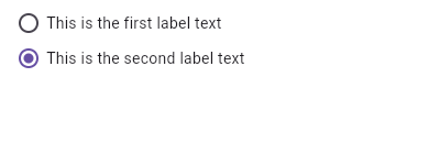 |
| /// |
| /// Here is an example of a custom LabeledRadio widget, but you can easily |
| /// make your own configurable widget. |
| /// |
| /// ```dart preamble |
| /// class LabeledRadio extends StatelessWidget { |
| /// const LabeledRadio({ |
| /// required this.label, |
| /// required this.padding, |
| /// required this.groupValue, |
| /// required this.value, |
| /// required this.onChanged, |
| /// }); |
| /// |
| /// final String label; |
| /// final EdgeInsets padding; |
| /// final bool groupValue; |
| /// final bool value; |
| /// final Function onChanged; |
| /// |
| /// @override |
| /// Widget build(BuildContext context) { |
| /// return InkWell( |
| /// onTap: () { |
| /// if (value != groupValue) |
| /// onChanged(value); |
| /// }, |
| /// child: Padding( |
| /// padding: padding, |
| /// child: Row( |
| /// children: <Widget>[ |
| /// Radio<bool>( |
| /// groupValue: groupValue, |
| /// value: value, |
| /// onChanged: (bool? newValue) { |
| /// onChanged(newValue); |
| /// }, |
| /// ), |
| /// Text(label), |
| /// ], |
| /// ), |
| /// ), |
| /// ); |
| /// } |
| /// } |
| /// ``` |
| /// ```dart |
| /// bool _isRadioSelected = false; |
| /// |
| /// @override |
| /// Widget build(BuildContext context) { |
| /// return Scaffold( |
| /// body: Column( |
| /// mainAxisAlignment: MainAxisAlignment.center, |
| /// children: <LabeledRadio>[ |
| /// LabeledRadio( |
| /// label: 'This is the first label text', |
| /// padding: const EdgeInsets.symmetric(horizontal: 5.0), |
| /// value: true, |
| /// groupValue: _isRadioSelected, |
| /// onChanged: (bool newValue) { |
| /// setState(() { |
| /// _isRadioSelected = newValue; |
| /// }); |
| /// }, |
| /// ), |
| /// LabeledRadio( |
| /// label: 'This is the second label text', |
| /// padding: const EdgeInsets.symmetric(horizontal: 5.0), |
| /// value: false, |
| /// groupValue: _isRadioSelected, |
| /// onChanged: (bool newValue) { |
| /// setState(() { |
| /// _isRadioSelected = newValue; |
| /// }); |
| /// }, |
| /// ), |
| /// ], |
| /// ), |
| /// ); |
| /// } |
| /// ``` |
| /// {@end-tool} |
| /// |
| /// See also: |
| /// |
| /// * [ListTileTheme], which can be used to affect the style of list tiles, |
| /// including radio list tiles. |
| /// * [CheckboxListTile], a similar widget for checkboxes. |
| /// * [SwitchListTile], a similar widget for switches. |
| /// * [ListTile] and [Radio], the widgets from which this widget is made. |
| class RadioListTile<T> extends StatelessWidget { |
| /// Creates a combination of a list tile and a radio button. |
| /// |
| /// The radio tile itself does not maintain any state. Instead, when the radio |
| /// button is selected, the widget calls the [onChanged] callback. Most |
| /// widgets that use a radio button will listen for the [onChanged] callback |
| /// and rebuild the radio tile with a new [groupValue] to update the visual |
| /// appearance of the radio button. |
| /// |
| /// The following arguments are required: |
| /// |
| /// * [value] and [groupValue] together determine whether the radio button is |
| /// selected. |
| /// * [onChanged] is called when the user selects this radio button. |
| const RadioListTile({ |
| Key? key, |
| required this.value, |
| required this.groupValue, |
| required this.onChanged, |
| this.toggleable = false, |
| this.activeColor, |
| this.title, |
| this.subtitle, |
| this.isThreeLine = false, |
| this.dense, |
| this.secondary, |
| this.selected = false, |
| this.controlAffinity = ListTileControlAffinity.platform, |
| this.autofocus = false, |
| this.contentPadding, |
| this.shape, |
| this.tileColor, |
| this.selectedTileColor, |
| }) : assert(toggleable != null), |
| assert(isThreeLine != null), |
| assert(!isThreeLine || subtitle != null), |
| assert(selected != null), |
| assert(controlAffinity != null), |
| assert(autofocus != null), |
| super(key: key); |
| |
| /// The value represented by this radio button. |
| final T value; |
| |
| /// The currently selected value for this group of radio buttons. |
| /// |
| /// This radio button is considered selected if its [value] matches the |
| /// [groupValue]. |
| final T? groupValue; |
| |
| /// Called when the user selects this radio button. |
| /// |
| /// The radio button passes [value] as a parameter to this callback. The radio |
| /// button does not actually change state until the parent widget rebuilds the |
| /// radio tile with the new [groupValue]. |
| /// |
| /// If null, the radio button will be displayed as disabled. |
| /// |
| /// The provided callback will not be invoked if this radio button is already |
| /// selected. |
| /// |
| /// The callback provided to [onChanged] should update the state of the parent |
| /// [StatefulWidget] using the [State.setState] method, so that the parent |
| /// gets rebuilt; for example: |
| /// |
| /// ```dart |
| /// RadioListTile<SingingCharacter>( |
| /// title: const Text('Lafayette'), |
| /// value: SingingCharacter.lafayette, |
| /// groupValue: _character, |
| /// onChanged: (SingingCharacter newValue) { |
| /// setState(() { |
| /// _character = newValue; |
| /// }); |
| /// }, |
| /// ) |
| /// ``` |
| final ValueChanged<T?>? onChanged; |
| |
| /// Set to true if this radio list tile is allowed to be returned to an |
| /// indeterminate state by selecting it again when selected. |
| /// |
| /// To indicate returning to an indeterminate state, [onChanged] will be |
| /// called with null. |
| /// |
| /// If true, [onChanged] can be called with [value] when selected while |
| /// [groupValue] != [value], or with null when selected again while |
| /// [groupValue] == [value]. |
| /// |
| /// If false, [onChanged] will be called with [value] when it is selected |
| /// while [groupValue] != [value], and only by selecting another radio button |
| /// in the group (i.e. changing the value of [groupValue]) can this radio |
| /// list tile be unselected. |
| /// |
| /// The default is false. |
| /// |
| /// {@tool dartpad --template=stateful_widget_scaffold} |
| /// This example shows how to enable deselecting a radio button by setting the |
| /// [toggleable] attribute. |
| /// |
| /// ```dart |
| /// int? groupValue; |
| /// static const List<String> selections = <String>[ |
| /// 'Hercules Mulligan', |
| /// 'Eliza Hamilton', |
| /// 'Philip Schuyler', |
| /// 'Maria Reynolds', |
| /// 'Samuel Seabury', |
| /// ]; |
| /// |
| /// @override |
| /// Widget build(BuildContext context) { |
| /// return Scaffold( |
| /// body: ListView.builder( |
| /// itemBuilder: (context, index) { |
| /// return RadioListTile<int>( |
| /// value: index, |
| /// groupValue: groupValue, |
| /// toggleable: true, |
| /// title: Text(selections[index]), |
| /// onChanged: (int? value) { |
| /// setState(() { |
| /// groupValue = value; |
| /// }); |
| /// }, |
| /// ); |
| /// }, |
| /// itemCount: selections.length, |
| /// ), |
| /// ); |
| /// } |
| /// ``` |
| /// {@end-tool} |
| final bool toggleable; |
| |
| /// The color to use when this radio button is selected. |
| /// |
| /// Defaults to accent color of the current [Theme]. |
| final Color? activeColor; |
| |
| /// The primary content of the list tile. |
| /// |
| /// Typically a [Text] widget. |
| final Widget? title; |
| |
| /// Additional content displayed below the title. |
| /// |
| /// Typically a [Text] widget. |
| final Widget? subtitle; |
| |
| /// A widget to display on the opposite side of the tile from the radio button. |
| /// |
| /// Typically an [Icon] widget. |
| final Widget? secondary; |
| |
| /// Whether this list tile is intended to display three lines of text. |
| /// |
| /// If false, the list tile is treated as having one line if the subtitle is |
| /// null and treated as having two lines if the subtitle is non-null. |
| final bool isThreeLine; |
| |
| /// Whether this list tile is part of a vertically dense list. |
| /// |
| /// If this property is null then its value is based on [ListTileTheme.dense]. |
| final bool? dense; |
| |
| /// Whether to render icons and text in the [activeColor]. |
| /// |
| /// No effort is made to automatically coordinate the [selected] state and the |
| /// [checked] state. To have the list tile appear selected when the radio |
| /// button is the selected radio button, set [selected] to true when [value] |
| /// matches [groupValue]. |
| /// |
| /// Normally, this property is left to its default value, false. |
| final bool selected; |
| |
| /// Where to place the control relative to the text. |
| final ListTileControlAffinity controlAffinity; |
| |
| /// {@macro flutter.widgets.Focus.autofocus} |
| final bool autofocus; |
| |
| /// Defines the insets surrounding the contents of the tile. |
| /// |
| /// Insets the [Radio], [title], [subtitle], and [secondary] widgets |
| /// in [RadioListTile]. |
| /// |
| /// When null, `EdgeInsets.symmetric(horizontal: 16.0)` is used. |
| final EdgeInsetsGeometry? contentPadding; |
| |
| /// Whether this radio button is checked. |
| /// |
| /// To control this value, set [value] and [groupValue] appropriately. |
| bool get checked => value == groupValue; |
| |
| /// If specified, [shape] defines the shape of the [RadioListTile]'s [InkWell] border. |
| final ShapeBorder? shape; |
| |
| /// If specified, defines the background color for `RadioListTile` when |
| /// [RadioListTile.selected] is false. |
| final Color? tileColor; |
| |
| /// If non-null, defines the background color when [RadioListTile.selected] is true. |
| final Color? selectedTileColor; |
| |
| @override |
| Widget build(BuildContext context) { |
| final Widget control = Radio<T>( |
| value: value, |
| groupValue: groupValue, |
| onChanged: onChanged, |
| toggleable: toggleable, |
| activeColor: activeColor, |
| materialTapTargetSize: MaterialTapTargetSize.shrinkWrap, |
| autofocus: autofocus, |
| ); |
| Widget? leading, trailing; |
| switch (controlAffinity) { |
| case ListTileControlAffinity.leading: |
| case ListTileControlAffinity.platform: |
| leading = control; |
| trailing = secondary; |
| break; |
| case ListTileControlAffinity.trailing: |
| leading = secondary; |
| trailing = control; |
| break; |
| } |
| return MergeSemantics( |
| child: ListTileTheme.merge( |
| selectedColor: activeColor ?? Theme.of(context).accentColor, |
| child: ListTile( |
| leading: leading, |
| title: title, |
| subtitle: subtitle, |
| trailing: trailing, |
| isThreeLine: isThreeLine, |
| dense: dense, |
| enabled: onChanged != null, |
| shape: shape, |
| tileColor: tileColor, |
| selectedTileColor: selectedTileColor, |
| onTap: onChanged != null ? () { |
| if (toggleable && checked) { |
| onChanged!(null); |
| return; |
| } |
| if (!checked) { |
| onChanged!(value); |
| } |
| } : null, |
| selected: selected, |
| autofocus: autofocus, |
| contentPadding: contentPadding, |
| ), |
| ), |
| ); |
| } |
| } |