| // Copyright 2014 The Flutter Authors. All rights reserved. |
| // Use of this source code is governed by a BSD-style license that can be |
| // found in the LICENSE file. |
| |
| import 'dart:math' as math; |
| |
| import 'package:flutter/widgets.dart'; |
| import 'package:flutter/foundation.dart'; |
| import 'package:flutter/rendering.dart'; |
| |
| import 'colors.dart'; |
| import 'constants.dart'; |
| import 'debug.dart'; |
| import 'divider.dart'; |
| import 'ink_well.dart'; |
| import 'material_state.dart'; |
| import 'theme.dart'; |
| import 'theme_data.dart'; |
| |
| /// Defines the title font used for [ListTile] descendants of a [ListTileTheme]. |
| /// |
| /// List tiles that appear in a [Drawer] use the theme's [TextTheme.bodyText1] |
| /// text style, which is a little smaller than the theme's [TextTheme.subtitle1] |
| /// text style, which is used by default. |
| enum ListTileStyle { |
| /// Use a title font that's appropriate for a [ListTile] in a list. |
| list, |
| |
| /// Use a title font that's appropriate for a [ListTile] that appears in a [Drawer]. |
| drawer, |
| } |
| |
| /// An inherited widget that defines color and style parameters for [ListTile]s |
| /// in this widget's subtree. |
| /// |
| /// Values specified here are used for [ListTile] properties that are not given |
| /// an explicit non-null value. |
| /// |
| /// The [Drawer] widget specifies a tile theme for its children which sets |
| /// [style] to [ListTileStyle.drawer]. |
| class ListTileTheme extends InheritedTheme { |
| /// Creates a list tile theme that controls the color and style parameters for |
| /// [ListTile]s. |
| const ListTileTheme({ |
| Key? key, |
| this.dense = false, |
| this.shape, |
| this.style = ListTileStyle.list, |
| this.selectedColor, |
| this.iconColor, |
| this.textColor, |
| this.contentPadding, |
| this.tileColor, |
| this.selectedTileColor, |
| this.enableFeedback, |
| this.horizontalTitleGap, |
| this.minVerticalPadding, |
| this.minLeadingWidth, |
| required Widget child, |
| }) : super(key: key, child: child); |
| |
| /// Creates a list tile theme that controls the color and style parameters for |
| /// [ListTile]s, and merges in the current list tile theme, if any. |
| /// |
| /// The [child] argument must not be null. |
| static Widget merge({ |
| Key? key, |
| bool? dense, |
| ShapeBorder? shape, |
| ListTileStyle? style, |
| Color? selectedColor, |
| Color? iconColor, |
| Color? textColor, |
| EdgeInsetsGeometry? contentPadding, |
| Color? tileColor, |
| Color? selectedTileColor, |
| bool? enableFeedback, |
| double? horizontalTitleGap, |
| double? minVerticalPadding, |
| double? minLeadingWidth, |
| required Widget child, |
| }) { |
| assert(child != null); |
| return Builder( |
| builder: (BuildContext context) { |
| final ListTileTheme parent = ListTileTheme.of(context); |
| return ListTileTheme( |
| key: key, |
| dense: dense ?? parent.dense, |
| shape: shape ?? parent.shape, |
| style: style ?? parent.style, |
| selectedColor: selectedColor ?? parent.selectedColor, |
| iconColor: iconColor ?? parent.iconColor, |
| textColor: textColor ?? parent.textColor, |
| contentPadding: contentPadding ?? parent.contentPadding, |
| tileColor: tileColor ?? parent.tileColor, |
| selectedTileColor: selectedTileColor ?? parent.selectedTileColor, |
| enableFeedback: enableFeedback ?? parent.enableFeedback, |
| horizontalTitleGap: horizontalTitleGap ?? parent.horizontalTitleGap, |
| minVerticalPadding: minVerticalPadding ?? parent.minVerticalPadding, |
| minLeadingWidth: minLeadingWidth ?? parent.minLeadingWidth, |
| child: child, |
| ); |
| }, |
| ); |
| } |
| |
| /// If true then [ListTile]s will have the vertically dense layout. |
| final bool dense; |
| |
| /// {@template flutter.material.ListTileTheme.shape} |
| /// If specified, [shape] defines the shape of the [ListTile]'s [InkWell] border. |
| /// {@endtemplate} |
| final ShapeBorder? shape; |
| |
| /// If specified, [style] defines the font used for [ListTile] titles. |
| final ListTileStyle style; |
| |
| /// If specified, the color used for icons and text when a [ListTile] is selected. |
| final Color? selectedColor; |
| |
| /// If specified, the icon color used for enabled [ListTile]s that are not selected. |
| final Color? iconColor; |
| |
| /// If specified, the text color used for enabled [ListTile]s that are not selected. |
| final Color? textColor; |
| |
| /// The tile's internal padding. |
| /// |
| /// Insets a [ListTile]'s contents: its [ListTile.leading], [ListTile.title], |
| /// [ListTile.subtitle], and [ListTile.trailing] widgets. |
| final EdgeInsetsGeometry? contentPadding; |
| |
| /// If specified, defines the background color for `ListTile` when |
| /// [ListTile.selected] is false. |
| /// |
| /// If [ListTile.tileColor] is provided, [tileColor] is ignored. |
| final Color? tileColor; |
| |
| /// If specified, defines the background color for `ListTile` when |
| /// [ListTile.selected] is true. |
| /// |
| /// If [ListTile.selectedTileColor] is provided, [selectedTileColor] is ignored. |
| final Color? selectedTileColor; |
| |
| /// The horizontal gap between the titles and the leading/trailing widgets. |
| /// |
| /// If specified, overrides the default value of [ListTile.horizontalTitleGap]. |
| final double? horizontalTitleGap; |
| |
| /// The minimum padding on the top and bottom of the title and subtitle widgets. |
| /// |
| /// If specified, overrides the default value of [ListTile.minVerticalPadding]. |
| final double? minVerticalPadding; |
| |
| /// The minimum width allocated for the [ListTile.leading] widget. |
| /// |
| /// If specified, overrides the default value of [ListTile.minLeadingWidth]. |
| final double? minLeadingWidth; |
| |
| /// If specified, defines the feedback property for `ListTile`. |
| /// |
| /// If [ListTile.enableFeedback] is provided, [enableFeedback] is ignored. |
| final bool? enableFeedback; |
| |
| /// The closest instance of this class that encloses the given context. |
| /// |
| /// Typical usage is as follows: |
| /// |
| /// ```dart |
| /// ListTileTheme theme = ListTileTheme.of(context); |
| /// ``` |
| static ListTileTheme of(BuildContext context) { |
| final ListTileTheme? result = context.dependOnInheritedWidgetOfExactType<ListTileTheme>(); |
| return result ?? const ListTileTheme(child: SizedBox()); |
| } |
| |
| @override |
| Widget wrap(BuildContext context, Widget child) { |
| return ListTileTheme( |
| dense: dense, |
| shape: shape, |
| style: style, |
| selectedColor: selectedColor, |
| iconColor: iconColor, |
| textColor: textColor, |
| contentPadding: contentPadding, |
| tileColor: tileColor, |
| selectedTileColor: selectedTileColor, |
| enableFeedback: enableFeedback, |
| horizontalTitleGap: horizontalTitleGap, |
| minVerticalPadding: minVerticalPadding, |
| minLeadingWidth: minLeadingWidth, |
| child: child, |
| ); |
| } |
| |
| @override |
| bool updateShouldNotify(ListTileTheme oldWidget) { |
| return dense != oldWidget.dense |
| || shape != oldWidget.shape |
| || style != oldWidget.style |
| || selectedColor != oldWidget.selectedColor |
| || iconColor != oldWidget.iconColor |
| || textColor != oldWidget.textColor |
| || contentPadding != oldWidget.contentPadding |
| || tileColor != oldWidget.tileColor |
| || selectedTileColor != oldWidget.selectedTileColor |
| || enableFeedback != oldWidget.enableFeedback |
| || horizontalTitleGap != oldWidget.horizontalTitleGap |
| || minVerticalPadding != oldWidget.minVerticalPadding |
| || minLeadingWidth != oldWidget.minLeadingWidth; |
| } |
| } |
| |
| /// Where to place the control in widgets that use [ListTile] to position a |
| /// control next to a label. |
| /// |
| /// See also: |
| /// |
| /// * [CheckboxListTile], which combines a [ListTile] with a [Checkbox]. |
| /// * [RadioListTile], which combines a [ListTile] with a [Radio] button. |
| /// * [SwitchListTile], which combines a [ListTile] with a [Switch]. |
| enum ListTileControlAffinity { |
| /// Position the control on the leading edge, and the secondary widget, if |
| /// any, on the trailing edge. |
| leading, |
| |
| /// Position the control on the trailing edge, and the secondary widget, if |
| /// any, on the leading edge. |
| trailing, |
| |
| /// Position the control relative to the text in the fashion that is typical |
| /// for the current platform, and place the secondary widget on the opposite |
| /// side. |
| platform, |
| } |
| |
| /// A single fixed-height row that typically contains some text as well as |
| /// a leading or trailing icon. |
| /// |
| /// {@youtube 560 315 https://www.youtube.com/watch?v=l8dj0yPBvgQ} |
| /// |
| /// A list tile contains one to three lines of text optionally flanked by icons or |
| /// other widgets, such as check boxes. The icons (or other widgets) for the |
| /// tile are defined with the [leading] and [trailing] parameters. The first |
| /// line of text is not optional and is specified with [title]. The value of |
| /// [subtitle], which _is_ optional, will occupy the space allocated for an |
| /// additional line of text, or two lines if [isThreeLine] is true. If [dense] |
| /// is true then the overall height of this tile and the size of the |
| /// [DefaultTextStyle]s that wrap the [title] and [subtitle] widget are reduced. |
| /// |
| /// It is the responsibility of the caller to ensure that [title] does not wrap, |
| /// and to ensure that [subtitle] doesn't wrap (if [isThreeLine] is false) or |
| /// wraps to two lines (if it is true). |
| /// |
| /// The heights of the [leading] and [trailing] widgets are constrained |
| /// according to the |
| /// [Material spec](https://material.io/design/components/lists.html). |
| /// An exception is made for one-line ListTiles for accessibility. Please |
| /// see the example below to see how to adhere to both Material spec and |
| /// accessibility requirements. |
| /// |
| /// Note that [leading] and [trailing] widgets can expand as far as they wish |
| /// horizontally, so ensure that they are properly constrained. |
| /// |
| /// List tiles are typically used in [ListView]s, or arranged in [Column]s in |
| /// [Drawer]s and [Card]s. |
| /// |
| /// Requires one of its ancestors to be a [Material] widget. |
| /// |
| /// {@tool snippet} |
| /// |
| /// This example uses a [ListView] to demonstrate different configurations of |
| /// [ListTile]s in [Card]s. |
| /// |
| /// 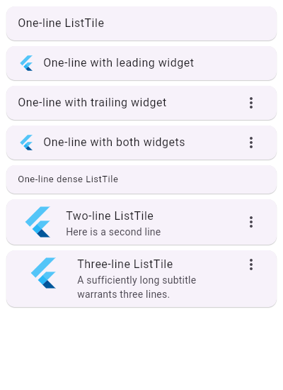 |
| /// |
| /// ```dart |
| /// ListView( |
| /// children: const <Widget>[ |
| /// Card(child: ListTile(title: Text('One-line ListTile'))), |
| /// Card( |
| /// child: ListTile( |
| /// leading: FlutterLogo(), |
| /// title: Text('One-line with leading widget'), |
| /// ), |
| /// ), |
| /// Card( |
| /// child: ListTile( |
| /// title: Text('One-line with trailing widget'), |
| /// trailing: Icon(Icons.more_vert), |
| /// ), |
| /// ), |
| /// Card( |
| /// child: ListTile( |
| /// leading: FlutterLogo(), |
| /// title: Text('One-line with both widgets'), |
| /// trailing: Icon(Icons.more_vert), |
| /// ), |
| /// ), |
| /// Card( |
| /// child: ListTile( |
| /// title: Text('One-line dense ListTile'), |
| /// dense: true, |
| /// ), |
| /// ), |
| /// Card( |
| /// child: ListTile( |
| /// leading: FlutterLogo(size: 56.0), |
| /// title: Text('Two-line ListTile'), |
| /// subtitle: Text('Here is a second line'), |
| /// trailing: Icon(Icons.more_vert), |
| /// ), |
| /// ), |
| /// Card( |
| /// child: ListTile( |
| /// leading: FlutterLogo(size: 72.0), |
| /// title: Text('Three-line ListTile'), |
| /// subtitle: Text( |
| /// 'A sufficiently long subtitle warrants three lines.' |
| /// ), |
| /// trailing: Icon(Icons.more_vert), |
| /// isThreeLine: true, |
| /// ), |
| /// ), |
| /// ], |
| /// ) |
| /// ``` |
| /// {@end-tool} |
| /// {@tool snippet} |
| /// |
| /// To use a [ListTile] within a [Row], it needs to be wrapped in an |
| /// [Expanded] widget. [ListTile] requires fixed width constraints, |
| /// whereas a [Row] does not constrain its children. |
| /// |
| /// ```dart |
| /// Row( |
| /// children: const <Widget>[ |
| /// Expanded( |
| /// child: ListTile( |
| /// leading: FlutterLogo(), |
| /// title: Text('These ListTiles are expanded '), |
| /// ), |
| /// ), |
| /// Expanded( |
| /// child: ListTile( |
| /// trailing: FlutterLogo(), |
| /// title: Text('to fill the available space.'), |
| /// ), |
| /// ), |
| /// ], |
| /// ) |
| /// ``` |
| /// {@end-tool} |
| /// {@tool snippet} |
| /// |
| /// Tiles can be much more elaborate. Here is a tile which can be tapped, but |
| /// which is disabled when the `_act` variable is not 2. When the tile is |
| /// tapped, the whole row has an ink splash effect (see [InkWell]). |
| /// |
| /// ```dart |
| /// int _act = 1; |
| /// // ... |
| /// ListTile( |
| /// leading: const Icon(Icons.flight_land), |
| /// title: const Text("Trix's airplane"), |
| /// subtitle: _act != 2 ? const Text('The airplane is only in Act II.') : null, |
| /// enabled: _act == 2, |
| /// onTap: () { /* react to the tile being tapped */ } |
| /// ) |
| /// ``` |
| /// {@end-tool} |
| /// |
| /// To be accessible, tappable [leading] and [trailing] widgets have to |
| /// be at least 48x48 in size. However, to adhere to the Material spec, |
| /// [trailing] and [leading] widgets in one-line ListTiles should visually be |
| /// at most 32 ([dense]: true) or 40 ([dense]: false) in height, which may |
| /// conflict with the accessibility requirement. |
| /// |
| /// For this reason, a one-line ListTile allows the height of [leading] |
| /// and [trailing] widgets to be constrained by the height of the ListTile. |
| /// This allows for the creation of tappable [leading] and [trailing] widgets |
| /// that are large enough, but it is up to the developer to ensure that |
| /// their widgets follow the Material spec. |
| /// |
| /// {@tool snippet} |
| /// |
| /// Here is an example of a one-line, non-[dense] ListTile with a |
| /// tappable leading widget that adheres to accessibility requirements and |
| /// the Material spec. To adjust the use case below for a one-line, [dense] |
| /// ListTile, adjust the vertical padding to 8.0. |
| /// |
| /// ```dart |
| /// ListTile( |
| /// leading: GestureDetector( |
| /// behavior: HitTestBehavior.translucent, |
| /// onTap: () {}, |
| /// child: Container( |
| /// width: 48, |
| /// height: 48, |
| /// padding: EdgeInsets.symmetric(vertical: 4.0), |
| /// alignment: Alignment.center, |
| /// child: CircleAvatar(), |
| /// ), |
| /// ), |
| /// title: Text('title'), |
| /// dense: false, |
| /// ), |
| /// ``` |
| /// {@end-tool} |
| /// |
| /// ## The ListTile layout isn't exactly what I want |
| /// |
| /// If the way ListTile pads and positions its elements isn't quite what |
| /// you're looking for, it's easy to create custom list items with a |
| /// combination of other widgets, such as [Row]s and [Column]s. |
| /// |
| /// {@tool dartpad --template=stateless_widget_scaffold} |
| /// |
| /// Here is an example of a custom list item that resembles a YouTube-related |
| /// video list item created with [Expanded] and [Container] widgets. |
| /// |
| /// 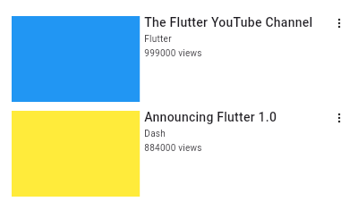 |
| /// |
| /// ```dart preamble |
| /// class CustomListItem extends StatelessWidget { |
| /// const CustomListItem({ |
| /// required this.thumbnail, |
| /// required this.title, |
| /// required this.user, |
| /// required this.viewCount, |
| /// }); |
| /// |
| /// final Widget thumbnail; |
| /// final String title; |
| /// final String user; |
| /// final int viewCount; |
| /// |
| /// @override |
| /// Widget build(BuildContext context) { |
| /// return Padding( |
| /// padding: const EdgeInsets.symmetric(vertical: 5.0), |
| /// child: Row( |
| /// crossAxisAlignment: CrossAxisAlignment.start, |
| /// children: <Widget>[ |
| /// Expanded( |
| /// flex: 2, |
| /// child: thumbnail, |
| /// ), |
| /// Expanded( |
| /// flex: 3, |
| /// child: _VideoDescription( |
| /// title: title, |
| /// user: user, |
| /// viewCount: viewCount, |
| /// ), |
| /// ), |
| /// const Icon( |
| /// Icons.more_vert, |
| /// size: 16.0, |
| /// ), |
| /// ], |
| /// ), |
| /// ); |
| /// } |
| /// } |
| /// |
| /// class _VideoDescription extends StatelessWidget { |
| /// const _VideoDescription({ |
| /// Key? key, |
| /// required this.title, |
| /// required this.user, |
| /// required this.viewCount, |
| /// }) : super(key: key); |
| /// |
| /// final String title; |
| /// final String user; |
| /// final int viewCount; |
| /// |
| /// @override |
| /// Widget build(BuildContext context) { |
| /// return Padding( |
| /// padding: const EdgeInsets.fromLTRB(5.0, 0.0, 0.0, 0.0), |
| /// child: Column( |
| /// crossAxisAlignment: CrossAxisAlignment.start, |
| /// children: <Widget>[ |
| /// Text( |
| /// title, |
| /// style: const TextStyle( |
| /// fontWeight: FontWeight.w500, |
| /// fontSize: 14.0, |
| /// ), |
| /// ), |
| /// const Padding(padding: EdgeInsets.symmetric(vertical: 2.0)), |
| /// Text( |
| /// user, |
| /// style: const TextStyle(fontSize: 10.0), |
| /// ), |
| /// const Padding(padding: EdgeInsets.symmetric(vertical: 1.0)), |
| /// Text( |
| /// '$viewCount views', |
| /// style: const TextStyle(fontSize: 10.0), |
| /// ), |
| /// ], |
| /// ), |
| /// ); |
| /// } |
| /// } |
| /// ``` |
| /// |
| /// ```dart |
| /// Widget build(BuildContext context) { |
| /// return ListView( |
| /// padding: const EdgeInsets.all(8.0), |
| /// itemExtent: 106.0, |
| /// children: <CustomListItem>[ |
| /// CustomListItem( |
| /// user: 'Flutter', |
| /// viewCount: 999000, |
| /// thumbnail: Container( |
| /// decoration: const BoxDecoration(color: Colors.blue), |
| /// ), |
| /// title: 'The Flutter YouTube Channel', |
| /// ), |
| /// CustomListItem( |
| /// user: 'Dash', |
| /// viewCount: 884000, |
| /// thumbnail: Container( |
| /// decoration: const BoxDecoration(color: Colors.yellow), |
| /// ), |
| /// title: 'Announcing Flutter 1.0', |
| /// ), |
| /// ], |
| /// ); |
| /// } |
| /// ``` |
| /// {@end-tool} |
| /// |
| /// {@tool dartpad --template=stateless_widget_scaffold} |
| /// |
| /// Here is an example of an article list item with multiline titles and |
| /// subtitles. It utilizes [Row]s and [Column]s, as well as [Expanded] and |
| /// [AspectRatio] widgets to organize its layout. |
| /// |
| /// 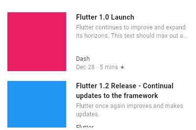 |
| /// |
| /// ```dart preamble |
| /// class _ArticleDescription extends StatelessWidget { |
| /// _ArticleDescription({ |
| /// Key? key, |
| /// required this.title, |
| /// required this.subtitle, |
| /// required this.author, |
| /// required this.publishDate, |
| /// required this.readDuration, |
| /// }) : super(key: key); |
| /// |
| /// final String title; |
| /// final String subtitle; |
| /// final String author; |
| /// final String publishDate; |
| /// final String readDuration; |
| /// |
| /// @override |
| /// Widget build(BuildContext context) { |
| /// return Column( |
| /// crossAxisAlignment: CrossAxisAlignment.start, |
| /// children: <Widget>[ |
| /// Expanded( |
| /// flex: 1, |
| /// child: Column( |
| /// crossAxisAlignment: CrossAxisAlignment.start, |
| /// children: <Widget>[ |
| /// Text( |
| /// '$title', |
| /// maxLines: 2, |
| /// overflow: TextOverflow.ellipsis, |
| /// style: const TextStyle( |
| /// fontWeight: FontWeight.bold, |
| /// ), |
| /// ), |
| /// const Padding(padding: EdgeInsets.only(bottom: 2.0)), |
| /// Text( |
| /// '$subtitle', |
| /// maxLines: 2, |
| /// overflow: TextOverflow.ellipsis, |
| /// style: const TextStyle( |
| /// fontSize: 12.0, |
| /// color: Colors.black54, |
| /// ), |
| /// ), |
| /// ], |
| /// ), |
| /// ), |
| /// Expanded( |
| /// flex: 1, |
| /// child: Column( |
| /// crossAxisAlignment: CrossAxisAlignment.start, |
| /// mainAxisAlignment: MainAxisAlignment.end, |
| /// children: <Widget>[ |
| /// Text( |
| /// '$author', |
| /// style: const TextStyle( |
| /// fontSize: 12.0, |
| /// color: Colors.black87, |
| /// ), |
| /// ), |
| /// Text( |
| /// '$publishDate - $readDuration', |
| /// style: const TextStyle( |
| /// fontSize: 12.0, |
| /// color: Colors.black54, |
| /// ), |
| /// ), |
| /// ], |
| /// ), |
| /// ), |
| /// ], |
| /// ); |
| /// } |
| /// } |
| /// |
| /// class CustomListItemTwo extends StatelessWidget { |
| /// CustomListItemTwo({ |
| /// Key? key, |
| /// required this.thumbnail, |
| /// required this.title, |
| /// required this.subtitle, |
| /// required this.author, |
| /// required this.publishDate, |
| /// required this.readDuration, |
| /// }) : super(key: key); |
| /// |
| /// final Widget thumbnail; |
| /// final String title; |
| /// final String subtitle; |
| /// final String author; |
| /// final String publishDate; |
| /// final String readDuration; |
| /// |
| /// @override |
| /// Widget build(BuildContext context) { |
| /// return Padding( |
| /// padding: const EdgeInsets.symmetric(vertical: 10.0), |
| /// child: SizedBox( |
| /// height: 100, |
| /// child: Row( |
| /// crossAxisAlignment: CrossAxisAlignment.start, |
| /// children: <Widget>[ |
| /// AspectRatio( |
| /// aspectRatio: 1.0, |
| /// child: thumbnail, |
| /// ), |
| /// Expanded( |
| /// child: Padding( |
| /// padding: const EdgeInsets.fromLTRB(20.0, 0.0, 2.0, 0.0), |
| /// child: _ArticleDescription( |
| /// title: title, |
| /// subtitle: subtitle, |
| /// author: author, |
| /// publishDate: publishDate, |
| /// readDuration: readDuration, |
| /// ), |
| /// ), |
| /// ) |
| /// ], |
| /// ), |
| /// ), |
| /// ); |
| /// } |
| /// } |
| /// ``` |
| /// |
| /// ```dart |
| /// Widget build(BuildContext context) { |
| /// return ListView( |
| /// padding: const EdgeInsets.all(10.0), |
| /// children: <Widget>[ |
| /// CustomListItemTwo( |
| /// thumbnail: Container( |
| /// decoration: const BoxDecoration(color: Colors.pink), |
| /// ), |
| /// title: 'Flutter 1.0 Launch', |
| /// subtitle: |
| /// 'Flutter continues to improve and expand its horizons.' |
| /// 'This text should max out at two lines and clip', |
| /// author: 'Dash', |
| /// publishDate: 'Dec 28', |
| /// readDuration: '5 mins', |
| /// ), |
| /// CustomListItemTwo( |
| /// thumbnail: Container( |
| /// decoration: const BoxDecoration(color: Colors.blue), |
| /// ), |
| /// title: 'Flutter 1.2 Release - Continual updates to the framework', |
| /// subtitle: 'Flutter once again improves and makes updates.', |
| /// author: 'Flutter', |
| /// publishDate: 'Feb 26', |
| /// readDuration: '12 mins', |
| /// ), |
| /// ], |
| /// ); |
| /// } |
| /// ``` |
| /// {@end-tool} |
| /// |
| /// See also: |
| /// |
| /// * [ListTileTheme], which defines visual properties for [ListTile]s. |
| /// * [ListView], which can display an arbitrary number of [ListTile]s |
| /// in a scrolling list. |
| /// * [CircleAvatar], which shows an icon representing a person and is often |
| /// used as the [leading] element of a ListTile. |
| /// * [Card], which can be used with [Column] to show a few [ListTile]s. |
| /// * [Divider], which can be used to separate [ListTile]s. |
| /// * [ListTile.divideTiles], a utility for inserting [Divider]s in between [ListTile]s. |
| /// * [CheckboxListTile], [RadioListTile], and [SwitchListTile], widgets |
| /// that combine [ListTile] with other controls. |
| /// * <https://material.io/design/components/lists.html> |
| /// * Cookbook: [Use lists](https://flutter.dev/docs/cookbook/lists/basic-list) |
| /// * Cookbook: [Implement swipe to dismiss](https://flutter.dev/docs/cookbook/gestures/dismissible) |
| class ListTile extends StatelessWidget { |
| /// Creates a list tile. |
| /// |
| /// If [isThreeLine] is true, then [subtitle] must not be null. |
| /// |
| /// Requires one of its ancestors to be a [Material] widget. |
| const ListTile({ |
| Key? key, |
| this.leading, |
| this.title, |
| this.subtitle, |
| this.trailing, |
| this.isThreeLine = false, |
| this.dense, |
| this.visualDensity, |
| this.shape, |
| this.contentPadding, |
| this.enabled = true, |
| this.onTap, |
| this.onLongPress, |
| this.mouseCursor, |
| this.selected = false, |
| this.focusColor, |
| this.hoverColor, |
| this.focusNode, |
| this.autofocus = false, |
| this.tileColor, |
| this.selectedTileColor, |
| this.enableFeedback, |
| this.horizontalTitleGap, |
| this.minVerticalPadding, |
| this.minLeadingWidth, |
| }) : assert(isThreeLine != null), |
| assert(enabled != null), |
| assert(selected != null), |
| assert(autofocus != null), |
| assert(!isThreeLine || subtitle != null), |
| super(key: key); |
| |
| /// A widget to display before the title. |
| /// |
| /// Typically an [Icon] or a [CircleAvatar] widget. |
| final Widget? leading; |
| |
| /// The primary content of the list tile. |
| /// |
| /// Typically a [Text] widget. |
| /// |
| /// This should not wrap. To enforce the single line limit, use |
| /// [Text.maxLines]. |
| final Widget? title; |
| |
| /// Additional content displayed below the title. |
| /// |
| /// Typically a [Text] widget. |
| /// |
| /// If [isThreeLine] is false, this should not wrap. |
| /// |
| /// If [isThreeLine] is true, this should be configured to take a maximum of |
| /// two lines. For example, you can use [Text.maxLines] to enforce the number |
| /// of lines. |
| /// |
| /// The subtitle's default [TextStyle] depends on [TextTheme.bodyText2] except |
| /// [TextStyle.color]. The [TextStyle.color] depends on the value of [enabled] |
| /// and [selected]. |
| /// |
| /// When [enabled] is false, the text color is set to [ThemeData.disabledColor]. |
| /// |
| /// When [selected] is true, the text color is set to [ListTileTheme.selectedColor] |
| /// if it's not null. If [ListTileTheme.selectedColor] is null, the text color |
| /// is set to [ThemeData.primaryColor] when [ThemeData.brightness] is |
| /// [Brightness.light] and to [ThemeData.accentColor] when it is [Brightness.dark]. |
| /// |
| /// When [selected] is false, the text color is set to [ListTileTheme.textColor] |
| /// if it's not null and to [TextTheme.caption]'s color if [ListTileTheme.textColor] |
| /// is null. |
| final Widget? subtitle; |
| |
| /// A widget to display after the title. |
| /// |
| /// Typically an [Icon] widget. |
| /// |
| /// To show right-aligned metadata (assuming left-to-right reading order; |
| /// left-aligned for right-to-left reading order), consider using a [Row] with |
| /// [CrossAxisAlignment.baseline] alignment whose first item is [Expanded] and |
| /// whose second child is the metadata text, instead of using the [trailing] |
| /// property. |
| final Widget? trailing; |
| |
| /// Whether this list tile is intended to display three lines of text. |
| /// |
| /// If true, then [subtitle] must be non-null (since it is expected to give |
| /// the second and third lines of text). |
| /// |
| /// If false, the list tile is treated as having one line if the subtitle is |
| /// null and treated as having two lines if the subtitle is non-null. |
| /// |
| /// When using a [Text] widget for [title] and [subtitle], you can enforce |
| /// line limits using [Text.maxLines]. |
| final bool isThreeLine; |
| |
| /// Whether this list tile is part of a vertically dense list. |
| /// |
| /// If this property is null then its value is based on [ListTileTheme.dense]. |
| /// |
| /// Dense list tiles default to a smaller height. |
| final bool? dense; |
| |
| /// Defines how compact the list tile's layout will be. |
| /// |
| /// {@macro flutter.material.themedata.visualDensity} |
| /// |
| /// See also: |
| /// |
| /// * [ThemeData.visualDensity], which specifies the [visualDensity] for all |
| /// widgets within a [Theme]. |
| final VisualDensity? visualDensity; |
| |
| /// The shape of the tile's [InkWell]. |
| /// |
| /// Defines the tile's [InkWell.customBorder]. |
| /// |
| /// If this property is null then [CardTheme.shape] of [ThemeData.cardTheme] |
| /// is used. If that's null then the shape will be a [RoundedRectangleBorder] |
| /// with a circular corner radius of 4.0. |
| final ShapeBorder? shape; |
| |
| /// The tile's internal padding. |
| /// |
| /// Insets a [ListTile]'s contents: its [leading], [title], [subtitle], |
| /// and [trailing] widgets. |
| /// |
| /// If null, `EdgeInsets.symmetric(horizontal: 16.0)` is used. |
| final EdgeInsetsGeometry? contentPadding; |
| |
| /// Whether this list tile is interactive. |
| /// |
| /// If false, this list tile is styled with the disabled color from the |
| /// current [Theme] and the [onTap] and [onLongPress] callbacks are |
| /// inoperative. |
| final bool enabled; |
| |
| /// Called when the user taps this list tile. |
| /// |
| /// Inoperative if [enabled] is false. |
| final GestureTapCallback? onTap; |
| |
| /// Called when the user long-presses on this list tile. |
| /// |
| /// Inoperative if [enabled] is false. |
| final GestureLongPressCallback? onLongPress; |
| |
| /// The cursor for a mouse pointer when it enters or is hovering over the |
| /// widget. |
| /// |
| /// If [mouseCursor] is a [MaterialStateProperty<MouseCursor>], |
| /// [MaterialStateProperty.resolve] is used for the following [MaterialState]s: |
| /// |
| /// * [MaterialState.selected]. |
| /// * [MaterialState.disabled]. |
| /// |
| /// If this property is null, [MaterialStateMouseCursor.clickable] will be used. |
| final MouseCursor? mouseCursor; |
| |
| /// If this tile is also [enabled] then icons and text are rendered with the same color. |
| /// |
| /// By default the selected color is the theme's primary color. The selected color |
| /// can be overridden with a [ListTileTheme]. |
| /// |
| /// {@tool dartpad --template=stateful_widget_scaffold} |
| /// |
| /// Here is an example of using a [StatefulWidget] to keep track of the |
| /// selected index, and using that to set the `selected` property on the |
| /// corresponding [ListTile]. |
| /// |
| /// ```dart |
| /// int _selectedIndex = 0; |
| /// |
| /// @override |
| /// Widget build(BuildContext context) { |
| /// return ListView.builder( |
| /// itemCount: 10, |
| /// itemBuilder: (BuildContext context, int index) { |
| /// return ListTile( |
| /// title: Text('Item $index'), |
| /// selected: index == _selectedIndex, |
| /// onTap: () { |
| /// setState(() { |
| /// _selectedIndex = index; |
| /// }); |
| /// }, |
| /// ); |
| /// }, |
| /// ); |
| /// } |
| /// ``` |
| /// {@end-tool} |
| final bool selected; |
| |
| /// The color for the tile's [Material] when it has the input focus. |
| final Color? focusColor; |
| |
| /// The color for the tile's [Material] when a pointer is hovering over it. |
| final Color? hoverColor; |
| |
| /// {@macro flutter.widgets.Focus.focusNode} |
| final FocusNode? focusNode; |
| |
| /// {@macro flutter.widgets.Focus.autofocus} |
| final bool autofocus; |
| |
| /// {@template flutter.material.ListTile.tileColor} |
| /// Defines the background color of `ListTile` when [selected] is false. |
| /// |
| /// When the value is null, the `tileColor` is set to [ListTileTheme.tileColor] |
| /// if it's not null and to [Colors.transparent] if it's null. |
| /// {@endtemplate} |
| final Color? tileColor; |
| |
| /// Defines the background color of `ListTile` when [selected] is true. |
| /// |
| /// When the value if null, the `selectedTileColor` is set to [ListTileTheme.selectedTileColor] |
| /// if it's not null and to [Colors.transparent] if it's null. |
| final Color? selectedTileColor; |
| |
| /// Whether detected gestures should provide acoustic and/or haptic feedback. |
| /// |
| /// For example, on Android a tap will produce a clicking sound and a |
| /// long-press will produce a short vibration, when feedback is enabled. |
| /// |
| /// See also: |
| /// |
| /// * [Feedback] for providing platform-specific feedback to certain actions. |
| final bool? enableFeedback; |
| |
| /// The horizontal gap between the titles and the leading/trailing widgets. |
| /// |
| /// If null, then the value of [ListTileTheme.horizontalTitleGap] is used. If |
| /// that is also null, then a default value of 16 is used. |
| final double? horizontalTitleGap; |
| |
| /// The minimum padding on the top and bottom of the title and subtitle widgets. |
| /// |
| /// If null, then the value of [ListTileTheme.minVerticalPadding] is used. If |
| /// that is also null, then a default value of 4 is used. |
| final double? minVerticalPadding; |
| |
| /// The minimum width allocated for the [ListTile.leading] widget. |
| /// |
| /// If null, then the value of [ListTileTheme.minLeadingWidth] is used. If |
| /// that is also null, then a default value of 40 is used. |
| final double? minLeadingWidth; |
| |
| /// Add a one pixel border in between each tile. If color isn't specified the |
| /// [ThemeData.dividerColor] of the context's [Theme] is used. |
| /// |
| /// See also: |
| /// |
| /// * [Divider], which you can use to obtain this effect manually. |
| static Iterable<Widget> divideTiles({ BuildContext? context, required Iterable<Widget> tiles, Color? color }) sync* { |
| assert(tiles != null); |
| assert(color != null || context != null); |
| |
| final Iterator<Widget> iterator = tiles.iterator; |
| final bool isNotEmpty = iterator.moveNext(); |
| |
| final Decoration decoration = BoxDecoration( |
| border: Border( |
| bottom: Divider.createBorderSide(context, color: color), |
| ), |
| ); |
| |
| Widget tile = iterator.current; |
| while (iterator.moveNext()) { |
| yield DecoratedBox( |
| position: DecorationPosition.foreground, |
| decoration: decoration, |
| child: tile, |
| ); |
| tile = iterator.current; |
| } |
| if (isNotEmpty) |
| yield tile; |
| } |
| |
| Color? _iconColor(ThemeData theme, ListTileTheme? tileTheme) { |
| if (!enabled) |
| return theme.disabledColor; |
| |
| if (selected && tileTheme?.selectedColor != null) |
| return tileTheme!.selectedColor; |
| |
| if (!selected && tileTheme?.iconColor != null) |
| return tileTheme!.iconColor; |
| |
| switch (theme.brightness) { |
| case Brightness.light: |
| return selected ? theme.primaryColor : Colors.black45; |
| case Brightness.dark: |
| return selected ? theme.accentColor : null; // null - use current icon theme color |
| } |
| } |
| |
| Color? _textColor(ThemeData theme, ListTileTheme? tileTheme, Color? defaultColor) { |
| if (!enabled) |
| return theme.disabledColor; |
| |
| if (selected && tileTheme?.selectedColor != null) |
| return tileTheme!.selectedColor; |
| |
| if (!selected && tileTheme?.textColor != null) |
| return tileTheme!.textColor; |
| |
| if (selected) { |
| switch (theme.brightness) { |
| case Brightness.light: |
| return theme.primaryColor; |
| case Brightness.dark: |
| return theme.accentColor; |
| } |
| } |
| return defaultColor; |
| } |
| |
| bool _isDenseLayout(ListTileTheme? tileTheme) { |
| return dense ?? tileTheme?.dense ?? false; |
| } |
| |
| TextStyle _titleTextStyle(ThemeData theme, ListTileTheme? tileTheme) { |
| final TextStyle style; |
| if (tileTheme != null) { |
| switch (tileTheme.style) { |
| case ListTileStyle.drawer: |
| style = theme.textTheme.bodyText1!; |
| break; |
| case ListTileStyle.list: |
| style = theme.textTheme.subtitle1!; |
| break; |
| } |
| } else { |
| style = theme.textTheme.subtitle1!; |
| } |
| final Color? color = _textColor(theme, tileTheme, style.color); |
| return _isDenseLayout(tileTheme) |
| ? style.copyWith(fontSize: 13.0, color: color) |
| : style.copyWith(color: color); |
| } |
| |
| TextStyle _subtitleTextStyle(ThemeData theme, ListTileTheme? tileTheme) { |
| final TextStyle style = theme.textTheme.bodyText2!; |
| final Color? color = _textColor(theme, tileTheme, theme.textTheme.caption!.color); |
| return _isDenseLayout(tileTheme) |
| ? style.copyWith(color: color, fontSize: 12.0) |
| : style.copyWith(color: color); |
| } |
| |
| Color _tileBackgroundColor(ListTileTheme? tileTheme) { |
| if (!selected) { |
| if (tileColor != null) |
| return tileColor!; |
| if (tileTheme?.tileColor != null) |
| return tileTheme!.tileColor!; |
| } |
| |
| if (selected) { |
| if (selectedTileColor != null) |
| return selectedTileColor!; |
| if (tileTheme?.selectedTileColor != null) |
| return tileTheme!.selectedTileColor!; |
| } |
| |
| return Colors.transparent; |
| } |
| |
| @override |
| Widget build(BuildContext context) { |
| assert(debugCheckHasMaterial(context)); |
| final ThemeData theme = Theme.of(context); |
| final ListTileTheme tileTheme = ListTileTheme.of(context); |
| |
| IconThemeData? iconThemeData; |
| if (leading != null || trailing != null) |
| iconThemeData = IconThemeData(color: _iconColor(theme, tileTheme)); |
| |
| Widget? leadingIcon; |
| if (leading != null) { |
| leadingIcon = IconTheme.merge( |
| data: iconThemeData!, |
| child: leading!, |
| ); |
| } |
| |
| final TextStyle titleStyle = _titleTextStyle(theme, tileTheme); |
| final Widget titleText = AnimatedDefaultTextStyle( |
| style: titleStyle, |
| duration: kThemeChangeDuration, |
| child: title ?? const SizedBox(), |
| ); |
| |
| Widget? subtitleText; |
| TextStyle? subtitleStyle; |
| if (subtitle != null) { |
| subtitleStyle = _subtitleTextStyle(theme, tileTheme); |
| subtitleText = AnimatedDefaultTextStyle( |
| style: subtitleStyle, |
| duration: kThemeChangeDuration, |
| child: subtitle!, |
| ); |
| } |
| |
| Widget? trailingIcon; |
| if (trailing != null) { |
| trailingIcon = IconTheme.merge( |
| data: iconThemeData!, |
| child: trailing!, |
| ); |
| } |
| |
| const EdgeInsets _defaultContentPadding = EdgeInsets.symmetric(horizontal: 16.0); |
| final TextDirection textDirection = Directionality.of(context); |
| final EdgeInsets resolvedContentPadding = contentPadding?.resolve(textDirection) |
| ?? tileTheme.contentPadding?.resolve(textDirection) |
| ?? _defaultContentPadding; |
| |
| final MouseCursor resolvedMouseCursor = MaterialStateProperty.resolveAs<MouseCursor>( |
| mouseCursor ?? MaterialStateMouseCursor.clickable, |
| <MaterialState>{ |
| if (!enabled || (onTap == null && onLongPress == null)) MaterialState.disabled, |
| if (selected) MaterialState.selected, |
| }, |
| ); |
| |
| return InkWell( |
| customBorder: shape ?? tileTheme.shape, |
| onTap: enabled ? onTap : null, |
| onLongPress: enabled ? onLongPress : null, |
| mouseCursor: resolvedMouseCursor, |
| canRequestFocus: enabled, |
| focusNode: focusNode, |
| focusColor: focusColor, |
| hoverColor: hoverColor, |
| autofocus: autofocus, |
| enableFeedback: enableFeedback ?? tileTheme.enableFeedback ?? true, |
| child: Semantics( |
| selected: selected, |
| enabled: enabled, |
| child: ColoredBox( |
| color: _tileBackgroundColor(tileTheme), |
| child: SafeArea( |
| top: false, |
| bottom: false, |
| minimum: resolvedContentPadding, |
| child: _ListTile( |
| leading: leadingIcon, |
| title: titleText, |
| subtitle: subtitleText, |
| trailing: trailingIcon, |
| isDense: _isDenseLayout(tileTheme), |
| visualDensity: visualDensity ?? theme.visualDensity, |
| isThreeLine: isThreeLine, |
| textDirection: textDirection, |
| titleBaselineType: titleStyle.textBaseline!, |
| subtitleBaselineType: subtitleStyle?.textBaseline, |
| horizontalTitleGap: horizontalTitleGap ?? tileTheme.horizontalTitleGap ?? 16, |
| minVerticalPadding: minVerticalPadding ?? tileTheme.minVerticalPadding ?? 4, |
| minLeadingWidth: minLeadingWidth ?? tileTheme.minLeadingWidth ?? 40, |
| ), |
| ), |
| ), |
| ), |
| ); |
| } |
| } |
| |
| // Identifies the children of a _ListTileElement. |
| enum _ListTileSlot { |
| leading, |
| title, |
| subtitle, |
| trailing, |
| } |
| |
| class _ListTile extends RenderObjectWidget { |
| const _ListTile({ |
| Key? key, |
| this.leading, |
| required this.title, |
| this.subtitle, |
| this.trailing, |
| required this.isThreeLine, |
| required this.isDense, |
| required this.visualDensity, |
| required this.textDirection, |
| required this.titleBaselineType, |
| required this.horizontalTitleGap, |
| required this.minVerticalPadding, |
| required this.minLeadingWidth, |
| this.subtitleBaselineType, |
| }) : assert(isThreeLine != null), |
| assert(isDense != null), |
| assert(visualDensity != null), |
| assert(textDirection != null), |
| assert(titleBaselineType != null), |
| assert(horizontalTitleGap != null), |
| assert(minVerticalPadding != null), |
| assert(minLeadingWidth != null), |
| super(key: key); |
| |
| final Widget? leading; |
| final Widget title; |
| final Widget? subtitle; |
| final Widget? trailing; |
| final bool isThreeLine; |
| final bool isDense; |
| final VisualDensity visualDensity; |
| final TextDirection textDirection; |
| final TextBaseline titleBaselineType; |
| final TextBaseline? subtitleBaselineType; |
| final double horizontalTitleGap; |
| final double minVerticalPadding; |
| final double minLeadingWidth; |
| |
| @override |
| _ListTileElement createElement() => _ListTileElement(this); |
| |
| @override |
| _RenderListTile createRenderObject(BuildContext context) { |
| return _RenderListTile( |
| isThreeLine: isThreeLine, |
| isDense: isDense, |
| visualDensity: visualDensity, |
| textDirection: textDirection, |
| titleBaselineType: titleBaselineType, |
| subtitleBaselineType: subtitleBaselineType, |
| horizontalTitleGap: horizontalTitleGap, |
| minVerticalPadding: minVerticalPadding, |
| minLeadingWidth: minLeadingWidth, |
| ); |
| } |
| |
| @override |
| void updateRenderObject(BuildContext context, _RenderListTile renderObject) { |
| renderObject |
| ..isThreeLine = isThreeLine |
| ..isDense = isDense |
| ..visualDensity = visualDensity |
| ..textDirection = textDirection |
| ..titleBaselineType = titleBaselineType |
| ..subtitleBaselineType = subtitleBaselineType |
| ..horizontalTitleGap = horizontalTitleGap |
| ..minLeadingWidth = minLeadingWidth |
| ..minVerticalPadding = minVerticalPadding; |
| } |
| } |
| |
| class _ListTileElement extends RenderObjectElement { |
| _ListTileElement(_ListTile widget) : super(widget); |
| |
| final Map<_ListTileSlot, Element> slotToChild = <_ListTileSlot, Element>{}; |
| |
| @override |
| _ListTile get widget => super.widget as _ListTile; |
| |
| @override |
| _RenderListTile get renderObject => super.renderObject as _RenderListTile; |
| |
| @override |
| void visitChildren(ElementVisitor visitor) { |
| slotToChild.values.forEach(visitor); |
| } |
| |
| @override |
| void forgetChild(Element child) { |
| assert(slotToChild.containsValue(child)); |
| assert(child.slot is _ListTileSlot); |
| assert(slotToChild.containsKey(child.slot)); |
| slotToChild.remove(child.slot); |
| super.forgetChild(child); |
| } |
| |
| void _mountChild(Widget? widget, _ListTileSlot slot) { |
| final Element? oldChild = slotToChild[slot]; |
| final Element? newChild = updateChild(oldChild, widget, slot); |
| if (oldChild != null) { |
| slotToChild.remove(slot); |
| } |
| if (newChild != null) { |
| slotToChild[slot] = newChild; |
| } |
| } |
| |
| @override |
| void mount(Element? parent, dynamic newSlot) { |
| super.mount(parent, newSlot); |
| _mountChild(widget.leading, _ListTileSlot.leading); |
| _mountChild(widget.title, _ListTileSlot.title); |
| _mountChild(widget.subtitle, _ListTileSlot.subtitle); |
| _mountChild(widget.trailing, _ListTileSlot.trailing); |
| } |
| |
| void _updateChild(Widget? widget, _ListTileSlot slot) { |
| final Element? oldChild = slotToChild[slot]; |
| final Element? newChild = updateChild(oldChild, widget, slot); |
| if (oldChild != null) { |
| slotToChild.remove(slot); |
| } |
| if (newChild != null) { |
| slotToChild[slot] = newChild; |
| } |
| } |
| |
| @override |
| void update(_ListTile newWidget) { |
| super.update(newWidget); |
| assert(widget == newWidget); |
| _updateChild(widget.leading, _ListTileSlot.leading); |
| _updateChild(widget.title, _ListTileSlot.title); |
| _updateChild(widget.subtitle, _ListTileSlot.subtitle); |
| _updateChild(widget.trailing, _ListTileSlot.trailing); |
| } |
| |
| void _updateRenderObject(RenderBox? child, _ListTileSlot slot) { |
| switch (slot) { |
| case _ListTileSlot.leading: |
| renderObject.leading = child; |
| break; |
| case _ListTileSlot.title: |
| renderObject.title = child; |
| break; |
| case _ListTileSlot.subtitle: |
| renderObject.subtitle = child; |
| break; |
| case _ListTileSlot.trailing: |
| renderObject.trailing = child; |
| break; |
| } |
| } |
| |
| @override |
| void insertRenderObjectChild(RenderObject child, _ListTileSlot slot) { |
| assert(child is RenderBox); |
| _updateRenderObject(child as RenderBox, slot); |
| assert(renderObject.children.keys.contains(slot)); |
| } |
| |
| @override |
| void removeRenderObjectChild(RenderObject child, _ListTileSlot slot) { |
| assert(child is RenderBox); |
| assert(renderObject.children[slot] == child); |
| _updateRenderObject(null, slot); |
| assert(!renderObject.children.keys.contains(slot)); |
| } |
| |
| @override |
| void moveRenderObjectChild(RenderObject child, dynamic oldSlot, dynamic newSlot) { |
| assert(false, 'not reachable'); |
| } |
| } |
| |
| class _RenderListTile extends RenderBox { |
| _RenderListTile({ |
| required bool isDense, |
| required VisualDensity visualDensity, |
| required bool isThreeLine, |
| required TextDirection textDirection, |
| required TextBaseline titleBaselineType, |
| TextBaseline? subtitleBaselineType, |
| required double horizontalTitleGap, |
| required double minVerticalPadding, |
| required double minLeadingWidth, |
| }) : assert(isDense != null), |
| assert(visualDensity != null), |
| assert(isThreeLine != null), |
| assert(textDirection != null), |
| assert(titleBaselineType != null), |
| assert(horizontalTitleGap != null), |
| assert(minVerticalPadding != null), |
| assert(minLeadingWidth != null), |
| _isDense = isDense, |
| _visualDensity = visualDensity, |
| _isThreeLine = isThreeLine, |
| _textDirection = textDirection, |
| _titleBaselineType = titleBaselineType, |
| _subtitleBaselineType = subtitleBaselineType, |
| _horizontalTitleGap = horizontalTitleGap, |
| _minVerticalPadding = minVerticalPadding, |
| _minLeadingWidth = minLeadingWidth; |
| |
| final Map<_ListTileSlot, RenderBox> children = <_ListTileSlot, RenderBox>{}; |
| |
| RenderBox? _updateChild(RenderBox? oldChild, RenderBox? newChild, _ListTileSlot slot) { |
| if (oldChild != null) { |
| dropChild(oldChild); |
| children.remove(slot); |
| } |
| if (newChild != null) { |
| children[slot] = newChild; |
| adoptChild(newChild); |
| } |
| return newChild; |
| } |
| |
| RenderBox? _leading; |
| RenderBox? get leading => _leading; |
| set leading(RenderBox? value) { |
| _leading = _updateChild(_leading, value, _ListTileSlot.leading); |
| } |
| |
| RenderBox? _title; |
| RenderBox? get title => _title; |
| set title(RenderBox? value) { |
| _title = _updateChild(_title, value, _ListTileSlot.title); |
| } |
| |
| RenderBox? _subtitle; |
| RenderBox? get subtitle => _subtitle; |
| set subtitle(RenderBox? value) { |
| _subtitle = _updateChild(_subtitle, value, _ListTileSlot.subtitle); |
| } |
| |
| RenderBox? _trailing; |
| RenderBox? get trailing => _trailing; |
| set trailing(RenderBox? value) { |
| _trailing = _updateChild(_trailing, value, _ListTileSlot.trailing); |
| } |
| |
| // The returned list is ordered for hit testing. |
| Iterable<RenderBox> get _children sync* { |
| if (leading != null) |
| yield leading!; |
| if (title != null) |
| yield title!; |
| if (subtitle != null) |
| yield subtitle!; |
| if (trailing != null) |
| yield trailing!; |
| } |
| |
| bool get isDense => _isDense; |
| bool _isDense; |
| set isDense(bool value) { |
| assert(value != null); |
| if (_isDense == value) |
| return; |
| _isDense = value; |
| markNeedsLayout(); |
| } |
| |
| VisualDensity get visualDensity => _visualDensity; |
| VisualDensity _visualDensity; |
| set visualDensity(VisualDensity value) { |
| assert(value != null); |
| if (_visualDensity == value) |
| return; |
| _visualDensity = value; |
| markNeedsLayout(); |
| } |
| |
| bool get isThreeLine => _isThreeLine; |
| bool _isThreeLine; |
| set isThreeLine(bool value) { |
| assert(value != null); |
| if (_isThreeLine == value) |
| return; |
| _isThreeLine = value; |
| markNeedsLayout(); |
| } |
| |
| TextDirection get textDirection => _textDirection; |
| TextDirection _textDirection; |
| set textDirection(TextDirection value) { |
| assert(value != null); |
| if (_textDirection == value) |
| return; |
| _textDirection = value; |
| markNeedsLayout(); |
| } |
| |
| TextBaseline get titleBaselineType => _titleBaselineType; |
| TextBaseline _titleBaselineType; |
| set titleBaselineType(TextBaseline value) { |
| assert(value != null); |
| if (_titleBaselineType == value) |
| return; |
| _titleBaselineType = value; |
| markNeedsLayout(); |
| } |
| |
| TextBaseline? get subtitleBaselineType => _subtitleBaselineType; |
| TextBaseline? _subtitleBaselineType; |
| set subtitleBaselineType(TextBaseline? value) { |
| if (_subtitleBaselineType == value) |
| return; |
| _subtitleBaselineType = value; |
| markNeedsLayout(); |
| } |
| |
| double get horizontalTitleGap => _horizontalTitleGap; |
| double _horizontalTitleGap; |
| double get _effectiveHorizontalTitleGap => _horizontalTitleGap + visualDensity.horizontal * 2.0; |
| |
| set horizontalTitleGap(double value) { |
| assert(value != null); |
| if (_horizontalTitleGap == value) |
| return; |
| _horizontalTitleGap = value; |
| markNeedsLayout(); |
| } |
| |
| double get minVerticalPadding => _minVerticalPadding; |
| double _minVerticalPadding; |
| |
| set minVerticalPadding(double value) { |
| assert(value != null); |
| if (_minVerticalPadding == value) |
| return; |
| _minVerticalPadding = value; |
| markNeedsLayout(); |
| } |
| |
| double get minLeadingWidth => _minLeadingWidth; |
| double _minLeadingWidth; |
| |
| set minLeadingWidth(double value) { |
| assert(value != null); |
| if (_minLeadingWidth == value) |
| return; |
| _minLeadingWidth = value; |
| markNeedsLayout(); |
| } |
| |
| @override |
| void attach(PipelineOwner owner) { |
| super.attach(owner); |
| for (final RenderBox child in _children) |
| child.attach(owner); |
| } |
| |
| @override |
| void detach() { |
| super.detach(); |
| for (final RenderBox child in _children) |
| child.detach(); |
| } |
| |
| @override |
| void redepthChildren() { |
| _children.forEach(redepthChild); |
| } |
| |
| @override |
| void visitChildren(RenderObjectVisitor visitor) { |
| _children.forEach(visitor); |
| } |
| |
| @override |
| List<DiagnosticsNode> debugDescribeChildren() { |
| final List<DiagnosticsNode> value = <DiagnosticsNode>[]; |
| void add(RenderBox? child, String name) { |
| if (child != null) |
| value.add(child.toDiagnosticsNode(name: name)); |
| } |
| add(leading, 'leading'); |
| add(title, 'title'); |
| add(subtitle, 'subtitle'); |
| add(trailing, 'trailing'); |
| return value; |
| } |
| |
| @override |
| bool get sizedByParent => false; |
| |
| static double _minWidth(RenderBox? box, double height) { |
| return box == null ? 0.0 : box.getMinIntrinsicWidth(height); |
| } |
| |
| static double _maxWidth(RenderBox? box, double height) { |
| return box == null ? 0.0 : box.getMaxIntrinsicWidth(height); |
| } |
| |
| @override |
| double computeMinIntrinsicWidth(double height) { |
| final double leadingWidth = leading != null |
| ? math.max(leading!.getMinIntrinsicWidth(height), _minLeadingWidth) + _effectiveHorizontalTitleGap |
| : 0.0; |
| return leadingWidth |
| + math.max(_minWidth(title, height), _minWidth(subtitle, height)) |
| + _maxWidth(trailing, height); |
| } |
| |
| @override |
| double computeMaxIntrinsicWidth(double height) { |
| final double leadingWidth = leading != null |
| ? math.max(leading!.getMaxIntrinsicWidth(height), _minLeadingWidth) + _effectiveHorizontalTitleGap |
| : 0.0; |
| return leadingWidth |
| + math.max(_maxWidth(title, height), _maxWidth(subtitle, height)) |
| + _maxWidth(trailing, height); |
| } |
| |
| double get _defaultTileHeight { |
| final bool hasSubtitle = subtitle != null; |
| final bool isTwoLine = !isThreeLine && hasSubtitle; |
| final bool isOneLine = !isThreeLine && !hasSubtitle; |
| |
| final Offset baseDensity = visualDensity.baseSizeAdjustment; |
| if (isOneLine) |
| return (isDense ? 48.0 : 56.0) + baseDensity.dy; |
| if (isTwoLine) |
| return (isDense ? 64.0 : 72.0) + baseDensity.dy; |
| return (isDense ? 76.0 : 88.0) + baseDensity.dy; |
| } |
| |
| @override |
| double computeMinIntrinsicHeight(double width) { |
| return math.max( |
| _defaultTileHeight, |
| title!.getMinIntrinsicHeight(width) + (subtitle?.getMinIntrinsicHeight(width) ?? 0.0), |
| ); |
| } |
| |
| @override |
| double computeMaxIntrinsicHeight(double width) { |
| return computeMinIntrinsicHeight(width); |
| } |
| |
| @override |
| double computeDistanceToActualBaseline(TextBaseline baseline) { |
| assert(title != null); |
| final BoxParentData parentData = title!.parentData! as BoxParentData; |
| return parentData.offset.dy + title!.getDistanceToActualBaseline(baseline)!; |
| } |
| |
| static double? _boxBaseline(RenderBox box, TextBaseline baseline) { |
| return box.getDistanceToBaseline(baseline); |
| } |
| |
| static Size _layoutBox(RenderBox? box, BoxConstraints constraints) { |
| if (box == null) |
| return Size.zero; |
| box.layout(constraints, parentUsesSize: true); |
| return box.size; |
| } |
| |
| static void _positionBox(RenderBox box, Offset offset) { |
| final BoxParentData parentData = box.parentData! as BoxParentData; |
| parentData.offset = offset; |
| } |
| |
| @override |
| Size computeDryLayout(BoxConstraints constraints) { |
| assert(debugCannotComputeDryLayout( |
| reason: 'Layout requires baseline metrics, which are only available after a full layout.' |
| )); |
| return const Size(0, 0); |
| } |
| |
| // All of the dimensions below were taken from the Material Design spec: |
| // https://material.io/design/components/lists.html#specs |
| @override |
| void performLayout() { |
| final BoxConstraints constraints = this.constraints; |
| final bool hasLeading = leading != null; |
| final bool hasSubtitle = subtitle != null; |
| final bool hasTrailing = trailing != null; |
| final bool isTwoLine = !isThreeLine && hasSubtitle; |
| final bool isOneLine = !isThreeLine && !hasSubtitle; |
| final Offset densityAdjustment = visualDensity.baseSizeAdjustment; |
| |
| final BoxConstraints maxIconHeightConstraint = BoxConstraints( |
| // One-line trailing and leading widget heights do not follow |
| // Material specifications, but this sizing is required to adhere |
| // to accessibility requirements for smallest tappable widget. |
| // Two- and three-line trailing widget heights are constrained |
| // properly according to the Material spec. |
| maxHeight: (isDense ? 48.0 : 56.0) + densityAdjustment.dy, |
| ); |
| final BoxConstraints looseConstraints = constraints.loosen(); |
| final BoxConstraints iconConstraints = looseConstraints.enforce(maxIconHeightConstraint); |
| |
| final double tileWidth = looseConstraints.maxWidth; |
| final Size leadingSize = _layoutBox(leading, iconConstraints); |
| final Size trailingSize = _layoutBox(trailing, iconConstraints); |
| assert( |
| tileWidth != leadingSize.width || tileWidth == 0.0, |
| 'Leading widget consumes entire tile width. Please use a sized widget, ' |
| 'or consider replacing ListTile with a custom widget ' |
| '(see https://api.flutter.dev/flutter/material/ListTile-class.html#material.ListTile.4)' |
| ); |
| assert( |
| tileWidth != trailingSize.width || tileWidth == 0.0, |
| 'Trailing widget consumes entire tile width. Please use a sized widget, ' |
| 'or consider replacing ListTile with a custom widget ' |
| '(see https://api.flutter.dev/flutter/material/ListTile-class.html#material.ListTile.4)' |
| ); |
| |
| final double titleStart = hasLeading |
| ? math.max(_minLeadingWidth, leadingSize.width) + _effectiveHorizontalTitleGap |
| : 0.0; |
| final double adjustedTrailingWidth = hasTrailing |
| ? math.max(trailingSize.width + _effectiveHorizontalTitleGap, 32.0) |
| : 0.0; |
| final BoxConstraints textConstraints = looseConstraints.tighten( |
| width: tileWidth - titleStart - adjustedTrailingWidth, |
| ); |
| final Size titleSize = _layoutBox(title, textConstraints); |
| final Size subtitleSize = _layoutBox(subtitle, textConstraints); |
| |
| double? titleBaseline; |
| double? subtitleBaseline; |
| if (isTwoLine) { |
| titleBaseline = isDense ? 28.0 : 32.0; |
| subtitleBaseline = isDense ? 48.0 : 52.0; |
| } else if (isThreeLine) { |
| titleBaseline = isDense ? 22.0 : 28.0; |
| subtitleBaseline = isDense ? 42.0 : 48.0; |
| } else { |
| assert(isOneLine); |
| } |
| |
| final double defaultTileHeight = _defaultTileHeight; |
| |
| double tileHeight; |
| double titleY; |
| double? subtitleY; |
| if (!hasSubtitle) { |
| tileHeight = math.max(defaultTileHeight, titleSize.height + 2.0 * _minVerticalPadding); |
| titleY = (tileHeight - titleSize.height) / 2.0; |
| } else { |
| assert(subtitleBaselineType != null); |
| titleY = titleBaseline! - _boxBaseline(title!, titleBaselineType)!; |
| subtitleY = subtitleBaseline! - _boxBaseline(subtitle!, subtitleBaselineType!)! + visualDensity.vertical * 2.0; |
| tileHeight = defaultTileHeight; |
| |
| // If the title and subtitle overlap, move the title upwards by half |
| // the overlap and the subtitle down by the same amount, and adjust |
| // tileHeight so that both titles fit. |
| final double titleOverlap = titleY + titleSize.height - subtitleY; |
| if (titleOverlap > 0.0) { |
| titleY -= titleOverlap / 2.0; |
| subtitleY += titleOverlap / 2.0; |
| } |
| |
| // If the title or subtitle overflow tileHeight then punt: title |
| // and subtitle are arranged in a column, tileHeight = column height plus |
| // _minVerticalPadding on top and bottom. |
| if (titleY < _minVerticalPadding || |
| (subtitleY + subtitleSize.height + _minVerticalPadding) > tileHeight) { |
| tileHeight = titleSize.height + subtitleSize.height + 2.0 * _minVerticalPadding; |
| titleY = _minVerticalPadding; |
| subtitleY = titleSize.height + _minVerticalPadding; |
| } |
| } |
| |
| // This attempts to implement the redlines for the vertical position of the |
| // leading and trailing icons on the spec page: |
| // https://material.io/design/components/lists.html#specs |
| // The interpretation for these redlines is as follows: |
| // - For large tiles (> 72dp), both leading and trailing controls should be |
| // a fixed distance from top. As per guidelines this is set to 16dp. |
| // - For smaller tiles, trailing should always be centered. Leading can be |
| // centered or closer to the top. It should never be further than 16dp |
| // to the top. |
| final double leadingY; |
| final double trailingY; |
| if (tileHeight > 72.0) { |
| leadingY = 16.0; |
| trailingY = 16.0; |
| } else { |
| leadingY = math.min((tileHeight - leadingSize.height) / 2.0, 16.0); |
| trailingY = (tileHeight - trailingSize.height) / 2.0; |
| } |
| |
| switch (textDirection) { |
| case TextDirection.rtl: { |
| if (hasLeading) |
| _positionBox(leading!, Offset(tileWidth - leadingSize.width, leadingY)); |
| _positionBox(title!, Offset(adjustedTrailingWidth, titleY)); |
| if (hasSubtitle) |
| _positionBox(subtitle!, Offset(adjustedTrailingWidth, subtitleY!)); |
| if (hasTrailing) |
| _positionBox(trailing!, Offset(0.0, trailingY)); |
| break; |
| } |
| case TextDirection.ltr: { |
| if (hasLeading) |
| _positionBox(leading!, Offset(0.0, leadingY)); |
| _positionBox(title!, Offset(titleStart, titleY)); |
| if (hasSubtitle) |
| _positionBox(subtitle!, Offset(titleStart, subtitleY!)); |
| if (hasTrailing) |
| _positionBox(trailing!, Offset(tileWidth - trailingSize.width, trailingY)); |
| break; |
| } |
| } |
| |
| size = constraints.constrain(Size(tileWidth, tileHeight)); |
| assert(size.width == constraints.constrainWidth(tileWidth)); |
| assert(size.height == constraints.constrainHeight(tileHeight)); |
| } |
| |
| @override |
| void paint(PaintingContext context, Offset offset) { |
| void doPaint(RenderBox? child) { |
| if (child != null) { |
| final BoxParentData parentData = child.parentData! as BoxParentData; |
| context.paintChild(child, parentData.offset + offset); |
| } |
| } |
| doPaint(leading); |
| doPaint(title); |
| doPaint(subtitle); |
| doPaint(trailing); |
| } |
| |
| @override |
| bool hitTestSelf(Offset position) => true; |
| |
| @override |
| bool hitTestChildren(BoxHitTestResult result, { required Offset position }) { |
| assert(position != null); |
| for (final RenderBox child in _children) { |
| final BoxParentData parentData = child.parentData! as BoxParentData; |
| final bool isHit = result.addWithPaintOffset( |
| offset: parentData.offset, |
| position: position, |
| hitTest: (BoxHitTestResult result, Offset transformed) { |
| assert(transformed == position - parentData.offset); |
| return child.hitTest(result, position: transformed); |
| }, |
| ); |
| if (isHit) |
| return true; |
| } |
| return false; |
| } |
| } |