| // Copyright 2014 The Flutter Authors. All rights reserved. |
| // Use of this source code is governed by a BSD-style license that can be |
| // found in the LICENSE file. |
| |
| import 'dart:math' as math; |
| |
| import 'package:flutter/foundation.dart'; |
| import 'package:flutter/rendering.dart'; |
| import 'package:flutter/widgets.dart'; |
| |
| import 'constants.dart'; |
| import 'debug.dart'; |
| import 'icons.dart'; |
| import 'ink_well.dart'; |
| import 'material.dart'; |
| import 'theme.dart'; |
| import 'theme_data.dart'; |
| import 'tooltip.dart'; |
| |
| // Minimum logical pixel size of the IconButton. |
| // See: <https://material.io/design/usability/accessibility.html#layout-typography>. |
| const double _kMinButtonSize = kMinInteractiveDimension; |
| |
| /// A material design icon button. |
| /// |
| /// An icon button is a picture printed on a [Material] widget that reacts to |
| /// touches by filling with color (ink). |
| /// |
| /// Icon buttons are commonly used in the [AppBar.actions] field, but they can |
| /// be used in many other places as well. |
| /// |
| /// If the [onPressed] callback is null, then the button will be disabled and |
| /// will not react to touch. |
| /// |
| /// Requires one of its ancestors to be a [Material] widget. |
| /// |
| /// The hit region of an icon button will, if possible, be at least |
| /// kMinInteractiveDimension pixels in size, regardless of the actual |
| /// [iconSize], to satisfy the [touch target size](https://material.io/design/layout/spacing-methods.html#touch-targets) |
| /// requirements in the Material Design specification. The [alignment] controls |
| /// how the icon itself is positioned within the hit region. |
| /// |
| /// {@tool dartpad --template=stateful_widget_scaffold_center_no_null_safety} |
| /// |
| /// This sample shows an `IconButton` that uses the Material icon "volume_up" to |
| /// increase the volume. |
| /// |
| /// 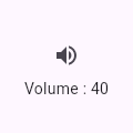 |
| /// |
| /// ```dart preamble |
| /// double _volume = 0.0; |
| /// ``` |
| /// |
| /// ```dart |
| /// Widget build(BuildContext context) { |
| /// return Column( |
| /// mainAxisSize: MainAxisSize.min, |
| /// children: <Widget>[ |
| /// IconButton( |
| /// icon: Icon(Icons.volume_up), |
| /// tooltip: 'Increase volume by 10', |
| /// onPressed: () { |
| /// setState(() { |
| /// _volume += 10; |
| /// }); |
| /// }, |
| /// ), |
| /// Text('Volume : $_volume') |
| /// ], |
| /// ); |
| /// } |
| /// ``` |
| /// {@end-tool} |
| /// |
| /// ### Adding a filled background |
| /// |
| /// Icon buttons don't support specifying a background color or other |
| /// background decoration because typically the icon is just displayed |
| /// on top of the parent widget's background. Icon buttons that appear |
| /// in [AppBar.actions] are an example of this. |
| /// |
| /// It's easy enough to create an icon button with a filled background |
| /// using the [Ink] widget. The [Ink] widget renders a decoration on |
| /// the underlying [Material] along with the splash and highlight |
| /// [InkResponse] contributed by descendant widgets. |
| /// |
| /// {@tool dartpad --template=stateless_widget_scaffold_no_null_safety} |
| /// |
| /// In this sample the icon button's background color is defined with an [Ink] |
| /// widget whose child is an [IconButton]. The icon button's filled background |
| /// is a light shade of blue, it's a filled circle, and it's as big as the |
| /// button is. |
| /// |
| ///  |
| /// |
| /// ```dart |
| /// Widget build(BuildContext context) { |
| /// return Material( |
| /// color: Colors.white, |
| /// child: Center( |
| /// child: Ink( |
| /// decoration: const ShapeDecoration( |
| /// color: Colors.lightBlue, |
| /// shape: CircleBorder(), |
| /// ), |
| /// child: IconButton( |
| /// icon: Icon(Icons.android), |
| /// color: Colors.white, |
| /// onPressed: () {}, |
| /// ), |
| /// ), |
| /// ), |
| /// ); |
| /// } |
| /// ``` |
| /// {@end-tool} |
| /// |
| /// See also: |
| /// |
| /// * [Icons], a library of predefined icons. |
| /// * [BackButton], an icon button for a "back" affordance which adapts to the |
| /// current platform's conventions. |
| /// * [CloseButton], an icon button for closing pages. |
| /// * [AppBar], to show a toolbar at the top of an application. |
| /// * [TextButton], [ElevatedButton], [OutlinedButton], for buttons with text labels and an optional icon. |
| /// * [InkResponse] and [InkWell], for the ink splash effect itself. |
| class IconButton extends StatelessWidget { |
| /// Creates an icon button. |
| /// |
| /// Icon buttons are commonly used in the [AppBar.actions] field, but they can |
| /// be used in many other places as well. |
| /// |
| /// Requires one of its ancestors to be a [Material] widget. |
| /// |
| /// The [iconSize], [padding], [autofocus], and [alignment] arguments must not |
| /// be null (though they each have default values). |
| /// |
| /// The [icon] argument must be specified, and is typically either an [Icon] |
| /// or an [ImageIcon]. |
| const IconButton({ |
| Key? key, |
| this.iconSize = 24.0, |
| this.visualDensity, |
| this.padding = const EdgeInsets.all(8.0), |
| this.alignment = Alignment.center, |
| this.splashRadius, |
| required this.icon, |
| this.color, |
| this.focusColor, |
| this.hoverColor, |
| this.highlightColor, |
| this.splashColor, |
| this.disabledColor, |
| required this.onPressed, |
| this.mouseCursor = SystemMouseCursors.click, |
| this.focusNode, |
| this.autofocus = false, |
| this.tooltip, |
| this.enableFeedback = true, |
| this.constraints, |
| }) : assert(iconSize != null), |
| assert(padding != null), |
| assert(alignment != null), |
| assert(splashRadius == null || splashRadius > 0), |
| assert(autofocus != null), |
| assert(icon != null), |
| super(key: key); |
| |
| /// The size of the icon inside the button. |
| /// |
| /// This property must not be null. It defaults to 24.0. |
| /// |
| /// The size given here is passed down to the widget in the [icon] property |
| /// via an [IconTheme]. Setting the size here instead of in, for example, the |
| /// [Icon.size] property allows the [IconButton] to size the splash area to |
| /// fit the [Icon]. If you were to set the size of the [Icon] using |
| /// [Icon.size] instead, then the [IconButton] would default to 24.0 and then |
| /// the [Icon] itself would likely get clipped. |
| final double iconSize; |
| |
| /// Defines how compact the icon button's layout will be. |
| /// |
| /// {@macro flutter.material.themedata.visualDensity} |
| /// |
| /// See also: |
| /// |
| /// * [ThemeData.visualDensity], which specifies the [visualDensity] for all |
| /// widgets within a [Theme]. |
| final VisualDensity? visualDensity; |
| |
| /// The padding around the button's icon. The entire padded icon will react |
| /// to input gestures. |
| /// |
| /// This property must not be null. It defaults to 8.0 padding on all sides. |
| final EdgeInsetsGeometry padding; |
| |
| /// Defines how the icon is positioned within the IconButton. |
| /// |
| /// This property must not be null. It defaults to [Alignment.center]. |
| /// |
| /// See also: |
| /// |
| /// * [Alignment], a class with convenient constants typically used to |
| /// specify an [AlignmentGeometry]. |
| /// * [AlignmentDirectional], like [Alignment] for specifying alignments |
| /// relative to text direction. |
| final AlignmentGeometry alignment; |
| |
| /// The splash radius. |
| /// |
| /// If null, default splash radius of [Material.defaultSplashRadius] is used. |
| final double? splashRadius; |
| |
| /// The icon to display inside the button. |
| /// |
| /// The [Icon.size] and [Icon.color] of the icon is configured automatically |
| /// based on the [iconSize] and [color] properties of _this_ widget using an |
| /// [IconTheme] and therefore should not be explicitly given in the icon |
| /// widget. |
| /// |
| /// This property must not be null. |
| /// |
| /// See [Icon], [ImageIcon]. |
| final Widget icon; |
| |
| /// The color for the button's icon when it has the input focus. |
| /// |
| /// Defaults to [ThemeData.focusColor] of the ambient theme. |
| final Color? focusColor; |
| |
| /// The color for the button's icon when a pointer is hovering over it. |
| /// |
| /// Defaults to [ThemeData.hoverColor] of the ambient theme. |
| final Color? hoverColor; |
| |
| /// The color to use for the icon inside the button, if the icon is enabled. |
| /// Defaults to leaving this up to the [icon] widget. |
| /// |
| /// The icon is enabled if [onPressed] is not null. |
| /// |
| /// ```dart |
| /// IconButton( |
| /// color: Colors.blue, |
| /// onPressed: _handleTap, |
| /// icon: Icons.widgets, |
| /// ) |
| /// ``` |
| final Color? color; |
| |
| /// The primary color of the button when the button is in the down (pressed) state. |
| /// The splash is represented as a circular overlay that appears above the |
| /// [highlightColor] overlay. The splash overlay has a center point that matches |
| /// the hit point of the user touch event. The splash overlay will expand to |
| /// fill the button area if the touch is held for long enough time. If the splash |
| /// color has transparency then the highlight and button color will show through. |
| /// |
| /// Defaults to the Theme's splash color, [ThemeData.splashColor]. |
| final Color? splashColor; |
| |
| /// The secondary color of the button when the button is in the down (pressed) |
| /// state. The highlight color is represented as a solid color that is overlaid over the |
| /// button color (if any). If the highlight color has transparency, the button color |
| /// will show through. The highlight fades in quickly as the button is held down. |
| /// |
| /// Defaults to the Theme's highlight color, [ThemeData.highlightColor]. |
| final Color? highlightColor; |
| |
| /// The color to use for the icon inside the button, if the icon is disabled. |
| /// Defaults to the [ThemeData.disabledColor] of the current [Theme]. |
| /// |
| /// The icon is disabled if [onPressed] is null. |
| final Color? disabledColor; |
| |
| /// The callback that is called when the button is tapped or otherwise activated. |
| /// |
| /// If this is set to null, the button will be disabled. |
| final VoidCallback? onPressed; |
| |
| /// {@macro flutter.material.RawMaterialButton.mouseCursor} |
| /// |
| /// Defaults to [SystemMouseCursors.click]. |
| final MouseCursor mouseCursor; |
| |
| /// {@macro flutter.widgets.Focus.focusNode} |
| final FocusNode? focusNode; |
| |
| /// {@macro flutter.widgets.Focus.autofocus} |
| final bool autofocus; |
| |
| /// Text that describes the action that will occur when the button is pressed. |
| /// |
| /// This text is displayed when the user long-presses on the button and is |
| /// used for accessibility. |
| final String? tooltip; |
| |
| /// Whether detected gestures should provide acoustic and/or haptic feedback. |
| /// |
| /// For example, on Android a tap will produce a clicking sound and a |
| /// long-press will produce a short vibration, when feedback is enabled. |
| /// |
| /// See also: |
| /// |
| /// * [Feedback] for providing platform-specific feedback to certain actions. |
| final bool enableFeedback; |
| |
| /// Optional size constraints for the button. |
| /// |
| /// When unspecified, defaults to: |
| /// ```dart |
| /// const BoxConstraints( |
| /// minWidth: kMinInteractiveDimension, |
| /// minHeight: kMinInteractiveDimension, |
| /// ) |
| /// ``` |
| /// where [kMinInteractiveDimension] is 48.0, and then with visual density |
| /// applied. |
| /// |
| /// The default constraints ensure that the button is accessible. |
| /// Specifying this parameter enables creation of buttons smaller than |
| /// the minimum size, but it is not recommended. |
| /// |
| /// The visual density uses the [visualDensity] parameter if specified, |
| /// and `Theme.of(context).visualDensity` otherwise. |
| final BoxConstraints? constraints; |
| |
| @override |
| Widget build(BuildContext context) { |
| assert(debugCheckHasMaterial(context)); |
| final ThemeData theme = Theme.of(context); |
| Color? currentColor; |
| if (onPressed != null) |
| currentColor = color; |
| else |
| currentColor = disabledColor ?? theme.disabledColor; |
| |
| final VisualDensity effectiveVisualDensity = visualDensity ?? theme.visualDensity; |
| |
| final BoxConstraints unadjustedConstraints = constraints ?? const BoxConstraints( |
| minWidth: _kMinButtonSize, |
| minHeight: _kMinButtonSize, |
| ); |
| final BoxConstraints adjustedConstraints = effectiveVisualDensity.effectiveConstraints(unadjustedConstraints); |
| |
| Widget result = ConstrainedBox( |
| constraints: adjustedConstraints, |
| child: Padding( |
| padding: padding, |
| child: SizedBox( |
| height: iconSize, |
| width: iconSize, |
| child: Align( |
| alignment: alignment, |
| child: IconTheme.merge( |
| data: IconThemeData( |
| size: iconSize, |
| color: currentColor, |
| ), |
| child: icon, |
| ), |
| ), |
| ), |
| ), |
| ); |
| |
| if (tooltip != null) { |
| result = Tooltip( |
| message: tooltip!, |
| child: result, |
| ); |
| } |
| |
| return Semantics( |
| button: true, |
| enabled: onPressed != null, |
| child: InkResponse( |
| focusNode: focusNode, |
| autofocus: autofocus, |
| canRequestFocus: onPressed != null, |
| onTap: onPressed, |
| mouseCursor: mouseCursor, |
| enableFeedback: enableFeedback, |
| child: result, |
| focusColor: focusColor ?? theme.focusColor, |
| hoverColor: hoverColor ?? theme.hoverColor, |
| highlightColor: highlightColor ?? theme.highlightColor, |
| splashColor: splashColor ?? theme.splashColor, |
| radius: splashRadius ?? math.max( |
| Material.defaultSplashRadius, |
| (iconSize + math.min(padding.horizontal, padding.vertical)) * 0.7, |
| // x 0.5 for diameter -> radius and + 40% overflow derived from other Material apps. |
| ), |
| ), |
| ); |
| } |
| |
| @override |
| void debugFillProperties(DiagnosticPropertiesBuilder properties) { |
| super.debugFillProperties(properties); |
| properties.add(DiagnosticsProperty<Widget>('icon', icon, showName: false)); |
| properties.add(StringProperty('tooltip', tooltip, defaultValue: null, quoted: false)); |
| properties.add(ObjectFlagProperty<VoidCallback>('onPressed', onPressed, ifNull: 'disabled')); |
| properties.add(ColorProperty('color', color, defaultValue: null)); |
| properties.add(ColorProperty('disabledColor', disabledColor, defaultValue: null)); |
| properties.add(ColorProperty('focusColor', focusColor, defaultValue: null)); |
| properties.add(ColorProperty('hoverColor', hoverColor, defaultValue: null)); |
| properties.add(ColorProperty('highlightColor', highlightColor, defaultValue: null)); |
| properties.add(ColorProperty('splashColor', splashColor, defaultValue: null)); |
| properties.add(DiagnosticsProperty<EdgeInsetsGeometry>('padding', padding, defaultValue: null)); |
| properties.add(DiagnosticsProperty<FocusNode>('focusNode', focusNode, defaultValue: null)); |
| } |
| } |