| // Copyright 2014 The Flutter Authors. All rights reserved. |
| // Use of this source code is governed by a BSD-style license that can be |
| // found in the LICENSE file. |
| |
| import 'package:flutter/widgets.dart'; |
| |
| import 'card_theme.dart'; |
| import 'material.dart'; |
| import 'theme.dart'; |
| |
| /// A material design card: a panel with slightly rounded corners and an |
| /// elevation shadow. |
| /// |
| /// A card is a sheet of [Material] used to represent some related information, |
| /// for example an album, a geographical location, a meal, contact details, etc. |
| /// |
| /// This is what it looks like when run: |
| /// |
| /// 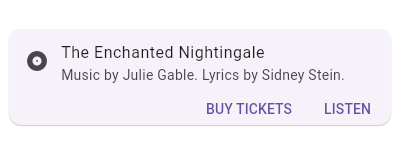 |
| /// |
| /// {@tool dartpad --template=stateless_widget_scaffold} |
| /// |
| /// This sample shows creation of a [Card] widget that shows album information |
| /// and two actions. |
| /// |
| /// ```dart |
| /// Widget build(BuildContext context) { |
| /// return Center( |
| /// child: Card( |
| /// child: Column( |
| /// mainAxisSize: MainAxisSize.min, |
| /// children: <Widget>[ |
| /// const ListTile( |
| /// leading: Icon(Icons.album), |
| /// title: Text('The Enchanted Nightingale'), |
| /// subtitle: Text('Music by Julie Gable. Lyrics by Sidney Stein.'), |
| /// ), |
| /// Row( |
| /// mainAxisAlignment: MainAxisAlignment.end, |
| /// children: <Widget>[ |
| /// TextButton( |
| /// child: const Text('BUY TICKETS'), |
| /// onPressed: () { /* ... */ }, |
| /// ), |
| /// const SizedBox(width: 8), |
| /// TextButton( |
| /// child: const Text('LISTEN'), |
| /// onPressed: () { /* ... */ }, |
| /// ), |
| /// const SizedBox(width: 8), |
| /// ], |
| /// ), |
| /// ], |
| /// ), |
| /// ), |
| /// ); |
| /// } |
| /// ``` |
| /// {@end-tool} |
| /// |
| /// Sometimes the primary action area of a card is the card itself. Cards can be |
| /// one large touch target that shows a detail screen when tapped. |
| /// |
| /// {@tool dartpad --template=stateless_widget_scaffold} |
| /// |
| /// This sample shows creation of a [Card] widget that can be tapped. When |
| /// tapped this [Card]'s [InkWell] displays an "ink splash" that fills the |
| /// entire card. |
| /// |
| /// ```dart |
| /// Widget build(BuildContext context) { |
| /// return Center( |
| /// child: Card( |
| /// child: InkWell( |
| /// splashColor: Colors.blue.withAlpha(30), |
| /// onTap: () { |
| /// print('Card tapped.'); |
| /// }, |
| /// child: Container( |
| /// width: 300, |
| /// height: 100, |
| /// child: Text('A card that can be tapped'), |
| /// ), |
| /// ), |
| /// ), |
| /// ); |
| /// } |
| /// ``` |
| /// |
| /// {@end-tool} |
| /// |
| /// See also: |
| /// |
| /// * [ListTile], to display icons and text in a card. |
| /// * [showDialog], to display a modal card. |
| /// * <https://material.io/design/components/cards.html> |
| class Card extends StatelessWidget { |
| /// Creates a material design card. |
| /// |
| /// The [elevation] must be null or non-negative. The [borderOnForeground] |
| /// must not be null. |
| const Card({ |
| Key? key, |
| this.color, |
| this.shadowColor, |
| this.elevation, |
| this.shape, |
| this.borderOnForeground = true, |
| this.margin, |
| this.clipBehavior, |
| this.child, |
| this.semanticContainer = true, |
| }) : assert(elevation == null || elevation >= 0.0), |
| assert(borderOnForeground != null), |
| super(key: key); |
| |
| /// The card's background color. |
| /// |
| /// Defines the card's [Material.color]. |
| /// |
| /// If this property is null then [CardTheme.color] of [ThemeData.cardTheme] |
| /// is used. If that's null then [ThemeData.cardColor] is used. |
| final Color? color; |
| |
| /// The color to paint the shadow below the card. |
| /// |
| /// If null then the ambient [CardTheme]'s shadowColor is used. |
| /// If that's null too, then the overall theme's [ThemeData.shadowColor] |
| /// (default black) is used. |
| final Color? shadowColor; |
| |
| /// The z-coordinate at which to place this card. This controls the size of |
| /// the shadow below the card. |
| /// |
| /// Defines the card's [Material.elevation]. |
| /// |
| /// If this property is null then [CardTheme.elevation] of |
| /// [ThemeData.cardTheme] is used. If that's null, the default value is 1.0. |
| final double? elevation; |
| |
| /// The shape of the card's [Material]. |
| /// |
| /// Defines the card's [Material.shape]. |
| /// |
| /// If this property is null then [CardTheme.shape] of [ThemeData.cardTheme] |
| /// is used. If that's null then the shape will be a [RoundedRectangleBorder] |
| /// with a circular corner radius of 4.0. |
| final ShapeBorder? shape; |
| |
| /// Whether to paint the [shape] border in front of the [child]. |
| /// |
| /// The default value is true. |
| /// If false, the border will be painted behind the [child]. |
| final bool borderOnForeground; |
| |
| /// {@macro flutter.material.Material.clipBehavior} |
| /// |
| /// If this property is null then [CardTheme.clipBehavior] of |
| /// [ThemeData.cardTheme] is used. If that's null then the behavior will be [Clip.none]. |
| final Clip? clipBehavior; |
| |
| /// The empty space that surrounds the card. |
| /// |
| /// Defines the card's outer [Container.margin]. |
| /// |
| /// If this property is null then [CardTheme.margin] of |
| /// [ThemeData.cardTheme] is used. If that's null, the default margin is 4.0 |
| /// logical pixels on all sides: `EdgeInsets.all(4.0)`. |
| final EdgeInsetsGeometry? margin; |
| |
| /// Whether this widget represents a single semantic container, or if false |
| /// a collection of individual semantic nodes. |
| /// |
| /// Defaults to true. |
| /// |
| /// Setting this flag to true will attempt to merge all child semantics into |
| /// this node. Setting this flag to false will force all child semantic nodes |
| /// to be explicit. |
| /// |
| /// This flag should be false if the card contains multiple different types |
| /// of content. |
| final bool semanticContainer; |
| |
| /// The widget below this widget in the tree. |
| /// |
| /// {@macro flutter.widgets.ProxyWidget.child} |
| final Widget? child; |
| |
| static const double _defaultElevation = 1.0; |
| |
| @override |
| Widget build(BuildContext context) { |
| final ThemeData theme = Theme.of(context); |
| final CardTheme cardTheme = CardTheme.of(context); |
| |
| return Semantics( |
| container: semanticContainer, |
| child: Container( |
| margin: margin ?? cardTheme.margin ?? const EdgeInsets.all(4.0), |
| child: Material( |
| type: MaterialType.card, |
| shadowColor: shadowColor ?? cardTheme.shadowColor ?? theme.shadowColor, |
| color: color ?? cardTheme.color ?? theme.cardColor, |
| elevation: elevation ?? cardTheme.elevation ?? _defaultElevation, |
| shape: shape ?? cardTheme.shape ?? const RoundedRectangleBorder( |
| borderRadius: BorderRadius.all(Radius.circular(4.0)), |
| ), |
| borderOnForeground: borderOnForeground, |
| clipBehavior: clipBehavior ?? cardTheme.clipBehavior ?? Clip.none, |
| child: Semantics( |
| explicitChildNodes: !semanticContainer, |
| child: child, |
| ), |
| ), |
| ), |
| ); |
| } |
| } |