| // Copyright 2014 The Flutter Authors. All rights reserved. |
| // Use of this source code is governed by a BSD-style license that can be |
| // found in the LICENSE file. |
| |
| import 'dart:collection' show Queue; |
| import 'dart:math' as math; |
| |
| import 'package:flutter/widgets.dart'; |
| import 'package:flutter/rendering.dart'; |
| import 'package:vector_math/vector_math_64.dart' show Vector3; |
| |
| import 'bottom_navigation_bar_theme.dart'; |
| import 'constants.dart'; |
| import 'debug.dart'; |
| import 'ink_well.dart'; |
| import 'material.dart'; |
| import 'material_localizations.dart'; |
| import 'theme.dart'; |
| import 'tooltip.dart'; |
| |
| /// Defines the layout and behavior of a [BottomNavigationBar]. |
| /// |
| /// See also: |
| /// |
| /// * [BottomNavigationBar] |
| /// * [BottomNavigationBarItem] |
| /// * <https://material.io/design/components/bottom-navigation.html#specs> |
| enum BottomNavigationBarType { |
| /// The [BottomNavigationBar]'s [BottomNavigationBarItem]s have fixed width. |
| fixed, |
| |
| /// The location and size of the [BottomNavigationBar] [BottomNavigationBarItem]s |
| /// animate and labels fade in when they are tapped. |
| shifting, |
| } |
| |
| /// A material widget that's displayed at the bottom of an app for selecting |
| /// among a small number of views, typically between three and five. |
| /// |
| /// The bottom navigation bar consists of multiple items in the form of |
| /// text labels, icons, or both, laid out on top of a piece of material. It |
| /// provides quick navigation between the top-level views of an app. For larger |
| /// screens, side navigation may be a better fit. |
| /// |
| /// A bottom navigation bar is usually used in conjunction with a [Scaffold], |
| /// where it is provided as the [Scaffold.bottomNavigationBar] argument. |
| /// |
| /// The bottom navigation bar's [type] changes how its [items] are displayed. |
| /// If not specified, then it's automatically set to |
| /// [BottomNavigationBarType.fixed] when there are less than four items, and |
| /// [BottomNavigationBarType.shifting] otherwise. |
| /// |
| /// The length of [items] must be at least two and each item's icon and title/label |
| /// must not be null. |
| /// |
| /// * [BottomNavigationBarType.fixed], the default when there are less than |
| /// four [items]. The selected item is rendered with the |
| /// [selectedItemColor] if it's non-null, otherwise the theme's |
| /// [ThemeData.primaryColor] is used. If [backgroundColor] is null, The |
| /// navigation bar's background color defaults to the [Material] background |
| /// color, [ThemeData.canvasColor] (essentially opaque white). |
| /// * [BottomNavigationBarType.shifting], the default when there are four |
| /// or more [items]. If [selectedItemColor] is null, all items are rendered |
| /// in white. The navigation bar's background color is the same as the |
| /// [BottomNavigationBarItem.backgroundColor] of the selected item. In this |
| /// case it's assumed that each item will have a different background color |
| /// and that background color will contrast well with white. |
| /// |
| /// {@tool dartpad --template=stateful_widget_material_no_null_safety} |
| /// This example shows a [BottomNavigationBar] as it is used within a [Scaffold] |
| /// widget. The [BottomNavigationBar] has three [BottomNavigationBarItem] |
| /// widgets and the [currentIndex] is set to index 0. The selected item is |
| /// amber. The `_onItemTapped` function changes the selected item's index |
| /// and displays a corresponding message in the center of the [Scaffold]. |
| /// |
| /// 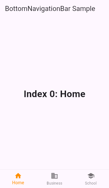 |
| /// |
| /// ```dart |
| /// int _selectedIndex = 0; |
| /// static const TextStyle optionStyle = TextStyle(fontSize: 30, fontWeight: FontWeight.bold); |
| /// static const List<Widget> _widgetOptions = <Widget>[ |
| /// Text( |
| /// 'Index 0: Home', |
| /// style: optionStyle, |
| /// ), |
| /// Text( |
| /// 'Index 1: Business', |
| /// style: optionStyle, |
| /// ), |
| /// Text( |
| /// 'Index 2: School', |
| /// style: optionStyle, |
| /// ), |
| /// ]; |
| /// |
| /// void _onItemTapped(int index) { |
| /// setState(() { |
| /// _selectedIndex = index; |
| /// }); |
| /// } |
| /// |
| /// @override |
| /// Widget build(BuildContext context) { |
| /// return Scaffold( |
| /// appBar: AppBar( |
| /// title: const Text('BottomNavigationBar Sample'), |
| /// ), |
| /// body: Center( |
| /// child: _widgetOptions.elementAt(_selectedIndex), |
| /// ), |
| /// bottomNavigationBar: BottomNavigationBar( |
| /// items: const <BottomNavigationBarItem>[ |
| /// BottomNavigationBarItem( |
| /// icon: Icon(Icons.home), |
| /// label: 'Home', |
| /// ), |
| /// BottomNavigationBarItem( |
| /// icon: Icon(Icons.business), |
| /// label: 'Business', |
| /// ), |
| /// BottomNavigationBarItem( |
| /// icon: Icon(Icons.school), |
| /// label: 'School', |
| /// ), |
| /// ], |
| /// currentIndex: _selectedIndex, |
| /// selectedItemColor: Colors.amber[800], |
| /// onTap: _onItemTapped, |
| /// ), |
| /// ); |
| /// } |
| /// ``` |
| /// {@end-tool} |
| /// |
| /// See also: |
| /// |
| /// * [BottomNavigationBarItem] |
| /// * [Scaffold] |
| /// * <https://material.io/design/components/bottom-navigation.html> |
| class BottomNavigationBar extends StatefulWidget { |
| /// Creates a bottom navigation bar which is typically used as a |
| /// [Scaffold]'s [Scaffold.bottomNavigationBar] argument. |
| /// |
| /// The length of [items] must be at least two and each item's icon and label |
| /// must not be null. |
| /// |
| /// If [type] is null then [BottomNavigationBarType.fixed] is used when there |
| /// are two or three [items], [BottomNavigationBarType.shifting] otherwise. |
| /// |
| /// The [iconSize], [selectedFontSize], [unselectedFontSize], and [elevation] |
| /// arguments must be non-null and non-negative. |
| /// |
| /// If [selectedLabelStyle.color] and [unselectedLabelStyle.color] values |
| /// are non-null, they will be used instead of [selectedItemColor] and |
| /// [unselectedItemColor]. |
| /// |
| /// If custom [IconThemeData]s are used, you must provide both |
| /// [selectedIconTheme] and [unselectedIconTheme], and both |
| /// [IconThemeData.color] and [IconThemeData.size] must be set. |
| /// |
| /// If both [selectedLabelStyle.fontSize] and [selectedFontSize] are set, |
| /// [selectedLabelStyle.fontSize] will be used. |
| /// |
| /// Only one of [selectedItemColor] and [fixedColor] can be specified. The |
| /// former is preferred, [fixedColor] only exists for the sake of |
| /// backwards compatibility. |
| /// |
| /// If [showSelectedLabels] is `null`, [BottomNavigationBarThemeData.showSelectedLabels] |
| /// is used. If [BottomNavigationBarThemeData.showSelectedLabels] is null, |
| /// then [showSelectedLabels] defaults to `true`. |
| /// |
| /// If [showUnselectedLabels] is `null`, [BottomNavigationBarThemeData.showUnselectedLabels] |
| /// is used. If [BottomNavigationBarThemeData.showSelectedLabels] is null, |
| /// then [showUnselectedLabels] defaults to `true` when [type] is |
| /// [BottomNavigationBarType.fixed] and `false` when [type] is |
| /// [BottomNavigationBarType.shifting]. |
| BottomNavigationBar({ |
| Key? key, |
| required this.items, |
| this.onTap, |
| this.currentIndex = 0, |
| this.elevation, |
| this.type, |
| Color? fixedColor, |
| this.backgroundColor, |
| this.iconSize = 24.0, |
| Color? selectedItemColor, |
| this.unselectedItemColor, |
| this.selectedIconTheme, |
| this.unselectedIconTheme, |
| this.selectedFontSize = 14.0, |
| this.unselectedFontSize = 12.0, |
| this.selectedLabelStyle, |
| this.unselectedLabelStyle, |
| this.showSelectedLabels, |
| this.showUnselectedLabels, |
| this.mouseCursor, |
| }) : assert(items != null), |
| assert(items.length >= 2), |
| assert( |
| items.every((BottomNavigationBarItem item) => item.title != null) || |
| items.every((BottomNavigationBarItem item) => item.label != null), |
| 'Every item must have a non-null title or label', |
| ), |
| assert(0 <= currentIndex && currentIndex < items.length), |
| assert(elevation == null || elevation >= 0.0), |
| assert(iconSize != null && iconSize >= 0.0), |
| assert( |
| selectedItemColor == null || fixedColor == null, |
| 'Either selectedItemColor or fixedColor can be specified, but not both' |
| ), |
| assert(selectedFontSize != null && selectedFontSize >= 0.0), |
| assert(unselectedFontSize != null && unselectedFontSize >= 0.0), |
| selectedItemColor = selectedItemColor ?? fixedColor, |
| super(key: key); |
| |
| /// Defines the appearance of the button items that are arrayed within the |
| /// bottom navigation bar. |
| final List<BottomNavigationBarItem> items; |
| |
| /// Called when one of the [items] is tapped. |
| /// |
| /// The stateful widget that creates the bottom navigation bar needs to keep |
| /// track of the index of the selected [BottomNavigationBarItem] and call |
| /// `setState` to rebuild the bottom navigation bar with the new [currentIndex]. |
| final ValueChanged<int>? onTap; |
| |
| /// The index into [items] for the current active [BottomNavigationBarItem]. |
| final int currentIndex; |
| |
| /// The z-coordinate of this [BottomNavigationBar]. |
| /// |
| /// If null, defaults to `8.0`. |
| /// |
| /// {@macro flutter.material.material.elevation} |
| final double? elevation; |
| |
| /// Defines the layout and behavior of a [BottomNavigationBar]. |
| /// |
| /// See documentation for [BottomNavigationBarType] for information on the |
| /// meaning of different types. |
| final BottomNavigationBarType? type; |
| |
| /// The value of [selectedItemColor]. |
| /// |
| /// This getter only exists for backwards compatibility, the |
| /// [selectedItemColor] property is preferred. |
| Color? get fixedColor => selectedItemColor; |
| |
| /// The color of the [BottomNavigationBar] itself. |
| /// |
| /// If [type] is [BottomNavigationBarType.shifting] and the |
| /// [items] have [BottomNavigationBarItem.backgroundColor] set, the [items]' |
| /// backgroundColor will splash and overwrite this color. |
| final Color? backgroundColor; |
| |
| /// The size of all of the [BottomNavigationBarItem] icons. |
| /// |
| /// See [BottomNavigationBarItem.icon] for more information. |
| final double iconSize; |
| |
| /// The color of the selected [BottomNavigationBarItem.icon] and |
| /// [BottomNavigationBarItem.title]. |
| /// |
| /// If null then the [ThemeData.primaryColor] is used. |
| final Color? selectedItemColor; |
| |
| /// The color of the unselected [BottomNavigationBarItem.icon] and |
| /// [BottomNavigationBarItem.title]s. |
| /// |
| /// If null then the [ThemeData.unselectedWidgetColor]'s color is used. |
| final Color? unselectedItemColor; |
| |
| /// The size, opacity, and color of the icon in the currently selected |
| /// [BottomNavigationBarItem.icon]. |
| /// |
| /// If this is not provided, the size will default to [iconSize], the color |
| /// will default to [selectedItemColor]. |
| /// |
| /// It this field is provided, it must contain non-null [IconThemeData.size] |
| /// and [IconThemeData.color] properties. Also, if this field is supplied, |
| /// [unselectedIconTheme] must be provided. |
| final IconThemeData? selectedIconTheme; |
| |
| /// The size, opacity, and color of the icon in the currently unselected |
| /// [BottomNavigationBarItem.icon]s. |
| /// |
| /// If this is not provided, the size will default to [iconSize], the color |
| /// will default to [unselectedItemColor]. |
| /// |
| /// It this field is provided, it must contain non-null [IconThemeData.size] |
| /// and [IconThemeData.color] properties. Also, if this field is supplied, |
| /// [selectedIconTheme] must be provided. |
| final IconThemeData? unselectedIconTheme; |
| |
| /// The [TextStyle] of the [BottomNavigationBarItem] labels when they are |
| /// selected. |
| final TextStyle? selectedLabelStyle; |
| |
| /// The [TextStyle] of the [BottomNavigationBarItem] labels when they are not |
| /// selected. |
| final TextStyle? unselectedLabelStyle; |
| |
| /// The font size of the [BottomNavigationBarItem] labels when they are selected. |
| /// |
| /// If [TextStyle.fontSize] of [selectedLabelStyle] is non-null, it will be |
| /// used instead of this. |
| /// |
| /// Defaults to `14.0`. |
| final double selectedFontSize; |
| |
| /// The font size of the [BottomNavigationBarItem] labels when they are not |
| /// selected. |
| /// |
| /// If [TextStyle.fontSize] of [unselectedLabelStyle] is non-null, it will be |
| /// used instead of this. |
| /// |
| /// Defaults to `12.0`. |
| final double unselectedFontSize; |
| |
| /// Whether the labels are shown for the unselected [BottomNavigationBarItem]s. |
| final bool? showUnselectedLabels; |
| |
| /// Whether the labels are shown for the selected [BottomNavigationBarItem]. |
| final bool? showSelectedLabels; |
| |
| /// The cursor for a mouse pointer when it enters or is hovering over the |
| /// tiles. |
| /// |
| /// If this property is null, [SystemMouseCursors.click] will be used. |
| final MouseCursor? mouseCursor; |
| |
| @override |
| _BottomNavigationBarState createState() => _BottomNavigationBarState(); |
| } |
| |
| // This represents a single tile in the bottom navigation bar. It is intended |
| // to go into a flex container. |
| class _BottomNavigationTile extends StatelessWidget { |
| const _BottomNavigationTile( |
| this.type, |
| this.item, |
| this.animation, |
| this.iconSize, { |
| this.onTap, |
| this.colorTween, |
| this.flex, |
| this.selected = false, |
| required this.selectedLabelStyle, |
| required this.unselectedLabelStyle, |
| required this.selectedIconTheme, |
| required this.unselectedIconTheme, |
| required this.showSelectedLabels, |
| required this.showUnselectedLabels, |
| this.indexLabel, |
| required this.mouseCursor, |
| }) : assert(type != null), |
| assert(item != null), |
| assert(animation != null), |
| assert(selected != null), |
| assert(selectedLabelStyle != null), |
| assert(unselectedLabelStyle != null), |
| assert(mouseCursor != null); |
| |
| final BottomNavigationBarType type; |
| final BottomNavigationBarItem item; |
| final Animation<double> animation; |
| final double iconSize; |
| final VoidCallback? onTap; |
| final ColorTween? colorTween; |
| final double? flex; |
| final bool selected; |
| final IconThemeData? selectedIconTheme; |
| final IconThemeData? unselectedIconTheme; |
| final TextStyle selectedLabelStyle; |
| final TextStyle unselectedLabelStyle; |
| final String? indexLabel; |
| final bool showSelectedLabels; |
| final bool showUnselectedLabels; |
| final MouseCursor mouseCursor; |
| |
| @override |
| Widget build(BuildContext context) { |
| // In order to use the flex container to grow the tile during animation, we |
| // need to divide the changes in flex allotment into smaller pieces to |
| // produce smooth animation. We do this by multiplying the flex value |
| // (which is an integer) by a large number. |
| final int size; |
| |
| final double selectedFontSize = selectedLabelStyle.fontSize!; |
| |
| final double selectedIconSize = selectedIconTheme?.size ?? iconSize; |
| final double unselectedIconSize = unselectedIconTheme?.size ?? iconSize; |
| |
| // The amount that the selected icon is bigger than the unselected icons, |
| // (or zero if the selected icon is not bigger than the unselected icons). |
| final double selectedIconDiff = math.max(selectedIconSize - unselectedIconSize, 0); |
| // The amount that the unselected icons are bigger than the selected icon, |
| // (or zero if the unselected icons are not any bigger than the selected icon). |
| final double unselectedIconDiff = math.max(unselectedIconSize - selectedIconSize, 0); |
| |
| // The effective tool tip message to be shown on the BottomNavigationBarItem. |
| final String? effectiveTooltip = item.tooltip == '' ? null : item.tooltip ?? item.label; |
| |
| // Defines the padding for the animating icons + labels. |
| // |
| // The animations go from "Unselected": |
| // ======= |
| // | <-- Padding equal to the text height + 1/2 selectedIconDiff. |
| // | ☆ |
| // | text <-- Invisible text + padding equal to 1/2 selectedIconDiff. |
| // ======= |
| // |
| // To "Selected": |
| // |
| // ======= |
| // | <-- Padding equal to 1/2 text height + 1/2 unselectedIconDiff. |
| // | ☆ |
| // | text |
| // | <-- Padding equal to 1/2 text height + 1/2 unselectedIconDiff. |
| // ======= |
| double bottomPadding; |
| double topPadding; |
| if (showSelectedLabels && !showUnselectedLabels) { |
| bottomPadding = Tween<double>( |
| begin: selectedIconDiff / 2.0, |
| end: selectedFontSize / 2.0 - unselectedIconDiff / 2.0, |
| ).evaluate(animation); |
| topPadding = Tween<double>( |
| begin: selectedFontSize + selectedIconDiff / 2.0, |
| end: selectedFontSize / 2.0 - unselectedIconDiff / 2.0, |
| ).evaluate(animation); |
| } else if (!showSelectedLabels && !showUnselectedLabels) { |
| bottomPadding = Tween<double>( |
| begin: selectedIconDiff / 2.0, |
| end: unselectedIconDiff / 2.0, |
| ).evaluate(animation); |
| topPadding = Tween<double>( |
| begin: selectedFontSize + selectedIconDiff / 2.0, |
| end: selectedFontSize + unselectedIconDiff / 2.0, |
| ).evaluate(animation); |
| } else { |
| bottomPadding = Tween<double>( |
| begin: selectedFontSize / 2.0 + selectedIconDiff / 2.0, |
| end: selectedFontSize / 2.0 + unselectedIconDiff / 2.0, |
| ).evaluate(animation); |
| topPadding = Tween<double>( |
| begin: selectedFontSize / 2.0 + selectedIconDiff / 2.0, |
| end: selectedFontSize / 2.0 + unselectedIconDiff / 2.0, |
| ).evaluate(animation); |
| } |
| |
| switch (type) { |
| case BottomNavigationBarType.fixed: |
| size = 1; |
| break; |
| case BottomNavigationBarType.shifting: |
| size = (flex! * 1000.0).round(); |
| break; |
| } |
| |
| Widget result = InkResponse( |
| onTap: onTap, |
| mouseCursor: mouseCursor, |
| child: Padding( |
| padding: EdgeInsets.only(top: topPadding, bottom: bottomPadding), |
| child: Column( |
| crossAxisAlignment: CrossAxisAlignment.center, |
| mainAxisAlignment: MainAxisAlignment.spaceBetween, |
| mainAxisSize: MainAxisSize.min, |
| children: <Widget>[ |
| _TileIcon( |
| colorTween: colorTween!, |
| animation: animation, |
| iconSize: iconSize, |
| selected: selected, |
| item: item, |
| selectedIconTheme: selectedIconTheme, |
| unselectedIconTheme: unselectedIconTheme, |
| ), |
| _Label( |
| colorTween: colorTween!, |
| animation: animation, |
| item: item, |
| selectedLabelStyle: selectedLabelStyle, |
| unselectedLabelStyle: unselectedLabelStyle, |
| showSelectedLabels: showSelectedLabels, |
| showUnselectedLabels: showUnselectedLabels, |
| ), |
| ], |
| ), |
| ), |
| ); |
| |
| if (effectiveTooltip != null) { |
| result = Tooltip( |
| message: effectiveTooltip, |
| preferBelow: false, |
| verticalOffset: selectedIconSize + selectedFontSize, |
| excludeFromSemantics: true, |
| child: result, |
| ); |
| } |
| |
| result = Semantics( |
| selected: selected, |
| container: true, |
| child: Stack( |
| children: <Widget>[ |
| result, |
| Semantics( |
| label: indexLabel, |
| ), |
| ], |
| ), |
| ); |
| |
| return Expanded( |
| flex: size, |
| child: result, |
| ); |
| } |
| } |
| |
| |
| class _TileIcon extends StatelessWidget { |
| const _TileIcon({ |
| Key? key, |
| required this.colorTween, |
| required this.animation, |
| required this.iconSize, |
| required this.selected, |
| required this.item, |
| required this.selectedIconTheme, |
| required this.unselectedIconTheme, |
| }) : assert(selected != null), |
| assert(item != null), |
| super(key: key); |
| |
| final ColorTween colorTween; |
| final Animation<double> animation; |
| final double iconSize; |
| final bool selected; |
| final BottomNavigationBarItem item; |
| final IconThemeData? selectedIconTheme; |
| final IconThemeData? unselectedIconTheme; |
| |
| @override |
| Widget build(BuildContext context) { |
| final Color? iconColor = colorTween.evaluate(animation); |
| final IconThemeData defaultIconTheme = IconThemeData( |
| color: iconColor, |
| size: iconSize, |
| ); |
| final IconThemeData iconThemeData = IconThemeData.lerp( |
| defaultIconTheme.merge(unselectedIconTheme), |
| defaultIconTheme.merge(selectedIconTheme), |
| animation.value, |
| ); |
| |
| return Align( |
| alignment: Alignment.topCenter, |
| heightFactor: 1.0, |
| child: Container( |
| child: IconTheme( |
| data: iconThemeData, |
| child: selected ? item.activeIcon : item.icon, |
| ), |
| ), |
| ); |
| } |
| } |
| |
| class _Label extends StatelessWidget { |
| const _Label({ |
| Key? key, |
| required this.colorTween, |
| required this.animation, |
| required this.item, |
| required this.selectedLabelStyle, |
| required this.unselectedLabelStyle, |
| required this.showSelectedLabels, |
| required this.showUnselectedLabels, |
| }) : assert(colorTween != null), |
| assert(animation != null), |
| assert(item != null), |
| assert(selectedLabelStyle != null), |
| assert(unselectedLabelStyle != null), |
| assert(showSelectedLabels != null), |
| assert(showUnselectedLabels != null), |
| super(key: key); |
| |
| final ColorTween colorTween; |
| final Animation<double> animation; |
| final BottomNavigationBarItem item; |
| final TextStyle selectedLabelStyle; |
| final TextStyle unselectedLabelStyle; |
| final bool showSelectedLabels; |
| final bool showUnselectedLabels; |
| |
| @override |
| Widget build(BuildContext context) { |
| final double? selectedFontSize = selectedLabelStyle.fontSize; |
| final double? unselectedFontSize = unselectedLabelStyle.fontSize; |
| |
| final TextStyle customStyle = TextStyle.lerp( |
| unselectedLabelStyle, |
| selectedLabelStyle, |
| animation.value, |
| )!; |
| Widget text = DefaultTextStyle.merge( |
| style: customStyle.copyWith( |
| fontSize: selectedFontSize, |
| color: colorTween.evaluate(animation), |
| ), |
| // The font size should grow here when active, but because of the way |
| // font rendering works, it doesn't grow smoothly if we just animate |
| // the font size, so we use a transform instead. |
| child: Transform( |
| transform: Matrix4.diagonal3( |
| Vector3.all( |
| Tween<double>( |
| begin: unselectedFontSize! / selectedFontSize!, |
| end: 1.0, |
| ).evaluate(animation), |
| ), |
| ), |
| alignment: Alignment.bottomCenter, |
| child: item.title ?? Text(item.label!), |
| ), |
| ); |
| |
| if (!showUnselectedLabels && !showSelectedLabels) { |
| // Never show any labels. |
| text = Opacity( |
| alwaysIncludeSemantics: true, |
| opacity: 0.0, |
| child: text, |
| ); |
| } else if (!showUnselectedLabels) { |
| // Fade selected labels in. |
| text = FadeTransition( |
| alwaysIncludeSemantics: true, |
| opacity: animation, |
| child: text, |
| ); |
| } else if (!showSelectedLabels) { |
| // Fade selected labels out. |
| text = FadeTransition( |
| alwaysIncludeSemantics: true, |
| opacity: Tween<double>(begin: 1.0, end: 0.0).animate(animation), |
| child: text, |
| ); |
| } |
| |
| text = Align( |
| alignment: Alignment.bottomCenter, |
| heightFactor: 1.0, |
| child: Container(child: text), |
| ); |
| |
| if (item.label != null) { |
| // Do not grow text in bottom navigation bar when we can show a tooltip |
| // instead. |
| final MediaQueryData mediaQueryData = MediaQuery.of(context); |
| text = MediaQuery( |
| data: mediaQueryData.copyWith( |
| textScaleFactor: math.min(1.0, mediaQueryData.textScaleFactor), |
| ), |
| child: text, |
| ); |
| } |
| |
| return text; |
| } |
| } |
| |
| class _BottomNavigationBarState extends State<BottomNavigationBar> with TickerProviderStateMixin { |
| List<AnimationController> _controllers = <AnimationController>[]; |
| late List<CurvedAnimation> _animations; |
| |
| // A queue of color splashes currently being animated. |
| final Queue<_Circle> _circles = Queue<_Circle>(); |
| |
| // Last splash circle's color, and the final color of the control after |
| // animation is complete. |
| Color? _backgroundColor; |
| |
| static final Animatable<double> _flexTween = Tween<double>(begin: 1.0, end: 1.5); |
| |
| void _resetState() { |
| for (final AnimationController controller in _controllers) |
| controller.dispose(); |
| for (final _Circle circle in _circles) |
| circle.dispose(); |
| _circles.clear(); |
| |
| _controllers = List<AnimationController>.generate(widget.items.length, (int index) { |
| return AnimationController( |
| duration: kThemeAnimationDuration, |
| vsync: this, |
| )..addListener(_rebuild); |
| }); |
| _animations = List<CurvedAnimation>.generate(widget.items.length, (int index) { |
| return CurvedAnimation( |
| parent: _controllers[index], |
| curve: Curves.fastOutSlowIn, |
| reverseCurve: Curves.fastOutSlowIn.flipped, |
| ); |
| }); |
| _controllers[widget.currentIndex].value = 1.0; |
| _backgroundColor = widget.items[widget.currentIndex].backgroundColor; |
| } |
| |
| // Computes the default value for the [type] parameter. |
| // |
| // If type is provided, it is returned. Next, if the bottom navigation bar |
| // theme provides a type, it is used. Finally, the default behavior will be |
| // [BottomNavigationBarType.fixed] for 3 or fewer items, and |
| // [BottomNavigationBarType.shifting] is used for 4+ items. |
| BottomNavigationBarType get _effectiveType { |
| return widget.type |
| ?? BottomNavigationBarTheme.of(context).type |
| ?? (widget.items.length <= 3 ? BottomNavigationBarType.fixed : BottomNavigationBarType.shifting); |
| } |
| |
| // Computes the default value for the [showUnselected] parameter. |
| // |
| // Unselected labels are shown by default for [BottomNavigationBarType.fixed], |
| // and hidden by default for [BottomNavigationBarType.shifting]. |
| bool get _defaultShowUnselected { |
| switch (_effectiveType) { |
| case BottomNavigationBarType.shifting: |
| return false; |
| case BottomNavigationBarType.fixed: |
| return true; |
| } |
| } |
| |
| @override |
| void initState() { |
| super.initState(); |
| _resetState(); |
| } |
| |
| void _rebuild() { |
| setState(() { |
| // Rebuilding when any of the controllers tick, i.e. when the items are |
| // animated. |
| }); |
| } |
| |
| @override |
| void dispose() { |
| for (final AnimationController controller in _controllers) |
| controller.dispose(); |
| for (final _Circle circle in _circles) |
| circle.dispose(); |
| super.dispose(); |
| } |
| |
| double _evaluateFlex(Animation<double> animation) => _flexTween.evaluate(animation); |
| |
| void _pushCircle(int index) { |
| if (widget.items[index].backgroundColor != null) { |
| _circles.add( |
| _Circle( |
| state: this, |
| index: index, |
| color: widget.items[index].backgroundColor!, |
| vsync: this, |
| )..controller.addStatusListener( |
| (AnimationStatus status) { |
| switch (status) { |
| case AnimationStatus.completed: |
| setState(() { |
| final _Circle circle = _circles.removeFirst(); |
| _backgroundColor = circle.color; |
| circle.dispose(); |
| }); |
| break; |
| case AnimationStatus.dismissed: |
| case AnimationStatus.forward: |
| case AnimationStatus.reverse: |
| break; |
| } |
| }, |
| ), |
| ); |
| } |
| } |
| |
| @override |
| void didUpdateWidget(BottomNavigationBar oldWidget) { |
| super.didUpdateWidget(oldWidget); |
| |
| // No animated segue if the length of the items list changes. |
| if (widget.items.length != oldWidget.items.length) { |
| _resetState(); |
| return; |
| } |
| |
| if (widget.currentIndex != oldWidget.currentIndex) { |
| switch (_effectiveType) { |
| case BottomNavigationBarType.fixed: |
| break; |
| case BottomNavigationBarType.shifting: |
| _pushCircle(widget.currentIndex); |
| break; |
| } |
| _controllers[oldWidget.currentIndex].reverse(); |
| _controllers[widget.currentIndex].forward(); |
| } else { |
| if (_backgroundColor != widget.items[widget.currentIndex].backgroundColor) |
| _backgroundColor = widget.items[widget.currentIndex].backgroundColor; |
| } |
| } |
| |
| // If the given [TextStyle] has a non-null `fontSize`, it should be used. |
| // Otherwise, the [selectedFontSize] parameter should be used. |
| static TextStyle _effectiveTextStyle(TextStyle? textStyle, double fontSize) { |
| textStyle ??= const TextStyle(); |
| // Prefer the font size on textStyle if present. |
| return textStyle.fontSize == null ? textStyle.copyWith(fontSize: fontSize) : textStyle; |
| } |
| |
| List<Widget> _createTiles() { |
| final MaterialLocalizations localizations = MaterialLocalizations.of(context); |
| assert(localizations != null); |
| |
| final ThemeData themeData = Theme.of(context); |
| final BottomNavigationBarThemeData bottomTheme = BottomNavigationBarTheme.of(context); |
| |
| final TextStyle effectiveSelectedLabelStyle = |
| _effectiveTextStyle( |
| widget.selectedLabelStyle ?? bottomTheme.selectedLabelStyle, |
| widget.selectedFontSize, |
| ); |
| final TextStyle effectiveUnselectedLabelStyle = |
| _effectiveTextStyle( |
| widget.unselectedLabelStyle ?? bottomTheme.unselectedLabelStyle, |
| widget.unselectedFontSize, |
| ); |
| |
| final Color themeColor; |
| switch (themeData.brightness) { |
| case Brightness.light: |
| themeColor = themeData.primaryColor; |
| break; |
| case Brightness.dark: |
| themeColor = themeData.accentColor; |
| break; |
| } |
| |
| final ColorTween colorTween; |
| switch (_effectiveType) { |
| case BottomNavigationBarType.fixed: |
| colorTween = ColorTween( |
| begin: widget.unselectedItemColor |
| ?? bottomTheme.unselectedItemColor |
| ?? themeData.unselectedWidgetColor, |
| end: widget.selectedItemColor |
| ?? bottomTheme.selectedItemColor |
| ?? widget.fixedColor |
| ?? themeColor, |
| ); |
| break; |
| case BottomNavigationBarType.shifting: |
| colorTween = ColorTween( |
| begin: widget.unselectedItemColor |
| ?? bottomTheme.unselectedItemColor |
| ?? themeData.colorScheme.surface, |
| end: widget.selectedItemColor |
| ?? bottomTheme.selectedItemColor |
| ?? themeData.colorScheme.surface, |
| ); |
| break; |
| } |
| final MouseCursor effectiveMouseCursor = widget.mouseCursor ?? SystemMouseCursors.click; |
| |
| final List<Widget> tiles = <Widget>[]; |
| for (int i = 0; i < widget.items.length; i++) { |
| tiles.add(_BottomNavigationTile( |
| _effectiveType, |
| widget.items[i], |
| _animations[i], |
| widget.iconSize, |
| selectedIconTheme: widget.selectedIconTheme ?? bottomTheme.selectedIconTheme, |
| unselectedIconTheme: widget.unselectedIconTheme ?? bottomTheme.unselectedIconTheme, |
| selectedLabelStyle: effectiveSelectedLabelStyle, |
| unselectedLabelStyle: effectiveUnselectedLabelStyle, |
| onTap: () { |
| if (widget.onTap != null) |
| widget.onTap!(i); |
| }, |
| colorTween: colorTween, |
| flex: _evaluateFlex(_animations[i]), |
| selected: i == widget.currentIndex, |
| showSelectedLabels: widget.showSelectedLabels ?? bottomTheme.showSelectedLabels ?? true, |
| showUnselectedLabels: widget.showUnselectedLabels ?? bottomTheme.showUnselectedLabels ?? _defaultShowUnselected, |
| indexLabel: localizations.tabLabel(tabIndex: i + 1, tabCount: widget.items.length), |
| mouseCursor: effectiveMouseCursor, |
| )); |
| } |
| return tiles; |
| } |
| |
| Widget _createContainer(List<Widget> tiles) { |
| return DefaultTextStyle.merge( |
| overflow: TextOverflow.ellipsis, |
| child: Row( |
| mainAxisAlignment: MainAxisAlignment.spaceBetween, |
| children: tiles, |
| ), |
| ); |
| } |
| |
| @override |
| Widget build(BuildContext context) { |
| assert(debugCheckHasDirectionality(context)); |
| assert(debugCheckHasMaterialLocalizations(context)); |
| assert(debugCheckHasMediaQuery(context)); |
| assert(Overlay.of(context, debugRequiredFor: widget) != null); |
| |
| final BottomNavigationBarThemeData bottomTheme = BottomNavigationBarTheme.of(context); |
| |
| // Labels apply up to _bottomMargin padding. Remainder is media padding. |
| final double additionalBottomPadding = math.max(MediaQuery.of(context).padding.bottom - widget.selectedFontSize / 2.0, 0.0); |
| Color? backgroundColor; |
| switch (_effectiveType) { |
| case BottomNavigationBarType.fixed: |
| backgroundColor = widget.backgroundColor ?? bottomTheme.backgroundColor; |
| break; |
| case BottomNavigationBarType.shifting: |
| backgroundColor = _backgroundColor; |
| break; |
| } |
| return Semantics( |
| explicitChildNodes: true, |
| child: Material( |
| elevation: widget.elevation ?? bottomTheme.elevation ?? 8.0, |
| color: backgroundColor, |
| child: ConstrainedBox( |
| constraints: BoxConstraints(minHeight: kBottomNavigationBarHeight + additionalBottomPadding), |
| child: CustomPaint( |
| painter: _RadialPainter( |
| circles: _circles.toList(), |
| textDirection: Directionality.of(context), |
| ), |
| child: Material( // Splashes. |
| type: MaterialType.transparency, |
| child: Padding( |
| padding: EdgeInsets.only(bottom: additionalBottomPadding), |
| child: MediaQuery.removePadding( |
| context: context, |
| removeBottom: true, |
| child: _createContainer(_createTiles()), |
| ), |
| ), |
| ), |
| ), |
| ), |
| ), |
| ); |
| } |
| } |
| |
| // Describes an animating color splash circle. |
| class _Circle { |
| _Circle({ |
| required this.state, |
| required this.index, |
| required this.color, |
| required TickerProvider vsync, |
| }) : assert(state != null), |
| assert(index != null), |
| assert(color != null) { |
| controller = AnimationController( |
| duration: kThemeAnimationDuration, |
| vsync: vsync, |
| ); |
| animation = CurvedAnimation( |
| parent: controller, |
| curve: Curves.fastOutSlowIn, |
| ); |
| controller.forward(); |
| } |
| |
| final _BottomNavigationBarState state; |
| final int index; |
| final Color color; |
| late AnimationController controller; |
| late CurvedAnimation animation; |
| |
| double get horizontalLeadingOffset { |
| double weightSum(Iterable<Animation<double>> animations) { |
| // We're adding flex values instead of animation values to produce correct |
| // ratios. |
| return animations.map<double>(state._evaluateFlex).fold<double>(0.0, (double sum, double value) => sum + value); |
| } |
| |
| final double allWeights = weightSum(state._animations); |
| // These weights sum to the start edge of the indexed item. |
| final double leadingWeights = weightSum(state._animations.sublist(0, index)); |
| |
| // Add half of its flex value in order to get to the center. |
| return (leadingWeights + state._evaluateFlex(state._animations[index]) / 2.0) / allWeights; |
| } |
| |
| void dispose() { |
| controller.dispose(); |
| } |
| } |
| |
| // Paints the animating color splash circles. |
| class _RadialPainter extends CustomPainter { |
| _RadialPainter({ |
| required this.circles, |
| required this.textDirection, |
| }) : assert(circles != null), |
| assert(textDirection != null); |
| |
| final List<_Circle> circles; |
| final TextDirection textDirection; |
| |
| // Computes the maximum radius attainable such that at least one of the |
| // bounding rectangle's corners touches the edge of the circle. Drawing a |
| // circle larger than this radius is not needed, since there is no perceivable |
| // difference within the cropped rectangle. |
| static double _maxRadius(Offset center, Size size) { |
| final double maxX = math.max(center.dx, size.width - center.dx); |
| final double maxY = math.max(center.dy, size.height - center.dy); |
| return math.sqrt(maxX * maxX + maxY * maxY); |
| } |
| |
| @override |
| bool shouldRepaint(_RadialPainter oldPainter) { |
| if (textDirection != oldPainter.textDirection) |
| return true; |
| if (circles == oldPainter.circles) |
| return false; |
| if (circles.length != oldPainter.circles.length) |
| return true; |
| for (int i = 0; i < circles.length; i += 1) |
| if (circles[i] != oldPainter.circles[i]) |
| return true; |
| return false; |
| } |
| |
| @override |
| void paint(Canvas canvas, Size size) { |
| for (final _Circle circle in circles) { |
| final Paint paint = Paint()..color = circle.color; |
| final Rect rect = Rect.fromLTWH(0.0, 0.0, size.width, size.height); |
| canvas.clipRect(rect); |
| final double leftFraction; |
| switch (textDirection) { |
| case TextDirection.rtl: |
| leftFraction = 1.0 - circle.horizontalLeadingOffset; |
| break; |
| case TextDirection.ltr: |
| leftFraction = circle.horizontalLeadingOffset; |
| break; |
| } |
| final Offset center = Offset(leftFraction * size.width, size.height / 2.0); |
| final Tween<double> radiusTween = Tween<double>( |
| begin: 0.0, |
| end: _maxRadius(center, size), |
| ); |
| canvas.drawCircle( |
| center, |
| radiusTween.transform(circle.animation.value), |
| paint, |
| ); |
| } |
| } |
| } |