[NNBD] Migrate sample code pt 1 (#72794)
diff --git a/packages/flutter/lib/src/material/about.dart b/packages/flutter/lib/src/material/about.dart
index a7d30fe..fd35650 100644
--- a/packages/flutter/lib/src/material/about.dart
+++ b/packages/flutter/lib/src/material/about.dart
@@ -44,14 +44,14 @@
 /// If your application does not have a [Drawer], you should provide an
 /// affordance to call [showAboutDialog] or (at least) [showLicensePage].
 ///
-/// {@tool dartpad --template=stateless_widget_material_no_null_safety}
+/// {@tool dartpad --template=stateless_widget_material}
 ///
 /// This sample shows two ways to open [AboutDialog]. The first one
 /// uses an [AboutListTile], and the second uses the [showAboutDialog] function.
 ///
 /// ```dart
 ///  Widget build(BuildContext context) {
-///    final TextStyle textStyle = Theme.of(context).textTheme.bodyText2;
+///    final TextStyle textStyle = Theme.of(context).textTheme.bodyText2!;
 ///    final List<Widget> aboutBoxChildren = <Widget>[
 ///      SizedBox(height: 24),
 ///      RichText(
diff --git a/packages/flutter/lib/src/material/card.dart b/packages/flutter/lib/src/material/card.dart
index f4fd149..3a4ee68 100644
--- a/packages/flutter/lib/src/material/card.dart
+++ b/packages/flutter/lib/src/material/card.dart
@@ -20,7 +20,7 @@
 /// some text describing a musical, and the other with buttons for buying
 /// tickets or listening to the show.](https://flutter.github.io/assets-for-api-docs/assets/material/card.png)
 ///
-/// {@tool dartpad --template=stateless_widget_scaffold_no_null_safety}
+/// {@tool dartpad --template=stateless_widget_scaffold}
 ///
 /// This sample shows creation of a [Card] widget that shows album information
 /// and two actions.
@@ -63,7 +63,7 @@
 /// Sometimes the primary action area of a card is the card itself. Cards can be
 /// one large touch target that shows a detail screen when tapped.
 ///
-/// {@tool dartpad --template=stateless_widget_scaffold_no_null_safety}
+/// {@tool dartpad --template=stateless_widget_scaffold}
 ///
 /// This sample shows creation of a [Card] widget that can be tapped. When
 /// tapped this [Card]'s [InkWell] displays an "ink splash" that fills the
diff --git a/packages/flutter/lib/src/material/data_table.dart b/packages/flutter/lib/src/material/data_table.dart
index 82fa7b7..5fedd16 100644
--- a/packages/flutter/lib/src/material/data_table.dart
+++ b/packages/flutter/lib/src/material/data_table.dart
@@ -260,7 +260,7 @@
 /// [PaginatedDataTable] which automatically splits the data into
 /// multiple pages.
 ///
-/// {@tool dartpad --template=stateless_widget_scaffold_no_null_safety}
+/// {@tool dartpad --template=stateless_widget_scaffold}
 ///
 /// This sample shows how to display a [DataTable] with three columns: name, age, and
 /// role. The columns are defined by three [DataColumn] objects. The table
@@ -322,7 +322,7 @@
 /// {@end-tool}
 ///
 ///
-/// {@tool dartpad --template=stateful_widget_scaffold_no_null_safety}
+/// {@tool dartpad --template=stateful_widget_scaffold}
 ///
 /// This sample shows how to display a [DataTable] with alternate colors per
 /// row, and a custom color for when the row is selected.
@@ -344,7 +344,7 @@
 ///       rows: List<DataRow>.generate(
 ///         numItems,
 ///         (index) => DataRow(
-///           color: MaterialStateProperty.resolveWith<Color>((Set<MaterialState> states) {
+///           color: MaterialStateProperty.resolveWith<Color?>((Set<MaterialState> states) {
 ///             // All rows will have the same selected color.
 ///             if (states.contains(MaterialState.selected))
 ///               return Theme.of(context).colorScheme.primary.withOpacity(0.08);
@@ -355,9 +355,9 @@
 ///           }),
 ///           cells: [DataCell(Text('Row $index'))],
 ///           selected: selected[index],
-///           onSelectChanged: (bool value) {
+///           onSelectChanged: (bool? value) {
 ///             setState(() {
-///               selected[index] = value;
+///               selected[index] = value!;
 ///             });
 ///           },
 ///         ),
diff --git a/packages/flutter/lib/src/material/ink_well.dart b/packages/flutter/lib/src/material/ink_well.dart
index e5409c9..6408c75 100644
--- a/packages/flutter/lib/src/material/ink_well.dart
+++ b/packages/flutter/lib/src/material/ink_well.dart
@@ -1171,7 +1171,7 @@
 ///
 /// An example of this situation is as follows:
 ///
-/// {@tool dartpad --template=stateful_widget_scaffold_center_no_null_safety}
+/// {@tool dartpad --template=stateful_widget_scaffold_center}
 ///
 /// Tap the container to cause it to grow. Then, tap it again and hold before
 /// the widget reaches its maximum size to observe the clipped ink splash.
diff --git a/packages/flutter/lib/src/material/input_decorator.dart b/packages/flutter/lib/src/material/input_decorator.dart
index 383fff6..04163b2 100644
--- a/packages/flutter/lib/src/material/input_decorator.dart
+++ b/packages/flutter/lib/src/material/input_decorator.dart
@@ -2389,7 +2389,7 @@
 /// to describe their decoration. (In fact, this class is merely the
 /// configuration of an [InputDecorator], which does all the heavy lifting.)
 ///
-/// {@tool dartpad --template=stateless_widget_scaffold_no_null_safety}
+/// {@tool dartpad --template=stateless_widget_scaffold}
 ///
 /// This sample shows how to style a `TextField` using an `InputDecorator`. The
 /// TextField displays a "send message" icon to the left of the input area,
@@ -2414,7 +2414,7 @@
 /// ```
 /// {@end-tool}
 ///
-/// {@tool dartpad --template=stateless_widget_scaffold_no_null_safety}
+/// {@tool dartpad --template=stateless_widget_scaffold}
 ///
 /// This sample shows how to style a "collapsed" `TextField` using an
 /// `InputDecorator`. The collapsed `TextField` surrounds the hint text and
@@ -2434,7 +2434,7 @@
 /// ```
 /// {@end-tool}
 ///
-/// {@tool dartpad --template=stateless_widget_scaffold_no_null_safety}
+/// {@tool dartpad --template=stateless_widget_scaffold}
 ///
 /// This sample shows how to create a `TextField` with hint text, a red border
 /// on all sides, and an error message. To display a red border and error
@@ -2455,7 +2455,7 @@
 /// ```
 /// {@end-tool}
 ///
-/// {@tool dartpad --template=stateless_widget_scaffold_no_null_safety}
+/// {@tool dartpad --template=stateless_widget_scaffold}
 ///
 /// This sample shows how to style a `TextField` with a round border and
 /// additional text before and after the input area. It displays "Prefix" before
@@ -2836,7 +2836,8 @@
   /// setting the constraints' minimum height and width to a value lower than
   /// 48px.
   ///
-  /// {@tool dartpad --template=stateless_widget_scaffold_no_null_safety}
+  /// {@tool dartpad --template=stateless_widget_scaffold}
+  ///
   /// This example shows the differences between two `TextField` widgets when
   /// [prefixIconConstraints] is set to the default value and when one is not.
   ///
diff --git a/packages/flutter/lib/src/material/radio_list_tile.dart b/packages/flutter/lib/src/material/radio_list_tile.dart
index 5f942e8..54b18a7 100644
--- a/packages/flutter/lib/src/material/radio_list_tile.dart
+++ b/packages/flutter/lib/src/material/radio_list_tile.dart
@@ -10,7 +10,6 @@
import 'theme_data.dart';
// Examples can assume:
-// // @dart = 2.9
// void setState(VoidCallback fn) { }
/// A [ListTile] with a [Radio]. In other words, a radio button with a label.
@@ -41,7 +40,7 @@
/// To show the [RadioListTile] as disabled, pass null as the [onChanged]
/// callback.
///
-/// {@tool dartpad --template=stateful_widget_scaffold_no_null_safety}
+/// {@tool dartpad --template=stateful_widget_scaffold}
///
/// 
///
@@ -52,7 +51,7 @@
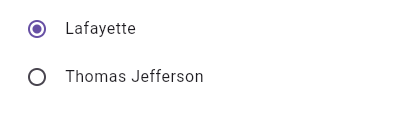
/// enum SingingCharacter { lafayette, jefferson }
/// ```
/// ```dart
-/// SingingCharacter _character = SingingCharacter.lafayette;
+/// SingingCharacter? _character = SingingCharacter.lafayette;
///
/// @override
/// Widget build(BuildContext context) {
@@ -62,13 +61,13 @@
/// title: const Text('Lafayette'),
/// value: SingingCharacter.lafayette,
/// groupValue: _character,
-/// onChanged: (SingingCharacter value) { setState(() { _character = value; }); },
+/// onChanged: (SingingCharacter? value) { setState(() { _character = value; }); },
/// ),
/// RadioListTile<SingingCharacter>(
/// title: const Text('Thomas Jefferson'),
/// value: SingingCharacter.jefferson,
/// groupValue: _character,
-/// onChanged: (SingingCharacter value) { setState(() { _character = value; }); },
+/// onChanged: (SingingCharacter? value) { setState(() { _character = value; }); },
/// ),
/// ],
/// );
@@ -93,7 +92,7 @@
/// into one. Therefore, it may be necessary to create a custom radio tile
/// widget to accommodate similar use cases.
///
-/// {@tool dartpad --template=stateful_widget_scaffold_no_null_safety}
+/// {@tool dartpad --template=stateful_widget_scaffold}
///
/// 
///
@@ -107,11 +106,11 @@
/// ```dart preamble
/// class LinkedLabelRadio extends StatelessWidget {
/// const LinkedLabelRadio({
-/// this.label,
-/// this.padding,
-/// this.groupValue,
-/// this.value,
-/// this.onChanged,
+/// required this.label,
+/// required this.padding,
+/// required this.groupValue,
+/// required this.value,
+/// required this.onChanged,
/// });
///
/// final String label;
@@ -129,7 +128,7 @@
/// Radio<bool>(
/// groupValue: groupValue,
/// value: value,
-/// onChanged: (bool newValue) {
+/// onChanged: (bool? newValue) {
/// onChanged(newValue);
/// }
/// ),
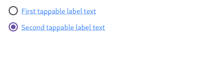
@@ -197,7 +196,7 @@
/// combining [Radio] with other widgets, such as [Text], [Padding] and
/// [InkWell].
///
-/// {@tool dartpad --template=stateful_widget_scaffold_no_null_safety}
+/// {@tool dartpad --template=stateful_widget_scaffold}
///
/// 
///
@@ -207,11 +206,11 @@
/// ```dart preamble
/// class LabeledRadio extends StatelessWidget {
/// const LabeledRadio({
-/// this.label,
-/// this.padding,
-/// this.groupValue,
-/// this.value,
-/// this.onChanged,
+/// required this.label,
+/// required this.padding,
+/// required this.groupValue,
+/// required this.value,
+/// required this.onChanged,
/// });
///
/// final String label;
@@ -234,7 +233,7 @@
/// Radio<bool>(
/// groupValue: groupValue,
/// value: value,
-/// onChanged: (bool newValue) {
+/// onChanged: (bool? newValue) {
/// onChanged(newValue);
/// },
/// ),
@@ -387,12 +386,12 @@
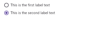
///
/// The default is false.
///
- /// {@tool dartpad --template=stateful_widget_scaffold_no_null_safety}
+ /// {@tool dartpad --template=stateful_widget_scaffold}
/// This example shows how to enable deselecting a radio button by setting the
/// [toggleable] attribute.
///
/// ```dart
- /// int groupValue;
+ /// int? groupValue;
/// static const List<String> selections = <String>[
/// 'Hercules Mulligan',
/// 'Eliza Hamilton',
@@ -411,7 +410,7 @@
/// groupValue: groupValue,
/// toggleable: true,
/// title: Text(selections[index]),
- /// onChanged: (int value) {
+ /// onChanged: (int? value) {
/// setState(() {
/// groupValue = value;
/// });
diff --git a/packages/flutter/lib/src/material/raised_button.dart b/packages/flutter/lib/src/material/raised_button.dart
index 87bc325..e214ab8 100644
--- a/packages/flutter/lib/src/material/raised_button.dart
+++ b/packages/flutter/lib/src/material/raised_button.dart
@@ -43,7 +43,7 @@
 /// Raised buttons have a minimum size of 88.0 by 36.0 which can be overridden
 /// with [ButtonTheme].
 ///
-/// {@tool dartpad --template=stateless_widget_scaffold_no_null_safety}
+/// {@tool dartpad --template=stateless_widget_scaffold}
 ///
 /// This sample shows how to render a disabled RaisedButton, an enabled RaisedButton
 /// and lastly a RaisedButton with gradient background.
diff --git a/packages/flutter/lib/src/material/snack_bar.dart b/packages/flutter/lib/src/material/snack_bar.dart
index 99b9941..29709a1 100644
--- a/packages/flutter/lib/src/material/snack_bar.dart
+++ b/packages/flutter/lib/src/material/snack_bar.dart
@@ -158,7 +158,7 @@
 /// A SnackBar with an action will not time out when TalkBack or VoiceOver are
 /// enabled. This is controlled by [AccessibilityFeatures.accessibleNavigation].
 ///
-/// {@tool dartpad --template=stateless_widget_scaffold_center_no_null_safety}
+/// {@tool dartpad --template=stateless_widget_scaffold_center}
 ///
 /// Here is an example of a [SnackBar] with an [action] button implemented using
 /// [SnackBarAction].
@@ -185,7 +185,7 @@
 /// ```
 /// {@end-tool}
 ///
-/// {@tool dartpad --template=stateless_widget_scaffold_center_no_null_safety}
+/// {@tool dartpad --template=stateless_widget_scaffold_center}
 ///
 /// Here is an example of a customized [SnackBar]. It utilizes
 /// [behavior], [shape], [padding], [width], and [duration] to customize the