| // Copyright 2014 The Flutter Authors. All rights reserved. |
| // Use of this source code is governed by a BSD-style license that can be |
| // found in the LICENSE file. |
| |
| |
| import 'dart:math' as math; |
| |
| import 'package:flutter/foundation.dart'; |
| |
| import 'basic_types.dart'; |
| import 'border_radius.dart'; |
| import 'box_border.dart'; |
| import 'box_shadow.dart'; |
| import 'colors.dart'; |
| import 'decoration.dart'; |
| import 'decoration_image.dart'; |
| import 'edge_insets.dart'; |
| import 'gradient.dart'; |
| import 'image_provider.dart'; |
| |
| /// An immutable description of how to paint a box. |
| /// |
| /// The [BoxDecoration] class provides a variety of ways to draw a box. |
| /// |
| /// The box has a [border], a body, and may cast a [boxShadow]. |
| /// |
| /// The [shape] of the box can be a circle or a rectangle. If it is a rectangle, |
| /// then the [borderRadius] property controls the roundness of the corners. |
| /// |
| /// The body of the box is painted in layers. The bottom-most layer is the |
| /// [color], which fills the box. Above that is the [gradient], which also fills |
| /// the box. Finally there is the [image], the precise alignment of which is |
| /// controlled by the [DecorationImage] class. |
| /// |
| /// The [border] paints over the body; the [boxShadow], naturally, paints below it. |
| /// |
| /// {@tool snippet} |
| /// |
| /// The following applies a [BoxDecoration] to a [Container] widget to draw an |
| /// [image] of an owl with a thick black [border] and rounded corners. |
| /// |
| /// 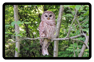 |
| /// |
| /// ```dart |
| /// Container( |
| /// decoration: BoxDecoration( |
| /// color: const Color(0xff7c94b6), |
| /// image: const DecorationImage( |
| /// image: NetworkImage('https://flutter.github.io/assets-for-api-docs/assets/widgets/owl-2.jpg'), |
| /// fit: BoxFit.cover, |
| /// ), |
| /// border: Border.all( |
| /// color: Colors.black, |
| /// width: 8, |
| /// ), |
| /// borderRadius: BorderRadius.circular(12), |
| /// ), |
| /// ) |
| /// ``` |
| /// {@end-tool} |
| /// |
| /// {@template flutter.painting.BoxDecoration.clip} |
| /// The [shape] or the [borderRadius] won't clip the children of the |
| /// decorated [Container]. If the clip is required, insert a clip widget |
| /// (e.g., [ClipRect], [ClipRRect], [ClipPath]) as the child of the [Container]. |
| /// Be aware that clipping may be costly in terms of performance. |
| /// {@endtemplate} |
| /// |
| /// See also: |
| /// |
| /// * [DecoratedBox] and [Container], widgets that can be configured with |
| /// [BoxDecoration] objects. |
| /// * [CustomPaint], a widget that lets you draw arbitrary graphics. |
| /// * [Decoration], the base class which lets you define other decorations. |
| class BoxDecoration extends Decoration { |
| /// Creates a box decoration. |
| /// |
| /// * If [color] is null, this decoration does not paint a background color. |
| /// * If [image] is null, this decoration does not paint a background image. |
| /// * If [border] is null, this decoration does not paint a border. |
| /// * If [borderRadius] is null, this decoration uses more efficient background |
| /// painting commands. The [borderRadius] argument must be null if [shape] is |
| /// [BoxShape.circle]. |
| /// * If [boxShadow] is null, this decoration does not paint a shadow. |
| /// * If [gradient] is null, this decoration does not paint gradients. |
| /// * If [backgroundBlendMode] is null, this decoration paints with [BlendMode.srcOver] |
| /// |
| /// The [shape] argument must not be null. |
| const BoxDecoration({ |
| this.color, |
| this.image, |
| this.border, |
| this.borderRadius, |
| this.boxShadow, |
| this.gradient, |
| this.backgroundBlendMode, |
| this.shape = BoxShape.rectangle, |
| }) : assert(shape != null), |
| assert( |
| backgroundBlendMode == null || color != null || gradient != null, |
| "backgroundBlendMode applies to BoxDecoration's background color or " |
| 'gradient, but no color or gradient was provided.', |
| ); |
| |
| /// Creates a copy of this object but with the given fields replaced with the |
| /// new values. |
| BoxDecoration copyWith({ |
| Color? color, |
| DecorationImage? image, |
| BoxBorder? border, |
| BorderRadiusGeometry? borderRadius, |
| List<BoxShadow>? boxShadow, |
| Gradient? gradient, |
| BlendMode? backgroundBlendMode, |
| BoxShape? shape, |
| }) { |
| return BoxDecoration( |
| color: color ?? this.color, |
| image: image ?? this.image, |
| border: border ?? this.border, |
| borderRadius: borderRadius ?? this.borderRadius, |
| boxShadow: boxShadow ?? this.boxShadow, |
| gradient: gradient ?? this.gradient, |
| backgroundBlendMode: backgroundBlendMode ?? this.backgroundBlendMode, |
| shape: shape ?? this.shape, |
| ); |
| } |
| |
| @override |
| bool debugAssertIsValid() { |
| assert(shape != BoxShape.circle || borderRadius == null); // Can't have a border radius if you're a circle. |
| return super.debugAssertIsValid(); |
| } |
| |
| /// The color to fill in the background of the box. |
| /// |
| /// The color is filled into the [shape] of the box (e.g., either a rectangle, |
| /// potentially with a [borderRadius], or a circle). |
| /// |
| /// This is ignored if [gradient] is non-null. |
| /// |
| /// The [color] is drawn under the [image]. |
| final Color? color; |
| |
| /// An image to paint above the background [color] or [gradient]. |
| /// |
| /// If [shape] is [BoxShape.circle] then the image is clipped to the circle's |
| /// boundary; if [borderRadius] is non-null then the image is clipped to the |
| /// given radii. |
| final DecorationImage? image; |
| |
| /// A border to draw above the background [color], [gradient], or [image]. |
| /// |
| /// Follows the [shape] and [borderRadius]. |
| /// |
| /// Use [Border] objects to describe borders that do not depend on the reading |
| /// direction. |
| /// |
| /// Use [BoxBorder] objects to describe borders that should flip their left |
| /// and right edges based on whether the text is being read left-to-right or |
| /// right-to-left. |
| final BoxBorder? border; |
| |
| /// If non-null, the corners of this box are rounded by this [BorderRadius]. |
| /// |
| /// Applies only to boxes with rectangular shapes; ignored if [shape] is not |
| /// [BoxShape.rectangle]. |
| /// |
| /// {@macro flutter.painting.BoxDecoration.clip} |
| final BorderRadiusGeometry? borderRadius; |
| |
| /// A list of shadows cast by this box behind the box. |
| /// |
| /// The shadow follows the [shape] of the box. |
| /// |
| /// See also: |
| /// |
| /// * [kElevationToShadow], for some predefined shadows used in Material |
| /// Design. |
| /// * [PhysicalModel], a widget for showing shadows. |
| final List<BoxShadow>? boxShadow; |
| |
| /// A gradient to use when filling the box. |
| /// |
| /// If this is specified, [color] has no effect. |
| /// |
| /// The [gradient] is drawn under the [image]. |
| final Gradient? gradient; |
| |
| /// The blend mode applied to the [color] or [gradient] background of the box. |
| /// |
| /// If no [backgroundBlendMode] is provided then the default painting blend |
| /// mode is used. |
| /// |
| /// If no [color] or [gradient] is provided then the blend mode has no impact. |
| final BlendMode? backgroundBlendMode; |
| |
| /// The shape to fill the background [color], [gradient], and [image] into and |
| /// to cast as the [boxShadow]. |
| /// |
| /// If this is [BoxShape.circle] then [borderRadius] is ignored. |
| /// |
| /// The [shape] cannot be interpolated; animating between two [BoxDecoration]s |
| /// with different [shape]s will result in a discontinuity in the rendering. |
| /// To interpolate between two shapes, consider using [ShapeDecoration] and |
| /// different [ShapeBorder]s; in particular, [CircleBorder] instead of |
| /// [BoxShape.circle] and [RoundedRectangleBorder] instead of |
| /// [BoxShape.rectangle]. |
| /// |
| /// {@macro flutter.painting.BoxDecoration.clip} |
| final BoxShape shape; |
| |
| @override |
| EdgeInsetsGeometry? get padding => border?.dimensions; |
| |
| @override |
| Path getClipPath(Rect rect, TextDirection textDirection) { |
| switch (shape) { |
| case BoxShape.circle: |
| final Offset center = rect.center; |
| final double radius = rect.shortestSide / 2.0; |
| final Rect square = Rect.fromCircle(center: center, radius: radius); |
| return Path()..addOval(square); |
| case BoxShape.rectangle: |
| if (borderRadius != null) |
| return Path()..addRRect(borderRadius!.resolve(textDirection).toRRect(rect)); |
| return Path()..addRect(rect); |
| } |
| } |
| |
| /// Returns a new box decoration that is scaled by the given factor. |
| BoxDecoration scale(double factor) { |
| return BoxDecoration( |
| color: Color.lerp(null, color, factor), |
| image: image, // TODO(ianh): fade the image from transparent |
| border: BoxBorder.lerp(null, border, factor), |
| borderRadius: BorderRadiusGeometry.lerp(null, borderRadius, factor), |
| boxShadow: BoxShadow.lerpList(null, boxShadow, factor), |
| gradient: gradient?.scale(factor), |
| shape: shape, |
| ); |
| } |
| |
| @override |
| bool get isComplex => boxShadow != null; |
| |
| @override |
| BoxDecoration? lerpFrom(Decoration? a, double t) { |
| if (a == null) |
| return scale(t); |
| if (a is BoxDecoration) |
| return BoxDecoration.lerp(a, this, t); |
| return super.lerpFrom(a, t) as BoxDecoration?; |
| } |
| |
| @override |
| BoxDecoration? lerpTo(Decoration? b, double t) { |
| if (b == null) |
| return scale(1.0 - t); |
| if (b is BoxDecoration) |
| return BoxDecoration.lerp(this, b, t); |
| return super.lerpTo(b, t) as BoxDecoration?; |
| } |
| |
| /// Linearly interpolate between two box decorations. |
| /// |
| /// Interpolates each parameter of the box decoration separately. |
| /// |
| /// The [shape] is not interpolated. To interpolate the shape, consider using |
| /// a [ShapeDecoration] with different border shapes. |
| /// |
| /// If both values are null, this returns null. Otherwise, it returns a |
| /// non-null value. If one of the values is null, then the result is obtained |
| /// by applying [scale] to the other value. If neither value is null and `t == |
| /// 0.0`, then `a` is returned unmodified; if `t == 1.0` then `b` is returned |
| /// unmodified. Otherwise, the values are computed by interpolating the |
| /// properties appropriately. |
| /// |
| /// {@macro dart.ui.shadow.lerp} |
| /// |
| /// See also: |
| /// |
| /// * [Decoration.lerp], which can interpolate between any two types of |
| /// [Decoration]s, not just [BoxDecoration]s. |
| /// * [lerpFrom] and [lerpTo], which are used to implement [Decoration.lerp] |
| /// and which use [BoxDecoration.lerp] when interpolating two |
| /// [BoxDecoration]s or a [BoxDecoration] to or from null. |
| static BoxDecoration? lerp(BoxDecoration? a, BoxDecoration? b, double t) { |
| assert(t != null); |
| if (a == null && b == null) |
| return null; |
| if (a == null) |
| return b!.scale(t); |
| if (b == null) |
| return a.scale(1.0 - t); |
| if (t == 0.0) |
| return a; |
| if (t == 1.0) |
| return b; |
| return BoxDecoration( |
| color: Color.lerp(a.color, b.color, t), |
| image: t < 0.5 ? a.image : b.image, // TODO(ianh): cross-fade the image |
| border: BoxBorder.lerp(a.border, b.border, t), |
| borderRadius: BorderRadiusGeometry.lerp(a.borderRadius, b.borderRadius, t), |
| boxShadow: BoxShadow.lerpList(a.boxShadow, b.boxShadow, t), |
| gradient: Gradient.lerp(a.gradient, b.gradient, t), |
| shape: t < 0.5 ? a.shape : b.shape, |
| ); |
| } |
| |
| @override |
| bool operator ==(Object other) { |
| if (identical(this, other)) |
| return true; |
| if (other.runtimeType != runtimeType) |
| return false; |
| return other is BoxDecoration |
| && other.color == color |
| && other.image == image |
| && other.border == border |
| && other.borderRadius == borderRadius |
| && listEquals<BoxShadow>(other.boxShadow, boxShadow) |
| && other.gradient == gradient |
| && other.shape == shape; |
| } |
| |
| @override |
| int get hashCode { |
| return hashValues( |
| color, |
| image, |
| border, |
| borderRadius, |
| hashList(boxShadow), |
| gradient, |
| shape, |
| ); |
| } |
| |
| @override |
| void debugFillProperties(DiagnosticPropertiesBuilder properties) { |
| super.debugFillProperties(properties); |
| properties |
| ..defaultDiagnosticsTreeStyle = DiagnosticsTreeStyle.whitespace |
| ..emptyBodyDescription = '<no decorations specified>'; |
| |
| properties.add(ColorProperty('color', color, defaultValue: null)); |
| properties.add(DiagnosticsProperty<DecorationImage>('image', image, defaultValue: null)); |
| properties.add(DiagnosticsProperty<BoxBorder>('border', border, defaultValue: null)); |
| properties.add(DiagnosticsProperty<BorderRadiusGeometry>('borderRadius', borderRadius, defaultValue: null)); |
| properties.add(IterableProperty<BoxShadow>('boxShadow', boxShadow, defaultValue: null, style: DiagnosticsTreeStyle.whitespace)); |
| properties.add(DiagnosticsProperty<Gradient>('gradient', gradient, defaultValue: null)); |
| properties.add(EnumProperty<BoxShape>('shape', shape, defaultValue: BoxShape.rectangle)); |
| } |
| |
| @override |
| bool hitTest(Size size, Offset position, { TextDirection? textDirection }) { |
| assert(shape != null); |
| assert((Offset.zero & size).contains(position)); |
| switch (shape) { |
| case BoxShape.rectangle: |
| if (borderRadius != null) { |
| final RRect bounds = borderRadius!.resolve(textDirection).toRRect(Offset.zero & size); |
| return bounds.contains(position); |
| } |
| return true; |
| case BoxShape.circle: |
| // Circles are inscribed into our smallest dimension. |
| final Offset center = size.center(Offset.zero); |
| final double distance = (position - center).distance; |
| return distance <= math.min(size.width, size.height) / 2.0; |
| } |
| } |
| |
| @override |
| BoxPainter createBoxPainter([ VoidCallback? onChanged ]) { |
| assert(onChanged != null || image == null); |
| return _BoxDecorationPainter(this, onChanged); |
| } |
| } |
| |
| /// An object that paints a [BoxDecoration] into a canvas. |
| class _BoxDecorationPainter extends BoxPainter { |
| _BoxDecorationPainter(this._decoration, VoidCallback? onChanged) |
| : assert(_decoration != null), |
| super(onChanged); |
| |
| final BoxDecoration _decoration; |
| |
| Paint? _cachedBackgroundPaint; |
| Rect? _rectForCachedBackgroundPaint; |
| Paint _getBackgroundPaint(Rect rect, TextDirection? textDirection) { |
| assert(rect != null); |
| assert(_decoration.gradient != null || _rectForCachedBackgroundPaint == null); |
| |
| if (_cachedBackgroundPaint == null || |
| (_decoration.gradient != null && _rectForCachedBackgroundPaint != rect)) { |
| final Paint paint = Paint(); |
| if (_decoration.backgroundBlendMode != null) |
| paint.blendMode = _decoration.backgroundBlendMode!; |
| if (_decoration.color != null) |
| paint.color = _decoration.color!; |
| if (_decoration.gradient != null) { |
| paint.shader = _decoration.gradient!.createShader(rect, textDirection: textDirection); |
| _rectForCachedBackgroundPaint = rect; |
| } |
| _cachedBackgroundPaint = paint; |
| } |
| |
| return _cachedBackgroundPaint!; |
| } |
| |
| void _paintBox(Canvas canvas, Rect rect, Paint paint, TextDirection? textDirection) { |
| switch (_decoration.shape) { |
| case BoxShape.circle: |
| assert(_decoration.borderRadius == null); |
| final Offset center = rect.center; |
| final double radius = rect.shortestSide / 2.0; |
| canvas.drawCircle(center, radius, paint); |
| break; |
| case BoxShape.rectangle: |
| if (_decoration.borderRadius == null) { |
| canvas.drawRect(rect, paint); |
| } else { |
| canvas.drawRRect(_decoration.borderRadius!.resolve(textDirection).toRRect(rect), paint); |
| } |
| break; |
| } |
| } |
| |
| void _paintShadows(Canvas canvas, Rect rect, TextDirection? textDirection) { |
| if (_decoration.boxShadow == null) |
| return; |
| for (final BoxShadow boxShadow in _decoration.boxShadow!) { |
| final Paint paint = boxShadow.toPaint(); |
| final Rect bounds = rect.shift(boxShadow.offset).inflate(boxShadow.spreadRadius); |
| _paintBox(canvas, bounds, paint, textDirection); |
| } |
| } |
| |
| void _paintBackgroundColor(Canvas canvas, Rect rect, TextDirection? textDirection) { |
| if (_decoration.color != null || _decoration.gradient != null) |
| _paintBox(canvas, rect, _getBackgroundPaint(rect, textDirection), textDirection); |
| } |
| |
| DecorationImagePainter? _imagePainter; |
| void _paintBackgroundImage(Canvas canvas, Rect rect, ImageConfiguration configuration) { |
| if (_decoration.image == null) |
| return; |
| _imagePainter ??= _decoration.image!.createPainter(onChanged!); |
| Path? clipPath; |
| switch (_decoration.shape) { |
| case BoxShape.circle: |
| assert(_decoration.borderRadius == null); |
| final Offset center = rect.center; |
| final double radius = rect.shortestSide / 2.0; |
| final Rect square = Rect.fromCircle(center: center, radius: radius); |
| clipPath = Path()..addOval(square); |
| break; |
| case BoxShape.rectangle: |
| if (_decoration.borderRadius != null) |
| clipPath = Path()..addRRect(_decoration.borderRadius!.resolve(configuration.textDirection).toRRect(rect)); |
| break; |
| } |
| _imagePainter!.paint(canvas, rect, clipPath, configuration); |
| } |
| |
| @override |
| void dispose() { |
| _imagePainter?.dispose(); |
| super.dispose(); |
| } |
| |
| /// Paint the box decoration into the given location on the given canvas. |
| @override |
| void paint(Canvas canvas, Offset offset, ImageConfiguration configuration) { |
| assert(configuration != null); |
| assert(configuration.size != null); |
| final Rect rect = offset & configuration.size!; |
| final TextDirection? textDirection = configuration.textDirection; |
| _paintShadows(canvas, rect, textDirection); |
| _paintBackgroundColor(canvas, rect, textDirection); |
| _paintBackgroundImage(canvas, rect, configuration); |
| _decoration.border?.paint( |
| canvas, |
| rect, |
| shape: _decoration.shape, |
| borderRadius: _decoration.borderRadius?.resolve(textDirection), |
| textDirection: configuration.textDirection, |
| ); |
| } |
| |
| @override |
| String toString() { |
| return 'BoxPainter for $_decoration'; |
| } |
| } |