| // Copyright 2014 The Flutter Authors. All rights reserved. |
| // Use of this source code is governed by a BSD-style license that can be |
| // found in the LICENSE file. |
| |
| import 'dart:async'; |
| import 'dart:math' as math; |
| |
| import 'package:flutter/cupertino.dart'; |
| import 'package:flutter/foundation.dart'; |
| import 'package:flutter/gestures.dart'; |
| import 'package:flutter/rendering.dart'; |
| import 'package:flutter/scheduler.dart' show timeDilation; |
| import 'package:flutter/services.dart'; |
| |
| import 'constants.dart'; |
| import 'debug.dart'; |
| import 'material.dart'; |
| import 'material_state.dart'; |
| import 'slider_theme.dart'; |
| import 'theme.dart'; |
| |
| // Examples can assume: |
| // int _dollars = 0; |
| // int _duelCommandment = 1; |
| // void setState(VoidCallback fn) { } |
| |
| /// [Slider] uses this callback to paint the value indicator on the overlay. |
| /// |
| /// Since the value indicator is painted on the Overlay; this method paints the |
| /// value indicator in a [RenderBox] that appears in the [Overlay]. |
| typedef PaintValueIndicator = void Function(PaintingContext context, Offset offset); |
| |
| enum _SliderType { material, adaptive } |
| |
| /// A Material Design slider. |
| /// |
| /// Used to select from a range of values. |
| /// |
| /// {@youtube 560 315 https://www.youtube.com/watch?v=ufb4gIPDmEs} |
| /// |
| /// {@tool dartpad} |
| /// 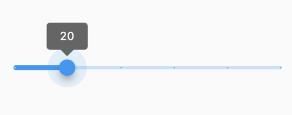 |
| /// |
| /// The Sliders value is part of the Stateful widget subclass to change the value |
| /// setState was called. |
| /// |
| /// ** See code in examples/api/lib/material/slider/slider.0.dart ** |
| /// {@end-tool} |
| /// |
| /// A slider can be used to select from either a continuous or a discrete set of |
| /// values. The default is to use a continuous range of values from [min] to |
| /// [max]. To use discrete values, use a non-null value for [divisions], which |
| /// indicates the number of discrete intervals. For example, if [min] is 0.0 and |
| /// [max] is 50.0 and [divisions] is 5, then the slider can take on the |
| /// discrete values 0.0, 10.0, 20.0, 30.0, 40.0, and 50.0. |
| /// |
| /// The terms for the parts of a slider are: |
| /// |
| /// * The "thumb", which is a shape that slides horizontally when the user |
| /// drags it. |
| /// * The "track", which is the line that the slider thumb slides along. |
| /// * The "value indicator", which is a shape that pops up when the user |
| /// is dragging the thumb to indicate the value being selected. |
| /// * The "active" side of the slider is the side between the thumb and the |
| /// minimum value. |
| /// * The "inactive" side of the slider is the side between the thumb and the |
| /// maximum value. |
| /// |
| /// The slider will be disabled if [onChanged] is null or if the range given by |
| /// [min]..[max] is empty (i.e. if [min] is equal to [max]). |
| /// |
| /// The slider widget itself does not maintain any state. Instead, when the state |
| /// of the slider changes, the widget calls the [onChanged] callback. Most |
| /// widgets that use a slider will listen for the [onChanged] callback and |
| /// rebuild the slider with a new [value] to update the visual appearance of the |
| /// slider. To know when the value starts to change, or when it is done |
| /// changing, set the optional callbacks [onChangeStart] and/or [onChangeEnd]. |
| /// |
| /// By default, a slider will be as wide as possible, centered vertically. When |
| /// given unbounded constraints, it will attempt to make the track 144 pixels |
| /// wide (with margins on each side) and will shrink-wrap vertically. |
| /// |
| /// Requires one of its ancestors to be a [Material] widget. |
| /// |
| /// Requires one of its ancestors to be a [MediaQuery] widget. Typically, these |
| /// are introduced by the [MaterialApp] or [WidgetsApp] widget at the top of |
| /// your application widget tree. |
| /// |
| /// To determine how it should be displayed (e.g. colors, thumb shape, etc.), |
| /// a slider uses the [SliderThemeData] available from either a [SliderTheme] |
| /// widget or the [ThemeData.sliderTheme] a [Theme] widget above it in the |
| /// widget tree. You can also override some of the colors with the [activeColor] |
| /// and [inactiveColor] properties, although more fine-grained control of the |
| /// look is achieved using a [SliderThemeData]. |
| /// |
| /// See also: |
| /// |
| /// * [SliderTheme] and [SliderThemeData] for information about controlling |
| /// the visual appearance of the slider. |
| /// * [Radio], for selecting among a set of explicit values. |
| /// * [Checkbox] and [Switch], for toggling a particular value on or off. |
| /// * <https://material.io/design/components/sliders.html> |
| /// * [MediaQuery], from which the text scale factor is obtained. |
| class Slider extends StatefulWidget { |
| /// Creates a Material Design slider. |
| /// |
| /// The slider itself does not maintain any state. Instead, when the state of |
| /// the slider changes, the widget calls the [onChanged] callback. Most |
| /// widgets that use a slider will listen for the [onChanged] callback and |
| /// rebuild the slider with a new [value] to update the visual appearance of |
| /// the slider. |
| /// |
| /// * [value] determines currently selected value for this slider. |
| /// * [onChanged] is called while the user is selecting a new value for the |
| /// slider. |
| /// * [onChangeStart] is called when the user starts to select a new value for |
| /// the slider. |
| /// * [onChangeEnd] is called when the user is done selecting a new value for |
| /// the slider. |
| /// |
| /// You can override some of the colors with the [activeColor] and |
| /// [inactiveColor] properties, although more fine-grained control of the |
| /// appearance is achieved using a [SliderThemeData]. |
| const Slider({ |
| Key? key, |
| required this.value, |
| required this.onChanged, |
| this.onChangeStart, |
| this.onChangeEnd, |
| this.min = 0.0, |
| this.max = 1.0, |
| this.divisions, |
| this.label, |
| this.activeColor, |
| this.inactiveColor, |
| this.thumbColor, |
| this.mouseCursor, |
| this.semanticFormatterCallback, |
| this.focusNode, |
| this.autofocus = false, |
| }) : _sliderType = _SliderType.material, |
| assert(value != null), |
| assert(min != null), |
| assert(max != null), |
| assert(min <= max), |
| assert(value >= min && value <= max), |
| assert(divisions == null || divisions > 0), |
| super(key: key); |
| |
| /// Creates an adaptive [Slider] based on the target platform, following |
| /// Material design's |
| /// [Cross-platform guidelines](https://material.io/design/platform-guidance/cross-platform-adaptation.html). |
| /// |
| /// Creates a [CupertinoSlider] if the target platform is iOS, creates a |
| /// Material Design slider otherwise. |
| /// |
| /// If a [CupertinoSlider] is created, the following parameters are |
| /// ignored: [label], [inactiveColor], [semanticFormatterCallback]. |
| /// |
| /// The target platform is based on the current [Theme]: [ThemeData.platform]. |
| const Slider.adaptive({ |
| Key? key, |
| required this.value, |
| required this.onChanged, |
| this.onChangeStart, |
| this.onChangeEnd, |
| this.min = 0.0, |
| this.max = 1.0, |
| this.divisions, |
| this.label, |
| this.mouseCursor, |
| this.activeColor, |
| this.inactiveColor, |
| this.thumbColor, |
| this.semanticFormatterCallback, |
| this.focusNode, |
| this.autofocus = false, |
| }) : _sliderType = _SliderType.adaptive, |
| assert(value != null), |
| assert(min != null), |
| assert(max != null), |
| assert(min <= max), |
| assert(value >= min && value <= max), |
| assert(divisions == null || divisions > 0), |
| super(key: key); |
| |
| /// The currently selected value for this slider. |
| /// |
| /// The slider's thumb is drawn at a position that corresponds to this value. |
| final double value; |
| |
| /// Called during a drag when the user is selecting a new value for the slider |
| /// by dragging. |
| /// |
| /// The slider passes the new value to the callback but does not actually |
| /// change state until the parent widget rebuilds the slider with the new |
| /// value. |
| /// |
| /// If null, the slider will be displayed as disabled. |
| /// |
| /// The callback provided to onChanged should update the state of the parent |
| /// [StatefulWidget] using the [State.setState] method, so that the parent |
| /// gets rebuilt; for example: |
| /// |
| /// {@tool snippet} |
| /// |
| /// ```dart |
| /// Slider( |
| /// value: _duelCommandment.toDouble(), |
| /// min: 1.0, |
| /// max: 10.0, |
| /// divisions: 10, |
| /// label: '$_duelCommandment', |
| /// onChanged: (double newValue) { |
| /// setState(() { |
| /// _duelCommandment = newValue.round(); |
| /// }); |
| /// }, |
| /// ) |
| /// ``` |
| /// {@end-tool} |
| /// |
| /// See also: |
| /// |
| /// * [onChangeStart] for a callback that is called when the user starts |
| /// changing the value. |
| /// * [onChangeEnd] for a callback that is called when the user stops |
| /// changing the value. |
| final ValueChanged<double>? onChanged; |
| |
| /// Called when the user starts selecting a new value for the slider. |
| /// |
| /// This callback shouldn't be used to update the slider [value] (use |
| /// [onChanged] for that), but rather to be notified when the user has started |
| /// selecting a new value by starting a drag or with a tap. |
| /// |
| /// The value passed will be the last [value] that the slider had before the |
| /// change began. |
| /// |
| /// {@tool snippet} |
| /// |
| /// ```dart |
| /// Slider( |
| /// value: _duelCommandment.toDouble(), |
| /// min: 1.0, |
| /// max: 10.0, |
| /// divisions: 10, |
| /// label: '$_duelCommandment', |
| /// onChanged: (double newValue) { |
| /// setState(() { |
| /// _duelCommandment = newValue.round(); |
| /// }); |
| /// }, |
| /// onChangeStart: (double startValue) { |
| /// print('Started change at $startValue'); |
| /// }, |
| /// ) |
| /// ``` |
| /// {@end-tool} |
| /// |
| /// See also: |
| /// |
| /// * [onChangeEnd] for a callback that is called when the value change is |
| /// complete. |
| final ValueChanged<double>? onChangeStart; |
| |
| /// Called when the user is done selecting a new value for the slider. |
| /// |
| /// This callback shouldn't be used to update the slider [value] (use |
| /// [onChanged] for that), but rather to know when the user has completed |
| /// selecting a new [value] by ending a drag or a click. |
| /// |
| /// {@tool snippet} |
| /// |
| /// ```dart |
| /// Slider( |
| /// value: _duelCommandment.toDouble(), |
| /// min: 1.0, |
| /// max: 10.0, |
| /// divisions: 10, |
| /// label: '$_duelCommandment', |
| /// onChanged: (double newValue) { |
| /// setState(() { |
| /// _duelCommandment = newValue.round(); |
| /// }); |
| /// }, |
| /// onChangeEnd: (double newValue) { |
| /// print('Ended change on $newValue'); |
| /// }, |
| /// ) |
| /// ``` |
| /// {@end-tool} |
| /// |
| /// See also: |
| /// |
| /// * [onChangeStart] for a callback that is called when a value change |
| /// begins. |
| final ValueChanged<double>? onChangeEnd; |
| |
| /// The minimum value the user can select. |
| /// |
| /// Defaults to 0.0. Must be less than or equal to [max]. |
| /// |
| /// If the [max] is equal to the [min], then the slider is disabled. |
| final double min; |
| |
| /// The maximum value the user can select. |
| /// |
| /// Defaults to 1.0. Must be greater than or equal to [min]. |
| /// |
| /// If the [max] is equal to the [min], then the slider is disabled. |
| final double max; |
| |
| /// The number of discrete divisions. |
| /// |
| /// Typically used with [label] to show the current discrete value. |
| /// |
| /// If null, the slider is continuous. |
| final int? divisions; |
| |
| /// A label to show above the slider when the slider is active. |
| /// |
| /// It is used to display the value of a discrete slider, and it is displayed |
| /// as part of the value indicator shape. |
| /// |
| /// The label is rendered using the active [ThemeData]'s [TextTheme.bodyText1] |
| /// text style, with the theme data's [ColorScheme.onPrimary] color. The |
| /// label's text style can be overridden with |
| /// [SliderThemeData.valueIndicatorTextStyle]. |
| /// |
| /// If null, then the value indicator will not be displayed. |
| /// |
| /// Ignored if this slider is created with [Slider.adaptive]. |
| /// |
| /// See also: |
| /// |
| /// * [SliderComponentShape] for how to create a custom value indicator |
| /// shape. |
| final String? label; |
| |
| /// The color to use for the portion of the slider track that is active. |
| /// |
| /// The "active" side of the slider is the side between the thumb and the |
| /// minimum value. |
| /// |
| /// Defaults to [SliderThemeData.activeTrackColor] of the current |
| /// [SliderTheme]. |
| /// |
| /// Using a [SliderTheme] gives much more fine-grained control over the |
| /// appearance of various components of the slider. |
| final Color? activeColor; |
| |
| /// The color for the inactive portion of the slider track. |
| /// |
| /// The "inactive" side of the slider is the side between the thumb and the |
| /// maximum value. |
| /// |
| /// Defaults to the [SliderThemeData.inactiveTrackColor] of the current |
| /// [SliderTheme]. |
| /// |
| /// Using a [SliderTheme] gives much more fine-grained control over the |
| /// appearance of various components of the slider. |
| /// |
| /// Ignored if this slider is created with [Slider.adaptive]. |
| final Color? inactiveColor; |
| |
| /// The color of the thumb. |
| /// |
| /// If this color is null: |
| /// * [Slider] will use [activeColor]. |
| /// * [CupertinoSlider] will have a white thumb |
| /// (like the native default iOS slider). |
| final Color? thumbColor; |
| |
| /// The cursor for a mouse pointer when it enters or is hovering over the |
| /// widget. |
| /// |
| /// If [mouseCursor] is a [MaterialStateProperty<MouseCursor>], |
| /// [MaterialStateProperty.resolve] is used for the following [MaterialState]s: |
| /// |
| /// * [MaterialState.hovered]. |
| /// * [MaterialState.focused]. |
| /// * [MaterialState.disabled]. |
| /// |
| /// If this property is null, [MaterialStateMouseCursor.clickable] will be used. |
| final MouseCursor? mouseCursor; |
| |
| /// The callback used to create a semantic value from a slider value. |
| /// |
| /// Defaults to formatting values as a percentage. |
| /// |
| /// This is used by accessibility frameworks like TalkBack on Android to |
| /// inform users what the currently selected value is with more context. |
| /// |
| /// {@tool snippet} |
| /// |
| /// In the example below, a slider for currency values is configured to |
| /// announce a value with a currency label. |
| /// |
| /// ```dart |
| /// Slider( |
| /// value: _dollars.toDouble(), |
| /// min: 20.0, |
| /// max: 330.0, |
| /// label: '$_dollars dollars', |
| /// onChanged: (double newValue) { |
| /// setState(() { |
| /// _dollars = newValue.round(); |
| /// }); |
| /// }, |
| /// semanticFormatterCallback: (double newValue) { |
| /// return '${newValue.round()} dollars'; |
| /// } |
| /// ) |
| /// ``` |
| /// {@end-tool} |
| /// |
| /// Ignored if this slider is created with [Slider.adaptive] |
| final SemanticFormatterCallback? semanticFormatterCallback; |
| |
| /// {@macro flutter.widgets.Focus.focusNode} |
| final FocusNode? focusNode; |
| |
| /// {@macro flutter.widgets.Focus.autofocus} |
| final bool autofocus; |
| |
| final _SliderType _sliderType ; |
| |
| @override |
| State<Slider> createState() => _SliderState(); |
| |
| @override |
| void debugFillProperties(DiagnosticPropertiesBuilder properties) { |
| super.debugFillProperties(properties); |
| properties.add(DoubleProperty('value', value)); |
| properties.add(ObjectFlagProperty<ValueChanged<double>>('onChanged', onChanged, ifNull: 'disabled')); |
| properties.add(ObjectFlagProperty<ValueChanged<double>>.has('onChangeStart', onChangeStart)); |
| properties.add(ObjectFlagProperty<ValueChanged<double>>.has('onChangeEnd', onChangeEnd)); |
| properties.add(DoubleProperty('min', min)); |
| properties.add(DoubleProperty('max', max)); |
| properties.add(IntProperty('divisions', divisions)); |
| properties.add(StringProperty('label', label)); |
| properties.add(ColorProperty('activeColor', activeColor)); |
| properties.add(ColorProperty('inactiveColor', inactiveColor)); |
| properties.add(ObjectFlagProperty<ValueChanged<double>>.has('semanticFormatterCallback', semanticFormatterCallback)); |
| properties.add(ObjectFlagProperty<FocusNode>.has('focusNode', focusNode)); |
| properties.add(FlagProperty('autofocus', value: autofocus, ifTrue: 'autofocus')); |
| } |
| } |
| |
| class _SliderState extends State<Slider> with TickerProviderStateMixin { |
| static const Duration enableAnimationDuration = Duration(milliseconds: 75); |
| static const Duration valueIndicatorAnimationDuration = Duration(milliseconds: 100); |
| |
| // Animation controller that is run when the overlay (a.k.a radial reaction) |
| // is shown in response to user interaction. |
| late AnimationController overlayController; |
| // Animation controller that is run when the value indicator is being shown |
| // or hidden. |
| late AnimationController valueIndicatorController; |
| // Animation controller that is run when enabling/disabling the slider. |
| late AnimationController enableController; |
| // Animation controller that is run when transitioning between one value |
| // and the next on a discrete slider. |
| late AnimationController positionController; |
| Timer? interactionTimer; |
| |
| final GlobalKey _renderObjectKey = GlobalKey(); |
| // Keyboard mapping for a focused slider. |
| final Map<ShortcutActivator, Intent> _shortcutMap = const <ShortcutActivator, Intent>{ |
| SingleActivator(LogicalKeyboardKey.arrowUp): _AdjustSliderIntent.up(), |
| SingleActivator(LogicalKeyboardKey.arrowDown): _AdjustSliderIntent.down(), |
| SingleActivator(LogicalKeyboardKey.arrowLeft): _AdjustSliderIntent.left(), |
| SingleActivator(LogicalKeyboardKey.arrowRight): _AdjustSliderIntent.right(), |
| }; |
| // Action mapping for a focused slider. |
| late Map<Type, Action<Intent>> _actionMap; |
| |
| bool get _enabled => widget.onChanged != null; |
| // Value Indicator Animation that appears on the Overlay. |
| PaintValueIndicator? paintValueIndicator; |
| |
| @override |
| void initState() { |
| super.initState(); |
| overlayController = AnimationController( |
| duration: kRadialReactionDuration, |
| vsync: this, |
| ); |
| valueIndicatorController = AnimationController( |
| duration: valueIndicatorAnimationDuration, |
| vsync: this, |
| ); |
| enableController = AnimationController( |
| duration: enableAnimationDuration, |
| vsync: this, |
| ); |
| positionController = AnimationController( |
| duration: Duration.zero, |
| vsync: this, |
| ); |
| enableController.value = widget.onChanged != null ? 1.0 : 0.0; |
| positionController.value = _unlerp(widget.value); |
| _actionMap = <Type, Action<Intent>>{ |
| _AdjustSliderIntent: CallbackAction<_AdjustSliderIntent>( |
| onInvoke: _actionHandler, |
| ), |
| }; |
| } |
| |
| @override |
| void dispose() { |
| interactionTimer?.cancel(); |
| overlayController.dispose(); |
| valueIndicatorController.dispose(); |
| enableController.dispose(); |
| positionController.dispose(); |
| if (overlayEntry != null) { |
| overlayEntry!.remove(); |
| overlayEntry = null; |
| } |
| super.dispose(); |
| } |
| |
| void _handleChanged(double value) { |
| assert(widget.onChanged != null); |
| final double lerpValue = _lerp(value); |
| if (lerpValue != widget.value) { |
| widget.onChanged!(lerpValue); |
| } |
| } |
| |
| void _handleDragStart(double value) { |
| assert(widget.onChangeStart != null); |
| widget.onChangeStart!(_lerp(value)); |
| } |
| |
| void _handleDragEnd(double value) { |
| assert(widget.onChangeEnd != null); |
| widget.onChangeEnd!(_lerp(value)); |
| } |
| |
| void _actionHandler(_AdjustSliderIntent intent) { |
| final _RenderSlider renderSlider = _renderObjectKey.currentContext!.findRenderObject()! as _RenderSlider; |
| final TextDirection textDirection = Directionality.of(_renderObjectKey.currentContext!); |
| switch (intent.type) { |
| case _SliderAdjustmentType.right: |
| switch (textDirection) { |
| case TextDirection.rtl: |
| renderSlider.decreaseAction(); |
| break; |
| case TextDirection.ltr: |
| renderSlider.increaseAction(); |
| break; |
| } |
| break; |
| case _SliderAdjustmentType.left: |
| switch (textDirection) { |
| case TextDirection.rtl: |
| renderSlider.increaseAction(); |
| break; |
| case TextDirection.ltr: |
| renderSlider.decreaseAction(); |
| break; |
| } |
| break; |
| case _SliderAdjustmentType.up: |
| renderSlider.increaseAction(); |
| break; |
| case _SliderAdjustmentType.down: |
| renderSlider.decreaseAction(); |
| break; |
| } |
| } |
| |
| bool _focused = false; |
| void _handleFocusHighlightChanged(bool focused) { |
| if (focused != _focused) { |
| setState(() { _focused = focused; }); |
| } |
| } |
| |
| bool _hovering = false; |
| void _handleHoverChanged(bool hovering) { |
| if (hovering != _hovering) { |
| setState(() { _hovering = hovering; }); |
| } |
| } |
| |
| // Returns a number between min and max, proportional to value, which must |
| // be between 0.0 and 1.0. |
| double _lerp(double value) { |
| assert(value >= 0.0); |
| assert(value <= 1.0); |
| return value * (widget.max - widget.min) + widget.min; |
| } |
| |
| // Returns a number between 0.0 and 1.0, given a value between min and max. |
| double _unlerp(double value) { |
| assert(value <= widget.max); |
| assert(value >= widget.min); |
| return widget.max > widget.min ? (value - widget.min) / (widget.max - widget.min) : 0.0; |
| } |
| |
| @override |
| Widget build(BuildContext context) { |
| assert(debugCheckHasMaterial(context)); |
| assert(debugCheckHasMediaQuery(context)); |
| |
| switch (widget._sliderType) { |
| case _SliderType.material: |
| return _buildMaterialSlider(context); |
| |
| case _SliderType.adaptive: { |
| final ThemeData theme = Theme.of(context); |
| assert(theme.platform != null); |
| switch (theme.platform) { |
| case TargetPlatform.android: |
| case TargetPlatform.fuchsia: |
| case TargetPlatform.linux: |
| case TargetPlatform.windows: |
| return _buildMaterialSlider(context); |
| case TargetPlatform.iOS: |
| case TargetPlatform.macOS: |
| return _buildCupertinoSlider(context); |
| } |
| } |
| } |
| } |
| |
| Widget _buildMaterialSlider(BuildContext context) { |
| final ThemeData theme = Theme.of(context); |
| SliderThemeData sliderTheme = SliderTheme.of(context); |
| |
| // If the widget has active or inactive colors specified, then we plug them |
| // in to the slider theme as best we can. If the developer wants more |
| // control than that, then they need to use a SliderTheme. The default |
| // colors come from the ThemeData.colorScheme. These colors, along with |
| // the default shapes and text styles are aligned to the Material |
| // Guidelines. |
| |
| const double _defaultTrackHeight = 4; |
| const SliderTrackShape _defaultTrackShape = RoundedRectSliderTrackShape(); |
| const SliderTickMarkShape _defaultTickMarkShape = RoundSliderTickMarkShape(); |
| const SliderComponentShape _defaultOverlayShape = RoundSliderOverlayShape(); |
| const SliderComponentShape _defaultThumbShape = RoundSliderThumbShape(); |
| const SliderComponentShape _defaultValueIndicatorShape = RectangularSliderValueIndicatorShape(); |
| const ShowValueIndicator _defaultShowValueIndicator = ShowValueIndicator.onlyForDiscrete; |
| |
| // The value indicator's color is not the same as the thumb and active track |
| // (which can be defined by activeColor) if the |
| // RectangularSliderValueIndicatorShape is used. In all other cases, the |
| // value indicator is assumed to be the same as the active color. |
| final SliderComponentShape valueIndicatorShape = sliderTheme.valueIndicatorShape ?? _defaultValueIndicatorShape; |
| final Color valueIndicatorColor; |
| if (valueIndicatorShape is RectangularSliderValueIndicatorShape) { |
| valueIndicatorColor = sliderTheme.valueIndicatorColor ?? Color.alphaBlend(theme.colorScheme.onSurface.withOpacity(0.60), theme.colorScheme.surface.withOpacity(0.90)); |
| } else { |
| valueIndicatorColor = widget.activeColor ?? sliderTheme.valueIndicatorColor ?? theme.colorScheme.primary; |
| } |
| |
| sliderTheme = sliderTheme.copyWith( |
| trackHeight: sliderTheme.trackHeight ?? _defaultTrackHeight, |
| activeTrackColor: widget.activeColor ?? sliderTheme.activeTrackColor ?? theme.colorScheme.primary, |
| inactiveTrackColor: widget.inactiveColor ?? sliderTheme.inactiveTrackColor ?? theme.colorScheme.primary.withOpacity(0.24), |
| disabledActiveTrackColor: sliderTheme.disabledActiveTrackColor ?? theme.colorScheme.onSurface.withOpacity(0.32), |
| disabledInactiveTrackColor: sliderTheme.disabledInactiveTrackColor ?? theme.colorScheme.onSurface.withOpacity(0.12), |
| activeTickMarkColor: widget.inactiveColor ?? sliderTheme.activeTickMarkColor ?? theme.colorScheme.onPrimary.withOpacity(0.54), |
| inactiveTickMarkColor: widget.activeColor ?? sliderTheme.inactiveTickMarkColor ?? theme.colorScheme.primary.withOpacity(0.54), |
| disabledActiveTickMarkColor: sliderTheme.disabledActiveTickMarkColor ?? theme.colorScheme.onPrimary.withOpacity(0.12), |
| disabledInactiveTickMarkColor: sliderTheme.disabledInactiveTickMarkColor ?? theme.colorScheme.onSurface.withOpacity(0.12), |
| thumbColor: widget.thumbColor ?? widget.activeColor ?? sliderTheme.thumbColor ?? theme.colorScheme.primary, |
| disabledThumbColor: sliderTheme.disabledThumbColor ?? Color.alphaBlend(theme.colorScheme.onSurface.withOpacity(.38), theme.colorScheme.surface), |
| overlayColor: widget.activeColor?.withOpacity(0.12) ?? sliderTheme.overlayColor ?? theme.colorScheme.primary.withOpacity(0.12), |
| valueIndicatorColor: valueIndicatorColor, |
| trackShape: sliderTheme.trackShape ?? _defaultTrackShape, |
| tickMarkShape: sliderTheme.tickMarkShape ?? _defaultTickMarkShape, |
| thumbShape: sliderTheme.thumbShape ?? _defaultThumbShape, |
| overlayShape: sliderTheme.overlayShape ?? _defaultOverlayShape, |
| valueIndicatorShape: valueIndicatorShape, |
| showValueIndicator: sliderTheme.showValueIndicator ?? _defaultShowValueIndicator, |
| valueIndicatorTextStyle: sliderTheme.valueIndicatorTextStyle ?? theme.textTheme.bodyText1!.copyWith( |
| color: theme.colorScheme.onPrimary, |
| ), |
| ); |
| final MouseCursor effectiveMouseCursor = MaterialStateProperty.resolveAs<MouseCursor>( |
| widget.mouseCursor ?? MaterialStateMouseCursor.clickable, |
| <MaterialState>{ |
| if (!_enabled) MaterialState.disabled, |
| if (_hovering) MaterialState.hovered, |
| if (_focused) MaterialState.focused, |
| }, |
| ); |
| |
| // This size is used as the max bounds for the painting of the value |
| // indicators It must be kept in sync with the function with the same name |
| // in range_slider.dart. |
| Size _screenSize() => MediaQuery.of(context).size; |
| |
| return Semantics( |
| container: true, |
| slider: true, |
| child: FocusableActionDetector( |
| actions: _actionMap, |
| shortcuts: _shortcutMap, |
| focusNode: widget.focusNode, |
| autofocus: widget.autofocus, |
| enabled: _enabled, |
| onShowFocusHighlight: _handleFocusHighlightChanged, |
| onShowHoverHighlight: _handleHoverChanged, |
| mouseCursor: effectiveMouseCursor, |
| child: CompositedTransformTarget( |
| link: _layerLink, |
| child: _SliderRenderObjectWidget( |
| key: _renderObjectKey, |
| value: _unlerp(widget.value), |
| divisions: widget.divisions, |
| label: widget.label, |
| sliderTheme: sliderTheme, |
| textScaleFactor: MediaQuery.of(context).textScaleFactor, |
| screenSize: _screenSize(), |
| onChanged: (widget.onChanged != null) && (widget.max > widget.min) ? _handleChanged : null, |
| onChangeStart: widget.onChangeStart != null ? _handleDragStart : null, |
| onChangeEnd: widget.onChangeEnd != null ? _handleDragEnd : null, |
| state: this, |
| semanticFormatterCallback: widget.semanticFormatterCallback, |
| hasFocus: _focused, |
| hovering: _hovering, |
| ), |
| ), |
| ), |
| ); |
| } |
| |
| Widget _buildCupertinoSlider(BuildContext context) { |
| // The render box of a slider has a fixed height but takes up the available |
| // width. Wrapping the [CupertinoSlider] in this manner will help maintain |
| // the same size. |
| return SizedBox( |
| width: double.infinity, |
| child: CupertinoSlider( |
| value: widget.value, |
| onChanged: widget.onChanged, |
| onChangeStart: widget.onChangeStart, |
| onChangeEnd: widget.onChangeEnd, |
| min: widget.min, |
| max: widget.max, |
| divisions: widget.divisions, |
| activeColor: widget.activeColor, |
| thumbColor: widget.thumbColor ?? CupertinoColors.white, |
| ), |
| ); |
| } |
| final LayerLink _layerLink = LayerLink(); |
| |
| OverlayEntry? overlayEntry; |
| |
| void showValueIndicator() { |
| if (overlayEntry == null) { |
| overlayEntry = OverlayEntry( |
| builder: (BuildContext context) { |
| return CompositedTransformFollower( |
| link: _layerLink, |
| child: _ValueIndicatorRenderObjectWidget( |
| state: this, |
| ), |
| ); |
| }, |
| ); |
| Overlay.of(context)!.insert(overlayEntry!); |
| } |
| } |
| } |
| |
| |
| class _SliderRenderObjectWidget extends LeafRenderObjectWidget { |
| const _SliderRenderObjectWidget({ |
| Key? key, |
| required this.value, |
| required this.divisions, |
| required this.label, |
| required this.sliderTheme, |
| required this.textScaleFactor, |
| required this.screenSize, |
| required this.onChanged, |
| required this.onChangeStart, |
| required this.onChangeEnd, |
| required this.state, |
| required this.semanticFormatterCallback, |
| required this.hasFocus, |
| required this.hovering, |
| }) : super(key: key); |
| |
| final double value; |
| final int? divisions; |
| final String? label; |
| final SliderThemeData sliderTheme; |
| final double textScaleFactor; |
| final Size screenSize; |
| final ValueChanged<double>? onChanged; |
| final ValueChanged<double>? onChangeStart; |
| final ValueChanged<double>? onChangeEnd; |
| final SemanticFormatterCallback? semanticFormatterCallback; |
| final _SliderState state; |
| final bool hasFocus; |
| final bool hovering; |
| |
| @override |
| _RenderSlider createRenderObject(BuildContext context) { |
| return _RenderSlider( |
| value: value, |
| divisions: divisions, |
| label: label, |
| sliderTheme: sliderTheme, |
| textScaleFactor: textScaleFactor, |
| screenSize: screenSize, |
| onChanged: onChanged, |
| onChangeStart: onChangeStart, |
| onChangeEnd: onChangeEnd, |
| state: state, |
| textDirection: Directionality.of(context), |
| semanticFormatterCallback: semanticFormatterCallback, |
| platform: Theme.of(context).platform, |
| hasFocus: hasFocus, |
| hovering: hovering, |
| ); |
| } |
| |
| @override |
| void updateRenderObject(BuildContext context, _RenderSlider renderObject) { |
| renderObject |
| // We should update the `divisions` ahead of `value`, because the `value` |
| // setter dependent on the `divisions`. |
| ..divisions = divisions |
| ..value = value |
| ..label = label |
| ..sliderTheme = sliderTheme |
| ..textScaleFactor = textScaleFactor |
| ..screenSize = screenSize |
| ..onChanged = onChanged |
| ..onChangeStart = onChangeStart |
| ..onChangeEnd = onChangeEnd |
| ..textDirection = Directionality.of(context) |
| ..semanticFormatterCallback = semanticFormatterCallback |
| ..platform = Theme.of(context).platform |
| ..hasFocus = hasFocus |
| ..hovering = hovering; |
| // Ticker provider cannot change since there's a 1:1 relationship between |
| // the _SliderRenderObjectWidget object and the _SliderState object. |
| } |
| } |
| |
| class _RenderSlider extends RenderBox with RelayoutWhenSystemFontsChangeMixin { |
| _RenderSlider({ |
| required double value, |
| required int? divisions, |
| required String? label, |
| required SliderThemeData sliderTheme, |
| required double textScaleFactor, |
| required Size screenSize, |
| required TargetPlatform platform, |
| required ValueChanged<double>? onChanged, |
| required SemanticFormatterCallback? semanticFormatterCallback, |
| required this.onChangeStart, |
| required this.onChangeEnd, |
| required _SliderState state, |
| required TextDirection textDirection, |
| required bool hasFocus, |
| required bool hovering, |
| }) : assert(value != null && value >= 0.0 && value <= 1.0), |
| assert(state != null), |
| assert(textDirection != null), |
| _platform = platform, |
| _semanticFormatterCallback = semanticFormatterCallback, |
| _label = label, |
| _value = value, |
| _divisions = divisions, |
| _sliderTheme = sliderTheme, |
| _textScaleFactor = textScaleFactor, |
| _screenSize = screenSize, |
| _onChanged = onChanged, |
| _state = state, |
| _textDirection = textDirection, |
| _hasFocus = hasFocus, |
| _hovering = hovering { |
| _updateLabelPainter(); |
| final GestureArenaTeam team = GestureArenaTeam(); |
| _drag = HorizontalDragGestureRecognizer() |
| ..team = team |
| ..onStart = _handleDragStart |
| ..onUpdate = _handleDragUpdate |
| ..onEnd = _handleDragEnd |
| ..onCancel = _endInteraction; |
| _tap = TapGestureRecognizer() |
| ..team = team |
| ..onTapDown = _handleTapDown |
| ..onTapUp = _handleTapUp; |
| _overlayAnimation = CurvedAnimation( |
| parent: _state.overlayController, |
| curve: Curves.fastOutSlowIn, |
| ); |
| _valueIndicatorAnimation = CurvedAnimation( |
| parent: _state.valueIndicatorController, |
| curve: Curves.fastOutSlowIn, |
| )..addStatusListener((AnimationStatus status) { |
| if (status == AnimationStatus.dismissed && _state.overlayEntry != null) { |
| _state.overlayEntry!.remove(); |
| _state.overlayEntry = null; |
| } |
| }); |
| _enableAnimation = CurvedAnimation( |
| parent: _state.enableController, |
| curve: Curves.easeInOut, |
| ); |
| } |
| static const Duration _positionAnimationDuration = Duration(milliseconds: 75); |
| static const Duration _minimumInteractionTime = Duration(milliseconds: 500); |
| |
| // This value is the touch target, 48, multiplied by 3. |
| static const double _minPreferredTrackWidth = 144.0; |
| |
| // Compute the largest width and height needed to paint the slider shapes, |
| // other than the track shape. It is assumed that these shapes are vertically |
| // centered on the track. |
| double get _maxSliderPartWidth => _sliderPartSizes.map((Size size) => size.width).reduce(math.max); |
| double get _maxSliderPartHeight => _sliderPartSizes.map((Size size) => size.height).reduce(math.max); |
| List<Size> get _sliderPartSizes => <Size>[ |
| _sliderTheme.overlayShape!.getPreferredSize(isInteractive, isDiscrete), |
| _sliderTheme.thumbShape!.getPreferredSize(isInteractive, isDiscrete), |
| _sliderTheme.tickMarkShape!.getPreferredSize(isEnabled: isInteractive, sliderTheme: sliderTheme), |
| ]; |
| double get _minPreferredTrackHeight => _sliderTheme.trackHeight!; |
| |
| final _SliderState _state; |
| late Animation<double> _overlayAnimation; |
| late Animation<double> _valueIndicatorAnimation; |
| late Animation<double> _enableAnimation; |
| final TextPainter _labelPainter = TextPainter(); |
| late HorizontalDragGestureRecognizer _drag; |
| late TapGestureRecognizer _tap; |
| bool _active = false; |
| double _currentDragValue = 0.0; |
| |
| // This rect is used in gesture calculations, where the gesture coordinates |
| // are relative to the sliders origin. Therefore, the offset is passed as |
| // (0,0). |
| Rect get _trackRect => _sliderTheme.trackShape!.getPreferredRect( |
| parentBox: this, |
| sliderTheme: _sliderTheme, |
| isDiscrete: false, |
| ); |
| |
| bool get isInteractive => onChanged != null; |
| |
| bool get isDiscrete => divisions != null && divisions! > 0; |
| |
| double get value => _value; |
| double _value; |
| set value(double newValue) { |
| assert(newValue != null && newValue >= 0.0 && newValue <= 1.0); |
| final double convertedValue = isDiscrete ? _discretize(newValue) : newValue; |
| if (convertedValue == _value) { |
| return; |
| } |
| _value = convertedValue; |
| if (isDiscrete) { |
| // Reset the duration to match the distance that we're traveling, so that |
| // whatever the distance, we still do it in _positionAnimationDuration, |
| // and if we get re-targeted in the middle, it still takes that long to |
| // get to the new location. |
| final double distance = (_value - _state.positionController.value).abs(); |
| _state.positionController.duration = distance != 0.0 |
| ? _positionAnimationDuration * (1.0 / distance) |
| : Duration.zero; |
| _state.positionController.animateTo(convertedValue, curve: Curves.easeInOut); |
| } else { |
| _state.positionController.value = convertedValue; |
| } |
| markNeedsSemanticsUpdate(); |
| } |
| |
| TargetPlatform _platform; |
| TargetPlatform get platform => _platform; |
| set platform(TargetPlatform value) { |
| if (_platform == value) |
| return; |
| _platform = value; |
| markNeedsSemanticsUpdate(); |
| } |
| |
| SemanticFormatterCallback? _semanticFormatterCallback; |
| SemanticFormatterCallback? get semanticFormatterCallback => _semanticFormatterCallback; |
| set semanticFormatterCallback(SemanticFormatterCallback? value) { |
| if (_semanticFormatterCallback == value) |
| return; |
| _semanticFormatterCallback = value; |
| markNeedsSemanticsUpdate(); |
| } |
| |
| int? get divisions => _divisions; |
| int? _divisions; |
| set divisions(int? value) { |
| if (value == _divisions) { |
| return; |
| } |
| _divisions = value; |
| markNeedsPaint(); |
| } |
| |
| String? get label => _label; |
| String? _label; |
| set label(String? value) { |
| if (value == _label) { |
| return; |
| } |
| _label = value; |
| _updateLabelPainter(); |
| } |
| |
| SliderThemeData get sliderTheme => _sliderTheme; |
| SliderThemeData _sliderTheme; |
| set sliderTheme(SliderThemeData value) { |
| if (value == _sliderTheme) { |
| return; |
| } |
| _sliderTheme = value; |
| markNeedsPaint(); |
| } |
| |
| double get textScaleFactor => _textScaleFactor; |
| double _textScaleFactor; |
| set textScaleFactor(double value) { |
| if (value == _textScaleFactor) { |
| return; |
| } |
| _textScaleFactor = value; |
| _updateLabelPainter(); |
| } |
| |
| Size get screenSize => _screenSize; |
| Size _screenSize; |
| set screenSize(Size value) { |
| if (value == _screenSize) { |
| return; |
| } |
| _screenSize = value; |
| markNeedsPaint(); |
| } |
| |
| ValueChanged<double>? get onChanged => _onChanged; |
| ValueChanged<double>? _onChanged; |
| set onChanged(ValueChanged<double>? value) { |
| if (value == _onChanged) { |
| return; |
| } |
| final bool wasInteractive = isInteractive; |
| _onChanged = value; |
| if (wasInteractive != isInteractive) { |
| if (isInteractive) { |
| _state.enableController.forward(); |
| } else { |
| _state.enableController.reverse(); |
| } |
| markNeedsPaint(); |
| markNeedsSemanticsUpdate(); |
| } |
| } |
| |
| ValueChanged<double>? onChangeStart; |
| ValueChanged<double>? onChangeEnd; |
| |
| TextDirection get textDirection => _textDirection; |
| TextDirection _textDirection; |
| set textDirection(TextDirection value) { |
| assert(value != null); |
| if (value == _textDirection) { |
| return; |
| } |
| _textDirection = value; |
| _updateLabelPainter(); |
| } |
| |
| /// True if this slider has the input focus. |
| bool get hasFocus => _hasFocus; |
| bool _hasFocus; |
| set hasFocus(bool value) { |
| assert(value != null); |
| if (value == _hasFocus) |
| return; |
| _hasFocus = value; |
| _updateForFocusOrHover(_hasFocus); |
| markNeedsSemanticsUpdate(); |
| } |
| |
| /// True if this slider is being hovered over by a pointer. |
| bool get hovering => _hovering; |
| bool _hovering; |
| set hovering(bool value) { |
| assert(value != null); |
| if (value == _hovering) |
| return; |
| _hovering = value; |
| _updateForFocusOrHover(_hovering); |
| } |
| |
| void _updateForFocusOrHover(bool hasFocusOrIsHovering) { |
| if (hasFocusOrIsHovering) { |
| _state.overlayController.forward(); |
| if (showValueIndicator) { |
| _state.valueIndicatorController.forward(); |
| } |
| } else { |
| _state.overlayController.reverse(); |
| if (showValueIndicator) { |
| _state.valueIndicatorController.reverse(); |
| } |
| } |
| } |
| |
| bool get showValueIndicator { |
| switch (_sliderTheme.showValueIndicator!) { |
| case ShowValueIndicator.onlyForDiscrete: |
| return isDiscrete; |
| case ShowValueIndicator.onlyForContinuous: |
| return !isDiscrete; |
| case ShowValueIndicator.always: |
| return true; |
| case ShowValueIndicator.never: |
| return false; |
| } |
| } |
| |
| double get _adjustmentUnit { |
| switch (_platform) { |
| case TargetPlatform.iOS: |
| case TargetPlatform.macOS: |
| // Matches iOS implementation of material slider. |
| return 0.1; |
| case TargetPlatform.android: |
| case TargetPlatform.fuchsia: |
| case TargetPlatform.linux: |
| case TargetPlatform.windows: |
| // Matches Android implementation of material slider. |
| return 0.05; |
| } |
| } |
| |
| void _updateLabelPainter() { |
| if (label != null) { |
| _labelPainter |
| ..text = TextSpan( |
| style: _sliderTheme.valueIndicatorTextStyle, |
| text: label, |
| ) |
| ..textDirection = textDirection |
| ..textScaleFactor = textScaleFactor |
| ..layout(); |
| } else { |
| _labelPainter.text = null; |
| } |
| // Changing the textDirection can result in the layout changing, because the |
| // bidi algorithm might line up the glyphs differently which can result in |
| // different ligatures, different shapes, etc. So we always markNeedsLayout. |
| markNeedsLayout(); |
| } |
| |
| @override |
| void systemFontsDidChange() { |
| super.systemFontsDidChange(); |
| _labelPainter.markNeedsLayout(); |
| _updateLabelPainter(); |
| } |
| |
| @override |
| void attach(PipelineOwner owner) { |
| super.attach(owner); |
| _overlayAnimation.addListener(markNeedsPaint); |
| _valueIndicatorAnimation.addListener(markNeedsPaint); |
| _enableAnimation.addListener(markNeedsPaint); |
| _state.positionController.addListener(markNeedsPaint); |
| } |
| |
| @override |
| void detach() { |
| _overlayAnimation.removeListener(markNeedsPaint); |
| _valueIndicatorAnimation.removeListener(markNeedsPaint); |
| _enableAnimation.removeListener(markNeedsPaint); |
| _state.positionController.removeListener(markNeedsPaint); |
| super.detach(); |
| } |
| |
| double _getValueFromVisualPosition(double visualPosition) { |
| switch (textDirection) { |
| case TextDirection.rtl: |
| return 1.0 - visualPosition; |
| case TextDirection.ltr: |
| return visualPosition; |
| } |
| } |
| |
| double _getValueFromGlobalPosition(Offset globalPosition) { |
| final double visualPosition = (globalToLocal(globalPosition).dx - _trackRect.left) / _trackRect.width; |
| return _getValueFromVisualPosition(visualPosition); |
| } |
| |
| double _discretize(double value) { |
| double result = value.clamp(0.0, 1.0); |
| if (isDiscrete) { |
| result = (result * divisions!).round() / divisions!; |
| } |
| return result; |
| } |
| |
| void _startInteraction(Offset globalPosition) { |
| _state.showValueIndicator(); |
| if (!_active && isInteractive) { |
| _active = true; |
| // We supply the *current* value as the start location, so that if we have |
| // a tap, it consists of a call to onChangeStart with the previous value and |
| // a call to onChangeEnd with the new value. |
| onChangeStart?.call(_discretize(value)); |
| _currentDragValue = _getValueFromGlobalPosition(globalPosition); |
| onChanged!(_discretize(_currentDragValue)); |
| _state.overlayController.forward(); |
| if (showValueIndicator) { |
| _state.valueIndicatorController.forward(); |
| _state.interactionTimer?.cancel(); |
| _state.interactionTimer = Timer(_minimumInteractionTime * timeDilation, () { |
| _state.interactionTimer = null; |
| if (!_active && |
| _state.valueIndicatorController.status == AnimationStatus.completed) { |
| _state.valueIndicatorController.reverse(); |
| } |
| }); |
| } |
| } |
| } |
| |
| void _endInteraction() { |
| if (!_state.mounted) { |
| return; |
| } |
| |
| if (_active && _state.mounted) { |
| onChangeEnd?.call(_discretize(_currentDragValue)); |
| _active = false; |
| _currentDragValue = 0.0; |
| _state.overlayController.reverse(); |
| |
| if (showValueIndicator && _state.interactionTimer == null) { |
| _state.valueIndicatorController.reverse(); |
| } |
| } |
| } |
| |
| void _handleDragStart(DragStartDetails details) { |
| _startInteraction(details.globalPosition); |
| } |
| |
| void _handleDragUpdate(DragUpdateDetails details) { |
| if (!_state.mounted) { |
| return; |
| } |
| |
| if (isInteractive) { |
| final double valueDelta = details.primaryDelta! / _trackRect.width; |
| switch (textDirection) { |
| case TextDirection.rtl: |
| _currentDragValue -= valueDelta; |
| break; |
| case TextDirection.ltr: |
| _currentDragValue += valueDelta; |
| break; |
| } |
| onChanged!(_discretize(_currentDragValue)); |
| } |
| } |
| |
| void _handleDragEnd(DragEndDetails details) { |
| _endInteraction(); |
| } |
| |
| void _handleTapDown(TapDownDetails details) { |
| _startInteraction(details.globalPosition); |
| } |
| |
| void _handleTapUp(TapUpDetails details) { |
| _endInteraction(); |
| } |
| |
| @override |
| bool hitTestSelf(Offset position) => true; |
| |
| @override |
| void handleEvent(PointerEvent event, BoxHitTestEntry entry) { |
| assert(debugHandleEvent(event, entry)); |
| if (event is PointerDownEvent && isInteractive) { |
| // We need to add the drag first so that it has priority. |
| _drag.addPointer(event); |
| _tap.addPointer(event); |
| } |
| } |
| |
| @override |
| double computeMinIntrinsicWidth(double height) => _minPreferredTrackWidth + _maxSliderPartWidth; |
| |
| @override |
| double computeMaxIntrinsicWidth(double height) => _minPreferredTrackWidth + _maxSliderPartWidth; |
| |
| @override |
| double computeMinIntrinsicHeight(double width) => math.max(_minPreferredTrackHeight, _maxSliderPartHeight); |
| |
| @override |
| double computeMaxIntrinsicHeight(double width) => math.max(_minPreferredTrackHeight, _maxSliderPartHeight); |
| |
| @override |
| bool get sizedByParent => true; |
| |
| @override |
| Size computeDryLayout(BoxConstraints constraints) { |
| return Size( |
| constraints.hasBoundedWidth ? constraints.maxWidth : _minPreferredTrackWidth + _maxSliderPartWidth, |
| constraints.hasBoundedHeight ? constraints.maxHeight : math.max(_minPreferredTrackHeight, _maxSliderPartHeight), |
| ); |
| } |
| |
| @override |
| void paint(PaintingContext context, Offset offset) { |
| final double value = _state.positionController.value; |
| |
| // The visual position is the position of the thumb from 0 to 1 from left |
| // to right. In left to right, this is the same as the value, but it is |
| // reversed for right to left text. |
| final double visualPosition; |
| switch (textDirection) { |
| case TextDirection.rtl: |
| visualPosition = 1.0 - value; |
| break; |
| case TextDirection.ltr: |
| visualPosition = value; |
| break; |
| } |
| |
| final Rect trackRect = _sliderTheme.trackShape!.getPreferredRect( |
| parentBox: this, |
| offset: offset, |
| sliderTheme: _sliderTheme, |
| isDiscrete: isDiscrete, |
| ); |
| final Offset thumbCenter = Offset(trackRect.left + visualPosition * trackRect.width, trackRect.center.dy); |
| |
| _sliderTheme.trackShape!.paint( |
| context, |
| offset, |
| parentBox: this, |
| sliderTheme: _sliderTheme, |
| enableAnimation: _enableAnimation, |
| textDirection: _textDirection, |
| thumbCenter: thumbCenter, |
| isDiscrete: isDiscrete, |
| isEnabled: isInteractive, |
| ); |
| |
| if (!_overlayAnimation.isDismissed) { |
| _sliderTheme.overlayShape!.paint( |
| context, |
| thumbCenter, |
| activationAnimation: _overlayAnimation, |
| enableAnimation: _enableAnimation, |
| isDiscrete: isDiscrete, |
| labelPainter: _labelPainter, |
| parentBox: this, |
| sliderTheme: _sliderTheme, |
| textDirection: _textDirection, |
| value: _value, |
| textScaleFactor: _textScaleFactor, |
| sizeWithOverflow: screenSize.isEmpty ? size : screenSize, |
| ); |
| } |
| |
| if (isDiscrete) { |
| final double tickMarkWidth = _sliderTheme.tickMarkShape!.getPreferredSize( |
| isEnabled: isInteractive, |
| sliderTheme: _sliderTheme, |
| ).width; |
| final double padding = trackRect.height; |
| final double adjustedTrackWidth = trackRect.width - padding; |
| // If the tick marks would be too dense, don't bother painting them. |
| if (adjustedTrackWidth / divisions! >= 3.0 * tickMarkWidth) { |
| final double dy = trackRect.center.dy; |
| for (int i = 0; i <= divisions!; i++) { |
| final double value = i / divisions!; |
| // The ticks are mapped to be within the track, so the tick mark width |
| // must be subtracted from the track width. |
| final double dx = trackRect.left + value * adjustedTrackWidth + padding / 2; |
| final Offset tickMarkOffset = Offset(dx, dy); |
| _sliderTheme.tickMarkShape!.paint( |
| context, |
| tickMarkOffset, |
| parentBox: this, |
| sliderTheme: _sliderTheme, |
| enableAnimation: _enableAnimation, |
| textDirection: _textDirection, |
| thumbCenter: thumbCenter, |
| isEnabled: isInteractive, |
| ); |
| } |
| } |
| } |
| |
| if (isInteractive && label != null && !_valueIndicatorAnimation.isDismissed) { |
| if (showValueIndicator) { |
| _state.paintValueIndicator = (PaintingContext context, Offset offset) { |
| if (attached) { |
| _sliderTheme.valueIndicatorShape!.paint( |
| context, |
| offset + thumbCenter, |
| activationAnimation: _valueIndicatorAnimation, |
| enableAnimation: _enableAnimation, |
| isDiscrete: isDiscrete, |
| labelPainter: _labelPainter, |
| parentBox: this, |
| sliderTheme: _sliderTheme, |
| textDirection: _textDirection, |
| value: _value, |
| textScaleFactor: textScaleFactor, |
| sizeWithOverflow: screenSize.isEmpty ? size : screenSize, |
| ); |
| } |
| }; |
| } |
| } |
| |
| _sliderTheme.thumbShape!.paint( |
| context, |
| thumbCenter, |
| activationAnimation: _overlayAnimation, |
| enableAnimation: _enableAnimation, |
| isDiscrete: isDiscrete, |
| labelPainter: _labelPainter, |
| parentBox: this, |
| sliderTheme: _sliderTheme, |
| textDirection: _textDirection, |
| value: _value, |
| textScaleFactor: textScaleFactor, |
| sizeWithOverflow: screenSize.isEmpty ? size : screenSize, |
| ); |
| } |
| |
| @override |
| void describeSemanticsConfiguration(SemanticsConfiguration config) { |
| super.describeSemanticsConfiguration(config); |
| |
| // The Slider widget has its own Focus widget with semantics information, |
| // and we want that semantics node to collect the semantics information here |
| // so that it's all in the same node: otherwise Talkback sees that the node |
| // has focusable children, and it won't focus the Slider's Focus widget |
| // because it thinks the Focus widget's node doesn't have anything to say |
| // (which it doesn't, but this child does). Aggregating the semantic |
| // information into one node means that Talkback will recognize that it has |
| // something to say and focus it when it receives keyboard focus. |
| // (See https://github.com/flutter/flutter/issues/57038 for context). |
| config.isSemanticBoundary = false; |
| |
| config.isEnabled = isInteractive; |
| config.textDirection = textDirection; |
| if (isInteractive) { |
| config.onIncrease = increaseAction; |
| config.onDecrease = decreaseAction; |
| } |
| config.label = _label ?? ''; |
| if (semanticFormatterCallback != null) { |
| config.value = semanticFormatterCallback!(_state._lerp(value)); |
| config.increasedValue = semanticFormatterCallback!(_state._lerp((value + _semanticActionUnit).clamp(0.0, 1.0))); |
| config.decreasedValue = semanticFormatterCallback!(_state._lerp((value - _semanticActionUnit).clamp(0.0, 1.0))); |
| } else { |
| config.value = '${(value * 100).round()}%'; |
| config.increasedValue = '${((value + _semanticActionUnit).clamp(0.0, 1.0) * 100).round()}%'; |
| config.decreasedValue = '${((value - _semanticActionUnit).clamp(0.0, 1.0) * 100).round()}%'; |
| } |
| } |
| |
| double get _semanticActionUnit => divisions != null ? 1.0 / divisions! : _adjustmentUnit; |
| |
| void increaseAction() { |
| if (isInteractive) { |
| onChanged!((value + _semanticActionUnit).clamp(0.0, 1.0)); |
| } |
| } |
| |
| void decreaseAction() { |
| if (isInteractive) { |
| onChanged!((value - _semanticActionUnit).clamp(0.0, 1.0)); |
| } |
| } |
| } |
| |
| class _AdjustSliderIntent extends Intent { |
| const _AdjustSliderIntent({ |
| required this.type, |
| }); |
| |
| const _AdjustSliderIntent.right() : type = _SliderAdjustmentType.right; |
| |
| const _AdjustSliderIntent.left() : type = _SliderAdjustmentType.left; |
| |
| const _AdjustSliderIntent.up() : type = _SliderAdjustmentType.up; |
| |
| const _AdjustSliderIntent.down() : type = _SliderAdjustmentType.down; |
| |
| final _SliderAdjustmentType type; |
| } |
| |
| enum _SliderAdjustmentType { |
| right, |
| left, |
| up, |
| down, |
| } |
| |
| class _ValueIndicatorRenderObjectWidget extends LeafRenderObjectWidget { |
| const _ValueIndicatorRenderObjectWidget({ |
| required this.state, |
| }); |
| |
| final _SliderState state; |
| |
| @override |
| _RenderValueIndicator createRenderObject(BuildContext context) { |
| return _RenderValueIndicator( |
| state: state, |
| ); |
| } |
| @override |
| void updateRenderObject(BuildContext context, _RenderValueIndicator renderObject) { |
| renderObject._state = state; |
| } |
| } |
| |
| class _RenderValueIndicator extends RenderBox with RelayoutWhenSystemFontsChangeMixin { |
| _RenderValueIndicator({ |
| required _SliderState state, |
| }) : _state = state { |
| _valueIndicatorAnimation = CurvedAnimation( |
| parent: _state.valueIndicatorController, |
| curve: Curves.fastOutSlowIn, |
| ); |
| } |
| late Animation<double> _valueIndicatorAnimation; |
| _SliderState _state; |
| |
| @override |
| bool get sizedByParent => true; |
| |
| @override |
| void attach(PipelineOwner owner) { |
| super.attach(owner); |
| _valueIndicatorAnimation.addListener(markNeedsPaint); |
| _state.positionController.addListener(markNeedsPaint); |
| } |
| |
| @override |
| void detach() { |
| _valueIndicatorAnimation.removeListener(markNeedsPaint); |
| _state.positionController.removeListener(markNeedsPaint); |
| super.detach(); |
| } |
| |
| @override |
| void paint(PaintingContext context, Offset offset) { |
| _state.paintValueIndicator?.call(context, offset); |
| } |
| |
| @override |
| Size computeDryLayout(BoxConstraints constraints) { |
| return constraints.smallest; |
| } |
| } |