| // Copyright 2014 The Flutter Authors. All rights reserved. |
| // Use of this source code is governed by a BSD-style license that can be |
| // found in the LICENSE file. |
| |
| import 'dart:math' as math; |
| |
| import 'package:flutter/foundation.dart'; |
| import 'package:flutter/rendering.dart'; |
| import 'package:flutter/widgets.dart'; |
| |
| import 'button.dart'; |
| import 'floating_action_button_theme.dart'; |
| import 'scaffold.dart'; |
| import 'theme.dart'; |
| import 'theme_data.dart'; |
| import 'tooltip.dart'; |
| |
| const BoxConstraints _kSizeConstraints = BoxConstraints.tightFor( |
| width: 56.0, |
| height: 56.0, |
| ); |
| |
| const BoxConstraints _kMiniSizeConstraints = BoxConstraints.tightFor( |
| width: 40.0, |
| height: 40.0, |
| ); |
| |
| const BoxConstraints _kLargeSizeConstraints = BoxConstraints.tightFor( |
| width: 96.0, |
| height: 96.0, |
| ); |
| |
| const BoxConstraints _kExtendedSizeConstraints = BoxConstraints.tightFor( |
| height: 48.0, |
| ); |
| |
| class _DefaultHeroTag { |
| const _DefaultHeroTag(); |
| @override |
| String toString() => '<default FloatingActionButton tag>'; |
| } |
| |
| enum _FloatingActionButtonType { |
| regular, |
| small, |
| large, |
| extended, |
| } |
| |
| /// A material design floating action button. |
| /// |
| /// A floating action button is a circular icon button that hovers over content |
| /// to promote a primary action in the application. Floating action buttons are |
| /// most commonly used in the [Scaffold.floatingActionButton] field. |
| /// |
| /// {@youtube 560 315 https://www.youtube.com/watch?v=2uaoEDOgk_I} |
| /// |
| /// Use at most a single floating action button per screen. Floating action |
| /// buttons should be used for positive actions such as "create", "share", or |
| /// "navigate". (If more than one floating action button is used within a |
| /// [Route], then make sure that each button has a unique [heroTag], otherwise |
| /// an exception will be thrown.) |
| /// |
| /// If the [onPressed] callback is null, then the button will be disabled and |
| /// will not react to touch. It is highly discouraged to disable a floating |
| /// action button as there is no indication to the user that the button is |
| /// disabled. Consider changing the [backgroundColor] if disabling the floating |
| /// action button. |
| /// |
| /// {@tool dartpad} |
| /// This example shows how to display a [FloatingActionButton] in a |
| /// [Scaffold], with a pink [backgroundColor] and a thumbs up [Icon]. |
| /// |
| /// 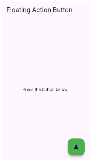 |
| /// |
| /// ** See code in examples/api/lib/material/floating_action_button/floating_action_button.0.dart ** |
| /// {@end-tool} |
| /// |
| /// {@tool dartpad} |
| /// This example shows how to make an extended [FloatingActionButton] in a |
| /// [Scaffold], with a pink [backgroundColor], a thumbs up [Icon] and a |
| /// [Text] label that reads "Approve". |
| /// |
| /// 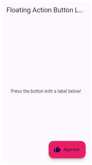 |
| /// |
| /// ** See code in examples/api/lib/material/floating_action_button/floating_action_button.1.dart ** |
| /// {@end-tool} |
| /// |
| /// See also: |
| /// |
| /// * [Scaffold], in which floating action buttons typically live. |
| /// * [ElevatedButton], a filled button whose material elevates when pressed. |
| /// * <https://material.io/design/components/buttons-floating-action-button.html> |
| class FloatingActionButton extends StatelessWidget { |
| /// Creates a circular floating action button. |
| /// |
| /// The [mini] and [clipBehavior] arguments must not be null. Additionally, |
| /// [elevation], [highlightElevation], and [disabledElevation] (if specified) |
| /// must be non-negative. |
| const FloatingActionButton({ |
| Key? key, |
| this.child, |
| this.tooltip, |
| this.foregroundColor, |
| this.backgroundColor, |
| this.focusColor, |
| this.hoverColor, |
| this.splashColor, |
| this.heroTag = const _DefaultHeroTag(), |
| this.elevation, |
| this.focusElevation, |
| this.hoverElevation, |
| this.highlightElevation, |
| this.disabledElevation, |
| required this.onPressed, |
| this.mouseCursor, |
| this.mini = false, |
| this.shape, |
| this.clipBehavior = Clip.none, |
| this.focusNode, |
| this.autofocus = false, |
| this.materialTapTargetSize, |
| this.isExtended = false, |
| this.enableFeedback, |
| }) : assert(elevation == null || elevation >= 0.0), |
| assert(focusElevation == null || focusElevation >= 0.0), |
| assert(hoverElevation == null || hoverElevation >= 0.0), |
| assert(highlightElevation == null || highlightElevation >= 0.0), |
| assert(disabledElevation == null || disabledElevation >= 0.0), |
| assert(mini != null), |
| assert(clipBehavior != null), |
| assert(isExtended != null), |
| assert(autofocus != null), |
| _floatingActionButtonType = mini ? _FloatingActionButtonType.small : _FloatingActionButtonType.regular, |
| _extendedLabel = null, |
| extendedIconLabelSpacing = null, |
| extendedPadding = null, |
| extendedTextStyle = null, |
| super(key: key); |
| |
| /// Creates a small circular floating action button. |
| /// |
| /// This constructor overrides the default size constraints of the floating |
| /// action button. |
| /// |
| /// The [clipBehavior] and [autofocus] arguments must not be null. |
| /// Additionally, [elevation], [focusElevation], [hoverElevation], |
| /// [highlightElevation], and [disabledElevation] (if specified) must be |
| /// non-negative. |
| const FloatingActionButton.small({ |
| Key? key, |
| this.child, |
| this.tooltip, |
| this.foregroundColor, |
| this.backgroundColor, |
| this.focusColor, |
| this.hoverColor, |
| this.splashColor, |
| this.heroTag = const _DefaultHeroTag(), |
| this.elevation, |
| this.focusElevation, |
| this.hoverElevation, |
| this.highlightElevation, |
| this.disabledElevation, |
| required this.onPressed, |
| this.mouseCursor, |
| this.shape, |
| this.clipBehavior = Clip.none, |
| this.focusNode, |
| this.autofocus = false, |
| this.materialTapTargetSize, |
| this.enableFeedback, |
| }) : assert(elevation == null || elevation >= 0.0), |
| assert(focusElevation == null || focusElevation >= 0.0), |
| assert(hoverElevation == null || hoverElevation >= 0.0), |
| assert(highlightElevation == null || highlightElevation >= 0.0), |
| assert(disabledElevation == null || disabledElevation >= 0.0), |
| assert(clipBehavior != null), |
| assert(autofocus != null), |
| _floatingActionButtonType = _FloatingActionButtonType.small, |
| mini = true, |
| isExtended = false, |
| _extendedLabel = null, |
| extendedIconLabelSpacing = null, |
| extendedPadding = null, |
| extendedTextStyle = null, |
| super(key: key); |
| |
| /// Creates a large circular floating action button. |
| /// |
| /// This constructor overrides the default size constraints of the floating |
| /// action button. |
| /// |
| /// The [clipBehavior] and [autofocus] arguments must not be null. |
| /// Additionally, [elevation], [focusElevation], [hoverElevation], |
| /// [highlightElevation], and [disabledElevation] (if specified) must be |
| /// non-negative. |
| const FloatingActionButton.large({ |
| Key? key, |
| this.child, |
| this.tooltip, |
| this.foregroundColor, |
| this.backgroundColor, |
| this.focusColor, |
| this.hoverColor, |
| this.splashColor, |
| this.heroTag = const _DefaultHeroTag(), |
| this.elevation, |
| this.focusElevation, |
| this.hoverElevation, |
| this.highlightElevation, |
| this.disabledElevation, |
| required this.onPressed, |
| this.mouseCursor, |
| this.shape, |
| this.clipBehavior = Clip.none, |
| this.focusNode, |
| this.autofocus = false, |
| this.materialTapTargetSize, |
| this.enableFeedback, |
| }) : assert(elevation == null || elevation >= 0.0), |
| assert(focusElevation == null || focusElevation >= 0.0), |
| assert(hoverElevation == null || hoverElevation >= 0.0), |
| assert(highlightElevation == null || highlightElevation >= 0.0), |
| assert(disabledElevation == null || disabledElevation >= 0.0), |
| assert(clipBehavior != null), |
| assert(autofocus != null), |
| _floatingActionButtonType = _FloatingActionButtonType.large, |
| mini = false, |
| isExtended = false, |
| _extendedLabel = null, |
| extendedIconLabelSpacing = null, |
| extendedPadding = null, |
| extendedTextStyle = null, |
| super(key: key); |
| |
| /// Creates a wider [StadiumBorder]-shaped floating action button with |
| /// an optional [icon] and a [label]. |
| /// |
| /// The [label], [autofocus], and [clipBehavior] arguments must not be null. |
| /// Additionally, [elevation], [highlightElevation], and [disabledElevation] |
| /// (if specified) must be non-negative. |
| const FloatingActionButton.extended({ |
| Key? key, |
| this.tooltip, |
| this.foregroundColor, |
| this.backgroundColor, |
| this.focusColor, |
| this.hoverColor, |
| this.heroTag = const _DefaultHeroTag(), |
| this.elevation, |
| this.focusElevation, |
| this.hoverElevation, |
| this.splashColor, |
| this.highlightElevation, |
| this.disabledElevation, |
| required this.onPressed, |
| this.mouseCursor = SystemMouseCursors.click, |
| this.shape, |
| this.isExtended = true, |
| this.materialTapTargetSize, |
| this.clipBehavior = Clip.none, |
| this.focusNode, |
| this.autofocus = false, |
| this.extendedIconLabelSpacing, |
| this.extendedPadding, |
| this.extendedTextStyle, |
| Widget? icon, |
| required Widget label, |
| this.enableFeedback, |
| }) : assert(elevation == null || elevation >= 0.0), |
| assert(focusElevation == null || focusElevation >= 0.0), |
| assert(hoverElevation == null || hoverElevation >= 0.0), |
| assert(highlightElevation == null || highlightElevation >= 0.0), |
| assert(disabledElevation == null || disabledElevation >= 0.0), |
| assert(isExtended != null), |
| assert(clipBehavior != null), |
| assert(autofocus != null), |
| mini = false, |
| _floatingActionButtonType = _FloatingActionButtonType.extended, |
| child = icon, |
| _extendedLabel = label, |
| super(key: key); |
| |
| /// The widget below this widget in the tree. |
| /// |
| /// Typically an [Icon]. |
| final Widget? child; |
| |
| /// Text that describes the action that will occur when the button is pressed. |
| /// |
| /// This text is displayed when the user long-presses on the button and is |
| /// used for accessibility. |
| final String? tooltip; |
| |
| /// The default foreground color for icons and text within the button. |
| /// |
| /// If this property is null, then the |
| /// [FloatingActionButtonThemeData.foregroundColor] of |
| /// [ThemeData.floatingActionButtonTheme] is used. If that property is also |
| /// null, then the [ColorScheme.onSecondary] color of [ThemeData.colorScheme] |
| /// is used. |
| final Color? foregroundColor; |
| |
| /// The button's background color. |
| /// |
| /// If this property is null, then the |
| /// [FloatingActionButtonThemeData.backgroundColor] of |
| /// [ThemeData.floatingActionButtonTheme] is used. If that property is also |
| /// null, then the [Theme]'s [ColorScheme.secondary] color is used. |
| final Color? backgroundColor; |
| |
| /// The color to use for filling the button when the button has input focus. |
| /// |
| /// Defaults to [ThemeData.focusColor] for the current theme. |
| final Color? focusColor; |
| |
| /// The color to use for filling the button when the button has a pointer |
| /// hovering over it. |
| /// |
| /// Defaults to [ThemeData.hoverColor] for the current theme. |
| final Color? hoverColor; |
| |
| /// The splash color for this [FloatingActionButton]'s [InkWell]. |
| /// |
| /// If null, [FloatingActionButtonThemeData.splashColor] is used, if that is |
| /// null, [ThemeData.splashColor] is used. |
| final Color? splashColor; |
| |
| /// The tag to apply to the button's [Hero] widget. |
| /// |
| /// Defaults to a tag that matches other floating action buttons. |
| /// |
| /// Set this to null explicitly if you don't want the floating action button to |
| /// have a hero tag. |
| /// |
| /// If this is not explicitly set, then there can only be one |
| /// [FloatingActionButton] per route (that is, per screen), since otherwise |
| /// there would be a tag conflict (multiple heroes on one route can't have the |
| /// same tag). The material design specification recommends only using one |
| /// floating action button per screen. |
| final Object? heroTag; |
| |
| /// The callback that is called when the button is tapped or otherwise activated. |
| /// |
| /// If this is set to null, the button will be disabled. |
| final VoidCallback? onPressed; |
| |
| /// {@macro flutter.material.RawMaterialButton.mouseCursor} |
| final MouseCursor? mouseCursor; |
| |
| /// The z-coordinate at which to place this button relative to its parent. |
| /// |
| /// This controls the size of the shadow below the floating action button. |
| /// |
| /// Defaults to 6, the appropriate elevation for floating action buttons. The |
| /// value is always non-negative. |
| /// |
| /// See also: |
| /// |
| /// * [highlightElevation], the elevation when the button is pressed. |
| /// * [disabledElevation], the elevation when the button is disabled. |
| final double? elevation; |
| |
| /// The z-coordinate at which to place this button relative to its parent when |
| /// the button has the input focus. |
| /// |
| /// This controls the size of the shadow below the floating action button. |
| /// |
| /// Defaults to 8, the appropriate elevation for floating action buttons |
| /// while they have focus. The value is always non-negative. |
| /// |
| /// See also: |
| /// |
| /// * [elevation], the default elevation. |
| /// * [highlightElevation], the elevation when the button is pressed. |
| /// * [disabledElevation], the elevation when the button is disabled. |
| final double? focusElevation; |
| |
| /// The z-coordinate at which to place this button relative to its parent when |
| /// the button is enabled and has a pointer hovering over it. |
| /// |
| /// This controls the size of the shadow below the floating action button. |
| /// |
| /// Defaults to 8, the appropriate elevation for floating action buttons while |
| /// they have a pointer hovering over them. The value is always non-negative. |
| /// |
| /// See also: |
| /// |
| /// * [elevation], the default elevation. |
| /// * [highlightElevation], the elevation when the button is pressed. |
| /// * [disabledElevation], the elevation when the button is disabled. |
| final double? hoverElevation; |
| |
| /// The z-coordinate at which to place this button relative to its parent when |
| /// the user is touching the button. |
| /// |
| /// This controls the size of the shadow below the floating action button. |
| /// |
| /// Defaults to 12, the appropriate elevation for floating action buttons |
| /// while they are being touched. The value is always non-negative. |
| /// |
| /// See also: |
| /// |
| /// * [elevation], the default elevation. |
| final double? highlightElevation; |
| |
| /// The z-coordinate at which to place this button when the button is disabled |
| /// ([onPressed] is null). |
| /// |
| /// This controls the size of the shadow below the floating action button. |
| /// |
| /// Defaults to the same value as [elevation]. Setting this to zero makes the |
| /// floating action button work similar to an [ElevatedButton] but the titular |
| /// "floating" effect is lost. The value is always non-negative. |
| /// |
| /// See also: |
| /// |
| /// * [elevation], the default elevation. |
| /// * [highlightElevation], the elevation when the button is pressed. |
| final double? disabledElevation; |
| |
| /// Controls the size of this button. |
| /// |
| /// By default, floating action buttons are non-mini and have a height and |
| /// width of 56.0 logical pixels. Mini floating action buttons have a height |
| /// and width of 40.0 logical pixels with a layout width and height of 48.0 |
| /// logical pixels. (The extra 4 pixels of padding on each side are added as a |
| /// result of the floating action button having [MaterialTapTargetSize.padded] |
| /// set on the underlying [RawMaterialButton.materialTapTargetSize].) |
| final bool mini; |
| |
| /// The shape of the button's [Material]. |
| /// |
| /// The button's highlight and splash are clipped to this shape. If the |
| /// button has an elevation, then its drop shadow is defined by this |
| /// shape as well. |
| final ShapeBorder? shape; |
| |
| /// {@macro flutter.material.Material.clipBehavior} |
| /// |
| /// Defaults to [Clip.none], and must not be null. |
| final Clip clipBehavior; |
| |
| /// True if this is an "extended" floating action button. |
| /// |
| /// Typically [extended] buttons have a [StadiumBorder] [shape] |
| /// and have been created with the [FloatingActionButton.extended] |
| /// constructor. |
| /// |
| /// The [Scaffold] animates the appearance of ordinary floating |
| /// action buttons with scale and rotation transitions. Extended |
| /// floating action buttons are scaled and faded in. |
| final bool isExtended; |
| |
| /// {@macro flutter.widgets.Focus.focusNode} |
| final FocusNode? focusNode; |
| |
| /// {@macro flutter.widgets.Focus.autofocus} |
| final bool autofocus; |
| |
| /// Configures the minimum size of the tap target. |
| /// |
| /// Defaults to [ThemeData.materialTapTargetSize]. |
| /// |
| /// See also: |
| /// |
| /// * [MaterialTapTargetSize], for a description of how this affects tap targets. |
| final MaterialTapTargetSize? materialTapTargetSize; |
| |
| /// Whether detected gestures should provide acoustic and/or haptic feedback. |
| /// |
| /// For example, on Android a tap will produce a clicking sound and a |
| /// long-press will produce a short vibration, when feedback is enabled. |
| /// |
| /// If null, [FloatingActionButtonThemeData.enableFeedback] is used. |
| /// If both are null, then default value is true. |
| /// |
| /// See also: |
| /// |
| /// * [Feedback] for providing platform-specific feedback to certain actions. |
| final bool? enableFeedback; |
| |
| |
| /// The spacing between the icon and the label for an extended |
| /// [FloatingActionButton]. |
| /// |
| /// If null, [FloatingActionButtonThemeData.extendedIconLabelSpacing] is used. |
| /// If that is also null, the default is 8.0. |
| final double? extendedIconLabelSpacing; |
| |
| /// The padding for an extended [FloatingActionButton]'s content. |
| /// |
| /// If null, [FloatingActionButtonThemeData.extendedPadding] is used. If that |
| /// is also null, the default is |
| /// `EdgeInsetsDirectional.only(start: 16.0, end: 20.0)` if an icon is |
| /// provided, and `EdgeInsetsDirectional.only(start: 20.0, end: 20.0)` if not. |
| final EdgeInsetsGeometry? extendedPadding; |
| |
| /// The text style for an extended [FloatingActionButton]'s label. |
| /// |
| /// If null, [FloatingActionButtonThemeData.extendedTextStyle] is used. If |
| /// that is also null, then [TextTheme.button] with a letter spacing of 1.2 |
| /// is used. |
| final TextStyle? extendedTextStyle; |
| |
| final _FloatingActionButtonType _floatingActionButtonType; |
| |
| final Widget? _extendedLabel; |
| |
| static const double _defaultElevation = 6; |
| static const double _defaultFocusElevation = 6; |
| static const double _defaultHoverElevation = 8; |
| static const double _defaultHighlightElevation = 12; |
| static const ShapeBorder _defaultShape = CircleBorder(); |
| static const ShapeBorder _defaultExtendedShape = StadiumBorder(); |
| |
| @override |
| Widget build(BuildContext context) { |
| final ThemeData theme = Theme.of(context); |
| final FloatingActionButtonThemeData floatingActionButtonTheme = theme.floatingActionButtonTheme; |
| |
| final Color foregroundColor = this.foregroundColor |
| ?? floatingActionButtonTheme.foregroundColor |
| ?? theme.colorScheme.onSecondary; |
| final Color backgroundColor = this.backgroundColor |
| ?? floatingActionButtonTheme.backgroundColor |
| ?? theme.colorScheme.secondary; |
| final Color focusColor = this.focusColor |
| ?? floatingActionButtonTheme.focusColor |
| ?? theme.focusColor; |
| final Color hoverColor = this.hoverColor |
| ?? floatingActionButtonTheme.hoverColor |
| ?? theme.hoverColor; |
| final Color splashColor = this.splashColor |
| ?? floatingActionButtonTheme.splashColor |
| ?? theme.splashColor; |
| final double elevation = this.elevation |
| ?? floatingActionButtonTheme.elevation |
| ?? _defaultElevation; |
| final double focusElevation = this.focusElevation |
| ?? floatingActionButtonTheme.focusElevation |
| ?? _defaultFocusElevation; |
| final double hoverElevation = this.hoverElevation |
| ?? floatingActionButtonTheme.hoverElevation |
| ?? _defaultHoverElevation; |
| final double disabledElevation = this.disabledElevation |
| ?? floatingActionButtonTheme.disabledElevation |
| ?? elevation; |
| final double highlightElevation = this.highlightElevation |
| ?? floatingActionButtonTheme.highlightElevation |
| ?? _defaultHighlightElevation; |
| final MaterialTapTargetSize materialTapTargetSize = this.materialTapTargetSize |
| ?? theme.materialTapTargetSize; |
| final bool enableFeedback = this.enableFeedback |
| ?? floatingActionButtonTheme.enableFeedback ?? true; |
| final TextStyle extendedTextStyle = (this.extendedTextStyle |
| ?? floatingActionButtonTheme.extendedTextStyle |
| ?? theme.textTheme.button!.copyWith(letterSpacing: 1.2)).copyWith(color: foregroundColor); |
| final ShapeBorder shape = this.shape |
| ?? floatingActionButtonTheme.shape |
| ?? (isExtended ? _defaultExtendedShape : _defaultShape); |
| |
| BoxConstraints sizeConstraints; |
| Widget? resolvedChild = child; |
| switch(_floatingActionButtonType) { |
| case _FloatingActionButtonType.regular: |
| sizeConstraints = floatingActionButtonTheme.sizeConstraints ?? _kSizeConstraints; |
| break; |
| case _FloatingActionButtonType.small: |
| sizeConstraints = floatingActionButtonTheme.smallSizeConstraints ?? _kMiniSizeConstraints; |
| break; |
| case _FloatingActionButtonType.large: |
| sizeConstraints = floatingActionButtonTheme.largeSizeConstraints ?? _kLargeSizeConstraints; |
| // The large FAB uses a larger icon. |
| resolvedChild = child != null ? IconTheme.merge( |
| data: const IconThemeData(size: 36.0), |
| child: child!, |
| ) : child; |
| break; |
| case _FloatingActionButtonType.extended: |
| sizeConstraints = floatingActionButtonTheme.extendedSizeConstraints ?? _kExtendedSizeConstraints; |
| final double iconLabelSpacing = extendedIconLabelSpacing ?? floatingActionButtonTheme.extendedIconLabelSpacing ?? 8.0; |
| final EdgeInsetsGeometry padding = extendedPadding |
| ?? floatingActionButtonTheme.extendedPadding |
| ?? EdgeInsetsDirectional.only(start: child != null && isExtended ? 16.0 : 20.0, end: 20.0); |
| resolvedChild = _ChildOverflowBox( |
| child: Padding( |
| padding: padding, |
| child: Row( |
| mainAxisSize: MainAxisSize.min, |
| children: <Widget>[ |
| if (child != null) |
| child!, |
| if (child != null && isExtended) |
| SizedBox(width: iconLabelSpacing), |
| if (isExtended) |
| _extendedLabel!, |
| ], |
| ), |
| ), |
| ); |
| break; |
| } |
| |
| Widget result = RawMaterialButton( |
| onPressed: onPressed, |
| mouseCursor: mouseCursor, |
| elevation: elevation, |
| focusElevation: focusElevation, |
| hoverElevation: hoverElevation, |
| highlightElevation: highlightElevation, |
| disabledElevation: disabledElevation, |
| constraints: sizeConstraints, |
| materialTapTargetSize: materialTapTargetSize, |
| fillColor: backgroundColor, |
| focusColor: focusColor, |
| hoverColor: hoverColor, |
| splashColor: splashColor, |
| textStyle: extendedTextStyle, |
| shape: shape, |
| clipBehavior: clipBehavior, |
| focusNode: focusNode, |
| autofocus: autofocus, |
| enableFeedback: enableFeedback, |
| child: resolvedChild, |
| ); |
| |
| if (tooltip != null) { |
| result = Tooltip( |
| message: tooltip, |
| child: result, |
| ); |
| } |
| |
| if (heroTag != null) { |
| result = Hero( |
| tag: heroTag!, |
| child: result, |
| ); |
| } |
| |
| return MergeSemantics(child: result); |
| } |
| |
| @override |
| void debugFillProperties(DiagnosticPropertiesBuilder properties) { |
| super.debugFillProperties(properties); |
| properties.add(ObjectFlagProperty<VoidCallback>('onPressed', onPressed, ifNull: 'disabled')); |
| properties.add(StringProperty('tooltip', tooltip, defaultValue: null)); |
| properties.add(ColorProperty('foregroundColor', foregroundColor, defaultValue: null)); |
| properties.add(ColorProperty('backgroundColor', backgroundColor, defaultValue: null)); |
| properties.add(ColorProperty('focusColor', focusColor, defaultValue: null)); |
| properties.add(ColorProperty('hoverColor', hoverColor, defaultValue: null)); |
| properties.add(ColorProperty('splashColor', splashColor, defaultValue: null)); |
| properties.add(ObjectFlagProperty<Object>('heroTag', heroTag, ifPresent: 'hero')); |
| properties.add(DoubleProperty('elevation', elevation, defaultValue: null)); |
| properties.add(DoubleProperty('focusElevation', focusElevation, defaultValue: null)); |
| properties.add(DoubleProperty('hoverElevation', hoverElevation, defaultValue: null)); |
| properties.add(DoubleProperty('highlightElevation', highlightElevation, defaultValue: null)); |
| properties.add(DoubleProperty('disabledElevation', disabledElevation, defaultValue: null)); |
| properties.add(DiagnosticsProperty<ShapeBorder>('shape', shape, defaultValue: null)); |
| properties.add(DiagnosticsProperty<FocusNode>('focusNode', focusNode, defaultValue: null)); |
| properties.add(FlagProperty('isExtended', value: isExtended, ifTrue: 'extended')); |
| properties.add(DiagnosticsProperty<MaterialTapTargetSize>('materialTapTargetSize', materialTapTargetSize, defaultValue: null)); |
| } |
| } |
| |
| // This widget's size matches its child's size unless its constraints |
| // force it to be larger or smaller. The child is centered. |
| // |
| // Used to encapsulate extended FABs whose size is fixed, using Row |
| // and MainAxisSize.min, to be as wide as their label and icon. |
| class _ChildOverflowBox extends SingleChildRenderObjectWidget { |
| const _ChildOverflowBox({ |
| Key? key, |
| Widget? child, |
| }) : super(key: key, child: child); |
| |
| @override |
| _RenderChildOverflowBox createRenderObject(BuildContext context) { |
| return _RenderChildOverflowBox( |
| textDirection: Directionality.of(context), |
| ); |
| } |
| |
| @override |
| void updateRenderObject(BuildContext context, _RenderChildOverflowBox renderObject) { |
| renderObject.textDirection = Directionality.of(context); |
| } |
| } |
| |
| class _RenderChildOverflowBox extends RenderAligningShiftedBox { |
| _RenderChildOverflowBox({ |
| RenderBox? child, |
| TextDirection? textDirection, |
| }) : super(child: child, alignment: Alignment.center, textDirection: textDirection); |
| |
| @override |
| double computeMinIntrinsicWidth(double height) => 0.0; |
| |
| @override |
| double computeMinIntrinsicHeight(double width) => 0.0; |
| |
| @override |
| Size computeDryLayout(BoxConstraints constraints) { |
| if (child != null) { |
| final Size childSize = child!.getDryLayout(const BoxConstraints()); |
| return Size( |
| math.max(constraints.minWidth, math.min(constraints.maxWidth, childSize.width)), |
| math.max(constraints.minHeight, math.min(constraints.maxHeight, childSize.height)), |
| ); |
| } else { |
| return constraints.biggest; |
| } |
| } |
| |
| @override |
| void performLayout() { |
| final BoxConstraints constraints = this.constraints; |
| if (child != null) { |
| child!.layout(const BoxConstraints(), parentUsesSize: true); |
| size = Size( |
| math.max(constraints.minWidth, math.min(constraints.maxWidth, child!.size.width)), |
| math.max(constraints.minHeight, math.min(constraints.maxHeight, child!.size.height)), |
| ); |
| alignChild(); |
| } else { |
| size = constraints.biggest; |
| } |
| } |
| } |