| // Copyright 2014 The Flutter Authors. All rights reserved. |
| // Use of this source code is governed by a BSD-style license that can be |
| // found in the LICENSE file. |
| |
| import 'dart:ui' show Color, lerpDouble; |
| |
| import 'package:flutter/cupertino.dart'; |
| import 'package:flutter/foundation.dart'; |
| |
| import 'app_bar_theme.dart'; |
| import 'banner_theme.dart'; |
| import 'bottom_app_bar_theme.dart'; |
| import 'bottom_navigation_bar_theme.dart'; |
| import 'bottom_sheet_theme.dart'; |
| import 'button_bar_theme.dart'; |
| import 'button_theme.dart'; |
| import 'card_theme.dart'; |
| import 'checkbox_theme.dart'; |
| import 'chip_theme.dart'; |
| import 'color_scheme.dart'; |
| import 'colors.dart'; |
| import 'data_table_theme.dart'; |
| import 'dialog_theme.dart'; |
| import 'divider_theme.dart'; |
| import 'drawer_theme.dart'; |
| import 'elevated_button_theme.dart'; |
| import 'expansion_tile_theme.dart'; |
| import 'floating_action_button_theme.dart'; |
| import 'ink_ripple.dart'; |
| import 'ink_sparkle.dart'; |
| import 'ink_splash.dart'; |
| import 'ink_well.dart' show InteractiveInkFeatureFactory; |
| import 'input_decorator.dart'; |
| import 'list_tile.dart'; |
| import 'list_tile_theme.dart'; |
| import 'navigation_bar_theme.dart'; |
| import 'navigation_rail_theme.dart'; |
| import 'outlined_button_theme.dart'; |
| import 'page_transitions_theme.dart'; |
| import 'popup_menu_theme.dart'; |
| import 'progress_indicator_theme.dart'; |
| import 'radio_theme.dart'; |
| import 'scrollbar_theme.dart'; |
| import 'slider_theme.dart'; |
| import 'snack_bar_theme.dart'; |
| import 'switch_theme.dart'; |
| import 'tab_bar_theme.dart'; |
| import 'text_button_theme.dart'; |
| import 'text_selection_theme.dart'; |
| import 'text_theme.dart'; |
| import 'time_picker_theme.dart'; |
| import 'toggle_buttons_theme.dart'; |
| import 'tooltip_theme.dart'; |
| import 'typography.dart'; |
| |
| export 'package:flutter/services.dart' show Brightness; |
| |
| /// An interface that defines custom additions to a [ThemeData] object. |
| /// |
| /// Typically used for custom colors. To use, subclass [ThemeExtension], |
| /// define a number of fields (e.g. [Color]s), and implement the [copyWith] and |
| /// [lerp] methods. The latter will ensure smooth transitions of properties when |
| /// switching themes. |
| /// |
| /// {@tool dartpad} |
| /// This sample shows how to create and use a subclass of [ThemeExtension] that |
| /// defines two colors. |
| /// |
| /// ** See code in examples/api/lib/material/theme/theme_extension.1.dart ** |
| /// {@end-tool} |
| abstract class ThemeExtension<T extends ThemeExtension<T>> { |
| /// Enable const constructor for subclasses. |
| const ThemeExtension(); |
| |
| /// The extension's type. |
| Object get type => T; |
| |
| /// Creates a copy of this theme extension with the given fields |
| /// replaced by the non-null parameter values. |
| ThemeExtension<T> copyWith(); |
| |
| /// Linearly interpolate with another [ThemeExtension] object. |
| /// |
| /// {@macro dart.ui.shadow.lerp} |
| ThemeExtension<T> lerp(ThemeExtension<T>? other, double t); |
| } |
| |
| // Deriving these values is black magic. The spec claims that pressed buttons |
| // have a highlight of 0x66999999, but that's clearly wrong. The videos in the |
| // spec show that buttons have a composited highlight of #E1E1E1 on a background |
| // of #FAFAFA. Assuming that the highlight really has an opacity of 0x66, we can |
| // solve for the actual color of the highlight: |
| const Color _kLightThemeHighlightColor = Color(0x66BCBCBC); |
| |
| // The same video shows the splash compositing to #D7D7D7 on a background of |
| // #E1E1E1. Again, assuming the splash has an opacity of 0x66, we can solve for |
| // the actual color of the splash: |
| const Color _kLightThemeSplashColor = Color(0x66C8C8C8); |
| |
| // Unfortunately, a similar video isn't available for the dark theme, which |
| // means we assume the values in the spec are actually correct. |
| const Color _kDarkThemeHighlightColor = Color(0x40CCCCCC); |
| const Color _kDarkThemeSplashColor = Color(0x40CCCCCC); |
| |
| /// Configures the tap target and layout size of certain Material widgets. |
| /// |
| /// Changing the value in [ThemeData.materialTapTargetSize] will affect the |
| /// accessibility experience. |
| /// |
| /// Some of the impacted widgets include: |
| /// |
| /// * [FloatingActionButton], only the mini tap target size is increased. |
| /// * [MaterialButton] |
| /// * [OutlinedButton] |
| /// * [TextButton] |
| /// * [ElevatedButton] |
| /// * [FlatButton] |
| /// * [RaisedButton] |
| /// * The time picker widget ([showTimePicker]) |
| /// * [SnackBar] |
| /// * [Chip] |
| /// * [RawChip] |
| /// * [InputChip] |
| /// * [ChoiceChip] |
| /// * [FilterChip] |
| /// * [ActionChip] |
| /// * [Radio] |
| /// * [Switch] |
| /// * [Checkbox] |
| enum MaterialTapTargetSize { |
| /// Expands the minimum tap target size to 48px by 48px. |
| /// |
| /// This is the default value of [ThemeData.materialTapTargetSize] and the |
| /// recommended size to conform to Android accessibility scanner |
| /// recommendations. |
| padded, |
| |
| /// Shrinks the tap target size to the minimum provided by the Material |
| /// specification. |
| shrinkWrap, |
| } |
| |
| /// Defines the configuration of the overall visual [Theme] for a [MaterialApp] |
| /// or a widget subtree within the app. |
| /// |
| /// The [MaterialApp] theme property can be used to configure the appearance |
| /// of the entire app. Widget subtree's within an app can override the app's |
| /// theme by including a [Theme] widget at the top of the subtree. |
| /// |
| /// Widgets whose appearance should align with the overall theme can obtain the |
| /// current theme's configuration with [Theme.of]. Material components typically |
| /// depend exclusively on the [colorScheme] and [textTheme]. These properties |
| /// are guaranteed to have non-null values. |
| /// |
| /// The static [Theme.of] method finds the [ThemeData] value specified for the |
| /// nearest [BuildContext] ancestor. This lookup is inexpensive, essentially |
| /// just a single HashMap access. It can sometimes be a little confusing |
| /// because [Theme.of] can not see a [Theme] widget that is defined in the |
| /// current build method's context. To overcome that, create a new custom widget |
| /// for the subtree that appears below the new [Theme], or insert a widget |
| /// that creates a new BuildContext, like [Builder]. |
| /// |
| /// {@tool snippet} |
| /// In this example, the [Container] widget uses [Theme.of] to retrieve the |
| /// primary color from the theme's [colorScheme] to draw an amber square. |
| /// The [Builder] widget separates the parent theme's [BuildContext] from the |
| /// child's [BuildContext]. |
| /// |
| ///  |
| /// |
| /// ```dart |
| /// Theme( |
| /// data: ThemeData.from( |
| /// colorScheme: ColorScheme.fromSwatch(primarySwatch: Colors.amber), |
| /// ), |
| /// child: Builder( |
| /// builder: (BuildContext context) { |
| /// return Container( |
| /// width: 100, |
| /// height: 100, |
| /// color: Theme.of(context).colorScheme.primary, |
| /// ); |
| /// }, |
| /// ), |
| /// ) |
| /// ``` |
| /// {@end-tool} |
| /// |
| /// {@tool snippet} |
| /// |
| /// This sample creates a [MaterialApp] with a [Theme] whose |
| /// [ColorScheme] is based on [Colors.blue], but with the color |
| /// scheme's [ColorScheme.secondary] color overridden to be green. The |
| /// [AppBar] widget uses the color scheme's [ColorScheme.primary] as |
| /// its default background color and the [FloatingActionButton] widget |
| /// uses the color scheme's [ColorScheme.secondary] for its default |
| /// background. By default, the [Text] widget uses |
| /// [TextTheme.bodyText2], and the color of that [TextStyle] has been |
| /// changed to purple. |
| /// |
| /// 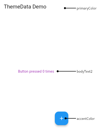 |
| /// |
| /// ```dart |
| /// MaterialApp( |
| /// theme: ThemeData( |
| /// colorScheme: ColorScheme.fromSwatch( |
| /// primarySwatch: Colors.blue, |
| /// ).copyWith( |
| /// secondary: Colors.green, |
| /// ), |
| /// textTheme: const TextTheme(bodyText2: TextStyle(color: Colors.purple)), |
| /// ), |
| /// home: Scaffold( |
| /// appBar: AppBar( |
| /// title: const Text('ThemeData Demo'), |
| /// ), |
| /// floatingActionButton: FloatingActionButton( |
| /// child: const Icon(Icons.add), |
| /// onPressed: () {}, |
| /// ), |
| /// body: const Center( |
| /// child: Text('Button pressed 0 times'), |
| /// ), |
| /// ), |
| /// ) |
| /// ``` |
| /// {@end-tool} |
| /// |
| /// See <https://material.io/design/color/> for |
| /// more discussion on how to pick the right colors. |
| |
| @immutable |
| class ThemeData with Diagnosticable { |
| /// Create a [ThemeData] that's used to configure a [Theme]. |
| /// |
| /// The [colorScheme] and [textTheme] are used by the Material components to |
| /// compute default values for visual properties. The API documentation for |
| /// each component widget explains exactly how the defaults are computed. |
| /// |
| /// When providing a [ColorScheme], apps can either provide one directly |
| /// with the [colorScheme] parameter, or have one generated for them by |
| /// using the [colorSchemeSeed] and [brightness] parameters. A generated |
| /// color scheme will be based on the tones of [colorSchemeSeed] and all of |
| /// its contrasting color will meet accessibility guidelines for readability. |
| /// (See [ColorScheme.fromSeed] for more details.) |
| /// |
| /// If the app wants to customize a generated color scheme, it can use |
| /// [ColorScheme.fromSeed] directly and then [ColorScheme.copyWith] on the |
| /// result to override any colors that need to be replaced. The result of |
| /// this can be used as the [colorScheme] directly. |
| /// |
| /// For historical reasons, instead of using a [colorSchemeSeed] or |
| /// [colorScheme], you can provide either a [primaryColor] or [primarySwatch] |
| /// to construct the [colorScheme], but the results will not be as complete |
| /// as when using generation from a seed color. |
| /// |
| /// If [colorSchemeSeed] is non-null then [colorScheme], [primaryColor] and |
| /// [primarySwatch] must all be null. |
| /// |
| /// The [textTheme] [TextStyle] colors are black if the color scheme's |
| /// brightness is [Brightness.light], and white for [Brightness.dark]. |
| /// |
| /// To override the appearance of specific components, provide |
| /// a component theme parameter like [sliderTheme], [toggleButtonsTheme], |
| /// or [bottomNavigationBarTheme]. |
| /// |
| /// See also: |
| /// |
| /// * [ThemeData.from], which creates a ThemeData from a [ColorScheme]. |
| /// * [ThemeData.light], which creates a light blue theme. |
| /// * [ThemeData.dark], which creates dark theme with a teal secondary [ColorScheme] color. |
| /// * [ColorScheme.fromSeed], which is used to create a [ColorScheme] from a seed color. |
| factory ThemeData({ |
| // GENERAL CONFIGURATION |
| bool? applyElevationOverlayColor, |
| NoDefaultCupertinoThemeData? cupertinoOverrideTheme, |
| Iterable<ThemeExtension<dynamic>>? extensions, |
| InputDecorationTheme? inputDecorationTheme, |
| MaterialTapTargetSize? materialTapTargetSize, |
| PageTransitionsTheme? pageTransitionsTheme, |
| TargetPlatform? platform, |
| ScrollbarThemeData? scrollbarTheme, |
| InteractiveInkFeatureFactory? splashFactory, |
| VisualDensity? visualDensity, |
| bool? useMaterial3, |
| // COLOR |
| // [colorScheme] is the preferred way to configure colors. The other color |
| // properties (as well as primaryColorBrightness, and primarySwatch) |
| // will gradually be phased out, see https://github.com/flutter/flutter/issues/91772. |
| ColorScheme? colorScheme, |
| Color? colorSchemeSeed, |
| Brightness? brightness, |
| MaterialColor? primarySwatch, |
| Color? primaryColor, |
| Color? primaryColorLight, |
| Color? primaryColorDark, |
| Color? focusColor, |
| Color? hoverColor, |
| Color? shadowColor, |
| Color? canvasColor, |
| Color? scaffoldBackgroundColor, |
| Color? bottomAppBarColor, |
| Color? cardColor, |
| Color? dividerColor, |
| Color? highlightColor, |
| Color? splashColor, |
| Color? selectedRowColor, |
| Color? unselectedWidgetColor, |
| Color? disabledColor, |
| Color? secondaryHeaderColor, |
| Color? backgroundColor, |
| Color? dialogBackgroundColor, |
| Color? indicatorColor, |
| Color? hintColor, |
| Color? errorColor, |
| Color? toggleableActiveColor, |
| // TYPOGRAPHY & ICONOGRAPHY |
| String? fontFamily, |
| Typography? typography, |
| TextTheme? textTheme, |
| TextTheme? primaryTextTheme, |
| IconThemeData? iconTheme, |
| IconThemeData? primaryIconTheme, |
| // COMPONENT THEMES |
| AppBarTheme? appBarTheme, |
| MaterialBannerThemeData? bannerTheme, |
| BottomAppBarTheme? bottomAppBarTheme, |
| BottomNavigationBarThemeData? bottomNavigationBarTheme, |
| BottomSheetThemeData? bottomSheetTheme, |
| ButtonBarThemeData? buttonBarTheme, |
| ButtonThemeData? buttonTheme, |
| CardTheme? cardTheme, |
| CheckboxThemeData? checkboxTheme, |
| ChipThemeData? chipTheme, |
| DataTableThemeData? dataTableTheme, |
| DialogTheme? dialogTheme, |
| DividerThemeData? dividerTheme, |
| DrawerThemeData? drawerTheme, |
| ElevatedButtonThemeData? elevatedButtonTheme, |
| FloatingActionButtonThemeData? floatingActionButtonTheme, |
| ListTileThemeData? listTileTheme, |
| NavigationBarThemeData? navigationBarTheme, |
| NavigationRailThemeData? navigationRailTheme, |
| OutlinedButtonThemeData? outlinedButtonTheme, |
| PopupMenuThemeData? popupMenuTheme, |
| ProgressIndicatorThemeData? progressIndicatorTheme, |
| RadioThemeData? radioTheme, |
| SliderThemeData? sliderTheme, |
| SnackBarThemeData? snackBarTheme, |
| SwitchThemeData? switchTheme, |
| TabBarTheme? tabBarTheme, |
| TextButtonThemeData? textButtonTheme, |
| TextSelectionThemeData? textSelectionTheme, |
| TimePickerThemeData? timePickerTheme, |
| ToggleButtonsThemeData? toggleButtonsTheme, |
| TooltipThemeData? tooltipTheme, |
| ExpansionTileThemeData? expansionTileTheme, |
| // DEPRECATED (newest deprecations at the bottom) |
| @Deprecated( |
| 'No longer used by the framework, please remove any reference to it. ' |
| 'This feature was deprecated after v1.23.0-4.0.pre.', |
| ) |
| bool? useTextSelectionTheme, |
| @Deprecated( |
| 'Use TextSelectionThemeData.selectionColor instead. ' |
| 'This feature was deprecated after v1.26.0-18.0.pre.', |
| ) |
| Color? textSelectionColor, |
| @Deprecated( |
| 'Use TextSelectionThemeData.cursorColor instead. ' |
| 'This feature was deprecated after v1.26.0-18.0.pre.', |
| ) |
| Color? cursorColor, |
| @Deprecated( |
| 'Use TextSelectionThemeData.selectionHandleColor instead. ' |
| 'This feature was deprecated after v1.26.0-18.0.pre.', |
| ) |
| Color? textSelectionHandleColor, |
| @Deprecated( |
| 'Use colorScheme.secondary instead. ' |
| 'For more information, consult the migration guide at ' |
| 'https://flutter.dev/docs/release/breaking-changes/theme-data-accent-properties#migration-guide. ' |
| 'This feature was deprecated after v2.3.0-0.1.pre.', |
| ) |
| Color? accentColor, |
| @Deprecated( |
| 'No longer used by the framework, please remove any reference to it. ' |
| 'For more information, consult the migration guide at ' |
| 'https://flutter.dev/docs/release/breaking-changes/theme-data-accent-properties#migration-guide. ' |
| 'This feature was deprecated after v2.3.0-0.1.pre.', |
| ) |
| Brightness? accentColorBrightness, |
| @Deprecated( |
| 'No longer used by the framework, please remove any reference to it. ' |
| 'For more information, consult the migration guide at ' |
| 'https://flutter.dev/docs/release/breaking-changes/theme-data-accent-properties#migration-guide. ' |
| 'This feature was deprecated after v2.3.0-0.1.pre.', |
| ) |
| TextTheme? accentTextTheme, |
| @Deprecated( |
| 'No longer used by the framework, please remove any reference to it. ' |
| 'For more information, consult the migration guide at ' |
| 'https://flutter.dev/docs/release/breaking-changes/theme-data-accent-properties#migration-guide. ' |
| 'This feature was deprecated after v2.3.0-0.1.pre.', |
| ) |
| IconThemeData? accentIconTheme, |
| @Deprecated( |
| 'No longer used by the framework, please remove any reference to it. ' |
| 'This feature was deprecated after v2.3.0-0.2.pre.', |
| ) |
| Color? buttonColor, |
| @Deprecated( |
| 'This "fix" is now enabled by default. ' |
| 'This feature was deprecated after v2.5.0-1.0.pre.', |
| ) |
| bool? fixTextFieldOutlineLabel, |
| @Deprecated( |
| 'No longer used by the framework, please remove any reference to it. ' |
| 'This feature was deprecated after v2.6.0-11.0.pre.', |
| ) |
| Brightness? primaryColorBrightness, |
| @Deprecated( |
| 'Use ThemeData.useMaterial3 or override ScrollBehavior.buildOverscrollIndicator. ' |
| 'This feature was deprecated after v2.13.0-0.0.pre.' |
| ) |
| AndroidOverscrollIndicator? androidOverscrollIndicator, |
| }) { |
| // GENERAL CONFIGURATION |
| cupertinoOverrideTheme = cupertinoOverrideTheme?.noDefault(); |
| extensions ??= <ThemeExtension<dynamic>>[]; |
| inputDecorationTheme ??= const InputDecorationTheme(); |
| platform ??= defaultTargetPlatform; |
| switch (platform) { |
| case TargetPlatform.android: |
| case TargetPlatform.fuchsia: |
| case TargetPlatform.iOS: |
| materialTapTargetSize ??= MaterialTapTargetSize.padded; |
| break; |
| case TargetPlatform.linux: |
| case TargetPlatform.macOS: |
| case TargetPlatform.windows: |
| materialTapTargetSize ??= MaterialTapTargetSize.shrinkWrap; |
| break; |
| } |
| pageTransitionsTheme ??= const PageTransitionsTheme(); |
| scrollbarTheme ??= const ScrollbarThemeData(); |
| visualDensity ??= VisualDensity.adaptivePlatformDensity; |
| useMaterial3 ??= false; |
| final bool useInkSparkle = platform == TargetPlatform.android && !kIsWeb; |
| splashFactory ??= useMaterial3 |
| ? useInkSparkle ? InkSparkle.splashFactory : InkRipple.splashFactory |
| : InkSplash.splashFactory; |
| |
| // COLOR |
| assert(colorScheme?.brightness == null || brightness == null || colorScheme!.brightness == brightness); |
| assert(colorSchemeSeed == null || colorScheme == null); |
| assert(colorSchemeSeed == null || primarySwatch == null); |
| assert(colorSchemeSeed == null || primaryColor == null); |
| final Brightness effectiveBrightness = brightness ?? colorScheme?.brightness ?? Brightness.light; |
| final bool isDark = effectiveBrightness == Brightness.dark; |
| if (colorSchemeSeed != null) { |
| colorScheme = ColorScheme.fromSeed(seedColor: colorSchemeSeed, brightness: effectiveBrightness); |
| |
| // For surfaces that use primary color in light themes and surface color in dark |
| final Color primarySurfaceColor = isDark ? colorScheme.surface : colorScheme.primary; |
| final Color onPrimarySurfaceColor = isDark ? colorScheme.onSurface : colorScheme.onPrimary; |
| |
| // Default some of the color settings to values from the color scheme |
| primaryColor = primarySurfaceColor; |
| primaryColorBrightness = ThemeData.estimateBrightnessForColor(primarySurfaceColor); |
| canvasColor ??= colorScheme.background; |
| accentColor ??= colorScheme.secondary; |
| accentColorBrightness ??= ThemeData.estimateBrightnessForColor(colorScheme.secondary); |
| scaffoldBackgroundColor ??= colorScheme.background; |
| bottomAppBarColor ??= colorScheme.surface; |
| cardColor ??= colorScheme.surface; |
| dividerColor ??= colorScheme.outline; |
| backgroundColor ??= colorScheme.background; |
| dialogBackgroundColor ??= colorScheme.background; |
| indicatorColor ??= onPrimarySurfaceColor; |
| errorColor ??= colorScheme.error; |
| applyElevationOverlayColor ??= brightness == Brightness.dark; |
| } |
| applyElevationOverlayColor ??= false; |
| primarySwatch ??= Colors.blue; |
| primaryColor ??= isDark ? Colors.grey[900]! : primarySwatch; |
| final Brightness estimatedPrimaryColorBrightness = estimateBrightnessForColor(primaryColor); |
| primaryColorLight ??= isDark ? Colors.grey[500]! : primarySwatch[100]!; |
| primaryColorDark ??= isDark ? Colors.black : primarySwatch[700]!; |
| final bool primaryIsDark = estimatedPrimaryColorBrightness == Brightness.dark; |
| toggleableActiveColor ??= isDark ? Colors.tealAccent[200]! : (accentColor ?? primarySwatch[600]!); |
| accentColor ??= isDark ? Colors.tealAccent[200]! : primarySwatch[500]!; |
| accentColorBrightness ??= estimateBrightnessForColor(accentColor); |
| final bool accentIsDark = accentColorBrightness == Brightness.dark; |
| focusColor ??= isDark ? Colors.white.withOpacity(0.12) : Colors.black.withOpacity(0.12); |
| hoverColor ??= isDark ? Colors.white.withOpacity(0.04) : Colors.black.withOpacity(0.04); |
| shadowColor ??= Colors.black; |
| canvasColor ??= isDark ? Colors.grey[850]! : Colors.grey[50]!; |
| scaffoldBackgroundColor ??= canvasColor; |
| bottomAppBarColor ??= isDark ? Colors.grey[800]! : Colors.white; |
| cardColor ??= isDark ? Colors.grey[800]! : Colors.white; |
| dividerColor ??= isDark ? const Color(0x1FFFFFFF) : const Color(0x1F000000); |
| // Create a ColorScheme that is backwards compatible as possible |
| // with the existing default ThemeData color values. |
| colorScheme ??= ColorScheme.fromSwatch( |
| primarySwatch: primarySwatch, |
| primaryColorDark: primaryColorDark, |
| accentColor: accentColor, |
| cardColor: cardColor, |
| backgroundColor: backgroundColor, |
| errorColor: errorColor, |
| brightness: effectiveBrightness, |
| ); |
| selectedRowColor ??= Colors.grey[100]!; |
| unselectedWidgetColor ??= isDark ? Colors.white70 : Colors.black54; |
| // Spec doesn't specify a dark theme secondaryHeaderColor, this is a guess. |
| secondaryHeaderColor ??= isDark ? Colors.grey[700]! : primarySwatch[50]!; |
| backgroundColor ??= isDark ? Colors.grey[700]! : primarySwatch[200]!; |
| dialogBackgroundColor ??= isDark ? Colors.grey[800]! : Colors.white; |
| indicatorColor ??= accentColor == primaryColor ? Colors.white : accentColor; |
| hintColor ??= isDark ? Colors.white60 : Colors.black.withOpacity(0.6); |
| errorColor ??= Colors.red[700]!; |
| // The default [buttonTheme] is here because it doesn't use the defaults for |
| // [disabledColor], [highlightColor], and [splashColor]. |
| buttonTheme ??= ButtonThemeData( |
| colorScheme: colorScheme, |
| // Defaults to the fill color for RaisedButtons for backwards compatibility. |
| buttonColor: buttonColor ?? (isDark ? primarySwatch[600]! : Colors.grey[300]!), |
| disabledColor: disabledColor, |
| focusColor: focusColor, |
| hoverColor: hoverColor, |
| highlightColor: highlightColor, |
| splashColor: splashColor, |
| materialTapTargetSize: materialTapTargetSize, |
| ); |
| disabledColor ??= isDark ? Colors.white38 : Colors.black38; |
| highlightColor ??= isDark ? _kDarkThemeHighlightColor : _kLightThemeHighlightColor; |
| splashColor ??= isDark ? _kDarkThemeSplashColor : _kLightThemeSplashColor; |
| |
| // TYPOGRAPHY & ICONOGRAPHY |
| typography ??= useMaterial3 ? Typography.material2021(platform: platform) : Typography.material2014(platform: platform); |
| TextTheme defaultTextTheme = isDark ? typography.white : typography.black; |
| TextTheme defaultPrimaryTextTheme = primaryIsDark ? typography.white : typography.black; |
| TextTheme defaultAccentTextTheme = accentIsDark ? typography.white : typography.black; |
| if (fontFamily != null) { |
| defaultTextTheme = defaultTextTheme.apply(fontFamily: fontFamily); |
| defaultPrimaryTextTheme = defaultPrimaryTextTheme.apply(fontFamily: fontFamily); |
| defaultAccentTextTheme = defaultAccentTextTheme.apply(fontFamily: fontFamily); |
| } |
| textTheme = defaultTextTheme.merge(textTheme); |
| primaryTextTheme = defaultPrimaryTextTheme.merge(primaryTextTheme); |
| iconTheme ??= isDark ? const IconThemeData(color: Colors.white) : const IconThemeData(color: Colors.black87); |
| primaryIconTheme ??= primaryIsDark ? const IconThemeData(color: Colors.white) : const IconThemeData(color: Colors.black); |
| |
| // COMPONENT THEMES |
| appBarTheme ??= const AppBarTheme(); |
| bannerTheme ??= const MaterialBannerThemeData(); |
| bottomAppBarTheme ??= const BottomAppBarTheme(); |
| bottomNavigationBarTheme ??= const BottomNavigationBarThemeData(); |
| bottomSheetTheme ??= const BottomSheetThemeData(); |
| buttonBarTheme ??= const ButtonBarThemeData(); |
| cardTheme ??= const CardTheme(); |
| chipTheme ??= const ChipThemeData(); |
| checkboxTheme ??= const CheckboxThemeData(); |
| dataTableTheme ??= const DataTableThemeData(); |
| dialogTheme ??= const DialogTheme(); |
| dividerTheme ??= const DividerThemeData(); |
| drawerTheme ??= const DrawerThemeData(); |
| elevatedButtonTheme ??= const ElevatedButtonThemeData(); |
| floatingActionButtonTheme ??= const FloatingActionButtonThemeData(); |
| listTileTheme ??= const ListTileThemeData(); |
| navigationBarTheme ??= const NavigationBarThemeData(); |
| navigationRailTheme ??= const NavigationRailThemeData(); |
| outlinedButtonTheme ??= const OutlinedButtonThemeData(); |
| popupMenuTheme ??= const PopupMenuThemeData(); |
| progressIndicatorTheme ??= const ProgressIndicatorThemeData(); |
| radioTheme ??= const RadioThemeData(); |
| sliderTheme ??= const SliderThemeData(); |
| snackBarTheme ??= const SnackBarThemeData(); |
| switchTheme ??= const SwitchThemeData(); |
| tabBarTheme ??= const TabBarTheme(); |
| textButtonTheme ??= const TextButtonThemeData(); |
| textSelectionTheme ??= const TextSelectionThemeData(); |
| timePickerTheme ??= const TimePickerThemeData(); |
| toggleButtonsTheme ??= const ToggleButtonsThemeData(); |
| tooltipTheme ??= const TooltipThemeData(); |
| expansionTileTheme ??= const ExpansionTileThemeData(); |
| |
| // DEPRECATED (newest deprecations at the bottom) |
| useTextSelectionTheme ??= true; |
| textSelectionColor ??= isDark ? accentColor : primarySwatch[200]!; |
| cursorColor = cursorColor ?? const Color.fromRGBO(66, 133, 244, 1.0); |
| textSelectionHandleColor ??= isDark ? Colors.tealAccent[400]! : primarySwatch[300]!; |
| accentTextTheme = defaultAccentTextTheme.merge(accentTextTheme); |
| accentIconTheme ??= accentIsDark ? const IconThemeData(color: Colors.white) : const IconThemeData(color: Colors.black); |
| buttonColor ??= isDark ? primarySwatch[600]! : Colors.grey[300]!; |
| fixTextFieldOutlineLabel ??= true; |
| primaryColorBrightness = estimatedPrimaryColorBrightness; |
| |
| return ThemeData.raw( |
| // GENERAL CONFIGURATION |
| applyElevationOverlayColor: applyElevationOverlayColor, |
| cupertinoOverrideTheme: cupertinoOverrideTheme, |
| extensions: _themeExtensionIterableToMap(extensions), |
| inputDecorationTheme: inputDecorationTheme, |
| materialTapTargetSize: materialTapTargetSize, |
| pageTransitionsTheme: pageTransitionsTheme, |
| platform: platform, |
| scrollbarTheme: scrollbarTheme, |
| splashFactory: splashFactory, |
| visualDensity: visualDensity, |
| useMaterial3: useMaterial3, |
| // COLOR |
| colorScheme: colorScheme, |
| primaryColor: primaryColor, |
| primaryColorLight: primaryColorLight, |
| primaryColorDark: primaryColorDark, |
| focusColor: focusColor, |
| hoverColor: hoverColor, |
| shadowColor: shadowColor, |
| canvasColor: canvasColor, |
| scaffoldBackgroundColor: scaffoldBackgroundColor, |
| bottomAppBarColor: bottomAppBarColor, |
| cardColor: cardColor, |
| dividerColor: dividerColor, |
| highlightColor: highlightColor, |
| splashColor: splashColor, |
| selectedRowColor: selectedRowColor, |
| unselectedWidgetColor: unselectedWidgetColor, |
| disabledColor: disabledColor, |
| secondaryHeaderColor: secondaryHeaderColor, |
| backgroundColor: backgroundColor, |
| dialogBackgroundColor: dialogBackgroundColor, |
| indicatorColor: indicatorColor, |
| hintColor: hintColor, |
| errorColor: errorColor, |
| toggleableActiveColor: toggleableActiveColor, |
| // TYPOGRAPHY & ICONOGRAPHY |
| typography: typography, |
| textTheme: textTheme, |
| primaryTextTheme: primaryTextTheme, |
| iconTheme: iconTheme, |
| primaryIconTheme: primaryIconTheme, |
| // COMPONENT THEMES |
| appBarTheme: appBarTheme, |
| bannerTheme: bannerTheme, |
| bottomAppBarTheme: bottomAppBarTheme, |
| bottomNavigationBarTheme: bottomNavigationBarTheme, |
| bottomSheetTheme: bottomSheetTheme, |
| buttonBarTheme: buttonBarTheme, |
| buttonTheme: buttonTheme, |
| cardTheme: cardTheme, |
| checkboxTheme: checkboxTheme, |
| chipTheme: chipTheme, |
| dataTableTheme: dataTableTheme, |
| dialogTheme: dialogTheme, |
| dividerTheme: dividerTheme, |
| drawerTheme: drawerTheme, |
| elevatedButtonTheme: elevatedButtonTheme, |
| floatingActionButtonTheme: floatingActionButtonTheme, |
| listTileTheme: listTileTheme, |
| navigationBarTheme: navigationBarTheme, |
| navigationRailTheme: navigationRailTheme, |
| outlinedButtonTheme: outlinedButtonTheme, |
| popupMenuTheme: popupMenuTheme, |
| progressIndicatorTheme: progressIndicatorTheme, |
| radioTheme: radioTheme, |
| sliderTheme: sliderTheme, |
| snackBarTheme: snackBarTheme, |
| switchTheme: switchTheme, |
| tabBarTheme: tabBarTheme, |
| textButtonTheme: textButtonTheme, |
| textSelectionTheme: textSelectionTheme, |
| timePickerTheme: timePickerTheme, |
| toggleButtonsTheme: toggleButtonsTheme, |
| tooltipTheme: tooltipTheme, |
| expansionTileTheme: expansionTileTheme, |
| // DEPRECATED (newest deprecations at the bottom) |
| useTextSelectionTheme: useTextSelectionTheme, |
| textSelectionColor: textSelectionColor, |
| cursorColor: cursorColor, |
| textSelectionHandleColor: textSelectionHandleColor, |
| accentColor: accentColor, |
| accentColorBrightness: accentColorBrightness, |
| accentTextTheme: accentTextTheme, |
| accentIconTheme: accentIconTheme, |
| buttonColor: buttonColor, |
| fixTextFieldOutlineLabel: fixTextFieldOutlineLabel, |
| primaryColorBrightness: primaryColorBrightness, |
| androidOverscrollIndicator: androidOverscrollIndicator, |
| ); |
| } |
| |
| /// Create a [ThemeData] given a set of exact values. All the values must be |
| /// specified. They all must also be non-null except for |
| /// [cupertinoOverrideTheme]. |
| /// |
| /// This will rarely be used directly. It is used by [lerp] to |
| /// create intermediate themes based on two themes created with the |
| /// [ThemeData] constructor. |
| const ThemeData.raw({ |
| // Warning: make sure these properties are in the exact same order as in |
| // operator == and in the Object.hash method and in the order of fields |
| // in this class, and in the lerp() method. |
| // GENERAL CONFIGURATION |
| required this.applyElevationOverlayColor, |
| required this.cupertinoOverrideTheme, |
| required this.extensions, |
| required this.inputDecorationTheme, |
| required this.materialTapTargetSize, |
| required this.pageTransitionsTheme, |
| required this.platform, |
| required this.scrollbarTheme, |
| required this.splashFactory, |
| required this.visualDensity, |
| required this.useMaterial3, |
| // COLOR |
| // [colorScheme] is the preferred way to configure colors. The other color |
| // properties will gradually be phased out, see |
| // https://github.com/flutter/flutter/issues/91772. |
| required this.colorScheme, |
| required this.primaryColor, |
| required this.primaryColorLight, |
| required this.primaryColorDark, |
| required this.focusColor, |
| required this.hoverColor, |
| required this.shadowColor, |
| required this.canvasColor, |
| required this.scaffoldBackgroundColor, |
| required this.bottomAppBarColor, |
| required this.cardColor, |
| required this.dividerColor, |
| required this.highlightColor, |
| required this.splashColor, |
| required this.selectedRowColor, |
| required this.unselectedWidgetColor, |
| required this.disabledColor, |
| required this.secondaryHeaderColor, |
| required this.backgroundColor, |
| required this.dialogBackgroundColor, |
| required this.indicatorColor, |
| required this.hintColor, |
| required this.errorColor, |
| required this.toggleableActiveColor, |
| // TYPOGRAPHY & ICONOGRAPHY |
| required this.typography, |
| required this.textTheme, |
| required this.primaryTextTheme, |
| required this.iconTheme, |
| required this.primaryIconTheme, |
| // COMPONENT THEMES |
| required this.appBarTheme, |
| required this.bannerTheme, |
| required this.bottomAppBarTheme, |
| required this.bottomNavigationBarTheme, |
| required this.bottomSheetTheme, |
| required this.buttonBarTheme, |
| required this.buttonTheme, |
| required this.cardTheme, |
| required this.checkboxTheme, |
| required this.chipTheme, |
| required this.dataTableTheme, |
| required this.dialogTheme, |
| required this.dividerTheme, |
| required this.drawerTheme, |
| required this.elevatedButtonTheme, |
| required this.floatingActionButtonTheme, |
| required this.listTileTheme, |
| required this.navigationBarTheme, |
| required this.navigationRailTheme, |
| required this.outlinedButtonTheme, |
| required this.popupMenuTheme, |
| required this.progressIndicatorTheme, |
| required this.radioTheme, |
| required this.sliderTheme, |
| required this.snackBarTheme, |
| required this.switchTheme, |
| required this.tabBarTheme, |
| required this.textButtonTheme, |
| required this.textSelectionTheme, |
| required this.timePickerTheme, |
| required this.toggleButtonsTheme, |
| required this.tooltipTheme, |
| required this.expansionTileTheme, |
| // DEPRECATED (newest deprecations at the bottom) |
| @Deprecated( |
| 'No longer used by the framework, please remove any reference to it. ' |
| 'This feature was deprecated after v1.23.0-4.0.pre.', |
| ) |
| required this.useTextSelectionTheme, |
| @Deprecated( |
| 'Use TextSelectionThemeData.selectionColor instead. ' |
| 'This feature was deprecated after v1.26.0-18.0.pre.', |
| ) |
| required this.textSelectionColor, |
| @Deprecated( |
| 'Use TextSelectionThemeData.cursorColor instead. ' |
| 'This feature was deprecated after v1.26.0-18.0.pre.', |
| ) |
| required this.cursorColor, |
| @Deprecated( |
| 'Use TextSelectionThemeData.selectionHandleColor instead. ' |
| 'This feature was deprecated after v1.26.0-18.0.pre.', |
| ) |
| required this.textSelectionHandleColor, |
| @Deprecated( |
| 'Use colorScheme.secondary instead. ' |
| 'For more information, consult the migration guide at ' |
| 'https://flutter.dev/docs/release/breaking-changes/theme-data-accent-properties#migration-guide. ' |
| 'This feature was deprecated after v2.3.0-0.1.pre.', |
| ) |
| required this.accentColor, |
| @Deprecated( |
| 'No longer used by the framework, please remove any reference to it. ' |
| 'For more information, consult the migration guide at ' |
| 'https://flutter.dev/docs/release/breaking-changes/theme-data-accent-properties#migration-guide. ' |
| 'This feature was deprecated after v2.3.0-0.1.pre.', |
| ) |
| required this.accentColorBrightness, |
| @Deprecated( |
| 'No longer used by the framework, please remove any reference to it. ' |
| 'For more information, consult the migration guide at ' |
| 'https://flutter.dev/docs/release/breaking-changes/theme-data-accent-properties#migration-guide. ' |
| 'This feature was deprecated after v2.3.0-0.1.pre.', |
| ) |
| required this.accentTextTheme, |
| @Deprecated( |
| 'No longer used by the framework, please remove any reference to it. ' |
| 'For more information, consult the migration guide at ' |
| 'https://flutter.dev/docs/release/breaking-changes/theme-data-accent-properties#migration-guide. ' |
| 'This feature was deprecated after v2.3.0-0.1.pre.', |
| ) |
| required this.accentIconTheme, |
| @Deprecated( |
| 'No longer used by the framework, please remove any reference to it. ' |
| 'This feature was deprecated after v2.3.0-0.2.pre.', |
| ) |
| required this.buttonColor, |
| @Deprecated( |
| 'This "fix" is now enabled by default. ' |
| 'This feature was deprecated after v2.5.0-1.0.pre.', |
| ) |
| required this.fixTextFieldOutlineLabel, |
| @Deprecated( |
| 'No longer used by the framework, please remove any reference to it. ' |
| 'This feature was deprecated after v2.6.0-11.0.pre.', |
| ) |
| required this.primaryColorBrightness, |
| @Deprecated( |
| 'Use ThemeData.useMaterial3 or override ScrollBehavior.buildOverscrollIndicator. ' |
| 'This feature was deprecated after v2.13.0-0.0.pre.' |
| ) |
| required this.androidOverscrollIndicator, |
| }) : // GENERAL CONFIGURATION |
| assert(applyElevationOverlayColor != null), |
| assert(extensions != null), |
| assert(inputDecorationTheme != null), |
| assert(materialTapTargetSize != null), |
| assert(pageTransitionsTheme != null), |
| assert(platform != null), |
| assert(scrollbarTheme != null), |
| assert(splashFactory != null), |
| assert(visualDensity != null), |
| assert(useMaterial3 != null), |
| // COLOR |
| assert(colorScheme != null), |
| assert(primaryColor != null), |
| assert(primaryColorLight != null), |
| assert(primaryColorDark != null), |
| assert(focusColor != null), |
| assert(hoverColor != null), |
| assert(shadowColor != null), |
| assert(canvasColor != null), |
| assert(scaffoldBackgroundColor != null), |
| assert(bottomAppBarColor != null), |
| assert(cardColor != null), |
| assert(dividerColor != null), |
| assert(highlightColor != null), |
| assert(splashColor != null), |
| assert(selectedRowColor != null), |
| assert(unselectedWidgetColor != null), |
| assert(disabledColor != null), |
| assert(secondaryHeaderColor != null), |
| assert(backgroundColor != null), |
| assert(dialogBackgroundColor != null), |
| assert(indicatorColor != null), |
| assert(hintColor != null), |
| assert(errorColor != null), |
| assert(toggleableActiveColor != null), |
| // TYPOGRAPHY & ICONOGRAPHY |
| assert(typography != null), |
| assert(textTheme != null), |
| assert(primaryTextTheme != null), |
| assert(iconTheme != null), |
| assert(primaryIconTheme != null), |
| // COMPONENT THEMES |
| assert(appBarTheme != null), |
| assert(bannerTheme != null), |
| assert(bottomAppBarTheme != null), |
| assert(bottomNavigationBarTheme != null), |
| assert(bottomSheetTheme != null), |
| assert(buttonBarTheme != null), |
| assert(buttonTheme != null), |
| assert(cardTheme != null), |
| assert(checkboxTheme != null), |
| assert(chipTheme != null), |
| assert(dataTableTheme != null), |
| assert(dialogTheme != null), |
| assert(dividerTheme != null), |
| assert(drawerTheme != null), |
| assert(elevatedButtonTheme != null), |
| assert(floatingActionButtonTheme != null), |
| assert(listTileTheme != null), |
| assert(navigationBarTheme != null), |
| assert(navigationRailTheme != null), |
| assert(outlinedButtonTheme != null), |
| assert(popupMenuTheme != null), |
| assert(progressIndicatorTheme != null), |
| assert(radioTheme != null), |
| assert(sliderTheme != null), |
| assert(snackBarTheme != null), |
| assert(switchTheme != null), |
| assert(tabBarTheme != null), |
| assert(textButtonTheme != null), |
| assert(textSelectionTheme != null), |
| assert(timePickerTheme != null), |
| assert(toggleButtonsTheme != null), |
| assert(tooltipTheme != null), |
| assert(expansionTileTheme != null), |
| // DEPRECATED (newest deprecations at the bottom) |
| assert(useTextSelectionTheme != null), |
| assert(textSelectionColor != null), |
| assert(cursorColor != null), |
| assert(textSelectionHandleColor != null), |
| assert(accentColor != null), |
| assert(accentColorBrightness != null), |
| assert(accentTextTheme != null), |
| assert(accentIconTheme != null), |
| assert(buttonColor != null), |
| assert(fixTextFieldOutlineLabel != null), |
| assert(primaryColorBrightness != null); |
| |
| /// Create a [ThemeData] based on the colors in the given [colorScheme] and |
| /// text styles of the optional [textTheme]. |
| /// |
| /// The [colorScheme] can not be null. |
| /// |
| /// If [colorScheme].brightness is [Brightness.dark] then |
| /// [ThemeData.applyElevationOverlayColor] will be set to true to support |
| /// the Material dark theme method for indicating elevation by applying |
| /// a semi-transparent onSurface color on top of the surface color. |
| /// |
| /// This is the recommended method to theme your application. As we move |
| /// forward we will be converting all the widget implementations to only use |
| /// colors or colors derived from those in [ColorScheme]. |
| /// |
| /// {@tool snippet} |
| /// This example will set up an application to use the baseline Material |
| /// Design light and dark themes. |
| /// |
| /// ```dart |
| /// MaterialApp( |
| /// theme: ThemeData.from(colorScheme: const ColorScheme.light()), |
| /// darkTheme: ThemeData.from(colorScheme: const ColorScheme.dark()), |
| /// ) |
| /// ``` |
| /// {@end-tool} |
| /// |
| /// See <https://material.io/design/color/> for |
| /// more discussion on how to pick the right colors. |
| factory ThemeData.from({ |
| required ColorScheme colorScheme, |
| TextTheme? textTheme, |
| bool? useMaterial3, |
| }) { |
| final bool isDark = colorScheme.brightness == Brightness.dark; |
| |
| // For surfaces that use primary color in light themes and surface color in dark |
| final Color primarySurfaceColor = isDark ? colorScheme.surface : colorScheme.primary; |
| final Color onPrimarySurfaceColor = isDark ? colorScheme.onSurface : colorScheme.onPrimary; |
| |
| return ThemeData( |
| colorScheme: colorScheme, |
| brightness: colorScheme.brightness, |
| primaryColor: primarySurfaceColor, |
| primaryColorBrightness: ThemeData.estimateBrightnessForColor(primarySurfaceColor), |
| canvasColor: colorScheme.background, |
| accentColor: colorScheme.secondary, |
| accentColorBrightness: ThemeData.estimateBrightnessForColor(colorScheme.secondary), |
| scaffoldBackgroundColor: colorScheme.background, |
| bottomAppBarColor: colorScheme.surface, |
| cardColor: colorScheme.surface, |
| dividerColor: colorScheme.onSurface.withOpacity(0.12), |
| backgroundColor: colorScheme.background, |
| dialogBackgroundColor: colorScheme.background, |
| indicatorColor: onPrimarySurfaceColor, |
| errorColor: colorScheme.error, |
| textTheme: textTheme, |
| applyElevationOverlayColor: isDark, |
| useMaterial3: useMaterial3, |
| ); |
| } |
| |
| /// A default light blue theme. |
| /// |
| /// This theme does not contain text geometry. Instead, it is expected that |
| /// this theme is localized using text geometry using [ThemeData.localize]. |
| factory ThemeData.light() => ThemeData(brightness: Brightness.light); |
| |
| /// A default dark theme with a teal secondary [ColorScheme] color. |
| /// |
| /// This theme does not contain text geometry. Instead, it is expected that |
| /// this theme is localized using text geometry using [ThemeData.localize]. |
| factory ThemeData.dark() => ThemeData(brightness: Brightness.dark); |
| |
| /// The default color theme. Same as [ThemeData.light]. |
| /// |
| /// This is used by [Theme.of] when no theme has been specified. |
| /// |
| /// This theme does not contain text geometry. Instead, it is expected that |
| /// this theme is localized using text geometry using [ThemeData.localize]. |
| /// |
| /// Most applications would use [Theme.of], which provides correct localized |
| /// text geometry. |
| factory ThemeData.fallback() => ThemeData.light(); |
| |
| /// The overall theme brightness. |
| /// |
| /// The default [TextStyle] color for the [textTheme] is black if the |
| /// theme is constructed with [Brightness.light] and white if the |
| /// theme is constructed with [Brightness.dark]. |
| Brightness get brightness => colorScheme.brightness; |
| |
| // Warning: make sure these properties are in the exact same order as in |
| // Object.hash() and in the raw constructor and in the order of fields in |
| // the class and in the lerp() method. |
| |
| // GENERAL CONFIGURATION |
| |
| /// Specifies which overscroll indicator to use on [TargetPlatform.android]. |
| /// |
| /// When null, the default value of |
| /// [MaterialScrollBehavior.androidOverscrollIndicator] is |
| /// [AndroidOverscrollIndicator.glow]. |
| /// |
| /// This property is deprecated. Use the [useMaterial3] flag instead, or |
| /// override [ScrollBehavior.buildOverscrollIndicator]. |
| /// |
| /// See also: |
| /// |
| /// * [StretchingOverscrollIndicator], a material design edge effect |
| /// that transforms the contents of a scrollable when overscrolled. |
| /// * [GlowingOverscrollIndicator], an edge effect that paints a glow |
| /// over the contents of a scrollable when overscrolled. |
| @Deprecated( |
| 'Use ThemeData.useMaterial3 or override ScrollBehavior.buildOverscrollIndicator. ' |
| 'This feature was deprecated after v2.13.0-0.0.pre.' |
| ) |
| final AndroidOverscrollIndicator? androidOverscrollIndicator; |
| |
| /// Apply a semi-transparent overlay color on Material surfaces to indicate |
| /// elevation for dark themes. |
| /// |
| /// If [useMaterial3] is true, then this flag is ignored as there is a new |
| /// [Material.surfaceTintColor] used to create an overlay for Material 3. |
| /// This flag is meant only for the Material 2 elevation overlay for dark |
| /// themes. |
| /// |
| /// Material drop shadows can be difficult to see in a dark theme, so the |
| /// elevation of a surface should be portrayed with an "overlay" in addition |
| /// to the shadow. As the elevation of the component increases, the |
| /// overlay increases in opacity. [applyElevationOverlayColor] turns the |
| /// application of this overlay on or off for dark themes. |
| /// |
| /// If true and [brightness] is [Brightness.dark], a |
| /// semi-transparent version of [ColorScheme.onSurface] will be |
| /// applied on top of [Material] widgets that have a [ColorScheme.surface] |
| /// color. The level of transparency is based on [Material.elevation] as |
| /// per the Material Dark theme specification. |
| /// |
| /// If false the surface color will be used unmodified. |
| /// |
| /// Defaults to false in order to maintain backwards compatibility with |
| /// apps that were built before the Material Dark theme specification |
| /// was published. New apps should set this to true for any themes |
| /// where [brightness] is [Brightness.dark]. |
| /// |
| /// See also: |
| /// |
| /// * [Material.elevation], which effects the level of transparency of the |
| /// overlay color. |
| /// * [ElevationOverlay.applyOverlay], which is used by [Material] to apply |
| /// the overlay color to its surface color. |
| /// * <https://material.io/design/color/dark-theme.html>, which specifies how |
| /// the overlay should be applied. |
| final bool applyElevationOverlayColor; |
| |
| /// Components of the [CupertinoThemeData] to override from the Material |
| /// [ThemeData] adaptation. |
| /// |
| /// By default, [cupertinoOverrideTheme] is null and Cupertino widgets |
| /// descendant to the Material [Theme] will adhere to a [CupertinoTheme] |
| /// derived from the Material [ThemeData]. e.g. [ThemeData]'s [ColorScheme] |
| /// will also inform the [CupertinoThemeData]'s `primaryColor` etc. |
| /// |
| /// This cascading effect for individual attributes of the [CupertinoThemeData] |
| /// can be overridden using attributes of this [cupertinoOverrideTheme]. |
| final NoDefaultCupertinoThemeData? cupertinoOverrideTheme; |
| |
| /// Arbitrary additions to this theme. |
| /// |
| /// To define extensions, pass an [Iterable] containing one or more [ThemeExtension] |
| /// subclasses to [ThemeData.new] or [copyWith]. |
| /// |
| /// To obtain an extension, use [extension]. |
| /// |
| /// {@tool dartpad} |
| /// This sample shows how to create and use a subclass of [ThemeExtension] that |
| /// defines two colors. |
| /// |
| /// ** See code in examples/api/lib/material/theme/theme_extension.1.dart ** |
| /// {@end-tool} |
| /// |
| /// See also: |
| /// |
| /// * [extension], a convenience function for obtaining a specific extension. |
| final Map<Object, ThemeExtension<dynamic>> extensions; |
| |
| /// Used to obtain a particular [ThemeExtension] from [extensions]. |
| /// |
| /// Obtain with `Theme.of(context).extension<MyThemeExtension>()`. |
| /// |
| /// See [extensions] for an interactive example. |
| T? extension<T>() => extensions[T] as T; |
| |
| /// The default [InputDecoration] values for [InputDecorator], [TextField], |
| /// and [TextFormField] are based on this theme. |
| /// |
| /// See [InputDecoration.applyDefaults]. |
| final InputDecorationTheme inputDecorationTheme; |
| |
| /// Configures the hit test size of certain Material widgets. |
| /// |
| /// Defaults to a [platform]-appropriate size: [MaterialTapTargetSize.padded] |
| /// on mobile platforms, [MaterialTapTargetSize.shrinkWrap] on desktop |
| /// platforms. |
| final MaterialTapTargetSize materialTapTargetSize; |
| |
| /// Default [MaterialPageRoute] transitions per [TargetPlatform]. |
| /// |
| /// [MaterialPageRoute.buildTransitions] delegates to a [platform] specific |
| /// [PageTransitionsBuilder]. If a matching builder is not found, a builder |
| /// whose platform is null is used. |
| final PageTransitionsTheme pageTransitionsTheme; |
| |
| /// The platform the material widgets should adapt to target. |
| /// |
| /// Defaults to the current platform, as exposed by [defaultTargetPlatform]. |
| /// This should be used in order to style UI elements according to platform |
| /// conventions. |
| /// |
| /// Widgets from the material library should use this getter (via [Theme.of]) |
| /// to determine the current platform for the purpose of emulating the |
| /// platform behavior (e.g. scrolling or haptic effects). Widgets and render |
| /// objects at lower layers that try to emulate the underlying platform |
| /// platform can depend on [defaultTargetPlatform] directly, or may require |
| /// that the target platform be provided as an argument. The |
| /// [dart:io.Platform] object should only be used directly when it's critical |
| /// to actually know the current platform, without any overrides possible (for |
| /// example, when a system API is about to be called). |
| /// |
| /// In a test environment, the platform returned is [TargetPlatform.android] |
| /// regardless of the host platform. (Android was chosen because the tests |
| /// were originally written assuming Android-like behavior, and we added |
| /// platform adaptations for other platforms later). Tests can check behavior |
| /// for other platforms by setting the [platform] of the [Theme] explicitly to |
| /// another [TargetPlatform] value, or by setting |
| /// [debugDefaultTargetPlatformOverride]. |
| /// |
| /// Determines the defaults for [typography] and [materialTapTargetSize]. |
| final TargetPlatform platform; |
| |
| /// A theme for customizing the colors, thickness, and shape of [Scrollbar]s. |
| final ScrollbarThemeData scrollbarTheme; |
| |
| /// Defines the appearance of ink splashes produces by [InkWell] |
| /// and [InkResponse]. |
| /// |
| /// See also: |
| /// |
| /// * [InkSplash.splashFactory], which defines the default splash. |
| /// * [InkRipple.splashFactory], which defines a splash that spreads out |
| /// more aggressively than the default. |
| /// * [InkSparkle.splashFactory], which defines a more aggressive and organic |
| /// splash with sparkle effects. |
| final InteractiveInkFeatureFactory splashFactory; |
| |
| /// The density value for specifying the compactness of various UI components. |
| /// |
| /// {@template flutter.material.themedata.visualDensity} |
| /// Density, in the context of a UI, is the vertical and horizontal |
| /// "compactness" of the elements in the UI. It is unitless, since it means |
| /// different things to different UI elements. For buttons, it affects the |
| /// spacing around the centered label of the button. For lists, it affects the |
| /// distance between baselines of entries in the list. |
| /// |
| /// Typically, density values are integral, but any value in range may be |
| /// used. The range includes values from [VisualDensity.minimumDensity] (which |
| /// is -4), to [VisualDensity.maximumDensity] (which is 4), inclusive, where |
| /// negative values indicate a denser, more compact, UI, and positive values |
| /// indicate a less dense, more expanded, UI. If a component doesn't support |
| /// the value given, it will clamp to the nearest supported value. |
| /// |
| /// The default for visual densities is zero for both vertical and horizontal |
| /// densities, which corresponds to the default visual density of components |
| /// in the Material Design specification. |
| /// |
| /// As a rule of thumb, a change of 1 or -1 in density corresponds to 4 |
| /// logical pixels. However, this is not a strict relationship since |
| /// components interpret the density values appropriately for their needs. |
| /// |
| /// A larger value translates to a spacing increase (less dense), and a |
| /// smaller value translates to a spacing decrease (more dense). |
| /// {@endtemplate} |
| final VisualDensity visualDensity; |
| |
| /// A temporary flag used to opt-in to Material 3 features. |
| /// |
| /// If true, then components that have been migrated to Material 3 will |
| /// use new colors, typography and other features of Material 3. |
| /// If false, they will use the Material 2 look and feel. |
| /// |
| /// If a [ThemeData] is constructed with [useMaterial3] set to true, then |
| /// some properties will get special defaults. However, just copying a [ThemeData] |
| /// with [useMaterial3] set to true will not change any of these properties in the |
| /// resulting [ThemeData]. These properties are: |
| /// <style>table,td,th { border-collapse: collapse; padding: 0.45em; } td { border: 1px solid }</style> |
| /// |
| /// | Property | Material 3 default | Fallback default | |
| /// | :-------------- | :--------------------------- | :------------------------ | |
| /// | [typography] | [Typography.material2021] | [Typography.material2014] | |
| /// | [splashFactory] | [InkSparkle]* or [InkRipple] | [InkSplash] | |
| /// |
| /// \* if and only if the target platform is Android and the app is not |
| /// running on the web, otherwise it will fallback to [InkRipple]. |
| /// |
| /// During the migration to Material 3, turning this on may yield |
| /// inconsistent look and feel in your app. Some components will be migrated |
| /// before others and typography changes will be coming in stages. |
| /// |
| /// [useMaterial3] defaults to false. After all the migrated components |
| /// have landed on stable, we will change this to be true by default. After |
| /// that change has landed on stable, we will deprecate this flag and remove |
| /// all uses of it. Everything will use the Material 3 look and feel at |
| /// that point. |
| /// |
| /// Components that have been migrated to Material 3 are: |
| /// |
| /// * [AlertDialog] |
| /// * [AppBar] |
| /// * [Card] |
| /// * [Dialog] |
| /// * [ElevatedButton] |
| /// * [FloatingActionButton] |
| /// * [Material] |
| /// * [NavigationBar] |
| /// * [NavigationRail] |
| /// * [OutlinedButton] |
| /// * [StretchingOverscrollIndicator], replacing the |
| /// [GlowingOverscrollIndicator] |
| /// * [TextButton] |
| /// |
| /// See also: |
| /// |
| /// * [Material Design 3](https://m3.material.io/). |
| final bool useMaterial3; |
| |
| // COLOR |
| |
| /// A set of twelve colors that can be used to configure the |
| /// color properties of most components. |
| /// |
| /// This property was added much later than the theme's set of highly |
| /// specific colors, like [cardColor], [buttonColor], [canvasColor] etc. |
| /// New components can be defined exclusively in terms of [colorScheme]. |
| /// Existing components will gradually migrate to it, to the extent |
| /// that is possible without significant backwards compatibility breaks. |
| final ColorScheme colorScheme; |
| |
| /// The background color for major parts of the app (toolbars, tab bars, etc) |
| /// |
| /// The theme's [colorScheme] property contains [ColorScheme.primary], as |
| /// well as a color that contrasts well with the primary color called |
| /// [ColorScheme.onPrimary]. It might be simpler to just configure an app's |
| /// visuals in terms of the theme's [colorScheme]. |
| final Color primaryColor; |
| |
| /// A lighter version of the [primaryColor]. |
| final Color primaryColorLight; |
| |
| /// A darker version of the [primaryColor]. |
| final Color primaryColorDark; |
| |
| /// The focus color used indicate that a component has the input focus. |
| final Color focusColor; |
| |
| /// The hover color used to indicate when a pointer is hovering over a |
| /// component. |
| final Color hoverColor; |
| |
| /// The color that the [Material] widget uses to draw elevation shadows. |
| /// |
| /// Defaults to fully opaque black. |
| /// |
| /// Shadows can be difficult to see in a dark theme, so the elevation of a |
| /// surface should be rendered with an "overlay" in addition to the shadow. |
| /// As the elevation of the component increases, the overlay increases in |
| /// opacity. The [applyElevationOverlayColor] property turns the elevation |
| /// overlay on or off for dark themes. |
| final Color shadowColor; |
| |
| /// The default color of [MaterialType.canvas] [Material]. |
| final Color canvasColor; |
| |
| /// The default color of the [Material] that underlies the [Scaffold]. The |
| /// background color for a typical material app or a page within the app. |
| final Color scaffoldBackgroundColor; |
| |
| /// The default color of the [BottomAppBar]. |
| /// |
| /// This can be overridden by specifying [BottomAppBar.color]. |
| final Color bottomAppBarColor; |
| |
| /// The color of [Material] when it is used as a [Card]. |
| final Color cardColor; |
| |
| /// The color of [Divider]s and [PopupMenuDivider]s, also used |
| /// between [ListTile]s, between rows in [DataTable]s, and so forth. |
| /// |
| /// To create an appropriate [BorderSide] that uses this color, consider |
| /// [Divider.createBorderSide]. |
| final Color dividerColor; |
| |
| /// The highlight color used during ink splash animations or to |
| /// indicate an item in a menu is selected. |
| final Color highlightColor; |
| |
| /// The color of ink splashes. |
| /// |
| /// See also: |
| /// * [splashFactory], which defines the appearance of the splash. |
| final Color splashColor; |
| |
| /// The color used to highlight selected rows. |
| final Color selectedRowColor; |
| |
| /// The color used for widgets in their inactive (but enabled) |
| /// state. For example, an unchecked checkbox. See also [disabledColor]. |
| final Color unselectedWidgetColor; |
| |
| /// The color used for widgets that are inoperative, regardless of |
| /// their state. For example, a disabled checkbox (which may be |
| /// checked or unchecked). |
| final Color disabledColor; |
| |
| /// The color of the header of a [PaginatedDataTable] when there are selected rows. |
| // According to the spec for data tables: |
| // https://material.io/archive/guidelines/components/data-tables.html#data-tables-tables-within-cards |
| // ...this should be the "50-value of secondary app color". |
| final Color secondaryHeaderColor; |
| |
| /// A color that contrasts with the [primaryColor], e.g. used as the |
| /// remaining part of a progress bar. |
| final Color backgroundColor; |
| |
| /// The background color of [Dialog] elements. |
| final Color dialogBackgroundColor; |
| |
| /// The color of the selected tab indicator in a tab bar. |
| final Color indicatorColor; |
| |
| /// The color to use for hint text or placeholder text, e.g. in |
| /// [TextField] fields. |
| final Color hintColor; |
| |
| /// The color to use for input validation errors, e.g. in [TextField] fields. |
| final Color errorColor; |
| |
| /// The color used to highlight the active states of toggleable widgets like |
| /// [Switch], [Radio], and [Checkbox]. |
| final Color toggleableActiveColor; |
| |
| // TYPOGRAPHY & ICONOGRAPHY |
| |
| /// The color and geometry [TextTheme] values used to configure [textTheme]. |
| /// |
| /// Defaults to a [platform]-appropriate typography. |
| final Typography typography; |
| |
| /// Text with a color that contrasts with the card and canvas colors. |
| final TextTheme textTheme; |
| |
| /// A text theme that contrasts with the primary color. |
| final TextTheme primaryTextTheme; |
| |
| /// An icon theme that contrasts with the card and canvas colors. |
| final IconThemeData iconTheme; |
| |
| /// An icon theme that contrasts with the primary color. |
| final IconThemeData primaryIconTheme; |
| |
| // COMPONENT THEMES |
| |
| /// A theme for customizing the color, elevation, brightness, iconTheme and |
| /// textTheme of [AppBar]s. |
| final AppBarTheme appBarTheme; |
| |
| /// A theme for customizing the color and text style of a [MaterialBanner]. |
| final MaterialBannerThemeData bannerTheme; |
| |
| /// A theme for customizing the shape, elevation, and color of a [BottomAppBar]. |
| final BottomAppBarTheme bottomAppBarTheme; |
| |
| /// A theme for customizing the appearance and layout of [BottomNavigationBar] |
| /// widgets. |
| final BottomNavigationBarThemeData bottomNavigationBarTheme; |
| |
| /// A theme for customizing the color, elevation, and shape of a bottom sheet. |
| final BottomSheetThemeData bottomSheetTheme; |
| |
| /// A theme for customizing the appearance and layout of [ButtonBar] widgets. |
| final ButtonBarThemeData buttonBarTheme; |
| |
| /// Defines the default configuration of button widgets, like [RaisedButton] |
| /// and [FlatButton]. |
| final ButtonThemeData buttonTheme; |
| |
| /// The colors and styles used to render [Card]. |
| /// |
| /// This is the value returned from [CardTheme.of]. |
| final CardTheme cardTheme; |
| |
| /// A theme for customizing the appearance and layout of [Checkbox] widgets. |
| final CheckboxThemeData checkboxTheme; |
| |
| /// The colors and styles used to render [Chip]s. |
| /// |
| /// This is the value returned from [ChipTheme.of]. |
| final ChipThemeData chipTheme; |
| |
| /// A theme for customizing the appearance and layout of [DataTable] |
| /// widgets. |
| final DataTableThemeData dataTableTheme; |
| |
| /// A theme for customizing the shape of a dialog. |
| final DialogTheme dialogTheme; |
| |
| /// A theme for customizing the color, thickness, and indents of [Divider]s, |
| /// [VerticalDivider]s, etc. |
| final DividerThemeData dividerTheme; |
| |
| /// A theme for customizing the appearance and layout of [Drawer] widgets. |
| final DrawerThemeData drawerTheme; |
| |
| /// A theme for customizing the appearance and internal layout of |
| /// [ElevatedButton]s. |
| final ElevatedButtonThemeData elevatedButtonTheme; |
| |
| /// A theme for customizing the shape, elevation, and color of a |
| /// [FloatingActionButton]. |
| final FloatingActionButtonThemeData floatingActionButtonTheme; |
| |
| /// A theme for customizing the appearance of [ListTile] widgets. |
| final ListTileThemeData listTileTheme; |
| |
| /// A theme for customizing the background color, text style, and icon themes |
| /// of a [NavigationBar]. |
| final NavigationBarThemeData navigationBarTheme; |
| |
| /// A theme for customizing the background color, elevation, text style, and |
| /// icon themes of a [NavigationRail]. |
| final NavigationRailThemeData navigationRailTheme; |
| |
| /// A theme for customizing the appearance and internal layout of |
| /// [OutlinedButton]s. |
| final OutlinedButtonThemeData outlinedButtonTheme; |
| |
| /// A theme for customizing the color, shape, elevation, and text style of |
| /// popup menus. |
| final PopupMenuThemeData popupMenuTheme; |
| |
| /// A theme for customizing the appearance and layout of [ProgressIndicator] widgets. |
| final ProgressIndicatorThemeData progressIndicatorTheme; |
| |
| /// A theme for customizing the appearance and layout of [Radio] widgets. |
| final RadioThemeData radioTheme; |
| |
| /// The colors and shapes used to render [Slider]. |
| /// |
| /// This is the value returned from [SliderTheme.of]. |
| final SliderThemeData sliderTheme; |
| |
| /// A theme for customizing colors, shape, elevation, and behavior of a [SnackBar]. |
| final SnackBarThemeData snackBarTheme; |
| |
| /// A theme for customizing the appearance and layout of [Switch] widgets. |
| final SwitchThemeData switchTheme; |
| |
| /// A theme for customizing the size, shape, and color of the tab bar indicator. |
| final TabBarTheme tabBarTheme; |
| |
| /// A theme for customizing the appearance and internal layout of |
| /// [TextButton]s. |
| final TextButtonThemeData textButtonTheme; |
| |
| /// A theme for customizing the appearance and layout of [TextField] widgets. |
| final TextSelectionThemeData textSelectionTheme; |
| |
| /// A theme for customizing the appearance and layout of time picker widgets. |
| final TimePickerThemeData timePickerTheme; |
| |
| /// Defines the default configuration of [ToggleButtons] widgets. |
| final ToggleButtonsThemeData toggleButtonsTheme; |
| |
| /// A theme for customizing the visual properties of [Tooltip]s. |
| /// |
| /// This is the value returned from [TooltipTheme.of]. |
| final TooltipThemeData tooltipTheme; |
| |
| /// A theme for customizing the visual properties of [ExpansionTile]s. |
| final ExpansionTileThemeData expansionTileTheme; |
| |
| // DEPRECATED (newest deprecations at the bottom) |
| |
| /// A temporary flag that was used to opt-in to the new [TextSelectionTheme] |
| /// during the migration to this new theme. That migration is now complete |
| /// and this flag is not longer used by the framework. Please remove any |
| /// reference to this property, as it will be removed in future releases. |
| @Deprecated( |
| 'No longer used by the framework, please remove any reference to it. ' |
| 'This feature was deprecated after v1.23.0-4.0.pre.', |
| ) |
| final bool useTextSelectionTheme; |
| |
| /// The color of text selections in text fields, such as [TextField]. |
| @Deprecated( |
| 'Use TextSelectionThemeData.selectionColor instead. ' |
| 'This feature was deprecated after v1.26.0-18.0.pre.', |
| ) |
| final Color textSelectionColor; |
| |
| /// The color of cursors in Material-style text fields, such as [TextField]. |
| @Deprecated( |
| 'Use TextSelectionThemeData.cursorColor instead. ' |
| 'This feature was deprecated after v1.26.0-18.0.pre.', |
| ) |
| final Color cursorColor; |
| |
| /// The color of the handles used to adjust what part of the text is currently selected. |
| @Deprecated( |
| 'Use TextSelectionThemeData.selectionHandleColor instead. ' |
| 'This feature was deprecated after v1.26.0-18.0.pre.', |
| ) |
| final Color textSelectionHandleColor; |
| |
| /// Obsolete property that was originally used as the foreground |
| /// color for widgets (knobs, text, overscroll edge effect, etc). |
| /// |
| /// The material library no longer uses this property. In most cases |
| /// the theme's [colorScheme] [ColorScheme.secondary] property is now |
| /// used instead. |
| /// |
| /// Apps should migrate uses of this property to the theme's [colorScheme] |
| /// [ColorScheme.secondary] color. In cases where a color is needed that |
| /// that contrasts well with the secondary color [ColorScheme.onSecondary] |
| /// can be used. |
| @Deprecated( |
| 'Use colorScheme.secondary instead. ' |
| 'For more information, consult the migration guide at ' |
| 'https://flutter.dev/docs/release/breaking-changes/theme-data-accent-properties#migration-guide. ' |
| 'This feature was deprecated after v2.3.0-0.1.pre.', |
| ) |
| final Color accentColor; |
| |
| /// Obsolete property that was originally used to determine the color |
| /// of text and icons placed on top of the accent color (e.g. the |
| /// icons on a floating action button). |
| /// |
| /// The material library no longer uses this property. The |
| /// [floatingActionButtonTheme] can be used to configure |
| /// the appearance of [FloatingActionButton]s. The brightness |
| /// of any color can be found with [ThemeData.estimateBrightnessForColor]. |
| @Deprecated( |
| 'No longer used by the framework, please remove any reference to it. ' |
| 'For more information, consult the migration guide at ' |
| 'https://flutter.dev/docs/release/breaking-changes/theme-data-accent-properties#migration-guide. ' |
| 'This feature was deprecated after v2.3.0-0.1.pre.', |
| ) |
| final Brightness accentColorBrightness; |
| |
| /// Obsolete property that was originally used when a [TextTheme] |
| /// that contrasted well with the [accentColor] was needed. |
| /// |
| /// The material library no longer uses this property and most uses |
| /// of [accentColor] have been replaced with |
| /// the theme's [colorScheme] [ColorScheme.secondary]. |
| /// You can configure the color of a [textTheme] [TextStyle] so that it |
| /// contrasts well with the [ColorScheme.secondary] like this: |
| /// |
| /// ```dart |
| /// final ThemeData theme = Theme.of(context); |
| /// theme.textTheme.headline1.copyWith( |
| /// color: theme.colorScheme.onSecondary, |
| /// ) |
| /// ``` |
| @Deprecated( |
| 'No longer used by the framework, please remove any reference to it. ' |
| 'For more information, consult the migration guide at ' |
| 'https://flutter.dev/docs/release/breaking-changes/theme-data-accent-properties#migration-guide. ' |
| 'This feature was deprecated after v2.3.0-0.1.pre.', |
| ) |
| final TextTheme accentTextTheme; |
| |
| /// Obsolete property that was originally used when an [IconTheme] |
| /// that contrasted well with the [accentColor] was needed. |
| /// |
| /// The material library no longer uses this property and most uses |
| /// of [accentColor] have been replaced with |
| /// the theme's [colorScheme] [ColorScheme.secondary]. |
| @Deprecated( |
| 'No longer used by the framework, please remove any reference to it. ' |
| 'For more information, consult the migration guide at ' |
| 'https://flutter.dev/docs/release/breaking-changes/theme-data-accent-properties#migration-guide. ' |
| 'This feature was deprecated after v2.3.0-0.1.pre.', |
| ) |
| final IconThemeData accentIconTheme; |
| |
| /// The default fill color of the [Material] used in [RaisedButton]s. |
| @Deprecated( |
| 'No longer used by the framework, please remove any reference to it. ' |
| 'This feature was deprecated after v2.3.0-0.2.pre.', |
| ) |
| final Color buttonColor; |
| |
| /// An obsolete flag to allow apps to opt-out of a |
| /// [small fix](https://github.com/flutter/flutter/issues/54028) for the Y |
| /// coordinate of the floating label in a [TextField] [OutlineInputBorder]. |
| /// |
| /// Setting this flag to true causes the floating label to be more precisely |
| /// vertically centered relative to the border's outline. |
| /// |
| /// The flag is true by default and its use is deprecated. |
| @Deprecated( |
| 'This "fix" is now enabled by default. ' |
| 'This feature was deprecated after v2.5.0-1.0.pre.', |
| ) |
| final bool fixTextFieldOutlineLabel; |
| |
| /// Obsolete property that was originally used to determine the color |
| /// of text and icons placed on top of the primary color (e.g. toolbar text). |
| /// |
| /// The material library no longer uses this property. The [appBarTheme] can |
| /// be used to configure the appearance of [AppBar]s. The appearance of |
| /// Keyboards for [TextField]s now uses the overall theme's |
| /// [ThemeData.brightness] and can also be customized with |
| /// [TextField.keyboardAppearance]. The brightness of any color can be found |
| /// with [ThemeData.estimateBrightnessForColor]. |
| @Deprecated( |
| 'No longer used by the framework, please remove any reference to it. ' |
| 'This feature was deprecated after v2.6.0-11.0.pre.', |
| ) |
| final Brightness primaryColorBrightness; |
| |
| /// Creates a copy of this theme but with the given fields replaced with the new values. |
| /// |
| /// The [brightness] value is applied to the [colorScheme]. |
| ThemeData copyWith({ |
| // GENERAL CONFIGURATION |
| bool? applyElevationOverlayColor, |
| NoDefaultCupertinoThemeData? cupertinoOverrideTheme, |
| Iterable<ThemeExtension<dynamic>>? extensions, |
| InputDecorationTheme? inputDecorationTheme, |
| MaterialTapTargetSize? materialTapTargetSize, |
| PageTransitionsTheme? pageTransitionsTheme, |
| TargetPlatform? platform, |
| ScrollbarThemeData? scrollbarTheme, |
| InteractiveInkFeatureFactory? splashFactory, |
| VisualDensity? visualDensity, |
| bool? useMaterial3, |
| // COLOR |
| // [colorScheme] is the preferred way to configure colors. The other color |
| // properties will gradually be phased out, see |
| // https://github.com/flutter/flutter/issues/91772. |
| ColorScheme? colorScheme, |
| Brightness? brightness, |
| Color? primaryColor, |
| Color? primaryColorLight, |
| Color? primaryColorDark, |
| Color? focusColor, |
| Color? hoverColor, |
| Color? shadowColor, |
| Color? canvasColor, |
| Color? scaffoldBackgroundColor, |
| Color? bottomAppBarColor, |
| Color? cardColor, |
| Color? dividerColor, |
| Color? highlightColor, |
| Color? splashColor, |
| Color? selectedRowColor, |
| Color? unselectedWidgetColor, |
| Color? disabledColor, |
| Color? secondaryHeaderColor, |
| Color? backgroundColor, |
| Color? dialogBackgroundColor, |
| Color? indicatorColor, |
| Color? hintColor, |
| Color? errorColor, |
| Color? toggleableActiveColor, |
| // TYPOGRAPHY & ICONOGRAPHY |
| Typography? typography, |
| TextTheme? textTheme, |
| TextTheme? primaryTextTheme, |
| IconThemeData? iconTheme, |
| IconThemeData? primaryIconTheme, |
| // COMPONENT THEMES |
| AppBarTheme? appBarTheme, |
| MaterialBannerThemeData? bannerTheme, |
| BottomAppBarTheme? bottomAppBarTheme, |
| BottomNavigationBarThemeData? bottomNavigationBarTheme, |
| BottomSheetThemeData? bottomSheetTheme, |
| ButtonBarThemeData? buttonBarTheme, |
| ButtonThemeData? buttonTheme, |
| CardTheme? cardTheme, |
| CheckboxThemeData? checkboxTheme, |
| ChipThemeData? chipTheme, |
| DataTableThemeData? dataTableTheme, |
| DialogTheme? dialogTheme, |
| DividerThemeData? dividerTheme, |
| DrawerThemeData? drawerTheme, |
| ElevatedButtonThemeData? elevatedButtonTheme, |
| FloatingActionButtonThemeData? floatingActionButtonTheme, |
| ListTileThemeData? listTileTheme, |
| NavigationBarThemeData? navigationBarTheme, |
| NavigationRailThemeData? navigationRailTheme, |
| OutlinedButtonThemeData? outlinedButtonTheme, |
| PopupMenuThemeData? popupMenuTheme, |
| ProgressIndicatorThemeData? progressIndicatorTheme, |
| RadioThemeData? radioTheme, |
| SliderThemeData? sliderTheme, |
| SnackBarThemeData? snackBarTheme, |
| SwitchThemeData? switchTheme, |
| TabBarTheme? tabBarTheme, |
| TextButtonThemeData? textButtonTheme, |
| TextSelectionThemeData? textSelectionTheme, |
| TimePickerThemeData? timePickerTheme, |
| ToggleButtonsThemeData? toggleButtonsTheme, |
| TooltipThemeData? tooltipTheme, |
| ExpansionTileThemeData? expansionTileTheme, |
| // DEPRECATED (newest deprecations at the bottom) |
| @Deprecated( |
| 'No longer used by the framework, please remove any reference to it. ' |
| 'This feature was deprecated after v1.23.0-4.0.pre.', |
| ) |
| bool? useTextSelectionTheme, |
| @Deprecated( |
| 'Use TextSelectionThemeData.selectionColor instead. ' |
| 'This feature was deprecated after v1.26.0-18.0.pre.', |
| ) |
| Color? textSelectionColor, |
| @Deprecated( |
| 'Use TextSelectionThemeData.cursorColor instead. ' |
| 'This feature was deprecated after v1.26.0-18.0.pre.', |
| ) |
| Color? cursorColor, |
| @Deprecated( |
| 'Use TextSelectionThemeData.selectionHandleColor instead. ' |
| 'This feature was deprecated after v1.26.0-18.0.pre.', |
| ) |
| Color? textSelectionHandleColor, |
| @Deprecated( |
| 'No longer used by the framework, please remove any reference to it. ' |
| 'For more information, consult the migration guide at ' |
| 'https://flutter.dev/docs/release/breaking-changes/theme-data-accent-properties#migration-guide. ' |
| 'This feature was deprecated after v2.3.0-0.1.pre.', |
| ) |
| Color? accentColor, |
| @Deprecated( |
| 'No longer used by the framework, please remove any reference to it. ' |
| 'For more information, consult the migration guide at ' |
| 'https://flutter.dev/docs/release/breaking-changes/theme-data-accent-properties#migration-guide. ' |
| 'This feature was deprecated after v2.3.0-0.1.pre.', |
| ) |
| Brightness? accentColorBrightness, |
| @Deprecated( |
| 'No longer used by the framework, please remove any reference to it. ' |
| 'For more information, consult the migration guide at ' |
| 'https://flutter.dev/docs/release/breaking-changes/theme-data-accent-properties#migration-guide. ' |
| 'This feature was deprecated after v2.3.0-0.1.pre.', |
| ) |
| TextTheme? accentTextTheme, |
| @Deprecated( |
| 'No longer used by the framework, please remove any reference to it. ' |
| 'For more information, consult the migration guide at ' |
| 'https://flutter.dev/docs/release/breaking-changes/theme-data-accent-properties#migration-guide. ' |
| 'This feature was deprecated after v2.3.0-0.1.pre.', |
| ) |
| IconThemeData? accentIconTheme, |
| @Deprecated( |
| 'No longer used by the framework, please remove any reference to it. ' |
| 'This feature was deprecated after v2.3.0-0.2.pre.', |
| ) |
| Color? buttonColor, |
| @Deprecated( |
| 'This "fix" is now enabled by default. ' |
| 'This feature was deprecated after v2.5.0-1.0.pre.', |
| ) |
| bool? fixTextFieldOutlineLabel, |
| @Deprecated( |
| 'No longer used by the framework, please remove any reference to it. ' |
| 'This feature was deprecated after v2.6.0-11.0.pre.', |
| ) |
| Brightness? primaryColorBrightness, |
| @Deprecated( |
| 'Use ThemeData.useMaterial3 or override ScrollBehavior.buildOverscrollIndicator. ' |
| 'This feature was deprecated after v2.13.0-0.0.pre.' |
| ) |
| AndroidOverscrollIndicator? androidOverscrollIndicator, |
| }) { |
| cupertinoOverrideTheme = cupertinoOverrideTheme?.noDefault(); |
| return ThemeData.raw( |
| // GENERAL CONFIGURATION |
| applyElevationOverlayColor: applyElevationOverlayColor ?? this.applyElevationOverlayColor, |
| cupertinoOverrideTheme: cupertinoOverrideTheme ?? this.cupertinoOverrideTheme, |
| extensions: (extensions != null) ? _themeExtensionIterableToMap(extensions) : this.extensions, |
| inputDecorationTheme: inputDecorationTheme ?? this.inputDecorationTheme, |
| materialTapTargetSize: materialTapTargetSize ?? this.materialTapTargetSize, |
| pageTransitionsTheme: pageTransitionsTheme ?? this.pageTransitionsTheme, |
| platform: platform ?? this.platform, |
| scrollbarTheme: scrollbarTheme ?? this.scrollbarTheme, |
| splashFactory: splashFactory ?? this.splashFactory, |
| visualDensity: visualDensity ?? this.visualDensity, |
| useMaterial3: useMaterial3 ?? this.useMaterial3, |
| // COLOR |
| colorScheme: (colorScheme ?? this.colorScheme).copyWith(brightness: brightness), |
| primaryColor: primaryColor ?? this.primaryColor, |
| primaryColorLight: primaryColorLight ?? this.primaryColorLight, |
| primaryColorDark: primaryColorDark ?? this.primaryColorDark, |
| focusColor: focusColor ?? this.focusColor, |
| hoverColor: hoverColor ?? this.hoverColor, |
| shadowColor: shadowColor ?? this.shadowColor, |
| canvasColor: canvasColor ?? this.canvasColor, |
| scaffoldBackgroundColor: scaffoldBackgroundColor ?? this.scaffoldBackgroundColor, |
| bottomAppBarColor: bottomAppBarColor ?? this.bottomAppBarColor, |
| cardColor: cardColor ?? this.cardColor, |
| dividerColor: dividerColor ?? this.dividerColor, |
| highlightColor: highlightColor ?? this.highlightColor, |
| splashColor: splashColor ?? this.splashColor, |
| selectedRowColor: selectedRowColor ?? this.selectedRowColor, |
| unselectedWidgetColor: unselectedWidgetColor ?? this.unselectedWidgetColor, |
| disabledColor: disabledColor ?? this.disabledColor, |
| secondaryHeaderColor: secondaryHeaderColor ?? this.secondaryHeaderColor, |
| backgroundColor: backgroundColor ?? this.backgroundColor, |
| dialogBackgroundColor: dialogBackgroundColor ?? this.dialogBackgroundColor, |
| indicatorColor: indicatorColor ?? this.indicatorColor, |
| hintColor: hintColor ?? this.hintColor, |
| errorColor: errorColor ?? this.errorColor, |
| toggleableActiveColor: toggleableActiveColor ?? this.toggleableActiveColor, |
| // TYPOGRAPHY & ICONOGRAPHY |
| typography: typography ?? this.typography, |
| textTheme: textTheme ?? this.textTheme, |
| primaryTextTheme: primaryTextTheme ?? this.primaryTextTheme, |
| iconTheme: iconTheme ?? this.iconTheme, |
| primaryIconTheme: primaryIconTheme ?? this.primaryIconTheme, |
| // COMPONENT THEMES |
| appBarTheme: appBarTheme ?? this.appBarTheme, |
| bannerTheme: bannerTheme ?? this.bannerTheme, |
| bottomAppBarTheme: bottomAppBarTheme ?? this.bottomAppBarTheme, |
| bottomNavigationBarTheme: bottomNavigationBarTheme ?? this.bottomNavigationBarTheme, |
| bottomSheetTheme: bottomSheetTheme ?? this.bottomSheetTheme, |
| buttonBarTheme: buttonBarTheme ?? this.buttonBarTheme, |
| buttonTheme: buttonTheme ?? this.buttonTheme, |
| cardTheme: cardTheme ?? this.cardTheme, |
| checkboxTheme: checkboxTheme ?? this.checkboxTheme, |
| chipTheme: chipTheme ?? this.chipTheme, |
| dataTableTheme: dataTableTheme ?? this.dataTableTheme, |
| dialogTheme: dialogTheme ?? this.dialogTheme, |
| dividerTheme: dividerTheme ?? this.dividerTheme, |
| drawerTheme: drawerTheme ?? this.drawerTheme, |
| elevatedButtonTheme: elevatedButtonTheme ?? this.elevatedButtonTheme, |
| floatingActionButtonTheme: floatingActionButtonTheme ?? this.floatingActionButtonTheme, |
| listTileTheme: listTileTheme ?? this.listTileTheme, |
| navigationBarTheme: navigationBarTheme ?? this.navigationBarTheme, |
| navigationRailTheme: navigationRailTheme ?? this.navigationRailTheme, |
| outlinedButtonTheme: outlinedButtonTheme ?? this.outlinedButtonTheme, |
| popupMenuTheme: popupMenuTheme ?? this.popupMenuTheme, |
| progressIndicatorTheme: progressIndicatorTheme ?? this.progressIndicatorTheme, |
| radioTheme: radioTheme ?? this.radioTheme, |
| sliderTheme: sliderTheme ?? this.sliderTheme, |
| snackBarTheme: snackBarTheme ?? this.snackBarTheme, |
| switchTheme: switchTheme ?? this.switchTheme, |
| tabBarTheme: tabBarTheme ?? this.tabBarTheme, |
| textButtonTheme: textButtonTheme ?? this.textButtonTheme, |
| textSelectionTheme: textSelectionTheme ?? this.textSelectionTheme, |
| timePickerTheme: timePickerTheme ?? this.timePickerTheme, |
| toggleButtonsTheme: toggleButtonsTheme ?? this.toggleButtonsTheme, |
| tooltipTheme: tooltipTheme ?? this.tooltipTheme, |
| expansionTileTheme: expansionTileTheme ?? this.expansionTileTheme, |
| // DEPRECATED (newest deprecations at the bottom) |
| useTextSelectionTheme: useTextSelectionTheme ?? this.useTextSelectionTheme, |
| textSelectionColor: textSelectionColor ?? this.textSelectionColor, |
| cursorColor: cursorColor ?? this.cursorColor, |
| textSelectionHandleColor: textSelectionHandleColor ?? this.textSelectionHandleColor, |
| accentColor: accentColor ?? this.accentColor, |
| accentColorBrightness: accentColorBrightness ?? this.accentColorBrightness, |
| accentTextTheme: accentTextTheme ?? this.accentTextTheme, |
| accentIconTheme: accentIconTheme ?? this.accentIconTheme, |
| buttonColor: buttonColor ?? this.buttonColor, |
| fixTextFieldOutlineLabel: fixTextFieldOutlineLabel ?? this.fixTextFieldOutlineLabel, |
| primaryColorBrightness: primaryColorBrightness ?? this.primaryColorBrightness, |
| androidOverscrollIndicator: androidOverscrollIndicator ?? this.androidOverscrollIndicator, |
| ); |
| } |
| |
| // The number 5 was chosen without any real science or research behind it. It |
| // just seemed like a number that's not too big (we should be able to fit 5 |
| // copies of ThemeData in memory comfortably) and not too small (most apps |
| // shouldn't have more than 5 theme/localization pairs). |
| static const int _localizedThemeDataCacheSize = 5; |
| |
| /// Caches localized themes to speed up the [localize] method. |
| static final _FifoCache<_IdentityThemeDataCacheKey, ThemeData> _localizedThemeDataCache = |
| _FifoCache<_IdentityThemeDataCacheKey, ThemeData>(_localizedThemeDataCacheSize); |
| |
| /// Returns a new theme built by merging the text geometry provided by the |
| /// [localTextGeometry] theme with the [baseTheme]. |
| /// |
| /// For those text styles in the [baseTheme] whose [TextStyle.inherit] is set |
| /// to true, the returned theme's text styles inherit the geometric properties |
| /// of [localTextGeometry]. The resulting text styles' [TextStyle.inherit] is |
| /// set to those provided by [localTextGeometry]. |
| static ThemeData localize(ThemeData baseTheme, TextTheme localTextGeometry) { |
| // WARNING: this method memoizes the result in a cache based on the |
| // previously seen baseTheme and localTextGeometry. Memoization is safe |
| // because all inputs and outputs of this function are deeply immutable, and |
| // the computations are referentially transparent. It only short-circuits |
| // the computation if the new inputs are identical() to the previous ones. |
| // It does not use the == operator, which performs a costly deep comparison. |
| // |
| // When changing this method, make sure the memoization logic is correct. |
| // Remember: |
| // |
| // There are only two hard things in Computer Science: cache invalidation |
| // and naming things. -- Phil Karlton |
| assert(baseTheme != null); |
| assert(localTextGeometry != null); |
| |
| return _localizedThemeDataCache.putIfAbsent( |
| _IdentityThemeDataCacheKey(baseTheme, localTextGeometry), |
| () { |
| return baseTheme.copyWith( |
| primaryTextTheme: localTextGeometry.merge(baseTheme.primaryTextTheme), |
| accentTextTheme: localTextGeometry.merge(baseTheme.accentTextTheme), |
| textTheme: localTextGeometry.merge(baseTheme.textTheme), |
| ); |
| }, |
| ); |
| } |
| |
| /// Determines whether the given [Color] is [Brightness.light] or |
| /// [Brightness.dark]. |
| /// |
| /// This compares the luminosity of the given color to a threshold value that |
| /// matches the material design specification. |
| static Brightness estimateBrightnessForColor(Color color) { |
| final double relativeLuminance = color.computeLuminance(); |
| |
| // See <https://www.w3.org/TR/WCAG20/#contrast-ratiodef> |
| // The spec says to use kThreshold=0.0525, but Material Design appears to bias |
| // more towards using light text than WCAG20 recommends. Material Design spec |
| // doesn't say what value to use, but 0.15 seemed close to what the Material |
| // Design spec shows for its color palette on |
| // <https://material.io/go/design-theming#color-color-palette>. |
| const double kThreshold = 0.15; |
| if ((relativeLuminance + 0.05) * (relativeLuminance + 0.05) > kThreshold) |
| return Brightness.light; |
| return Brightness.dark; |
| } |
| |
| /// Linearly interpolate between two [extensions]. |
| /// |
| /// Includes all theme extensions in [a] and [b]. |
| /// |
| /// {@macro dart.ui.shadow.lerp} |
| static Map<Object, ThemeExtension<dynamic>> _lerpThemeExtensions(ThemeData a, ThemeData b, double t) { |
| // Lerp [a]. |
| final Map<Object, ThemeExtension<dynamic>> newExtensions = a.extensions.map((Object id, ThemeExtension<dynamic> extensionA) { |
| final ThemeExtension<dynamic>? extensionB = b.extensions[id]; |
| return MapEntry<Object, ThemeExtension<dynamic>>(id, extensionA.lerp(extensionB, t)); |
| }); |
| // Add [b]-only extensions. |
| newExtensions.addEntries(b.extensions.entries.where( |
| (MapEntry<Object, ThemeExtension<dynamic>> entry) => |
| !a.extensions.containsKey(entry.key))); |
| |
| return newExtensions; |
| } |
| |
| /// Convert the [extensionsIterable] passed to [ThemeData.new] or [copyWith] |
| /// to the stored [extensions] map, where each entry's key consists of the extension's type. |
| static Map<Object, ThemeExtension<dynamic>> _themeExtensionIterableToMap(Iterable<ThemeExtension<dynamic>> extensionsIterable) { |
| return Map<Object, ThemeExtension<dynamic>>.unmodifiable(<Object, ThemeExtension<dynamic>>{ |
| // Strangely, the cast is necessary for tests to run. |
| for (final ThemeExtension<dynamic> extension in extensionsIterable) extension.type: extension as ThemeExtension<ThemeExtension<dynamic>> |
| }); |
| } |
| |
| /// Linearly interpolate between two themes. |
| /// |
| /// The arguments must not be null. |
| /// |
| /// {@macro dart.ui.shadow.lerp} |
| static ThemeData lerp(ThemeData a, ThemeData b, double t) { |
| assert(a != null); |
| assert(b != null); |
| assert(t != null); |
| // Warning: make sure these properties are in the exact same order as in |
| // Object.hash() and in the raw constructor and in the order of fields in |
| // the class and in the lerp() method. |
| return ThemeData.raw( |
| // GENERAL CONFIGURATION |
| applyElevationOverlayColor:t < 0.5 ? a.applyElevationOverlayColor : b.applyElevationOverlayColor, |
| cupertinoOverrideTheme:t < 0.5 ? a.cupertinoOverrideTheme : b.cupertinoOverrideTheme, |
| extensions: _lerpThemeExtensions(a, b, t), |
| inputDecorationTheme:t < 0.5 ? a.inputDecorationTheme : b.inputDecorationTheme, |
| materialTapTargetSize:t < 0.5 ? a.materialTapTargetSize : b.materialTapTargetSize, |
| pageTransitionsTheme:t < 0.5 ? a.pageTransitionsTheme : b.pageTransitionsTheme, |
| platform: t < 0.5 ? a.platform : b.platform, |
| scrollbarTheme: ScrollbarThemeData.lerp(a.scrollbarTheme, b.scrollbarTheme, t), |
| splashFactory: t < 0.5 ? a.splashFactory : b.splashFactory, |
| visualDensity: VisualDensity.lerp(a.visualDensity, b.visualDensity, t), |
| useMaterial3: t < 0.5 ? a.useMaterial3 : b.useMaterial3, |
| // COLOR |
| colorScheme: ColorScheme.lerp(a.colorScheme, b.colorScheme, t), |
| primaryColor: Color.lerp(a.primaryColor, b.primaryColor, t)!, |
| primaryColorLight: Color.lerp(a.primaryColorLight, b.primaryColorLight, t)!, |
| primaryColorDark: Color.lerp(a.primaryColorDark, b.primaryColorDark, t)!, |
| focusColor: Color.lerp(a.focusColor, b.focusColor, t)!, |
| hoverColor: Color.lerp(a.hoverColor, b.hoverColor, t)!, |
| shadowColor: Color.lerp(a.shadowColor, b.shadowColor, t)!, |
| canvasColor: Color.lerp(a.canvasColor, b.canvasColor, t)!, |
| scaffoldBackgroundColor: Color.lerp(a.scaffoldBackgroundColor, b.scaffoldBackgroundColor, t)!, |
| bottomAppBarColor: Color.lerp(a.bottomAppBarColor, b.bottomAppBarColor, t)!, |
| cardColor: Color.lerp(a.cardColor, b.cardColor, t)!, |
| dividerColor: Color.lerp(a.dividerColor, b.dividerColor, t)!, |
| highlightColor: Color.lerp(a.highlightColor, b.highlightColor, t)!, |
| splashColor: Color.lerp(a.splashColor, b.splashColor, t)!, |
| selectedRowColor: Color.lerp(a.selectedRowColor, b.selectedRowColor, t)!, |
| unselectedWidgetColor: Color.lerp(a.unselectedWidgetColor, b.unselectedWidgetColor, t)!, |
| disabledColor: Color.lerp(a.disabledColor, b.disabledColor, t)!, |
| secondaryHeaderColor: Color.lerp(a.secondaryHeaderColor, b.secondaryHeaderColor, t)!, |
| backgroundColor: Color.lerp(a.backgroundColor, b.backgroundColor, t)!, |
| dialogBackgroundColor: Color.lerp(a.dialogBackgroundColor, b.dialogBackgroundColor, t)!, |
| indicatorColor: Color.lerp(a.indicatorColor, b.indicatorColor, t)!, |
| hintColor: Color.lerp(a.hintColor, b.hintColor, t)!, |
| errorColor: Color.lerp(a.errorColor, b.errorColor, t)!, |
| toggleableActiveColor: Color.lerp(a.toggleableActiveColor, b.toggleableActiveColor, t)!, |
| // TYPOGRAPHY & ICONOGRAPHY |
| typography: Typography.lerp(a.typography, b.typography, t), |
| textTheme: TextTheme.lerp(a.textTheme, b.textTheme, t), |
| primaryTextTheme: TextTheme.lerp(a.primaryTextTheme, b.primaryTextTheme, t), |
| iconTheme: IconThemeData.lerp(a.iconTheme, b.iconTheme, t), |
| primaryIconTheme: IconThemeData.lerp(a.primaryIconTheme, b.primaryIconTheme, t), |
| // COMPONENT THEMES |
| appBarTheme: AppBarTheme.lerp(a.appBarTheme, b.appBarTheme, t), |
| bannerTheme: MaterialBannerThemeData.lerp(a.bannerTheme, b.bannerTheme, t), |
| bottomAppBarTheme: BottomAppBarTheme.lerp(a.bottomAppBarTheme, b.bottomAppBarTheme, t), |
| bottomNavigationBarTheme: BottomNavigationBarThemeData.lerp(a.bottomNavigationBarTheme, b.bottomNavigationBarTheme, t), |
| bottomSheetTheme: BottomSheetThemeData.lerp(a.bottomSheetTheme, b.bottomSheetTheme, t)!, |
| buttonBarTheme: ButtonBarThemeData.lerp(a.buttonBarTheme, b.buttonBarTheme, t)!, |
| buttonTheme: t < 0.5 ? a.buttonTheme : b.buttonTheme, |
| cardTheme: CardTheme.lerp(a.cardTheme, b.cardTheme, t), |
| checkboxTheme: CheckboxThemeData.lerp(a.checkboxTheme, b.checkboxTheme, t), |
| chipTheme: ChipThemeData.lerp(a.chipTheme, b.chipTheme, t)!, |
| dataTableTheme: DataTableThemeData.lerp(a.dataTableTheme, b.dataTableTheme, t), |
| dialogTheme: DialogTheme.lerp(a.dialogTheme, b.dialogTheme, t), |
| dividerTheme: DividerThemeData.lerp(a.dividerTheme, b.dividerTheme, t), |
| drawerTheme: DrawerThemeData.lerp(a.drawerTheme, b.drawerTheme, t)!, |
| elevatedButtonTheme: ElevatedButtonThemeData.lerp(a.elevatedButtonTheme, b.elevatedButtonTheme, t)!, |
| floatingActionButtonTheme: FloatingActionButtonThemeData.lerp(a.floatingActionButtonTheme, b.floatingActionButtonTheme, t)!, |
| listTileTheme: ListTileThemeData.lerp(a.listTileTheme, b.listTileTheme, t)!, |
| navigationBarTheme: NavigationBarThemeData.lerp(a.navigationBarTheme, b.navigationBarTheme, t)!, |
| navigationRailTheme: NavigationRailThemeData.lerp(a.navigationRailTheme, b.navigationRailTheme, t)!, |
| outlinedButtonTheme: OutlinedButtonThemeData.lerp(a.outlinedButtonTheme, b.outlinedButtonTheme, t)!, |
| popupMenuTheme: PopupMenuThemeData.lerp(a.popupMenuTheme, b.popupMenuTheme, t)!, |
| progressIndicatorTheme: ProgressIndicatorThemeData.lerp(a.progressIndicatorTheme, b.progressIndicatorTheme, t)!, |
| radioTheme: RadioThemeData.lerp(a.radioTheme, b.radioTheme, t), |
| sliderTheme: SliderThemeData.lerp(a.sliderTheme, b.sliderTheme, t), |
| snackBarTheme: SnackBarThemeData.lerp(a.snackBarTheme, b.snackBarTheme, t), |
| switchTheme: SwitchThemeData.lerp(a.switchTheme, b.switchTheme, t), |
| tabBarTheme: TabBarTheme.lerp(a.tabBarTheme, b.tabBarTheme, t), |
| textButtonTheme: TextButtonThemeData.lerp(a.textButtonTheme, b.textButtonTheme, t)!, |
| textSelectionTheme: TextSelectionThemeData.lerp(a.textSelectionTheme, b.textSelectionTheme, t)!, |
| timePickerTheme: TimePickerThemeData.lerp(a.timePickerTheme, b.timePickerTheme, t), |
| toggleButtonsTheme: ToggleButtonsThemeData.lerp(a.toggleButtonsTheme, b.toggleButtonsTheme, t)!, |
| tooltipTheme: TooltipThemeData.lerp(a.tooltipTheme, b.tooltipTheme, t)!, |
| expansionTileTheme: ExpansionTileThemeData.lerp(a.expansionTileTheme, b.expansionTileTheme, t)!, |
| // DEPRECATED (newest deprecations at the bottom) |
| useTextSelectionTheme: t < 0.5 ? a.useTextSelectionTheme : b.useTextSelectionTheme, |
| textSelectionColor: Color.lerp(a.textSelectionColor, b.textSelectionColor, t)!, |
| cursorColor: Color.lerp(a.cursorColor, b.cursorColor, t)!, |
| textSelectionHandleColor: Color.lerp(a.textSelectionHandleColor, b.textSelectionHandleColor, t)!, |
| accentColor: Color.lerp(a.accentColor, b.accentColor, t)!, |
| accentColorBrightness: t < 0.5 ? a.accentColorBrightness : b.accentColorBrightness, |
| accentTextTheme: TextTheme.lerp(a.accentTextTheme, b.accentTextTheme, t), |
| accentIconTheme: IconThemeData.lerp(a.accentIconTheme, b.accentIconTheme, t), |
| buttonColor: Color.lerp(a.buttonColor, b.buttonColor, t)!, |
| fixTextFieldOutlineLabel: t < 0.5 ? a.fixTextFieldOutlineLabel : b.fixTextFieldOutlineLabel, |
| primaryColorBrightness: t < 0.5 ? a.primaryColorBrightness : b.primaryColorBrightness, |
| androidOverscrollIndicator:t < 0.5 ? a.androidOverscrollIndicator : b.androidOverscrollIndicator, |
| ); |
| } |
| |
| @override |
| bool operator ==(Object other) { |
| if (other.runtimeType != runtimeType) |
| return false; |
| // Warning: make sure these properties are in the exact same order as in |
| // Object.hash() and in the raw constructor and in the order of fields in |
| // the class and in the lerp() method. |
| return other is ThemeData && |
| // GENERAL CONFIGURATION |
| other.applyElevationOverlayColor == applyElevationOverlayColor && |
| other.cupertinoOverrideTheme == cupertinoOverrideTheme && |
| mapEquals(other.extensions, extensions) && |
| other.inputDecorationTheme == inputDecorationTheme && |
| other.materialTapTargetSize == materialTapTargetSize && |
| other.pageTransitionsTheme == pageTransitionsTheme && |
| other.platform == platform && |
| other.scrollbarTheme == scrollbarTheme && |
| other.splashFactory == splashFactory && |
| other.visualDensity == visualDensity && |
| other.useMaterial3 == useMaterial3 && |
| // COLOR |
| other.colorScheme == colorScheme && |
| other.primaryColor == primaryColor && |
| other.primaryColorLight == primaryColorLight && |
| other.primaryColorDark == primaryColorDark && |
| other.focusColor == focusColor && |
| other.hoverColor == hoverColor && |
| other.shadowColor == shadowColor && |
| other.canvasColor == canvasColor && |
| other.scaffoldBackgroundColor == scaffoldBackgroundColor && |
| other.bottomAppBarColor == bottomAppBarColor && |
| other.cardColor == cardColor && |
| other.dividerColor == dividerColor && |
| other.highlightColor == highlightColor && |
| other.splashColor == splashColor && |
| other.selectedRowColor == selectedRowColor && |
| other.unselectedWidgetColor == unselectedWidgetColor && |
| other.disabledColor == disabledColor && |
| other.secondaryHeaderColor == secondaryHeaderColor && |
| other.backgroundColor == backgroundColor && |
| other.dialogBackgroundColor == dialogBackgroundColor && |
| other.indicatorColor == indicatorColor && |
| other.hintColor == hintColor && |
| other.errorColor == errorColor && |
| other.toggleableActiveColor == toggleableActiveColor && |
| // TYPOGRAPHY & ICONOGRAPHY |
| other.typography == typography && |
| other.textTheme == textTheme && |
| other.primaryTextTheme == primaryTextTheme && |
| other.iconTheme == iconTheme && |
| other.primaryIconTheme == primaryIconTheme && |
| // COMPONENT THEMES |
| other.appBarTheme == appBarTheme && |
| other.bannerTheme == bannerTheme && |
| other.bottomAppBarTheme == bottomAppBarTheme && |
| other.bottomNavigationBarTheme == bottomNavigationBarTheme && |
| other.bottomSheetTheme == bottomSheetTheme && |
| other.buttonBarTheme == buttonBarTheme && |
| other.buttonTheme == buttonTheme && |
| other.cardTheme == cardTheme && |
| other.checkboxTheme == checkboxTheme && |
| other.chipTheme == chipTheme && |
| other.dataTableTheme == dataTableTheme && |
| other.dialogTheme == dialogTheme && |
| other.dividerTheme == dividerTheme && |
| other.drawerTheme == drawerTheme && |
| other.elevatedButtonTheme == elevatedButtonTheme && |
| other.floatingActionButtonTheme == floatingActionButtonTheme && |
| other.listTileTheme == listTileTheme && |
| other.navigationBarTheme == navigationBarTheme && |
| other.navigationRailTheme == navigationRailTheme && |
| other.outlinedButtonTheme == outlinedButtonTheme && |
| other.popupMenuTheme == popupMenuTheme && |
| other.progressIndicatorTheme == progressIndicatorTheme && |
| other.radioTheme == radioTheme && |
| other.sliderTheme == sliderTheme && |
| other.snackBarTheme == snackBarTheme && |
| other.switchTheme == switchTheme && |
| other.tabBarTheme == tabBarTheme && |
| other.textButtonTheme == textButtonTheme && |
| other.textSelectionTheme == textSelectionTheme && |
| other.timePickerTheme == timePickerTheme && |
| other.toggleButtonsTheme == toggleButtonsTheme && |
| other.tooltipTheme == tooltipTheme && |
| other.expansionTileTheme == expansionTileTheme && |
| // DEPRECATED (newest deprecations at the bottom) |
| other.useTextSelectionTheme == useTextSelectionTheme && |
| other.textSelectionColor == textSelectionColor && |
| other.cursorColor == cursorColor && |
| other.textSelectionHandleColor == textSelectionHandleColor && |
| other.accentColor == accentColor && |
| other.accentColorBrightness == accentColorBrightness && |
| other.accentTextTheme == accentTextTheme && |
| other.accentIconTheme == accentIconTheme && |
| other.buttonColor == buttonColor && |
| other.fixTextFieldOutlineLabel == fixTextFieldOutlineLabel && |
| other.primaryColorBrightness == primaryColorBrightness && |
| other.androidOverscrollIndicator == androidOverscrollIndicator; |
| } |
| |
| @override |
| int get hashCode { |
| // Warning: For the sanity of the reader, please make sure these properties |
| // are in the exact same order as in operator == and in the raw constructor |
| // and in the order of fields in the class and in the lerp() method. |
| final List<Object?> values = <Object?>[ |
| // GENERAL CONFIGURATION |
| applyElevationOverlayColor, |
| cupertinoOverrideTheme, |
| hashList(extensions.keys), |
| hashList(extensions.values), |
| inputDecorationTheme, |
| materialTapTargetSize, |
| pageTransitionsTheme, |
| platform, |
| scrollbarTheme, |
| splashFactory, |
| visualDensity, |
| useMaterial3, |
| // COLOR |
| colorScheme, |
| primaryColor, |
| primaryColorLight, |
| primaryColorDark, |
| focusColor, |
| hoverColor, |
| shadowColor, |
| canvasColor, |
| scaffoldBackgroundColor, |
| bottomAppBarColor, |
| cardColor, |
| dividerColor, |
| highlightColor, |
| splashColor, |
| selectedRowColor, |
| unselectedWidgetColor, |
| disabledColor, |
| secondaryHeaderColor, |
| backgroundColor, |
| dialogBackgroundColor, |
| indicatorColor, |
| hintColor, |
| errorColor, |
| toggleableActiveColor, |
| // TYPOGRAPHY & ICONOGRAPHY |
| typography, |
| textTheme, |
| primaryTextTheme, |
| iconTheme, |
| primaryIconTheme, |
| // COMPONENT THEMES |
| appBarTheme, |
| bannerTheme, |
| bottomAppBarTheme, |
| bottomNavigationBarTheme, |
| bottomSheetTheme, |
| buttonBarTheme, |
| buttonTheme, |
| cardTheme, |
| checkboxTheme, |
| chipTheme, |
| dataTableTheme, |
| dialogTheme, |
| dividerTheme, |
| drawerTheme, |
| elevatedButtonTheme, |
| floatingActionButtonTheme, |
| listTileTheme, |
| navigationBarTheme, |
| navigationRailTheme, |
| outlinedButtonTheme, |
| popupMenuTheme, |
| progressIndicatorTheme, |
| radioTheme, |
| sliderTheme, |
| snackBarTheme, |
| switchTheme, |
| tabBarTheme, |
| textButtonTheme, |
| textSelectionTheme, |
| timePickerTheme, |
| toggleButtonsTheme, |
| tooltipTheme, |
| expansionTileTheme, |
| // DEPRECATED (newest deprecations at the bottom) |
| useTextSelectionTheme, |
| textSelectionColor, |
| cursorColor, |
| textSelectionHandleColor, |
| accentColor, |
| accentColorBrightness, |
| accentTextTheme, |
| accentIconTheme, |
| buttonColor, |
| fixTextFieldOutlineLabel, |
| primaryColorBrightness, |
| androidOverscrollIndicator, |
| ]; |
| return Object.hashAll(values); |
| } |
| |
| @override |
| void debugFillProperties(DiagnosticPropertiesBuilder properties) { |
| super.debugFillProperties(properties); |
| final ThemeData defaultData = ThemeData.fallback(); |
| // GENERAL CONFIGURATION |
| properties.add(DiagnosticsProperty<bool>('applyElevationOverlayColor', applyElevationOverlayColor, level: DiagnosticLevel.debug)); |
| properties.add(DiagnosticsProperty<NoDefaultCupertinoThemeData>('cupertinoOverrideTheme', cupertinoOverrideTheme, defaultValue: defaultData.cupertinoOverrideTheme, level: DiagnosticLevel.debug)); |
| properties.add(IterableProperty<ThemeExtension<dynamic>>('extensions', extensions.values, defaultValue: defaultData.extensions.values, level: DiagnosticLevel.debug)); |
| properties.add(DiagnosticsProperty<InputDecorationTheme>('inputDecorationTheme', inputDecorationTheme, level: DiagnosticLevel.debug)); |
| properties.add(DiagnosticsProperty<MaterialTapTargetSize>('materialTapTargetSize', materialTapTargetSize, level: DiagnosticLevel.debug)); |
| properties.add(DiagnosticsProperty<PageTransitionsTheme>('pageTransitionsTheme', pageTransitionsTheme, level: DiagnosticLevel.debug)); |
| properties.add(EnumProperty<TargetPlatform>('platform', platform, defaultValue: defaultTargetPlatform, level: DiagnosticLevel.debug)); |
| properties.add(DiagnosticsProperty<ScrollbarThemeData>('scrollbarTheme', scrollbarTheme, defaultValue: defaultData.scrollbarTheme, level: DiagnosticLevel.debug)); |
| properties.add(DiagnosticsProperty<InteractiveInkFeatureFactory>('splashFactory', splashFactory, defaultValue: defaultData.splashFactory, level: DiagnosticLevel.debug)); |
| properties.add(DiagnosticsProperty<VisualDensity>('visualDensity', visualDensity, defaultValue: defaultData.visualDensity, level: DiagnosticLevel.debug)); |
| properties.add(DiagnosticsProperty<bool>('useMaterial3', useMaterial3, defaultValue: defaultData.useMaterial3, level: DiagnosticLevel.debug)); |
| // COLORS |
| properties.add(DiagnosticsProperty<ColorScheme>('colorScheme', colorScheme, defaultValue: defaultData.colorScheme, level: DiagnosticLevel.debug)); |
| properties.add(ColorProperty('primaryColor', primaryColor, defaultValue: defaultData.primaryColor, level: DiagnosticLevel.debug)); |
| properties.add(ColorProperty('primaryColorLight', primaryColorLight, defaultValue: defaultData.primaryColorLight, level: DiagnosticLevel.debug)); |
| properties.add(ColorProperty('primaryColorDark', primaryColorDark, defaultValue: defaultData.primaryColorDark, level: DiagnosticLevel.debug)); |
| properties.add(ColorProperty('focusColor', focusColor, defaultValue: defaultData.focusColor, level: DiagnosticLevel.debug)); |
| properties.add(ColorProperty('hoverColor', hoverColor, defaultValue: defaultData.hoverColor, level: DiagnosticLevel.debug)); |
| properties.add(ColorProperty('shadowColor', shadowColor, defaultValue: defaultData.shadowColor, level: DiagnosticLevel.debug)); |
| properties.add(ColorProperty('canvasColor', canvasColor, defaultValue: defaultData.canvasColor, level: DiagnosticLevel.debug)); |
| properties.add(ColorProperty('scaffoldBackgroundColor', scaffoldBackgroundColor, defaultValue: defaultData.scaffoldBackgroundColor, level: DiagnosticLevel.debug)); |
| properties.add(ColorProperty('bottomAppBarColor', bottomAppBarColor, defaultValue: defaultData.bottomAppBarColor, level: DiagnosticLevel.debug)); |
| properties.add(ColorProperty('cardColor', cardColor, defaultValue: defaultData.cardColor, level: DiagnosticLevel.debug)); |
| properties.add(ColorProperty('dividerColor', dividerColor, defaultValue: defaultData.dividerColor, level: DiagnosticLevel.debug)); |
| properties.add(ColorProperty('highlightColor', highlightColor, defaultValue: defaultData.highlightColor, level: DiagnosticLevel.debug)); |
| properties.add(ColorProperty('splashColor', splashColor, defaultValue: defaultData.splashColor, level: DiagnosticLevel.debug)); |
| properties.add(ColorProperty('selectedRowColor', selectedRowColor, defaultValue: defaultData.selectedRowColor, level: DiagnosticLevel.debug)); |
| properties.add(ColorProperty('unselectedWidgetColor', unselectedWidgetColor, defaultValue: defaultData.unselectedWidgetColor, level: DiagnosticLevel.debug)); |
| properties.add(ColorProperty('disabledColor', disabledColor, defaultValue: defaultData.disabledColor, level: DiagnosticLevel.debug)); |
| properties.add(ColorProperty('secondaryHeaderColor', secondaryHeaderColor, defaultValue: defaultData.secondaryHeaderColor, level: DiagnosticLevel.debug)); |
| properties.add(ColorProperty('backgroundColor', backgroundColor, defaultValue: defaultData.backgroundColor, level: DiagnosticLevel.debug)); |
| properties.add(ColorProperty('dialogBackgroundColor', dialogBackgroundColor, defaultValue: defaultData.dialogBackgroundColor, level: DiagnosticLevel.debug)); |
| properties.add(ColorProperty('indicatorColor', indicatorColor, defaultValue: defaultData.indicatorColor, level: DiagnosticLevel.debug)); |
| properties.add(ColorProperty('hintColor', hintColor, defaultValue: defaultData.hintColor, level: DiagnosticLevel.debug)); |
| properties.add(ColorProperty('errorColor', errorColor, defaultValue: defaultData.errorColor, level: DiagnosticLevel.debug)); |
| properties.add(ColorProperty('toggleableActiveColor', toggleableActiveColor, defaultValue: defaultData.toggleableActiveColor, level: DiagnosticLevel.debug)); |
| // TYPOGRAPHY & ICONOGRAPHY |
| properties.add(DiagnosticsProperty<Typography>('typography', typography, defaultValue: defaultData.typography, level: DiagnosticLevel.debug)); |
| properties.add(DiagnosticsProperty<TextTheme>('textTheme', textTheme, level: DiagnosticLevel.debug)); |
| properties.add(DiagnosticsProperty<TextTheme>('primaryTextTheme', primaryTextTheme, level: DiagnosticLevel.debug)); |
| properties.add(DiagnosticsProperty<IconThemeData>('iconTheme', iconTheme, level: DiagnosticLevel.debug)); |
| properties.add(DiagnosticsProperty<IconThemeData>('primaryIconTheme', primaryIconTheme, level: DiagnosticLevel.debug)); |
| // COMPONENT THEMES |
| properties.add(DiagnosticsProperty<AppBarTheme>('appBarTheme', appBarTheme, defaultValue: defaultData.appBarTheme, level: DiagnosticLevel.debug)); |
| properties.add(DiagnosticsProperty<MaterialBannerThemeData>('bannerTheme', bannerTheme, defaultValue: defaultData.bannerTheme, level: DiagnosticLevel.debug)); |
| properties.add(DiagnosticsProperty<BottomAppBarTheme>('bottomAppBarTheme', bottomAppBarTheme, defaultValue: defaultData.bottomAppBarTheme, level: DiagnosticLevel.debug)); |
| properties.add(DiagnosticsProperty<BottomNavigationBarThemeData>('bottomNavigationBarTheme', bottomNavigationBarTheme, defaultValue: defaultData.bottomNavigationBarTheme, level: DiagnosticLevel.debug)); |
| properties.add(DiagnosticsProperty<BottomSheetThemeData>('bottomSheetTheme', bottomSheetTheme, defaultValue: defaultData.bottomSheetTheme, level: DiagnosticLevel.debug)); |
| properties.add(DiagnosticsProperty<ButtonBarThemeData>('buttonBarTheme', buttonBarTheme, defaultValue: defaultData.buttonBarTheme, level: DiagnosticLevel.debug)); |
| properties.add(DiagnosticsProperty<ButtonThemeData>('buttonTheme', buttonTheme, level: DiagnosticLevel.debug)); |
| properties.add(DiagnosticsProperty<CardTheme>('cardTheme', cardTheme, level: DiagnosticLevel.debug)); |
| properties.add(DiagnosticsProperty<CheckboxThemeData>('checkboxTheme', checkboxTheme, defaultValue: defaultData.checkboxTheme, level: DiagnosticLevel.debug)); |
| properties.add(DiagnosticsProperty<ChipThemeData>('chipTheme', chipTheme, level: DiagnosticLevel.debug)); |
| properties.add(DiagnosticsProperty<DataTableThemeData>('dataTableTheme', dataTableTheme, defaultValue: defaultData.dataTableTheme, level: DiagnosticLevel.debug)); |
| properties.add(DiagnosticsProperty<DialogTheme>('dialogTheme', dialogTheme, defaultValue: defaultData.dialogTheme, level: DiagnosticLevel.debug)); |
| properties.add(DiagnosticsProperty<DividerThemeData>('dividerTheme', dividerTheme, defaultValue: defaultData.dividerTheme, level: DiagnosticLevel.debug)); |
| properties.add(DiagnosticsProperty<DrawerThemeData>('drawerTheme', drawerTheme, defaultValue: defaultData.drawerTheme, level: DiagnosticLevel.debug)); |
| properties.add(DiagnosticsProperty<ElevatedButtonThemeData>('elevatedButtonTheme', elevatedButtonTheme, defaultValue: defaultData.elevatedButtonTheme, level: DiagnosticLevel.debug)); |
| properties.add(DiagnosticsProperty<FloatingActionButtonThemeData>('floatingActionButtonTheme', floatingActionButtonTheme, defaultValue: defaultData.floatingActionButtonTheme, level: DiagnosticLevel.debug)); |
| properties.add(DiagnosticsProperty<ListTileThemeData>('listTileTheme', listTileTheme, defaultValue: defaultData.listTileTheme, level: DiagnosticLevel.debug)); |
| properties.add(DiagnosticsProperty<NavigationBarThemeData>('navigationBarTheme', navigationBarTheme, defaultValue: defaultData.navigationBarTheme, level: DiagnosticLevel.debug)); |
| properties.add(DiagnosticsProperty<NavigationRailThemeData>('navigationRailTheme', navigationRailTheme, defaultValue: defaultData.navigationRailTheme, level: DiagnosticLevel.debug)); |
| properties.add(DiagnosticsProperty<OutlinedButtonThemeData>('outlinedButtonTheme', outlinedButtonTheme, defaultValue: defaultData.outlinedButtonTheme, level: DiagnosticLevel.debug)); |
| properties.add(DiagnosticsProperty<PopupMenuThemeData>('popupMenuTheme', popupMenuTheme, defaultValue: defaultData.popupMenuTheme, level: DiagnosticLevel.debug)); |
| properties.add(DiagnosticsProperty<ProgressIndicatorThemeData>('progressIndicatorTheme', progressIndicatorTheme, defaultValue: defaultData.progressIndicatorTheme, level: DiagnosticLevel.debug)); |
| properties.add(DiagnosticsProperty<RadioThemeData>('radioTheme', radioTheme, defaultValue: defaultData.radioTheme, level: DiagnosticLevel.debug)); |
| properties.add(DiagnosticsProperty<SliderThemeData>('sliderTheme', sliderTheme, level: DiagnosticLevel.debug)); |
| properties.add(DiagnosticsProperty<SnackBarThemeData>('snackBarTheme', snackBarTheme, defaultValue: defaultData.snackBarTheme, level: DiagnosticLevel.debug)); |
| properties.add(DiagnosticsProperty<SwitchThemeData>('switchTheme', switchTheme, defaultValue: defaultData.switchTheme, level: DiagnosticLevel.debug)); |
| properties.add(DiagnosticsProperty<TabBarTheme>('tabBarTheme', tabBarTheme, level: DiagnosticLevel.debug)); |
| properties.add(DiagnosticsProperty<TextButtonThemeData>('textButtonTheme', textButtonTheme, defaultValue: defaultData.textButtonTheme, level: DiagnosticLevel.debug)); |
| properties.add(DiagnosticsProperty<TextSelectionThemeData>('textSelectionTheme', textSelectionTheme, defaultValue: defaultData.textSelectionTheme, level: DiagnosticLevel.debug)); |
| properties.add(DiagnosticsProperty<TimePickerThemeData>('timePickerTheme', timePickerTheme, defaultValue: defaultData.timePickerTheme, level: DiagnosticLevel.debug)); |
| properties.add(DiagnosticsProperty<ToggleButtonsThemeData>('toggleButtonsTheme', toggleButtonsTheme, level: DiagnosticLevel.debug)); |
| properties.add(DiagnosticsProperty<TooltipThemeData>('tooltipTheme', tooltipTheme, level: DiagnosticLevel.debug)); |
| properties.add(DiagnosticsProperty<ExpansionTileThemeData>('expansionTileTheme', expansionTileTheme, level: DiagnosticLevel.debug)); |
| // DEPRECATED (newest deprecations at the bottom) |
| properties.add(DiagnosticsProperty<bool>('useTextSelectionTheme', useTextSelectionTheme, level: DiagnosticLevel.debug)); |
| properties.add(ColorProperty('textSelectionColor', textSelectionColor, defaultValue: defaultData.textSelectionColor, level: DiagnosticLevel.debug)); |
| properties.add(ColorProperty('cursorColor', cursorColor, defaultValue: defaultData.cursorColor, level: DiagnosticLevel.debug)); |
| properties.add(ColorProperty('textSelectionHandleColor', textSelectionHandleColor, defaultValue: defaultData.textSelectionHandleColor, level: DiagnosticLevel.debug)); |
| properties.add(ColorProperty('accentColor', accentColor, defaultValue: defaultData.accentColor, level: DiagnosticLevel.debug)); |
| properties.add(EnumProperty<Brightness>('accentColorBrightness', accentColorBrightness, defaultValue: defaultData.accentColorBrightness, level: DiagnosticLevel.debug)); |
| properties.add(DiagnosticsProperty<TextTheme>('accentTextTheme', accentTextTheme, level: DiagnosticLevel.debug)); |
| properties.add(DiagnosticsProperty<IconThemeData>('accentIconTheme', accentIconTheme, level: DiagnosticLevel.debug)); |
| properties.add(ColorProperty('buttonColor', buttonColor, defaultValue: defaultData.buttonColor, level: DiagnosticLevel.debug)); |
| properties.add(DiagnosticsProperty<bool>('fixTextFieldOutlineLabel', fixTextFieldOutlineLabel, level: DiagnosticLevel.debug)); |
| properties.add(EnumProperty<Brightness>('primaryColorBrightness', primaryColorBrightness, defaultValue: defaultData.primaryColorBrightness, level: DiagnosticLevel.debug)); |
| properties.add(EnumProperty<AndroidOverscrollIndicator>('androidOverscrollIndicator', androidOverscrollIndicator, defaultValue: null, level: DiagnosticLevel.debug)); |
| } |
| } |
| |
| /// A [CupertinoThemeData] that defers unspecified theme attributes to an |
| /// upstream Material [ThemeData]. |
| /// |
| /// This type of [CupertinoThemeData] is used by the Material [Theme] to |
| /// harmonize the [CupertinoTheme] with the material theme's colors and text |
| /// styles. |
| /// |
| /// In the most basic case, [ThemeData]'s `cupertinoOverrideTheme` is null and |
| /// and descendant Cupertino widgets' styling is derived from the Material theme. |
| /// |
| /// To override individual parts of the Material-derived Cupertino styling, |
| /// `cupertinoOverrideTheme`'s construction parameters can be used. |
| /// |
| /// To completely decouple the Cupertino styling from Material theme derivation, |
| /// another [CupertinoTheme] widget can be inserted as a descendant of the |
| /// Material [Theme]. On a [MaterialApp], this can be done using the `builder` |
| /// parameter on the constructor. |
| /// |
| /// See also: |
| /// |
| /// * [CupertinoThemeData], whose null constructor parameters default to |
| /// reasonable iOS styling defaults rather than harmonizing with a Material |
| /// theme. |
| /// * [Theme], widget which inserts a [CupertinoTheme] with this |
| /// [MaterialBasedCupertinoThemeData]. |
| // This class subclasses CupertinoThemeData rather than composes one because it |
| // _is_ a CupertinoThemeData with partially altered behavior. e.g. its textTheme |
| // is from the superclass and based on the primaryColor but the primaryColor |
| // comes from the Material theme unless overridden. |
| class MaterialBasedCupertinoThemeData extends CupertinoThemeData { |
| /// Create a [MaterialBasedCupertinoThemeData] based on a Material [ThemeData] |
| /// and its `cupertinoOverrideTheme`. |
| /// |
| /// The [materialTheme] parameter must not be null. |
| MaterialBasedCupertinoThemeData({ |
| required ThemeData materialTheme, |
| }) : this._( |
| materialTheme, |
| (materialTheme.cupertinoOverrideTheme ?? const CupertinoThemeData()).noDefault(), |
| ); |
| |
| MaterialBasedCupertinoThemeData._( |
| this._materialTheme, |
| this._cupertinoOverrideTheme, |
| ) : assert(_materialTheme != null), |
| assert(_cupertinoOverrideTheme != null), |
| // Pass all values to the superclass so Material-agnostic properties |
| // like barBackgroundColor can still behave like a normal |
| // CupertinoThemeData. |
| super.raw( |
| _cupertinoOverrideTheme.brightness, |
| _cupertinoOverrideTheme.primaryColor, |
| _cupertinoOverrideTheme.primaryContrastingColor, |
| _cupertinoOverrideTheme.textTheme, |
| _cupertinoOverrideTheme.barBackgroundColor, |
| _cupertinoOverrideTheme.scaffoldBackgroundColor, |
| ); |
| |
| final ThemeData _materialTheme; |
| final NoDefaultCupertinoThemeData _cupertinoOverrideTheme; |
| |
| @override |
| Brightness get brightness => _cupertinoOverrideTheme.brightness ?? _materialTheme.brightness; |
| |
| @override |
| Color get primaryColor => _cupertinoOverrideTheme.primaryColor ?? _materialTheme.colorScheme.primary; |
| |
| @override |
| Color get primaryContrastingColor => _cupertinoOverrideTheme.primaryContrastingColor ?? _materialTheme.colorScheme.onPrimary; |
| |
| @override |
| Color get scaffoldBackgroundColor => _cupertinoOverrideTheme.scaffoldBackgroundColor ?? _materialTheme.scaffoldBackgroundColor; |
| |
| /// Copies the [ThemeData]'s `cupertinoOverrideTheme`. |
| /// |
| /// Only the specified override attributes of the [ThemeData]'s |
| /// `cupertinoOverrideTheme` and the newly specified parameters are in the |
| /// returned [CupertinoThemeData]. No derived attributes from iOS defaults or |
| /// from cascaded Material theme attributes are copied. |
| /// |
| /// [MaterialBasedCupertinoThemeData.copyWith] cannot change the base |
| /// Material [ThemeData]. To change the base Material [ThemeData], create a |
| /// new Material [Theme] and use `copyWith` on the Material [ThemeData] |
| /// instead. |
| @override |
| MaterialBasedCupertinoThemeData copyWith({ |
| Brightness? brightness, |
| Color? primaryColor, |
| Color? primaryContrastingColor, |
| CupertinoTextThemeData? textTheme, |
| Color? barBackgroundColor, |
| Color? scaffoldBackgroundColor, |
| }) { |
| return MaterialBasedCupertinoThemeData._( |
| _materialTheme, |
| _cupertinoOverrideTheme.copyWith( |
| brightness: brightness, |
| primaryColor: primaryColor, |
| primaryContrastingColor: primaryContrastingColor, |
| textTheme: textTheme, |
| barBackgroundColor: barBackgroundColor, |
| scaffoldBackgroundColor: scaffoldBackgroundColor, |
| ), |
| ); |
| } |
| |
| @override |
| CupertinoThemeData resolveFrom(BuildContext context) { |
| // Only the cupertino override theme part will be resolved. |
| // If the color comes from the material theme it's not resolved. |
| return MaterialBasedCupertinoThemeData._( |
| _materialTheme, |
| _cupertinoOverrideTheme.resolveFrom(context), |
| ); |
| } |
| } |
| |
| @immutable |
| class _IdentityThemeDataCacheKey { |
| const _IdentityThemeDataCacheKey(this.baseTheme, this.localTextGeometry); |
| |
| final ThemeData baseTheme; |
| final TextTheme localTextGeometry; |
| |
| // Using XOR to make the hash function as fast as possible (e.g. Jenkins is |
| // noticeably slower). |
| @override |
| int get hashCode => identityHashCode(baseTheme) ^ identityHashCode(localTextGeometry); |
| |
| @override |
| bool operator ==(Object other) { |
| // We are explicitly ignoring the possibility that the types might not |
| // match in the interests of speed. |
| return other is _IdentityThemeDataCacheKey |
| && identical(other.baseTheme, baseTheme) |
| && identical(other.localTextGeometry, localTextGeometry); |
| } |
| } |
| |
| /// Cache of objects of limited size that uses the first in first out eviction |
| /// strategy (a.k.a least recently inserted). |
| /// |
| /// The key that was inserted before all other keys is evicted first, i.e. the |
| /// one inserted least recently. |
| class _FifoCache<K, V> { |
| _FifoCache(this._maximumSize) : assert(_maximumSize != null && _maximumSize > 0); |
| |
| /// In Dart the map literal uses a linked hash-map implementation, whose keys |
| /// are stored such that [Map.keys] returns them in the order they were |
| /// inserted. |
| final Map<K, V> _cache = <K, V>{}; |
| |
| /// Maximum number of entries to store in the cache. |
| /// |
| /// Once this many entries have been cached, the entry inserted least recently |
| /// is evicted when adding a new entry. |
| final int _maximumSize; |
| |
| /// Returns the previously cached value for the given key, if available; |
| /// if not, calls the given callback to obtain it first. |
| /// |
| /// The arguments must not be null. |
| V putIfAbsent(K key, V Function() loader) { |
| assert(key != null); |
| assert(loader != null); |
| final V? result = _cache[key]; |
| if (result != null) |
| return result; |
| if (_cache.length == _maximumSize) |
| _cache.remove(_cache.keys.first); |
| return _cache[key] = loader(); |
| } |
| } |
| |
| /// Defines the visual density of user interface components. |
| /// |
| /// Density, in the context of a UI, is the vertical and horizontal |
| /// "compactness" of the components in the UI. It is unitless, since it means |
| /// different things to different UI components. |
| /// |
| /// The default for visual densities is zero for both vertical and horizontal |
| /// densities, which corresponds to the default visual density of components in |
| /// the Material Design specification. It does not affect text sizes, icon |
| /// sizes, or padding values. |
| /// |
| /// For example, for buttons, it affects the spacing around the child of the |
| /// button. For lists, it affects the distance between baselines of entries in |
| /// the list. For chips, it only affects the vertical size, not the horizontal |
| /// size. |
| /// |
| /// Here are some examples of widgets that respond to density changes: |
| /// |
| /// * [Checkbox] |
| /// * [Chip] |
| /// * [ElevatedButton] |
| /// * [FlatButton] |
| /// * [IconButton] |
| /// * [InputDecorator] (which gives density support to [TextField], etc.) |
| /// * [ListTile] |
| /// * [MaterialButton] |
| /// * [OutlinedButton] |
| /// * [Radio] |
| /// * [RawMaterialButton] |
| /// * [TextButton] |
| /// |
| /// See also: |
| /// |
| /// * [ThemeData.visualDensity], where this property is used to specify the base |
| /// horizontal density of Material components. |
| /// * [Material design guidance on density](https://material.io/design/layout/applying-density.html). |
| @immutable |
| class VisualDensity with Diagnosticable { |
| /// A const constructor for [VisualDensity]. |
| /// |
| /// All of the arguments must be non-null, and [horizontal] and [vertical] |
| /// must be in the interval between [minimumDensity] and [maximumDensity], |
| /// inclusive. |
| const VisualDensity({ |
| this.horizontal = 0.0, |
| this.vertical = 0.0, |
| }) : assert(horizontal != null), |
| assert(vertical != null), |
| assert(vertical <= maximumDensity), |
| assert(vertical <= maximumDensity), |
| assert(vertical >= minimumDensity), |
| assert(horizontal <= maximumDensity), |
| assert(horizontal >= minimumDensity); |
| |
| /// The minimum allowed density. |
| static const double minimumDensity = -4.0; |
| |
| /// The maximum allowed density. |
| static const double maximumDensity = 4.0; |
| |
| /// The default profile for [VisualDensity] in [ThemeData]. |
| /// |
| /// This default value represents a visual density that is less dense than |
| /// either [comfortable] or [compact], and corresponds to density values of |
| /// zero in both axes. |
| static const VisualDensity standard = VisualDensity(); |
| |
| /// The profile for a "comfortable" interpretation of [VisualDensity]. |
| /// |
| /// Individual components will interpret the density value independently, |
| /// making themselves more visually dense than [standard] and less dense than |
| /// [compact] to different degrees based on the Material Design specification |
| /// of the "comfortable" setting for their particular use case. |
| /// |
| /// It corresponds to a density value of -1 in both axes. |
| static const VisualDensity comfortable = VisualDensity(horizontal: -1.0, vertical: -1.0); |
| |
| /// The profile for a "compact" interpretation of [VisualDensity]. |
| /// |
| /// Individual components will interpret the density value independently, |
| /// making themselves more visually dense than [standard] and [comfortable] to |
| /// different degrees based on the Material Design specification of the |
| /// "comfortable" setting for their particular use case. |
| /// |
| /// It corresponds to a density value of -2 in both axes. |
| static const VisualDensity compact = VisualDensity(horizontal: -2.0, vertical: -2.0); |
| |
| /// Returns a visual density that is adaptive based on the [defaultTargetPlatform]. |
| /// |
| /// For desktop platforms, this returns [compact], and for other platforms, |
| /// it returns a default-constructed [VisualDensity]. |
| static VisualDensity get adaptivePlatformDensity { |
| switch (defaultTargetPlatform) { |
| case TargetPlatform.android: |
| case TargetPlatform.iOS: |
| case TargetPlatform.fuchsia: |
| break; |
| case TargetPlatform.linux: |
| case TargetPlatform.macOS: |
| case TargetPlatform.windows: |
| return compact; |
| } |
| return VisualDensity.standard; |
| } |
| |
| /// Copy the current [VisualDensity] with the given values replacing the |
| /// current values. |
| VisualDensity copyWith({ |
| double? horizontal, |
| double? vertical, |
| }) { |
| return VisualDensity( |
| horizontal: horizontal ?? this.horizontal, |
| vertical: vertical ?? this.vertical, |
| ); |
| } |
| |
| /// The horizontal visual density of UI components. |
| /// |
| /// This property affects only the horizontal spacing between and within |
| /// components, to allow for different UI visual densities. It does not affect |
| /// text sizes, icon sizes, or padding values. The default value is 0.0, |
| /// corresponding to the metrics specified in the Material Design |
| /// specification. The value can range from [minimumDensity] to |
| /// [maximumDensity], inclusive. |
| /// |
| /// See also: |
| /// |
| /// * [ThemeData.visualDensity], where this property is used to specify the base |
| /// horizontal density of Material components. |
| /// * [Material design guidance on density](https://material.io/design/layout/applying-density.html). |
| final double horizontal; |
| |
| /// The vertical visual density of UI components. |
| /// |
| /// This property affects only the vertical spacing between and within |
| /// components, to allow for different UI visual densities. It does not affect |
| /// text sizes, icon sizes, or padding values. The default value is 0.0, |
| /// corresponding to the metrics specified in the Material Design |
| /// specification. The value can range from [minimumDensity] to |
| /// [maximumDensity], inclusive. |
| /// |
| /// See also: |
| /// |
| /// * [ThemeData.visualDensity], where this property is used to specify the base |
| /// vertical density of Material components. |
| /// * [Material design guidance on density](https://material.io/design/layout/applying-density.html). |
| final double vertical; |
| |
| /// The base adjustment in logical pixels of the visual density of UI components. |
| /// |
| /// The input density values are multiplied by a constant to arrive at a base |
| /// size adjustment that fits material design guidelines. |
| /// |
| /// Individual components may adjust this value based upon their own |
| /// individual interpretation of density. |
| Offset get baseSizeAdjustment { |
| // The number of logical pixels represented by an increase or decrease in |
| // density by one. The Material Design guidelines say to increment/decrement |
| // sized in terms of four pixel increments. |
| const double interval = 4.0; |
| |
| return Offset(horizontal, vertical) * interval; |
| } |
| |
| /// Linearly interpolate between two densities. |
| static VisualDensity lerp(VisualDensity a, VisualDensity b, double t) { |
| return VisualDensity( |
| horizontal: lerpDouble(a.horizontal, b.horizontal, t)!, |
| vertical: lerpDouble(a.vertical, b.vertical, t)!, |
| ); |
| } |
| |
| /// Return a copy of [constraints] whose minimum width and height have been |
| /// updated with the [baseSizeAdjustment]. |
| /// |
| /// The resulting minWidth and minHeight values are clamped to not exceed the |
| /// maxWidth and maxHeight values, respectively. |
| BoxConstraints effectiveConstraints(BoxConstraints constraints) { |
| assert(constraints != null && constraints.debugAssertIsValid()); |
| return constraints.copyWith( |
| minWidth: (constraints.minWidth + baseSizeAdjustment.dx).clamp(0.0, constraints.maxWidth), |
| minHeight: (constraints.minHeight + baseSizeAdjustment.dy).clamp(0.0, constraints.maxHeight), |
| ); |
| } |
| |
| @override |
| bool operator ==(Object other) { |
| if (other.runtimeType != runtimeType) { |
| return false; |
| } |
| return other is VisualDensity |
| && other.horizontal == horizontal |
| && other.vertical == vertical; |
| } |
| |
| @override |
| int get hashCode => Object.hash(horizontal, vertical); |
| |
| @override |
| void debugFillProperties(DiagnosticPropertiesBuilder properties) { |
| super.debugFillProperties(properties); |
| properties.add(DoubleProperty('horizontal', horizontal, defaultValue: 0.0)); |
| properties.add(DoubleProperty('vertical', vertical, defaultValue: 0.0)); |
| } |
| |
| @override |
| String toStringShort() { |
| return '${super.toStringShort()}(h: ${debugFormatDouble(horizontal)}, v: ${debugFormatDouble(vertical)})'; |
| } |
| } |