| // Copyright 2014 The Flutter Authors. All rights reserved. |
| // Use of this source code is governed by a BSD-style license that can be |
| // found in the LICENSE file. |
| |
| import 'dart:math' as math; |
| |
| import 'package:flutter/gestures.dart'; |
| import 'package:flutter/rendering.dart'; |
| |
| import 'basic.dart'; |
| import 'debug.dart'; |
| import 'focus_manager.dart'; |
| import 'focus_scope.dart'; |
| import 'framework.dart'; |
| import 'media_query.dart'; |
| import 'notification_listener.dart'; |
| import 'primary_scroll_controller.dart'; |
| import 'scroll_configuration.dart'; |
| import 'scroll_controller.dart'; |
| import 'scroll_notification.dart'; |
| import 'scroll_physics.dart'; |
| import 'scrollable.dart'; |
| import 'sliver.dart'; |
| import 'sliver_prototype_extent_list.dart'; |
| import 'viewport.dart'; |
| |
| // Examples can assume: |
| // late int itemCount; |
| |
| /// A representation of how a [ScrollView] should dismiss the on-screen |
| /// keyboard. |
| enum ScrollViewKeyboardDismissBehavior { |
| /// `manual` means there is no automatic dismissal of the on-screen keyboard. |
| /// It is up to the client to dismiss the keyboard. |
| manual, |
| /// `onDrag` means that the [ScrollView] will dismiss an on-screen keyboard |
| /// when a drag begins. |
| onDrag, |
| } |
| |
| /// A widget that scrolls. |
| /// |
| /// Scrollable widgets consist of three pieces: |
| /// |
| /// 1. A [Scrollable] widget, which listens for various user gestures and |
| /// implements the interaction design for scrolling. |
| /// 2. A viewport widget, such as [Viewport] or [ShrinkWrappingViewport], which |
| /// implements the visual design for scrolling by displaying only a portion |
| /// of the widgets inside the scroll view. |
| /// 3. One or more slivers, which are widgets that can be composed to created |
| /// various scrolling effects, such as lists, grids, and expanding headers. |
| /// |
| /// [ScrollView] helps orchestrate these pieces by creating the [Scrollable] and |
| /// the viewport and deferring to its subclass to create the slivers. |
| /// |
| /// To control the initial scroll offset of the scroll view, provide a |
| /// [controller] with its [ScrollController.initialScrollOffset] property set. |
| /// |
| /// See also: |
| /// |
| /// * [ListView], which is a commonly used [ScrollView] that displays a |
| /// scrolling, linear list of child widgets. |
| /// * [PageView], which is a scrolling list of child widgets that are each the |
| /// size of the viewport. |
| /// * [GridView], which is a [ScrollView] that displays a scrolling, 2D array |
| /// of child widgets. |
| /// * [CustomScrollView], which is a [ScrollView] that creates custom scroll |
| /// effects using slivers. |
| /// * [ScrollNotification] and [NotificationListener], which can be used to watch |
| /// the scroll position without using a [ScrollController]. |
| abstract class ScrollView extends StatelessWidget { |
| /// Creates a widget that scrolls. |
| /// |
| /// The [ScrollView.primary] argument defaults to true for vertical |
| /// scroll views if no [controller] has been provided. The [controller] argument |
| /// must be null if [primary] is explicitly set to true. If [primary] is true, |
| /// the nearest [PrimaryScrollController] surrounding the widget is attached |
| /// to this scroll view. |
| /// |
| /// If the [shrinkWrap] argument is true, the [center] argument must be null. |
| /// |
| /// The [scrollDirection], [reverse], and [shrinkWrap] arguments must not be null. |
| /// |
| /// The [anchor] argument must be non-null and in the range 0.0 to 1.0. |
| const ScrollView({ |
| super.key, |
| this.scrollDirection = Axis.vertical, |
| this.reverse = false, |
| this.controller, |
| this.primary, |
| ScrollPhysics? physics, |
| this.scrollBehavior, |
| this.shrinkWrap = false, |
| this.center, |
| this.anchor = 0.0, |
| this.cacheExtent, |
| this.semanticChildCount, |
| this.dragStartBehavior = DragStartBehavior.start, |
| this.keyboardDismissBehavior = ScrollViewKeyboardDismissBehavior.manual, |
| this.restorationId, |
| this.clipBehavior = Clip.hardEdge, |
| }) : assert(scrollDirection != null), |
| assert(reverse != null), |
| assert(shrinkWrap != null), |
| assert(dragStartBehavior != null), |
| assert(clipBehavior != null), |
| assert( |
| !(controller != null && (primary ?? false)), |
| 'Primary ScrollViews obtain their ScrollController via inheritance ' |
| 'from a PrimaryScrollController widget. You cannot both set primary to ' |
| 'true and pass an explicit controller.', |
| ), |
| assert(!shrinkWrap || center == null), |
| assert(anchor != null), |
| assert(anchor >= 0.0 && anchor <= 1.0), |
| assert(semanticChildCount == null || semanticChildCount >= 0), |
| physics = physics ?? ((primary ?? false) || (primary == null && controller == null && identical(scrollDirection, Axis.vertical)) ? const AlwaysScrollableScrollPhysics() : null); |
| |
| /// {@template flutter.widgets.scroll_view.scrollDirection} |
| /// The axis along which the scroll view scrolls. |
| /// |
| /// Defaults to [Axis.vertical]. |
| /// {@endtemplate} |
| final Axis scrollDirection; |
| |
| /// {@template flutter.widgets.scroll_view.reverse} |
| /// Whether the scroll view scrolls in the reading direction. |
| /// |
| /// For example, if the reading direction is left-to-right and |
| /// [scrollDirection] is [Axis.horizontal], then the scroll view scrolls from |
| /// left to right when [reverse] is false and from right to left when |
| /// [reverse] is true. |
| /// |
| /// Similarly, if [scrollDirection] is [Axis.vertical], then the scroll view |
| /// scrolls from top to bottom when [reverse] is false and from bottom to top |
| /// when [reverse] is true. |
| /// |
| /// Defaults to false. |
| /// {@endtemplate} |
| final bool reverse; |
| |
| /// {@template flutter.widgets.scroll_view.controller} |
| /// An object that can be used to control the position to which this scroll |
| /// view is scrolled. |
| /// |
| /// Must be null if [primary] is true. |
| /// |
| /// A [ScrollController] serves several purposes. It can be used to control |
| /// the initial scroll position (see [ScrollController.initialScrollOffset]). |
| /// It can be used to control whether the scroll view should automatically |
| /// save and restore its scroll position in the [PageStorage] (see |
| /// [ScrollController.keepScrollOffset]). It can be used to read the current |
| /// scroll position (see [ScrollController.offset]), or change it (see |
| /// [ScrollController.animateTo]). |
| /// {@endtemplate} |
| final ScrollController? controller; |
| |
| /// {@template flutter.widgets.scroll_view.primary} |
| /// Whether this is the primary scroll view associated with the parent |
| /// [PrimaryScrollController]. |
| /// |
| /// When this is true, the scroll view is scrollable even if it does not have |
| /// sufficient content to actually scroll. Otherwise, by default the user can |
| /// only scroll the view if it has sufficient content. See [physics]. |
| /// |
| /// Also when true, the scroll view is used for default [ScrollAction]s. If a |
| /// ScrollAction is not handled by an otherwise focused part of the application, |
| /// the ScrollAction will be evaluated using this scroll view, for example, |
| /// when executing [Shortcuts] key events like page up and down. |
| /// |
| /// On iOS, this also identifies the scroll view that will scroll to top in |
| /// response to a tap in the status bar. |
| /// |
| /// Cannot be true while a [ScrollController] is provided to `controller`, |
| /// only one ScrollController can be associated with a ScrollView. |
| /// |
| /// Setting to false will explicitly prevent inheriting any |
| /// [PrimaryScrollController]. |
| /// |
| /// Defaults to null. When null, and a controller is not provided, |
| /// [PrimaryScrollController.shouldInherit] is used to decide automatic |
| /// inheritance. |
| /// |
| /// By default, the [PrimaryScrollController] that is injected by each |
| /// [ModalRoute] is configured to automatically be inherited on |
| /// [TargetPlatformVariant.mobile] for ScrollViews in the [Axis.vertical] |
| /// scroll direction. Adding another to your app will override the |
| /// PrimaryScrollController above it. |
| /// {@endtemplate} |
| final bool? primary; |
| |
| /// {@template flutter.widgets.scroll_view.physics} |
| /// How the scroll view should respond to user input. |
| /// |
| /// For example, determines how the scroll view continues to animate after the |
| /// user stops dragging the scroll view. |
| /// |
| /// Defaults to matching platform conventions. Furthermore, if [primary] is |
| /// false, then the user cannot scroll if there is insufficient content to |
| /// scroll, while if [primary] is true, they can always attempt to scroll. |
| /// |
| /// To force the scroll view to always be scrollable even if there is |
| /// insufficient content, as if [primary] was true but without necessarily |
| /// setting it to true, provide an [AlwaysScrollableScrollPhysics] physics |
| /// object, as in: |
| /// |
| /// ```dart |
| /// physics: const AlwaysScrollableScrollPhysics(), |
| /// ``` |
| /// |
| /// To force the scroll view to use the default platform conventions and not |
| /// be scrollable if there is insufficient content, regardless of the value of |
| /// [primary], provide an explicit [ScrollPhysics] object, as in: |
| /// |
| /// ```dart |
| /// physics: const ScrollPhysics(), |
| /// ``` |
| /// |
| /// The physics can be changed dynamically (by providing a new object in a |
| /// subsequent build), but new physics will only take effect if the _class_ of |
| /// the provided object changes. Merely constructing a new instance with a |
| /// different configuration is insufficient to cause the physics to be |
| /// reapplied. (This is because the final object used is generated |
| /// dynamically, which can be relatively expensive, and it would be |
| /// inefficient to speculatively create this object each frame to see if the |
| /// physics should be updated.) |
| /// {@endtemplate} |
| /// |
| /// If an explicit [ScrollBehavior] is provided to [scrollBehavior], the |
| /// [ScrollPhysics] provided by that behavior will take precedence after |
| /// [physics]. |
| final ScrollPhysics? physics; |
| |
| /// {@macro flutter.widgets.shadow.scrollBehavior} |
| /// |
| /// [ScrollBehavior]s also provide [ScrollPhysics]. If an explicit |
| /// [ScrollPhysics] is provided in [physics], it will take precedence, |
| /// followed by [scrollBehavior], and then the inherited ancestor |
| /// [ScrollBehavior]. |
| final ScrollBehavior? scrollBehavior; |
| |
| /// {@template flutter.widgets.scroll_view.shrinkWrap} |
| /// Whether the extent of the scroll view in the [scrollDirection] should be |
| /// determined by the contents being viewed. |
| /// |
| /// If the scroll view does not shrink wrap, then the scroll view will expand |
| /// to the maximum allowed size in the [scrollDirection]. If the scroll view |
| /// has unbounded constraints in the [scrollDirection], then [shrinkWrap] must |
| /// be true. |
| /// |
| /// Shrink wrapping the content of the scroll view is significantly more |
| /// expensive than expanding to the maximum allowed size because the content |
| /// can expand and contract during scrolling, which means the size of the |
| /// scroll view needs to be recomputed whenever the scroll position changes. |
| /// |
| /// Defaults to false. |
| /// |
| /// {@youtube 560 315 https://www.youtube.com/watch?v=LUqDNnv_dh0} |
| /// {@endtemplate} |
| final bool shrinkWrap; |
| |
| /// The first child in the [GrowthDirection.forward] growth direction. |
| /// |
| /// Children after [center] will be placed in the [AxisDirection] determined |
| /// by [scrollDirection] and [reverse] relative to the [center]. Children |
| /// before [center] will be placed in the opposite of the axis direction |
| /// relative to the [center]. This makes the [center] the inflection point of |
| /// the growth direction. |
| /// |
| /// The [center] must be the key of one of the slivers built by [buildSlivers]. |
| /// |
| /// Of the built-in subclasses of [ScrollView], only [CustomScrollView] |
| /// supports [center]; for that class, the given key must be the key of one of |
| /// the slivers in the [CustomScrollView.slivers] list. |
| /// |
| /// See also: |
| /// |
| /// * [anchor], which controls where the [center] as aligned in the viewport. |
| final Key? center; |
| |
| /// {@template flutter.widgets.scroll_view.anchor} |
| /// The relative position of the zero scroll offset. |
| /// |
| /// For example, if [anchor] is 0.5 and the [AxisDirection] determined by |
| /// [scrollDirection] and [reverse] is [AxisDirection.down] or |
| /// [AxisDirection.up], then the zero scroll offset is vertically centered |
| /// within the viewport. If the [anchor] is 1.0, and the axis direction is |
| /// [AxisDirection.right], then the zero scroll offset is on the left edge of |
| /// the viewport. |
| /// {@endtemplate} |
| final double anchor; |
| |
| /// {@macro flutter.rendering.RenderViewportBase.cacheExtent} |
| final double? cacheExtent; |
| |
| /// The number of children that will contribute semantic information. |
| /// |
| /// Some subtypes of [ScrollView] can infer this value automatically. For |
| /// example [ListView] will use the number of widgets in the child list, |
| /// while the [ListView.separated] constructor will use half that amount. |
| /// |
| /// For [CustomScrollView] and other types which do not receive a builder |
| /// or list of widgets, the child count must be explicitly provided. If the |
| /// number is unknown or unbounded this should be left unset or set to null. |
| /// |
| /// See also: |
| /// |
| /// * [SemanticsConfiguration.scrollChildCount], the corresponding semantics property. |
| final int? semanticChildCount; |
| |
| /// {@macro flutter.widgets.scrollable.dragStartBehavior} |
| final DragStartBehavior dragStartBehavior; |
| |
| /// {@template flutter.widgets.scroll_view.keyboardDismissBehavior} |
| /// [ScrollViewKeyboardDismissBehavior] the defines how this [ScrollView] will |
| /// dismiss the keyboard automatically. |
| /// {@endtemplate} |
| final ScrollViewKeyboardDismissBehavior keyboardDismissBehavior; |
| |
| /// {@macro flutter.widgets.scrollable.restorationId} |
| final String? restorationId; |
| |
| /// {@macro flutter.material.Material.clipBehavior} |
| /// |
| /// Defaults to [Clip.hardEdge]. |
| final Clip clipBehavior; |
| |
| /// Returns the [AxisDirection] in which the scroll view scrolls. |
| /// |
| /// Combines the [scrollDirection] with the [reverse] boolean to obtain the |
| /// concrete [AxisDirection]. |
| /// |
| /// If the [scrollDirection] is [Axis.horizontal], the ambient |
| /// [Directionality] is also considered when selecting the concrete |
| /// [AxisDirection]. For example, if the ambient [Directionality] is |
| /// [TextDirection.rtl], then the non-reversed [AxisDirection] is |
| /// [AxisDirection.left] and the reversed [AxisDirection] is |
| /// [AxisDirection.right]. |
| @protected |
| AxisDirection getDirection(BuildContext context) { |
| return getAxisDirectionFromAxisReverseAndDirectionality(context, scrollDirection, reverse); |
| } |
| |
| /// Build the list of widgets to place inside the viewport. |
| /// |
| /// Subclasses should override this method to build the slivers for the inside |
| /// of the viewport. |
| @protected |
| List<Widget> buildSlivers(BuildContext context); |
| |
| /// Build the viewport. |
| /// |
| /// Subclasses may override this method to change how the viewport is built. |
| /// The default implementation uses a [ShrinkWrappingViewport] if [shrinkWrap] |
| /// is true, and a regular [Viewport] otherwise. |
| /// |
| /// The `offset` argument is the value obtained from |
| /// [Scrollable.viewportBuilder]. |
| /// |
| /// The `axisDirection` argument is the value obtained from [getDirection], |
| /// which by default uses [scrollDirection] and [reverse]. |
| /// |
| /// The `slivers` argument is the value obtained from [buildSlivers]. |
| @protected |
| Widget buildViewport( |
| BuildContext context, |
| ViewportOffset offset, |
| AxisDirection axisDirection, |
| List<Widget> slivers, |
| ) { |
| assert(() { |
| switch (axisDirection) { |
| case AxisDirection.up: |
| case AxisDirection.down: |
| return debugCheckHasDirectionality( |
| context, |
| why: 'to determine the cross-axis direction of the scroll view', |
| hint: 'Vertical scroll views create Viewport widgets that try to determine their cross axis direction ' |
| 'from the ambient Directionality.', |
| ); |
| case AxisDirection.left: |
| case AxisDirection.right: |
| return true; |
| } |
| }()); |
| if (shrinkWrap) { |
| return ShrinkWrappingViewport( |
| axisDirection: axisDirection, |
| offset: offset, |
| slivers: slivers, |
| clipBehavior: clipBehavior, |
| ); |
| } |
| return Viewport( |
| axisDirection: axisDirection, |
| offset: offset, |
| slivers: slivers, |
| cacheExtent: cacheExtent, |
| center: center, |
| anchor: anchor, |
| clipBehavior: clipBehavior, |
| ); |
| } |
| |
| @override |
| Widget build(BuildContext context) { |
| final List<Widget> slivers = buildSlivers(context); |
| final AxisDirection axisDirection = getDirection(context); |
| |
| final bool effectivePrimary = primary |
| ?? controller == null && PrimaryScrollController.shouldInherit(context, scrollDirection); |
| |
| final ScrollController? scrollController = effectivePrimary |
| ? PrimaryScrollController.of(context) |
| : controller; |
| |
| final Scrollable scrollable = Scrollable( |
| dragStartBehavior: dragStartBehavior, |
| axisDirection: axisDirection, |
| controller: scrollController, |
| physics: physics, |
| scrollBehavior: scrollBehavior, |
| semanticChildCount: semanticChildCount, |
| restorationId: restorationId, |
| viewportBuilder: (BuildContext context, ViewportOffset offset) { |
| return buildViewport(context, offset, axisDirection, slivers); |
| }, |
| clipBehavior: clipBehavior, |
| ); |
| |
| final Widget scrollableResult = effectivePrimary && scrollController != null |
| // Further descendant ScrollViews will not inherit the same PrimaryScrollController |
| ? PrimaryScrollController.none(child: scrollable) |
| : scrollable; |
| |
| if (keyboardDismissBehavior == ScrollViewKeyboardDismissBehavior.onDrag) { |
| return NotificationListener<ScrollUpdateNotification>( |
| child: scrollableResult, |
| onNotification: (ScrollUpdateNotification notification) { |
| final FocusScopeNode focusScope = FocusScope.of(context); |
| if (notification.dragDetails != null && focusScope.hasFocus) { |
| focusScope.unfocus(); |
| } |
| return false; |
| }, |
| ); |
| } else { |
| return scrollableResult; |
| } |
| } |
| |
| @override |
| void debugFillProperties(DiagnosticPropertiesBuilder properties) { |
| super.debugFillProperties(properties); |
| properties.add(EnumProperty<Axis>('scrollDirection', scrollDirection)); |
| properties.add(FlagProperty('reverse', value: reverse, ifTrue: 'reversed', showName: true)); |
| properties.add(DiagnosticsProperty<ScrollController>('controller', controller, showName: false, defaultValue: null)); |
| properties.add(FlagProperty('primary', value: primary, ifTrue: 'using primary controller', showName: true)); |
| properties.add(DiagnosticsProperty<ScrollPhysics>('physics', physics, showName: false, defaultValue: null)); |
| properties.add(FlagProperty('shrinkWrap', value: shrinkWrap, ifTrue: 'shrink-wrapping', showName: true)); |
| } |
| } |
| |
| /// A [ScrollView] that creates custom scroll effects using slivers. |
| /// |
| /// A [CustomScrollView] lets you supply [slivers] directly to create various |
| /// scrolling effects, such as lists, grids, and expanding headers. For example, |
| /// to create a scroll view that contains an expanding app bar followed by a |
| /// list and a grid, use a list of three slivers: [SliverAppBar], [SliverList], |
| /// and [SliverGrid]. |
| /// |
| /// [Widget]s in these [slivers] must produce [RenderSliver] objects. |
| /// |
| /// To control the initial scroll offset of the scroll view, provide a |
| /// [controller] with its [ScrollController.initialScrollOffset] property set. |
| /// |
| /// {@animation 400 376 https://flutter.github.io/assets-for-api-docs/assets/widgets/custom_scroll_view.mp4} |
| /// |
| /// {@tool snippet} |
| /// |
| /// This sample code shows a scroll view that contains a flexible pinned app |
| /// bar, a grid, and an infinite list. |
| /// |
| /// ```dart |
| /// CustomScrollView( |
| /// slivers: <Widget>[ |
| /// const SliverAppBar( |
| /// pinned: true, |
| /// expandedHeight: 250.0, |
| /// flexibleSpace: FlexibleSpaceBar( |
| /// title: Text('Demo'), |
| /// ), |
| /// ), |
| /// SliverGrid( |
| /// gridDelegate: const SliverGridDelegateWithMaxCrossAxisExtent( |
| /// maxCrossAxisExtent: 200.0, |
| /// mainAxisSpacing: 10.0, |
| /// crossAxisSpacing: 10.0, |
| /// childAspectRatio: 4.0, |
| /// ), |
| /// delegate: SliverChildBuilderDelegate( |
| /// (BuildContext context, int index) { |
| /// return Container( |
| /// alignment: Alignment.center, |
| /// color: Colors.teal[100 * (index % 9)], |
| /// child: Text('Grid Item $index'), |
| /// ); |
| /// }, |
| /// childCount: 20, |
| /// ), |
| /// ), |
| /// SliverFixedExtentList( |
| /// itemExtent: 50.0, |
| /// delegate: SliverChildBuilderDelegate( |
| /// (BuildContext context, int index) { |
| /// return Container( |
| /// alignment: Alignment.center, |
| /// color: Colors.lightBlue[100 * (index % 9)], |
| /// child: Text('List Item $index'), |
| /// ); |
| /// }, |
| /// ), |
| /// ), |
| /// ], |
| /// ) |
| /// ``` |
| /// {@end-tool} |
| /// |
| /// {@tool dartpad} |
| /// By default, if items are inserted at the "top" of a scrolling container like |
| /// [ListView] or [CustomScrollView], the top item and all of the items below it |
| /// are scrolled downwards. In some applications, it's preferable to have the |
| /// top of the list just grow upwards, without changing the scroll position. |
| /// This example demonstrates how to do that with a [CustomScrollView] with |
| /// two [SliverList] children, and the [CustomScrollView.center] set to the key |
| /// of the bottom SliverList. The top one SliverList will grow upwards, and the |
| /// bottom SliverList will grow downwards. |
| /// |
| /// ** See code in examples/api/lib/widgets/scroll_view/custom_scroll_view.1.dart ** |
| /// {@end-tool} |
| /// |
| /// ## Accessibility |
| /// |
| /// A [CustomScrollView] can allow Talkback/VoiceOver to make announcements |
| /// to the user when the scroll state changes. For example, on Android an |
| /// announcement might be read as "showing items 1 to 10 of 23". To produce |
| /// this announcement, the scroll view needs three pieces of information: |
| /// |
| /// * The first visible child index. |
| /// * The total number of children. |
| /// * The total number of visible children. |
| /// |
| /// The last value can be computed exactly by the framework, however the first |
| /// two must be provided. Most of the higher-level scrollable widgets provide |
| /// this information automatically. For example, [ListView] provides each child |
| /// widget with a semantic index automatically and sets the semantic child |
| /// count to the length of the list. |
| /// |
| /// To determine visible indexes, the scroll view needs a way to associate the |
| /// generated semantics of each scrollable item with a semantic index. This can |
| /// be done by wrapping the child widgets in an [IndexedSemantics]. |
| /// |
| /// This semantic index is not necessarily the same as the index of the widget in |
| /// the scrollable, because some widgets may not contribute semantic |
| /// information. Consider a [ListView.separated]: every other widget is a |
| /// divider with no semantic information. In this case, only odd numbered |
| /// widgets have a semantic index (equal to the index ~/ 2). Furthermore, the |
| /// total number of children in this example would be half the number of |
| /// widgets. (The [ListView.separated] constructor handles this |
| /// automatically; this is only used here as an example.) |
| /// |
| /// The total number of visible children can be provided by the constructor |
| /// parameter `semanticChildCount`. This should always be the same as the |
| /// number of widgets wrapped in [IndexedSemantics]. |
| /// |
| /// See also: |
| /// |
| /// * [SliverList], which is a sliver that displays linear list of children. |
| /// * [SliverFixedExtentList], which is a more efficient sliver that displays |
| /// linear list of children that have the same extent along the scroll axis. |
| /// * [SliverGrid], which is a sliver that displays a 2D array of children. |
| /// * [SliverPadding], which is a sliver that adds blank space around another |
| /// sliver. |
| /// * [SliverAppBar], which is a sliver that displays a header that can expand |
| /// and float as the scroll view scrolls. |
| /// * [ScrollNotification] and [NotificationListener], which can be used to watch |
| /// the scroll position without using a [ScrollController]. |
| /// * [IndexedSemantics], which allows annotating child lists with an index |
| /// for scroll announcements. |
| class CustomScrollView extends ScrollView { |
| /// Creates a [ScrollView] that creates custom scroll effects using slivers. |
| /// |
| /// See the [ScrollView] constructor for more details on these arguments. |
| const CustomScrollView({ |
| super.key, |
| super.scrollDirection, |
| super.reverse, |
| super.controller, |
| super.primary, |
| super.physics, |
| super.scrollBehavior, |
| super.shrinkWrap, |
| super.center, |
| super.anchor, |
| super.cacheExtent, |
| this.slivers = const <Widget>[], |
| super.semanticChildCount, |
| super.dragStartBehavior, |
| super.keyboardDismissBehavior, |
| super.restorationId, |
| super.clipBehavior, |
| }); |
| |
| /// The slivers to place inside the viewport. |
| final List<Widget> slivers; |
| |
| @override |
| List<Widget> buildSlivers(BuildContext context) => slivers; |
| } |
| |
| /// A [ScrollView] that uses a single child layout model. |
| /// |
| /// See also: |
| /// |
| /// * [ListView], which is a [BoxScrollView] that uses a linear layout model. |
| /// * [GridView], which is a [BoxScrollView] that uses a 2D layout model. |
| /// * [CustomScrollView], which can combine multiple child layout models into a |
| /// single scroll view. |
| abstract class BoxScrollView extends ScrollView { |
| /// Creates a [ScrollView] uses a single child layout model. |
| /// |
| /// If the [primary] argument is true, the [controller] must be null. |
| const BoxScrollView({ |
| super.key, |
| super.scrollDirection, |
| super.reverse, |
| super.controller, |
| super.primary, |
| super.physics, |
| super.shrinkWrap, |
| this.padding, |
| super.cacheExtent, |
| super.semanticChildCount, |
| super.dragStartBehavior, |
| super.keyboardDismissBehavior, |
| super.restorationId, |
| super.clipBehavior, |
| }); |
| |
| /// The amount of space by which to inset the children. |
| final EdgeInsetsGeometry? padding; |
| |
| @override |
| List<Widget> buildSlivers(BuildContext context) { |
| Widget sliver = buildChildLayout(context); |
| EdgeInsetsGeometry? effectivePadding = padding; |
| if (padding == null) { |
| final MediaQueryData? mediaQuery = MediaQuery.maybeOf(context); |
| if (mediaQuery != null) { |
| // Automatically pad sliver with padding from MediaQuery. |
| final EdgeInsets mediaQueryHorizontalPadding = |
| mediaQuery.padding.copyWith(top: 0.0, bottom: 0.0); |
| final EdgeInsets mediaQueryVerticalPadding = |
| mediaQuery.padding.copyWith(left: 0.0, right: 0.0); |
| // Consume the main axis padding with SliverPadding. |
| effectivePadding = scrollDirection == Axis.vertical |
| ? mediaQueryVerticalPadding |
| : mediaQueryHorizontalPadding; |
| // Leave behind the cross axis padding. |
| sliver = MediaQuery( |
| data: mediaQuery.copyWith( |
| padding: scrollDirection == Axis.vertical |
| ? mediaQueryHorizontalPadding |
| : mediaQueryVerticalPadding, |
| ), |
| child: sliver, |
| ); |
| } |
| } |
| |
| if (effectivePadding != null) { |
| sliver = SliverPadding(padding: effectivePadding, sliver: sliver); |
| } |
| return <Widget>[ sliver ]; |
| } |
| |
| /// Subclasses should override this method to build the layout model. |
| @protected |
| Widget buildChildLayout(BuildContext context); |
| |
| @override |
| void debugFillProperties(DiagnosticPropertiesBuilder properties) { |
| super.debugFillProperties(properties); |
| properties.add(DiagnosticsProperty<EdgeInsetsGeometry>('padding', padding, defaultValue: null)); |
| } |
| } |
| |
| /// A scrollable list of widgets arranged linearly. |
| /// |
| /// {@youtube 560 315 https://www.youtube.com/watch?v=KJpkjHGiI5A} |
| /// |
| /// [ListView] is the most commonly used scrolling widget. It displays its |
| /// children one after another in the scroll direction. In the cross axis, the |
| /// children are required to fill the [ListView]. |
| /// |
| /// If non-null, the [itemExtent] forces the children to have the given extent |
| /// in the scroll direction. |
| /// |
| /// If non-null, the [prototypeItem] forces the children to have the same extent |
| /// as the given widget in the scroll direction. |
| /// |
| /// Specifying an [itemExtent] or an [prototypeItem] is more efficient than |
| /// letting the children determine their own extent because the scrolling |
| /// machinery can make use of the foreknowledge of the children's extent to save |
| /// work, for example when the scroll position changes drastically. |
| /// |
| /// You can't specify both [itemExtent] and [prototypeItem], only one or none of |
| /// them. |
| /// |
| /// There are four options for constructing a [ListView]: |
| /// |
| /// 1. The default constructor takes an explicit [List<Widget>] of children. This |
| /// constructor is appropriate for list views with a small number of |
| /// children because constructing the [List] requires doing work for every |
| /// child that could possibly be displayed in the list view instead of just |
| /// those children that are actually visible. |
| /// |
| /// 2. The [ListView.builder] constructor takes an [IndexedWidgetBuilder], which |
| /// builds the children on demand. This constructor is appropriate for list views |
| /// with a large (or infinite) number of children because the builder is called |
| /// only for those children that are actually visible. |
| /// |
| /// 3. The [ListView.separated] constructor takes two [IndexedWidgetBuilder]s: |
| /// `itemBuilder` builds child items on demand, and `separatorBuilder` |
| /// similarly builds separator children which appear in between the child items. |
| /// This constructor is appropriate for list views with a fixed number of children. |
| /// |
| /// 4. The [ListView.custom] constructor takes a [SliverChildDelegate], which provides |
| /// the ability to customize additional aspects of the child model. For example, |
| /// a [SliverChildDelegate] can control the algorithm used to estimate the |
| /// size of children that are not actually visible. |
| /// |
| /// To control the initial scroll offset of the scroll view, provide a |
| /// [controller] with its [ScrollController.initialScrollOffset] property set. |
| /// |
| /// By default, [ListView] will automatically pad the list's scrollable |
| /// extremities to avoid partial obstructions indicated by [MediaQuery]'s |
| /// padding. To avoid this behavior, override with a zero [padding] property. |
| /// |
| /// {@tool snippet} |
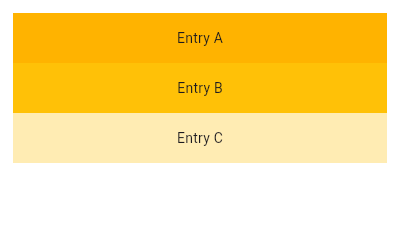
| /// This example uses the default constructor for [ListView] which takes an |
| /// explicit [List<Widget>] of children. This [ListView]'s children are made up |
| /// of [Container]s with [Text]. |
| /// |
| ///  |
| /// |
| /// ```dart |
| /// ListView( |
| /// padding: const EdgeInsets.all(8), |
| /// children: <Widget>[ |
| /// Container( |
| /// height: 50, |
| /// color: Colors.amber[600], |
| /// child: const Center(child: Text('Entry A')), |
| /// ), |
| /// Container( |
| /// height: 50, |
| /// color: Colors.amber[500], |
| /// child: const Center(child: Text('Entry B')), |
| /// ), |
| /// Container( |
| /// height: 50, |
| /// color: Colors.amber[100], |
| /// child: const Center(child: Text('Entry C')), |
| /// ), |
| /// ], |
| /// ) |
| /// ``` |
| /// {@end-tool} |
| /// |
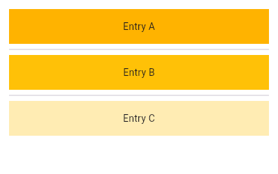
| /// {@tool snippet} |
| /// This example mirrors the previous one, creating the same list using the |
| /// [ListView.builder] constructor. Using the [IndexedWidgetBuilder], children |
| /// are built lazily and can be infinite in number. |
| /// |
| ///  |
| /// |
| /// ```dart |
| /// final List<String> entries = <String>['A', 'B', 'C']; |
| /// final List<int> colorCodes = <int>[600, 500, 100]; |
| /// |
| /// ListView.builder( |
| /// padding: const EdgeInsets.all(8), |
| /// itemCount: entries.length, |
| /// itemBuilder: (BuildContext context, int index) { |
| /// return Container( |
| /// height: 50, |
| /// color: Colors.amber[colorCodes[index]], |
| /// child: Center(child: Text('Entry ${entries[index]}')), |
| /// ); |
| /// } |
| /// ); |
| /// ``` |
| /// {@end-tool} |
| /// |
| /// {@tool snippet} |
| /// This example continues to build from our the previous ones, creating a |
| /// similar list using [ListView.separated]. Here, a [Divider] is used as a |
| /// separator. |
| /// |
| ///  |
| /// |
| /// ```dart |
| /// final List<String> entries = <String>['A', 'B', 'C']; |
| /// final List<int> colorCodes = <int>[600, 500, 100]; |
| /// |
| /// ListView.separated( |
| /// padding: const EdgeInsets.all(8), |
| /// itemCount: entries.length, |
| /// itemBuilder: (BuildContext context, int index) { |
| /// return Container( |
| /// height: 50, |
| /// color: Colors.amber[colorCodes[index]], |
| /// child: Center(child: Text('Entry ${entries[index]}')), |
| /// ); |
| /// }, |
| /// separatorBuilder: (BuildContext context, int index) => const Divider(), |
| /// ); |
| /// ``` |
| /// {@end-tool} |
| /// |
| /// ## Child elements' lifecycle |
| /// |
| /// ### Creation |
| /// |
| /// While laying out the list, visible children's elements, states and render |
| /// objects will be created lazily based on existing widgets (such as when using |
| /// the default constructor) or lazily provided ones (such as when using the |
| /// [ListView.builder] constructor). |
| /// |
| /// ### Destruction |
| /// |
| /// When a child is scrolled out of view, the associated element subtree, |
| /// states and render objects are destroyed. A new child at the same position |
| /// in the list will be lazily recreated along with new elements, states and |
| /// render objects when it is scrolled back. |
| /// |
| /// ### Destruction mitigation |
| /// |
| /// In order to preserve state as child elements are scrolled in and out of |
| /// view, the following options are possible: |
| /// |
| /// * Moving the ownership of non-trivial UI-state-driving business logic |
| /// out of the list child subtree. For instance, if a list contains posts |
| /// with their number of upvotes coming from a cached network response, store |
| /// the list of posts and upvote number in a data model outside the list. Let |
| /// the list child UI subtree be easily recreate-able from the |
| /// source-of-truth model object. Use [StatefulWidget]s in the child |
| /// widget subtree to store instantaneous UI state only. |
| /// |
| /// * Letting [KeepAlive] be the root widget of the list child widget subtree |
| /// that needs to be preserved. The [KeepAlive] widget marks the child |
| /// subtree's top render object child for keepalive. When the associated top |
| /// render object is scrolled out of view, the list keeps the child's render |
| /// object (and by extension, its associated elements and states) in a cache |
| /// list instead of destroying them. When scrolled back into view, the render |
| /// object is repainted as-is (if it wasn't marked dirty in the interim). |
| /// |
| /// This only works if `addAutomaticKeepAlives` and `addRepaintBoundaries` |
| /// are false since those parameters cause the [ListView] to wrap each child |
| /// widget subtree with other widgets. |
| /// |
| /// * Using [AutomaticKeepAlive] widgets (inserted by default when |
| /// `addAutomaticKeepAlives` is true). [AutomaticKeepAlive] allows descendant |
| /// widgets to control whether the subtree is actually kept alive or not. |
| /// This behavior is in contrast with [KeepAlive], which will unconditionally keep |
| /// the subtree alive. |
| /// |
| /// As an example, the [EditableText] widget signals its list child element |
| /// subtree to stay alive while its text field has input focus. If it doesn't |
| /// have focus and no other descendants signaled for keepalive via a |
| /// [KeepAliveNotification], the list child element subtree will be destroyed |
| /// when scrolled away. |
| /// |
| /// [AutomaticKeepAlive] descendants typically signal it to be kept alive |
| /// by using the [AutomaticKeepAliveClientMixin], then implementing the |
| /// [AutomaticKeepAliveClientMixin.wantKeepAlive] getter and calling |
| /// [AutomaticKeepAliveClientMixin.updateKeepAlive]. |
| /// |
| /// ## Transitioning to [CustomScrollView] |
| /// |
| /// A [ListView] is basically a [CustomScrollView] with a single [SliverList] in |
| /// its [CustomScrollView.slivers] property. |
| /// |
| /// If [ListView] is no longer sufficient, for example because the scroll view |
| /// is to have both a list and a grid, or because the list is to be combined |
| /// with a [SliverAppBar], etc, it is straight-forward to port code from using |
| /// [ListView] to using [CustomScrollView] directly. |
| /// |
| /// The [key], [scrollDirection], [reverse], [controller], [primary], [physics], |
| /// and [shrinkWrap] properties on [ListView] map directly to the identically |
| /// named properties on [CustomScrollView]. |
| /// |
| /// The [CustomScrollView.slivers] property should be a list containing either: |
| /// * a [SliverList] if both [itemExtent] and [prototypeItem] were null; |
| /// * a [SliverFixedExtentList] if [itemExtent] was not null; or |
| /// * a [SliverPrototypeExtentList] if [prototypeItem] was not null. |
| /// |
| /// The [childrenDelegate] property on [ListView] corresponds to the |
| /// [SliverList.delegate] (or [SliverFixedExtentList.delegate]) property. The |
| /// [ListView] constructor's `children` argument corresponds to the |
| /// [childrenDelegate] being a [SliverChildListDelegate] with that same |
| /// argument. The [ListView.builder] constructor's `itemBuilder` and |
| /// `itemCount` arguments correspond to the [childrenDelegate] being a |
| /// [SliverChildBuilderDelegate] with the equivalent arguments. |
| /// |
| /// The [padding] property corresponds to having a [SliverPadding] in the |
| /// [CustomScrollView.slivers] property instead of the list itself, and having |
| /// the [SliverList] instead be a child of the [SliverPadding]. |
| /// |
| /// [CustomScrollView]s don't automatically avoid obstructions from [MediaQuery] |
| /// like [ListView]s do. To reproduce the behavior, wrap the slivers in |
| /// [SliverSafeArea]s. |
| /// |
| /// Once code has been ported to use [CustomScrollView], other slivers, such as |
| /// [SliverGrid] or [SliverAppBar], can be put in the [CustomScrollView.slivers] |
| /// list. |
| /// |
| /// {@tool snippet} |
| /// |
| /// Here are two brief snippets showing a [ListView] and its equivalent using |
| /// [CustomScrollView]: |
| /// |
| /// ```dart |
| /// ListView( |
| /// shrinkWrap: true, |
| /// padding: const EdgeInsets.all(20.0), |
| /// children: const <Widget>[ |
| /// Text("I'm dedicating every day to you"), |
| /// Text('Domestic life was never quite my style'), |
| /// Text('When you smile, you knock me out, I fall apart'), |
| /// Text('And I thought I was so smart'), |
| /// ], |
| /// ) |
| /// ``` |
| /// {@end-tool} |
| /// {@tool snippet} |
| /// |
| /// ```dart |
| /// CustomScrollView( |
| /// shrinkWrap: true, |
| /// slivers: <Widget>[ |
| /// SliverPadding( |
| /// padding: const EdgeInsets.all(20.0), |
| /// sliver: SliverList( |
| /// delegate: SliverChildListDelegate( |
| /// <Widget>[ |
| /// const Text("I'm dedicating every day to you"), |
| /// const Text('Domestic life was never quite my style'), |
| /// const Text('When you smile, you knock me out, I fall apart'), |
| /// const Text('And I thought I was so smart'), |
| /// ], |
| /// ), |
| /// ), |
| /// ), |
| /// ], |
| /// ) |
| /// ``` |
| /// {@end-tool} |
| /// |
| /// ## Special handling for an empty list |
| /// |
| /// A common design pattern is to have a custom UI for an empty list. The best |
| /// way to achieve this in Flutter is just conditionally replacing the |
| /// [ListView] at build time with whatever widgets you need to show for the |
| /// empty list state: |
| /// |
| /// {@tool snippet} |
| /// |
| /// Example of simple empty list interface: |
| /// |
| /// ```dart |
| /// Widget build(BuildContext context) { |
| /// return Scaffold( |
| /// appBar: AppBar(title: const Text('Empty List Test')), |
| /// body: itemCount > 0 |
| /// ? ListView.builder( |
| /// itemCount: itemCount, |
| /// itemBuilder: (BuildContext context, int index) { |
| /// return ListTile( |
| /// title: Text('Item ${index + 1}'), |
| /// ); |
| /// }, |
| /// ) |
| /// : const Center(child: Text('No items')), |
| /// ); |
| /// } |
| /// ``` |
| /// {@end-tool} |
| /// |
| /// ## Selection of list items |
| /// |
| /// `ListView` has no built-in notion of a selected item or items. For a small |
| /// example of how a caller might wire up basic item selection, see |
| /// [ListTile.selected]. |
| /// |
| /// {@tool dartpad} |
| /// This example shows a custom implementation of [ListTile] selection in a [ListView] or [GridView]. |
| /// Long press any ListTile to enable selection mode. |
| /// |
| /// ** See code in examples/api/lib/widgets/scroll_view/listview_select.1.dart ** |
| /// {@end-tool} |
| /// |
| /// See also: |
| /// |
| /// * [SingleChildScrollView], which is a scrollable widget that has a single |
| /// child. |
| /// * [PageView], which is a scrolling list of child widgets that are each the |
| /// size of the viewport. |
| /// * [GridView], which is a scrollable, 2D array of widgets. |
| /// * [CustomScrollView], which is a scrollable widget that creates custom |
| /// scroll effects using slivers. |
| /// * [ListBody], which arranges its children in a similar manner, but without |
| /// scrolling. |
| /// * [ScrollNotification] and [NotificationListener], which can be used to watch |
| /// the scroll position without using a [ScrollController]. |
| /// * The [catalog of layout widgets](https://flutter.dev/widgets/layout/). |
| /// * Cookbook: [Use lists](https://flutter.dev/docs/cookbook/lists/basic-list) |
| /// * Cookbook: [Work with long lists](https://flutter.dev/docs/cookbook/lists/long-lists) |
| /// * Cookbook: [Create a horizontal list](https://flutter.dev/docs/cookbook/lists/horizontal-list) |
| /// * Cookbook: [Create lists with different types of items](https://flutter.dev/docs/cookbook/lists/mixed-list) |
| /// * Cookbook: [Implement swipe to dismiss](https://flutter.dev/docs/cookbook/gestures/dismissible) |
| class ListView extends BoxScrollView { |
| /// Creates a scrollable, linear array of widgets from an explicit [List]. |
| /// |
| /// This constructor is appropriate for list views with a small number of |
| /// children because constructing the [List] requires doing work for every |
| /// child that could possibly be displayed in the list view instead of just |
| /// those children that are actually visible. |
| /// |
| /// Like other widgets in the framework, this widget expects that |
| /// the [children] list will not be mutated after it has been passed in here. |
| /// See the documentation at [SliverChildListDelegate.children] for more details. |
| /// |
| /// It is usually more efficient to create children on demand using |
| /// [ListView.builder] because it will create the widget children lazily as necessary. |
| /// |
| /// The `addAutomaticKeepAlives` argument corresponds to the |
| /// [SliverChildListDelegate.addAutomaticKeepAlives] property. The |
| /// `addRepaintBoundaries` argument corresponds to the |
| /// [SliverChildListDelegate.addRepaintBoundaries] property. The |
| /// `addSemanticIndexes` argument corresponds to the |
| /// [SliverChildListDelegate.addSemanticIndexes] property. None |
| /// may be null. |
| ListView({ |
| super.key, |
| super.scrollDirection, |
| super.reverse, |
| super.controller, |
| super.primary, |
| super.physics, |
| super.shrinkWrap, |
| super.padding, |
| this.itemExtent, |
| this.prototypeItem, |
| bool addAutomaticKeepAlives = true, |
| bool addRepaintBoundaries = true, |
| bool addSemanticIndexes = true, |
| super.cacheExtent, |
| List<Widget> children = const <Widget>[], |
| int? semanticChildCount, |
| super.dragStartBehavior, |
| super.keyboardDismissBehavior, |
| super.restorationId, |
| super.clipBehavior, |
| }) : assert( |
| itemExtent == null || prototypeItem == null, |
| 'You can only pass itemExtent or prototypeItem, not both.', |
| ), |
| childrenDelegate = SliverChildListDelegate( |
| children, |
| addAutomaticKeepAlives: addAutomaticKeepAlives, |
| addRepaintBoundaries: addRepaintBoundaries, |
| addSemanticIndexes: addSemanticIndexes, |
| ), |
| super( |
| semanticChildCount: semanticChildCount ?? children.length, |
| ); |
| |
| /// Creates a scrollable, linear array of widgets that are created on demand. |
| /// |
| /// This constructor is appropriate for list views with a large (or infinite) |
| /// number of children because the builder is called only for those children |
| /// that are actually visible. |
| /// |
| /// Providing a non-null `itemCount` improves the ability of the [ListView] to |
| /// estimate the maximum scroll extent. |
| /// |
| /// The `itemBuilder` callback will be called only with indices greater than |
| /// or equal to zero and less than `itemCount`. |
| /// |
| /// The `itemBuilder` should always return a non-null widget, and actually |
| /// create the widget instances when called. Avoid using a builder that |
| /// returns a previously-constructed widget; if the list view's children are |
| /// created in advance, or all at once when the [ListView] itself is created, |
| /// it is more efficient to use the [ListView] constructor. Even more |
| /// efficient, however, is to create the instances on demand using this |
| /// constructor's `itemBuilder` callback. |
| /// |
| /// {@macro flutter.widgets.PageView.findChildIndexCallback} |
| /// |
| /// The `addAutomaticKeepAlives` argument corresponds to the |
| /// [SliverChildBuilderDelegate.addAutomaticKeepAlives] property. The |
| /// `addRepaintBoundaries` argument corresponds to the |
| /// [SliverChildBuilderDelegate.addRepaintBoundaries] property. The |
| /// `addSemanticIndexes` argument corresponds to the |
| /// [SliverChildBuilderDelegate.addSemanticIndexes] property. None may be |
| /// null. |
| ListView.builder({ |
| super.key, |
| super.scrollDirection, |
| super.reverse, |
| super.controller, |
| super.primary, |
| super.physics, |
| super.shrinkWrap, |
| super.padding, |
| this.itemExtent, |
| this.prototypeItem, |
| required IndexedWidgetBuilder itemBuilder, |
| ChildIndexGetter? findChildIndexCallback, |
| int? itemCount, |
| bool addAutomaticKeepAlives = true, |
| bool addRepaintBoundaries = true, |
| bool addSemanticIndexes = true, |
| super.cacheExtent, |
| int? semanticChildCount, |
| super.dragStartBehavior, |
| super.keyboardDismissBehavior, |
| super.restorationId, |
| super.clipBehavior, |
| }) : assert(itemCount == null || itemCount >= 0), |
| assert(semanticChildCount == null || semanticChildCount <= itemCount!), |
| assert( |
| itemExtent == null || prototypeItem == null, |
| 'You can only pass itemExtent or prototypeItem, not both.', |
| ), |
| childrenDelegate = SliverChildBuilderDelegate( |
| itemBuilder, |
| findChildIndexCallback: findChildIndexCallback, |
| childCount: itemCount, |
| addAutomaticKeepAlives: addAutomaticKeepAlives, |
| addRepaintBoundaries: addRepaintBoundaries, |
| addSemanticIndexes: addSemanticIndexes, |
| ), |
| super( |
| semanticChildCount: semanticChildCount ?? itemCount, |
| ); |
| |
| /// Creates a fixed-length scrollable linear array of list "items" separated |
| /// by list item "separators". |
| /// |
| /// This constructor is appropriate for list views with a large number of |
| /// item and separator children because the builders are only called for |
| /// the children that are actually visible. |
| /// |
| /// The `itemBuilder` callback will be called with indices greater than |
| /// or equal to zero and less than `itemCount`. |
| /// |
| /// Separators only appear between list items: separator 0 appears after item |
| /// 0 and the last separator appears before the last item. |
| /// |
| /// The `separatorBuilder` callback will be called with indices greater than |
| /// or equal to zero and less than `itemCount - 1`. |
| /// |
| /// The `itemBuilder` and `separatorBuilder` callbacks should always return a |
| /// non-null widget, and actually create widget instances when called. Avoid |
| /// using a builder that returns a previously-constructed widget; if the list |
| /// view's children are created in advance, or all at once when the [ListView] |
| /// itself is created, it is more efficient to use the [ListView] constructor. |
| /// |
| /// {@macro flutter.widgets.PageView.findChildIndexCallback} |
| /// |
| /// {@tool snippet} |
| /// |
| /// This example shows how to create [ListView] whose [ListTile] list items |
| /// are separated by [Divider]s. |
| /// |
| /// ```dart |
| /// ListView.separated( |
| /// itemCount: 25, |
| /// separatorBuilder: (BuildContext context, int index) => const Divider(), |
| /// itemBuilder: (BuildContext context, int index) { |
| /// return ListTile( |
| /// title: Text('item $index'), |
| /// ); |
| /// }, |
| /// ) |
| /// ``` |
| /// {@end-tool} |
| /// |
| /// The `addAutomaticKeepAlives` argument corresponds to the |
| /// [SliverChildBuilderDelegate.addAutomaticKeepAlives] property. The |
| /// `addRepaintBoundaries` argument corresponds to the |
| /// [SliverChildBuilderDelegate.addRepaintBoundaries] property. The |
| /// `addSemanticIndexes` argument corresponds to the |
| /// [SliverChildBuilderDelegate.addSemanticIndexes] property. None may be |
| /// null. |
| ListView.separated({ |
| super.key, |
| super.scrollDirection, |
| super.reverse, |
| super.controller, |
| super.primary, |
| super.physics, |
| super.shrinkWrap, |
| super.padding, |
| required IndexedWidgetBuilder itemBuilder, |
| ChildIndexGetter? findChildIndexCallback, |
| required IndexedWidgetBuilder separatorBuilder, |
| required int itemCount, |
| bool addAutomaticKeepAlives = true, |
| bool addRepaintBoundaries = true, |
| bool addSemanticIndexes = true, |
| super.cacheExtent, |
| super.dragStartBehavior, |
| super.keyboardDismissBehavior, |
| super.restorationId, |
| super.clipBehavior, |
| }) : assert(itemBuilder != null), |
| assert(separatorBuilder != null), |
| assert(itemCount != null && itemCount >= 0), |
| itemExtent = null, |
| prototypeItem = null, |
| childrenDelegate = SliverChildBuilderDelegate( |
| (BuildContext context, int index) { |
| final int itemIndex = index ~/ 2; |
| final Widget widget; |
| if (index.isEven) { |
| widget = itemBuilder(context, itemIndex); |
| } else { |
| widget = separatorBuilder(context, itemIndex); |
| assert(() { |
| if (widget == null) { |
| throw FlutterError('separatorBuilder cannot return null.'); |
| } |
| return true; |
| }()); |
| } |
| return widget; |
| }, |
| findChildIndexCallback: findChildIndexCallback, |
| childCount: _computeActualChildCount(itemCount), |
| addAutomaticKeepAlives: addAutomaticKeepAlives, |
| addRepaintBoundaries: addRepaintBoundaries, |
| addSemanticIndexes: addSemanticIndexes, |
| semanticIndexCallback: (Widget _, int index) { |
| return index.isEven ? index ~/ 2 : null; |
| }, |
| ), |
| super( |
| semanticChildCount: itemCount, |
| ); |
| |
| /// Creates a scrollable, linear array of widgets with a custom child model. |
| /// |
| /// For example, a custom child model can control the algorithm used to |
| /// estimate the size of children that are not actually visible. |
| /// |
| /// {@tool snippet} |
| /// |
| /// This [ListView] uses a custom [SliverChildBuilderDelegate] to support child |
| /// reordering. |
| /// |
| /// ```dart |
| /// class MyListView extends StatefulWidget { |
| /// const MyListView({super.key}); |
| /// |
| /// @override |
| /// State<MyListView> createState() => _MyListViewState(); |
| /// } |
| /// |
| /// class _MyListViewState extends State<MyListView> { |
| /// List<String> items = <String>['1', '2', '3', '4', '5']; |
| /// |
| /// void _reverse() { |
| /// setState(() { |
| /// items = items.reversed.toList(); |
| /// }); |
| /// } |
| /// |
| /// @override |
| /// Widget build(BuildContext context) { |
| /// return Scaffold( |
| /// body: SafeArea( |
| /// child: ListView.custom( |
| /// childrenDelegate: SliverChildBuilderDelegate( |
| /// (BuildContext context, int index) { |
| /// return KeepAlive( |
| /// data: items[index], |
| /// key: ValueKey<String>(items[index]), |
| /// ); |
| /// }, |
| /// childCount: items.length, |
| /// findChildIndexCallback: (Key key) { |
| /// final ValueKey<String> valueKey = key as ValueKey<String>; |
| /// final String data = valueKey.value; |
| /// return items.indexOf(data); |
| /// } |
| /// ), |
| /// ), |
| /// ), |
| /// bottomNavigationBar: BottomAppBar( |
| /// child: Row( |
| /// mainAxisAlignment: MainAxisAlignment.center, |
| /// children: <Widget>[ |
| /// TextButton( |
| /// onPressed: () => _reverse(), |
| /// child: const Text('Reverse items'), |
| /// ), |
| /// ], |
| /// ), |
| /// ), |
| /// ); |
| /// } |
| /// } |
| /// |
| /// class KeepAlive extends StatefulWidget { |
| /// const KeepAlive({ |
| /// required Key key, |
| /// required this.data, |
| /// }) : super(key: key); |
| /// |
| /// final String data; |
| /// |
| /// @override |
| /// State<KeepAlive> createState() => _KeepAliveState(); |
| /// } |
| /// |
| /// class _KeepAliveState extends State<KeepAlive> with AutomaticKeepAliveClientMixin{ |
| /// @override |
| /// bool get wantKeepAlive => true; |
| /// |
| /// @override |
| /// Widget build(BuildContext context) { |
| /// super.build(context); |
| /// return Text(widget.data); |
| /// } |
| /// } |
| /// ``` |
| /// {@end-tool} |
| const ListView.custom({ |
| super.key, |
| super.scrollDirection, |
| super.reverse, |
| super.controller, |
| super.primary, |
| super.physics, |
| super.shrinkWrap, |
| super.padding, |
| this.itemExtent, |
| this.prototypeItem, |
| required this.childrenDelegate, |
| super.cacheExtent, |
| super.semanticChildCount, |
| super.dragStartBehavior, |
| super.keyboardDismissBehavior, |
| super.restorationId, |
| super.clipBehavior, |
| }) : assert(childrenDelegate != null), |
| assert( |
| itemExtent == null || prototypeItem == null, |
| 'You can only pass itemExtent or prototypeItem, not both', |
| ); |
| |
| /// {@template flutter.widgets.list_view.itemExtent} |
| /// If non-null, forces the children to have the given extent in the scroll |
| /// direction. |
| /// |
| /// Specifying an [itemExtent] is more efficient than letting the children |
| /// determine their own extent because the scrolling machinery can make use of |
| /// the foreknowledge of the children's extent to save work, for example when |
| /// the scroll position changes drastically. |
| /// |
| /// See also: |
| /// |
| /// * [SliverFixedExtentList], the sliver used internally when this property |
| /// is provided. It constrains its box children to have a specific given |
| /// extent along the main axis. |
| /// * The [prototypeItem] property, which allows forcing the children's |
| /// extent to be the same as the given widget. |
| /// {@endtemplate} |
| final double? itemExtent; |
| |
| /// {@template flutter.widgets.list_view.prototypeItem} |
| /// If non-null, forces the children to have the same extent as the given |
| /// widget in the scroll direction. |
| /// |
| /// Specifying an [prototypeItem] is more efficient than letting the children |
| /// determine their own extent because the scrolling machinery can make use of |
| /// the foreknowledge of the children's extent to save work, for example when |
| /// the scroll position changes drastically. |
| /// |
| /// See also: |
| /// |
| /// * [SliverPrototypeExtentList], the sliver used internally when this |
| /// property is provided. It constrains its box children to have the same |
| /// extent as a prototype item along the main axis. |
| /// * The [itemExtent] property, which allows forcing the children's extent |
| /// to a given value. |
| /// {@endtemplate} |
| final Widget? prototypeItem; |
| |
| /// A delegate that provides the children for the [ListView]. |
| /// |
| /// The [ListView.custom] constructor lets you specify this delegate |
| /// explicitly. The [ListView] and [ListView.builder] constructors create a |
| /// [childrenDelegate] that wraps the given [List] and [IndexedWidgetBuilder], |
| /// respectively. |
| final SliverChildDelegate childrenDelegate; |
| |
| @override |
| Widget buildChildLayout(BuildContext context) { |
| if (itemExtent != null) { |
| return SliverFixedExtentList( |
| delegate: childrenDelegate, |
| itemExtent: itemExtent!, |
| ); |
| } else if (prototypeItem != null) { |
| return SliverPrototypeExtentList( |
| delegate: childrenDelegate, |
| prototypeItem: prototypeItem!, |
| ); |
| } |
| return SliverList(delegate: childrenDelegate); |
| } |
| |
| @override |
| void debugFillProperties(DiagnosticPropertiesBuilder properties) { |
| super.debugFillProperties(properties); |
| properties.add(DoubleProperty('itemExtent', itemExtent, defaultValue: null)); |
| } |
| |
| // Helper method to compute the actual child count for the separated constructor. |
| static int _computeActualChildCount(int itemCount) { |
| return math.max(0, itemCount * 2 - 1); |
| } |
| } |
| |
| /// A scrollable, 2D array of widgets. |
| /// |
| /// {@youtube 560 315 https://www.youtube.com/watch?v=bLOtZDTm4H8} |
| /// |
| /// The main axis direction of a grid is the direction in which it scrolls (the |
| /// [scrollDirection]). |
| /// |
| /// The most commonly used grid layouts are [GridView.count], which creates a |
| /// layout with a fixed number of tiles in the cross axis, and |
| /// [GridView.extent], which creates a layout with tiles that have a maximum |
| /// cross-axis extent. A custom [SliverGridDelegate] can produce an arbitrary 2D |
| /// arrangement of children, including arrangements that are unaligned or |
| /// overlapping. |
| /// |
| /// To create a grid with a large (or infinite) number of children, use the |
| /// [GridView.builder] constructor with either a |
| /// [SliverGridDelegateWithFixedCrossAxisCount] or a |
| /// [SliverGridDelegateWithMaxCrossAxisExtent] for the [gridDelegate]. |
| /// |
| /// To use a custom [SliverChildDelegate], use [GridView.custom]. |
| /// |
| /// To create a linear array of children, use a [ListView]. |
| /// |
| /// To control the initial scroll offset of the scroll view, provide a |
| /// [controller] with its [ScrollController.initialScrollOffset] property set. |
| /// |
| /// ## Transitioning to [CustomScrollView] |
| /// |
| /// A [GridView] is basically a [CustomScrollView] with a single [SliverGrid] in |
| /// its [CustomScrollView.slivers] property. |
| /// |
| /// If [GridView] is no longer sufficient, for example because the scroll view |
| /// is to have both a grid and a list, or because the grid is to be combined |
| /// with a [SliverAppBar], etc, it is straight-forward to port code from using |
| /// [GridView] to using [CustomScrollView] directly. |
| /// |
| /// The [key], [scrollDirection], [reverse], [controller], [primary], [physics], |
| /// and [shrinkWrap] properties on [GridView] map directly to the identically |
| /// named properties on [CustomScrollView]. |
| /// |
| /// The [CustomScrollView.slivers] property should be a list containing just a |
| /// [SliverGrid]. |
| /// |
| /// The [childrenDelegate] property on [GridView] corresponds to the |
| /// [SliverGrid.delegate] property, and the [gridDelegate] property on the |
| /// [GridView] corresponds to the [SliverGrid.gridDelegate] property. |
| /// |
| /// The [GridView], [GridView.count], and [GridView.extent] |
| /// constructors' `children` arguments correspond to the [childrenDelegate] |
| /// being a [SliverChildListDelegate] with that same argument. The |
| /// [GridView.builder] constructor's `itemBuilder` and `childCount` arguments |
| /// correspond to the [childrenDelegate] being a [SliverChildBuilderDelegate] |
| /// with the matching arguments. |
| /// |
| /// The [GridView.count] and [GridView.extent] constructors create |
| /// custom grid delegates, and have equivalently named constructors on |
| /// [SliverGrid] to ease the transition: [SliverGrid.count] and |
| /// [SliverGrid.extent] respectively. |
| /// |
| /// The [padding] property corresponds to having a [SliverPadding] in the |
| /// [CustomScrollView.slivers] property instead of the grid itself, and having |
| /// the [SliverGrid] instead be a child of the [SliverPadding]. |
| /// |
| /// Once code has been ported to use [CustomScrollView], other slivers, such as |
| /// [SliverList] or [SliverAppBar], can be put in the [CustomScrollView.slivers] |
| /// list. |
| /// |
| /// {@tool snippet} |
| /// This example demonstrates how to create a [GridView] with two columns. The |
| /// children are spaced apart using the `crossAxisSpacing` and `mainAxisSpacing` |
| /// properties. |
| /// |
| ///  |
| /// |
| /// ```dart |
| /// GridView.count( |
| /// primary: false, |
| /// padding: const EdgeInsets.all(20), |
| /// crossAxisSpacing: 10, |
| /// mainAxisSpacing: 10, |
| /// crossAxisCount: 2, |
| /// children: <Widget>[ |
| /// Container( |
| /// padding: const EdgeInsets.all(8), |
| /// color: Colors.teal[100], |
| /// child: const Text("He'd have you all unravel at the"), |
| /// ), |
| /// Container( |
| /// padding: const EdgeInsets.all(8), |
| /// color: Colors.teal[200], |
| /// child: const Text('Heed not the rabble'), |
| /// ), |
| /// Container( |
| /// padding: const EdgeInsets.all(8), |
| /// color: Colors.teal[300], |
| /// child: const Text('Sound of screams but the'), |
| /// ), |
| /// Container( |
| /// padding: const EdgeInsets.all(8), |
| /// color: Colors.teal[400], |
| /// child: const Text('Who scream'), |
| /// ), |
| /// Container( |
| /// padding: const EdgeInsets.all(8), |
| /// color: Colors.teal[500], |
| /// child: const Text('Revolution is coming...'), |
| /// ), |
| /// Container( |
| /// padding: const EdgeInsets.all(8), |
| /// color: Colors.teal[600], |
| /// child: const Text('Revolution, they...'), |
| /// ), |
| /// ], |
| /// ) |
| /// ``` |
| /// {@end-tool} |
| /// |
| /// {@tool snippet} |
| /// This example shows how to create the same grid as the previous example |
| /// using a [CustomScrollView] and a [SliverGrid]. |
| /// |
| /// 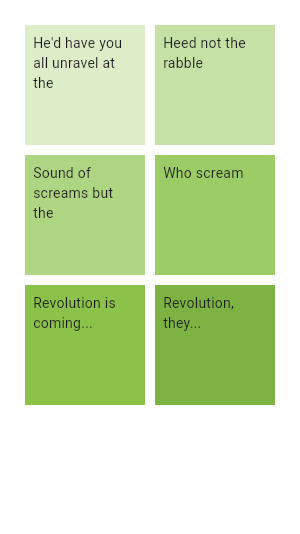 |
| /// |
| /// ```dart |
| /// CustomScrollView( |
| /// primary: false, |
| /// slivers: <Widget>[ |
| /// SliverPadding( |
| /// padding: const EdgeInsets.all(20), |
| /// sliver: SliverGrid.count( |
| /// crossAxisSpacing: 10, |
| /// mainAxisSpacing: 10, |
| /// crossAxisCount: 2, |
| /// children: <Widget>[ |
| /// Container( |
| /// padding: const EdgeInsets.all(8), |
| /// color: Colors.green[100], |
| /// child: const Text("He'd have you all unravel at the"), |
| /// ), |
| /// Container( |
| /// padding: const EdgeInsets.all(8), |
| /// color: Colors.green[200], |
| /// child: const Text('Heed not the rabble'), |
| /// ), |
| /// Container( |
| /// padding: const EdgeInsets.all(8), |
| /// color: Colors.green[300], |
| /// child: const Text('Sound of screams but the'), |
| /// ), |
| /// Container( |
| /// padding: const EdgeInsets.all(8), |
| /// color: Colors.green[400], |
| /// child: const Text('Who scream'), |
| /// ), |
| /// Container( |
| /// padding: const EdgeInsets.all(8), |
| /// color: Colors.green[500], |
| /// child: const Text('Revolution is coming...'), |
| /// ), |
| /// Container( |
| /// padding: const EdgeInsets.all(8), |
| /// color: Colors.green[600], |
| /// child: const Text('Revolution, they...'), |
| /// ), |
| /// ], |
| /// ), |
| /// ), |
| /// ], |
| /// ) |
| /// ``` |
| /// {@end-tool} |
| /// |
| /// By default, [GridView] will automatically pad the limits of the |
| /// grids's scrollable to avoid partial obstructions indicated by |
| /// [MediaQuery]'s padding. To avoid this behavior, override with a |
| /// zero [padding] property. |
| /// |
| /// {@tool snippet} |
| /// The following example demonstrates how to override the default top padding |
| /// using [MediaQuery.removePadding]. |
| /// |
| /// ```dart |
| /// Widget myWidget(BuildContext context) { |
| /// return MediaQuery.removePadding( |
| /// context: context, |
| /// removeTop: true, |
| /// child: GridView.builder( |
| /// gridDelegate: const SliverGridDelegateWithFixedCrossAxisCount( |
| /// crossAxisCount: 3, |
| /// ), |
| /// itemCount: 300, |
| /// itemBuilder: (BuildContext context, int index) { |
| /// return Card( |
| /// color: Colors.amber, |
| /// child: Center(child: Text('$index')), |
| /// ); |
| /// } |
| /// ), |
| /// ); |
| /// } |
| /// ``` |
| /// {@end-tool} |
| /// |
| /// {@tool dartpad} |
| /// This example shows a custom implementation of [ListTile] selection in a [GridView] or [ListView]. |
| /// Long press any ListTile to enable selection mode. |
| /// |
| /// ** See code in examples/api/lib/widgets/scroll_view/listview_select.1.dart ** |
| /// {@end-tool} |
| /// |
| /// See also: |
| /// |
| /// * [SingleChildScrollView], which is a scrollable widget that has a single |
| /// child. |
| /// * [ListView], which is scrollable, linear list of widgets. |
| /// * [PageView], which is a scrolling list of child widgets that are each the |
| /// size of the viewport. |
| /// * [CustomScrollView], which is a scrollable widget that creates custom |
| /// scroll effects using slivers. |
| /// * [SliverGridDelegateWithFixedCrossAxisCount], which creates a layout with |
| /// a fixed number of tiles in the cross axis. |
| /// * [SliverGridDelegateWithMaxCrossAxisExtent], which creates a layout with |
| /// tiles that have a maximum cross-axis extent. |
| /// * [ScrollNotification] and [NotificationListener], which can be used to watch |
| /// the scroll position without using a [ScrollController]. |
| /// * The [catalog of layout widgets](https://flutter.dev/widgets/layout/). |
| class GridView extends BoxScrollView { |
| /// Creates a scrollable, 2D array of widgets with a custom |
| /// [SliverGridDelegate]. |
| /// |
| /// The [gridDelegate] argument must not be null. |
| /// |
| /// The `addAutomaticKeepAlives` argument corresponds to the |
| /// [SliverChildListDelegate.addAutomaticKeepAlives] property. The |
| /// `addRepaintBoundaries` argument corresponds to the |
| /// [SliverChildListDelegate.addRepaintBoundaries] property. Both must not be |
| /// null. |
| GridView({ |
| super.key, |
| super.scrollDirection, |
| super.reverse, |
| super.controller, |
| super.primary, |
| super.physics, |
| super.shrinkWrap, |
| super.padding, |
| required this.gridDelegate, |
| bool addAutomaticKeepAlives = true, |
| bool addRepaintBoundaries = true, |
| bool addSemanticIndexes = true, |
| super.cacheExtent, |
| List<Widget> children = const <Widget>[], |
| int? semanticChildCount, |
| super.dragStartBehavior, |
| super.clipBehavior, |
| super.keyboardDismissBehavior, |
| super.restorationId, |
| }) : assert(gridDelegate != null), |
| childrenDelegate = SliverChildListDelegate( |
| children, |
| addAutomaticKeepAlives: addAutomaticKeepAlives, |
| addRepaintBoundaries: addRepaintBoundaries, |
| addSemanticIndexes: addSemanticIndexes, |
| ), |
| super( |
| semanticChildCount: semanticChildCount ?? children.length, |
| ); |
| |
| /// Creates a scrollable, 2D array of widgets that are created on demand. |
| /// |
| /// This constructor is appropriate for grid views with a large (or infinite) |
| /// number of children because the builder is called only for those children |
| /// that are actually visible. |
| /// |
| /// Providing a non-null `itemCount` improves the ability of the [GridView] to |
| /// estimate the maximum scroll extent. |
| /// |
| /// `itemBuilder` will be called only with indices greater than or equal to |
| /// zero and less than `itemCount`. |
| /// |
| /// {@macro flutter.widgets.PageView.findChildIndexCallback} |
| /// |
| /// The [gridDelegate] argument must not be null. |
| /// |
| /// The `addAutomaticKeepAlives` argument corresponds to the |
| /// [SliverChildBuilderDelegate.addAutomaticKeepAlives] property. The |
| /// `addRepaintBoundaries` argument corresponds to the |
| /// [SliverChildBuilderDelegate.addRepaintBoundaries] property. Both must not |
| /// be null. |
| GridView.builder({ |
| super.key, |
| super.scrollDirection, |
| super.reverse, |
| super.controller, |
| super.primary, |
| super.physics, |
| super.shrinkWrap, |
| super.padding, |
| required this.gridDelegate, |
| required IndexedWidgetBuilder itemBuilder, |
| ChildIndexGetter? findChildIndexCallback, |
| int? itemCount, |
| bool addAutomaticKeepAlives = true, |
| bool addRepaintBoundaries = true, |
| bool addSemanticIndexes = true, |
| super.cacheExtent, |
| int? semanticChildCount, |
| super.dragStartBehavior, |
| super.keyboardDismissBehavior, |
| super.restorationId, |
| super.clipBehavior, |
| }) : assert(gridDelegate != null), |
| childrenDelegate = SliverChildBuilderDelegate( |
| itemBuilder, |
| findChildIndexCallback: findChildIndexCallback, |
| childCount: itemCount, |
| addAutomaticKeepAlives: addAutomaticKeepAlives, |
| addRepaintBoundaries: addRepaintBoundaries, |
| addSemanticIndexes: addSemanticIndexes, |
| ), |
| super( |
| semanticChildCount: semanticChildCount ?? itemCount, |
| ); |
| |
| /// Creates a scrollable, 2D array of widgets with both a custom |
| /// [SliverGridDelegate] and a custom [SliverChildDelegate]. |
| /// |
| /// To use an [IndexedWidgetBuilder] callback to build children, either use |
| /// a [SliverChildBuilderDelegate] or use the [GridView.builder] constructor. |
| /// |
| /// The [gridDelegate] and [childrenDelegate] arguments must not be null. |
| const GridView.custom({ |
| super.key, |
| super.scrollDirection, |
| super.reverse, |
| super.controller, |
| super.primary, |
| super.physics, |
| super.shrinkWrap, |
| super.padding, |
| required this.gridDelegate, |
| required this.childrenDelegate, |
| super.cacheExtent, |
| super.semanticChildCount, |
| super.dragStartBehavior, |
| super.keyboardDismissBehavior, |
| super.restorationId, |
| super.clipBehavior, |
| }) : assert(gridDelegate != null), |
| assert(childrenDelegate != null); |
| |
| /// Creates a scrollable, 2D array of widgets with a fixed number of tiles in |
| /// the cross axis. |
| /// |
| /// Uses a [SliverGridDelegateWithFixedCrossAxisCount] as the [gridDelegate]. |
| /// |
| /// The `addAutomaticKeepAlives` argument corresponds to the |
| /// [SliverChildListDelegate.addAutomaticKeepAlives] property. The |
| /// `addRepaintBoundaries` argument corresponds to the |
| /// [SliverChildListDelegate.addRepaintBoundaries] property. Both must not be |
| /// null. |
| /// |
| /// See also: |
| /// |
| /// * [SliverGrid.count], the equivalent constructor for [SliverGrid]. |
| GridView.count({ |
| super.key, |
| super.scrollDirection, |
| super.reverse, |
| super.controller, |
| super.primary, |
| super.physics, |
| super.shrinkWrap, |
| super.padding, |
| required int crossAxisCount, |
| double mainAxisSpacing = 0.0, |
| double crossAxisSpacing = 0.0, |
| double childAspectRatio = 1.0, |
| bool addAutomaticKeepAlives = true, |
| bool addRepaintBoundaries = true, |
| bool addSemanticIndexes = true, |
| super.cacheExtent, |
| List<Widget> children = const <Widget>[], |
| int? semanticChildCount, |
| super.dragStartBehavior, |
| super.keyboardDismissBehavior, |
| super.restorationId, |
| super.clipBehavior, |
| }) : gridDelegate = SliverGridDelegateWithFixedCrossAxisCount( |
| crossAxisCount: crossAxisCount, |
| mainAxisSpacing: mainAxisSpacing, |
| crossAxisSpacing: crossAxisSpacing, |
| childAspectRatio: childAspectRatio, |
| ), |
| childrenDelegate = SliverChildListDelegate( |
| children, |
| addAutomaticKeepAlives: addAutomaticKeepAlives, |
| addRepaintBoundaries: addRepaintBoundaries, |
| addSemanticIndexes: addSemanticIndexes, |
| ), |
| super( |
| semanticChildCount: semanticChildCount ?? children.length, |
| ); |
| |
| /// Creates a scrollable, 2D array of widgets with tiles that each have a |
| /// maximum cross-axis extent. |
| /// |
| /// Uses a [SliverGridDelegateWithMaxCrossAxisExtent] as the [gridDelegate]. |
| /// |
| /// The `addAutomaticKeepAlives` argument corresponds to the |
| /// [SliverChildListDelegate.addAutomaticKeepAlives] property. The |
| /// `addRepaintBoundaries` argument corresponds to the |
| /// [SliverChildListDelegate.addRepaintBoundaries] property. Both must not be |
| /// null. |
| /// |
| /// See also: |
| /// |
| /// * [SliverGrid.extent], the equivalent constructor for [SliverGrid]. |
| GridView.extent({ |
| super.key, |
| super.scrollDirection, |
| super.reverse, |
| super.controller, |
| super.primary, |
| super.physics, |
| super.shrinkWrap, |
| super.padding, |
| required double maxCrossAxisExtent, |
| double mainAxisSpacing = 0.0, |
| double crossAxisSpacing = 0.0, |
| double childAspectRatio = 1.0, |
| bool addAutomaticKeepAlives = true, |
| bool addRepaintBoundaries = true, |
| bool addSemanticIndexes = true, |
| super.cacheExtent, |
| List<Widget> children = const <Widget>[], |
| int? semanticChildCount, |
| super.dragStartBehavior, |
| super.keyboardDismissBehavior, |
| super.restorationId, |
| super.clipBehavior, |
| }) : gridDelegate = SliverGridDelegateWithMaxCrossAxisExtent( |
| maxCrossAxisExtent: maxCrossAxisExtent, |
| mainAxisSpacing: mainAxisSpacing, |
| crossAxisSpacing: crossAxisSpacing, |
| childAspectRatio: childAspectRatio, |
| ), |
| childrenDelegate = SliverChildListDelegate( |
| children, |
| addAutomaticKeepAlives: addAutomaticKeepAlives, |
| addRepaintBoundaries: addRepaintBoundaries, |
| addSemanticIndexes: addSemanticIndexes, |
| ), |
| super( |
| semanticChildCount: semanticChildCount ?? children.length, |
| ); |
| |
| /// A delegate that controls the layout of the children within the [GridView]. |
| /// |
| /// The [GridView], [GridView.builder], and [GridView.custom] constructors let you specify this |
| /// delegate explicitly. The other constructors create a [gridDelegate] |
| /// implicitly. |
| final SliverGridDelegate gridDelegate; |
| |
| /// A delegate that provides the children for the [GridView]. |
| /// |
| /// The [GridView.custom] constructor lets you specify this delegate |
| /// explicitly. The other constructors create a [childrenDelegate] that wraps |
| /// the given child list. |
| final SliverChildDelegate childrenDelegate; |
| |
| @override |
| Widget buildChildLayout(BuildContext context) { |
| return SliverGrid( |
| delegate: childrenDelegate, |
| gridDelegate: gridDelegate, |
| ); |
| } |
| } |