| // Copyright 2014 The Flutter Authors. All rights reserved. |
| // Use of this source code is governed by a BSD-style license that can be |
| // found in the LICENSE file. |
| |
| import 'dart:ui' as ui show BoxHeightStyle, BoxWidthStyle; |
| |
| import 'package:flutter/cupertino.dart'; |
| import 'package:flutter/foundation.dart'; |
| import 'package:flutter/gestures.dart'; |
| import 'package:flutter/rendering.dart'; |
| import 'package:flutter/services.dart'; |
| |
| import 'debug.dart'; |
| import 'desktop_text_selection.dart'; |
| import 'feedback.dart'; |
| import 'input_decorator.dart'; |
| import 'material.dart'; |
| import 'material_localizations.dart'; |
| import 'material_state.dart'; |
| import 'selectable_text.dart' show iOSHorizontalOffset; |
| import 'text_selection.dart'; |
| import 'theme.dart'; |
| |
| export 'package:flutter/services.dart' show TextInputType, TextInputAction, TextCapitalization, SmartQuotesType, SmartDashesType; |
| |
| /// Signature for the [TextField.buildCounter] callback. |
| typedef InputCounterWidgetBuilder = Widget? Function( |
| /// The build context for the TextField. |
| BuildContext context, { |
| /// The length of the string currently in the input. |
| required int currentLength, |
| /// The maximum string length that can be entered into the TextField. |
| required int? maxLength, |
| /// Whether or not the TextField is currently focused. Mainly provided for |
| /// the [liveRegion] parameter in the [Semantics] widget for accessibility. |
| required bool isFocused, |
| }); |
| |
| class _TextFieldSelectionGestureDetectorBuilder extends TextSelectionGestureDetectorBuilder { |
| _TextFieldSelectionGestureDetectorBuilder({ |
| required _TextFieldState state, |
| }) : _state = state, |
| super(delegate: state); |
| |
| final _TextFieldState _state; |
| |
| @override |
| void onForcePressStart(ForcePressDetails details) { |
| super.onForcePressStart(details); |
| if (delegate.selectionEnabled && shouldShowSelectionToolbar) { |
| editableText.showToolbar(); |
| } |
| } |
| |
| @override |
| void onForcePressEnd(ForcePressDetails details) { |
| // Not required. |
| } |
| |
| @override |
| void onSingleLongTapMoveUpdate(LongPressMoveUpdateDetails details) { |
| if (delegate.selectionEnabled) { |
| switch (Theme.of(_state.context).platform) { |
| case TargetPlatform.iOS: |
| case TargetPlatform.macOS: |
| renderEditable.selectPositionAt( |
| from: details.globalPosition, |
| cause: SelectionChangedCause.longPress, |
| ); |
| break; |
| case TargetPlatform.android: |
| case TargetPlatform.fuchsia: |
| case TargetPlatform.linux: |
| case TargetPlatform.windows: |
| renderEditable.selectWordsInRange( |
| from: details.globalPosition - details.offsetFromOrigin, |
| to: details.globalPosition, |
| cause: SelectionChangedCause.longPress, |
| ); |
| break; |
| } |
| } |
| } |
| |
| @override |
| void onSingleTapUp(TapUpDetails details) { |
| editableText.hideToolbar(); |
| super.onSingleTapUp(details); |
| _state._requestKeyboard(); |
| _state.widget.onTap?.call(); |
| } |
| |
| @override |
| void onSingleLongTapStart(LongPressStartDetails details) { |
| if (delegate.selectionEnabled) { |
| switch (Theme.of(_state.context).platform) { |
| case TargetPlatform.iOS: |
| case TargetPlatform.macOS: |
| renderEditable.selectPositionAt( |
| from: details.globalPosition, |
| cause: SelectionChangedCause.longPress, |
| ); |
| break; |
| case TargetPlatform.android: |
| case TargetPlatform.fuchsia: |
| case TargetPlatform.linux: |
| case TargetPlatform.windows: |
| renderEditable.selectWord(cause: SelectionChangedCause.longPress); |
| Feedback.forLongPress(_state.context); |
| break; |
| } |
| } |
| } |
| } |
| |
| /// A Material Design text field. |
| /// |
| /// A text field lets the user enter text, either with hardware keyboard or with |
| /// an onscreen keyboard. |
| /// |
| /// The text field calls the [onChanged] callback whenever the user changes the |
| /// text in the field. If the user indicates that they are done typing in the |
| /// field (e.g., by pressing a button on the soft keyboard), the text field |
| /// calls the [onSubmitted] callback. |
| /// |
| /// To control the text that is displayed in the text field, use the |
| /// [controller]. For example, to set the initial value of the text field, use |
| /// a [controller] that already contains some text. The [controller] can also |
| /// control the selection and composing region (and to observe changes to the |
| /// text, selection, and composing region). |
| /// |
| /// By default, a text field has a [decoration] that draws a divider below the |
| /// text field. You can use the [decoration] property to control the decoration, |
| /// for example by adding a label or an icon. If you set the [decoration] |
| /// property to null, the decoration will be removed entirely, including the |
| /// extra padding introduced by the decoration to save space for the labels. |
| /// |
| /// If [decoration] is non-null (which is the default), the text field requires |
| /// one of its ancestors to be a [Material] widget. |
| /// |
| /// To integrate the [TextField] into a [Form] with other [FormField] widgets, |
| /// consider using [TextFormField]. |
| /// |
| /// {@template flutter.material.textfield.wantKeepAlive} |
| /// When the widget has focus, it will prevent itself from disposing via its |
| /// underlying [EditableText]'s [AutomaticKeepAliveClientMixin.wantKeepAlive] in |
| /// order to avoid losing the selection. Removing the focus will allow it to be |
| /// disposed. |
| /// {@endtemplate} |
| /// |
| /// Remember to call [TextEditingController.dispose] of the [TextEditingController] |
| /// when it is no longer needed. This will ensure we discard any resources used |
| /// by the object. |
| /// |
| /// {@tool snippet} |
| /// This example shows how to create a [TextField] that will obscure input. The |
| /// [InputDecoration] surrounds the field in a border using [OutlineInputBorder] |
| /// and adds a label. |
| /// |
| /// 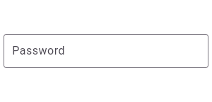 |
| /// |
| /// ```dart |
| /// const TextField( |
| /// obscureText: true, |
| /// decoration: InputDecoration( |
| /// border: OutlineInputBorder(), |
| /// labelText: 'Password', |
| /// ), |
| /// ) |
| /// ``` |
| /// {@end-tool} |
| /// |
| /// ## Reading values |
| /// |
| /// A common way to read a value from a TextField is to use the [onSubmitted] |
| /// callback. This callback is applied to the text field's current value when |
| /// the user finishes editing. |
| /// |
| /// {@tool dartpad} |
| /// This sample shows how to get a value from a TextField via the [onSubmitted] |
| /// callback. |
| /// |
| /// ** See code in examples/api/lib/material/text_field/text_field.1.dart ** |
| /// {@end-tool} |
| /// |
| /// {@macro flutter.widgets.EditableText.lifeCycle} |
| /// |
| /// For most applications the [onSubmitted] callback will be sufficient for |
| /// reacting to user input. |
| /// |
| /// The [onEditingComplete] callback also runs when the user finishes editing. |
| /// It's different from [onSubmitted] because it has a default value which |
| /// updates the text controller and yields the keyboard focus. Applications that |
| /// require different behavior can override the default [onEditingComplete] |
| /// callback. |
| /// |
| /// Keep in mind you can also always read the current string from a TextField's |
| /// [TextEditingController] using [TextEditingController.text]. |
| /// |
| /// ## Handling emojis and other complex characters |
| /// {@macro flutter.widgets.EditableText.onChanged} |
| /// |
| /// In the live Dartpad example above, try typing the emoji 👨👩👦 |
| /// into the field and submitting. Because the example code measures the length |
| /// with `value.characters.length`, the emoji is correctly counted as a single |
| /// character. |
| /// |
| /// {@macro flutter.widgets.editableText.showCaretOnScreen} |
| /// |
| /// {@macro flutter.widgets.editableText.accessibility} |
| /// |
| /// See also: |
| /// |
| /// * [TextFormField], which integrates with the [Form] widget. |
| /// * [InputDecorator], which shows the labels and other visual elements that |
| /// surround the actual text editing widget. |
| /// * [EditableText], which is the raw text editing control at the heart of a |
| /// [TextField]. The [EditableText] widget is rarely used directly unless |
| /// you are implementing an entirely different design language, such as |
| /// Cupertino. |
| /// * <https://material.io/design/components/text-fields.html> |
| /// * Cookbook: [Create and style a text field](https://flutter.dev/docs/cookbook/forms/text-input) |
| /// * Cookbook: [Handle changes to a text field](https://flutter.dev/docs/cookbook/forms/text-field-changes) |
| /// * Cookbook: [Retrieve the value of a text field](https://flutter.dev/docs/cookbook/forms/retrieve-input) |
| /// * Cookbook: [Focus and text fields](https://flutter.dev/docs/cookbook/forms/focus) |
| class TextField extends StatefulWidget { |
| /// Creates a Material Design text field. |
| /// |
| /// If [decoration] is non-null (which is the default), the text field requires |
| /// one of its ancestors to be a [Material] widget. |
| /// |
| /// To remove the decoration entirely (including the extra padding introduced |
| /// by the decoration to save space for the labels), set the [decoration] to |
| /// null. |
| /// |
| /// The [maxLines] property can be set to null to remove the restriction on |
| /// the number of lines. By default, it is one, meaning this is a single-line |
| /// text field. [maxLines] must not be zero. |
| /// |
| /// The [maxLength] property is set to null by default, which means the |
| /// number of characters allowed in the text field is not restricted. If |
| /// [maxLength] is set a character counter will be displayed below the |
| /// field showing how many characters have been entered. If the value is |
| /// set to a positive integer it will also display the maximum allowed |
| /// number of characters to be entered. If the value is set to |
| /// [TextField.noMaxLength] then only the current length is displayed. |
| /// |
| /// After [maxLength] characters have been input, additional input |
| /// is ignored, unless [maxLengthEnforcement] is set to |
| /// [MaxLengthEnforcement.none]. |
| /// The text field enforces the length with a [LengthLimitingTextInputFormatter], |
| /// which is evaluated after the supplied [inputFormatters], if any. |
| /// The [maxLength] value must be either null or greater than zero. |
| /// |
| /// If [maxLengthEnforcement] is set to [MaxLengthEnforcement.none], then more |
| /// than [maxLength] characters may be entered, and the error counter and |
| /// divider will switch to the [decoration].errorStyle when the limit is |
| /// exceeded. |
| /// |
| /// The text cursor is not shown if [showCursor] is false or if [showCursor] |
| /// is null (the default) and [readOnly] is true. |
| /// |
| /// The [selectionHeightStyle] and [selectionWidthStyle] properties allow |
| /// changing the shape of the selection highlighting. These properties default |
| /// to [ui.BoxHeightStyle.tight] and [ui.BoxWidthStyle.tight] respectively and |
| /// must not be null. |
| /// |
| /// The [textAlign], [autofocus], [obscureText], [readOnly], [autocorrect], |
| /// [scrollPadding], [maxLines], [maxLength], [selectionHeightStyle], |
| /// [selectionWidthStyle], [enableSuggestions], and |
| /// [enableIMEPersonalizedLearning] arguments must not be null. |
| /// |
| /// See also: |
| /// |
| /// * [maxLength], which discusses the precise meaning of "number of |
| /// characters" and how it may differ from the intuitive meaning. |
| const TextField({ |
| super.key, |
| this.controller, |
| this.focusNode, |
| this.decoration = const InputDecoration(), |
| TextInputType? keyboardType, |
| this.textInputAction, |
| this.textCapitalization = TextCapitalization.none, |
| this.style, |
| this.strutStyle, |
| this.textAlign = TextAlign.start, |
| this.textAlignVertical, |
| this.textDirection, |
| this.readOnly = false, |
| ToolbarOptions? toolbarOptions, |
| this.showCursor, |
| this.autofocus = false, |
| this.obscuringCharacter = '•', |
| this.obscureText = false, |
| this.autocorrect = true, |
| SmartDashesType? smartDashesType, |
| SmartQuotesType? smartQuotesType, |
| this.enableSuggestions = true, |
| this.maxLines = 1, |
| this.minLines, |
| this.expands = false, |
| this.maxLength, |
| this.maxLengthEnforcement, |
| this.onChanged, |
| this.onEditingComplete, |
| this.onSubmitted, |
| this.onAppPrivateCommand, |
| this.inputFormatters, |
| this.enabled, |
| this.cursorWidth = 2.0, |
| this.cursorHeight, |
| this.cursorRadius, |
| this.cursorColor, |
| this.selectionHeightStyle = ui.BoxHeightStyle.tight, |
| this.selectionWidthStyle = ui.BoxWidthStyle.tight, |
| this.keyboardAppearance, |
| this.scrollPadding = const EdgeInsets.all(20.0), |
| this.dragStartBehavior = DragStartBehavior.start, |
| bool? enableInteractiveSelection, |
| this.selectionControls, |
| this.onTap, |
| this.mouseCursor, |
| this.buildCounter, |
| this.scrollController, |
| this.scrollPhysics, |
| this.autofillHints = const <String>[], |
| this.clipBehavior = Clip.hardEdge, |
| this.restorationId, |
| this.scribbleEnabled = true, |
| this.enableIMEPersonalizedLearning = true, |
| }) : assert(textAlign != null), |
| assert(readOnly != null), |
| assert(autofocus != null), |
| assert(obscuringCharacter != null && obscuringCharacter.length == 1), |
| assert(obscureText != null), |
| assert(autocorrect != null), |
| smartDashesType = smartDashesType ?? (obscureText ? SmartDashesType.disabled : SmartDashesType.enabled), |
| smartQuotesType = smartQuotesType ?? (obscureText ? SmartQuotesType.disabled : SmartQuotesType.enabled), |
| assert(enableSuggestions != null), |
| assert(scrollPadding != null), |
| assert(dragStartBehavior != null), |
| assert(selectionHeightStyle != null), |
| assert(selectionWidthStyle != null), |
| assert(maxLines == null || maxLines > 0), |
| assert(minLines == null || minLines > 0), |
| assert( |
| (maxLines == null) || (minLines == null) || (maxLines >= minLines), |
| "minLines can't be greater than maxLines", |
| ), |
| assert(expands != null), |
| assert( |
| !expands || (maxLines == null && minLines == null), |
| 'minLines and maxLines must be null when expands is true.', |
| ), |
| assert(!obscureText || maxLines == 1, 'Obscured fields cannot be multiline.'), |
| assert(maxLength == null || maxLength == TextField.noMaxLength || maxLength > 0), |
| // Assert the following instead of setting it directly to avoid surprising the user by silently changing the value they set. |
| assert( |
| !identical(textInputAction, TextInputAction.newline) || |
| maxLines == 1 || |
| !identical(keyboardType, TextInputType.text), |
| 'Use keyboardType TextInputType.multiline when using TextInputAction.newline on a multiline TextField.', |
| ), |
| assert(clipBehavior != null), |
| assert(enableIMEPersonalizedLearning != null), |
| keyboardType = keyboardType ?? (maxLines == 1 ? TextInputType.text : TextInputType.multiline), |
| enableInteractiveSelection = enableInteractiveSelection ?? (!readOnly || !obscureText), |
| toolbarOptions = toolbarOptions ?? |
| (obscureText |
| ? (readOnly |
| // No point in even offering "Select All" in a read-only obscured |
| // field. |
| ? const ToolbarOptions() |
| // Writable, but obscured. |
| : const ToolbarOptions( |
| selectAll: true, |
| paste: true, |
| )) |
| : (readOnly |
| // Read-only, not obscured. |
| ? const ToolbarOptions( |
| selectAll: true, |
| copy: true, |
| ) |
| // Writable, not obscured. |
| : const ToolbarOptions( |
| copy: true, |
| cut: true, |
| selectAll: true, |
| paste: true, |
| ))); |
| |
| /// Controls the text being edited. |
| /// |
| /// If null, this widget will create its own [TextEditingController]. |
| final TextEditingController? controller; |
| |
| /// Defines the keyboard focus for this widget. |
| /// |
| /// The [focusNode] is a long-lived object that's typically managed by a |
| /// [StatefulWidget] parent. See [FocusNode] for more information. |
| /// |
| /// To give the keyboard focus to this widget, provide a [focusNode] and then |
| /// use the current [FocusScope] to request the focus: |
| /// |
| /// ```dart |
| /// FocusScope.of(context).requestFocus(myFocusNode); |
| /// ``` |
| /// |
| /// This happens automatically when the widget is tapped. |
| /// |
| /// To be notified when the widget gains or loses the focus, add a listener |
| /// to the [focusNode]: |
| /// |
| /// ```dart |
| /// focusNode.addListener(() { print(myFocusNode.hasFocus); }); |
| /// ``` |
| /// |
| /// If null, this widget will create its own [FocusNode]. |
| /// |
| /// ## Keyboard |
| /// |
| /// Requesting the focus will typically cause the keyboard to be shown |
| /// if it's not showing already. |
| /// |
| /// On Android, the user can hide the keyboard - without changing the focus - |
| /// with the system back button. They can restore the keyboard's visibility |
| /// by tapping on a text field. The user might hide the keyboard and |
| /// switch to a physical keyboard, or they might just need to get it |
| /// out of the way for a moment, to expose something it's |
| /// obscuring. In this case requesting the focus again will not |
| /// cause the focus to change, and will not make the keyboard visible. |
| /// |
| /// This widget builds an [EditableText] and will ensure that the keyboard is |
| /// showing when it is tapped by calling [EditableTextState.requestKeyboard()]. |
| final FocusNode? focusNode; |
| |
| /// The decoration to show around the text field. |
| /// |
| /// By default, draws a horizontal line under the text field but can be |
| /// configured to show an icon, label, hint text, and error text. |
| /// |
| /// Specify null to remove the decoration entirely (including the |
| /// extra padding introduced by the decoration to save space for the labels). |
| final InputDecoration? decoration; |
| |
| /// {@macro flutter.widgets.editableText.keyboardType} |
| final TextInputType keyboardType; |
| |
| /// The type of action button to use for the keyboard. |
| /// |
| /// Defaults to [TextInputAction.newline] if [keyboardType] is |
| /// [TextInputType.multiline] and [TextInputAction.done] otherwise. |
| final TextInputAction? textInputAction; |
| |
| /// {@macro flutter.widgets.editableText.textCapitalization} |
| final TextCapitalization textCapitalization; |
| |
| /// The style to use for the text being edited. |
| /// |
| /// This text style is also used as the base style for the [decoration]. |
| /// |
| /// If null, defaults to the `subtitle1` text style from the current [Theme]. |
| final TextStyle? style; |
| |
| /// {@macro flutter.widgets.editableText.strutStyle} |
| final StrutStyle? strutStyle; |
| |
| /// {@macro flutter.widgets.editableText.textAlign} |
| final TextAlign textAlign; |
| |
| /// {@macro flutter.material.InputDecorator.textAlignVertical} |
| final TextAlignVertical? textAlignVertical; |
| |
| /// {@macro flutter.widgets.editableText.textDirection} |
| final TextDirection? textDirection; |
| |
| /// {@macro flutter.widgets.editableText.autofocus} |
| final bool autofocus; |
| |
| /// {@macro flutter.widgets.editableText.obscuringCharacter} |
| final String obscuringCharacter; |
| |
| /// {@macro flutter.widgets.editableText.obscureText} |
| final bool obscureText; |
| |
| /// {@macro flutter.widgets.editableText.autocorrect} |
| final bool autocorrect; |
| |
| /// {@macro flutter.services.TextInputConfiguration.smartDashesType} |
| final SmartDashesType smartDashesType; |
| |
| /// {@macro flutter.services.TextInputConfiguration.smartQuotesType} |
| final SmartQuotesType smartQuotesType; |
| |
| /// {@macro flutter.services.TextInputConfiguration.enableSuggestions} |
| final bool enableSuggestions; |
| |
| /// {@macro flutter.widgets.editableText.maxLines} |
| /// * [expands], which determines whether the field should fill the height of |
| /// its parent. |
| final int? maxLines; |
| |
| /// {@macro flutter.widgets.editableText.minLines} |
| /// * [expands], which determines whether the field should fill the height of |
| /// its parent. |
| final int? minLines; |
| |
| /// {@macro flutter.widgets.editableText.expands} |
| final bool expands; |
| |
| /// {@macro flutter.widgets.editableText.readOnly} |
| final bool readOnly; |
| |
| /// Configuration of toolbar options. |
| /// |
| /// If not set, select all and paste will default to be enabled. Copy and cut |
| /// will be disabled if [obscureText] is true. If [readOnly] is true, |
| /// paste and cut will be disabled regardless. |
| final ToolbarOptions toolbarOptions; |
| |
| /// {@macro flutter.widgets.editableText.showCursor} |
| final bool? showCursor; |
| |
| /// If [maxLength] is set to this value, only the "current input length" |
| /// part of the character counter is shown. |
| static const int noMaxLength = -1; |
| |
| /// The maximum number of characters (Unicode scalar values) to allow in the |
| /// text field. |
| /// |
| /// If set, a character counter will be displayed below the |
| /// field showing how many characters have been entered. If set to a number |
| /// greater than 0, it will also display the maximum number allowed. If set |
| /// to [TextField.noMaxLength] then only the current character count is displayed. |
| /// |
| /// After [maxLength] characters have been input, additional input |
| /// is ignored, unless [maxLengthEnforcement] is set to |
| /// [MaxLengthEnforcement.none]. |
| /// |
| /// The text field enforces the length with a [LengthLimitingTextInputFormatter], |
| /// which is evaluated after the supplied [inputFormatters], if any. |
| /// |
| /// This value must be either null, [TextField.noMaxLength], or greater than 0. |
| /// If null (the default) then there is no limit to the number of characters |
| /// that can be entered. If set to [TextField.noMaxLength], then no limit will |
| /// be enforced, but the number of characters entered will still be displayed. |
| /// |
| /// Whitespace characters (e.g. newline, space, tab) are included in the |
| /// character count. |
| /// |
| /// If [maxLengthEnforcement] is [MaxLengthEnforcement.none], then more than |
| /// [maxLength] characters may be entered, but the error counter and divider |
| /// will switch to the [decoration]'s [InputDecoration.errorStyle] when the |
| /// limit is exceeded. |
| /// |
| /// {@macro flutter.services.lengthLimitingTextInputFormatter.maxLength} |
| final int? maxLength; |
| |
| /// Determines how the [maxLength] limit should be enforced. |
| /// |
| /// {@macro flutter.services.textFormatter.effectiveMaxLengthEnforcement} |
| /// |
| /// {@macro flutter.services.textFormatter.maxLengthEnforcement} |
| final MaxLengthEnforcement? maxLengthEnforcement; |
| |
| /// {@macro flutter.widgets.editableText.onChanged} |
| /// |
| /// See also: |
| /// |
| /// * [inputFormatters], which are called before [onChanged] |
| /// runs and can validate and change ("format") the input value. |
| /// * [onEditingComplete], [onSubmitted]: |
| /// which are more specialized input change notifications. |
| final ValueChanged<String>? onChanged; |
| |
| /// {@macro flutter.widgets.editableText.onEditingComplete} |
| final VoidCallback? onEditingComplete; |
| |
| /// {@macro flutter.widgets.editableText.onSubmitted} |
| /// |
| /// See also: |
| /// |
| /// * [TextInputAction.next] and [TextInputAction.previous], which |
| /// automatically shift the focus to the next/previous focusable item when |
| /// the user is done editing. |
| final ValueChanged<String>? onSubmitted; |
| |
| /// {@macro flutter.widgets.editableText.onAppPrivateCommand} |
| final AppPrivateCommandCallback? onAppPrivateCommand; |
| |
| /// {@macro flutter.widgets.editableText.inputFormatters} |
| final List<TextInputFormatter>? inputFormatters; |
| |
| /// If false the text field is "disabled": it ignores taps and its |
| /// [decoration] is rendered in grey. |
| /// |
| /// If non-null this property overrides the [decoration]'s |
| /// [InputDecoration.enabled] property. |
| final bool? enabled; |
| |
| /// {@macro flutter.widgets.editableText.cursorWidth} |
| final double cursorWidth; |
| |
| /// {@macro flutter.widgets.editableText.cursorHeight} |
| final double? cursorHeight; |
| |
| /// {@macro flutter.widgets.editableText.cursorRadius} |
| final Radius? cursorRadius; |
| |
| /// The color of the cursor. |
| /// |
| /// The cursor indicates the current location of text insertion point in |
| /// the field. |
| /// |
| /// If this is null it will default to the ambient |
| /// [DefaultSelectionStyle.cursorColor]. If that is null, and the |
| /// [ThemeData.platform] is [TargetPlatform.iOS] or [TargetPlatform.macOS] |
| /// it will use [CupertinoThemeData.primaryColor]. Otherwise it will use |
| /// the value of [ColorScheme.primary] of [ThemeData.colorScheme]. |
| final Color? cursorColor; |
| |
| /// Controls how tall the selection highlight boxes are computed to be. |
| /// |
| /// See [ui.BoxHeightStyle] for details on available styles. |
| final ui.BoxHeightStyle selectionHeightStyle; |
| |
| /// Controls how wide the selection highlight boxes are computed to be. |
| /// |
| /// See [ui.BoxWidthStyle] for details on available styles. |
| final ui.BoxWidthStyle selectionWidthStyle; |
| |
| /// The appearance of the keyboard. |
| /// |
| /// This setting is only honored on iOS devices. |
| /// |
| /// If unset, defaults to [ThemeData.brightness]. |
| final Brightness? keyboardAppearance; |
| |
| /// {@macro flutter.widgets.editableText.scrollPadding} |
| final EdgeInsets scrollPadding; |
| |
| /// {@macro flutter.widgets.editableText.enableInteractiveSelection} |
| final bool enableInteractiveSelection; |
| |
| /// {@macro flutter.widgets.editableText.selectionControls} |
| final TextSelectionControls? selectionControls; |
| |
| /// {@macro flutter.widgets.scrollable.dragStartBehavior} |
| final DragStartBehavior dragStartBehavior; |
| |
| /// {@macro flutter.widgets.editableText.selectionEnabled} |
| bool get selectionEnabled => enableInteractiveSelection; |
| |
| /// {@template flutter.material.textfield.onTap} |
| /// Called for each distinct tap except for every second tap of a double tap. |
| /// |
| /// The text field builds a [GestureDetector] to handle input events like tap, |
| /// to trigger focus requests, to move the caret, adjust the selection, etc. |
| /// Handling some of those events by wrapping the text field with a competing |
| /// GestureDetector is problematic. |
| /// |
| /// To unconditionally handle taps, without interfering with the text field's |
| /// internal gesture detector, provide this callback. |
| /// |
| /// If the text field is created with [enabled] false, taps will not be |
| /// recognized. |
| /// |
| /// To be notified when the text field gains or loses the focus, provide a |
| /// [focusNode] and add a listener to that. |
| /// |
| /// To listen to arbitrary pointer events without competing with the |
| /// text field's internal gesture detector, use a [Listener]. |
| /// {@endtemplate} |
| final GestureTapCallback? onTap; |
| |
| /// The cursor for a mouse pointer when it enters or is hovering over the |
| /// widget. |
| /// |
| /// If [mouseCursor] is a [MaterialStateProperty<MouseCursor>], |
| /// [MaterialStateProperty.resolve] is used for the following [MaterialState]s: |
| /// |
| /// * [MaterialState.error]. |
| /// * [MaterialState.hovered]. |
| /// * [MaterialState.focused]. |
| /// * [MaterialState.disabled]. |
| /// |
| /// If this property is null, [MaterialStateMouseCursor.textable] will be used. |
| /// |
| /// The [mouseCursor] is the only property of [TextField] that controls the |
| /// appearance of the mouse pointer. All other properties related to "cursor" |
| /// stand for the text cursor, which is usually a blinking vertical line at |
| /// the editing position. |
| final MouseCursor? mouseCursor; |
| |
| /// Callback that generates a custom [InputDecoration.counter] widget. |
| /// |
| /// See [InputCounterWidgetBuilder] for an explanation of the passed in |
| /// arguments. The returned widget will be placed below the line in place of |
| /// the default widget built when [InputDecoration.counterText] is specified. |
| /// |
| /// The returned widget will be wrapped in a [Semantics] widget for |
| /// accessibility, but it also needs to be accessible itself. For example, |
| /// if returning a Text widget, set the [Text.semanticsLabel] property. |
| /// |
| /// {@tool snippet} |
| /// ```dart |
| /// Widget counter( |
| /// BuildContext context, |
| /// { |
| /// required int currentLength, |
| /// required int? maxLength, |
| /// required bool isFocused, |
| /// } |
| /// ) { |
| /// return Text( |
| /// '$currentLength of $maxLength characters', |
| /// semanticsLabel: 'character count', |
| /// ); |
| /// } |
| /// ``` |
| /// {@end-tool} |
| /// |
| /// If buildCounter returns null, then no counter and no Semantics widget will |
| /// be created at all. |
| final InputCounterWidgetBuilder? buildCounter; |
| |
| /// {@macro flutter.widgets.editableText.scrollPhysics} |
| final ScrollPhysics? scrollPhysics; |
| |
| /// {@macro flutter.widgets.editableText.scrollController} |
| final ScrollController? scrollController; |
| |
| /// {@macro flutter.widgets.editableText.autofillHints} |
| /// {@macro flutter.services.AutofillConfiguration.autofillHints} |
| final Iterable<String>? autofillHints; |
| |
| /// {@macro flutter.material.Material.clipBehavior} |
| /// |
| /// Defaults to [Clip.hardEdge]. |
| final Clip clipBehavior; |
| |
| /// {@template flutter.material.textfield.restorationId} |
| /// Restoration ID to save and restore the state of the text field. |
| /// |
| /// If non-null, the text field will persist and restore its current scroll |
| /// offset and - if no [controller] has been provided - the content of the |
| /// text field. If a [controller] has been provided, it is the responsibility |
| /// of the owner of that controller to persist and restore it, e.g. by using |
| /// a [RestorableTextEditingController]. |
| /// |
| /// The state of this widget is persisted in a [RestorationBucket] claimed |
| /// from the surrounding [RestorationScope] using the provided restoration ID. |
| /// |
| /// See also: |
| /// |
| /// * [RestorationManager], which explains how state restoration works in |
| /// Flutter. |
| /// {@endtemplate} |
| final String? restorationId; |
| |
| /// {@macro flutter.widgets.editableText.scribbleEnabled} |
| final bool scribbleEnabled; |
| |
| /// {@macro flutter.services.TextInputConfiguration.enableIMEPersonalizedLearning} |
| final bool enableIMEPersonalizedLearning; |
| |
| @override |
| State<TextField> createState() => _TextFieldState(); |
| |
| @override |
| void debugFillProperties(DiagnosticPropertiesBuilder properties) { |
| super.debugFillProperties(properties); |
| properties.add(DiagnosticsProperty<TextEditingController>('controller', controller, defaultValue: null)); |
| properties.add(DiagnosticsProperty<FocusNode>('focusNode', focusNode, defaultValue: null)); |
| properties.add(DiagnosticsProperty<bool>('enabled', enabled, defaultValue: null)); |
| properties.add(DiagnosticsProperty<InputDecoration>('decoration', decoration, defaultValue: const InputDecoration())); |
| properties.add(DiagnosticsProperty<TextInputType>('keyboardType', keyboardType, defaultValue: TextInputType.text)); |
| properties.add(DiagnosticsProperty<TextStyle>('style', style, defaultValue: null)); |
| properties.add(DiagnosticsProperty<bool>('autofocus', autofocus, defaultValue: false)); |
| properties.add(DiagnosticsProperty<String>('obscuringCharacter', obscuringCharacter, defaultValue: '•')); |
| properties.add(DiagnosticsProperty<bool>('obscureText', obscureText, defaultValue: false)); |
| properties.add(DiagnosticsProperty<bool>('autocorrect', autocorrect, defaultValue: true)); |
| properties.add(EnumProperty<SmartDashesType>('smartDashesType', smartDashesType, defaultValue: obscureText ? SmartDashesType.disabled : SmartDashesType.enabled)); |
| properties.add(EnumProperty<SmartQuotesType>('smartQuotesType', smartQuotesType, defaultValue: obscureText ? SmartQuotesType.disabled : SmartQuotesType.enabled)); |
| properties.add(DiagnosticsProperty<bool>('enableSuggestions', enableSuggestions, defaultValue: true)); |
| properties.add(IntProperty('maxLines', maxLines, defaultValue: 1)); |
| properties.add(IntProperty('minLines', minLines, defaultValue: null)); |
| properties.add(DiagnosticsProperty<bool>('expands', expands, defaultValue: false)); |
| properties.add(IntProperty('maxLength', maxLength, defaultValue: null)); |
| properties.add(EnumProperty<MaxLengthEnforcement>('maxLengthEnforcement', maxLengthEnforcement, defaultValue: null)); |
| properties.add(EnumProperty<TextInputAction>('textInputAction', textInputAction, defaultValue: null)); |
| properties.add(EnumProperty<TextCapitalization>('textCapitalization', textCapitalization, defaultValue: TextCapitalization.none)); |
| properties.add(EnumProperty<TextAlign>('textAlign', textAlign, defaultValue: TextAlign.start)); |
| properties.add(DiagnosticsProperty<TextAlignVertical>('textAlignVertical', textAlignVertical, defaultValue: null)); |
| properties.add(EnumProperty<TextDirection>('textDirection', textDirection, defaultValue: null)); |
| properties.add(DoubleProperty('cursorWidth', cursorWidth, defaultValue: 2.0)); |
| properties.add(DoubleProperty('cursorHeight', cursorHeight, defaultValue: null)); |
| properties.add(DiagnosticsProperty<Radius>('cursorRadius', cursorRadius, defaultValue: null)); |
| properties.add(ColorProperty('cursorColor', cursorColor, defaultValue: null)); |
| properties.add(DiagnosticsProperty<Brightness>('keyboardAppearance', keyboardAppearance, defaultValue: null)); |
| properties.add(DiagnosticsProperty<EdgeInsetsGeometry>('scrollPadding', scrollPadding, defaultValue: const EdgeInsets.all(20.0))); |
| properties.add(FlagProperty('selectionEnabled', value: selectionEnabled, defaultValue: true, ifFalse: 'selection disabled')); |
| properties.add(DiagnosticsProperty<TextSelectionControls>('selectionControls', selectionControls, defaultValue: null)); |
| properties.add(DiagnosticsProperty<ScrollController>('scrollController', scrollController, defaultValue: null)); |
| properties.add(DiagnosticsProperty<ScrollPhysics>('scrollPhysics', scrollPhysics, defaultValue: null)); |
| properties.add(DiagnosticsProperty<Clip>('clipBehavior', clipBehavior, defaultValue: Clip.hardEdge)); |
| properties.add(DiagnosticsProperty<bool>('scribbleEnabled', scribbleEnabled, defaultValue: true)); |
| properties.add(DiagnosticsProperty<bool>('enableIMEPersonalizedLearning', enableIMEPersonalizedLearning, defaultValue: true)); |
| } |
| } |
| |
| class _TextFieldState extends State<TextField> with RestorationMixin implements TextSelectionGestureDetectorBuilderDelegate, AutofillClient { |
| RestorableTextEditingController? _controller; |
| TextEditingController get _effectiveController => widget.controller ?? _controller!.value; |
| |
| FocusNode? _focusNode; |
| FocusNode get _effectiveFocusNode => widget.focusNode ?? (_focusNode ??= FocusNode()); |
| |
| MaxLengthEnforcement get _effectiveMaxLengthEnforcement => widget.maxLengthEnforcement |
| ?? LengthLimitingTextInputFormatter.getDefaultMaxLengthEnforcement(Theme.of(context).platform); |
| |
| bool _isHovering = false; |
| |
| bool get needsCounter => widget.maxLength != null |
| && widget.decoration != null |
| && widget.decoration!.counterText == null; |
| |
| bool _showSelectionHandles = false; |
| |
| late _TextFieldSelectionGestureDetectorBuilder _selectionGestureDetectorBuilder; |
| |
| // API for TextSelectionGestureDetectorBuilderDelegate. |
| @override |
| late bool forcePressEnabled; |
| |
| @override |
| final GlobalKey<EditableTextState> editableTextKey = GlobalKey<EditableTextState>(); |
| |
| @override |
| bool get selectionEnabled => widget.selectionEnabled; |
| // End of API for TextSelectionGestureDetectorBuilderDelegate. |
| |
| bool get _isEnabled => widget.enabled ?? widget.decoration?.enabled ?? true; |
| |
| int get _currentLength => _effectiveController.value.text.characters.length; |
| |
| bool get _hasIntrinsicError => widget.maxLength != null && widget.maxLength! > 0 && _effectiveController.value.text.characters.length > widget.maxLength!; |
| |
| bool get _hasError => widget.decoration?.errorText != null || _hasIntrinsicError; |
| |
| InputDecoration _getEffectiveDecoration() { |
| final MaterialLocalizations localizations = MaterialLocalizations.of(context); |
| final ThemeData themeData = Theme.of(context); |
| final InputDecoration effectiveDecoration = (widget.decoration ?? const InputDecoration()) |
| .applyDefaults(themeData.inputDecorationTheme) |
| .copyWith( |
| enabled: _isEnabled, |
| hintMaxLines: widget.decoration?.hintMaxLines ?? widget.maxLines, |
| ); |
| |
| // No need to build anything if counter or counterText were given directly. |
| if (effectiveDecoration.counter != null || effectiveDecoration.counterText != null) { |
| return effectiveDecoration; |
| } |
| |
| // If buildCounter was provided, use it to generate a counter widget. |
| Widget? counter; |
| final int currentLength = _currentLength; |
| if (effectiveDecoration.counter == null |
| && effectiveDecoration.counterText == null |
| && widget.buildCounter != null) { |
| final bool isFocused = _effectiveFocusNode.hasFocus; |
| final Widget? builtCounter = widget.buildCounter!( |
| context, |
| currentLength: currentLength, |
| maxLength: widget.maxLength, |
| isFocused: isFocused, |
| ); |
| // If buildCounter returns null, don't add a counter widget to the field. |
| if (builtCounter != null) { |
| counter = Semantics( |
| container: true, |
| liveRegion: isFocused, |
| child: builtCounter, |
| ); |
| } |
| return effectiveDecoration.copyWith(counter: counter); |
| } |
| |
| if (widget.maxLength == null) { |
| return effectiveDecoration; |
| } // No counter widget |
| |
| String counterText = '$currentLength'; |
| String semanticCounterText = ''; |
| |
| // Handle a real maxLength (positive number) |
| if (widget.maxLength! > 0) { |
| // Show the maxLength in the counter |
| counterText += '/${widget.maxLength}'; |
| final int remaining = (widget.maxLength! - currentLength).clamp(0, widget.maxLength!); // ignore_clamp_double_lint |
| semanticCounterText = localizations.remainingTextFieldCharacterCount(remaining); |
| } |
| |
| if (_hasIntrinsicError) { |
| return effectiveDecoration.copyWith( |
| errorText: effectiveDecoration.errorText ?? '', |
| counterStyle: effectiveDecoration.errorStyle |
| ?? themeData.textTheme.caption!.copyWith(color: themeData.errorColor), |
| counterText: counterText, |
| semanticCounterText: semanticCounterText, |
| ); |
| } |
| |
| return effectiveDecoration.copyWith( |
| counterText: counterText, |
| semanticCounterText: semanticCounterText, |
| ); |
| } |
| |
| @override |
| void initState() { |
| super.initState(); |
| _selectionGestureDetectorBuilder = _TextFieldSelectionGestureDetectorBuilder(state: this); |
| if (widget.controller == null) { |
| _createLocalController(); |
| } |
| _effectiveFocusNode.canRequestFocus = _isEnabled; |
| _effectiveFocusNode.addListener(_handleFocusChanged); |
| } |
| |
| bool get _canRequestFocus { |
| final NavigationMode mode = MediaQuery.maybeOf(context)?.navigationMode ?? NavigationMode.traditional; |
| switch (mode) { |
| case NavigationMode.traditional: |
| return _isEnabled; |
| case NavigationMode.directional: |
| return true; |
| } |
| } |
| |
| @override |
| void didChangeDependencies() { |
| super.didChangeDependencies(); |
| _effectiveFocusNode.canRequestFocus = _canRequestFocus; |
| } |
| |
| @override |
| void didUpdateWidget(TextField oldWidget) { |
| super.didUpdateWidget(oldWidget); |
| if (widget.controller == null && oldWidget.controller != null) { |
| _createLocalController(oldWidget.controller!.value); |
| } else if (widget.controller != null && oldWidget.controller == null) { |
| unregisterFromRestoration(_controller!); |
| _controller!.dispose(); |
| _controller = null; |
| } |
| |
| if (widget.focusNode != oldWidget.focusNode) { |
| (oldWidget.focusNode ?? _focusNode)?.removeListener(_handleFocusChanged); |
| (widget.focusNode ?? _focusNode)?.addListener(_handleFocusChanged); |
| } |
| |
| _effectiveFocusNode.canRequestFocus = _canRequestFocus; |
| |
| if (_effectiveFocusNode.hasFocus && widget.readOnly != oldWidget.readOnly && _isEnabled) { |
| if(_effectiveController.selection.isCollapsed) { |
| _showSelectionHandles = !widget.readOnly; |
| } |
| } |
| } |
| |
| @override |
| void restoreState(RestorationBucket? oldBucket, bool initialRestore) { |
| if (_controller != null) { |
| _registerController(); |
| } |
| } |
| |
| void _registerController() { |
| assert(_controller != null); |
| registerForRestoration(_controller!, 'controller'); |
| } |
| |
| void _createLocalController([TextEditingValue? value]) { |
| assert(_controller == null); |
| _controller = value == null |
| ? RestorableTextEditingController() |
| : RestorableTextEditingController.fromValue(value); |
| if (!restorePending) { |
| _registerController(); |
| } |
| } |
| |
| @override |
| String? get restorationId => widget.restorationId; |
| |
| @override |
| void dispose() { |
| _effectiveFocusNode.removeListener(_handleFocusChanged); |
| _focusNode?.dispose(); |
| _controller?.dispose(); |
| super.dispose(); |
| } |
| |
| EditableTextState? get _editableText => editableTextKey.currentState; |
| |
| void _requestKeyboard() { |
| _editableText?.requestKeyboard(); |
| } |
| |
| bool _shouldShowSelectionHandles(SelectionChangedCause? cause) { |
| // When the text field is activated by something that doesn't trigger the |
| // selection overlay, we shouldn't show the handles either. |
| if (!_selectionGestureDetectorBuilder.shouldShowSelectionToolbar) { |
| return false; |
| } |
| |
| if (cause == SelectionChangedCause.keyboard) { |
| return false; |
| } |
| |
| if (widget.readOnly && _effectiveController.selection.isCollapsed) { |
| return false; |
| } |
| |
| if (!_isEnabled) { |
| return false; |
| } |
| |
| if (cause == SelectionChangedCause.longPress || cause == SelectionChangedCause.scribble) { |
| return true; |
| } |
| |
| if (_effectiveController.text.isNotEmpty) { |
| return true; |
| } |
| |
| return false; |
| } |
| |
| void _handleFocusChanged() { |
| setState(() { |
| // Rebuild the widget on focus change to show/hide the text selection |
| // highlight. |
| }); |
| } |
| |
| void _handleSelectionChanged(TextSelection selection, SelectionChangedCause? cause) { |
| final bool willShowSelectionHandles = _shouldShowSelectionHandles(cause); |
| if (willShowSelectionHandles != _showSelectionHandles) { |
| setState(() { |
| _showSelectionHandles = willShowSelectionHandles; |
| }); |
| } |
| |
| switch (Theme.of(context).platform) { |
| case TargetPlatform.iOS: |
| case TargetPlatform.macOS: |
| if (cause == SelectionChangedCause.longPress |
| || cause == SelectionChangedCause.drag) { |
| _editableText?.bringIntoView(selection.extent); |
| } |
| return; |
| case TargetPlatform.linux: |
| case TargetPlatform.windows: |
| case TargetPlatform.fuchsia: |
| case TargetPlatform.android: |
| if (cause == SelectionChangedCause.drag) { |
| _editableText?.bringIntoView(selection.extent); |
| } |
| return; |
| } |
| } |
| |
| /// Toggle the toolbar when a selection handle is tapped. |
| void _handleSelectionHandleTapped() { |
| if (_effectiveController.selection.isCollapsed) { |
| _editableText!.toggleToolbar(); |
| } |
| } |
| |
| void _handleHover(bool hovering) { |
| if (hovering != _isHovering) { |
| setState(() { |
| _isHovering = hovering; |
| }); |
| } |
| } |
| |
| // AutofillClient implementation start. |
| @override |
| String get autofillId => _editableText!.autofillId; |
| |
| @override |
| void autofill(TextEditingValue newEditingValue) => _editableText!.autofill(newEditingValue); |
| |
| @override |
| TextInputConfiguration get textInputConfiguration { |
| final List<String>? autofillHints = widget.autofillHints?.toList(growable: false); |
| final AutofillConfiguration autofillConfiguration = autofillHints != null |
| ? AutofillConfiguration( |
| uniqueIdentifier: autofillId, |
| autofillHints: autofillHints, |
| currentEditingValue: _effectiveController.value, |
| hintText: (widget.decoration ?? const InputDecoration()).hintText, |
| ) |
| : AutofillConfiguration.disabled; |
| |
| return _editableText!.textInputConfiguration.copyWith(autofillConfiguration: autofillConfiguration); |
| } |
| // AutofillClient implementation end. |
| |
| @override |
| Widget build(BuildContext context) { |
| assert(debugCheckHasMaterial(context)); |
| assert(debugCheckHasMaterialLocalizations(context)); |
| assert(debugCheckHasDirectionality(context)); |
| assert( |
| !(widget.style != null && widget.style!.inherit == false && |
| (widget.style!.fontSize == null || widget.style!.textBaseline == null)), |
| 'inherit false style must supply fontSize and textBaseline', |
| ); |
| |
| final ThemeData theme = Theme.of(context); |
| final DefaultSelectionStyle selectionStyle = DefaultSelectionStyle.of(context); |
| final TextStyle style = theme.textTheme.subtitle1!.merge(widget.style); |
| final Brightness keyboardAppearance = widget.keyboardAppearance ?? theme.brightness; |
| final TextEditingController controller = _effectiveController; |
| final FocusNode focusNode = _effectiveFocusNode; |
| final List<TextInputFormatter> formatters = <TextInputFormatter>[ |
| ...?widget.inputFormatters, |
| if (widget.maxLength != null) |
| LengthLimitingTextInputFormatter( |
| widget.maxLength, |
| maxLengthEnforcement: _effectiveMaxLengthEnforcement, |
| ), |
| ]; |
| |
| TextSelectionControls? textSelectionControls = widget.selectionControls; |
| final bool paintCursorAboveText; |
| final bool cursorOpacityAnimates; |
| Offset? cursorOffset; |
| final Color cursorColor; |
| final Color selectionColor; |
| Color? autocorrectionTextRectColor; |
| Radius? cursorRadius = widget.cursorRadius; |
| VoidCallback? handleDidGainAccessibilityFocus; |
| |
| switch (theme.platform) { |
| case TargetPlatform.iOS: |
| final CupertinoThemeData cupertinoTheme = CupertinoTheme.of(context); |
| forcePressEnabled = true; |
| textSelectionControls ??= cupertinoTextSelectionControls; |
| paintCursorAboveText = true; |
| cursorOpacityAnimates = true; |
| cursorColor = widget.cursorColor ?? selectionStyle.cursorColor ?? cupertinoTheme.primaryColor; |
| selectionColor = selectionStyle.selectionColor ?? cupertinoTheme.primaryColor.withOpacity(0.40); |
| cursorRadius ??= const Radius.circular(2.0); |
| cursorOffset = Offset(iOSHorizontalOffset / MediaQuery.of(context).devicePixelRatio, 0); |
| autocorrectionTextRectColor = selectionColor; |
| break; |
| |
| case TargetPlatform.macOS: |
| final CupertinoThemeData cupertinoTheme = CupertinoTheme.of(context); |
| forcePressEnabled = false; |
| textSelectionControls ??= cupertinoDesktopTextSelectionControls; |
| paintCursorAboveText = true; |
| cursorOpacityAnimates = true; |
| cursorColor = widget.cursorColor ?? selectionStyle.cursorColor ?? cupertinoTheme.primaryColor; |
| selectionColor = selectionStyle.selectionColor ?? cupertinoTheme.primaryColor.withOpacity(0.40); |
| cursorRadius ??= const Radius.circular(2.0); |
| cursorOffset = Offset(iOSHorizontalOffset / MediaQuery.of(context).devicePixelRatio, 0); |
| handleDidGainAccessibilityFocus = () { |
| // Automatically activate the TextField when it receives accessibility focus. |
| if (!_effectiveFocusNode.hasFocus && _effectiveFocusNode.canRequestFocus) { |
| _effectiveFocusNode.requestFocus(); |
| } |
| }; |
| break; |
| |
| case TargetPlatform.android: |
| case TargetPlatform.fuchsia: |
| forcePressEnabled = false; |
| textSelectionControls ??= materialTextSelectionControls; |
| paintCursorAboveText = false; |
| cursorOpacityAnimates = false; |
| cursorColor = widget.cursorColor ?? selectionStyle.cursorColor ?? theme.colorScheme.primary; |
| selectionColor = selectionStyle.selectionColor ?? theme.colorScheme.primary.withOpacity(0.40); |
| break; |
| |
| case TargetPlatform.linux: |
| forcePressEnabled = false; |
| textSelectionControls ??= desktopTextSelectionControls; |
| paintCursorAboveText = false; |
| cursorOpacityAnimates = false; |
| cursorColor = widget.cursorColor ?? selectionStyle.cursorColor ?? theme.colorScheme.primary; |
| selectionColor = selectionStyle.selectionColor ?? theme.colorScheme.primary.withOpacity(0.40); |
| break; |
| |
| case TargetPlatform.windows: |
| forcePressEnabled = false; |
| textSelectionControls ??= desktopTextSelectionControls; |
| paintCursorAboveText = false; |
| cursorOpacityAnimates = false; |
| cursorColor = widget.cursorColor ?? selectionStyle.cursorColor ?? theme.colorScheme.primary; |
| selectionColor = selectionStyle.selectionColor ?? theme.colorScheme.primary.withOpacity(0.40); |
| handleDidGainAccessibilityFocus = () { |
| // Automatically activate the TextField when it receives accessibility focus. |
| if (!_effectiveFocusNode.hasFocus && _effectiveFocusNode.canRequestFocus) { |
| _effectiveFocusNode.requestFocus(); |
| } |
| }; |
| break; |
| } |
| |
| Widget child = RepaintBoundary( |
| child: UnmanagedRestorationScope( |
| bucket: bucket, |
| child: EditableText( |
| key: editableTextKey, |
| readOnly: widget.readOnly || !_isEnabled, |
| toolbarOptions: widget.toolbarOptions, |
| showCursor: widget.showCursor, |
| showSelectionHandles: _showSelectionHandles, |
| controller: controller, |
| focusNode: focusNode, |
| keyboardType: widget.keyboardType, |
| textInputAction: widget.textInputAction, |
| textCapitalization: widget.textCapitalization, |
| style: style, |
| strutStyle: widget.strutStyle, |
| textAlign: widget.textAlign, |
| textDirection: widget.textDirection, |
| autofocus: widget.autofocus, |
| obscuringCharacter: widget.obscuringCharacter, |
| obscureText: widget.obscureText, |
| autocorrect: widget.autocorrect, |
| smartDashesType: widget.smartDashesType, |
| smartQuotesType: widget.smartQuotesType, |
| enableSuggestions: widget.enableSuggestions, |
| maxLines: widget.maxLines, |
| minLines: widget.minLines, |
| expands: widget.expands, |
| // Only show the selection highlight when the text field is focused. |
| selectionColor: focusNode.hasFocus ? selectionColor : null, |
| selectionControls: widget.selectionEnabled ? textSelectionControls : null, |
| onChanged: widget.onChanged, |
| onSelectionChanged: _handleSelectionChanged, |
| onEditingComplete: widget.onEditingComplete, |
| onSubmitted: widget.onSubmitted, |
| onAppPrivateCommand: widget.onAppPrivateCommand, |
| onSelectionHandleTapped: _handleSelectionHandleTapped, |
| inputFormatters: formatters, |
| rendererIgnoresPointer: true, |
| mouseCursor: MouseCursor.defer, // TextField will handle the cursor |
| cursorWidth: widget.cursorWidth, |
| cursorHeight: widget.cursorHeight, |
| cursorRadius: cursorRadius, |
| cursorColor: cursorColor, |
| selectionHeightStyle: widget.selectionHeightStyle, |
| selectionWidthStyle: widget.selectionWidthStyle, |
| cursorOpacityAnimates: cursorOpacityAnimates, |
| cursorOffset: cursorOffset, |
| paintCursorAboveText: paintCursorAboveText, |
| backgroundCursorColor: CupertinoColors.inactiveGray, |
| scrollPadding: widget.scrollPadding, |
| keyboardAppearance: keyboardAppearance, |
| enableInteractiveSelection: widget.enableInteractiveSelection, |
| dragStartBehavior: widget.dragStartBehavior, |
| scrollController: widget.scrollController, |
| scrollPhysics: widget.scrollPhysics, |
| autofillClient: this, |
| autocorrectionTextRectColor: autocorrectionTextRectColor, |
| clipBehavior: widget.clipBehavior, |
| restorationId: 'editable', |
| scribbleEnabled: widget.scribbleEnabled, |
| enableIMEPersonalizedLearning: widget.enableIMEPersonalizedLearning, |
| ), |
| ), |
| ); |
| |
| if (widget.decoration != null) { |
| child = AnimatedBuilder( |
| animation: Listenable.merge(<Listenable>[ focusNode, controller ]), |
| builder: (BuildContext context, Widget? child) { |
| return InputDecorator( |
| decoration: _getEffectiveDecoration(), |
| baseStyle: widget.style, |
| textAlign: widget.textAlign, |
| textAlignVertical: widget.textAlignVertical, |
| isHovering: _isHovering, |
| isFocused: focusNode.hasFocus, |
| isEmpty: controller.value.text.isEmpty, |
| expands: widget.expands, |
| child: child, |
| ); |
| }, |
| child: child, |
| ); |
| } |
| final MouseCursor effectiveMouseCursor = MaterialStateProperty.resolveAs<MouseCursor>( |
| widget.mouseCursor ?? MaterialStateMouseCursor.textable, |
| <MaterialState>{ |
| if (!_isEnabled) MaterialState.disabled, |
| if (_isHovering) MaterialState.hovered, |
| if (focusNode.hasFocus) MaterialState.focused, |
| if (_hasError) MaterialState.error, |
| }, |
| ); |
| |
| final int? semanticsMaxValueLength; |
| if (_effectiveMaxLengthEnforcement != MaxLengthEnforcement.none && |
| widget.maxLength != null && |
| widget.maxLength! > 0) { |
| semanticsMaxValueLength = widget.maxLength; |
| } else { |
| semanticsMaxValueLength = null; |
| } |
| |
| return FocusTrapArea( |
| focusNode: focusNode, |
| child: MouseRegion( |
| cursor: effectiveMouseCursor, |
| onEnter: (PointerEnterEvent event) => _handleHover(true), |
| onExit: (PointerExitEvent event) => _handleHover(false), |
| child: IgnorePointer( |
| ignoring: !_isEnabled, |
| child: AnimatedBuilder( |
| animation: controller, // changes the _currentLength |
| builder: (BuildContext context, Widget? child) { |
| return Semantics( |
| maxValueLength: semanticsMaxValueLength, |
| currentValueLength: _currentLength, |
| onTap: widget.readOnly ? null : () { |
| if (!_effectiveController.selection.isValid) { |
| _effectiveController.selection = TextSelection.collapsed(offset: _effectiveController.text.length); |
| } |
| _requestKeyboard(); |
| }, |
| onDidGainAccessibilityFocus: handleDidGainAccessibilityFocus, |
| child: child, |
| ); |
| }, |
| child: _selectionGestureDetectorBuilder.buildGestureDetector( |
| behavior: HitTestBehavior.translucent, |
| child: child, |
| ), |
| ), |
| ), |
| ), |
| ); |
| } |
| } |