| // Copyright 2014 The Flutter Authors. All rights reserved. |
| // Use of this source code is governed by a BSD-style license that can be |
| // found in the LICENSE file. |
| |
| import 'package:flutter/rendering.dart'; |
| |
| import 'basic.dart'; |
| import 'debug.dart'; |
| import 'framework.dart'; |
| import 'icon_data.dart'; |
| import 'icon_theme.dart'; |
| import 'icon_theme_data.dart'; |
| |
| /// A graphical icon widget drawn with a glyph from a font described in |
| /// an [IconData] such as material's predefined [IconData]s in [Icons]. |
| /// |
| /// Icons are not interactive. For an interactive icon, consider material's |
| /// [IconButton]. |
| /// |
| /// There must be an ambient [Directionality] widget when using [Icon]. |
| /// Typically this is introduced automatically by the [WidgetsApp] or |
| /// [MaterialApp]. |
| /// |
| /// This widget assumes that the rendered icon is squared. Non-squared icons may |
| /// render incorrectly. |
| /// |
| /// {@tool snippet} |
| /// |
| /// This example shows how to create a [Row] of [Icon]s in different colors and |
| /// sizes. The first [Icon] uses a [semanticLabel] to announce in accessibility |
| /// modes like TalkBack and VoiceOver. |
| /// |
| /// 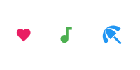 |
| /// |
| /// ```dart |
| /// Row( |
| /// mainAxisAlignment: MainAxisAlignment.spaceAround, |
| /// children: const <Widget>[ |
| /// Icon( |
| /// Icons.favorite, |
| /// color: Colors.pink, |
| /// size: 24.0, |
| /// semanticLabel: 'Text to announce in accessibility modes', |
| /// ), |
| /// Icon( |
| /// Icons.audiotrack, |
| /// color: Colors.green, |
| /// size: 30.0, |
| /// ), |
| /// Icon( |
| /// Icons.beach_access, |
| /// color: Colors.blue, |
| /// size: 36.0, |
| /// ), |
| /// ], |
| /// ) |
| /// ``` |
| /// {@end-tool} |
| /// |
| /// See also: |
| /// |
| /// * [IconButton], for interactive icons. |
| /// * [Icons], for the list of available icons for use with this class. |
| /// * [IconTheme], which provides ambient configuration for icons. |
| /// * [ImageIcon], for showing icons from [AssetImage]s or other [ImageProvider]s. |
| class Icon extends StatelessWidget { |
| /// Creates an icon. |
| /// |
| /// The [size] and [color] default to the value given by the current [IconTheme]. |
| const Icon( |
| this.icon, { |
| Key? key, |
| this.size, |
| this.color, |
| this.semanticLabel, |
| this.textDirection, |
| }) : super(key: key); |
| |
| /// The icon to display. The available icons are described in [Icons]. |
| /// |
| /// The icon can be null, in which case the widget will render as an empty |
| /// space of the specified [size]. |
| final IconData? icon; |
| |
| /// The size of the icon in logical pixels. |
| /// |
| /// Icons occupy a square with width and height equal to size. |
| /// |
| /// Defaults to the current [IconTheme] size, if any. If there is no |
| /// [IconTheme], or it does not specify an explicit size, then it defaults to |
| /// 24.0. |
| /// |
| /// If this [Icon] is being placed inside an [IconButton], then use |
| /// [IconButton.iconSize] instead, so that the [IconButton] can make the splash |
| /// area the appropriate size as well. The [IconButton] uses an [IconTheme] to |
| /// pass down the size to the [Icon]. |
| final double? size; |
| |
| /// The color to use when drawing the icon. |
| /// |
| /// Defaults to the current [IconTheme] color, if any. |
| /// |
| /// The color (whether specified explicitly here or obtained from the |
| /// [IconTheme]) will be further adjusted by the opacity of the current |
| /// [IconTheme], if any. |
| /// |
| /// In material apps, if there is a [Theme] without any [IconTheme]s |
| /// specified, icon colors default to white if the theme is dark |
| /// and black if the theme is light. |
| /// |
| /// If no [IconTheme] and no [Theme] is specified, icons will default to |
| /// black. |
| /// |
| /// See [Theme] to set the current theme and [ThemeData.brightness] |
| /// for setting the current theme's brightness. |
| /// |
| /// {@tool snippet} |
| /// Typically, a Material Design color will be used, as follows: |
| /// |
| /// ```dart |
| /// Icon( |
| /// Icons.widgets, |
| /// color: Colors.blue.shade400, |
| /// ) |
| /// ``` |
| /// {@end-tool} |
| final Color? color; |
| |
| /// Semantic label for the icon. |
| /// |
| /// Announced in accessibility modes (e.g TalkBack/VoiceOver). |
| /// This label does not show in the UI. |
| /// |
| /// * [SemanticsProperties.label], which is set to [semanticLabel] in the |
| /// underlying [Semantics] widget. |
| final String? semanticLabel; |
| |
| /// The text direction to use for rendering the icon. |
| /// |
| /// If this is null, the ambient [Directionality] is used instead. |
| /// |
| /// Some icons follow the reading direction. For example, "back" buttons point |
| /// left in left-to-right environments and right in right-to-left |
| /// environments. Such icons have their [IconData.matchTextDirection] field |
| /// set to true, and the [Icon] widget uses the [textDirection] to determine |
| /// the orientation in which to draw the icon. |
| /// |
| /// This property has no effect if the [icon]'s [IconData.matchTextDirection] |
| /// field is false, but for consistency a text direction value must always be |
| /// specified, either directly using this property or using [Directionality]. |
| final TextDirection? textDirection; |
| |
| @override |
| Widget build(BuildContext context) { |
| assert(this.textDirection != null || debugCheckHasDirectionality(context)); |
| final TextDirection textDirection = this.textDirection ?? Directionality.of(context); |
| |
| final IconThemeData iconTheme = IconTheme.of(context); |
| |
| final double? iconSize = size ?? iconTheme.size; |
| |
| if (icon == null) { |
| return Semantics( |
| label: semanticLabel, |
| child: SizedBox(width: iconSize, height: iconSize), |
| ); |
| } |
| |
| final double iconOpacity = iconTheme.opacity ?? 1.0; |
| Color iconColor = color ?? iconTheme.color!; |
| if (iconOpacity != 1.0) |
| iconColor = iconColor.withOpacity(iconColor.opacity * iconOpacity); |
| |
| Widget iconWidget = RichText( |
| overflow: TextOverflow.visible, // Never clip. |
| textDirection: textDirection, // Since we already fetched it for the assert... |
| text: TextSpan( |
| text: String.fromCharCode(icon!.codePoint), |
| style: TextStyle( |
| inherit: false, |
| color: iconColor, |
| fontSize: iconSize, |
| fontFamily: icon!.fontFamily, |
| package: icon!.fontPackage, |
| ), |
| ), |
| ); |
| |
| if (icon!.matchTextDirection) { |
| switch (textDirection) { |
| case TextDirection.rtl: |
| iconWidget = Transform( |
| transform: Matrix4.identity()..scale(-1.0, 1.0, 1.0), |
| alignment: Alignment.center, |
| transformHitTests: false, |
| child: iconWidget, |
| ); |
| break; |
| case TextDirection.ltr: |
| break; |
| } |
| } |
| |
| return Semantics( |
| label: semanticLabel, |
| child: ExcludeSemantics( |
| child: SizedBox( |
| width: iconSize, |
| height: iconSize, |
| child: Center( |
| child: iconWidget, |
| ), |
| ), |
| ), |
| ); |
| } |
| |
| @override |
| void debugFillProperties(DiagnosticPropertiesBuilder properties) { |
| super.debugFillProperties(properties); |
| properties.add(IconDataProperty('icon', icon, ifNull: '<empty>', showName: false)); |
| properties.add(DoubleProperty('size', size, defaultValue: null)); |
| properties.add(ColorProperty('color', color, defaultValue: null)); |
| } |
| } |