| // Copyright 2014 The Flutter Authors. All rights reserved. |
| // Use of this source code is governed by a BSD-style license that can be |
| // found in the LICENSE file. |
| |
| import 'package:flutter/widgets.dart'; |
| |
| import 'divider_theme.dart'; |
| import 'theme.dart'; |
| |
| // Examples can assume: |
| // late BuildContext context; |
| |
| /// A thin horizontal line, with padding on either side. |
| /// |
| /// In the material design language, this represents a divider. Dividers can be |
| /// used in lists, [Drawer]s, and elsewhere to separate content. |
| /// |
| /// To create a divider between [ListTile] items, consider using |
| /// [ListTile.divideTiles], which is optimized for this case. |
| /// |
| /// {@youtube 560 315 https://www.youtube.com/watch?v=_liUC641Nmk} |
| /// |
| /// The box's total height is controlled by [height]. The appropriate |
| /// padding is automatically computed from the height. |
| /// |
| /// {@tool dartpad} |
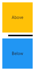
| /// This sample shows how to display a Divider between an orange and blue box |
| /// inside a column. The Divider is 20 logical pixels in height and contains a |
| /// vertically centered black line that is 5 logical pixels thick. The black |
| /// line is indented by 20 logical pixels. |
| /// |
| ///  |
| /// |
| /// ** See code in examples/api/lib/material/divider/divider.0.dart ** |
| /// {@end-tool} |
| /// |
| /// See also: |
| /// |
| /// * [PopupMenuDivider], which is the equivalent but for popup menus. |
| /// * [ListTile.divideTiles], another approach to dividing widgets in a list. |
| /// * [VerticalDivider], which is the vertical analog of this widget. |
| /// * <https://material.io/design/components/dividers.html> |
| class Divider extends StatelessWidget { |
| /// Creates a material design divider. |
| /// |
| /// The [height], [thickness], [indent], and [endIndent] must be null or |
| /// non-negative. |
| const Divider({ |
| Key? key, |
| this.height, |
| this.thickness, |
| this.indent, |
| this.endIndent, |
| this.color, |
| }) : assert(height == null || height >= 0.0), |
| assert(thickness == null || thickness >= 0.0), |
| assert(indent == null || indent >= 0.0), |
| assert(endIndent == null || endIndent >= 0.0), |
| super(key: key); |
| |
| |
| /// The divider's height extent. |
| /// |
| /// The divider itself is always drawn as a horizontal line that is centered |
| /// within the height specified by this value. |
| /// |
| /// If this is null, then the [DividerThemeData.space] is used. If that is |
| /// also null, then this defaults to 16.0. |
| final double? height; |
| |
| /// The thickness of the line drawn within the divider. |
| /// |
| /// A divider with a [thickness] of 0.0 is always drawn as a line with a |
| /// height of exactly one device pixel. |
| /// |
| /// If this is null, then the [DividerThemeData.thickness] is used. If |
| /// that is also null, then this defaults to 0.0. |
| final double? thickness; |
| |
| /// The amount of empty space to the leading edge of the divider. |
| /// |
| /// If this is null, then the [DividerThemeData.indent] is used. If that is |
| /// also null, then this defaults to 0.0. |
| final double? indent; |
| |
| /// The amount of empty space to the trailing edge of the divider. |
| /// |
| /// If this is null, then the [DividerThemeData.endIndent] is used. If that is |
| /// also null, then this defaults to 0.0. |
| final double? endIndent; |
| |
| /// The color to use when painting the line. |
| /// |
| /// If this is null, then the [DividerThemeData.color] is used. If that is |
| /// also null, then [ThemeData.dividerColor] is used. |
| /// |
| /// {@tool snippet} |
| /// |
| /// ```dart |
| /// const Divider( |
| /// color: Colors.deepOrange, |
| /// ) |
| /// ``` |
| /// {@end-tool} |
| final Color? color; |
| |
| /// Computes the [BorderSide] that represents a divider. |
| /// |
| /// If [color] is null, then [DividerThemeData.color] is used. If that is also |
| /// null, then [ThemeData.dividerColor] is used. |
| /// |
| /// If [width] is null, then [DividerThemeData.thickness] is used. If that is |
| /// also null, then this defaults to 0.0 (a hairline border). |
| /// |
| /// If [context] is null, the default color of [BorderSide] is used and the |
| /// default width of 0.0 is used. |
| /// |
| /// {@tool snippet} |
| /// |
| /// This example uses this method to create a box that has a divider above and |
| /// below it. This is sometimes useful with lists, for instance, to separate a |
| /// scrollable section from the rest of the interface. |
| /// |
| /// ```dart |
| /// DecoratedBox( |
| /// decoration: BoxDecoration( |
| /// border: Border( |
| /// top: Divider.createBorderSide(context), |
| /// bottom: Divider.createBorderSide(context), |
| /// ), |
| /// ), |
| /// // child: ... |
| /// ) |
| /// ``` |
| /// {@end-tool} |
| static BorderSide createBorderSide(BuildContext? context, { Color? color, double? width }) { |
| final Color? effectiveColor = color |
| ?? (context != null ? (DividerTheme.of(context).color ?? Theme.of(context).dividerColor) : null); |
| final double effectiveWidth = width |
| ?? (context != null ? DividerTheme.of(context).thickness : null) |
| ?? 0.0; |
| |
| // Prevent assertion since it is possible that context is null and no color |
| // is specified. |
| if (effectiveColor == null) { |
| return BorderSide( |
| width: effectiveWidth, |
| ); |
| } |
| return BorderSide( |
| color: effectiveColor, |
| width: effectiveWidth, |
| ); |
| } |
| |
| @override |
| Widget build(BuildContext context) { |
| final DividerThemeData dividerTheme = DividerTheme.of(context); |
| final double height = this.height ?? dividerTheme.space ?? 16.0; |
| final double thickness = this.thickness ?? dividerTheme.thickness ?? 0.0; |
| final double indent = this.indent ?? dividerTheme.indent ?? 0.0; |
| final double endIndent = this.endIndent ?? dividerTheme.endIndent ?? 0.0; |
| |
| return SizedBox( |
| height: height, |
| child: Center( |
| child: Container( |
| height: thickness, |
| margin: EdgeInsetsDirectional.only(start: indent, end: endIndent), |
| decoration: BoxDecoration( |
| border: Border( |
| bottom: createBorderSide(context, color: color, width: thickness), |
| ), |
| ), |
| ), |
| ), |
| ); |
| } |
| } |
| |
| /// A thin vertical line, with padding on either side. |
| /// |
| /// In the material design language, this represents a divider. Vertical |
| /// dividers can be used in horizontally scrolling lists, such as a |
| /// [ListView] with [ListView.scrollDirection] set to [Axis.horizontal]. |
| /// |
| /// The box's total width is controlled by [width]. The appropriate |
| /// padding is automatically computed from the width. |
| /// |
| /// {@tool dartpad} |
| /// This sample shows how to display a [VerticalDivider] between a purple and orange box |
| /// inside a [Row]. The [VerticalDivider] is 20 logical pixels in width and contains a |
| /// horizontally centered black line that is 1 logical pixels thick. The grey |
| /// line is indented by 20 logical pixels. |
| /// |
| /// ** See code in examples/api/lib/material/divider/vertical_divider.0.dart ** |
| /// {@end-tool} |
| /// |
| /// See also: |
| /// |
| /// * [ListView.separated], which can be used to generate vertical dividers. |
| /// * [Divider], which is the horizontal analog of this widget. |
| /// * <https://material.io/design/components/dividers.html> |
| class VerticalDivider extends StatelessWidget { |
| /// Creates a material design vertical divider. |
| /// |
| /// The [width], [thickness], [indent], and [endIndent] must be null or |
| /// non-negative. |
| const VerticalDivider({ |
| Key? key, |
| this.width, |
| this.thickness, |
| this.indent, |
| this.endIndent, |
| this.color, |
| }) : assert(width == null || width >= 0.0), |
| assert(thickness == null || thickness >= 0.0), |
| assert(indent == null || indent >= 0.0), |
| assert(endIndent == null || endIndent >= 0.0), |
| super(key: key); |
| |
| /// The divider's width. |
| /// |
| /// The divider itself is always drawn as a vertical line that is centered |
| /// within the width specified by this value. |
| /// |
| /// If this is null, then the [DividerThemeData.space] is used. If that is |
| /// also null, then this defaults to 16.0. |
| final double? width; |
| |
| /// The thickness of the line drawn within the divider. |
| /// |
| /// A divider with a [thickness] of 0.0 is always drawn as a line with a |
| /// width of exactly one device pixel. |
| /// |
| /// If this is null, then the [DividerThemeData.thickness] is used which |
| /// defaults to 0.0. |
| final double? thickness; |
| |
| /// The amount of empty space on top of the divider. |
| /// |
| /// If this is null, then the [DividerThemeData.indent] is used. If that is |
| /// also null, then this defaults to 0.0. |
| final double? indent; |
| |
| /// The amount of empty space under the divider. |
| /// |
| /// If this is null, then the [DividerThemeData.endIndent] is used. If that is |
| /// also null, then this defaults to 0.0. |
| final double? endIndent; |
| |
| /// The color to use when painting the line. |
| /// |
| /// If this is null, then the [DividerThemeData.color] is used. If that is |
| /// also null, then [ThemeData.dividerColor] is used. |
| /// |
| /// {@tool snippet} |
| /// |
| /// ```dart |
| /// const Divider( |
| /// color: Colors.deepOrange, |
| /// ) |
| /// ``` |
| /// {@end-tool} |
| final Color? color; |
| |
| @override |
| Widget build(BuildContext context) { |
| final DividerThemeData dividerTheme = DividerTheme.of(context); |
| final double width = this.width ?? dividerTheme.space ?? 16.0; |
| final double thickness = this.thickness ?? dividerTheme.thickness ?? 0.0; |
| final double indent = this.indent ?? dividerTheme.indent ?? 0.0; |
| final double endIndent = this.endIndent ?? dividerTheme.endIndent ?? 0.0; |
| |
| return SizedBox( |
| width: width, |
| child: Center( |
| child: Container( |
| width: thickness, |
| margin: EdgeInsetsDirectional.only(top: indent, bottom: endIndent), |
| decoration: BoxDecoration( |
| border: Border( |
| left: Divider.createBorderSide(context, color: color, width: thickness), |
| ), |
| ), |
| ), |
| ), |
| ); |
| } |
| } |