| // Copyright 2014 The Flutter Authors. All rights reserved. |
| // Use of this source code is governed by a BSD-style license that can be |
| // found in the LICENSE file. |
| |
| import 'package:flutter/painting.dart'; |
| |
| /// Defines a single color as well a color swatch with ten shades of the color. |
| /// |
| /// The color's shades are referred to by index. The greater the index, the |
| /// darker the color. There are 10 valid indices: 50, 100, 200, ..., 900. |
| /// The value of this color should the same the value of index 500 and [shade500]. |
| /// |
| /// See also: |
| /// |
| /// * [Colors], which defines all of the standard material colors. |
| class MaterialColor extends ColorSwatch<int> { |
| /// Creates a color swatch with a variety of shades. |
| /// |
| /// The `primary` argument should be the 32 bit ARGB value of one of the |
| /// values in the swatch, as would be passed to the [new Color] constructor |
| /// for that same color, and as is exposed by [value]. (This is distinct from |
| /// the specific index of the color in the swatch.) |
| const MaterialColor(int primary, Map<int, Color> swatch) : super(primary, swatch); |
| |
| /// The lightest shade. |
| Color get shade50 => this[50]!; |
| |
| /// The second lightest shade. |
| Color get shade100 => this[100]!; |
| |
| /// The third lightest shade. |
| Color get shade200 => this[200]!; |
| |
| /// The fourth lightest shade. |
| Color get shade300 => this[300]!; |
| |
| /// The fifth lightest shade. |
| Color get shade400 => this[400]!; |
| |
| /// The default shade. |
| Color get shade500 => this[500]!; |
| |
| /// The fourth darkest shade. |
| Color get shade600 => this[600]!; |
| |
| /// The third darkest shade. |
| Color get shade700 => this[700]!; |
| |
| /// The second darkest shade. |
| Color get shade800 => this[800]!; |
| |
| /// The darkest shade. |
| Color get shade900 => this[900]!; |
| } |
| |
| /// Defines a single accent color as well a swatch of four shades of the |
| /// accent color. |
| /// |
| /// The color's shades are referred to by index, the colors with smaller |
| /// indices are lighter, larger indices are darker. There are four valid |
| /// indices: 100, 200, 400, and 700. The value of this color should be the |
| /// same as the value of index 200 and [shade200]. |
| /// |
| /// See also: |
| /// |
| /// * [Colors], which defines all of the standard material colors. |
| /// * <https://material.io/go/design-theming#color-color-schemes> |
| class MaterialAccentColor extends ColorSwatch<int> { |
| /// Creates a color swatch with a variety of shades appropriate for accent |
| /// colors. |
| const MaterialAccentColor(int primary, Map<int, Color> swatch) : super(primary, swatch); |
| |
| /// The lightest shade. |
| Color get shade100 => this[100]!; |
| |
| /// The default shade. |
| Color get shade200 => this[200]!; |
| |
| /// The second darkest shade. |
| Color get shade400 => this[400]!; |
| |
| /// The darkest shade. |
| Color get shade700 => this[700]!; |
| } |
| |
| /// [Color] and [ColorSwatch] constants which represent Material design's |
| /// [color palette](https://material.io/design/color/). |
| /// |
| /// Instead of using an absolute color from these palettes, consider using |
| /// [Theme.of] to obtain the local [ThemeData.colorScheme], which defines |
| /// the colors that most of the Material components use by default. |
| /// |
| /// |
| /// Most swatches have colors from 100 to 900 in increments of one hundred, plus |
| /// the color 50. The smaller the number, the more pale the color. The greater |
| /// the number, the darker the color. The accent swatches (e.g. [redAccent]) only |
| /// have the values 100, 200, 400, and 700. |
| /// |
| /// In addition, a series of blacks and whites with common opacities are |
| /// available. For example, [black54] is a pure black with 54% opacity. |
| /// |
| /// {@tool snippet} |
| /// |
| /// To select a specific color from one of the swatches, index into the swatch |
| /// using an integer for the specific color desired, as follows: |
| /// |
| /// ```dart |
| /// Color selection = Colors.green[400]!; // Selects a mid-range green. |
| /// ``` |
| /// {@end-tool} |
| /// {@tool snippet} |
| /// |
| /// Each [ColorSwatch] constant is a color and can used directly. For example: |
| /// |
| /// ```dart |
| /// Container( |
| /// color: Colors.blue, // same as Colors.blue[500] or Colors.blue.shade500 |
| /// ) |
| /// ``` |
| /// {@end-tool} |
| /// |
| /// ## Color palettes |
| /// |
| ///  |
| ///  |
| /// |
| ///  |
| ///  |
| /// |
| ///  |
| ///  |
| /// |
| ///  |
| ///  |
| /// |
| ///  |
| ///  |
| /// |
| ///  |
| ///  |
| /// |
| ///  |
| ///  |
| /// |
| ///  |
| ///  |
| /// |
| ///  |
| ///  |
| /// |
| ///  |
| ///  |
| /// |
| ///  |
| ///  |
| /// |
| ///  |
| ///  |
| /// |
| ///  |
| ///  |
| /// |
| ///  |
| ///  |
| /// |
| ///  |
| ///  |
| /// |
| ///  |
| ///  |
| /// |
| ///  |
| /// |
| ///  |
| /// |
| ///  |
| /// |
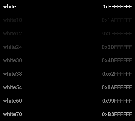
| /// ## Blacks and whites |
| /// |
| /// These colors are identified by their transparency. The low transparency |
| /// levels (e.g. [Colors.white12] and [Colors.white10]) are very hard to see and |
| /// should be avoided in general. They are intended for very subtle effects. |
| /// |
| ///  |
| ///  |
| /// |
| /// The [Colors.transparent] color isn't shown here because it is entirely |
| /// invisible! |
| /// |
| /// See also: |
| /// |
| /// * Cookbook: [Use themes to share colors and font styles](https://flutter.dev/docs/cookbook/design/themes) |
| class Colors { |
| // This class is not meant to be instantiated or extended; this constructor |
| // prevents instantiation and extension. |
| Colors._(); |
| |
| /// Completely invisible. |
| static const Color transparent = Color(0x00000000); |
| |
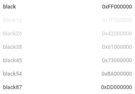
| /// Completely opaque black. |
| /// |
| ///  |
| /// |
| /// See also: |
| /// |
| /// * [black87], [black54], [black45], [black38], [black26], [black12], which |
| /// are variants on this color but with different opacities. |
| /// * [white], a solid white color. |
| /// * [transparent], a fully-transparent color. |
| static const Color black = Color(0xFF000000); |
| |
| /// Black with 87% opacity. |
| /// |
| /// This is a good contrasting color for text in light themes. |
| /// |
| ///  |
| /// |
| /// See also: |
| /// |
| /// * [Typography.black], which uses this color for its text styles. |
| /// * [Theme.of], which allows you to select colors from the current theme |
| /// rather than hard-coding colors in your build methods. |
| /// * [black], [black54], [black45], [black38], [black26], [black12], which |
| /// are variants on this color but with different opacities. |
| static const Color black87 = Color(0xDD000000); |
| |
| /// Black with 54% opacity. |
| /// |
| /// This is a color commonly used for headings in light themes. It's also used |
| /// as the mask color behind dialogs. |
| /// |
| ///  |
| /// |
| /// See also: |
| /// |
| /// * [Typography.black], which uses this color for its text styles. |
| /// * [Theme.of], which allows you to select colors from the current theme |
| /// rather than hard-coding colors in your build methods. |
| /// * [black], [black87], [black45], [black38], [black26], [black12], which |
| /// are variants on this color but with different opacities. |
| static const Color black54 = Color(0x8A000000); |
| |
| /// Black with 45% opacity. |
| /// |
| ///  |
| /// |
| /// See also: |
| /// |
| /// * [black], [black87], [black54], [black38], [black26], [black12], which |
| /// are variants on this color but with different opacities. |
| static const Color black45 = Color(0x73000000); |
| |
| /// Black with 38% opacity. |
| /// |
| /// For light themes, i.e. when the Theme's [ThemeData.brightness] is |
| /// [Brightness.light], this color is used for disabled icons and for |
| /// placeholder text in [DataTable]. |
| /// |
| ///  |
| /// |
| /// See also: |
| /// |
| /// * [black], [black87], [black54], [black45], [black26], [black12], which |
| /// are variants on this color but with different opacities. |
| static const Color black38 = Color(0x61000000); |
| |
| /// Black with 26% opacity. |
| /// |
| /// Used for disabled radio buttons and the text of disabled flat buttons in light themes. |
| /// |
| ///  |
| /// |
| /// See also: |
| /// |
| /// * [ThemeData.disabledColor], which uses this color by default in light themes. |
| /// * [Theme.of], which allows you to select colors from the current theme |
| /// rather than hard-coding colors in your build methods. |
| /// * [black], [black87], [black54], [black45], [black38], [black12], which |
| /// are variants on this color but with different opacities. |
| static const Color black26 = Color(0x42000000); |
| |
| /// Black with 12% opacity. |
| /// |
| ///  |
| /// |
| /// Used for the background of disabled raised buttons in light themes. |
| /// |
| /// See also: |
| /// |
| /// * [black], [black87], [black54], [black45], [black38], [black26], which |
| /// are variants on this color but with different opacities. |
| static const Color black12 = Color(0x1F000000); |
| |
| /// Completely opaque white. |
| /// |
| /// This is a good contrasting color for the [ThemeData.primaryColor] in the |
| /// dark theme. See [ThemeData.brightness]. |
| /// |
| ///  |
| /// |
| /// See also: |
| /// |
| /// * [Typography.white], which uses this color for its text styles. |
| /// * [Theme.of], which allows you to select colors from the current theme |
| /// rather than hard-coding colors in your build methods. |
| /// * [white70], [white60], [white54], [white38], [white30], [white12], |
| /// [white10], which are variants on this color but with different |
| /// opacities. |
| /// * [black], a solid black color. |
| /// * [transparent], a fully-transparent color. |
| static const Color white = Color(0xFFFFFFFF); |
| |
| /// White with 70% opacity. |
| /// |
| /// This is a color commonly used for headings in dark themes. |
| /// |
| ///  |
| /// |
| /// See also: |
| /// |
| /// * [Typography.white], which uses this color for its text styles. |
| /// * [Theme.of], which allows you to select colors from the current theme |
| /// rather than hard-coding colors in your build methods. |
| /// * [white], [white60], [white54], [white38], [white30], [white12], |
| /// [white10], which are variants on this color but with different |
| /// opacities. |
| static const Color white70 = Color(0xB3FFFFFF); |
| |
| /// White with 60% opacity. |
| /// |
| /// Used for medium-emphasis text and hint text when [ThemeData.brightness] is |
| /// set to [Brightness.dark]. |
| /// |
| ///  |
| /// |
| /// See also: |
| /// |
| /// * [ExpandIcon], which uses this color for dark themes. |
| /// * [Theme.of], which allows you to select colors from the current theme |
| /// rather than hard-coding colors in your build methods. |
| /// * [white], [white54], [white30], [white38], [white12], [white10], which |
| /// are variants on this color but with different opacities. |
| static const Color white60 = Color(0x99FFFFFF); |
| |
| /// White with 54% opacity. |
| /// |
| ///  |
| /// |
| /// See also: |
| /// |
| /// * [Theme.of], which allows you to select colors from the current theme |
| /// rather than hard-coding colors in your build methods. |
| /// * [white], [white60], [white38], [white30], [white12], [white10], which |
| /// are variants on this color but with different opacities. |
| static const Color white54 = Color(0x8AFFFFFF); |
| |
| /// White with 38% opacity. |
| /// |
| /// Used for disabled radio buttons and the text of disabled flat buttons in dark themes. |
| /// |
| ///  |
| /// |
| /// See also: |
| /// |
| /// * [ThemeData.disabledColor], which uses this color by default in dark themes. |
| /// * [Theme.of], which allows you to select colors from the current theme |
| /// rather than hard-coding colors in your build methods. |
| /// * [white], [white60], [white54], [white70], [white30], [white12], |
| /// [white10], which are variants on this color but with different |
| /// opacities. |
| static const Color white38 = Color(0x62FFFFFF); |
| |
| /// White with 30% opacity. |
| /// |
| ///  |
| /// |
| /// See also: |
| /// |
| /// * [Theme.of], which allows you to select colors from the current theme |
| /// rather than hard-coding colors in your build methods. |
| /// * [white], [white60], [white54], [white70], [white38], [white12], |
| /// [white10], which are variants on this color but with different |
| /// opacities. |
| static const Color white30 = Color(0x4DFFFFFF); |
| |
| /// White with 24% opacity. |
| /// |
| ///  |
| /// |
| /// Used for the splash color for filled buttons. |
| /// |
| /// See also: |
| /// |
| /// * [white], [white60], [white54], [white70], [white38], [white30], |
| /// [white10], which are variants on this color |
| /// but with different opacities. |
| static const Color white24 = Color(0x3DFFFFFF); |
| |
| /// White with 12% opacity. |
| /// |
| ///  |
| /// |
| /// Used for the background of disabled raised buttons in dark themes. |
| /// |
| /// See also: |
| /// |
| /// * [white], [white60], [white54], [white70], [white38], [white30], |
| /// [white10], which are variants on this color but with different |
| /// opacities. |
| static const Color white12 = Color(0x1FFFFFFF); |
| |
| /// White with 10% opacity. |
| /// |
| ///  |
| /// |
| /// See also: |
| /// |
| /// * [white], [white60], [white54], [white70], [white38], [white30], |
| /// [white12], which are variants on this color |
| /// but with different opacities. |
| /// * [transparent], a fully-transparent color, not far from this one. |
| static const Color white10 = Color(0x1AFFFFFF); |
| |
| /// The red primary color and swatch. |
| /// |
| ///  |
| ///  |
| /// |
| ///  |
| ///  |
| /// |
| ///  |
| ///  |
| /// |
| /// {@tool snippet} |
| /// |
| /// ```dart |
| /// Icon( |
| /// Icons.widgets, |
| /// color: Colors.red[400], |
| /// ) |
| /// ``` |
| /// {@end-tool} |
| /// |
| /// See also: |
| /// |
| /// * [redAccent], the corresponding accent colors. |
| /// * [deepOrange] and [pink], similar colors. |
| /// * [Theme.of], which allows you to select colors from the current theme |
| /// rather than hard-coding colors in your build methods. |
| static const MaterialColor red = MaterialColor( |
| _redPrimaryValue, |
| <int, Color>{ |
| 50: Color(0xFFFFEBEE), |
| 100: Color(0xFFFFCDD2), |
| 200: Color(0xFFEF9A9A), |
| 300: Color(0xFFE57373), |
| 400: Color(0xFFEF5350), |
| 500: Color(_redPrimaryValue), |
| 600: Color(0xFFE53935), |
| 700: Color(0xFFD32F2F), |
| 800: Color(0xFFC62828), |
| 900: Color(0xFFB71C1C), |
| }, |
| ); |
| static const int _redPrimaryValue = 0xFFF44336; |
| |
| /// The red accent swatch. |
| /// |
| ///  |
| ///  |
| /// |
| ///  |
| ///  |
| /// |
| ///  |
| ///  |
| /// |
| /// {@tool snippet} |
| /// |
| /// ```dart |
| /// Icon( |
| /// Icons.widgets, |
| /// color: Colors.redAccent[400], |
| /// ) |
| /// ``` |
| /// {@end-tool} |
| /// |
| /// See also: |
| /// |
| /// * [red], the corresponding primary colors. |
| /// * [deepOrangeAccent] and [pinkAccent], similar colors. |
| /// * [Theme.of], which allows you to select colors from the current theme |
| /// rather than hard-coding colors in your build methods. |
| static const MaterialAccentColor redAccent = MaterialAccentColor( |
| _redAccentValue, |
| <int, Color>{ |
| 100: Color(0xFFFF8A80), |
| 200: Color(_redAccentValue), |
| 400: Color(0xFFFF1744), |
| 700: Color(0xFFD50000), |
| }, |
| ); |
| static const int _redAccentValue = 0xFFFF5252; |
| |
| /// The pink primary color and swatch. |
| /// |
| ///  |
| ///  |
| /// |
| ///  |
| ///  |
| /// |
| ///  |
| ///  |
| /// |
| /// {@tool snippet} |
| /// |
| /// ```dart |
| /// Icon( |
| /// Icons.widgets, |
| /// color: Colors.pink[400], |
| /// ) |
| /// ``` |
| /// {@end-tool} |
| /// |
| /// See also: |
| /// |
| /// * [pinkAccent], the corresponding accent colors. |
| /// * [red] and [purple], similar colors. |
| /// * [Theme.of], which allows you to select colors from the current theme |
| /// rather than hard-coding colors in your build methods. |
| static const MaterialColor pink = MaterialColor( |
| _pinkPrimaryValue, |
| <int, Color>{ |
| 50: Color(0xFFFCE4EC), |
| 100: Color(0xFFF8BBD0), |
| 200: Color(0xFFF48FB1), |
| 300: Color(0xFFF06292), |
| 400: Color(0xFFEC407A), |
| 500: Color(_pinkPrimaryValue), |
| 600: Color(0xFFD81B60), |
| 700: Color(0xFFC2185B), |
| 800: Color(0xFFAD1457), |
| 900: Color(0xFF880E4F), |
| }, |
| ); |
| static const int _pinkPrimaryValue = 0xFFE91E63; |
| |
| /// The pink accent color swatch. |
| /// |
| ///  |
| ///  |
| /// |
| ///  |
| ///  |
| /// |
| ///  |
| ///  |
| /// |
| /// {@tool snippet} |
| /// |
| /// ```dart |
| /// Icon( |
| /// Icons.widgets, |
| /// color: Colors.pinkAccent[400], |
| /// ) |
| /// ``` |
| /// {@end-tool} |
| /// |
| /// See also: |
| /// |
| /// * [pink], the corresponding primary colors. |
| /// * [redAccent] and [purpleAccent], similar colors. |
| /// * [Theme.of], which allows you to select colors from the current theme |
| /// rather than hard-coding colors in your build methods. |
| static const MaterialAccentColor pinkAccent = MaterialAccentColor( |
| _pinkAccentPrimaryValue, |
| <int, Color>{ |
| 100: Color(0xFFFF80AB), |
| 200: Color(_pinkAccentPrimaryValue), |
| 400: Color(0xFFF50057), |
| 700: Color(0xFFC51162), |
| }, |
| ); |
| static const int _pinkAccentPrimaryValue = 0xFFFF4081; |
| |
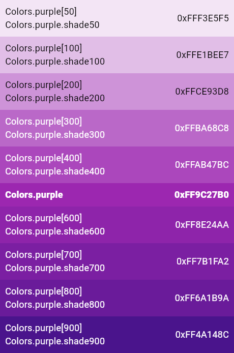
| /// The purple primary color and swatch. |
| /// |
| ///  |
| ///  |
| /// |
| ///  |
| ///  |
| /// |
| ///  |
| ///  |
| /// |
| /// {@tool snippet} |
| /// |
| /// ```dart |
| /// Icon( |
| /// Icons.widgets, |
| /// color: Colors.purple[400], |
| /// ) |
| /// ``` |
| /// {@end-tool} |
| /// |
| /// See also: |
| /// |
| /// * [purpleAccent], the corresponding accent colors. |
| /// * [deepPurple] and [pink], similar colors. |
| /// * [Theme.of], which allows you to select colors from the current theme |
| /// rather than hard-coding colors in your build methods. |
| static const MaterialColor purple = MaterialColor( |
| _purplePrimaryValue, |
| <int, Color>{ |
| 50: Color(0xFFF3E5F5), |
| 100: Color(0xFFE1BEE7), |
| 200: Color(0xFFCE93D8), |
| 300: Color(0xFFBA68C8), |
| 400: Color(0xFFAB47BC), |
| 500: Color(_purplePrimaryValue), |
| 600: Color(0xFF8E24AA), |
| 700: Color(0xFF7B1FA2), |
| 800: Color(0xFF6A1B9A), |
| 900: Color(0xFF4A148C), |
| }, |
| ); |
| static const int _purplePrimaryValue = 0xFF9C27B0; |
| |
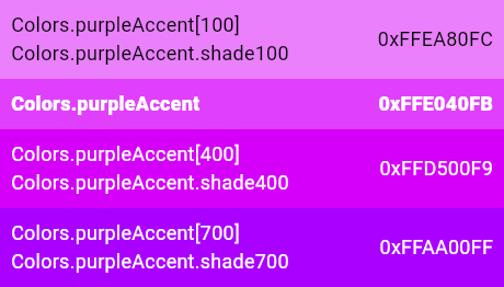
| /// The purple accent color and swatch. |
| /// |
| ///  |
| ///  |
| /// |
| ///  |
| ///  |
| /// |
| ///  |
| ///  |
| /// |
| /// {@tool snippet} |
| /// |
| /// ```dart |
| /// Icon( |
| /// Icons.widgets, |
| /// color: Colors.purpleAccent[400], |
| /// ) |
| /// ``` |
| /// {@end-tool} |
| /// |
| /// See also: |
| /// |
| /// * [purple], the corresponding primary colors. |
| /// * [deepPurpleAccent] and [pinkAccent], similar colors. |
| /// * [Theme.of], which allows you to select colors from the current theme |
| /// rather than hard-coding colors in your build methods. |
| static const MaterialAccentColor purpleAccent = MaterialAccentColor( |
| _purpleAccentPrimaryValue, |
| <int, Color>{ |
| 100: Color(0xFFEA80FC), |
| 200: Color(_purpleAccentPrimaryValue), |
| 400: Color(0xFFD500F9), |
| 700: Color(0xFFAA00FF), |
| }, |
| ); |
| static const int _purpleAccentPrimaryValue = 0xFFE040FB; |
| |
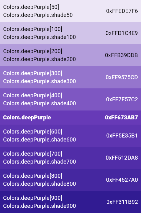
| /// The deep purple primary color and swatch. |
| /// |
| ///  |
| ///  |
| /// |
| ///  |
| ///  |
| /// |
| ///  |
| ///  |
| /// |
| /// {@tool snippet} |
| /// |
| /// ```dart |
| /// Icon( |
| /// Icons.widgets, |
| /// color: Colors.deepPurple[400], |
| /// ) |
| /// ``` |
| /// {@end-tool} |
| /// |
| /// See also: |
| /// |
| /// * [deepPurpleAccent], the corresponding accent colors. |
| /// * [purple] and [indigo], similar colors. |
| /// * [Theme.of], which allows you to select colors from the current theme |
| /// rather than hard-coding colors in your build methods. |
| static const MaterialColor deepPurple = MaterialColor( |
| _deepPurplePrimaryValue, |
| <int, Color>{ |
| 50: Color(0xFFEDE7F6), |
| 100: Color(0xFFD1C4E9), |
| 200: Color(0xFFB39DDB), |
| 300: Color(0xFF9575CD), |
| 400: Color(0xFF7E57C2), |
| 500: Color(_deepPurplePrimaryValue), |
| 600: Color(0xFF5E35B1), |
| 700: Color(0xFF512DA8), |
| 800: Color(0xFF4527A0), |
| 900: Color(0xFF311B92), |
| }, |
| ); |
| static const int _deepPurplePrimaryValue = 0xFF673AB7; |
| |
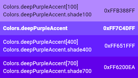
| /// The deep purple accent color and swatch. |
| /// |
| ///  |
| ///  |
| /// |
| ///  |
| ///  |
| /// |
| ///  |
| ///  |
| /// |
| /// {@tool snippet} |
| /// |
| /// ```dart |
| /// Icon( |
| /// Icons.widgets, |
| /// color: Colors.deepPurpleAccent[400], |
| /// ) |
| /// ``` |
| /// {@end-tool} |
| /// |
| /// See also: |
| /// |
| /// * [deepPurple], the corresponding primary colors. |
| /// * [purpleAccent] and [indigoAccent], similar colors. |
| /// * [Theme.of], which allows you to select colors from the current theme |
| /// rather than hard-coding colors in your build methods. |
| static const MaterialAccentColor deepPurpleAccent = MaterialAccentColor( |
| _deepPurpleAccentPrimaryValue, |
| <int, Color>{ |
| 100: Color(0xFFB388FF), |
| 200: Color(_deepPurpleAccentPrimaryValue), |
| 400: Color(0xFF651FFF), |
| 700: Color(0xFF6200EA), |
| }, |
| ); |
| static const int _deepPurpleAccentPrimaryValue = 0xFF7C4DFF; |
| |
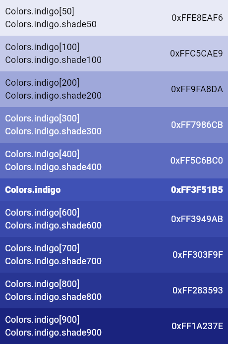
| /// The indigo primary color and swatch. |
| /// |
| ///  |
| ///  |
| /// |
| ///  |
| ///  |
| /// |
| ///  |
| ///  |
| /// |
| /// {@tool snippet} |
| /// |
| /// ```dart |
| /// Icon( |
| /// Icons.widgets, |
| /// color: Colors.indigo[400], |
| /// ) |
| /// ``` |
| /// {@end-tool} |
| /// |
| /// See also: |
| /// |
| /// * [indigoAccent], the corresponding accent colors. |
| /// * [blue] and [deepPurple], similar colors. |
| /// * [Theme.of], which allows you to select colors from the current theme |
| /// rather than hard-coding colors in your build methods. |
| static const MaterialColor indigo = MaterialColor( |
| _indigoPrimaryValue, |
| <int, Color>{ |
| 50: Color(0xFFE8EAF6), |
| 100: Color(0xFFC5CAE9), |
| 200: Color(0xFF9FA8DA), |
| 300: Color(0xFF7986CB), |
| 400: Color(0xFF5C6BC0), |
| 500: Color(_indigoPrimaryValue), |
| 600: Color(0xFF3949AB), |
| 700: Color(0xFF303F9F), |
| 800: Color(0xFF283593), |
| 900: Color(0xFF1A237E), |
| }, |
| ); |
| static const int _indigoPrimaryValue = 0xFF3F51B5; |
| |
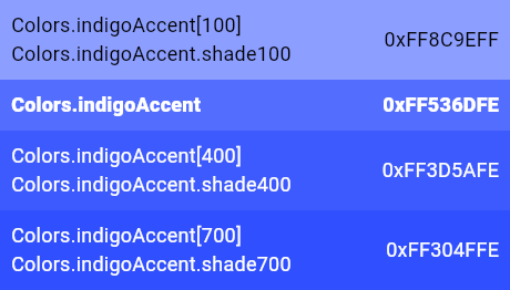
| /// The indigo accent color and swatch. |
| /// |
| ///  |
| ///  |
| /// |
| ///  |
| ///  |
| /// |
| ///  |
| ///  |
| /// |
| /// {@tool snippet} |
| /// |
| /// ```dart |
| /// Icon( |
| /// Icons.widgets, |
| /// color: Colors.indigoAccent[400], |
| /// ) |
| /// ``` |
| /// {@end-tool} |
| /// |
| /// See also: |
| /// |
| /// * [indigo], the corresponding primary colors. |
| /// * [blueAccent] and [deepPurpleAccent], similar colors. |
| /// * [Theme.of], which allows you to select colors from the current theme |
| /// rather than hard-coding colors in your build methods. |
| static const MaterialAccentColor indigoAccent = MaterialAccentColor( |
| _indigoAccentPrimaryValue, |
| <int, Color>{ |
| 100: Color(0xFF8C9EFF), |
| 200: Color(_indigoAccentPrimaryValue), |
| 400: Color(0xFF3D5AFE), |
| 700: Color(0xFF304FFE), |
| }, |
| ); |
| static const int _indigoAccentPrimaryValue = 0xFF536DFE; |
| |
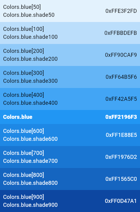
| /// The blue primary color and swatch. |
| /// |
| ///  |
| ///  |
| /// |
| ///  |
| ///  |
| /// |
| ///  |
| ///  |
| /// |
| ///  |
| /// |
| /// {@tool snippet} |
| /// |
| /// ```dart |
| /// Icon( |
| /// Icons.widgets, |
| /// color: Colors.blue[400], |
| /// ) |
| /// ``` |
| /// {@end-tool} |
| /// |
| /// See also: |
| /// |
| /// * [blueAccent], the corresponding accent colors. |
| /// * [indigo], [lightBlue], and [blueGrey], similar colors. |
| /// * [Theme.of], which allows you to select colors from the current theme |
| /// rather than hard-coding colors in your build methods. |
| static const MaterialColor blue = MaterialColor( |
| _bluePrimaryValue, |
| <int, Color>{ |
| 50: Color(0xFFE3F2FD), |
| 100: Color(0xFFBBDEFB), |
| 200: Color(0xFF90CAF9), |
| 300: Color(0xFF64B5F6), |
| 400: Color(0xFF42A5F5), |
| 500: Color(_bluePrimaryValue), |
| 600: Color(0xFF1E88E5), |
| 700: Color(0xFF1976D2), |
| 800: Color(0xFF1565C0), |
| 900: Color(0xFF0D47A1), |
| }, |
| ); |
| static const int _bluePrimaryValue = 0xFF2196F3; |
| |
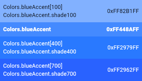
| /// The blue accent color and swatch. |
| /// |
| ///  |
| ///  |
| /// |
| ///  |
| ///  |
| /// |
| ///  |
| ///  |
| /// |
| /// {@tool snippet} |
| /// |
| /// ```dart |
| /// Icon( |
| /// Icons.widgets, |
| /// color: Colors.blueAccent[400], |
| /// ) |
| /// ``` |
| /// {@end-tool} |
| /// |
| /// See also: |
| /// |
| /// * [blue], the corresponding primary colors. |
| /// * [indigoAccent] and [lightBlueAccent], similar colors. |
| /// * [Theme.of], which allows you to select colors from the current theme |
| /// rather than hard-coding colors in your build methods. |
| static const MaterialAccentColor blueAccent = MaterialAccentColor( |
| _blueAccentPrimaryValue, |
| <int, Color>{ |
| 100: Color(0xFF82B1FF), |
| 200: Color(_blueAccentPrimaryValue), |
| 400: Color(0xFF2979FF), |
| 700: Color(0xFF2962FF), |
| }, |
| ); |
| static const int _blueAccentPrimaryValue = 0xFF448AFF; |
| |
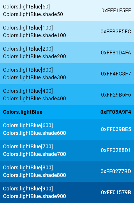
| /// The light blue primary color and swatch. |
| /// |
| ///  |
| ///  |
| /// |
| ///  |
| ///  |
| /// |
| ///  |
| ///  |
| /// |
| /// {@tool snippet} |
| /// |
| /// ```dart |
| /// Icon( |
| /// Icons.widgets, |
| /// color: Colors.lightBlue[400], |
| /// ) |
| /// ``` |
| /// {@end-tool} |
| /// |
| /// See also: |
| /// |
| /// * [lightBlueAccent], the corresponding accent colors. |
| /// * [blue] and [cyan], similar colors. |
| /// * [Theme.of], which allows you to select colors from the current theme |
| /// rather than hard-coding colors in your build methods. |
| static const MaterialColor lightBlue = MaterialColor( |
| _lightBluePrimaryValue, |
| <int, Color>{ |
| 50: Color(0xFFE1F5FE), |
| 100: Color(0xFFB3E5FC), |
| 200: Color(0xFF81D4FA), |
| 300: Color(0xFF4FC3F7), |
| 400: Color(0xFF29B6F6), |
| 500: Color(_lightBluePrimaryValue), |
| 600: Color(0xFF039BE5), |
| 700: Color(0xFF0288D1), |
| 800: Color(0xFF0277BD), |
| 900: Color(0xFF01579B), |
| }, |
| ); |
| static const int _lightBluePrimaryValue = 0xFF03A9F4; |
| |
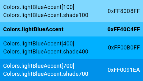
| /// The light blue accent swatch. |
| /// |
| ///  |
| ///  |
| /// |
| ///  |
| ///  |
| /// |
| ///  |
| ///  |
| /// |
| /// {@tool snippet} |
| /// |
| /// ```dart |
| /// Icon( |
| /// Icons.widgets, |
| /// color: Colors.lightBlueAccent[400], |
| /// ) |
| /// ``` |
| /// {@end-tool} |
| /// |
| /// See also: |
| /// |
| /// * [lightBlue], the corresponding primary colors. |
| /// * [blueAccent] and [cyanAccent], similar colors. |
| /// * [Theme.of], which allows you to select colors from the current theme |
| /// rather than hard-coding colors in your build methods. |
| static const MaterialAccentColor lightBlueAccent = MaterialAccentColor( |
| _lightBlueAccentPrimaryValue, |
| <int, Color>{ |
| 100: Color(0xFF80D8FF), |
| 200: Color(_lightBlueAccentPrimaryValue), |
| 400: Color(0xFF00B0FF), |
| 700: Color(0xFF0091EA), |
| }, |
| ); |
| static const int _lightBlueAccentPrimaryValue = 0xFF40C4FF; |
| |
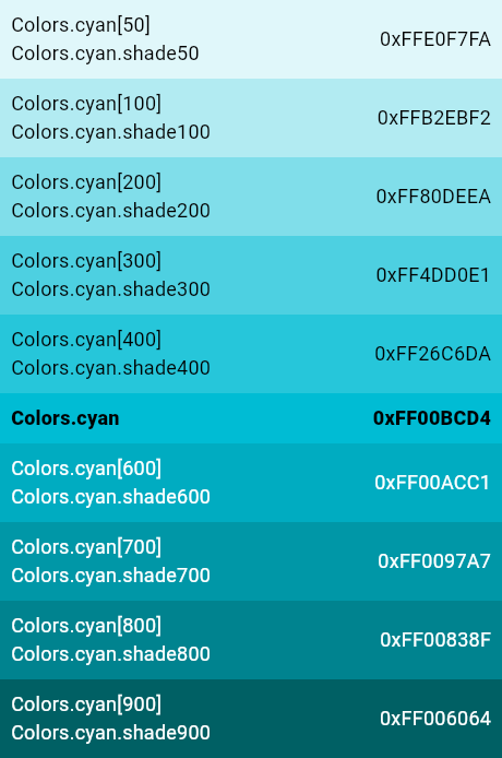
| /// The cyan primary color and swatch. |
| /// |
| ///  |
| ///  |
| /// |
| ///  |
| ///  |
| /// |
| ///  |
| ///  |
| /// |
| ///  |
| /// |
| /// {@tool snippet} |
| /// |
| /// ```dart |
| /// Icon( |
| /// Icons.widgets, |
| /// color: Colors.cyan[400], |
| /// ) |
| /// ``` |
| /// {@end-tool} |
| /// |
| /// See also: |
| /// |
| /// * [cyanAccent], the corresponding accent colors. |
| /// * [lightBlue], [teal], and [blueGrey], similar colors. |
| /// * [Theme.of], which allows you to select colors from the current theme |
| /// rather than hard-coding colors in your build methods. |
| static const MaterialColor cyan = MaterialColor( |
| _cyanPrimaryValue, |
| <int, Color>{ |
| 50: Color(0xFFE0F7FA), |
| 100: Color(0xFFB2EBF2), |
| 200: Color(0xFF80DEEA), |
| 300: Color(0xFF4DD0E1), |
| 400: Color(0xFF26C6DA), |
| 500: Color(_cyanPrimaryValue), |
| 600: Color(0xFF00ACC1), |
| 700: Color(0xFF0097A7), |
| 800: Color(0xFF00838F), |
| 900: Color(0xFF006064), |
| }, |
| ); |
| static const int _cyanPrimaryValue = 0xFF00BCD4; |
| |
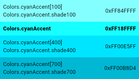
| /// The cyan accent color and swatch. |
| /// |
| ///  |
| ///  |
| /// |
| ///  |
| ///  |
| /// |
| ///  |
| ///  |
| /// |
| /// {@tool snippet} |
| /// |
| /// ```dart |
| /// Icon( |
| /// Icons.widgets, |
| /// color: Colors.cyanAccent[400], |
| /// ) |
| /// ``` |
| /// {@end-tool} |
| /// |
| /// See also: |
| /// |
| /// * [cyan], the corresponding primary colors. |
| /// * [lightBlueAccent] and [tealAccent], similar colors. |
| /// * [Theme.of], which allows you to select colors from the current theme |
| /// rather than hard-coding colors in your build methods. |
| static const MaterialAccentColor cyanAccent = MaterialAccentColor( |
| _cyanAccentPrimaryValue, |
| <int, Color>{ |
| 100: Color(0xFF84FFFF), |
| 200: Color(_cyanAccentPrimaryValue), |
| 400: Color(0xFF00E5FF), |
| 700: Color(0xFF00B8D4), |
| }, |
| ); |
| static const int _cyanAccentPrimaryValue = 0xFF18FFFF; |
| |
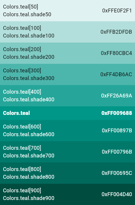
| /// The teal primary color and swatch. |
| /// |
| ///  |
| ///  |
| /// |
| ///  |
| ///  |
| /// |
| ///  |
| ///  |
| /// |
| /// {@tool snippet} |
| /// |
| /// ```dart |
| /// Icon( |
| /// Icons.widgets, |
| /// color: Colors.teal[400], |
| /// ) |
| /// ``` |
| /// {@end-tool} |
| /// |
| /// See also: |
| /// |
| /// * [tealAccent], the corresponding accent colors. |
| /// * [green] and [cyan], similar colors. |
| /// * [Theme.of], which allows you to select colors from the current theme |
| /// rather than hard-coding colors in your build methods. |
| static const MaterialColor teal = MaterialColor( |
| _tealPrimaryValue, |
| <int, Color>{ |
| 50: Color(0xFFE0F2F1), |
| 100: Color(0xFFB2DFDB), |
| 200: Color(0xFF80CBC4), |
| 300: Color(0xFF4DB6AC), |
| 400: Color(0xFF26A69A), |
| 500: Color(_tealPrimaryValue), |
| 600: Color(0xFF00897B), |
| 700: Color(0xFF00796B), |
| 800: Color(0xFF00695C), |
| 900: Color(0xFF004D40), |
| }, |
| ); |
| static const int _tealPrimaryValue = 0xFF009688; |
| |
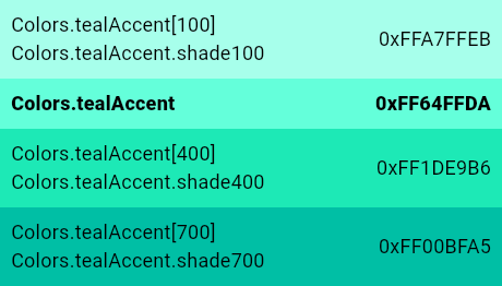
| /// The teal accent color and swatch. |
| /// |
| ///  |
| ///  |
| /// |
| ///  |
| ///  |
| /// |
| ///  |
| ///  |
| /// |
| /// {@tool snippet} |
| /// |
| /// ```dart |
| /// Icon( |
| /// Icons.widgets, |
| /// color: Colors.tealAccent[400], |
| /// ) |
| /// ``` |
| /// {@end-tool} |
| /// |
| /// See also: |
| /// |
| /// * [teal], the corresponding primary colors. |
| /// * [greenAccent] and [cyanAccent], similar colors. |
| /// * [Theme.of], which allows you to select colors from the current theme |
| /// rather than hard-coding colors in your build methods. |
| static const MaterialAccentColor tealAccent = MaterialAccentColor( |
| _tealAccentPrimaryValue, |
| <int, Color>{ |
| 100: Color(0xFFA7FFEB), |
| 200: Color(_tealAccentPrimaryValue), |
| 400: Color(0xFF1DE9B6), |
| 700: Color(0xFF00BFA5), |
| }, |
| ); |
| static const int _tealAccentPrimaryValue = 0xFF64FFDA; |
| |
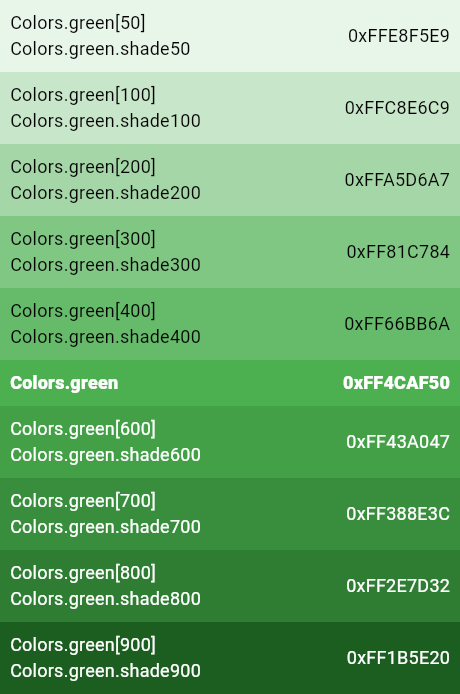
| /// The green primary color and swatch. |
| /// |
| ///  |
| ///  |
| /// |
| ///  |
| ///  |
| /// |
| ///  |
| ///  |
| /// |
| ///  |
| ///  |
| /// |
| /// {@tool snippet} |
| /// |
| /// ```dart |
| /// Icon( |
| /// Icons.widgets, |
| /// color: Colors.green[400], |
| /// ) |
| /// ``` |
| /// {@end-tool} |
| /// |
| /// See also: |
| /// |
| /// * [greenAccent], the corresponding accent colors. |
| /// * [teal], [lightGreen], and [lime], similar colors. |
| /// * [Theme.of], which allows you to select colors from the current theme |
| /// rather than hard-coding colors in your build methods. |
| static const MaterialColor green = MaterialColor( |
| _greenPrimaryValue, |
| <int, Color>{ |
| 50: Color(0xFFE8F5E9), |
| 100: Color(0xFFC8E6C9), |
| 200: Color(0xFFA5D6A7), |
| 300: Color(0xFF81C784), |
| 400: Color(0xFF66BB6A), |
| 500: Color(_greenPrimaryValue), |
| 600: Color(0xFF43A047), |
| 700: Color(0xFF388E3C), |
| 800: Color(0xFF2E7D32), |
| 900: Color(0xFF1B5E20), |
| }, |
| ); |
| static const int _greenPrimaryValue = 0xFF4CAF50; |
| |
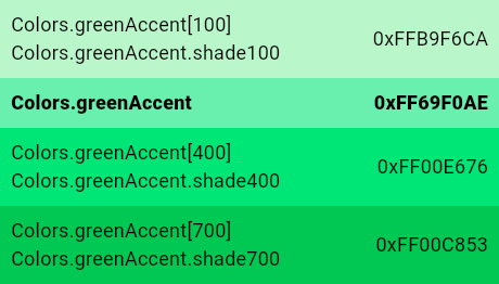
| /// The green accent color and swatch. |
| /// |
| ///  |
| ///  |
| /// |
| ///  |
| ///  |
| /// |
| ///  |
| ///  |
| /// |
| ///  |
| ///  |
| /// |
| /// {@tool snippet} |
| /// |
| /// ```dart |
| /// Icon( |
| /// Icons.widgets, |
| /// color: Colors.greenAccent[400], |
| /// ) |
| /// ``` |
| /// {@end-tool} |
| /// |
| /// See also: |
| /// |
| /// * [green], the corresponding primary colors. |
| /// * [tealAccent], [lightGreenAccent], and [limeAccent], similar colors. |
| /// * [Theme.of], which allows you to select colors from the current theme |
| /// rather than hard-coding colors in your build methods. |
| static const MaterialAccentColor greenAccent = MaterialAccentColor( |
| _greenAccentPrimaryValue, |
| <int, Color>{ |
| 100: Color(0xFFB9F6CA), |
| 200: Color(_greenAccentPrimaryValue), |
| 400: Color(0xFF00E676), |
| 700: Color(0xFF00C853), |
| }, |
| ); |
| static const int _greenAccentPrimaryValue = 0xFF69F0AE; |
| |
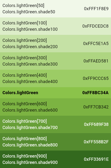
| /// The light green primary color and swatch. |
| /// |
| ///  |
| ///  |
| /// |
| ///  |
| ///  |
| /// |
| ///  |
| ///  |
| /// |
| /// {@tool snippet} |
| /// |
| /// ```dart |
| /// Icon( |
| /// Icons.widgets, |
| /// color: Colors.lightGreen[400], |
| /// ) |
| /// ``` |
| /// {@end-tool} |
| /// |
| /// See also: |
| /// |
| /// * [lightGreenAccent], the corresponding accent colors. |
| /// * [green] and [lime], similar colors. |
| /// * [Theme.of], which allows you to select colors from the current theme |
| /// rather than hard-coding colors in your build methods. |
| static const MaterialColor lightGreen = MaterialColor( |
| _lightGreenPrimaryValue, |
| <int, Color>{ |
| 50: Color(0xFFF1F8E9), |
| 100: Color(0xFFDCEDC8), |
| 200: Color(0xFFC5E1A5), |
| 300: Color(0xFFAED581), |
| 400: Color(0xFF9CCC65), |
| 500: Color(_lightGreenPrimaryValue), |
| 600: Color(0xFF7CB342), |
| 700: Color(0xFF689F38), |
| 800: Color(0xFF558B2F), |
| 900: Color(0xFF33691E), |
| }, |
| ); |
| static const int _lightGreenPrimaryValue = 0xFF8BC34A; |
| |
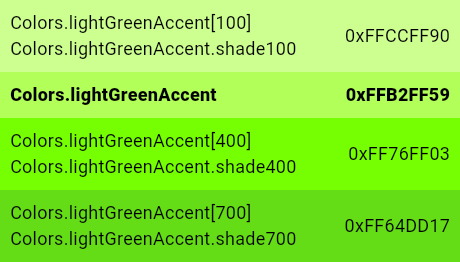
| /// The light green accent color and swatch. |
| /// |
| ///  |
| ///  |
| /// |
| ///  |
| ///  |
| /// |
| ///  |
| ///  |
| /// |
| /// {@tool snippet} |
| /// |
| /// ```dart |
| /// Icon( |
| /// Icons.widgets, |
| /// color: Colors.lightGreenAccent[400], |
| /// ) |
| /// ``` |
| /// {@end-tool} |
| /// |
| /// See also: |
| /// |
| /// * [lightGreen], the corresponding primary colors. |
| /// * [greenAccent] and [limeAccent], similar colors. |
| /// * [Theme.of], which allows you to select colors from the current theme |
| /// rather than hard-coding colors in your build methods. |
| static const MaterialAccentColor lightGreenAccent = MaterialAccentColor( |
| _lightGreenAccentPrimaryValue, |
| <int, Color>{ |
| 100: Color(0xFFCCFF90), |
| 200: Color(_lightGreenAccentPrimaryValue), |
| 400: Color(0xFF76FF03), |
| 700: Color(0xFF64DD17), |
| }, |
| ); |
| static const int _lightGreenAccentPrimaryValue = 0xFFB2FF59; |
| |
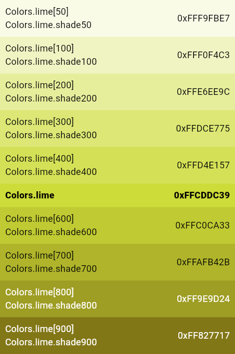
| /// The lime primary color and swatch. |
| /// |
| ///  |
| ///  |
| /// |
| ///  |
| ///  |
| /// |
| ///  |
| ///  |
| /// |
| /// {@tool snippet} |
| /// |
| /// ```dart |
| /// Icon( |
| /// Icons.widgets, |
| /// color: Colors.lime[400], |
| /// ) |
| /// ``` |
| /// {@end-tool} |
| /// |
| /// See also: |
| /// |
| /// * [limeAccent], the corresponding accent colors. |
| /// * [lightGreen] and [yellow], similar colors. |
| /// * [Theme.of], which allows you to select colors from the current theme |
| /// rather than hard-coding colors in your build methods. |
| static const MaterialColor lime = MaterialColor( |
| _limePrimaryValue, |
| <int, Color>{ |
| 50: Color(0xFFF9FBE7), |
| 100: Color(0xFFF0F4C3), |
| 200: Color(0xFFE6EE9C), |
| 300: Color(0xFFDCE775), |
| 400: Color(0xFFD4E157), |
| 500: Color(_limePrimaryValue), |
| 600: Color(0xFFC0CA33), |
| 700: Color(0xFFAFB42B), |
| 800: Color(0xFF9E9D24), |
| 900: Color(0xFF827717), |
| }, |
| ); |
| static const int _limePrimaryValue = 0xFFCDDC39; |
| |
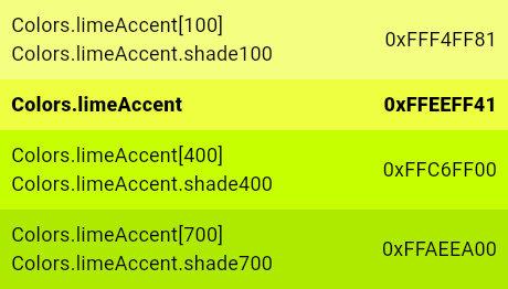
| /// The lime accent primary color and swatch. |
| /// |
| ///  |
| ///  |
| /// |
| ///  |
| ///  |
| /// |
| ///  |
| ///  |
| /// |
| /// {@tool snippet} |
| /// |
| /// ```dart |
| /// Icon( |
| /// Icons.widgets, |
| /// color: Colors.limeAccent[400], |
| /// ) |
| /// ``` |
| /// {@end-tool} |
| /// |
| /// See also: |
| /// |
| /// * [lime], the corresponding primary colors. |
| /// * [lightGreenAccent] and [yellowAccent], similar colors. |
| /// * [Theme.of], which allows you to select colors from the current theme |
| /// rather than hard-coding colors in your build methods. |
| static const MaterialAccentColor limeAccent = MaterialAccentColor( |
| _limeAccentPrimaryValue, |
| <int, Color>{ |
| 100: Color(0xFFF4FF81), |
| 200: Color(_limeAccentPrimaryValue), |
| 400: Color(0xFFC6FF00), |
| 700: Color(0xFFAEEA00), |
| }, |
| ); |
| static const int _limeAccentPrimaryValue = 0xFFEEFF41; |
| |
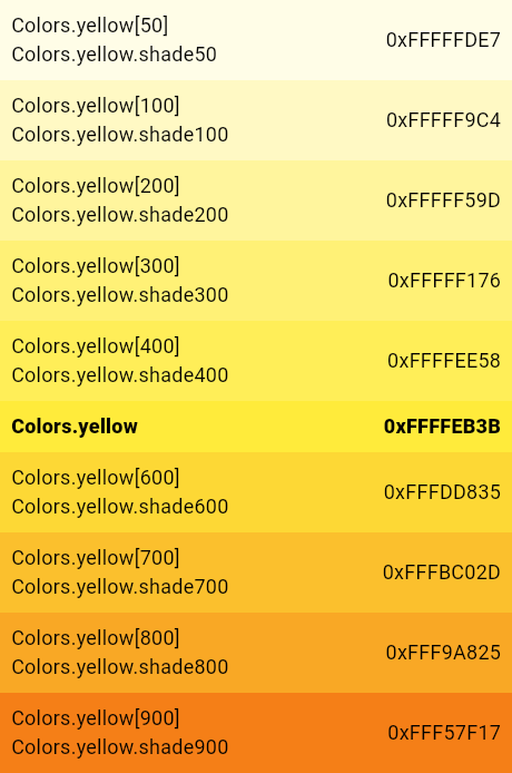
| /// The yellow primary color and swatch. |
| /// |
| ///  |
| ///  |
| /// |
| ///  |
| ///  |
| /// |
| ///  |
| ///  |
| /// |
| /// {@tool snippet} |
| /// |
| /// ```dart |
| /// Icon( |
| /// Icons.widgets, |
| /// color: Colors.yellow[400], |
| /// ) |
| /// ``` |
| /// {@end-tool} |
| /// |
| /// See also: |
| /// |
| /// * [yellowAccent], the corresponding accent colors. |
| /// * [lime] and [amber], similar colors. |
| /// * [Theme.of], which allows you to select colors from the current theme |
| /// rather than hard-coding colors in your build methods. |
| static const MaterialColor yellow = MaterialColor( |
| _yellowPrimaryValue, |
| <int, Color>{ |
| 50: Color(0xFFFFFDE7), |
| 100: Color(0xFFFFF9C4), |
| 200: Color(0xFFFFF59D), |
| 300: Color(0xFFFFF176), |
| 400: Color(0xFFFFEE58), |
| 500: Color(_yellowPrimaryValue), |
| 600: Color(0xFFFDD835), |
| 700: Color(0xFFFBC02D), |
| 800: Color(0xFFF9A825), |
| 900: Color(0xFFF57F17), |
| }, |
| ); |
| static const int _yellowPrimaryValue = 0xFFFFEB3B; |
| |
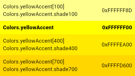
| /// The yellow accent color and swatch. |
| /// |
| ///  |
| ///  |
| /// |
| ///  |
| ///  |
| /// |
| ///  |
| ///  |
| /// |
| /// {@tool snippet} |
| /// |
| /// ```dart |
| /// Icon( |
| /// Icons.widgets, |
| /// color: Colors.yellowAccent[400], |
| /// ) |
| /// ``` |
| /// {@end-tool} |
| /// |
| /// See also: |
| /// |
| /// * [yellow], the corresponding primary colors. |
| /// * [limeAccent] and [amberAccent], similar colors. |
| /// * [Theme.of], which allows you to select colors from the current theme |
| /// rather than hard-coding colors in your build methods. |
| static const MaterialAccentColor yellowAccent = MaterialAccentColor( |
| _yellowAccentPrimaryValue, |
| <int, Color>{ |
| 100: Color(0xFFFFFF8D), |
| 200: Color(_yellowAccentPrimaryValue), |
| 400: Color(0xFFFFEA00), |
| 700: Color(0xFFFFD600), |
| }, |
| ); |
| static const int _yellowAccentPrimaryValue = 0xFFFFFF00; |
| |
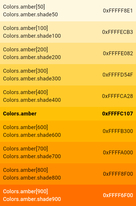
| /// The amber primary color and swatch. |
| /// |
| ///  |
| ///  |
| /// |
| ///  |
| ///  |
| /// |
| ///  |
| ///  |
| /// |
| /// {@tool snippet} |
| /// |
| /// ```dart |
| /// Icon( |
| /// Icons.widgets, |
| /// color: Colors.amber[400], |
| /// ) |
| /// ``` |
| /// {@end-tool} |
| /// |
| /// See also: |
| /// |
| /// * [amberAccent], the corresponding accent colors. |
| /// * [yellow] and [orange], similar colors. |
| /// * [Theme.of], which allows you to select colors from the current theme |
| /// rather than hard-coding colors in your build methods. |
| static const MaterialColor amber = MaterialColor( |
| _amberPrimaryValue, |
| <int, Color>{ |
| 50: Color(0xFFFFF8E1), |
| 100: Color(0xFFFFECB3), |
| 200: Color(0xFFFFE082), |
| 300: Color(0xFFFFD54F), |
| 400: Color(0xFFFFCA28), |
| 500: Color(_amberPrimaryValue), |
| 600: Color(0xFFFFB300), |
| 700: Color(0xFFFFA000), |
| 800: Color(0xFFFF8F00), |
| 900: Color(0xFFFF6F00), |
| }, |
| ); |
| static const int _amberPrimaryValue = 0xFFFFC107; |
| |
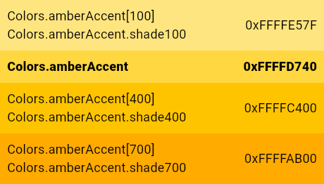
| /// The amber accent color and swatch. |
| /// |
| ///  |
| ///  |
| /// |
| ///  |
| ///  |
| /// |
| ///  |
| ///  |
| /// |
| /// {@tool snippet} |
| /// |
| /// ```dart |
| /// Icon( |
| /// Icons.widgets, |
| /// color: Colors.amberAccent[400], |
| /// ) |
| /// ``` |
| /// {@end-tool} |
| /// |
| /// See also: |
| /// |
| /// * [amber], the corresponding primary colors. |
| /// * [yellowAccent] and [orangeAccent], similar colors. |
| /// * [Theme.of], which allows you to select colors from the current theme |
| /// rather than hard-coding colors in your build methods. |
| static const MaterialAccentColor amberAccent = MaterialAccentColor( |
| _amberAccentPrimaryValue, |
| <int, Color>{ |
| 100: Color(0xFFFFE57F), |
| 200: Color(_amberAccentPrimaryValue), |
| 400: Color(0xFFFFC400), |
| 700: Color(0xFFFFAB00), |
| }, |
| ); |
| static const int _amberAccentPrimaryValue = 0xFFFFD740; |
| |
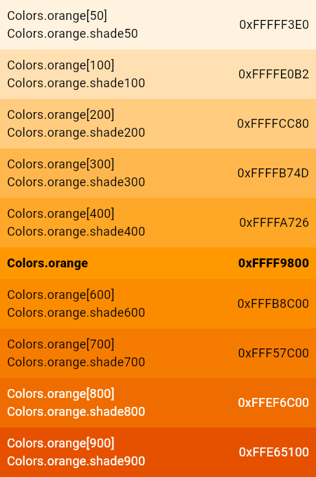
| /// The orange primary color and swatch. |
| /// |
| ///  |
| ///  |
| /// |
| ///  |
| ///  |
| /// |
| ///  |
| ///  |
| /// |
| ///  |
| /// |
| /// {@tool snippet} |
| /// |
| /// ```dart |
| /// Icon( |
| /// Icons.widgets, |
| /// color: Colors.orange[400], |
| /// ) |
| /// ``` |
| /// {@end-tool} |
| /// |
| /// See also: |
| /// |
| /// * [orangeAccent], the corresponding accent colors. |
| /// * [amber], [deepOrange], and [brown], similar colors. |
| /// * [Theme.of], which allows you to select colors from the current theme |
| /// rather than hard-coding colors in your build methods. |
| static const MaterialColor orange = MaterialColor( |
| _orangePrimaryValue, |
| <int, Color>{ |
| 50: Color(0xFFFFF3E0), |
| 100: Color(0xFFFFE0B2), |
| 200: Color(0xFFFFCC80), |
| 300: Color(0xFFFFB74D), |
| 400: Color(0xFFFFA726), |
| 500: Color(_orangePrimaryValue), |
| 600: Color(0xFFFB8C00), |
| 700: Color(0xFFF57C00), |
| 800: Color(0xFFEF6C00), |
| 900: Color(0xFFE65100), |
| }, |
| ); |
| static const int _orangePrimaryValue = 0xFFFF9800; |
| |
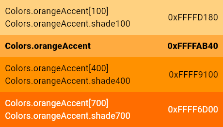
| /// The orange accent color and swatch. |
| /// |
| ///  |
| ///  |
| /// |
| ///  |
| ///  |
| /// |
| ///  |
| ///  |
| /// |
| /// {@tool snippet} |
| /// |
| /// ```dart |
| /// Icon( |
| /// Icons.widgets, |
| /// color: Colors.orangeAccent[400], |
| /// ) |
| /// ``` |
| /// {@end-tool} |
| /// |
| /// See also: |
| /// |
| /// * [orange], the corresponding primary colors. |
| /// * [amberAccent] and [deepOrangeAccent], similar colors. |
| /// * [Theme.of], which allows you to select colors from the current theme |
| /// rather than hard-coding colors in your build methods. |
| static const MaterialAccentColor orangeAccent = MaterialAccentColor( |
| _orangeAccentPrimaryValue, |
| <int, Color>{ |
| 100: Color(0xFFFFD180), |
| 200: Color(_orangeAccentPrimaryValue), |
| 400: Color(0xFFFF9100), |
| 700: Color(0xFFFF6D00), |
| }, |
| ); |
| static const int _orangeAccentPrimaryValue = 0xFFFFAB40; |
| |
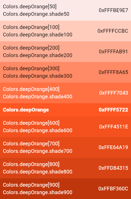
| /// The deep orange primary color and swatch. |
| /// |
| ///  |
| ///  |
| /// |
| ///  |
| ///  |
| /// |
| ///  |
| ///  |
| /// |
| ///  |
| /// |
| /// {@tool snippet} |
| /// |
| /// ```dart |
| /// Icon( |
| /// Icons.widgets, |
| /// color: Colors.deepOrange[400], |
| /// ) |
| /// ``` |
| /// {@end-tool} |
| /// |
| /// See also: |
| /// |
| /// * [deepOrangeAccent], the corresponding accent colors. |
| /// * [orange], [red], and [brown], similar colors. |
| /// * [Theme.of], which allows you to select colors from the current theme |
| /// rather than hard-coding colors in your build methods. |
| static const MaterialColor deepOrange = MaterialColor( |
| _deepOrangePrimaryValue, |
| <int, Color>{ |
| 50: Color(0xFFFBE9E7), |
| 100: Color(0xFFFFCCBC), |
| 200: Color(0xFFFFAB91), |
| 300: Color(0xFFFF8A65), |
| 400: Color(0xFFFF7043), |
| 500: Color(_deepOrangePrimaryValue), |
| 600: Color(0xFFF4511E), |
| 700: Color(0xFFE64A19), |
| 800: Color(0xFFD84315), |
| 900: Color(0xFFBF360C), |
| }, |
| ); |
| static const int _deepOrangePrimaryValue = 0xFFFF5722; |
| |
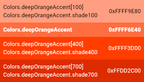
| /// The deep orange accent color and swatch. |
| /// |
| ///  |
| ///  |
| /// |
| ///  |
| ///  |
| /// |
| ///  |
| ///  |
| /// |
| /// {@tool snippet} |
| /// |
| /// ```dart |
| /// Icon( |
| /// Icons.widgets, |
| /// color: Colors.deepOrangeAccent[400], |
| /// ) |
| /// ``` |
| /// {@end-tool} |
| /// |
| /// See also: |
| /// |
| /// * [deepOrange], the corresponding primary colors. |
| /// * [orangeAccent] [redAccent], similar colors. |
| /// * [Theme.of], which allows you to select colors from the current theme |
| /// rather than hard-coding colors in your build methods. |
| static const MaterialAccentColor deepOrangeAccent = MaterialAccentColor( |
| _deepOrangeAccentPrimaryValue, |
| <int, Color>{ |
| 100: Color(0xFFFF9E80), |
| 200: Color(_deepOrangeAccentPrimaryValue), |
| 400: Color(0xFFFF3D00), |
| 700: Color(0xFFDD2C00), |
| }, |
| ); |
| static const int _deepOrangeAccentPrimaryValue = 0xFFFF6E40; |
| |
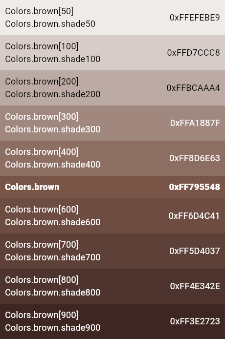
| /// The brown primary color and swatch. |
| /// |
| ///  |
| /// |
| ///  |
| /// |
| ///  |
| /// |
| /// This swatch has no corresponding accent color and swatch. |
| /// |
| /// {@tool snippet} |
| /// |
| /// ```dart |
| /// Icon( |
| /// Icons.widgets, |
| /// color: Colors.brown[400], |
| /// ) |
| /// ``` |
| /// {@end-tool} |
| /// |
| /// See also: |
| /// |
| /// * [orange] and [blueGrey], vaguely similar colors. |
| /// * [Theme.of], which allows you to select colors from the current theme |
| /// rather than hard-coding colors in your build methods. |
| static const MaterialColor brown = MaterialColor( |
| _brownPrimaryValue, |
| <int, Color>{ |
| 50: Color(0xFFEFEBE9), |
| 100: Color(0xFFD7CCC8), |
| 200: Color(0xFFBCAAA4), |
| 300: Color(0xFFA1887F), |
| 400: Color(0xFF8D6E63), |
| 500: Color(_brownPrimaryValue), |
| 600: Color(0xFF6D4C41), |
| 700: Color(0xFF5D4037), |
| 800: Color(0xFF4E342E), |
| 900: Color(0xFF3E2723), |
| }, |
| ); |
| static const int _brownPrimaryValue = 0xFF795548; |
| |
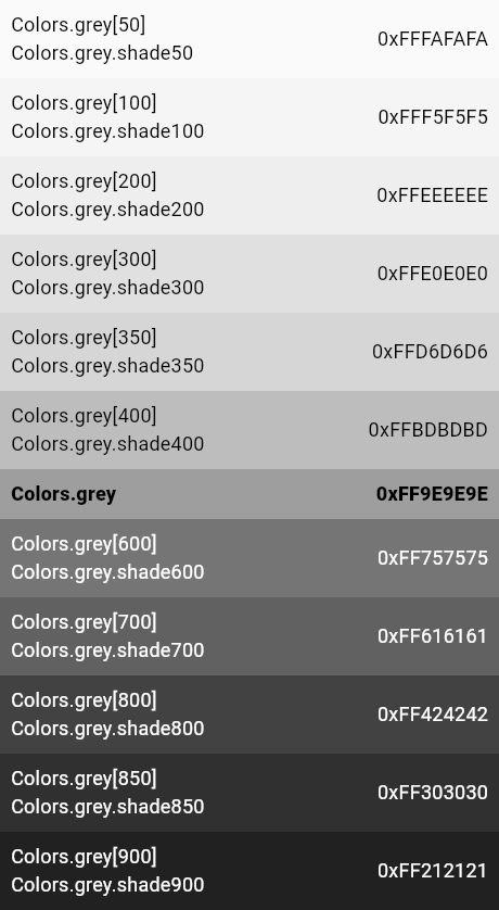
| /// The grey primary color and swatch. |
| /// |
| ///  |
| /// |
| ///  |
| /// |
| ///  |
| /// |
| /// This swatch has no corresponding accent swatch. |
| /// |
| /// This swatch, in addition to the values 50 and 100 to 900 in 100 |
| /// increments, also features the special values 350 and 850. The 350 value is |
| /// used for raised button while pressed in light themes, and 850 is used for |
| /// the background color of the dark theme. See [ThemeData.brightness]. |
| /// |
| /// {@tool snippet} |
| /// |
| /// ```dart |
| /// Icon( |
| /// Icons.widgets, |
| /// color: Colors.grey[400], |
| /// ) |
| /// ``` |
| /// {@end-tool} |
| /// |
| /// See also: |
| /// |
| /// * [blueGrey] and [brown], somewhat similar colors. |
| /// * [black], [black87], [black54], [black45], [black38], [black26], [black12], which |
| /// provide a different approach to showing shades of grey. |
| /// * [Theme.of], which allows you to select colors from the current theme |
| /// rather than hard-coding colors in your build methods. |
| static const MaterialColor grey = MaterialColor( |
| _greyPrimaryValue, |
| <int, Color>{ |
| 50: Color(0xFFFAFAFA), |
| 100: Color(0xFFF5F5F5), |
| 200: Color(0xFFEEEEEE), |
| 300: Color(0xFFE0E0E0), |
| 350: Color(0xFFD6D6D6), // only for raised button while pressed in light theme |
| 400: Color(0xFFBDBDBD), |
| 500: Color(_greyPrimaryValue), |
| 600: Color(0xFF757575), |
| 700: Color(0xFF616161), |
| 800: Color(0xFF424242), |
| 850: Color(0xFF303030), // only for background color in dark theme |
| 900: Color(0xFF212121), |
| }, |
| ); |
| static const int _greyPrimaryValue = 0xFF9E9E9E; |
| |
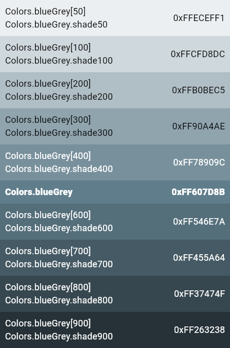
| /// The blue-grey primary color and swatch. |
| /// |
| ///  |
| /// |
| ///  |
| /// |
| ///  |
| /// |
| ///  |
| /// |
| /// This swatch has no corresponding accent swatch. |
| /// |
| /// {@tool snippet} |
| /// |
| /// ```dart |
| /// Icon( |
| /// Icons.widgets, |
| /// color: Colors.blueGrey[400], |
| /// ) |
| /// ``` |
| /// {@end-tool} |
| /// |
| /// See also: |
| /// |
| /// * [grey], [cyan], and [blue], similar colors. |
| /// * [Theme.of], which allows you to select colors from the current theme |
| /// rather than hard-coding colors in your build methods. |
| static const MaterialColor blueGrey = MaterialColor( |
| _blueGreyPrimaryValue, |
| <int, Color>{ |
| 50: Color(0xFFECEFF1), |
| 100: Color(0xFFCFD8DC), |
| 200: Color(0xFFB0BEC5), |
| 300: Color(0xFF90A4AE), |
| 400: Color(0xFF78909C), |
| 500: Color(_blueGreyPrimaryValue), |
| 600: Color(0xFF546E7A), |
| 700: Color(0xFF455A64), |
| 800: Color(0xFF37474F), |
| 900: Color(0xFF263238), |
| }, |
| ); |
| static const int _blueGreyPrimaryValue = 0xFF607D8B; |
| |
| /// The material design primary color swatches, excluding grey. |
| static const List<MaterialColor> primaries = <MaterialColor>[ |
| red, |
| pink, |
| purple, |
| deepPurple, |
| indigo, |
| blue, |
| lightBlue, |
| cyan, |
| teal, |
| green, |
| lightGreen, |
| lime, |
| yellow, |
| amber, |
| orange, |
| deepOrange, |
| brown, |
| // The grey swatch is intentionally omitted because when picking a color |
| // randomly from this list to colorize an application, picking grey suddenly |
| // makes the app look disabled. |
| blueGrey, |
| ]; |
| |
| /// The material design accent color swatches. |
| static const List<MaterialAccentColor> accents = <MaterialAccentColor>[ |
| redAccent, |
| pinkAccent, |
| purpleAccent, |
| deepPurpleAccent, |
| indigoAccent, |
| blueAccent, |
| lightBlueAccent, |
| cyanAccent, |
| tealAccent, |
| greenAccent, |
| lightGreenAccent, |
| limeAccent, |
| yellowAccent, |
| amberAccent, |
| orangeAccent, |
| deepOrangeAccent, |
| ]; |
| } |