| // Copyright 2014 The Flutter Authors. All rights reserved. |
| // Use of this source code is governed by a BSD-style license that can be |
| // found in the LICENSE file. |
| |
| import 'dart:ui' as ui; |
| |
| import 'package:flutter/cupertino.dart'; |
| import 'package:flutter/foundation.dart'; |
| import 'package:flutter/services.dart'; |
| |
| import 'arc.dart'; |
| import 'colors.dart'; |
| import 'floating_action_button.dart'; |
| import 'icons.dart'; |
| import 'material_localizations.dart'; |
| import 'page.dart'; |
| import 'scaffold.dart' show ScaffoldMessenger, ScaffoldMessengerState; |
| import 'scrollbar.dart'; |
| import 'theme.dart'; |
| import 'tooltip.dart'; |
| |
| /// [MaterialApp] uses this [TextStyle] as its [DefaultTextStyle] to encourage |
| /// developers to be intentional about their [DefaultTextStyle]. |
| /// |
| /// In Material Design, most [Text] widgets are contained in [Material] widgets, |
| /// which sets a specific [DefaultTextStyle]. If you're seeing text that uses |
| /// this text style, consider putting your text in a [Material] widget (or |
| /// another widget that sets a [DefaultTextStyle]). |
| const TextStyle _errorTextStyle = TextStyle( |
| color: Color(0xD0FF0000), |
| fontFamily: 'monospace', |
| fontSize: 48.0, |
| fontWeight: FontWeight.w900, |
| decoration: TextDecoration.underline, |
| decorationColor: Color(0xFFFFFF00), |
| decorationStyle: TextDecorationStyle.double, |
| debugLabel: 'fallback style; consider putting your text in a Material', |
| ); |
| |
| /// Describes which theme will be used by [MaterialApp]. |
| enum ThemeMode { |
| /// Use either the light or dark theme based on what the user has selected in |
| /// the system settings. |
| system, |
| |
| /// Always use the light mode regardless of system preference. |
| light, |
| |
| /// Always use the dark mode (if available) regardless of system preference. |
| dark, |
| } |
| |
| /// An application that uses material design. |
| /// |
| /// A convenience widget that wraps a number of widgets that are commonly |
| /// required for material design applications. It builds upon a [WidgetsApp] by |
| /// adding material-design specific functionality, such as [AnimatedTheme] and |
| /// [GridPaper]. |
| /// |
| /// The [MaterialApp] configures the top-level [Navigator] to search for routes |
| /// in the following order: |
| /// |
| /// 1. For the `/` route, the [home] property, if non-null, is used. |
| /// |
| /// 2. Otherwise, the [routes] table is used, if it has an entry for the route. |
| /// |
| /// 3. Otherwise, [onGenerateRoute] is called, if provided. It should return a |
| /// non-null value for any _valid_ route not handled by [home] and [routes]. |
| /// |
| /// 4. Finally if all else fails [onUnknownRoute] is called. |
| /// |
| /// If a [Navigator] is created, at least one of these options must handle the |
| /// `/` route, since it is used when an invalid [initialRoute] is specified on |
| /// startup (e.g. by another application launching this one with an intent on |
| /// Android; see [dart:ui.PlatformDispatcher.defaultRouteName]). |
| /// |
| /// This widget also configures the observer of the top-level [Navigator] (if |
| /// any) to perform [Hero] animations. |
| /// |
| /// If [home], [routes], [onGenerateRoute], and [onUnknownRoute] are all null, |
| /// and [builder] is not null, then no [Navigator] is created. |
| /// |
| /// {@tool snippet} |
| /// This example shows how to create a [MaterialApp] that disables the "debug" |
| /// banner with a [home] route that will be displayed when the app is launched. |
| /// |
| /// 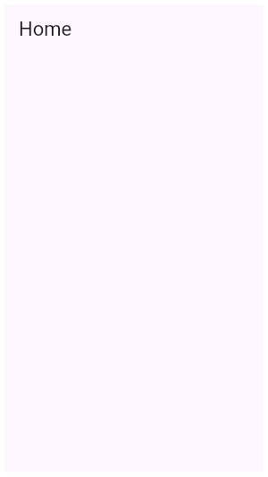 |
| /// |
| /// ```dart |
| /// MaterialApp( |
| /// home: Scaffold( |
| /// appBar: AppBar( |
| /// title: const Text('Home'), |
| /// ), |
| /// ), |
| /// debugShowCheckedModeBanner: false, |
| /// ) |
| /// ``` |
| /// {@end-tool} |
| /// |
| /// {@tool snippet} |
| /// This example shows how to create a [MaterialApp] that uses the [routes] |
| /// `Map` to define the "home" route and an "about" route. |
| /// |
| /// ```dart |
| /// MaterialApp( |
| /// routes: <String, WidgetBuilder>{ |
| /// '/': (BuildContext context) { |
| /// return Scaffold( |
| /// appBar: AppBar( |
| /// title: const Text('Home Route'), |
| /// ), |
| /// ); |
| /// }, |
| /// '/about': (BuildContext context) { |
| /// return Scaffold( |
| /// appBar: AppBar( |
| /// title: const Text('About Route'), |
| /// ), |
| /// ); |
| /// } |
| /// }, |
| /// ) |
| /// ``` |
| /// {@end-tool} |
| /// |
| /// {@tool snippet} |
| /// This example shows how to create a [MaterialApp] that defines a [theme] that |
| /// will be used for material widgets in the app. |
| /// |
| /// 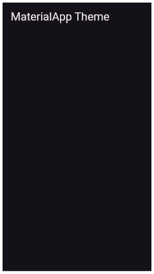 |
| /// |
| /// ```dart |
| /// MaterialApp( |
| /// theme: ThemeData( |
| /// brightness: Brightness.dark, |
| /// primaryColor: Colors.blueGrey |
| /// ), |
| /// home: Scaffold( |
| /// appBar: AppBar( |
| /// title: const Text('MaterialApp Theme'), |
| /// ), |
| /// ), |
| /// ) |
| /// ``` |
| /// {@end-tool} |
| /// |
| /// See also: |
| /// |
| /// * [Scaffold], which provides standard app elements like an [AppBar] and a [Drawer]. |
| /// * [Navigator], which is used to manage the app's stack of pages. |
| /// * [MaterialPageRoute], which defines an app page that transitions in a material-specific way. |
| /// * [WidgetsApp], which defines the basic app elements but does not depend on the material library. |
| /// * The Flutter Internationalization Tutorial, |
| /// <https://flutter.dev/tutorials/internationalization/>. |
| class MaterialApp extends StatefulWidget { |
| /// Creates a MaterialApp. |
| /// |
| /// At least one of [home], [routes], [onGenerateRoute], or [builder] must be |
| /// non-null. If only [routes] is given, it must include an entry for the |
| /// [Navigator.defaultRouteName] (`/`), since that is the route used when the |
| /// application is launched with an intent that specifies an otherwise |
| /// unsupported route. |
| /// |
| /// This class creates an instance of [WidgetsApp]. |
| /// |
| /// The boolean arguments, [routes], and [navigatorObservers], must not be null. |
| const MaterialApp({ |
| Key? key, |
| this.navigatorKey, |
| this.scaffoldMessengerKey, |
| this.home, |
| Map<String, WidgetBuilder> this.routes = const <String, WidgetBuilder>{}, |
| this.initialRoute, |
| this.onGenerateRoute, |
| this.onGenerateInitialRoutes, |
| this.onUnknownRoute, |
| List<NavigatorObserver> this.navigatorObservers = const <NavigatorObserver>[], |
| this.builder, |
| this.title = '', |
| this.onGenerateTitle, |
| this.color, |
| this.theme, |
| this.darkTheme, |
| this.highContrastTheme, |
| this.highContrastDarkTheme, |
| this.themeMode = ThemeMode.system, |
| this.locale, |
| this.localizationsDelegates, |
| this.localeListResolutionCallback, |
| this.localeResolutionCallback, |
| this.supportedLocales = const <Locale>[Locale('en', 'US')], |
| this.debugShowMaterialGrid = false, |
| this.showPerformanceOverlay = false, |
| this.checkerboardRasterCacheImages = false, |
| this.checkerboardOffscreenLayers = false, |
| this.showSemanticsDebugger = false, |
| this.debugShowCheckedModeBanner = true, |
| this.shortcuts, |
| this.actions, |
| this.restorationScopeId, |
| this.scrollBehavior, |
| this.useInheritedMediaQuery = false, |
| }) : assert(routes != null), |
| assert(navigatorObservers != null), |
| assert(title != null), |
| assert(debugShowMaterialGrid != null), |
| assert(showPerformanceOverlay != null), |
| assert(checkerboardRasterCacheImages != null), |
| assert(checkerboardOffscreenLayers != null), |
| assert(showSemanticsDebugger != null), |
| assert(debugShowCheckedModeBanner != null), |
| routeInformationProvider = null, |
| routeInformationParser = null, |
| routerDelegate = null, |
| backButtonDispatcher = null, |
| super(key: key); |
| |
| /// Creates a [MaterialApp] that uses the [Router] instead of a [Navigator]. |
| const MaterialApp.router({ |
| Key? key, |
| this.scaffoldMessengerKey, |
| this.routeInformationProvider, |
| required RouteInformationParser<Object> this.routeInformationParser, |
| required RouterDelegate<Object> this.routerDelegate, |
| this.backButtonDispatcher, |
| this.builder, |
| this.title = '', |
| this.onGenerateTitle, |
| this.color, |
| this.theme, |
| this.darkTheme, |
| this.highContrastTheme, |
| this.highContrastDarkTheme, |
| this.themeMode = ThemeMode.system, |
| this.locale, |
| this.localizationsDelegates, |
| this.localeListResolutionCallback, |
| this.localeResolutionCallback, |
| this.supportedLocales = const <Locale>[Locale('en', 'US')], |
| this.debugShowMaterialGrid = false, |
| this.showPerformanceOverlay = false, |
| this.checkerboardRasterCacheImages = false, |
| this.checkerboardOffscreenLayers = false, |
| this.showSemanticsDebugger = false, |
| this.debugShowCheckedModeBanner = true, |
| this.shortcuts, |
| this.actions, |
| this.restorationScopeId, |
| this.scrollBehavior, |
| this.useInheritedMediaQuery = false, |
| }) : assert(routeInformationParser != null), |
| assert(routerDelegate != null), |
| assert(title != null), |
| assert(debugShowMaterialGrid != null), |
| assert(showPerformanceOverlay != null), |
| assert(checkerboardRasterCacheImages != null), |
| assert(checkerboardOffscreenLayers != null), |
| assert(showSemanticsDebugger != null), |
| assert(debugShowCheckedModeBanner != null), |
| navigatorObservers = null, |
| navigatorKey = null, |
| onGenerateRoute = null, |
| home = null, |
| onGenerateInitialRoutes = null, |
| onUnknownRoute = null, |
| routes = null, |
| initialRoute = null, |
| super(key: key); |
| |
| /// {@macro flutter.widgets.widgetsApp.navigatorKey} |
| final GlobalKey<NavigatorState>? navigatorKey; |
| |
| /// A key to use when building the [ScaffoldMessenger]. |
| /// |
| /// If a [scaffoldMessengerKey] is specified, the [ScaffoldMessenger] can be |
| /// directly manipulated without first obtaining it from a [BuildContext] via |
| /// [ScaffoldMessenger.of]: from the [scaffoldMessengerKey], use the |
| /// [GlobalKey.currentState] getter. |
| final GlobalKey<ScaffoldMessengerState>? scaffoldMessengerKey; |
| |
| /// {@macro flutter.widgets.widgetsApp.home} |
| final Widget? home; |
| |
| /// The application's top-level routing table. |
| /// |
| /// When a named route is pushed with [Navigator.pushNamed], the route name is |
| /// looked up in this map. If the name is present, the associated |
| /// [widgets.WidgetBuilder] is used to construct a [MaterialPageRoute] that |
| /// performs an appropriate transition, including [Hero] animations, to the |
| /// new route. |
| /// |
| /// {@macro flutter.widgets.widgetsApp.routes} |
| final Map<String, WidgetBuilder>? routes; |
| |
| /// {@macro flutter.widgets.widgetsApp.initialRoute} |
| final String? initialRoute; |
| |
| /// {@macro flutter.widgets.widgetsApp.onGenerateRoute} |
| final RouteFactory? onGenerateRoute; |
| |
| /// {@macro flutter.widgets.widgetsApp.onGenerateInitialRoutes} |
| final InitialRouteListFactory? onGenerateInitialRoutes; |
| |
| /// {@macro flutter.widgets.widgetsApp.onUnknownRoute} |
| final RouteFactory? onUnknownRoute; |
| |
| /// {@macro flutter.widgets.widgetsApp.navigatorObservers} |
| final List<NavigatorObserver>? navigatorObservers; |
| |
| /// {@macro flutter.widgets.widgetsApp.routeInformationProvider} |
| final RouteInformationProvider? routeInformationProvider; |
| |
| /// {@macro flutter.widgets.widgetsApp.routeInformationParser} |
| final RouteInformationParser<Object>? routeInformationParser; |
| |
| /// {@macro flutter.widgets.widgetsApp.routerDelegate} |
| final RouterDelegate<Object>? routerDelegate; |
| |
| /// {@macro flutter.widgets.widgetsApp.backButtonDispatcher} |
| final BackButtonDispatcher? backButtonDispatcher; |
| |
| /// {@macro flutter.widgets.widgetsApp.builder} |
| /// |
| /// Material specific features such as [showDialog] and [showMenu], and widgets |
| /// such as [Tooltip], [PopupMenuButton], also require a [Navigator] to properly |
| /// function. |
| final TransitionBuilder? builder; |
| |
| /// {@macro flutter.widgets.widgetsApp.title} |
| /// |
| /// This value is passed unmodified to [WidgetsApp.title]. |
| final String title; |
| |
| /// {@macro flutter.widgets.widgetsApp.onGenerateTitle} |
| /// |
| /// This value is passed unmodified to [WidgetsApp.onGenerateTitle]. |
| final GenerateAppTitle? onGenerateTitle; |
| |
| /// Default visual properties, like colors fonts and shapes, for this app's |
| /// material widgets. |
| /// |
| /// A second [darkTheme] [ThemeData] value, which is used to provide a dark |
| /// version of the user interface can also be specified. [themeMode] will |
| /// control which theme will be used if a [darkTheme] is provided. |
| /// |
| /// The default value of this property is the value of [ThemeData.light()]. |
| /// |
| /// See also: |
| /// |
| /// * [themeMode], which controls which theme to use. |
| /// * [MediaQueryData.platformBrightness], which indicates the platform's |
| /// desired brightness and is used to automatically toggle between [theme] |
| /// and [darkTheme] in [MaterialApp]. |
| /// * [ThemeData.brightness], which indicates the [Brightness] of a theme's |
| /// colors. |
| final ThemeData? theme; |
| |
| /// The [ThemeData] to use when a 'dark mode' is requested by the system. |
| /// |
| /// Some host platforms allow the users to select a system-wide 'dark mode', |
| /// or the application may want to offer the user the ability to choose a |
| /// dark theme just for this application. This is theme that will be used for |
| /// such cases. [themeMode] will control which theme will be used. |
| /// |
| /// This theme should have a [ThemeData.brightness] set to [Brightness.dark]. |
| /// |
| /// Uses [theme] instead when null. Defaults to the value of |
| /// [ThemeData.light()] when both [darkTheme] and [theme] are null. |
| /// |
| /// See also: |
| /// |
| /// * [themeMode], which controls which theme to use. |
| /// * [MediaQueryData.platformBrightness], which indicates the platform's |
| /// desired brightness and is used to automatically toggle between [theme] |
| /// and [darkTheme] in [MaterialApp]. |
| /// * [ThemeData.brightness], which is typically set to the value of |
| /// [MediaQueryData.platformBrightness]. |
| final ThemeData? darkTheme; |
| |
| /// The [ThemeData] to use when 'high contrast' is requested by the system. |
| /// |
| /// Some host platforms (for example, iOS) allow the users to increase |
| /// contrast through an accessibility setting. |
| /// |
| /// Uses [theme] instead when null. |
| /// |
| /// See also: |
| /// |
| /// * [MediaQueryData.highContrast], which indicates the platform's |
| /// desire to increase contrast. |
| final ThemeData? highContrastTheme; |
| |
| /// The [ThemeData] to use when a 'dark mode' and 'high contrast' is requested |
| /// by the system. |
| /// |
| /// Some host platforms (for example, iOS) allow the users to increase |
| /// contrast through an accessibility setting. |
| /// |
| /// This theme should have a [ThemeData.brightness] set to [Brightness.dark]. |
| /// |
| /// Uses [darkTheme] instead when null. |
| /// |
| /// See also: |
| /// |
| /// * [MediaQueryData.highContrast], which indicates the platform's |
| /// desire to increase contrast. |
| final ThemeData? highContrastDarkTheme; |
| |
| /// Determines which theme will be used by the application if both [theme] |
| /// and [darkTheme] are provided. |
| /// |
| /// If set to [ThemeMode.system], the choice of which theme to use will |
| /// be based on the user's system preferences. If the [MediaQuery.platformBrightnessOf] |
| /// is [Brightness.light], [theme] will be used. If it is [Brightness.dark], |
| /// [darkTheme] will be used (unless it is null, in which case [theme] |
| /// will be used. |
| /// |
| /// If set to [ThemeMode.light] the [theme] will always be used, |
| /// regardless of the user's system preference. |
| /// |
| /// If set to [ThemeMode.dark] the [darkTheme] will be used |
| /// regardless of the user's system preference. If [darkTheme] is null |
| /// then it will fallback to using [theme]. |
| /// |
| /// The default value is [ThemeMode.system]. |
| /// |
| /// See also: |
| /// |
| /// * [theme], which is used when a light mode is selected. |
| /// * [darkTheme], which is used when a dark mode is selected. |
| /// * [ThemeData.brightness], which indicates to various parts of the |
| /// system what kind of theme is being used. |
| final ThemeMode? themeMode; |
| |
| /// {@macro flutter.widgets.widgetsApp.color} |
| final Color? color; |
| |
| /// {@macro flutter.widgets.widgetsApp.locale} |
| final Locale? locale; |
| |
| /// {@macro flutter.widgets.widgetsApp.localizationsDelegates} |
| /// |
| /// Internationalized apps that require translations for one of the locales |
| /// listed in [GlobalMaterialLocalizations] should specify this parameter |
| /// and list the [supportedLocales] that the application can handle. |
| /// |
| /// ```dart |
| /// import 'package:flutter_localizations/flutter_localizations.dart'; |
| /// MaterialApp( |
| /// localizationsDelegates: [ |
| /// // ... app-specific localization delegate[s] here |
| /// GlobalMaterialLocalizations.delegate, |
| /// GlobalWidgetsLocalizations.delegate, |
| /// ], |
| /// supportedLocales: [ |
| /// const Locale('en', 'US'), // English |
| /// const Locale('he', 'IL'), // Hebrew |
| /// // ... other locales the app supports |
| /// ], |
| /// // ... |
| /// ) |
| /// ``` |
| /// |
| /// ## Adding localizations for a new locale |
| /// |
| /// The information that follows applies to the unusual case of an app |
| /// adding translations for a language not already supported by |
| /// [GlobalMaterialLocalizations]. |
| /// |
| /// Delegates that produce [WidgetsLocalizations] and [MaterialLocalizations] |
| /// are included automatically. Apps can provide their own versions of these |
| /// localizations by creating implementations of |
| /// [LocalizationsDelegate<WidgetsLocalizations>] or |
| /// [LocalizationsDelegate<MaterialLocalizations>] whose load methods return |
| /// custom versions of [WidgetsLocalizations] or [MaterialLocalizations]. |
| /// |
| /// For example: to add support to [MaterialLocalizations] for a |
| /// locale it doesn't already support, say `const Locale('foo', 'BR')`, |
| /// one could just extend [DefaultMaterialLocalizations]: |
| /// |
| /// ```dart |
| /// class FooLocalizations extends DefaultMaterialLocalizations { |
| /// FooLocalizations(Locale locale) : super(locale); |
| /// @override |
| /// String get okButtonLabel { |
| /// if (locale == const Locale('foo', 'BR')) |
| /// return 'foo'; |
| /// return super.okButtonLabel; |
| /// } |
| /// } |
| /// |
| /// ``` |
| /// |
| /// A `FooLocalizationsDelegate` is essentially just a method that constructs |
| /// a `FooLocalizations` object. We return a [SynchronousFuture] here because |
| /// no asynchronous work takes place upon "loading" the localizations object. |
| /// |
| /// ```dart |
| /// class FooLocalizationsDelegate extends LocalizationsDelegate<MaterialLocalizations> { |
| /// const FooLocalizationsDelegate(); |
| /// @override |
| /// Future<FooLocalizations> load(Locale locale) { |
| /// return SynchronousFuture(FooLocalizations(locale)); |
| /// } |
| /// @override |
| /// bool shouldReload(FooLocalizationsDelegate old) => false; |
| /// } |
| /// ``` |
| /// |
| /// Constructing a [MaterialApp] with a `FooLocalizationsDelegate` overrides |
| /// the automatically included delegate for [MaterialLocalizations] because |
| /// only the first delegate of each [LocalizationsDelegate.type] is used and |
| /// the automatically included delegates are added to the end of the app's |
| /// [localizationsDelegates] list. |
| /// |
| /// ```dart |
| /// MaterialApp( |
| /// localizationsDelegates: [ |
| /// const FooLocalizationsDelegate(), |
| /// ], |
| /// // ... |
| /// ) |
| /// ``` |
| /// See also: |
| /// |
| /// * [supportedLocales], which must be specified along with |
| /// [localizationsDelegates]. |
| /// * [GlobalMaterialLocalizations], a [localizationsDelegates] value |
| /// which provides material localizations for many languages. |
| /// * The Flutter Internationalization Tutorial, |
| /// <https://flutter.dev/tutorials/internationalization/>. |
| final Iterable<LocalizationsDelegate<dynamic>>? localizationsDelegates; |
| |
| /// {@macro flutter.widgets.widgetsApp.localeListResolutionCallback} |
| /// |
| /// This callback is passed along to the [WidgetsApp] built by this widget. |
| final LocaleListResolutionCallback? localeListResolutionCallback; |
| |
| /// {@macro flutter.widgets.LocaleResolutionCallback} |
| /// |
| /// This callback is passed along to the [WidgetsApp] built by this widget. |
| final LocaleResolutionCallback? localeResolutionCallback; |
| |
| /// {@macro flutter.widgets.widgetsApp.supportedLocales} |
| /// |
| /// It is passed along unmodified to the [WidgetsApp] built by this widget. |
| /// |
| /// See also: |
| /// |
| /// * [localizationsDelegates], which must be specified for localized |
| /// applications. |
| /// * [GlobalMaterialLocalizations], a [localizationsDelegates] value |
| /// which provides material localizations for many languages. |
| /// * The Flutter Internationalization Tutorial, |
| /// <https://flutter.dev/tutorials/internationalization/>. |
| final Iterable<Locale> supportedLocales; |
| |
| /// Turns on a performance overlay. |
| /// |
| /// See also: |
| /// |
| /// * <https://flutter.dev/debugging/#performanceoverlay> |
| final bool showPerformanceOverlay; |
| |
| /// Turns on checkerboarding of raster cache images. |
| final bool checkerboardRasterCacheImages; |
| |
| /// Turns on checkerboarding of layers rendered to offscreen bitmaps. |
| final bool checkerboardOffscreenLayers; |
| |
| /// Turns on an overlay that shows the accessibility information |
| /// reported by the framework. |
| final bool showSemanticsDebugger; |
| |
| /// {@macro flutter.widgets.widgetsApp.debugShowCheckedModeBanner} |
| final bool debugShowCheckedModeBanner; |
| |
| /// {@macro flutter.widgets.widgetsApp.shortcuts} |
| /// {@tool snippet} |
| /// This example shows how to add a single shortcut for |
| /// [LogicalKeyboardKey.select] to the default shortcuts without needing to |
| /// add your own [Shortcuts] widget. |
| /// |
| /// Alternatively, you could insert a [Shortcuts] widget with just the mapping |
| /// you want to add between the [WidgetsApp] and its child and get the same |
| /// effect. |
| /// |
| /// ```dart |
| /// Widget build(BuildContext context) { |
| /// return WidgetsApp( |
| /// shortcuts: <ShortcutActivator, Intent>{ |
| /// ... WidgetsApp.defaultShortcuts, |
| /// const SingleActivator(LogicalKeyboardKey.select): const ActivateIntent(), |
| /// }, |
| /// color: const Color(0xFFFF0000), |
| /// builder: (BuildContext context, Widget? child) { |
| /// return const Placeholder(); |
| /// }, |
| /// ); |
| /// } |
| /// ``` |
| /// {@end-tool} |
| /// {@macro flutter.widgets.widgetsApp.shortcuts.seeAlso} |
| final Map<ShortcutActivator, Intent>? shortcuts; |
| |
| /// {@macro flutter.widgets.widgetsApp.actions} |
| /// {@tool snippet} |
| /// This example shows how to add a single action handling an |
| /// [ActivateAction] to the default actions without needing to |
| /// add your own [Actions] widget. |
| /// |
| /// Alternatively, you could insert a [Actions] widget with just the mapping |
| /// you want to add between the [WidgetsApp] and its child and get the same |
| /// effect. |
| /// |
| /// ```dart |
| /// Widget build(BuildContext context) { |
| /// return WidgetsApp( |
| /// actions: <Type, Action<Intent>>{ |
| /// ... WidgetsApp.defaultActions, |
| /// ActivateAction: CallbackAction<Intent>( |
| /// onInvoke: (Intent intent) { |
| /// // Do something here... |
| /// return null; |
| /// }, |
| /// ), |
| /// }, |
| /// color: const Color(0xFFFF0000), |
| /// builder: (BuildContext context, Widget? child) { |
| /// return const Placeholder(); |
| /// }, |
| /// ); |
| /// } |
| /// ``` |
| /// {@end-tool} |
| /// {@macro flutter.widgets.widgetsApp.actions.seeAlso} |
| final Map<Type, Action<Intent>>? actions; |
| |
| /// {@macro flutter.widgets.widgetsApp.restorationScopeId} |
| final String? restorationScopeId; |
| |
| /// {@template flutter.material.materialApp.scrollBehavior} |
| /// The default [ScrollBehavior] for the application. |
| /// |
| /// [ScrollBehavior]s describe how [Scrollable] widgets behave. Providing |
| /// a [ScrollBehavior] can set the default [ScrollPhysics] across |
| /// an application, and manage [Scrollable] decorations like [Scrollbar]s and |
| /// [GlowingOverscrollIndicator]s. |
| /// {@endtemplate} |
| /// |
| /// When null, defaults to [MaterialScrollBehavior]. |
| /// |
| /// See also: |
| /// |
| /// * [ScrollConfiguration], which controls how [Scrollable] widgets behave |
| /// in a subtree. |
| final ScrollBehavior? scrollBehavior; |
| |
| /// Turns on a [GridPaper] overlay that paints a baseline grid |
| /// Material apps. |
| /// |
| /// Only available in debug mode. |
| /// |
| /// See also: |
| /// |
| /// * <https://material.io/design/layout/spacing-methods.html> |
| final bool debugShowMaterialGrid; |
| |
| /// {@macro flutter.widgets.widgetsApp.useInheritedMediaQuery} |
| final bool useInheritedMediaQuery; |
| |
| @override |
| State<MaterialApp> createState() => _MaterialAppState(); |
| |
| /// The [HeroController] used for Material page transitions. |
| /// |
| /// Used by the [MaterialApp]. |
| static HeroController createMaterialHeroController() { |
| return HeroController( |
| createRectTween: (Rect? begin, Rect? end) { |
| return MaterialRectArcTween(begin: begin, end: end); |
| }, |
| ); |
| } |
| } |
| |
| /// Describes how [Scrollable] widgets behave for [MaterialApp]s. |
| /// |
| /// {@macro flutter.widgets.scrollBehavior} |
| /// |
| /// Setting a [MaterialScrollBehavior] will apply a |
| /// [GlowingOverscrollIndicator] to [Scrollable] descendants when executing on |
| /// [TargetPlatform.android] and [TargetPlatform.fuchsia]. |
| /// |
| /// When using the desktop platform, if the [Scrollable] widget scrolls in the |
| /// [Axis.vertical], a [Scrollbar] is applied. |
| /// |
| /// [MaterialScrollBehavior.androidOverscrollIndicator] specifies the |
| /// overscroll indicator that is used on [TargetPlatform.android]. When null, |
| /// [ThemeData.androidOverscrollIndicator] is used. If also null, the default |
| /// overscroll indicator is the [GlowingOverscrollIndicator]. |
| /// |
| /// See also: |
| /// |
| /// * [ScrollBehavior], the default scrolling behavior extended by this class. |
| class MaterialScrollBehavior extends ScrollBehavior { |
| /// Creates a MaterialScrollBehavior that decorates [Scrollable]s with |
| /// [GlowingOverscrollIndicator]s and [Scrollbar]s based on the current |
| /// platform and provided [ScrollableDetails]. |
| /// |
| /// [MaterialScrollBehavior.androidOverscrollIndicator] specifies the |
| /// overscroll indicator that is used on [TargetPlatform.android]. When null, |
| /// [ThemeData.androidOverscrollIndicator] is used. If also null, the default |
| /// overscroll indicator is the [GlowingOverscrollIndicator]. |
| const MaterialScrollBehavior({ |
| AndroidOverscrollIndicator? androidOverscrollIndicator, |
| }) : _androidOverscrollIndicator = androidOverscrollIndicator, |
| super(androidOverscrollIndicator: androidOverscrollIndicator); |
| |
| final AndroidOverscrollIndicator? _androidOverscrollIndicator; |
| |
| @override |
| TargetPlatform getPlatform(BuildContext context) => Theme.of(context).platform; |
| |
| @override |
| Widget buildScrollbar(BuildContext context, Widget child, ScrollableDetails details) { |
| // When modifying this function, consider modifying the implementation in |
| // the base class as well. |
| switch (axisDirectionToAxis(details.direction)) { |
| case Axis.horizontal: |
| return child; |
| case Axis.vertical: |
| switch (getPlatform(context)) { |
| case TargetPlatform.linux: |
| case TargetPlatform.macOS: |
| case TargetPlatform.windows: |
| return Scrollbar( |
| controller: details.controller, |
| child: child, |
| ); |
| case TargetPlatform.android: |
| case TargetPlatform.fuchsia: |
| case TargetPlatform.iOS: |
| return child; |
| } |
| } |
| } |
| |
| @override |
| Widget buildOverscrollIndicator(BuildContext context, Widget child, ScrollableDetails details) { |
| // When modifying this function, consider modifying the implementation in |
| // the base class as well. |
| final AndroidOverscrollIndicator indicator = _androidOverscrollIndicator |
| ?? Theme.of(context).androidOverscrollIndicator |
| ?? androidOverscrollIndicator; |
| switch (getPlatform(context)) { |
| case TargetPlatform.iOS: |
| case TargetPlatform.linux: |
| case TargetPlatform.macOS: |
| case TargetPlatform.windows: |
| return child; |
| case TargetPlatform.android: |
| switch (indicator) { |
| case AndroidOverscrollIndicator.stretch: |
| return StretchingOverscrollIndicator( |
| axisDirection: details.direction, |
| child: child, |
| ); |
| case AndroidOverscrollIndicator.glow: |
| continue glow; |
| } |
| glow: |
| case TargetPlatform.fuchsia: |
| return GlowingOverscrollIndicator( |
| axisDirection: details.direction, |
| color: Theme.of(context).colorScheme.secondary, |
| child: child, |
| ); |
| } |
| } |
| } |
| |
| class _MaterialAppState extends State<MaterialApp> { |
| late HeroController _heroController; |
| |
| bool get _usesRouter => widget.routerDelegate != null; |
| |
| @override |
| void initState() { |
| super.initState(); |
| _heroController = MaterialApp.createMaterialHeroController(); |
| } |
| |
| // Combine the Localizations for Material with the ones contributed |
| // by the localizationsDelegates parameter, if any. Only the first delegate |
| // of a particular LocalizationsDelegate.type is loaded so the |
| // localizationsDelegate parameter can be used to override |
| // _MaterialLocalizationsDelegate. |
| Iterable<LocalizationsDelegate<dynamic>> get _localizationsDelegates sync* { |
| if (widget.localizationsDelegates != null) |
| yield* widget.localizationsDelegates!; |
| yield DefaultMaterialLocalizations.delegate; |
| yield DefaultCupertinoLocalizations.delegate; |
| } |
| |
| Widget _inspectorSelectButtonBuilder(BuildContext context, VoidCallback onPressed) { |
| return FloatingActionButton( |
| onPressed: onPressed, |
| mini: true, |
| child: const Icon(Icons.search), |
| ); |
| } |
| |
| Widget _materialBuilder(BuildContext context, Widget? child) { |
| // Resolve which theme to use based on brightness and high contrast. |
| final ThemeMode mode = widget.themeMode ?? ThemeMode.system; |
| final Brightness platformBrightness = MediaQuery.platformBrightnessOf(context); |
| final bool useDarkTheme = mode == ThemeMode.dark |
| || (mode == ThemeMode.system && platformBrightness == ui.Brightness.dark); |
| final bool highContrast = MediaQuery.highContrastOf(context); |
| ThemeData? theme; |
| |
| if (useDarkTheme && highContrast && widget.highContrastDarkTheme != null) { |
| theme = widget.highContrastDarkTheme; |
| } else if (useDarkTheme && widget.darkTheme != null) { |
| theme = widget.darkTheme; |
| } else if (highContrast && widget.highContrastTheme != null) { |
| theme = widget.highContrastTheme; |
| } |
| theme ??= widget.theme ?? ThemeData.light(); |
| |
| return ScaffoldMessenger( |
| key: widget.scaffoldMessengerKey, |
| child: AnimatedTheme( |
| data: theme, |
| child: widget.builder != null |
| ? Builder( |
| builder: (BuildContext context) { |
| // Why are we surrounding a builder with a builder? |
| // |
| // The widget.builder may contain code that invokes |
| // Theme.of(), which should return the theme we selected |
| // above in AnimatedTheme. However, if we invoke |
| // widget.builder() directly as the child of AnimatedTheme |
| // then there is no Context separating them, and the |
| // widget.builder() will not find the theme. Therefore, we |
| // surround widget.builder with yet another builder so that |
| // a context separates them and Theme.of() correctly |
| // resolves to the theme we passed to AnimatedTheme. |
| return widget.builder!(context, child); |
| }, |
| ) |
| : child ?? const SizedBox.shrink(), |
| ), |
| ); |
| } |
| |
| Widget _buildWidgetApp(BuildContext context) { |
| // The color property is always pulled from the light theme, even if dark |
| // mode is activated. This was done to simplify the technical details |
| // of switching themes and it was deemed acceptable because this color |
| // property is only used on old Android OSes to color the app bar in |
| // Android's switcher UI. |
| // |
| // blue is the primary color of the default theme. |
| final Color materialColor = widget.color ?? widget.theme?.primaryColor ?? Colors.blue; |
| if (_usesRouter) { |
| return WidgetsApp.router( |
| key: GlobalObjectKey(this), |
| routeInformationProvider: widget.routeInformationProvider, |
| routeInformationParser: widget.routeInformationParser!, |
| routerDelegate: widget.routerDelegate!, |
| backButtonDispatcher: widget.backButtonDispatcher, |
| builder: _materialBuilder, |
| title: widget.title, |
| onGenerateTitle: widget.onGenerateTitle, |
| textStyle: _errorTextStyle, |
| color: materialColor, |
| locale: widget.locale, |
| localizationsDelegates: _localizationsDelegates, |
| localeResolutionCallback: widget.localeResolutionCallback, |
| localeListResolutionCallback: widget.localeListResolutionCallback, |
| supportedLocales: widget.supportedLocales, |
| showPerformanceOverlay: widget.showPerformanceOverlay, |
| checkerboardRasterCacheImages: widget.checkerboardRasterCacheImages, |
| checkerboardOffscreenLayers: widget.checkerboardOffscreenLayers, |
| showSemanticsDebugger: widget.showSemanticsDebugger, |
| debugShowCheckedModeBanner: widget.debugShowCheckedModeBanner, |
| inspectorSelectButtonBuilder: _inspectorSelectButtonBuilder, |
| shortcuts: widget.shortcuts, |
| actions: widget.actions, |
| restorationScopeId: widget.restorationScopeId, |
| useInheritedMediaQuery: widget.useInheritedMediaQuery, |
| ); |
| } |
| |
| return WidgetsApp( |
| key: GlobalObjectKey(this), |
| navigatorKey: widget.navigatorKey, |
| navigatorObservers: widget.navigatorObservers!, |
| pageRouteBuilder: <T>(RouteSettings settings, WidgetBuilder builder) { |
| return MaterialPageRoute<T>(settings: settings, builder: builder); |
| }, |
| home: widget.home, |
| routes: widget.routes!, |
| initialRoute: widget.initialRoute, |
| onGenerateRoute: widget.onGenerateRoute, |
| onGenerateInitialRoutes: widget.onGenerateInitialRoutes, |
| onUnknownRoute: widget.onUnknownRoute, |
| builder: _materialBuilder, |
| title: widget.title, |
| onGenerateTitle: widget.onGenerateTitle, |
| textStyle: _errorTextStyle, |
| color: materialColor, |
| locale: widget.locale, |
| localizationsDelegates: _localizationsDelegates, |
| localeResolutionCallback: widget.localeResolutionCallback, |
| localeListResolutionCallback: widget.localeListResolutionCallback, |
| supportedLocales: widget.supportedLocales, |
| showPerformanceOverlay: widget.showPerformanceOverlay, |
| checkerboardRasterCacheImages: widget.checkerboardRasterCacheImages, |
| checkerboardOffscreenLayers: widget.checkerboardOffscreenLayers, |
| showSemanticsDebugger: widget.showSemanticsDebugger, |
| debugShowCheckedModeBanner: widget.debugShowCheckedModeBanner, |
| inspectorSelectButtonBuilder: _inspectorSelectButtonBuilder, |
| shortcuts: widget.shortcuts, |
| actions: widget.actions, |
| restorationScopeId: widget.restorationScopeId, |
| useInheritedMediaQuery: widget.useInheritedMediaQuery, |
| ); |
| } |
| |
| @override |
| Widget build(BuildContext context) { |
| Widget result = _buildWidgetApp(context); |
| result = Focus( |
| canRequestFocus: false, |
| onKey: (FocusNode node, RawKeyEvent event) { |
| if (event is! RawKeyDownEvent || event.logicalKey != LogicalKeyboardKey.escape) |
| return KeyEventResult.ignored; |
| return Tooltip.dismissAllToolTips() ? KeyEventResult.handled : KeyEventResult.ignored; |
| }, |
| child: result, |
| ); |
| assert(() { |
| if (widget.debugShowMaterialGrid) { |
| result = GridPaper( |
| color: const Color(0xE0F9BBE0), |
| interval: 8.0, |
| subdivisions: 1, |
| child: result, |
| ); |
| } |
| return true; |
| }()); |
| |
| return ScrollConfiguration( |
| behavior: widget.scrollBehavior ?? const MaterialScrollBehavior(), |
| child: HeroControllerScope( |
| controller: _heroController, |
| child: result, |
| ), |
| ); |
| } |
| } |