| // Copyright 2014 The Flutter Authors. All rights reserved. |
| // Use of this source code is governed by a BSD-style license that can be |
| // found in the LICENSE file. |
| |
| import 'dart:async'; |
| import 'dart:math' as math; |
| import 'dart:ui' as ui; |
| |
| import 'package:flutter/foundation.dart'; |
| import 'package:flutter/gestures.dart'; |
| import 'package:flutter/rendering.dart'; |
| import 'package:flutter/scheduler.dart' show timeDilation; |
| import 'package:flutter/widgets.dart'; |
| |
| import 'constants.dart'; |
| import 'debug.dart'; |
| import 'slider_theme.dart'; |
| import 'theme.dart'; |
| |
| // Examples can assume: |
| // RangeValues _rangeValues = RangeValues(0.3, 0.7); |
| // RangeValues _dollarsRange = RangeValues(50, 100); |
| // void setState(VoidCallback fn) { } |
| |
| /// [RangeSlider] uses this callback to paint the value indicator on the overlay. |
| /// Since the value indicator is painted on the Overlay; this method paints the |
| /// value indicator in a [RenderBox] that appears in the [Overlay]. |
| typedef PaintRangeValueIndicator = void Function(PaintingContext context, Offset offset); |
| |
| /// A Material Design range slider. |
| /// |
| /// Used to select a range from a range of values. |
| /// |
| /// {@youtube 560 315 https://www.youtube.com/watch?v=ufb4gIPDmEs} |
| /// |
| /// {@tool dartpad --template=stateful_widget_scaffold} |
| /// |
| /// 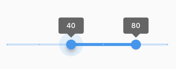 |
| /// |
| /// This range values are in intervals of 20 because the Range Slider has 5 |
| /// divisions, from 0 to 100. This means are values are split between 0, 20, 40, |
| /// 60, 80, and 100. The range values are initialized with 40 and 80 in this demo. |
| /// |
| /// ```dart |
| /// RangeValues _currentRangeValues = const RangeValues(40, 80); |
| /// |
| /// @override |
| /// Widget build(BuildContext context) { |
| /// return RangeSlider( |
| /// values: _currentRangeValues, |
| /// min: 0, |
| /// max: 100, |
| /// divisions: 5, |
| /// labels: RangeLabels( |
| /// _currentRangeValues.start.round().toString(), |
| /// _currentRangeValues.end.round().toString(), |
| /// ), |
| /// onChanged: (RangeValues values) { |
| /// setState(() { |
| /// _currentRangeValues = values; |
| /// }); |
| /// }, |
| /// ); |
| /// } |
| /// ``` |
| /// {@end-tool} |
| /// |
| /// A range slider can be used to select from either a continuous or a discrete |
| /// set of values. The default is to use a continuous range of values from [min] |
| /// to [max]. To use discrete values, use a non-null value for [divisions], which |
| /// indicates the number of discrete intervals. For example, if [min] is 0.0 and |
| /// [max] is 50.0 and [divisions] is 5, then the slider can take on the |
| /// discrete values 0.0, 10.0, 20.0, 30.0, 40.0, and 50.0. |
| /// |
| /// The terms for the parts of a slider are: |
| /// |
| /// * The "thumbs", which are the shapes that slide horizontally when the user |
| /// drags them to change the selected range. |
| /// * The "track", which is the horizontal line that the thumbs can be dragged |
| /// along. |
| /// * The "tick marks", which mark the discrete values of a discrete slider. |
| /// * The "overlay", which is a highlight that's drawn over a thumb in response |
| /// to a user tap-down gesture. |
| /// * The "value indicators", which are the shapes that pop up when the user |
| /// is dragging a thumb to show the value being selected. |
| /// * The "active" segment of the slider is the segment between the two thumbs. |
| /// * The "inactive" slider segments are the two track intervals outside of the |
| /// slider's thumbs. |
| /// |
| /// The range slider will be disabled if [onChanged] is null or if the range |
| /// given by [min]..[max] is empty (i.e. if [min] is equal to [max]). |
| /// |
| /// The range slider widget itself does not maintain any state. Instead, when |
| /// the state of the slider changes, the widget calls the [onChanged] callback. |
| /// Most widgets that use a range slider will listen for the [onChanged] callback |
| /// and rebuild the slider with new [values] to update the visual appearance of |
| /// the slider. To know when the value starts to change, or when it is done |
| /// changing, set the optional callbacks [onChangeStart] and/or [onChangeEnd]. |
| /// |
| /// By default, a slider will be as wide as possible, centered vertically. When |
| /// given unbounded constraints, it will attempt to make the track 144 pixels |
| /// wide (including margins on each side) and will shrink-wrap vertically. |
| /// |
| /// Requires one of its ancestors to be a [Material] widget. This is typically |
| /// provided by a [Scaffold] widget. |
| /// |
| /// Requires one of its ancestors to be a [MediaQuery] widget. Typically, a |
| /// [MediaQuery] widget is introduced by the [MaterialApp] or [WidgetsApp] |
| /// widget at the top of your application widget tree. |
| /// |
| /// To determine how it should be displayed (e.g. colors, thumb shape, etc.), |
| /// a slider uses the [SliderThemeData] available from either a [SliderTheme] |
| /// widget, or the [ThemeData.sliderTheme] inside a [Theme] widget above it in |
| /// the widget tree. You can also override some of the colors with the |
| /// [activeColor] and [inactiveColor] properties, although more fine-grained |
| /// control of the colors, and other visual properties is achieved using a |
| /// [SliderThemeData]. |
| /// |
| /// See also: |
| /// |
| /// * [SliderTheme] and [SliderThemeData] for information about controlling |
| /// the visual appearance of the slider. |
| /// * [Slider], for a single-valued slider. |
| /// * [Radio], for selecting among a set of explicit values. |
| /// * [Checkbox] and [Switch], for toggling a particular value on or off. |
| /// * <https://material.io/design/components/sliders.html> |
| /// * [MediaQuery], from which the text scale factor is obtained. |
| class RangeSlider extends StatefulWidget { |
| /// Creates a Material Design range slider. |
| /// |
| /// The range slider widget itself does not maintain any state. Instead, when |
| /// the state of the slider changes, the widget calls the [onChanged] callback. |
| /// Most widgets that use a range slider will listen for the [onChanged] callback |
| /// and rebuild the slider with a new [value] to update the visual appearance of |
| /// the slider. To know when the value starts to change, or when it is done |
| /// changing, set the optional callbacks [onChangeStart] and/or [onChangeEnd]. |
| /// |
| /// * [values], which determines currently selected values for this range |
| /// slider. |
| /// * [onChanged], which is called while the user is selecting a new value for |
| /// the range slider. |
| /// * [onChangeStart], which is called when the user starts to select a new |
| /// value for the range slider. |
| /// * [onChangeEnd], which is called when the user is done selecting a new |
| /// value for the range slider. |
| /// |
| /// You can override some of the colors with the [activeColor] and |
| /// [inactiveColor] properties, although more fine-grained control of the |
| /// appearance is achieved using a [SliderThemeData]. |
| /// |
| /// The [values], [min], [max] must not be null. The [min] must be less than |
| /// or equal to the [max]. [values.start] must be less than or equal to |
| /// [values.end]. [values.start] and [values.end] must be greater than or |
| /// equal to the [min] and less than or equal to the [max]. The [divisions] |
| /// must be null or greater than 0. |
| RangeSlider({ |
| Key? key, |
| required this.values, |
| required this.onChanged, |
| this.onChangeStart, |
| this.onChangeEnd, |
| this.min = 0.0, |
| this.max = 1.0, |
| this.divisions, |
| this.labels, |
| this.activeColor, |
| this.inactiveColor, |
| this.semanticFormatterCallback, |
| }) : assert(values != null), |
| assert(min != null), |
| assert(max != null), |
| assert(min <= max), |
| assert(values.start <= values.end), |
| assert(values.start >= min && values.start <= max), |
| assert(values.end >= min && values.end <= max), |
| assert(divisions == null || divisions > 0), |
| super(key: key); |
| |
| /// The currently selected values for this range slider. |
| /// |
| /// The slider's thumbs are drawn at horizontal positions that corresponds to |
| /// these values. |
| final RangeValues values; |
| |
| /// Called when the user is selecting a new value for the slider by dragging. |
| /// |
| /// The slider passes the new values to the callback but does not actually |
| /// change state until the parent widget rebuilds the slider with the new |
| /// values. |
| /// |
| /// If null, the slider will be displayed as disabled. |
| /// |
| /// The callback provided to [onChanged] should update the state of the parent |
| /// [StatefulWidget] using the [State.setState] method, so that the parent |
| /// gets rebuilt; for example: |
| /// |
| /// {@tool snippet} |
| /// |
| /// ```dart |
| /// RangeSlider( |
| /// values: _rangeValues, |
| /// min: 1.0, |
| /// max: 10.0, |
| /// onChanged: (RangeValues newValues) { |
| /// setState(() { |
| /// _rangeValues = newValues; |
| /// }); |
| /// }, |
| /// ) |
| /// ``` |
| /// {@end-tool} |
| /// |
| /// See also: |
| /// |
| /// * [onChangeStart], which is called when the user starts changing the |
| /// values. |
| /// * [onChangeEnd], which is called when the user stops changing the values. |
| final ValueChanged<RangeValues>? onChanged; |
| |
| /// Called when the user starts selecting new values for the slider. |
| /// |
| /// This callback shouldn't be used to update the slider [values] (use |
| /// [onChanged] for that). Rather, it should be used to be notified when the |
| /// user has started selecting a new value by starting a drag or with a tap. |
| /// |
| /// The values passed will be the last [values] that the slider had before the |
| /// change began. |
| /// |
| /// {@tool snippet} |
| /// |
| /// ```dart |
| /// RangeSlider( |
| /// values: _rangeValues, |
| /// min: 1.0, |
| /// max: 10.0, |
| /// onChanged: (RangeValues newValues) { |
| /// setState(() { |
| /// _rangeValues = newValues; |
| /// }); |
| /// }, |
| /// onChangeStart: (RangeValues startValues) { |
| /// print('Started change at $startValues'); |
| /// }, |
| /// ) |
| /// ``` |
| /// {@end-tool} |
| /// |
| /// See also: |
| /// |
| /// * [onChangeEnd] for a callback that is called when the value change is |
| /// complete. |
| final ValueChanged<RangeValues>? onChangeStart; |
| |
| /// Called when the user is done selecting new values for the slider. |
| /// |
| /// This differs from [onChanged] because it is only called once at the end |
| /// of the interaction, while [onChanged] is called as the value is getting |
| /// updated within the interaction. |
| /// |
| /// This callback shouldn't be used to update the slider [values] (use |
| /// [onChanged] for that). Rather, it should be used to know when the user has |
| /// completed selecting a new [values] by ending a drag or a click. |
| /// |
| /// {@tool snippet} |
| /// |
| /// ```dart |
| /// RangeSlider( |
| /// values: _rangeValues, |
| /// min: 1.0, |
| /// max: 10.0, |
| /// onChanged: (RangeValues newValues) { |
| /// setState(() { |
| /// _rangeValues = newValues; |
| /// }); |
| /// }, |
| /// onChangeEnd: (RangeValues endValues) { |
| /// print('Ended change at $endValues'); |
| /// }, |
| /// ) |
| /// ``` |
| /// {@end-tool} |
| /// |
| /// See also: |
| /// |
| /// * [onChangeStart] for a callback that is called when a value change |
| /// begins. |
| final ValueChanged<RangeValues>? onChangeEnd; |
| |
| /// The minimum value the user can select. |
| /// |
| /// Defaults to 0.0. Must be less than or equal to [max]. |
| /// |
| /// If the [max] is equal to the [min], then the slider is disabled. |
| final double min; |
| |
| /// The maximum value the user can select. |
| /// |
| /// Defaults to 1.0. Must be greater than or equal to [min]. |
| /// |
| /// If the [max] is equal to the [min], then the slider is disabled. |
| final double max; |
| |
| /// The number of discrete divisions. |
| /// |
| /// Typically used with [labels] to show the current discrete values. |
| /// |
| /// If null, the slider is continuous. |
| final int? divisions; |
| |
| /// Labels to show as text in the [SliderThemeData.rangeValueIndicatorShape]. |
| /// |
| /// There are two labels: one for the start thumb and one for the end thumb. |
| /// |
| /// Each label is rendered using the active [ThemeData]'s |
| /// [TextTheme.bodyText1] text style, with the theme data's |
| /// [ColorScheme.onPrimary] color. The label's text style can be overridden |
| /// with [SliderThemeData.valueIndicatorTextStyle]. |
| /// |
| /// If null, then the value indicator will not be displayed. |
| /// |
| /// See also: |
| /// |
| /// * [RangeSliderValueIndicatorShape] for how to create a custom value |
| /// indicator shape. |
| final RangeLabels? labels; |
| |
| /// The color of the track's active segment, i.e. the span of track between |
| /// the thumbs. |
| /// |
| /// Defaults to [ColorScheme.primary]. |
| /// |
| /// Using a [SliderTheme] gives more fine-grained control over the |
| /// appearance of various components of the slider. |
| final Color? activeColor; |
| |
| /// The color of the track's inactive segments, i.e. the span of tracks |
| /// between the min and the start thumb, and the end thumb and the max. |
| /// |
| /// Defaults to [ColorScheme.primary] with 24% opacity. |
| /// |
| /// Using a [SliderTheme] gives more fine-grained control over the |
| /// appearance of various components of the slider. |
| final Color? inactiveColor; |
| |
| /// The callback used to create a semantic value from the slider's values. |
| /// |
| /// Defaults to formatting values as a percentage. |
| /// |
| /// This is used by accessibility frameworks like TalkBack on Android to |
| /// inform users what the currently selected value is with more context. |
| /// |
| /// {@tool snippet} |
| /// |
| /// In the example below, a slider for currency values is configured to |
| /// announce a value with a currency label. |
| /// |
| /// ```dart |
| /// RangeSlider( |
| /// values: _dollarsRange, |
| /// min: 20.0, |
| /// max: 330.0, |
| /// onChanged: (RangeValues newValues) { |
| /// setState(() { |
| /// _dollarsRange = newValues; |
| /// }); |
| /// }, |
| /// semanticFormatterCallback: (double newValue) { |
| /// return '${newValue.round()} dollars'; |
| /// } |
| /// ) |
| /// ``` |
| /// {@end-tool} |
| final SemanticFormatterCallback? semanticFormatterCallback; |
| |
| // Touch width for the tap boundary of the slider thumbs. |
| static const double _minTouchTargetWidth = kMinInteractiveDimension; |
| |
| @override |
| _RangeSliderState createState() => _RangeSliderState(); |
| |
| @override |
| void debugFillProperties(DiagnosticPropertiesBuilder properties) { |
| super.debugFillProperties(properties); |
| properties.add(DoubleProperty('valueStart', values.start)); |
| properties.add(DoubleProperty('valueEnd', values.end)); |
| properties.add(ObjectFlagProperty<ValueChanged<RangeValues>>('onChanged', onChanged, ifNull: 'disabled')); |
| properties.add(ObjectFlagProperty<ValueChanged<RangeValues>>.has('onChangeStart', onChangeStart)); |
| properties.add(ObjectFlagProperty<ValueChanged<RangeValues>>.has('onChangeEnd', onChangeEnd)); |
| properties.add(DoubleProperty('min', min)); |
| properties.add(DoubleProperty('max', max)); |
| properties.add(IntProperty('divisions', divisions)); |
| properties.add(StringProperty('labelStart', labels?.start)); |
| properties.add(StringProperty('labelEnd', labels?.end)); |
| properties.add(ColorProperty('activeColor', activeColor)); |
| properties.add(ColorProperty('inactiveColor', inactiveColor)); |
| properties.add(ObjectFlagProperty<ValueChanged<double>>.has('semanticFormatterCallback', semanticFormatterCallback)); |
| } |
| } |
| |
| class _RangeSliderState extends State<RangeSlider> with TickerProviderStateMixin { |
| static const Duration enableAnimationDuration = Duration(milliseconds: 75); |
| static const Duration valueIndicatorAnimationDuration = Duration(milliseconds: 100); |
| |
| // Animation controller that is run when the overlay (a.k.a radial reaction) |
| // changes visibility in response to user interaction. |
| late AnimationController overlayController; |
| |
| // Animation controller that is run when the value indicators change visibility. |
| late AnimationController valueIndicatorController; |
| |
| // Animation controller that is run when enabling/disabling the slider. |
| late AnimationController enableController; |
| |
| // Animation controllers that are run when transitioning between one value |
| // and the next on a discrete slider. |
| late AnimationController startPositionController; |
| late AnimationController endPositionController; |
| Timer? interactionTimer; |
| // Value Indicator paint Animation that appears on the Overlay. |
| PaintRangeValueIndicator? paintTopValueIndicator; |
| PaintRangeValueIndicator? paintBottomValueIndicator; |
| |
| |
| @override |
| void initState() { |
| super.initState(); |
| overlayController = AnimationController( |
| duration: kRadialReactionDuration, |
| vsync: this, |
| ); |
| valueIndicatorController = AnimationController( |
| duration: valueIndicatorAnimationDuration, |
| vsync: this, |
| ); |
| enableController = AnimationController( |
| duration: enableAnimationDuration, |
| vsync: this, |
| value: widget.onChanged != null ? 1.0 : 0.0, |
| ); |
| startPositionController = AnimationController( |
| duration: Duration.zero, |
| vsync: this, |
| value: _unlerp(widget.values.start), |
| ); |
| endPositionController = AnimationController( |
| duration: Duration.zero, |
| vsync: this, |
| value: _unlerp(widget.values.end), |
| ); |
| } |
| |
| @override |
| void didUpdateWidget(RangeSlider oldWidget) { |
| super.didUpdateWidget(oldWidget); |
| if (oldWidget.onChanged == widget.onChanged) |
| return; |
| final bool wasEnabled = oldWidget.onChanged != null; |
| final bool isEnabled = widget.onChanged != null; |
| if (wasEnabled != isEnabled) { |
| if (isEnabled) { |
| enableController.forward(); |
| } else { |
| enableController.reverse(); |
| } |
| } |
| } |
| |
| @override |
| void dispose() { |
| interactionTimer?.cancel(); |
| overlayController.dispose(); |
| valueIndicatorController.dispose(); |
| enableController.dispose(); |
| startPositionController.dispose(); |
| endPositionController.dispose(); |
| if (overlayEntry != null) { |
| overlayEntry!.remove(); |
| overlayEntry = null; |
| } |
| super.dispose(); |
| } |
| |
| void _handleChanged(RangeValues values) { |
| assert(widget.onChanged != null); |
| final RangeValues lerpValues = _lerpRangeValues(values); |
| if (lerpValues != widget.values) { |
| widget.onChanged!(lerpValues); |
| } |
| } |
| |
| void _handleDragStart(RangeValues values) { |
| assert(widget.onChangeStart != null); |
| widget.onChangeStart!(_lerpRangeValues(values)); |
| } |
| |
| void _handleDragEnd(RangeValues values) { |
| assert(widget.onChangeEnd != null); |
| widget.onChangeEnd!(_lerpRangeValues(values)); |
| } |
| |
| // Returns a number between min and max, proportional to value, which must |
| // be between 0.0 and 1.0. |
| double _lerp(double value) => ui.lerpDouble(widget.min, widget.max, value)!; |
| |
| // Returns a new range value with the start and end lerped. |
| RangeValues _lerpRangeValues(RangeValues values) { |
| return RangeValues(_lerp(values.start), _lerp(values.end)); |
| } |
| |
| // Returns a number between 0.0 and 1.0, given a value between min and max. |
| double _unlerp(double value) { |
| assert(value <= widget.max); |
| assert(value >= widget.min); |
| return widget.max > widget.min ? (value - widget.min) / (widget.max - widget.min) : 0.0; |
| } |
| |
| // Returns a new range value with the start and end unlerped. |
| RangeValues _unlerpRangeValues(RangeValues values) { |
| return RangeValues(_unlerp(values.start), _unlerp(values.end)); |
| } |
| |
| // Finds closest thumb. If the thumbs are close to each other, no thumb is |
| // immediately selected while the drag displacement is zero. If the first |
| // non-zero displacement is negative, then the left thumb is selected, and if its |
| // positive, then the right thumb is selected. |
| static final RangeThumbSelector _defaultRangeThumbSelector = ( |
| TextDirection textDirection, |
| RangeValues values, |
| double tapValue, |
| Size thumbSize, |
| Size trackSize, |
| double dx, // The horizontal delta or displacement of the drag update. |
| ) { |
| final double touchRadius = math.max(thumbSize.width, RangeSlider._minTouchTargetWidth) / 2; |
| final bool inStartTouchTarget = (tapValue - values.start).abs() * trackSize.width < touchRadius; |
| final bool inEndTouchTarget = (tapValue - values.end).abs() * trackSize.width < touchRadius; |
| |
| // Use dx if the thumb touch targets overlap. If dx is 0 and the drag |
| // position is in both touch targets, no thumb is selected because it is |
| // ambiguous to which thumb should be selected. If the dx is non-zero, the |
| // thumb selection is determined by the direction of the dx. The left thumb |
| // is chosen for negative dx, and the right thumb is chosen for positive dx. |
| if (inStartTouchTarget && inEndTouchTarget) { |
| final bool towardsStart; |
| final bool towardsEnd; |
| switch (textDirection) { |
| case TextDirection.ltr: |
| towardsStart = dx < 0; |
| towardsEnd = dx > 0; |
| break; |
| case TextDirection.rtl: |
| towardsStart = dx > 0; |
| towardsEnd = dx < 0; |
| break; |
| } |
| if (towardsStart) |
| return Thumb.start; |
| if (towardsEnd) |
| return Thumb.end; |
| } else { |
| // Snap position on the track if its in the inactive range. |
| if (tapValue < values.start || inStartTouchTarget) |
| return Thumb.start; |
| if (tapValue > values.end || inEndTouchTarget) |
| return Thumb.end; |
| } |
| return null; |
| }; |
| |
| |
| |
| @override |
| Widget build(BuildContext context) { |
| assert(debugCheckHasMaterial(context)); |
| assert(debugCheckHasMediaQuery(context)); |
| |
| final ThemeData theme = Theme.of(context)!; |
| SliderThemeData sliderTheme = SliderTheme.of(context); |
| |
| // If the widget has active or inactive colors specified, then we plug them |
| // in to the slider theme as best we can. If the developer wants more |
| // control than that, then they need to use a SliderTheme. The default |
| // colors come from the ThemeData.colorScheme. These colors, along with |
| // the default shapes and text styles are aligned to the Material |
| // Guidelines. |
| |
| const double _defaultTrackHeight = 4; |
| const RangeSliderTrackShape _defaultTrackShape = RoundedRectRangeSliderTrackShape(); |
| const RangeSliderTickMarkShape _defaultTickMarkShape = RoundRangeSliderTickMarkShape(); |
| const SliderComponentShape _defaultOverlayShape = RoundSliderOverlayShape(); |
| const RangeSliderThumbShape _defaultThumbShape = RoundRangeSliderThumbShape(); |
| const RangeSliderValueIndicatorShape _defaultValueIndicatorShape = RectangularRangeSliderValueIndicatorShape(); |
| const ShowValueIndicator _defaultShowValueIndicator = ShowValueIndicator.onlyForDiscrete; |
| const double _defaultMinThumbSeparation = 8; |
| |
| // The value indicator's color is not the same as the thumb and active track |
| // (which can be defined by activeColor) if the |
| // RectangularSliderValueIndicatorShape is used. In all other cases, the |
| // value indicator is assumed to be the same as the active color. |
| final RangeSliderValueIndicatorShape valueIndicatorShape = sliderTheme.rangeValueIndicatorShape ?? _defaultValueIndicatorShape; |
| final Color valueIndicatorColor; |
| if (valueIndicatorShape is RectangularRangeSliderValueIndicatorShape) { |
| valueIndicatorColor = sliderTheme.valueIndicatorColor ?? Color.alphaBlend(theme.colorScheme.onSurface.withOpacity(0.60), theme.colorScheme.surface.withOpacity(0.90)); |
| } else { |
| valueIndicatorColor = widget.activeColor ?? sliderTheme.valueIndicatorColor ?? theme.colorScheme.primary; |
| } |
| |
| sliderTheme = sliderTheme.copyWith( |
| trackHeight: sliderTheme.trackHeight ?? _defaultTrackHeight, |
| activeTrackColor: widget.activeColor ?? sliderTheme.activeTrackColor ?? theme.colorScheme.primary, |
| inactiveTrackColor: widget.inactiveColor ?? sliderTheme.inactiveTrackColor ?? theme.colorScheme.primary.withOpacity(0.24), |
| disabledActiveTrackColor: sliderTheme.disabledActiveTrackColor ?? theme.colorScheme.onSurface.withOpacity(0.32), |
| disabledInactiveTrackColor: sliderTheme.disabledInactiveTrackColor ?? theme.colorScheme.onSurface.withOpacity(0.12), |
| activeTickMarkColor: widget.inactiveColor ?? sliderTheme.activeTickMarkColor ?? theme.colorScheme.onPrimary.withOpacity(0.54), |
| inactiveTickMarkColor: widget.activeColor ?? sliderTheme.inactiveTickMarkColor ?? theme.colorScheme.primary.withOpacity(0.54), |
| disabledActiveTickMarkColor: sliderTheme.disabledActiveTickMarkColor ?? theme.colorScheme.onPrimary.withOpacity(0.12), |
| disabledInactiveTickMarkColor: sliderTheme.disabledInactiveTickMarkColor ?? theme.colorScheme.onSurface.withOpacity(0.12), |
| thumbColor: widget.activeColor ?? sliderTheme.thumbColor ?? theme.colorScheme.primary, |
| overlappingShapeStrokeColor: sliderTheme.overlappingShapeStrokeColor ?? theme.colorScheme.surface, |
| disabledThumbColor: sliderTheme.disabledThumbColor ?? Color.alphaBlend(theme.colorScheme.onSurface.withOpacity(.38), theme.colorScheme.surface), |
| overlayColor: widget.activeColor?.withOpacity(0.12) ?? sliderTheme.overlayColor ?? theme.colorScheme.primary.withOpacity(0.12), |
| valueIndicatorColor: valueIndicatorColor, |
| rangeTrackShape: sliderTheme.rangeTrackShape ?? _defaultTrackShape, |
| rangeTickMarkShape: sliderTheme.rangeTickMarkShape ?? _defaultTickMarkShape, |
| rangeThumbShape: sliderTheme.rangeThumbShape ?? _defaultThumbShape, |
| overlayShape: sliderTheme.overlayShape ?? _defaultOverlayShape, |
| rangeValueIndicatorShape: valueIndicatorShape, |
| showValueIndicator: sliderTheme.showValueIndicator ?? _defaultShowValueIndicator, |
| valueIndicatorTextStyle: sliderTheme.valueIndicatorTextStyle ?? theme.textTheme.bodyText1!.copyWith( |
| color: theme.colorScheme.onPrimary, |
| ), |
| minThumbSeparation: sliderTheme.minThumbSeparation ?? _defaultMinThumbSeparation, |
| thumbSelector: sliderTheme.thumbSelector ?? _defaultRangeThumbSelector, |
| ); |
| |
| // This size is used as the max bounds for the painting of the value |
| // indicators. It must be kept in sync with the function with the same name |
| // in slider.dart. |
| Size _screenSize() => MediaQuery.of(context)!.size; |
| |
| return CompositedTransformTarget( |
| link: _layerLink, |
| child: _RangeSliderRenderObjectWidget( |
| values: _unlerpRangeValues(widget.values), |
| divisions: widget.divisions, |
| labels: widget.labels, |
| sliderTheme: sliderTheme, |
| textScaleFactor: MediaQuery.of(context)!.textScaleFactor, |
| screenSize: _screenSize(), |
| onChanged: (widget.onChanged != null) && (widget.max > widget.min) ? _handleChanged : null, |
| onChangeStart: widget.onChangeStart != null ? _handleDragStart : null, |
| onChangeEnd: widget.onChangeEnd != null ? _handleDragEnd : null, |
| state: this, |
| semanticFormatterCallback: widget.semanticFormatterCallback, |
| ), |
| ); |
| } |
| |
| final LayerLink _layerLink = LayerLink(); |
| |
| OverlayEntry? overlayEntry; |
| |
| void showValueIndicator() { |
| if (overlayEntry == null) { |
| overlayEntry = OverlayEntry( |
| builder: (BuildContext context) { |
| return CompositedTransformFollower( |
| link: _layerLink, |
| child: _ValueIndicatorRenderObjectWidget( |
| state: this, |
| ), |
| ); |
| }, |
| ); |
| Overlay.of(context)!.insert(overlayEntry!); |
| } |
| } |
| } |
| |
| class _RangeSliderRenderObjectWidget extends LeafRenderObjectWidget { |
| const _RangeSliderRenderObjectWidget({ |
| Key? key, |
| required this.values, |
| required this.divisions, |
| required this.labels, |
| required this.sliderTheme, |
| required this.textScaleFactor, |
| required this.screenSize, |
| required this.onChanged, |
| required this.onChangeStart, |
| required this.onChangeEnd, |
| required this.state, |
| required this.semanticFormatterCallback, |
| }) : super(key: key); |
| |
| final RangeValues values; |
| final int? divisions; |
| final RangeLabels? labels; |
| final SliderThemeData sliderTheme; |
| final double textScaleFactor; |
| final Size screenSize; |
| final ValueChanged<RangeValues>? onChanged; |
| final ValueChanged<RangeValues>? onChangeStart; |
| final ValueChanged<RangeValues>? onChangeEnd; |
| final SemanticFormatterCallback? semanticFormatterCallback; |
| final _RangeSliderState state; |
| |
| @override |
| _RenderRangeSlider createRenderObject(BuildContext context) { |
| return _RenderRangeSlider( |
| values: values, |
| divisions: divisions, |
| labels: labels, |
| sliderTheme: sliderTheme, |
| theme: Theme.of(context), |
| textScaleFactor: textScaleFactor, |
| screenSize: screenSize, |
| onChanged: onChanged, |
| onChangeStart: onChangeStart, |
| onChangeEnd: onChangeEnd, |
| state: state, |
| textDirection: Directionality.of(context)!, |
| semanticFormatterCallback: semanticFormatterCallback, |
| platform: Theme.of(context)!.platform, |
| ); |
| } |
| |
| @override |
| void updateRenderObject(BuildContext context, _RenderRangeSlider renderObject) { |
| renderObject |
| // We should update the `divisions` ahead of `values`, because the `values` |
| // setter dependent on the `divisions`. |
| ..divisions = divisions |
| ..values = values |
| ..labels = labels |
| ..sliderTheme = sliderTheme |
| ..theme = Theme.of(context) |
| ..textScaleFactor = textScaleFactor |
| ..screenSize = screenSize |
| ..onChanged = onChanged |
| ..onChangeStart = onChangeStart |
| ..onChangeEnd = onChangeEnd |
| ..textDirection = Directionality.of(context)! |
| ..semanticFormatterCallback = semanticFormatterCallback |
| ..platform = Theme.of(context)!.platform; |
| } |
| } |
| |
| class _RenderRangeSlider extends RenderBox with RelayoutWhenSystemFontsChangeMixin { |
| _RenderRangeSlider({ |
| required RangeValues values, |
| required int? divisions, |
| required RangeLabels? labels, |
| required SliderThemeData sliderTheme, |
| required ThemeData? theme, |
| required double textScaleFactor, |
| required Size screenSize, |
| required TargetPlatform platform, |
| required ValueChanged<RangeValues>? onChanged, |
| required SemanticFormatterCallback? semanticFormatterCallback, |
| required this.onChangeStart, |
| required this.onChangeEnd, |
| required _RangeSliderState state, |
| required TextDirection textDirection, |
| }) : assert(values != null), |
| assert(values.start >= 0.0 && values.start <= 1.0), |
| assert(values.end >= 0.0 && values.end <= 1.0), |
| assert(state != null), |
| assert(textDirection != null), |
| _platform = platform, |
| _semanticFormatterCallback = semanticFormatterCallback, |
| _labels = labels, |
| _values = values, |
| _divisions = divisions, |
| _sliderTheme = sliderTheme, |
| _theme = theme, |
| _textScaleFactor = textScaleFactor, |
| _screenSize = screenSize, |
| _onChanged = onChanged, |
| _state = state, |
| _textDirection = textDirection { |
| _updateLabelPainters(); |
| final GestureArenaTeam team = GestureArenaTeam(); |
| _drag = HorizontalDragGestureRecognizer() |
| ..team = team |
| ..onStart = _handleDragStart |
| ..onUpdate = _handleDragUpdate |
| ..onEnd = _handleDragEnd |
| ..onCancel = _handleDragCancel; |
| _tap = TapGestureRecognizer() |
| ..team = team |
| ..onTapDown = _handleTapDown |
| ..onTapUp = _handleTapUp |
| ..onTapCancel = _handleTapCancel; |
| _overlayAnimation = CurvedAnimation( |
| parent: _state.overlayController, |
| curve: Curves.fastOutSlowIn, |
| ); |
| _valueIndicatorAnimation = CurvedAnimation( |
| parent: _state.valueIndicatorController, |
| curve: Curves.fastOutSlowIn, |
| )..addStatusListener((AnimationStatus status) { |
| if (status == AnimationStatus.dismissed && _state.overlayEntry != null) { |
| _state.overlayEntry!.remove(); |
| _state.overlayEntry = null; |
| } |
| }); |
| _enableAnimation = CurvedAnimation( |
| parent: _state.enableController, |
| curve: Curves.easeInOut, |
| ); |
| } |
| |
| // Keep track of the last selected thumb so they can be drawn in the |
| // right order. |
| Thumb? _lastThumbSelection; |
| |
| static const Duration _positionAnimationDuration = Duration(milliseconds: 75); |
| |
| // This value is the touch target, 48, multiplied by 3. |
| static const double _minPreferredTrackWidth = 144.0; |
| |
| // Compute the largest width and height needed to paint the slider shapes, |
| // other than the track shape. It is assumed that these shapes are vertically |
| // centered on the track. |
| double get _maxSliderPartWidth => _sliderPartSizes.map((Size size) => size.width).reduce(math.max); |
| double get _maxSliderPartHeight => _sliderPartSizes.map((Size size) => size.height).reduce(math.max); |
| List<Size> get _sliderPartSizes => <Size>[ |
| _sliderTheme.overlayShape!.getPreferredSize(isEnabled, isDiscrete), |
| _sliderTheme.rangeThumbShape!.getPreferredSize(isEnabled, isDiscrete), |
| _sliderTheme.rangeTickMarkShape!.getPreferredSize(isEnabled: isEnabled, sliderTheme: sliderTheme), |
| ]; |
| double? get _minPreferredTrackHeight => _sliderTheme.trackHeight; |
| |
| // This rect is used in gesture calculations, where the gesture coordinates |
| // are relative to the sliders origin. Therefore, the offset is passed as |
| // (0,0). |
| Rect get _trackRect => _sliderTheme.rangeTrackShape!.getPreferredRect( |
| parentBox: this, |
| offset: Offset.zero, |
| sliderTheme: _sliderTheme, |
| isDiscrete: false, |
| ); |
| |
| static const Duration _minimumInteractionTime = Duration(milliseconds: 500); |
| |
| final _RangeSliderState _state; |
| late Animation<double> _overlayAnimation; |
| late Animation<double> _valueIndicatorAnimation; |
| late Animation<double> _enableAnimation; |
| final TextPainter _startLabelPainter = TextPainter(); |
| final TextPainter _endLabelPainter = TextPainter(); |
| late HorizontalDragGestureRecognizer _drag; |
| late TapGestureRecognizer _tap; |
| bool _active = false; |
| late RangeValues _newValues; |
| |
| bool get isEnabled => onChanged != null; |
| |
| bool get isDiscrete => divisions != null && divisions! > 0; |
| |
| double get _minThumbSeparationValue => isDiscrete ? 0 : sliderTheme.minThumbSeparation! / _trackRect.width; |
| |
| RangeValues get values => _values; |
| RangeValues _values; |
| set values(RangeValues newValues) { |
| assert(newValues != null); |
| assert(newValues.start != null && newValues.start >= 0.0 && newValues.start <= 1.0); |
| assert(newValues.end != null && newValues.end >= 0.0 && newValues.end <= 1.0); |
| assert(newValues.start <= newValues.end); |
| final RangeValues convertedValues = isDiscrete ? _discretizeRangeValues(newValues) : newValues; |
| if (convertedValues == _values) { |
| return; |
| } |
| _values = convertedValues; |
| if (isDiscrete) { |
| // Reset the duration to match the distance that we're traveling, so that |
| // whatever the distance, we still do it in _positionAnimationDuration, |
| // and if we get re-targeted in the middle, it still takes that long to |
| // get to the new location. |
| final double startDistance = (_values.start - _state.startPositionController.value).abs(); |
| _state.startPositionController.duration = startDistance != 0.0 ? _positionAnimationDuration * (1.0 / startDistance) : Duration.zero; |
| _state.startPositionController.animateTo(_values.start, curve: Curves.easeInOut); |
| final double endDistance = (_values.end - _state.endPositionController.value).abs(); |
| _state.endPositionController.duration = endDistance != 0.0 ? _positionAnimationDuration * (1.0 / endDistance) : Duration.zero; |
| _state.endPositionController.animateTo(_values.end, curve: Curves.easeInOut); |
| } else { |
| _state.startPositionController.value = convertedValues.start; |
| _state.endPositionController.value = convertedValues.end; |
| } |
| markNeedsSemanticsUpdate(); |
| } |
| |
| TargetPlatform _platform; |
| TargetPlatform get platform => _platform; |
| set platform(TargetPlatform value) { |
| if (_platform == value) |
| return; |
| _platform = value; |
| markNeedsSemanticsUpdate(); |
| } |
| |
| SemanticFormatterCallback? _semanticFormatterCallback; |
| SemanticFormatterCallback? get semanticFormatterCallback => _semanticFormatterCallback; |
| set semanticFormatterCallback(SemanticFormatterCallback? value) { |
| if (_semanticFormatterCallback == value) |
| return; |
| _semanticFormatterCallback = value; |
| markNeedsSemanticsUpdate(); |
| } |
| |
| int? get divisions => _divisions; |
| int? _divisions; |
| set divisions(int? value) { |
| if (value == _divisions) { |
| return; |
| } |
| _divisions = value; |
| markNeedsPaint(); |
| } |
| |
| RangeLabels? get labels => _labels; |
| RangeLabels? _labels; |
| set labels(RangeLabels? labels) { |
| if (labels == _labels) |
| return; |
| _labels = labels; |
| _updateLabelPainters(); |
| } |
| |
| SliderThemeData get sliderTheme => _sliderTheme; |
| SliderThemeData _sliderTheme; |
| set sliderTheme(SliderThemeData value) { |
| if (value == _sliderTheme) |
| return; |
| _sliderTheme = value; |
| markNeedsPaint(); |
| } |
| |
| ThemeData? get theme => _theme; |
| ThemeData? _theme; |
| set theme(ThemeData? value) { |
| if (value == _theme) |
| return; |
| _theme = value; |
| markNeedsPaint(); |
| } |
| |
| double get textScaleFactor => _textScaleFactor; |
| double _textScaleFactor; |
| set textScaleFactor(double value) { |
| if (value == _textScaleFactor) |
| return; |
| _textScaleFactor = value; |
| _updateLabelPainters(); |
| } |
| |
| Size get screenSize => _screenSize; |
| Size _screenSize; |
| set screenSize(Size value) { |
| if (value == screenSize) |
| return; |
| _screenSize = value; |
| markNeedsPaint(); |
| } |
| |
| ValueChanged<RangeValues>? get onChanged => _onChanged; |
| ValueChanged<RangeValues>? _onChanged; |
| set onChanged(ValueChanged<RangeValues>? value) { |
| if (value == _onChanged) |
| return; |
| final bool wasEnabled = isEnabled; |
| _onChanged = value; |
| if (wasEnabled != isEnabled) { |
| markNeedsPaint(); |
| markNeedsSemanticsUpdate(); |
| } |
| } |
| |
| ValueChanged<RangeValues>? onChangeStart; |
| ValueChanged<RangeValues>? onChangeEnd; |
| |
| TextDirection get textDirection => _textDirection; |
| TextDirection _textDirection; |
| set textDirection(TextDirection value) { |
| assert(value != null); |
| if (value == _textDirection) |
| return; |
| _textDirection = value; |
| _updateLabelPainters(); |
| } |
| |
| bool get showValueIndicator { |
| switch (_sliderTheme.showValueIndicator!) { |
| case ShowValueIndicator.onlyForDiscrete: |
| return isDiscrete; |
| case ShowValueIndicator.onlyForContinuous: |
| return !isDiscrete; |
| case ShowValueIndicator.always: |
| return true; |
| case ShowValueIndicator.never: |
| return false; |
| } |
| } |
| |
| Size get _thumbSize => _sliderTheme.rangeThumbShape!.getPreferredSize(isEnabled, isDiscrete); |
| |
| double get _adjustmentUnit { |
| switch (_platform) { |
| case TargetPlatform.iOS: |
| // Matches iOS implementation of material slider. |
| return 0.1; |
| case TargetPlatform.android: |
| case TargetPlatform.fuchsia: |
| case TargetPlatform.linux: |
| case TargetPlatform.macOS: |
| case TargetPlatform.windows: |
| // Matches Android implementation of material slider. |
| return 0.05; |
| } |
| } |
| |
| void _updateLabelPainters() { |
| _updateLabelPainter(Thumb.start); |
| _updateLabelPainter(Thumb.end); |
| } |
| |
| void _updateLabelPainter(Thumb thumb) { |
| if (labels == null) |
| return; |
| |
| final String text; |
| final TextPainter labelPainter; |
| switch (thumb) { |
| case Thumb.start: |
| text = labels!.start; |
| labelPainter = _startLabelPainter; |
| break; |
| case Thumb.end: |
| text = labels!.end; |
| labelPainter = _endLabelPainter; |
| break; |
| } |
| |
| if (labels != null) { |
| labelPainter |
| ..text = TextSpan( |
| style: _sliderTheme.valueIndicatorTextStyle, |
| text: text, |
| ) |
| ..textDirection = textDirection |
| ..textScaleFactor = textScaleFactor |
| ..layout(); |
| } else { |
| labelPainter.text = null; |
| } |
| // Changing the textDirection can result in the layout changing, because the |
| // bidi algorithm might line up the glyphs differently which can result in |
| // different ligatures, different shapes, etc. So we always markNeedsLayout. |
| markNeedsLayout(); |
| } |
| |
| @override |
| void systemFontsDidChange() { |
| super.systemFontsDidChange(); |
| _startLabelPainter.markNeedsLayout(); |
| _endLabelPainter.markNeedsLayout(); |
| _updateLabelPainters(); |
| } |
| |
| @override |
| void attach(PipelineOwner owner) { |
| super.attach(owner); |
| _overlayAnimation.addListener(markNeedsPaint); |
| _valueIndicatorAnimation.addListener(markNeedsPaint); |
| _enableAnimation.addListener(markNeedsPaint); |
| _state.startPositionController.addListener(markNeedsPaint); |
| _state.endPositionController.addListener(markNeedsPaint); |
| } |
| |
| @override |
| void detach() { |
| _overlayAnimation.removeListener(markNeedsPaint); |
| _valueIndicatorAnimation.removeListener(markNeedsPaint); |
| _enableAnimation.removeListener(markNeedsPaint); |
| _state.startPositionController.removeListener(markNeedsPaint); |
| _state.endPositionController.removeListener(markNeedsPaint); |
| super.detach(); |
| } |
| |
| double _getValueFromVisualPosition(double visualPosition) { |
| switch (textDirection) { |
| case TextDirection.rtl: |
| return 1.0 - visualPosition; |
| case TextDirection.ltr: |
| return visualPosition; |
| } |
| } |
| |
| double _getValueFromGlobalPosition(Offset globalPosition) { |
| final double visualPosition = (globalToLocal(globalPosition).dx - _trackRect.left) / _trackRect.width; |
| return _getValueFromVisualPosition(visualPosition); |
| } |
| |
| double _discretize(double value) { |
| double result = value.clamp(0.0, 1.0); |
| if (isDiscrete) { |
| result = (result * divisions!).round() / divisions!; |
| } |
| return result; |
| } |
| |
| RangeValues _discretizeRangeValues(RangeValues values) { |
| return RangeValues(_discretize(values.start), _discretize(values.end)); |
| } |
| |
| void _startInteraction(Offset globalPosition) { |
| _state.showValueIndicator(); |
| final double tapValue = _getValueFromGlobalPosition(globalPosition).clamp(0.0, 1.0); |
| _lastThumbSelection = sliderTheme.thumbSelector!(textDirection, values, tapValue, _thumbSize, size, 0); |
| |
| if (_lastThumbSelection != null) { |
| _active = true; |
| // We supply the *current* values as the start locations, so that if we have |
| // a tap, it consists of a call to onChangeStart with the previous value and |
| // a call to onChangeEnd with the new value. |
| final RangeValues currentValues = _discretizeRangeValues(values); |
| if (_lastThumbSelection == Thumb.start) { |
| _newValues = RangeValues(tapValue, currentValues.end); |
| } else if (_lastThumbSelection == Thumb.end) { |
| _newValues = RangeValues(currentValues.start, tapValue); |
| } |
| _updateLabelPainter(_lastThumbSelection!); |
| |
| if (onChangeStart != null) { |
| onChangeStart!(currentValues); |
| } |
| |
| onChanged!(_discretizeRangeValues(_newValues)); |
| |
| _state.overlayController.forward(); |
| if (showValueIndicator) { |
| _state.valueIndicatorController.forward(); |
| _state.interactionTimer?.cancel(); |
| _state.interactionTimer = |
| Timer(_minimumInteractionTime * timeDilation, () { |
| _state.interactionTimer = null; |
| if (!_active && _state.valueIndicatorController.status == AnimationStatus.completed) { |
| _state.valueIndicatorController.reverse(); |
| } |
| }); |
| } |
| } |
| } |
| |
| void _handleDragUpdate(DragUpdateDetails details) { |
| if (!_state.mounted) { |
| return; |
| } |
| |
| final double dragValue = _getValueFromGlobalPosition(details.globalPosition); |
| |
| // If no selection has been made yet, test for thumb selection again now |
| // that the value of dx can be non-zero. If this is the first selection of |
| // the interaction, then onChangeStart must be called. |
| bool shouldCallOnChangeStart = false; |
| if (_lastThumbSelection == null) { |
| _lastThumbSelection = sliderTheme.thumbSelector!(textDirection, values, dragValue, _thumbSize, size, details.delta.dx); |
| if (_lastThumbSelection != null) { |
| shouldCallOnChangeStart = true; |
| _active = true; |
| _state.overlayController.forward(); |
| if (showValueIndicator) { |
| _state.valueIndicatorController.forward(); |
| } |
| } |
| } |
| |
| if (isEnabled && _lastThumbSelection != null) { |
| final RangeValues currentValues = _discretizeRangeValues(values); |
| if (onChangeStart != null && shouldCallOnChangeStart) { |
| onChangeStart!(currentValues); |
| } |
| final double currentDragValue = _discretize(dragValue); |
| |
| if (_lastThumbSelection == Thumb.start) { |
| _newValues = RangeValues(math.min(currentDragValue, currentValues.end - _minThumbSeparationValue), currentValues.end); |
| } else if (_lastThumbSelection == Thumb.end) { |
| _newValues = RangeValues(currentValues.start, math.max(currentDragValue, currentValues.start + _minThumbSeparationValue)); |
| } |
| onChanged!(_newValues); |
| } |
| } |
| |
| void _endInteraction() { |
| if (!_state.mounted) { |
| return; |
| } |
| |
| if (showValueIndicator && _state.interactionTimer == null) { |
| _state.valueIndicatorController.reverse(); |
| } |
| |
| if (_active && _state.mounted && _lastThumbSelection != null) { |
| final RangeValues discreteValues = _discretizeRangeValues(_newValues); |
| if (onChangeEnd != null) { |
| onChangeEnd!(discreteValues); |
| } |
| _active = false; |
| } |
| _state.overlayController.reverse(); |
| } |
| |
| void _handleDragStart(DragStartDetails details) { |
| _startInteraction(details.globalPosition); |
| } |
| |
| void _handleDragEnd(DragEndDetails details) { |
| _endInteraction(); |
| } |
| |
| void _handleDragCancel() { |
| _endInteraction(); |
| } |
| |
| void _handleTapDown(TapDownDetails details) { |
| _startInteraction(details.globalPosition); |
| } |
| |
| void _handleTapUp(TapUpDetails details) { |
| _endInteraction(); |
| } |
| |
| void _handleTapCancel() { |
| _endInteraction(); |
| } |
| |
| @override |
| bool hitTestSelf(Offset position) => true; |
| |
| @override |
| void handleEvent(PointerEvent event, HitTestEntry entry) { |
| assert(debugHandleEvent(event, entry)); |
| if (event is PointerDownEvent && isEnabled) { |
| // We need to add the drag first so that it has priority. |
| _drag.addPointer(event); |
| _tap.addPointer(event); |
| } |
| } |
| |
| @override |
| double computeMinIntrinsicWidth(double height) => _minPreferredTrackWidth + _maxSliderPartWidth; |
| |
| @override |
| double computeMaxIntrinsicWidth(double height) => _minPreferredTrackWidth + _maxSliderPartWidth; |
| |
| @override |
| double computeMinIntrinsicHeight(double width) => math.max(_minPreferredTrackHeight!, _maxSliderPartHeight); |
| |
| @override |
| double computeMaxIntrinsicHeight(double width) => math.max(_minPreferredTrackHeight!, _maxSliderPartHeight); |
| |
| @override |
| bool get sizedByParent => true; |
| |
| @override |
| void performResize() { |
| size = Size( |
| constraints.hasBoundedWidth ? constraints.maxWidth : _minPreferredTrackWidth + _maxSliderPartWidth, |
| constraints.hasBoundedHeight ? constraints.maxHeight : math.max(_minPreferredTrackHeight!, _maxSliderPartHeight), |
| ); |
| } |
| |
| @override |
| void paint(PaintingContext context, Offset offset) { |
| final double startValue = _state.startPositionController.value; |
| final double endValue = _state.endPositionController.value; |
| |
| // The visual position is the position of the thumb from 0 to 1 from left |
| // to right. In left to right, this is the same as the value, but it is |
| // reversed for right to left text. |
| final double startVisualPosition; |
| final double endVisualPosition; |
| switch (textDirection) { |
| case TextDirection.rtl: |
| startVisualPosition = 1.0 - startValue; |
| endVisualPosition = 1.0 - endValue; |
| break; |
| case TextDirection.ltr: |
| startVisualPosition = startValue; |
| endVisualPosition = endValue; |
| break; |
| } |
| |
| final Rect trackRect = _sliderTheme.rangeTrackShape!.getPreferredRect( |
| parentBox: this, |
| offset: offset, |
| sliderTheme: _sliderTheme, |
| isDiscrete: isDiscrete, |
| ); |
| final Offset startThumbCenter = Offset(trackRect.left + startVisualPosition * trackRect.width, trackRect.center.dy); |
| final Offset endThumbCenter = Offset(trackRect.left + endVisualPosition * trackRect.width, trackRect.center.dy); |
| |
| _sliderTheme.rangeTrackShape!.paint( |
| context, |
| offset, |
| parentBox: this, |
| sliderTheme: _sliderTheme, |
| enableAnimation: _enableAnimation, |
| textDirection: _textDirection, |
| startThumbCenter: startThumbCenter, |
| endThumbCenter: endThumbCenter, |
| isDiscrete: isDiscrete, |
| isEnabled: isEnabled, |
| ); |
| |
| final bool startThumbSelected = _lastThumbSelection == Thumb.start; |
| final bool endThumbSelected = _lastThumbSelection == Thumb.end; |
| final Size resolvedscreenSize = screenSize.isEmpty ? size : screenSize; |
| |
| if (!_overlayAnimation.isDismissed) { |
| if (startThumbSelected) { |
| _sliderTheme.overlayShape!.paint( |
| context, |
| startThumbCenter, |
| activationAnimation: _overlayAnimation, |
| enableAnimation: _enableAnimation, |
| isDiscrete: isDiscrete, |
| labelPainter: _startLabelPainter, |
| parentBox: this, |
| sliderTheme: _sliderTheme, |
| textDirection: _textDirection, |
| value: startValue, |
| textScaleFactor: _textScaleFactor, |
| sizeWithOverflow: resolvedscreenSize, |
| ); |
| } |
| if (endThumbSelected) { |
| _sliderTheme.overlayShape!.paint( |
| context, |
| endThumbCenter, |
| activationAnimation: _overlayAnimation, |
| enableAnimation: _enableAnimation, |
| isDiscrete: isDiscrete, |
| labelPainter: _endLabelPainter, |
| parentBox: this, |
| sliderTheme: _sliderTheme, |
| textDirection: _textDirection, |
| value: endValue, |
| textScaleFactor: _textScaleFactor, |
| sizeWithOverflow: resolvedscreenSize, |
| ); |
| } |
| } |
| |
| if (isDiscrete) { |
| final double tickMarkWidth = _sliderTheme.rangeTickMarkShape!.getPreferredSize( |
| isEnabled: isEnabled, |
| sliderTheme: _sliderTheme, |
| ).width; |
| final double padding = trackRect.height; |
| final double adjustedTrackWidth = trackRect.width - padding; |
| // If the tick marks would be too dense, don't bother painting them. |
| if (adjustedTrackWidth / divisions! >= 3.0 * tickMarkWidth) { |
| final double dy = trackRect.center.dy; |
| for (int i = 0; i <= divisions!; i++) { |
| final double value = i / divisions!; |
| // The ticks are mapped to be within the track, so the tick mark width |
| // must be subtracted from the track width. |
| final double dx = trackRect.left + value * adjustedTrackWidth + padding / 2; |
| final Offset tickMarkOffset = Offset(dx, dy); |
| _sliderTheme.rangeTickMarkShape!.paint( |
| context, |
| tickMarkOffset, |
| parentBox: this, |
| sliderTheme: _sliderTheme, |
| enableAnimation: _enableAnimation, |
| textDirection: _textDirection, |
| startThumbCenter: startThumbCenter, |
| endThumbCenter: endThumbCenter, |
| isEnabled: isEnabled, |
| ); |
| } |
| } |
| } |
| |
| final double thumbDelta = (endThumbCenter.dx - startThumbCenter.dx).abs(); |
| |
| final bool isLastThumbStart = _lastThumbSelection == Thumb.start; |
| final Thumb bottomThumb = isLastThumbStart ? Thumb.end : Thumb.start; |
| final Thumb topThumb = isLastThumbStart ? Thumb.start : Thumb.end; |
| final Offset bottomThumbCenter = isLastThumbStart ? endThumbCenter : startThumbCenter; |
| final Offset topThumbCenter = isLastThumbStart ? startThumbCenter : endThumbCenter; |
| final TextPainter bottomLabelPainter = isLastThumbStart ? _endLabelPainter : _startLabelPainter; |
| final TextPainter topLabelPainter = isLastThumbStart ? _startLabelPainter : _endLabelPainter; |
| final double bottomValue = isLastThumbStart ? endValue : startValue; |
| final double topValue = isLastThumbStart ? startValue : endValue; |
| final bool shouldPaintValueIndicators = isEnabled && labels != null && !_valueIndicatorAnimation.isDismissed && showValueIndicator; |
| |
| if (shouldPaintValueIndicators) { |
| _state.paintBottomValueIndicator = (PaintingContext context, Offset offset) { |
| if (attached) { |
| _sliderTheme.rangeValueIndicatorShape!.paint( |
| context, |
| bottomThumbCenter, |
| activationAnimation: _valueIndicatorAnimation, |
| enableAnimation: _enableAnimation, |
| isDiscrete: isDiscrete, |
| isOnTop: false, |
| labelPainter: bottomLabelPainter, |
| parentBox: this, |
| sliderTheme: _sliderTheme, |
| textDirection: _textDirection, |
| thumb: bottomThumb, |
| value: bottomValue, |
| textScaleFactor: textScaleFactor, |
| sizeWithOverflow: resolvedscreenSize, |
| ); |
| } |
| }; |
| } |
| |
| _sliderTheme.rangeThumbShape!.paint( |
| context, |
| bottomThumbCenter, |
| activationAnimation: _valueIndicatorAnimation, |
| enableAnimation: _enableAnimation, |
| isDiscrete: isDiscrete, |
| isOnTop: false, |
| textDirection: textDirection, |
| sliderTheme: _sliderTheme, |
| thumb: bottomThumb, |
| isPressed: bottomThumb == Thumb.start ? startThumbSelected : endThumbSelected, |
| ); |
| |
| if (shouldPaintValueIndicators) { |
| final double startOffset = sliderTheme.rangeValueIndicatorShape!.getHorizontalShift( |
| parentBox: this, |
| center: startThumbCenter, |
| labelPainter: _startLabelPainter, |
| activationAnimation: _valueIndicatorAnimation, |
| textScaleFactor: textScaleFactor, |
| sizeWithOverflow: resolvedscreenSize, |
| ); |
| final double endOffset = sliderTheme.rangeValueIndicatorShape!.getHorizontalShift( |
| parentBox: this, |
| center: endThumbCenter, |
| labelPainter: _endLabelPainter, |
| activationAnimation: _valueIndicatorAnimation, |
| textScaleFactor: textScaleFactor, |
| sizeWithOverflow: resolvedscreenSize, |
| ); |
| final double startHalfWidth = sliderTheme.rangeValueIndicatorShape!.getPreferredSize( |
| isEnabled, |
| isDiscrete, |
| labelPainter: _startLabelPainter, |
| textScaleFactor: textScaleFactor, |
| ).width / 2; |
| final double endHalfWidth = sliderTheme.rangeValueIndicatorShape!.getPreferredSize( |
| isEnabled, |
| isDiscrete, |
| labelPainter: _endLabelPainter, |
| textScaleFactor: textScaleFactor, |
| ).width / 2; |
| double innerOverflow = startHalfWidth + endHalfWidth; |
| switch (textDirection) { |
| case TextDirection.ltr: |
| innerOverflow += startOffset; |
| innerOverflow -= endOffset; |
| break; |
| case TextDirection.rtl: |
| innerOverflow -= startOffset; |
| innerOverflow += endOffset; |
| break; |
| } |
| |
| _state.paintTopValueIndicator = (PaintingContext context, Offset offset) { |
| if (attached) { |
| _sliderTheme.rangeValueIndicatorShape!.paint( |
| context, |
| topThumbCenter, |
| activationAnimation: _valueIndicatorAnimation, |
| enableAnimation: _enableAnimation, |
| isDiscrete: isDiscrete, |
| isOnTop: thumbDelta < innerOverflow, |
| labelPainter: topLabelPainter, |
| parentBox: this, |
| sliderTheme: _sliderTheme, |
| textDirection: _textDirection, |
| thumb: topThumb, |
| value: topValue, |
| textScaleFactor: textScaleFactor, |
| sizeWithOverflow: resolvedscreenSize, |
| ); |
| } |
| }; |
| } |
| |
| _sliderTheme.rangeThumbShape!.paint( |
| context, |
| topThumbCenter, |
| activationAnimation: _overlayAnimation, |
| enableAnimation: _enableAnimation, |
| isDiscrete: isDiscrete, |
| isOnTop: thumbDelta < sliderTheme.rangeThumbShape!.getPreferredSize(isEnabled, isDiscrete).width, |
| textDirection: textDirection, |
| sliderTheme: _sliderTheme, |
| thumb: topThumb, |
| isPressed: topThumb == Thumb.start ? startThumbSelected : endThumbSelected, |
| ); |
| } |
| |
| /// Describe the semantics of the start thumb. |
| SemanticsNode? _startSemanticsNode = SemanticsNode(); |
| |
| /// Describe the semantics of the end thumb. |
| SemanticsNode? _endSemanticsNode = SemanticsNode(); |
| |
| // Create the semantics configuration for a single value. |
| SemanticsConfiguration _createSemanticsConfiguration( |
| double value, |
| double increasedValue, |
| double decreasedValue, |
| String? label, |
| VoidCallback increaseAction, |
| VoidCallback decreaseAction, |
| ) { |
| final SemanticsConfiguration config = SemanticsConfiguration(); |
| config.isEnabled = isEnabled; |
| config.textDirection = textDirection; |
| config.isSlider = true; |
| if (isEnabled) { |
| config.onIncrease = increaseAction; |
| config.onDecrease = decreaseAction; |
| } |
| config.label = label ?? ''; |
| if (semanticFormatterCallback != null) { |
| config.value = semanticFormatterCallback!(_state._lerp(value)); |
| config.increasedValue = semanticFormatterCallback!(_state._lerp(increasedValue)); |
| config.decreasedValue = semanticFormatterCallback!(_state._lerp(decreasedValue)); |
| } else { |
| config.value = '${(value * 100).round()}%'; |
| config.increasedValue = '${(increasedValue * 100).round()}%'; |
| config.decreasedValue = '${(decreasedValue * 100).round()}%'; |
| } |
| |
| return config; |
| } |
| |
| @override |
| void assembleSemanticsNode( |
| SemanticsNode node, |
| SemanticsConfiguration config, |
| Iterable<SemanticsNode> children, |
| ) { |
| assert(children.isEmpty); |
| |
| final SemanticsConfiguration startSemanticsConfiguration = _createSemanticsConfiguration( |
| values.start, |
| _increasedStartValue, |
| _decreasedStartValue, |
| labels?.start, |
| _increaseStartAction, |
| _decreaseStartAction, |
| ); |
| final SemanticsConfiguration endSemanticsConfiguration = _createSemanticsConfiguration( |
| values.end, |
| _increasedEndValue, |
| _decreasedEndValue, |
| labels?.end, |
| _increaseEndAction, |
| _decreaseEndAction, |
| ); |
| |
| // Split the semantics node area between the start and end nodes. |
| final Rect leftRect = Rect.fromPoints(node.rect.topLeft, node.rect.bottomCenter); |
| final Rect rightRect = Rect.fromPoints(node.rect.topCenter, node.rect.bottomRight); |
| switch (textDirection) { |
| case TextDirection.ltr: |
| _startSemanticsNode!.rect = leftRect; |
| _endSemanticsNode!.rect = rightRect; |
| break; |
| case TextDirection.rtl: |
| _startSemanticsNode!.rect = rightRect; |
| _endSemanticsNode!.rect = leftRect; |
| break; |
| } |
| |
| _startSemanticsNode!.updateWith(config: startSemanticsConfiguration); |
| _endSemanticsNode!.updateWith(config: endSemanticsConfiguration); |
| |
| final List<SemanticsNode> finalChildren = <SemanticsNode>[ |
| _startSemanticsNode!, |
| _endSemanticsNode!, |
| ]; |
| |
| node.updateWith(config: config, childrenInInversePaintOrder: finalChildren); |
| } |
| |
| @override |
| void clearSemantics() { |
| super.clearSemantics(); |
| _startSemanticsNode = null; |
| _endSemanticsNode = null; |
| } |
| |
| @override |
| void describeSemanticsConfiguration(SemanticsConfiguration config) { |
| super.describeSemanticsConfiguration(config); |
| config.isSemanticBoundary = true; |
| } |
| |
| double get _semanticActionUnit => divisions != null ? 1.0 / divisions! : _adjustmentUnit; |
| |
| void _increaseStartAction() { |
| if (isEnabled) { |
| onChanged!(RangeValues(_increasedStartValue, values.end)); |
| } |
| } |
| |
| void _decreaseStartAction() { |
| if (isEnabled) { |
| onChanged!(RangeValues(_decreasedStartValue, values.end)); |
| } |
| } |
| |
| void _increaseEndAction() { |
| if (isEnabled) { |
| onChanged!(RangeValues(values.start, _increasedEndValue)); |
| } |
| } |
| |
| void _decreaseEndAction() { |
| if (isEnabled) { |
| onChanged!(RangeValues(values.start, _decreasedEndValue)); |
| } |
| } |
| |
| double get _increasedStartValue { |
| // Due to floating-point operations, this value can actually be greater than |
| // expected (e.g. 0.4 + 0.2 = 0.600000000001), so we limit to 2 decimal points. |
| final double increasedStartValue = double.parse((values.start + _semanticActionUnit).toStringAsFixed(2)); |
| return increasedStartValue <= values.end - _minThumbSeparationValue ? increasedStartValue : values.start; |
| } |
| |
| double get _decreasedStartValue { |
| return (values.start - _semanticActionUnit).clamp(0.0, 1.0); |
| } |
| |
| double get _increasedEndValue { |
| return (values.end + _semanticActionUnit).clamp(0.0, 1.0); |
| } |
| |
| double get _decreasedEndValue { |
| final double decreasedEndValue = values.end - _semanticActionUnit; |
| return decreasedEndValue >= values.start + _minThumbSeparationValue ? decreasedEndValue : values.end; |
| } |
| } |
| |
| |
| class _ValueIndicatorRenderObjectWidget extends LeafRenderObjectWidget { |
| const _ValueIndicatorRenderObjectWidget({ |
| required this.state, |
| }); |
| |
| final _RangeSliderState state; |
| |
| @override |
| _RenderValueIndicator createRenderObject(BuildContext context) { |
| return _RenderValueIndicator( |
| state: state, |
| ); |
| } |
| @override |
| void updateRenderObject(BuildContext context, _RenderValueIndicator renderObject) { |
| renderObject._state = state; |
| } |
| } |
| |
| class _RenderValueIndicator extends RenderBox with RelayoutWhenSystemFontsChangeMixin { |
| _RenderValueIndicator({ |
| required _RangeSliderState state, |
| }) :_state = state { |
| _valueIndicatorAnimation = CurvedAnimation( |
| parent: _state.valueIndicatorController, |
| curve: Curves.fastOutSlowIn, |
| ); |
| } |
| |
| late Animation<double> _valueIndicatorAnimation; |
| late _RangeSliderState _state; |
| |
| @override |
| bool get sizedByParent => true; |
| |
| @override |
| void attach(PipelineOwner owner) { |
| super.attach(owner); |
| _valueIndicatorAnimation.addListener(markNeedsPaint); |
| _state.startPositionController.addListener(markNeedsPaint); |
| _state.endPositionController.addListener(markNeedsPaint); |
| } |
| |
| @override |
| void detach() { |
| _valueIndicatorAnimation.removeListener(markNeedsPaint); |
| _state.startPositionController.removeListener(markNeedsPaint); |
| _state.endPositionController.removeListener(markNeedsPaint); |
| super.detach(); |
| } |
| |
| @override |
| void paint(PaintingContext context, Offset offset) { |
| if (_state.paintBottomValueIndicator != null) { |
| _state.paintBottomValueIndicator!(context, offset); |
| } |
| if (_state.paintTopValueIndicator != null) { |
| _state.paintTopValueIndicator!(context, offset); |
| } |
| } |
| } |